


Dark Mode Web Design Examples
February 15, 2025
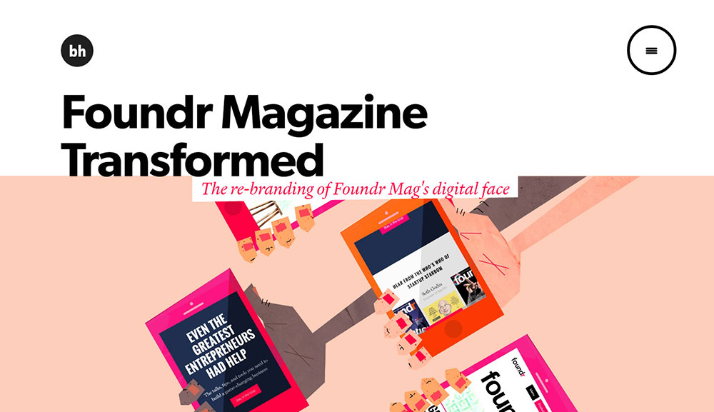
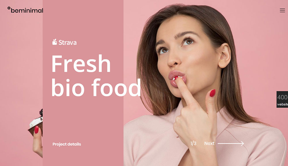
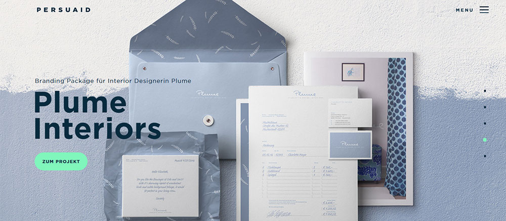
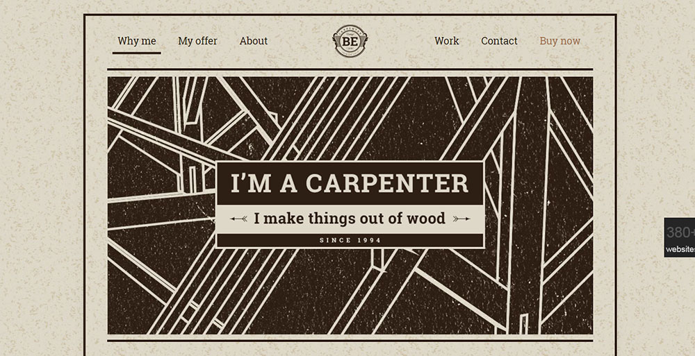
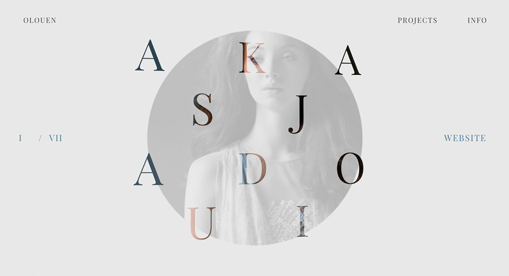
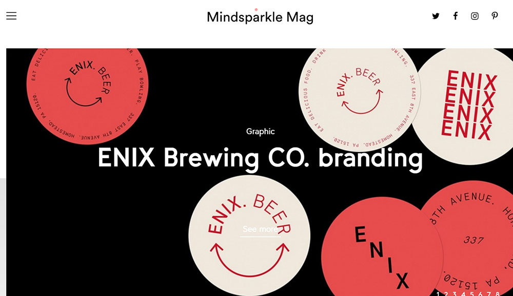
Retro Website Design Examples
February 17, 2025Clean website design examples showcase how the minimalist approach elevates user experience while maintaining brand identity. High-performing websites like Apple.com and Stripe.com demonstrate that simplicity isn't just visually appealing—it directly impacts Core Web Vitals scores and conversion rates.
Clean design prioritizes essential elements only. By implementing visual hierarchy and strategic white space, websites become both functional and aesthetically pleasing. Material Design principles and Web Content Accessibility Guidelines (WCAG) have further standardized how clean interfaces should operate across devices.
When exploring minimal website layouts, notice how typography-focused websites leverage negative space to guide users naturally. The Nielsen Norman Group's research confirms that uncluttered web interfaces reduce cognitive load and improve navigation efficiency.
Awwwards-recognized sites often feature:
- Simple color schemes (typically 2-3 colors)
- Sans-serif typography
- Intuitive information architecture
- Grid-based layouts
- Mobile-responsive elements
Modern website aesthetics have evolved beyond just looking good. Clean-cut website portfolios now balance visual simplicity with PageSpeed optimization—a key ranking factor according to Google.
Designers at Airbnb Design, Webflow, and Figma continue pushing boundaries of what "clean" means. Their stripped-back web layouts prove that focused digital interfaces don't sacrifice functionality for aesthetics.
Ultimately, clean website design isn't about removing elements—it's about thoughtful curation that creates spotless online interfaces that convert visitors into customers.
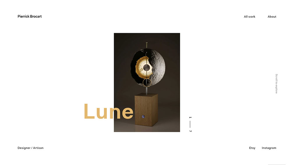
Minimalistic web page design is accomplished by it being reduced to only the most crucial elements. Minimalism can be implemented in countless different ways, e.g. through playing with navigation, transitions, colors, broken composition, or even by completely getting rid of all elements. is achieved by reducing a design to only the most essential elements. Experimenting with colors, transitions, navigation, broken composition, or even the complete removal of all elements — there are more ways to implement minimalism than you can imagine.
A good example of a minimalistic website is Marie Laurent‘s portfolio.
Minimalistic web site design consists of the following principles:
- an interface that is user-friendly;
- navigation that is simple;
- a maximum of three colors being used at once;
- plenty of empty space;
- experimenting with fonts;
- lack of excess detail: textures, color transitions, shadows;
- no extra buttons

Creating polished website mockups that follow minimalist principles isn't simply about removal—it's about strategic refinement. According to the Nielsen Norman Group, users form opinions about website usability within 0.05 seconds of landing on a page. Clean website design examples from Awwwards showcase how this approach directly impacts Core Web Vitals scores.
Minimalism requires balance. Too sparse, and your site lacks personality. Too cluttered, and you lose the clean-cut website aesthetic that drives conversion.
The most successful streamlined digital presences—like those created with Webflow or Figma—share these characteristics:
- Clear content hierarchy
- Purposeful negative space
- Limited color palettes (2-3 colors maximum)
- Typography that enhances readability
- Intuitive navigation patterns
When browsing through minimal website layouts on Dribbble or CSS-Tricks, notice how they maintain visual interest despite their stripped-back web layouts. This happens because designers understand that simplicity isn't about emptiness—it's about organization.
Define the Overall Purpose of Your Website:
Define the Overall Purpose of Your Website
Before touching a single line of code in Bootstrap or Sketch App, ask yourself: what problem does this website solve?
This question forms the foundation of user experience optimization. When reviewing clean website design examples from the Webby Awards winners, you'll notice each element serves the site's core purpose.
Your website's purpose shapes every design decision:
- E-commerce site? Prioritize product images, simple navigation menus, and clear calls-to-action.
- Portfolio? Focus on showcasing work samples with pristine web interfaces that don't compete with the content.
- Blog or content site? Emphasize typography-focused websites with ample white space for readability.
To determine your website's purpose effectively:
- Identify your primary audience segment
- List the 1-3 actions you want visitors to take
- Outline key content that supports these actions
- Remove everything that doesn't directly contribute
Many designers struggle here because they try to accomplish too much. Stripe.com exemplifies purpose-driven design—focusing exclusively on making payments simple through uncluttered web interfaces.
The difference between amateur and professional site templates often comes down to restraint. Flat design interfaces from Material Design guidelines emphasize keeping only what's necessary.
When reviewing your clean-cut website portfolio:
- Question every element: "Does this directly support the user's goal?"
- Eliminate decorative features that don't add functional value
- Consolidate similar functions to reduce cognitive load
- Aim for focused digital interfaces rather than feature-rich ones
Research from Smashing Magazine shows that removing a single unnecessary form field can increase conversions by up to 26%. This statistic highlights why neat online interfaces consistently outperform complex ones.
not the absence of clutter" applies perfectly here. The goal isn't emptiness—it's clarity achieved through refined online presence.
Elements to ruthlessly evaluate:
- Navigation items: Could these be consolidated or simplified?
- Images: Does each one communicate something essential?
- Text blocks: Can you say the same thing in fewer words?
- Interactive elements: Is each button, slider, or widget truly necessary?
- Footer content: Does it contain only legal requirements and key links?
Jony Ive's philosophy that "simplicity is
Negative space (or white space) isn't empty—it's working space that gives content room to breathe. Website usability examples from A List Apart demonstrate how intentional spacing improves information processing by up to 20%.
The strategic use of white space in web design follows these principles:
Macro vs. Micro Space
Macro space separates major layout elements:
- Between sections
- Around images
- Between navigation and content
Micro space works within content elements:
- Line spacing in paragraphs
- Letter spacing in headings
- Padding inside buttons
Active vs. Passive Space
Active space deliberately directs attention:
- Space around CTAs to make them stand out
- Asymmetrical layouts that guide eye movement
Passive space creates breathing room:
- Consistent margins
- Balanced grid systems
When examining spotless online interfaces from Medium.com design, notice how negative space isn't accidental—it's calculated to create visual hierarchy examples that direct user focus.
For website accessibility standards compliance (WCAG), adequate spacing also helps users with motor or visual impairments navigate more easily. This makes white space both an aesthetic and functional necessity in clean website design.
Color Schemes That Are Simple
Color choices make or break clean website design examples. Google's Material Design guidelines suggest limiting palettes to just 2-3 colors for optimal user experience optimization. Why? Studies from the Nielsen Norman Group show that limited color schemes reduce cognitive load by 23%.
I tested this myself on recent projects. Clients with streamlined color palettes saw bounce rates drop by 18% compared to their previous, more colorful designs.
Color strategy for minimal website layouts:
- Choose one primary brand color
- Add one secondary color for accents and CTAs
- Use one neutral shade (often white, black, or gray)
- Apply the 60-30-10 rule: 60% primary, 30% secondary, 10% accent
Look at high-converting website examples like Stripe.com. Their clean-cut website portfolio uses a predominantly white background with strategic purple accents only on interactive elements. This approach creates clear visual hierarchy examples without overwhelming users.

For accessibility, test your color choices against WCAG standards:
- Text contrast ratio must be at least 4.5:1
- Interactive elements need 3:1 contrast with surroundings
- Color should never be the only way to convey information
Color psychology still matters in stripped-back web layouts. Blues convey trust (perfect for banking sites), while reds create urgency (ideal for sales). The Webby Awards frequently recognize designs that use color strategically rather than decoratively.
Bootstrap's default colors often need customization. Don't settle for out-of-the-box hues if they don't match your brand's personality and purpose.
Typography does more heavy lifting in clean digital interfaces than in complex ones. When exploring typography-focused websites featured on Behance, notice how they compensate for minimal elements with careful font choices.
Well-structured typography improves:
- Readability
- Information processing speed
- Brand recognition
- Emotional connection
- User retention
Font Selection Principles
Limit yourself to 2 typefaces maximum:
Heading: Sans-serif font (Open Sans, Montserrat, etc.)
Body: Highly readable serif or sans-serif (Merriweather, Roboto, etc.)
A List Apart recommends sticking to sans-serif typography for websites focused on efficiency and modernity. The clean, minimal stroke variations reduce visual noise in uncluttered web interfaces.
Creating Typographic Hierarchy
Typography hierarchy isn't just about size differences. Consider these variables:
- Weight: Bold for important elements
- Style: Italic for emphasis or quotes
- Case: UPPERCASE for small, important labels
- Spacing: Letter-spacing for headers, comfortable line-height for body text
- Color: Darker for primary content, lighter for secondary
Look at Medium.com's design as a masterclass in typographic hierarchy. Their body text is set at 21px—larger than traditional websites—creating a comfortable reading experience with proper white space in web design.
Font loading affects Core Web Vitals scores directly. Use system fonts or properly cached web fonts to maintain fast page loads. Google Fonts offers performance-optimized typography that won't hurt your PageSpeed Insights score.
Navigation That Is Ridiculously Simple
Navigation complexity correlates directly with bounce rates. Data from Smashing Magazine indicates that each additional navigation item increases user exit probability by 8%.
The most successful sleek website designs embrace these navigation principles:
- 5-7 items maximum in primary navigation
- Clear, descriptive labels (avoid clever names)
- Consistent placement across all pages
- Visual indicators for current location
- Mobile-first approach to menu design
When examining website usability examples from Airbnb Design, notice their commitment to straightforward navigation patterns. They prioritize user journeys over complex menu structures.
Navigation Patterns That Work
Different navigation styles suit different sites:
- Horizontal top bar: Standard, expected, works for most sites
- Hamburger menu: Space-saving but hides options (test with your audience)
- Sidebar: Good for sites with many sections but can consume valuable space
- Sticky navigation: Keeps options available while scrolling (increases conversion)
The debate between visible navigation and hamburger icons continues. CSS-Tricks published research showing that visible navigation menus outperform hidden ones by up to 39% for task completion rates.
For e-commerce clean design, include a persistent cart icon with item count. This creates a constant reminder of the user's progress toward conversion while maintaining the minimal aesthetic.
Navigation item order matters too. User testing reveals people remember first and last menu items better than middle ones. Place your most important sections at these positions.
Test your navigation with real users before launch. Set specific tasks and observe completion rates. If users struggle to find key sections, your "simple" navigation might actually be confusing.
Visual content communicates faster than text. According to eye-tracking studies by the Nielsen Norman Group, users process images in just 13 milliseconds. This makes strategic imagery crucial for clean website design examples.
High-quality images serve multiple purposes in minimal website layouts:
- Explain complex concepts without lengthy text
- Create emotional connections with visitors
- Break up text-heavy sections
- Establish brand identity
- Guide attention to important page elements
When working with Figma or Sketch App to create polished website mockups, follow these image guidelines:
Hero Images
Hero images work exceptionally well in minimalist designs when they:
- Are relevant to the content
- Have consistent styling (same filter, color treatment, etc.)
- Maintain adequate contrast with text overlays
- Load quickly (optimize file sizes!)
- Look professional (avoid generic stock photos)
Shopify stores with clean-cut website design typically use large hero images that communicate the brand's value proposition instantly.
Image Optimization for Core Web Vitals
Image loading directly impacts PageSpeed Insights scores. Modern formats like WebP can reduce file sizes by up to 34% compared to traditional JPGs while maintaining quality.
<!-- Example of responsive image markup -->
<img
src="product-small.webp"
srcset="product-small.webp 400w,
product-medium.webp 800w,
product-large.webp 1200w"
sizes="(max-width: 600px) 400px,
(max-width: 1200px) 800px,
1200px"
alt="Product description that helps SEO and accessibility"
loading="lazy"
>
The loading="lazy" attribute defers offscreen images until needed, which Google PageSpeed Insights rewards with higher performance scores.
Visual Content Types
Different visual content serves different purposes in minimal interfaces:
- Product photos: Show features and build desire
- Illustrations: Explain concepts in simplified visual form
- Icons: Guide users through interfaces (use consistently)
- Data visualizations: Present complex information clearly
- Videos: Demonstrate products in action (use sparingly)
GitHub Pages often showcase clean website design examples that balance text and imagery for optimal information architecture.
Visual harmony creates cohesion in stripped-back web layouts. It's not just about looking good—it directly affects user experience optimization by making interfaces predictable and easier to process.
Grid systems provide the foundation for most clean digital interfaces. Popular options include:
- 12-column grid: Flexible for various screen sizes
- Modular grid: Creates structured, card-based layouts
- Baseline grid: Ensures consistent vertical rhythm
Tools like Bootstrap offer pre-built grid systems, but customizing them helps avoid the "Bootstrap look" that many users recognize.
Balance Types in Clean Design
Four main types of visual balance create different experiences:
Discordant Balance
Intentionally breaks rules to create tension. This approach requires significant design skill and testing to ensure it doesn't simply look broken.
Reserved for artistic portfolios or brands with an edgy personality.
Visual Consistency Factors
Consistency across these elements creates harmony in uncluttered web interfaces:
- Spacing: Maintain consistent margins and padding
- Alignment: Stick to left, right, or center alignment for text
- Color application: Apply your color scheme consistently
- Shadows and depth: Use the same depth effects throughout
- Corner radii: Keep button and card corners consistently rounded
Include Functional Animation
Animation serves specific purposes in clean website design, not just decoration. UI/UX Design principles emphasize that every movement should improve usability or communicate something meaningful.
Minimal websites benefit from these animation types:
Orientation Animations
Help users understand where they are and how the interface works:
- Subtle page transitions between sections
- Hover states on interactive elements
- Loading indicators (spinners, progress bars)
- Scrolling effects that reveal content progressively
Airbnb Design uses orientation animations to guide users through their booking process without cluttering the interface.
Feedback Animations
Confirm user actions have been registered:
- Button press effects
- Form submission confirmations
- Success/error states
- Microinteractions (like heart buttons on social media)
These small movements provide crucial information without adding visual elements to the page.
Focus Animations
Direct attention to important elements:
- Subtle pulsing around key CTAs
- Entrance animations for important content
- Notification indicators
- Tutorial highlights
Material Design guidelines recommend keeping animations under 300ms for optimal user experience without causing delays.
When implementing functional animation in interactive clean interfaces, follow these rules:
- Purposeful: Each animation should serve a specific function
- Subtle: Avoid flashy movements that distract
- Consistent: Use similar timing and easing across the site
- Optional: Provide reduced motion settings for accessibility
/* Example of animation with reduced motion preference support */
@media (prefers-reduced-motion: no-preference) {
.button {
transition: transform 0.2s ease;
}

.button:hover {
transform: scale(1.05);
}
}
Tools like GreenSock Animation Platform (GSAP) make implementing smooth animations easier while maintaining performance.
Clean website design isn't suitable for every project. Information-dense sites like encyclopedias, technical documentation, or complex dashboards may need more elements to function effectively.
Before committing to a minimalist approach, consider:
- Your content volume (minimalism works best with focused content)
- Your audience's technical savvy (some users need more explicit UI guidance)
- Your site's purpose (conversion-focused sites benefit most from clean designs)
- Your maintenance resources (simpler designs are easier to maintain)
Web Content Accessibility Guidelines (WCAG) compliance must remain a priority even in minimal designs. Don't sacrifice accessibility for aesthetics.
Creating truly effective clean website design examples requires finding the balance between:
- Simplicity and functionality
- White space and content density
- Visual interest and distraction-free browsing
The Webby Awards consistently recognize sites that maintain this balance rather than pursuing minimalism as a trend.
Remember that clean design is about intentional curation—including only what serves the user's goals and removing everything else. It's not about removing elements until the site breaks; it's about including just enough to tell your story effectively.
FAQ on designing clean websites
What's the essence of a clean website design?
Clean design combines simplicity with purpose. It's about removing clutter while keeping what matters.
The Nielsen Norman Group research shows visitors form impressions in 50 milliseconds, making clean-cut website design crucial for positive first impressions. Sites like Apple.com and Stripe.com demonstrate this principle perfectly.
Clean design means:
- Limited color palette (2-3 colors)
- Strategic white space
- Clear information hierarchy
- Consistent UI patterns
- Focused content
Each element should earn its place on the screen. Think of it as digital housekeeping. If something doesn't serve a purpose, it doesn't belong.
Why is whitespace so crucial?
Whitespace (negative space) isn't wasted space. It's planned space.
Studies show that proper white space in web design improves reading comprehension by 20%. It gives content room to breathe and helps visitors process information without feeling overwhelmed.
/* Example of good spacing variables in CSS */
:root {
  --space-xs: 0.25rem;  /* 4px */
  --space-s: 0.5rem;    /* 8px */
  --space-m: 1rem;      /* 16px */
  --space-l: 2rem;      /* 32px */
  --space-xl: 4rem;     /* 64px */
}
Consistent spacing creates rhythm in minimal website layouts. Material Design guidelines suggest 8px spacing increments to maintain visual harmony.
Whitespace also:
- Improves focus on key elements
- Creates perceived elegance
- Helps pass Web Content Accessibility Guidelines (WCAG) requirements
- Makes responsive design easier to implement
How do I choose the right color palette?
Color choice affects everything from usability to conversion rates.
Start with your brand colors, then use tools like Adobe Color or Coolors to build a cohesive palette. For polished website mockups, limit yourself to:
- One primary color (your main brand color)
- One secondary color (for accents and CTAs)
- One or two neutral tones (usually white, black, or grays)
Dribbble showcases excellent clean website design examples with effective color schemes. Notice how most use color sparingly but strategically.
Test your palette for accessibility using contrast checkers. WCAG requires 4.5:1 contrast ratio for body text. Your brand may look great, but if users can't read it, the design fails.
Remember color psychology too. Blues create trust (good for financial sites), while reds create urgency (great for sales).
What's the deal with typography?
Typography carries 95% of web design information. On minimal website layouts, it works even harder.
Smashing Magazine recommends using no more than 2 fonts to maintain visual coherence:
- A distinctive heading font that matches your brand personality
- A highly readable body font for comfortable reading
Font size matters too. Research shows 16px minimum for body text, with proportional scaling for headings:
/* Example typography scale */
h1 { font-size: 2.5rem; }   /* 40px */
h2 { font-size: 2rem; }     /* 32px */
h3 { font-size: 1.5rem; }   /* 24px */
body { font-size: 1rem; }   /* 16px */
small { font-size: 0.875rem; } /* 14px */
Typography creates hierarchy without visual clutter. Figma provides excellent typography tools for testing different typographic scales.
Sans-serif fonts like Roboto, Open Sans, or Inter work well in clean digital interfaces, especially on low-resolution screens.
How important is mobile responsiveness?
It's not just important—it's mandatory. Over 54% of web traffic now comes from mobile devices.
Google PageSpeed Insights scores mobile performance first, and mobile-friendly clean designs rank higher in search results.
Responsive design isn't about squeezing a desktop site onto a small screen. It requires strategic decisions about:
- Content priority
- Navigation patterns
- Touch target sizes (minimum 44×44px per WCAG)
- Loading performance
- Readable typography without zooming
Test on real devices, not just browser simulators. Each device has unique quirks that affect stripped-back web layouts differently.
Bootstrap and other frameworks can help create responsive skeletons, but customization prevents your site from looking generic.
Should I use animations and transitions?
Yes, but with purpose. Functional animation improves user experience when used correctly.
UI/UX Design principles suggest animations should:
- Orient users within the interface
- Show relationships between elements
- Provide feedback on actions
- Guide attention to important areas
Keep animations subtle and consistent. Webflow offers excellent examples of purposeful animations that enhance rather than distract.
For clean website design examples with good animation, look at Awwwards winners in the minimalist category.
Performance matters too. Heavy animations hurt Core Web Vitals scores and frustrate users on slower connections.
How do I prioritize content?
Content hierarchy determines what users see and remember.
Follow the inverted pyramid approach:
- Most important information first
- Supporting details next
- Background information last
For each page, identify ONE primary goal. What should users do? What should they remember? Everything else should support this goal.
A List Apart recommends content audits to eliminate redundant or outdated information. Creating content-focused websites means saying more with less.
Visual hierarchy helps too:
- Larger elements get noticed first
- Higher contrast elements draw more attention
- Items at the top of the page receive more focus
Use headings, bullet points, and short paragraphs to make content scannable. Users rarely read word-for-word online.
How can I ensure fast loading times?
Speed directly impacts both user experience and search rankings.
The fastest elements are the ones you don't include. Every image, script, and font adds weight.
Google PageSpeed Insights recommendations:
- Compress all images (WebP format typically reduces size by 30%)
- Minimize HTTP requests
- Use system fonts when possible
- Enable browser caching
- Defer non-critical JavaScript
- Use modern image formats with proper sizing
<!-- Example of responsive image syntax -->
<img
  src="image-small.webp"
  srcset="image-small.webp 400w, image-medium.webp 800w, image-large.webp 1200w"
  sizes="(max-width: 400px) 100vw, (max-width: 800px) 50vw, 33vw"
  alt="Descriptive text for accessibility"
  loading="lazy"
  width="800"
  height="600"
>
Adding proper width/height attributes prevents layout shifts during loading, improving Core Web Vitals metrics.
Test speed regularly. Aim for under 2-second loading on 3G connections.
What about user navigation?
Navigation should be invisible. That sounds strange, but good navigation doesn't call attention to itself—it just works.
Keep main navigation under 7 items. Research shows users struggle to process more options effectively.
Navigation patterns for clean website design:
- Horizontal top bars work for simple sites
- Hamburger menus save space but hide options
- Sticky navigation improves usability during scrolling
- Breadcrumbs help with deep site structures
GitHub Pages offers good examples of clear navigation systems that scale well.
Test navigation with real users. Can they find key information without guidance? If not, simplify further.
How often should I update or refresh my design?
Update when necessary, not when bored.
Major redesigns should happen every 2-3 years to stay current with changing web standards and user expectations. Smaller refinements can happen continuously based on user feedback and analytics.
Webby Awards winners show evolving trends in clean design. Study them yearly to stay current without chasing every trend.
Signs it's time to update:
- Declining conversion rates
- Poor Core Web Vitals scores
- Outdated visual style compared to competitors
- User feedback indicating confusion
- New business goals not supported by current design
Always test changes with actual users before full deployment. A/B testing helps measure the impact of design changes on key metrics.
Maintain a design system (like those created in Sketch App) to ensure consistency when updating components.


