


10 Quick Tricks to Boost WooCommerce Sales with Betheme
February 13, 2026
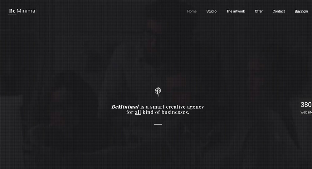
Amazing web design portfolio websites (40+ Examples)
February 15, 2026Most websites try to say everything at once. The best ones don't.
The clean website design examples in this article prove that restraint converts. Stripe, Notion, Allbirds, and a handful of others built their entire visual identity around one principle: remove everything that doesn't help the user.
65% of users actively prefer websites with a simple, clean layout (HubSpot). That preference shows up directly in bounce rates, time on page, and revenue.
This article covers what makes a clean web design actually work, from visual hierarchy and white space to real examples across SaaS, ecommerce, editorial, and portfolio sites. You will also find the common mistakes that create clutter and the tools designers use to avoid them.
What Is Clean Website Design?
Clean website design is a visual approach that removes everything non-essential, leaving only the elements that help users understand, navigate, and act. It is not the same as minimalism. A minimal site can still feel cold or incomplete. A clean site feels deliberate.
The core properties are simple: low visual noise, a clear content hierarchy, readable typography, and fast cognitive processing. Every element earns its place. If it does not help the user, it goes.
What separates clean from cluttered comes down to intent. Cluttered sites add. Clean sites subtract. That subtraction is harder than it sounds, which is why so few sites actually get it right.
Design influences 94% of first impressions, according to a Carleton University study (Lindgaard et al., 2006). Users form those impressions in about 50 milliseconds. Not enough time to read anything. Just enough to react to visual structure, spacing, and hierarchy.
Clean design is also not a trend. Apple built its brand on it in the early 2000s. Google launched with almost nothing on the page. Both made clean design feel like the standard. Today, 65% of users say they prefer websites with a simple, clean design (HubSpot).
What Clean Design Is Not
Not empty. A page with nothing on it is not clean, it is just bare. Clean design uses negative space intentionally to give content room and direct attention.
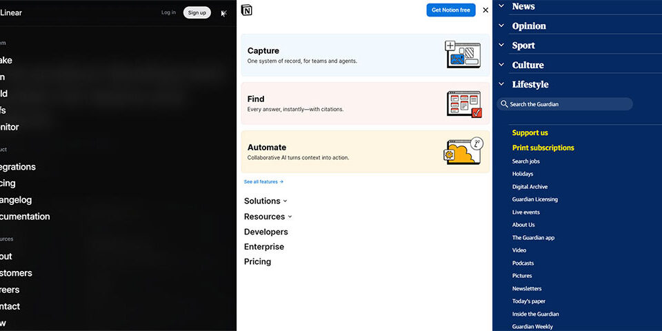
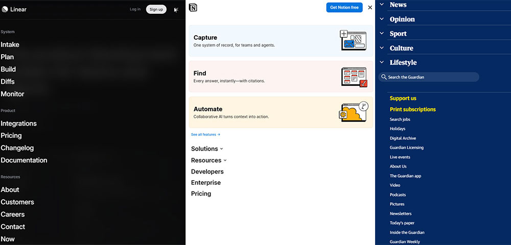
Not boring. Stripe's homepage is clean and visually engaging. Linear's site is dark, precise, and technical. Both are clean. Neither is generic.
Not one style. Clean design works across dark and light themes, editorial layouts, and product-heavy pages. The shared trait is restraint, not a specific look.
Why Clean Design Converts Better
A well-designed user interface can increase conversion rates by up to 400%, according to Forrester Research. Clean layouts are a significant part of that, because they reduce cognitive load and keep user attention on the primary action.
Minimalist, clean design with generous white space can boost conversion rates by up to 60% compared to dense, cluttered alternatives (research via ThisDayLive, 2025). Generous spacing also improves comprehension by roughly 20%, meaning users actually understand what they are reading.
84.6% of designers say cluttered layouts are the most common error small businesses make in their web presence (GoodFirms, 2025). The fix is usually not a redesign. It is editing.
What Are the Visual Principles Behind Clean Website Design?
Clean web design is built on a short list of decisions made consistently across every page. Get these right and the site reads as clean. Get them wrong in even one area and the whole layout feels off.
| Principle | What It Does | Common Mistake |
|---|---|---|
| White space | Directs attention, reduces noise | Treated as wasted space |
| Typography hierarchy | Creates readable content flow | Too many font sizes, no contrast |
| Color restraint | Keeps visual weight consistent | 4+ colors with no clear accent |
| Grid alignment | Builds structure users can follow | Inconsistent spacing between sections |
How White Space Affects User Attention
White space is not decoration. It is a functional layout tool that controls where a user's eye goes next.
Swiss typographer Jan Tschichold wrote in 1930 that white space should be treated as an active element, not a passive background. That principle holds. When spacing is tight, everything competes. When spacing is generous, priority becomes obvious.
At the micro level, this means line-height set to roughly 150% of font size for body text, comfortable paragraph margins, and padding around contained text blocks. Small adjustments, large readability gains.
Apple's product pages are the most cited example. Each section introduces one idea, surrounded by enough space that the product image becomes the only thing to look at. The spacing does the selling.
How Typography Hierarchy Creates Clean Layouts
The rule is 2-3 font weights maximum, with clear size contrast between heading levels and body text.
Most clean sites use a single sans-serif typeface family. Inter, Helvetica, and Geist show up constantly. The variation comes from weight and size, not from mixing typefaces. Adding a second typeface is a decision that needs a clear reason behind it.
Visual hierarchy in typography guides users through content in the order the designer intends. Size signals importance. Weight signals priority. Spacing signals grouping. When those signals are inconsistent, users slow down.
How Color Restraint Reduces Visual Noise
The 60-30-10 rule applied to web UI: 60% neutral background, 30% secondary tone, 10% accent color for interactive elements and CTAs.
Most strong clean-design sites push the neutral percentage even higher. Notion uses near-black and white with minimal color. Linear uses a dark background with precise accent highlights. The point is that every color present has a job.
One accent color for CTAs and interactive elements. When everything is an accent color, nothing is. The color theory here is simple: contrast creates hierarchy, and hierarchy creates clarity.
A well-chosen color scheme does not just look good. It communicates brand positioning. Aesop's off-whites and earth tones signal premium quality before a user reads a single word.

Visual style and structural layout are two different things. A site can have restrained colors and still feel cluttered if the layout logic is broken. Structural clean design is about how information is organized and sequenced, not just how it looks.
The above-the-fold section carries most of the structural weight. One primary message, one CTA. If a homepage hero section is doing 4 jobs at once, the layout is not clean regardless of the color palette.
Single-Column vs. Multi-Column Layouts
Single-column layouts read as clean almost automatically. One thread of information, no competing columns pulling attention sideways. Medium's reading view is the obvious example. Nothing exists on the page except the content.
Multi-column layouts can still be clean, but they need a stronger grid system to hold them together. The 8pt grid system is the most common structural tool for this. Spacing, margins, and element sizes all snap to multiples of 8px, which keeps the layout visually consistent even as complexity increases.
The mistake most sites make with multi-column layouts: unequal gutters, inconsistent row heights, and elements that don't align to a shared baseline. Any one of those breaks the structured feel.
Navigation Structure and Visual Clarity
Navigation simplicity is one of the clearest signals of a clean site. More items in the nav means more cognitive work before a user gets to content.
54% of e-commerce websites score mediocre or below on navigation ease (Baymard Institute, State of Homepage and Category Navigation UX, 2024). That stat is not about aesthetics. It is about structure. Clean navigation is organized by user intent, not by internal company logic.
Most clean sites cap primary navigation at 5-6 items. When more links are needed, they move to footer navigation or secondary menus. The primary nav stays focused. Check out how effective website navigation examples handle this balance across different industries.
Content Chunking and Section Breaks
Content chunking is the practice of grouping related information into discrete visual sections separated by clear spacing or dividers. It reduces cognitive load by giving users natural stopping points.
The F-pattern and Z-pattern reading flows both depend on content being chunked correctly. Users scanning in an F-pattern read the first line fully, then scan vertically down the left side. If content is not chunked into clear sections, that scanning pattern breaks and users lose their place.
Practically: one idea per section, a visible break between sections, and a section heading that tells users what they are about to read before they read it. The hero section is where this logic matters most. One headline, one supporting line, one CTA.

How Do Clean Websites Handle Mobile Design?
Mobile is no longer a secondary consideration. As of 2024, mobile devices account for roughly 64% of global web traffic (StatCounter). A layout that reads as clean on desktop but breaks on a 390px viewport is not a clean layout. It is an incomplete one.
The cleanest mobile first design approaches treat the phone screen as the primary canvas, then scale up. Not the other way around.
Mobile-First Layout Decisions
Single-column by default. Every clean desktop layout that works on mobile has a single-column fallback baked in from the start. Multi-column grids compress badly unless spacing and font sizes are explicitly adjusted at each breakpoint.
Touch targets matter more than most designers account for. A 44px minimum tap target is the standard, but plenty of "clean" sites fail this because buttons and nav links look fine on desktop and become unusable on mobile. Mobile users are 5 times more likely to abandon a task if the site is not optimized for mobile (DesignRush, 2025).
The thumb zone matters too. Primary navigation and CTAs belong in the lower portion of the screen on mobile, where thumbs naturally reach. Anything critical placed only at the top of a full-screen mobile layout asks users to stretch.
How Desktop-Clean Layouts Break on Mobile
Mobile bounce rates range between 58% and 60%, compared to 48-50% on desktop (DesignRush, 2025). A significant portion of that gap comes from layouts that never adapted properly.
Common breakpoints where clean design fails:
- Side-by-side text and image sections that stack poorly
- Navigation menus with 6+ items that overflow without a proper collapse
- Hero sections with 48px+ desktop headlines that overwhelm mobile viewports
- Card grids that compress into 1-column layouts but keep desktop padding ratios
Allbirds handles mobile scaling well specifically because each page section was designed for one idea at a time. That single-focus structure scales to mobile without requiring a separate mobile layout strategy.
Performance as Part of Mobile Clean Design
53% of mobile users abandon pages that take more than 3 seconds to load (Bright Vessel, citing Google research). That number alone makes page speed a core component of clean mobile design.
LCP under 2.5 seconds. CLS under 0.1. INP under 200ms. These are Google's thresholds for "good" Core Web Vitals (Google Search Central, 2025). A site that hits all three will render as stable and fast on mobile. One that misses even CLS will shift elements during load, which breaks the visual cleanliness of any layout regardless of how well it was designed.
Fewer DOM elements load faster. This is one of the direct technical benefits of clean design: less visual complexity means less rendering work, which improves LCP scores on lower-powered mobile devices.

Clean design does not happen by accident. It is produced by systems that enforce consistency. The right tools are not what make a site clean, but the wrong ones make it much harder to stay clean as a project grows in complexity.
| Platform | Starting Plan (monthly) | Best For |
|---|---|---|
| BeTheme | $60 one-time (WordPress theme) | Actors wanting full design control with 700+ prebuilt templates |
| Squarespace | $16/month (Personal) | Design quality, theatre/commercial actors |
| Wix | $10.50/month (Light) | Design flexibility, more template options |
| Hostinger | $2.69/month | Budget-conscious actors, entry level |
| SITE123 | $5.50/month | Quick setup, minimal technical skill needed |
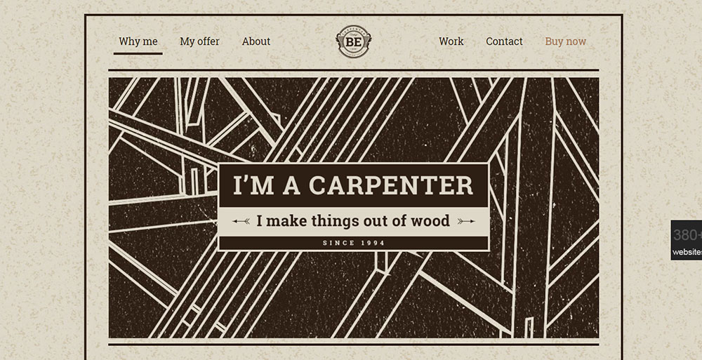
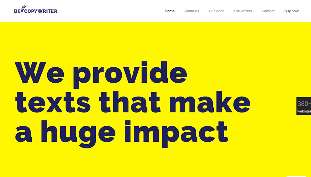
BeTheme for Pre-Built Design Consistency in WordPress
BeTheme approaches clean design from a different angle. Rather than giving designers a blank canvas, it provides over 700 prebuilt websites, each built around consistent spacing, typography, and layout patterns. For WordPress users, that means a clean structural foundation is already in place before any customization begins.
The built-in BeBuilder enforces layout decisions at the template level. Sections, columns, and spacing behave predictably across pages because they share the same underlying component logic.
That structural consistency is what keeps multi-page WordPress sites visually coherent without requiring a separate design system.
For actors and small creative businesses in particular, BeTheme removes the need to build spacing systems from scratch.
The design constraints are set by the theme, which means the risk of visual drift across pages is significantly lower than with a fully custom build.
Figma for Spacing Systems and Component Consistency
Figma holds a 40.65% market share in the design tools category, with 93% adoption among organizations in the software design category as of late 2024 (Cropink, SQ Magazine). That dominance comes from its real-time collaboration model and component library system.
For clean design specifically, Figma's auto-layout feature is the most useful tool. It enforces consistent spacing between elements at the component level. A button with 16px horizontal padding defined in Figma stays 16px across every instance. No manual adjustment, no drift.
Design tokens extend that consistency to development. Spacing, color, and typography values defined in Figma can be exported directly to code, which eliminates the gap between designed spacing and implemented spacing.
Tailwind CSS for Spacing-Consistent Front-End Code
Tailwind's 8pt spacing scale bakes the 8pt grid system directly into the framework. Spacing values are multiples of 4px by default. Every padding, margin, and gap value in a Tailwind project traces back to the same scale, which is exactly how clean layouts stay consistent through development.
The practical benefit: designers no longer have to specify every spacing value individually. Developers pick from a fixed scale. Inconsistency becomes structurally harder to introduce.
Most web design tools built for production output now include Tailwind integration. The web design principles behind Tailwind's approach are the same ones behind clean design: constraints produce consistency, and consistency produces clarity.
Webflow for Visual Layout Control
Webflow lets designers control layout and spacing visually without writing CSS from scratch. For clean design, the key advantage is that spacing adjustments are immediate and visible during the build process.
The website layout logic in Webflow mirrors how CSS Grid and Flexbox actually work, which means designers learn real layout behavior rather than a simplified abstraction. That understanding directly transfers to cleaner, more predictable layouts.
What Are the Common Mistakes That Make Websites Look Cluttered?
Clutter is not usually caused by one big decision. It builds up through many small ones, each individually defensible, that compound into visual noise. 84.6% of designers say cluttered layouts are the most common error small businesses make (GoodFirms, 2025).
Most of these mistakes are fixable without a full redesign. They are structural habits, not fundamental problems.
Too Many Competing CTAs on One Section
A page section with 3 CTAs has no CTA. When every action is equally prominent, none of them get attention. The user's eye has nowhere to land, so it keeps scanning.
The fix is a strict hierarchy: one primary CTA per section, one secondary action maximum, styled with clearly different visual weight. A strong call to action button does not need competition to work. It needs contrast.
No Spacing System
Inconsistent spacing is the most common source of clutter that designers don't immediately see. When spacing between elements varies randomly (24px here, 31px there, 18px somewhere else), the layout reads as unstable even when individual components look fine.
The human eye reads spatial relationships as meaning. Elements close together belong together. Elements far apart are separate. Random spacing sends random signals. An 8pt spacing system resolves this by limiting spacing choices to a fixed set of values.
Four or More Typefaces
Adding a second typeface is a design decision that needs a reason. Adding a third requires a stronger one. Most clean sites use 1-2 typefaces with variation coming from weight and size contrast alone.
Took me a while to understand this when I started out, honestly. I kept thinking more variety meant more personality. It doesn't. It means more visual noise. Medium uses one typeface. Notion uses one typeface. Neither feels monotonous because the size hierarchy is sharp enough that variety comes from structure, not from font switching.
Homepage Trying to Do Six Things at Once
This is the single most common homepage mistake. A hero section that introduces the company, explains 3 features, showcases 2 awards, includes a video, and has a newsletter signup is not a homepage. It is a wireframe that never got edited.
British Gas redesigned a cluttered landing page to score 72 on EyeQuant's visual clarity scale, up from 48. The cleaner version outperformed the original by 50% in an A/B test (EyeQuant). The redesign did not add anything. It removed competing elements until one message was clear.
Check out actual examples of bad design to see how quickly these mistakes compound when left unaddressed.
How Does Clean Design Affect Website Performance and SEO?
Clean design and technical performance are not separate goals. They reinforce each other. A layout with fewer DOM elements renders faster. A page with clean navigation structure is easier to crawl. Both outcomes improve search performance.
Sites that load in 1 second have a conversion rate 5 times higher than sites that load in 10 seconds (DesignRush, citing Portent research, 2025). Clean design directly contributes to that speed gap.
Fewer DOM Elements, Better Core Web Vitals
Every visual element added to a page adds to the DOM. Decorative backgrounds, layered animations, icon-heavy layouts, and nested card structures all increase rendering work. More rendering work increases Largest Contentful Paint (LCP) times, which Google measures directly as a ranking signal.
Google's LCP target is under 2.5 seconds. Sites that hit it consistently tend to be those with clean, focused layouts where the main content element (a product image, a headline, a hero) is not buried under competing visual layers (Google Search Central, 2025).
CoinStats improved their number of URLs with "Good" Core Web Vitals scores by 300% after fixing a single LCP issue, and search impressions grew by the same amount (DebugBear). That is what performance optimization through cleaner code can do.
Clean Navigation and Crawlability
Navigation structure: directly affects how Google crawls and indexes a site. Clean navigation means fewer clicks to reach any page, clearer internal link logic, and no orphaned pages buried under non-crawlable JavaScript menus.
A flat, clean navigation structure distributes internal link equity efficiently. Every page in the top-level nav gets a link from every other page through the shared header. Pages buried 4-5 clicks deep in complex navigation systems receive far less crawl priority. Website navigation quality is both a UX problem and a technical SEO problem simultaneously.
Page Experience Signals and Rankings
Core Web Vitals function as a tiebreaker when content quality is equal between competing pages (DebugBear). In competitive niches, that tiebreaker matters. A clean, fast-loading page with a good CLS score will rank above a slower equivalent when all other factors are equal.
62% of companies increased sales after implementing responsive websites (DesignRush, 2025). Responsive design and clean layout structure produce faster, more stable pages. The business impact follows from the technical improvement.

How Do You Measure Whether a Website Design Is Clean?
Clean is not purely subjective. There are measurable signals that indicate whether a layout is visually organized, cognitively accessible, and technically efficient. Testing matters because designers often become blind to their own layouts after working on them long enough.
Five-Second Tests and Eye-Tracking
The 5-second test is the most direct measurement available. Show a user the homepage for 5 seconds, then ask them: what does this company do? What was the main message? Where would you click first?
If users cannot answer clearly, the layout is not clean. Not confusing, not ugly necessarily. Just not organized clearly enough to communicate in the time available. UsabilityHub runs 5-second tests at scale. Hotjar and Microsoft Clarity provide session recordings and heatmaps that show where users actually look versus where the layout intends them to look.
Core Web Vitals as a Technical Cleanliness Proxy
Google Lighthouse scores are not ranking signals directly, but they are strong proxies for technical cleanliness. A Lighthouse Performance score above 90 on mobile generally indicates a lean, well-structured layout without excessive rendering complexity.
Three metrics to check in Google Search Console:
- LCP: main content loads within 2.5 seconds
- CLS: layout does not shift after initial load (score under 0.1)
- INP: all interactions respond within 200ms
These are the same signals Google uses to evaluate user friendly websites. Hitting all three on mobile means the layout is technically clean, not just visually.
Before/After Redesign Measurement
Measuring cleanliness after a redesign requires comparing metrics before and after across 3 dimensions.
Before/after comparison framework:
- Bounce rate change: lower bounce rate on mobile indicates cleaner layout clarity
- Task completion rate: measured through user testing with specific scenarios
- Conversion rate delta: the most direct business measure of layout effectiveness
The British Gas case is the clearest example of this structure in practice. EyeQuant's visual clarity score gave a quantitative before/after comparison (48 vs 72), which mapped directly to a 50% conversion lift. That is what structured cleanliness measurement looks like when done well.
A complete website checklist covering layout, accessibility, performance, and navigation will surface most of the structural issues that create clutter before any user testing begins.


FAQ on Clean Website Design
What makes a website design "clean"?
Clean web design removes everything that doesn't help the user. It relies on visual hierarchy, generous white space, restrained color palettes, and readable typography. Every element serves a purpose. If it doesn't aid navigation or communicate value, it goes.
What are the best clean website design examples?
Stripe, Linear, Notion, Allbirds, and Everlane are widely cited as top examples. Each uses minimal layouts, tight spacing systems, and focused above-the-fold messaging. Medium and Svelte.dev lead in editorial and technical content categories respectively.
Is clean design the same as minimalist design?
Not exactly. Minimalist design is a style choice. Clean design is a structural one. A page can carry substantial content and still read as clean if the visual hierarchy is clear and spacing is applied consistently throughout.
How does white space improve a website?
White space directs user attention, reduces cognitive load, and separates content into digestible sections. Research shows generous spacing improves comprehension by roughly 20%. It also gives CTAs room to stand out without competing visual elements nearby.
Does clean design help with SEO?
Yes. Clean layouts produce fewer DOM elements, which speeds up rendering and improves Core Web Vitals scores. Google uses LCP, CLS, and INP as page experience signals. Faster, structurally simple pages tend to outrank cluttered equivalents when content quality is equal.
What fonts work best for clean website design?
Sans-serif typefaces dominate clean layouts. Inter, Helvetica, and Geist appear most frequently across top-performing sites. Limit to two typefaces maximum, use size and weight for hierarchy, and set body line-height to roughly 150% of font size.
How many colors should a clean website use?
Three is the practical ceiling. Apply the 60-30-10 rule: 60% neutral background, 30% secondary tone, 10% accent color for CTAs and interactive elements. Notion uses near-black and white with minimal accents. Stripe adds one brand color sparingly.
What are the most common mistakes that make websites look cluttered?
Too many competing CTAs per section, no spacing system, four or more typefaces, and homepages trying to communicate six value propositions at once. Inconsistent spacing is the most common culprit. It makes layouts feel unstable even when individual components look fine.
How do I test whether my website design is clean?
Run a 5-second test via UsabilityHub. Check Core Web Vitals in Google Search Console. Review heatmaps in Hotjar or Microsoft Clarity. If users cannot identify your main message within 5 seconds, the layout needs editing, not expanding.
Can ecommerce sites use clean design without hurting sales?
Clean ecommerce design consistently improves sales. Allbirds focuses on one product per scroll section. Everlane removes decorative elements entirely. Abandoned cart rates drop by 20% on sites with optimized, clutter-free checkout flows, according to Statista research.
Conclusion
This conclusion is for an article presenting clean website design examples drawn from SaaS, ecommerce, editorial, and portfolio categories.
The pattern across every example is the same: disciplined spacing, restrained color use, and a clear content hierarchy do more than any decorative element could.
Visual restraint is a conversion strategy, not a stylistic preference. Fewer competing elements mean faster decisions, lower bounce rates, and cleaner Core Web Vitals scores.
Whether you are building minimalistic websites from scratch or auditing an existing layout, the fix is almost always subtraction.
Start with spacing consistency. Cut competing CTAs. Limit your color palette to three values. The sites covered here prove that doing less, done deliberately, produces better results every time.


