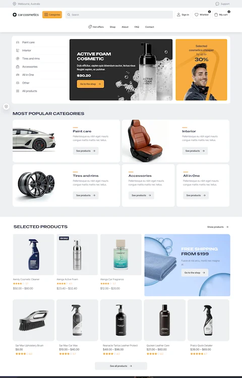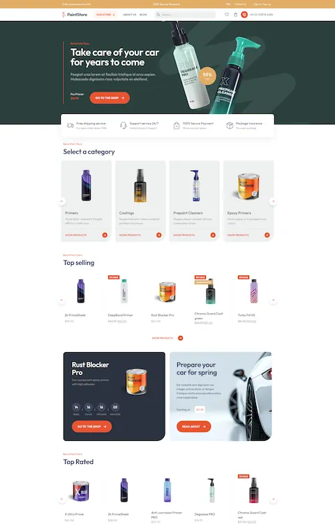
Awesome Automotive WordPress Themes
January 12, 2026
Cool Looking Personal Trainer Website Design Examples
January 16, 2026A potential client just searched for a stylist near them. Your website loaded. They left in 3 seconds.
That happens more than most salon owners realize. And it almost always comes down to design, not skill.
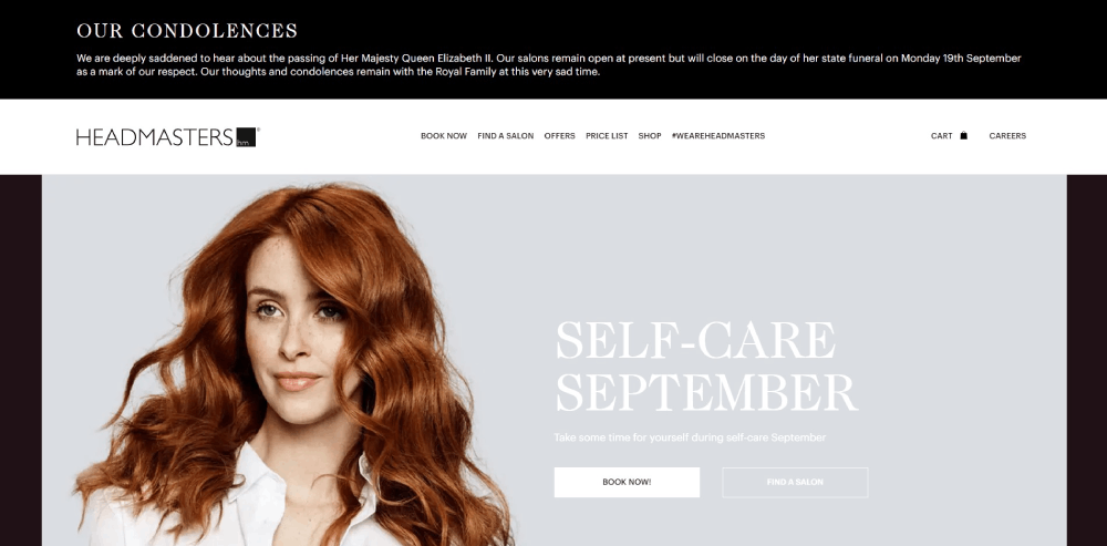
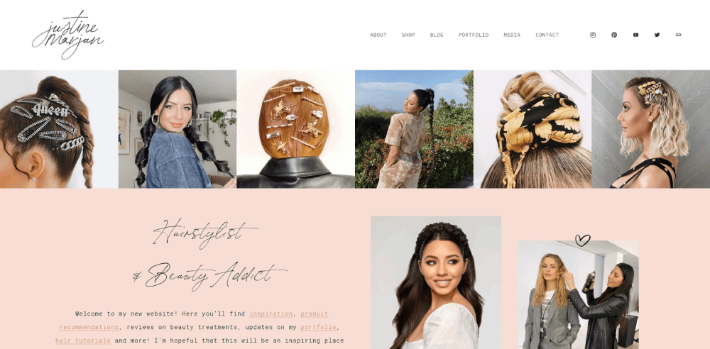
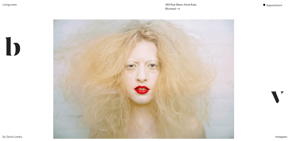
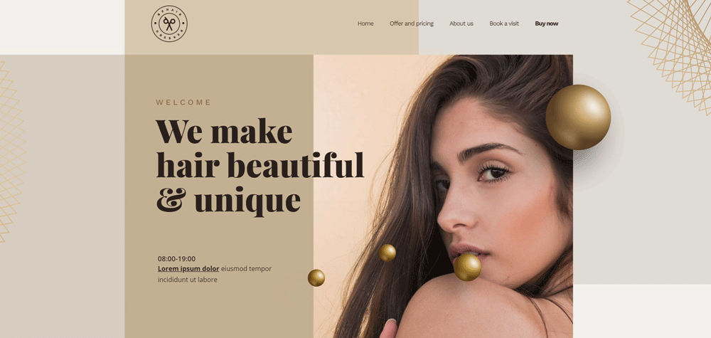
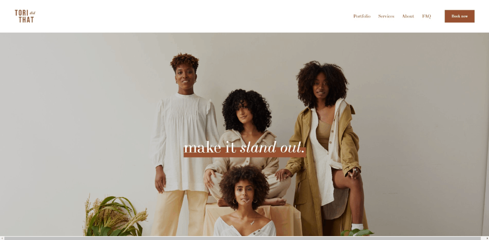
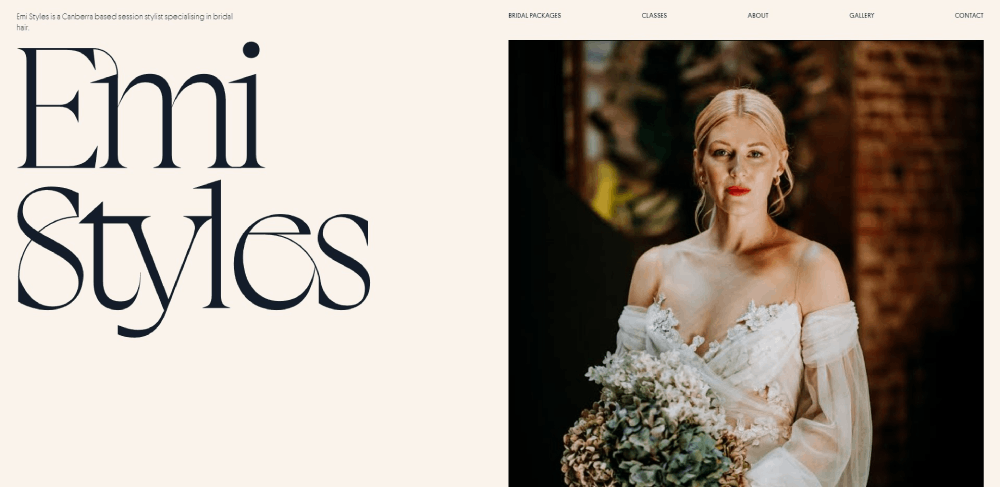
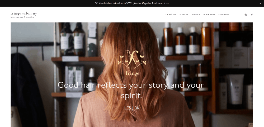
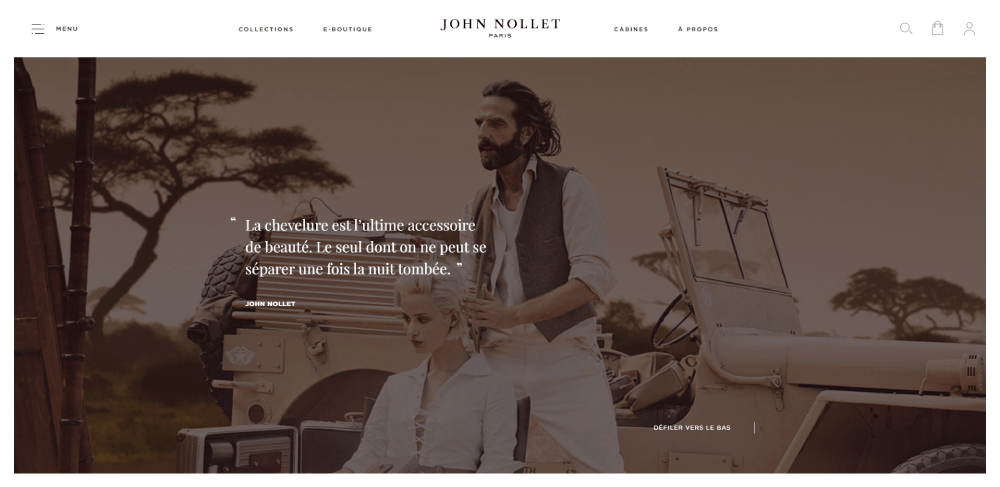
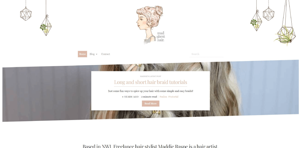
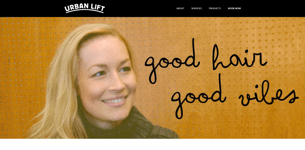
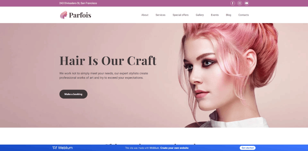
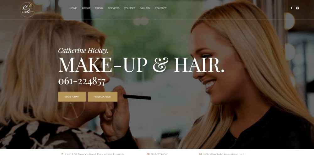
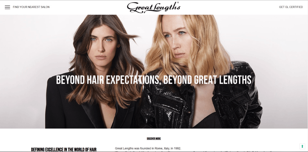
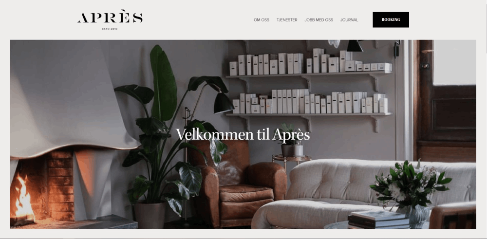
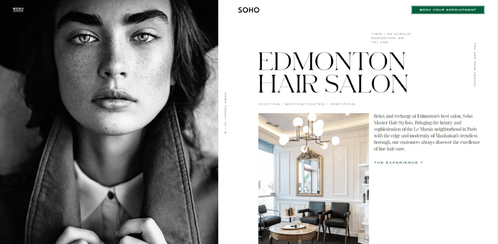
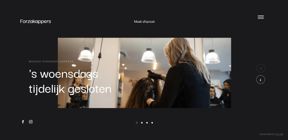
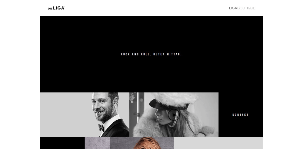
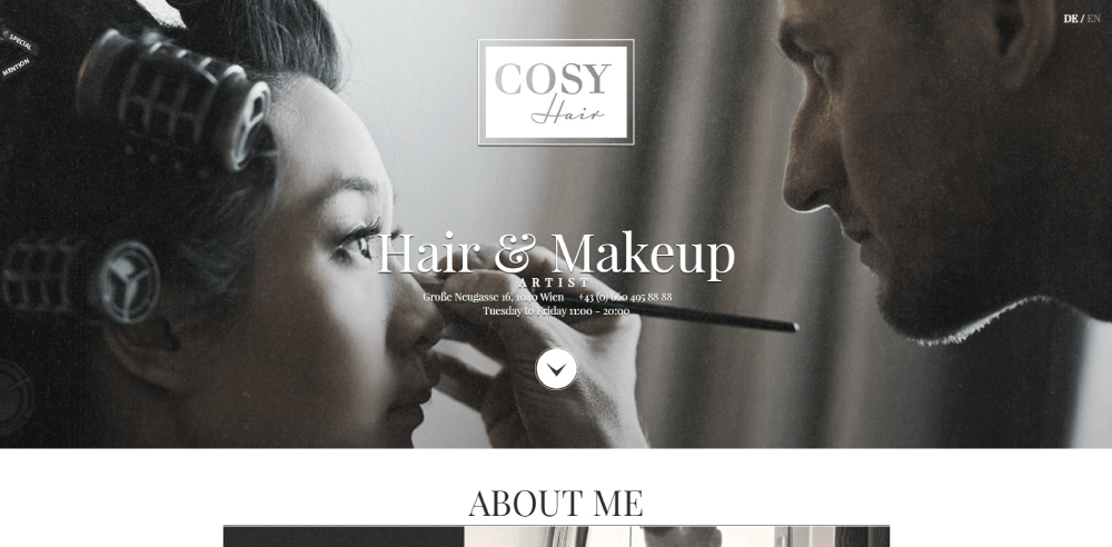
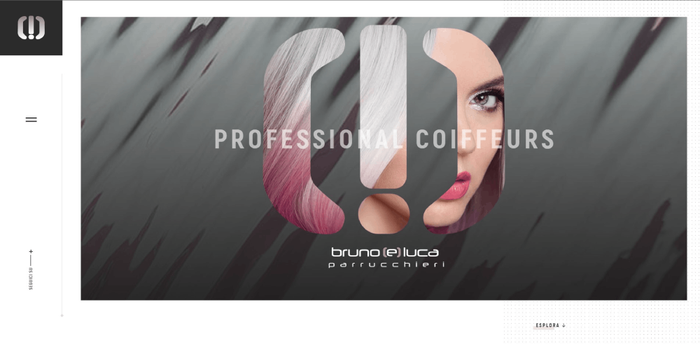
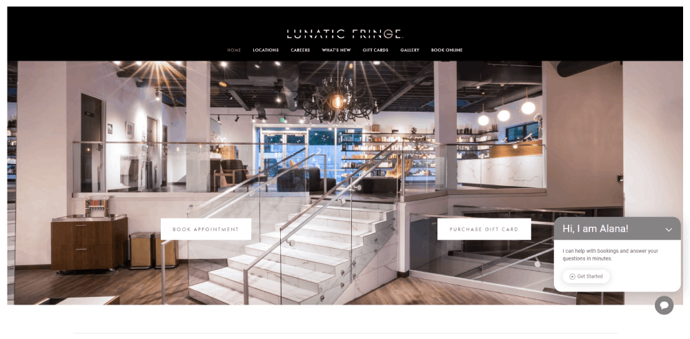
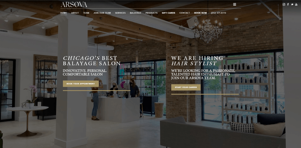
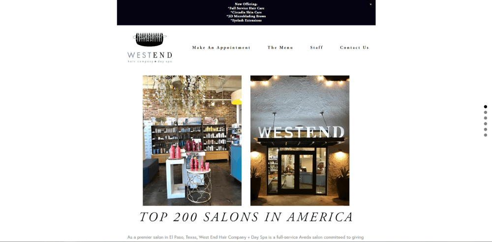
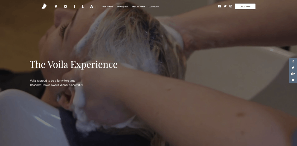
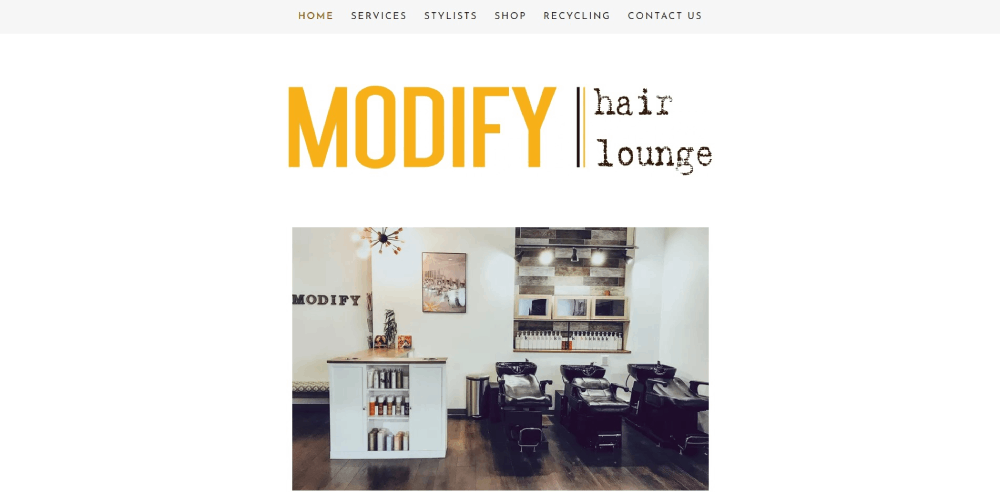
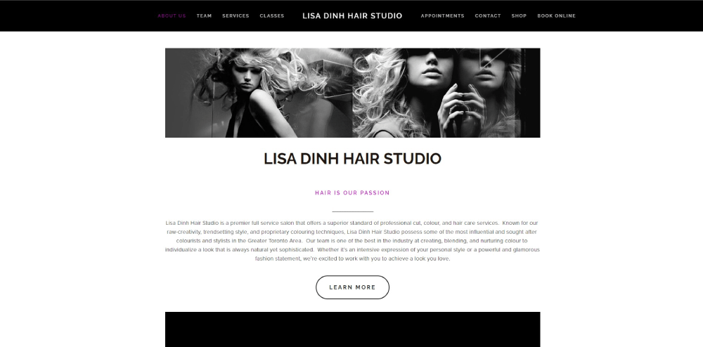
The right hairstylist website design examples show exactly what works: clean portfolio layouts, fast mobile performance, booking systems that don't make people jump through hoops, and brand consistency that builds trust before the first appointment.
This article breaks down real salon websites built on platforms like Squarespace, WordPress, and Wix. You will see what makes each one effective, which features drive online bookings, and how to apply those patterns to your own hair salon website.
What Is a Hairstylist Website
A hairstylist website is a professional website built specifically for hair stylists, salon owners, or independent hair colorists to display their work, list services, and accept online bookings.
It typically includes a portfolio gallery with before-and-after hair photos, a service menu with pricing, stylist bios, client testimonials, and an integrated appointment scheduling system through platforms like Vagaro, Fresha, or GlossGenius.
Unlike a generic business page on Instagram or Facebook, a hairstylist website gives you full control over your brand identity, your booking flow, and how potential clients find you through Google Search.
Most hairstylist websites are built on Squarespace, WordPress, Wix, or Showit. Some freelance stylists use booking-first platforms like StyleSeat or Booksy that bundle a basic site with their scheduling software.
The structure varies based on the stylist's setup. A solo freelance hairstylist website might be a single-page layout with a booking link. A multi-location hair salon website typically needs separate pages for each branch, a full team section, and deeper service breakdowns.
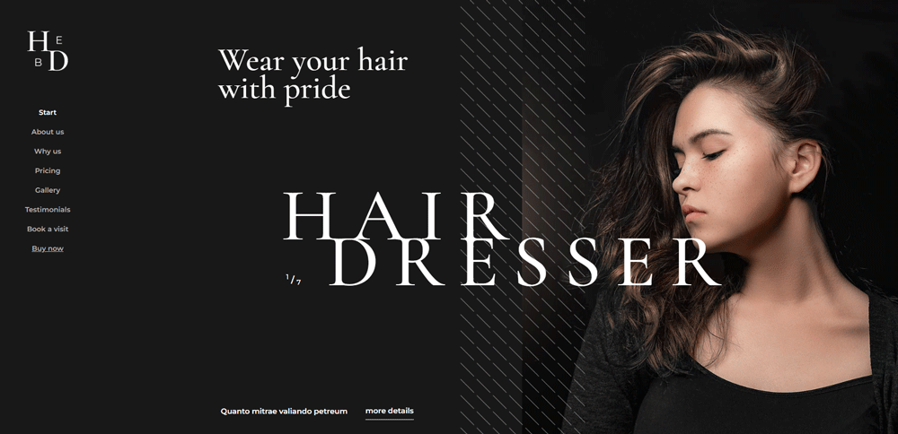
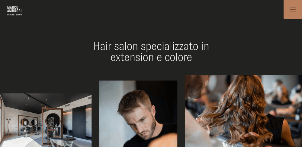
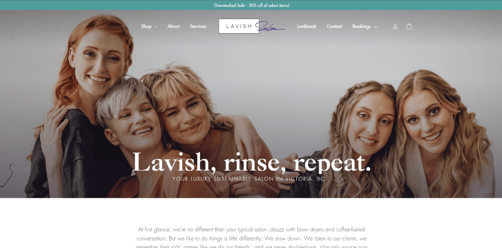
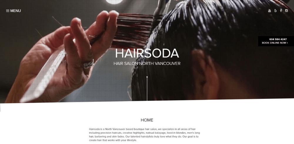
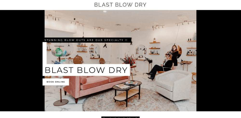
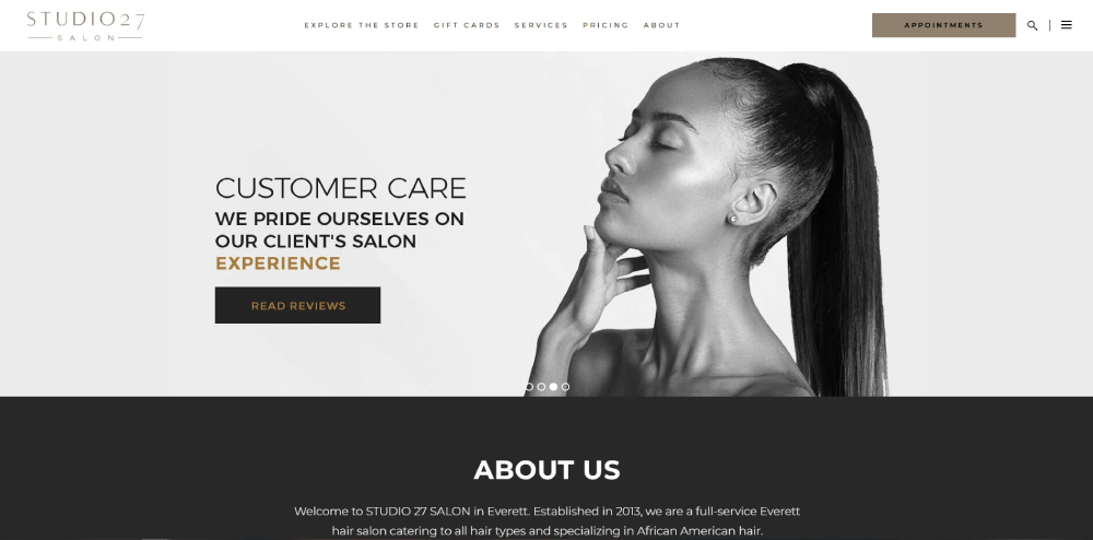
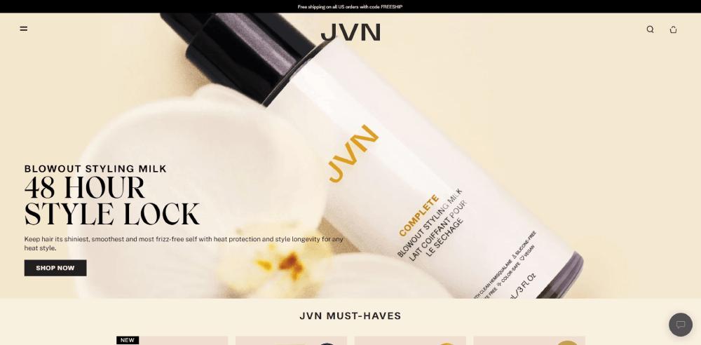
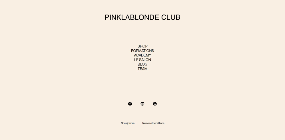
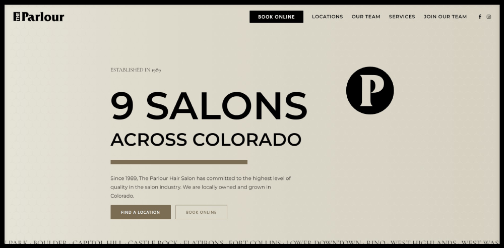
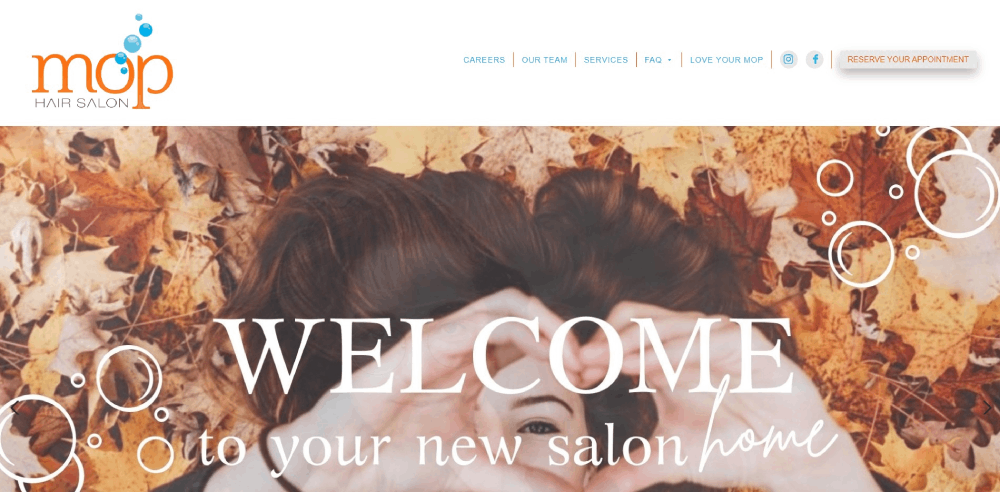
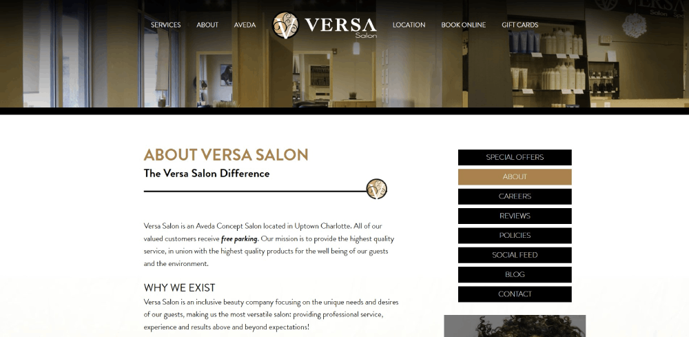
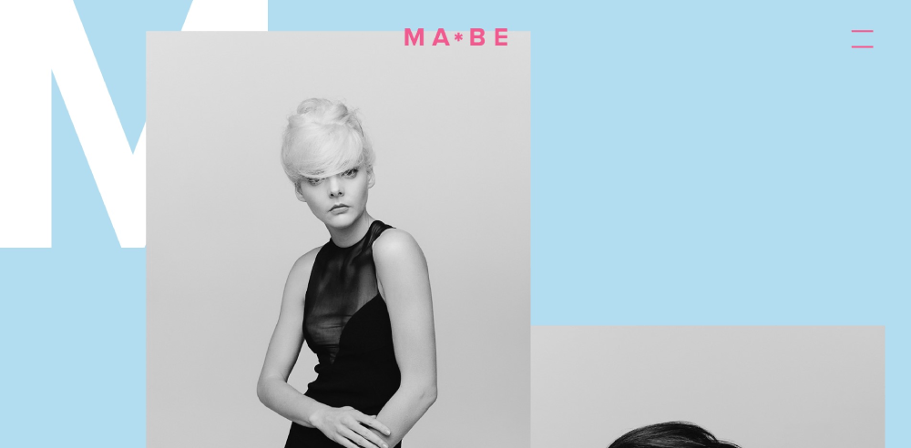
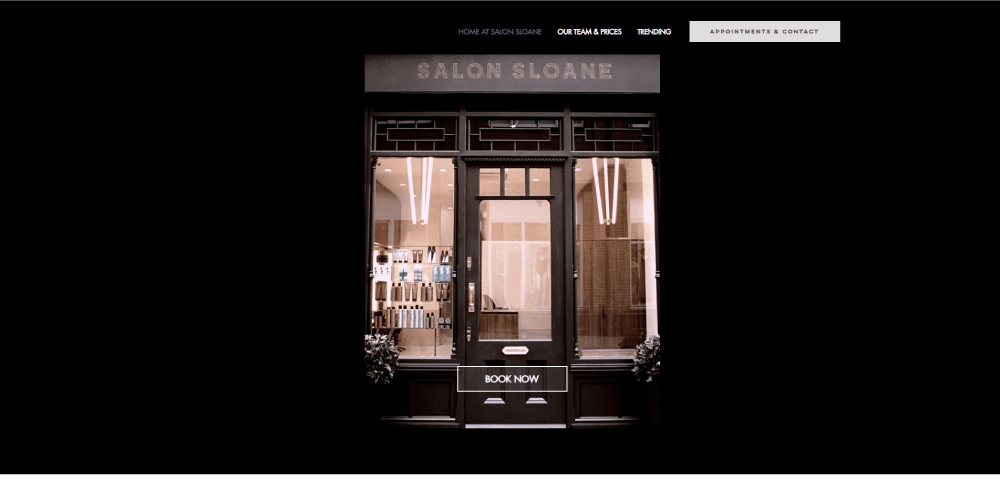
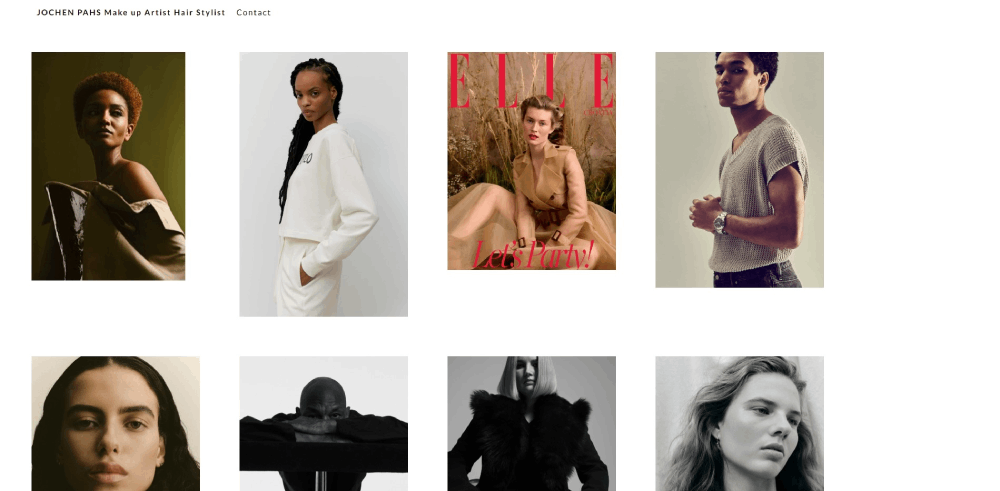
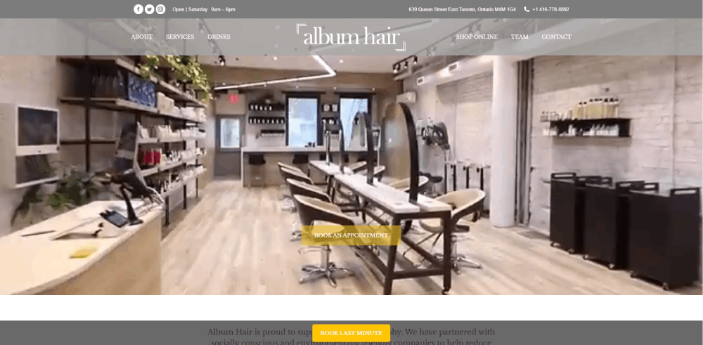
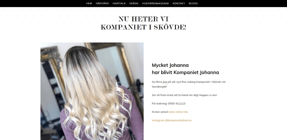
Hairstylist Website Design Examples
Lasse Pederson
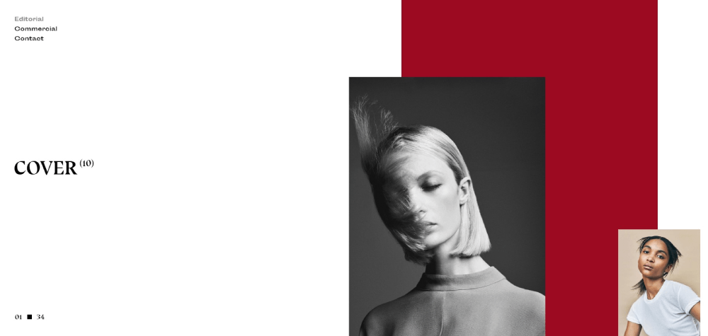
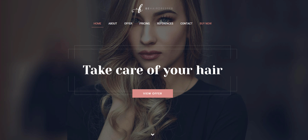
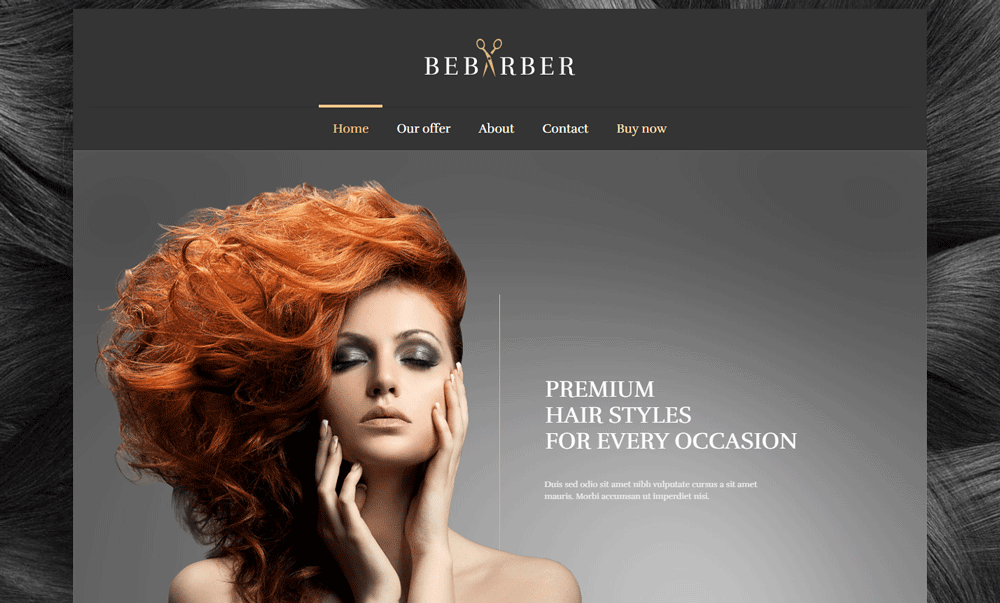
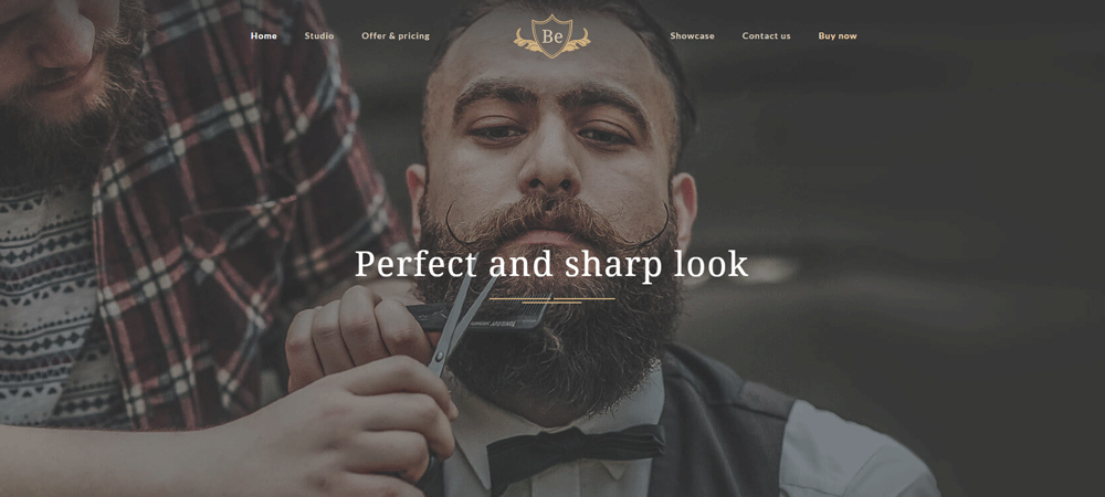
Be Hairdresser
What Makes a Good Hairstylist Website Design
Good salon website design does one thing well: it turns a visitor into a booked appointment. Everything else supports that goal.
The criteria below are what separate the hairstylist websites that actually perform from the ones that just look decent. I've seen plenty of gorgeous salon sites that nobody books through because the booking button is buried three scrolls deep. Or the gallery takes 8 seconds to load on mobile.
Here is what to measure before looking at specific examples.
How Does a Portfolio Layout Affect Client Bookings
A portfolio layout directly affects whether someone books or leaves. Grid galleries with before-and-after hair photos organized by service type (balayage, color correction, precision cuts) perform better than random image dumps.
Clients want to see results that match their own hair goals. If your gallery doesn't let them filter or scan by style, they bounce.
What Role Does Mobile Responsiveness Play for Salon Websites
About 70% of salon website traffic comes from smartphones. A responsive website is not optional here, it is the baseline.
Booking buttons need to be thumb-friendly. Gallery images should load without pinching to zoom. The phone number should be tappable. If any of this breaks on a 6-inch screen, you are losing clients before they even see your work.
How Does Page Speed Influence a Hairstylist Website's Performance
Google PageSpeed Insights scores below 50 on mobile are common for salon sites loaded with uncompressed portfolio images. That is a problem.
Every extra second of load time increases bounce rate by roughly 32%. Compress images, use WebP format, and lazy-load your gallery sections. Platforms like Squarespace handle most of this automatically; WordPress needs a caching plugin like WP Rocket or ShortPixel for image optimization.
Why Does Brand Consistency Matter on a Hairstylist Website
Your website's color scheme, typography, and photo style should match what clients experience in person. A mismatch between a moody, dark-toned website and a bright, airy salon creates distrust.
Consistent brand identity across your site, your Google Business Profile, your Instagram, and your physical space builds recognition. Pick two to three brand colors, one heading font, one body font, and stick with them everywhere.
What Features Do the Best Hairstylist Websites Include
After looking at those examples, clear patterns emerge. The best salon websites share a specific set of features that drive bookings and reduce friction for new clients.
How Do Online Booking Systems Work on Hairstylist Websites
Most hairstylist websites connect to a third-party booking platform. The top options are Vagaro, Fresha, GlossGenius, Acuity Scheduling, Square Appointments, Booksy, Boulevard, Mangomint, Zenoti, Phorest, and Schedulicity.
The booking widget either embeds directly into the site or opens a branded overlay. Clients select a service, choose a stylist, pick a date, and confirm. Automated reminders go out via SMS or email. Some platforms like Mangomint allow the booking form to fade in without leaving the page, which keeps the experience smooth and builds trust.
What Types of Image Galleries Work Best for Hair Salons
Before-and-after grids organized by service type (balayage, highlights, corrective color, men's cuts) outperform random photo feeds every time.
Pull from Instagram automatically when possible, but also maintain a curated on-site gallery with your absolute best work. High-resolution, well-lit photos with consistent backgrounds make the strongest impression. Some salons add short video clips showing the transformation process, which keeps visitors on the page longer.
How Do Hairstylist Websites Display Service Menus and Pricing
Transparent pricing page layouts build trust and filter qualified leads. The best salon sites list services with clear descriptions, time estimates, and starting prices.
Avoid vague labels like "starting at" without context. If pricing varies by hair length or density, say so directly. Group services logically: cuts, color, treatments, styling, add-ons. Some examples like Eight Five Zero Salon and Z-Hair Studio display pricing right on the main services page without requiring an extra click.
What Contact and Location Elements Should a Hairstylist Website Have
A tappable phone number, a Google Maps embed, the physical address, business hours, and links to social profiles (Instagram, Facebook, Pinterest). These should be visible in the website footer on every page.
Google Business Profile integration matters here too. When your site address, hours, and phone number match what is listed on your Google profile, it strengthens your local search presence. Inconsistent data across platforms confuses both clients and search engines.
Which Website Platforms Do Hairstylists Use Most
The platform you choose affects your design options, booking integrations, page speed, and how much control you have over your salon's online presence.
Based on the examples above and broader industry patterns, three platforms dominate the hairstylist website space.
How Does Squarespace Perform for Hairstylist Websites
Squarespace is the most popular choice among independent stylists and small salons. It offers drag-and-drop editing, built-in mobile responsiveness, and native integration with Acuity Scheduling (which Squarespace owns).
Templates like "Paloma" and "Brine" are commonly used for beauty business websites. The built-in image handling compresses files automatically, which helps with page speed. The downside: limited customization if you want something outside the template structure, and third-party plugin options are minimal compared to WordPress.
How Does WordPress Compare for Salon Website Design
WordPress powers sites like Jocelyn Petroni and several other high-profile salon websites. It offers the most flexibility for custom design and functionality.
You can integrate any booking system, add a blog for salon SEO, use advanced gallery plugins, and customize everything down to the pixel. The tradeoff is complexity. WordPress requires hosting (WP Engine, Kinsta, SiteGround), regular updates, security plugins, and a caching setup. For salon owners who want full control and have the budget for a developer or the patience to learn, WordPress is hard to beat.
When Does a Custom-Built Website Make Sense for a Hairstylist
Drybar's custom platform is the exception, not the rule. A fully custom-built site makes sense when you have multiple locations, sell products online, need complex booking logic, or want a completely unique user friendly website experience that templates cannot deliver.
Budget range for custom salon website design sits between $5,000 and $15,000 or more. For most solo stylists and single-location salons, Squarespace or Wix covers 90% of what you need at a fraction of that cost. The examples from Hiroshi Beverly Hills and Westfolk Salon prove that Wix can produce results that look and feel custom without the custom price tag.
FAQ on Hairstylist Website Design
What is the best platform for building a hairstylist website?
Squarespace is the most popular choice for independent stylists because of its drag-and-drop editor and native Acuity Scheduling integration. WordPress offers more flexibility for custom salon websites. Wix works well for budget-conscious salon owners who want built-in booking tools.
How much does a professional hairstylist website cost?
Template-based salon websites on Squarespace or Wix cost between $150 and $500 per year including hosting. Custom WordPress builds range from $2,000 to $10,000. Fully custom-coded hair salon website design projects can exceed $15,000 depending on features.
What pages should a hairstylist website include?
A homepage with a booking button, a services page with pricing, a portfolio gallery with before-and-after photos, an about page with stylist bios, a contact page with Google Maps embed, and a testimonial page featuring client reviews.
Which online booking system works best for salon websites?
Vagaro, Fresha, GlossGenius, and Square Appointments are the most used. Booksy and Boulevard work well for larger teams. Mangomint and Zenoti suit multi-location salons. The best choice depends on your team size and existing point-of-sale setup.
How do I display my hair portfolio on a website?
Use a grid-based gallery organized by service type: balayage, color correction, cuts, styling. Include before-and-after photos with consistent lighting. Pull from your Instagram feed automatically and maintain a separate curated on-site gallery for your strongest work.
Does a hairstylist website need a blog?
A blog helps with salon search engine visibility by targeting questions clients actually search for, like hair care tips or styling product recommendations. Society Salon's blog covering topics like purple shampoo and gray hair transition is a strong example.
What makes a salon website mobile friendly?
Thumb-friendly booking buttons, compressed images that load fast, tappable phone numbers, and readable text without pinch-to-zoom. Around 70% of salon traffic comes from smartphones, so mobile first design is the baseline for any hairstylist site.
How important are photos on a hairstylist website?
Photos are the single most important element. High-resolution, well-lit images with consistent backgrounds outperform stock photography every time. Salons like Drybar and TONI&GUY use professional editorial shoots that double as both portfolio pieces and brand-building content.
Can I build a hairstylist website myself without a developer?
Yes. Squarespace, Wix, and Showit all offer salon-specific templates with no coding required. GlossGenius and StyleSeat bundle a basic stylist website with their booking software. Results from Hiroshi Beverly Hills and Westfolk Salon show Wix can produce professional-level output.
How do I get my salon website to show up on Google?
Claim your Google Business Profile and keep your name, address, and phone number consistent across your website, Google, and Yelp. Add service-specific page titles, compress images for speed, and collect Google reviews from existing clients regularly.
Conclusion
The hairstylist website design examples covered here prove one thing: the sites that book the most clients are not the flashiest. They are the clearest.
A structured service menu, fast-loading image gallery, and a booking integration through tools like Vagaro or GlossGenius do more for your salon than any fancy animation.
Pick a platform that fits your budget. Squarespace and Wix handle most solo stylist needs. WordPress gives you room to grow if you run a multi-location salon.
Invest in professional hair photography. Keep your salon branding consistent across your site, your Google Business Profile, and your Instagram.
Then make the "Book Now" button impossible to miss. That is the entire point.
Start with one example from this list that matches your style, study its layout, and build from there. Your next client is already searching.

