Inspiring Mental Health Website Design Examples
July 26, 2024
Top Fintech Website Design Examples for Inspiration
July 30, 2024Minimalism speaks for itself. It strips away the excess, leaving purity and function – a hallmark in web design that's hard to ignore. Let's face it, the beauty of minimalistic website design examples lies in their simplicity and efficiency.
Clean design templates, thoughtful UI/UX elements, and strategic use of white space create an environment where content-first approaches shine. This isn't just about aesthetics; it's important for performance too. PageSpeed Insights and accessibility checkers love it.
If you're wondering about how to achieve this seamless look, you’re in the right place. We’ll highlight specific design case studies and break down how successful examples utilize HTML, CSS, and JavaScript to elevate user experience.
You'll learn how these sites manage to maintain elegance without sacrificing usability or functionality.
Successful Minimalistic Website Designs
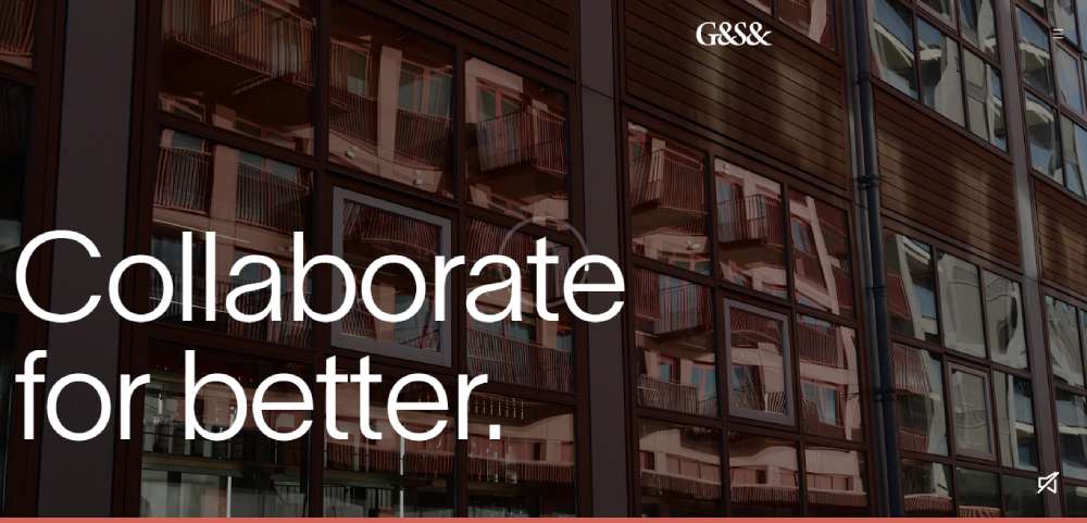
G&S&
The outcome of a merger, our long-term client G&S Vastgoed tasked us with integrating their fresh brand identity into a distinct digital journey under the banner of "Kill off the average™".
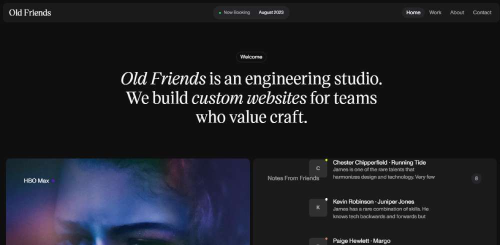
Old Friends
In the realm of Old Friends, it's all about meticulous custom website creation. This engineering studio crafts for those who appreciate a job well done.
Ewa Thomas Studio
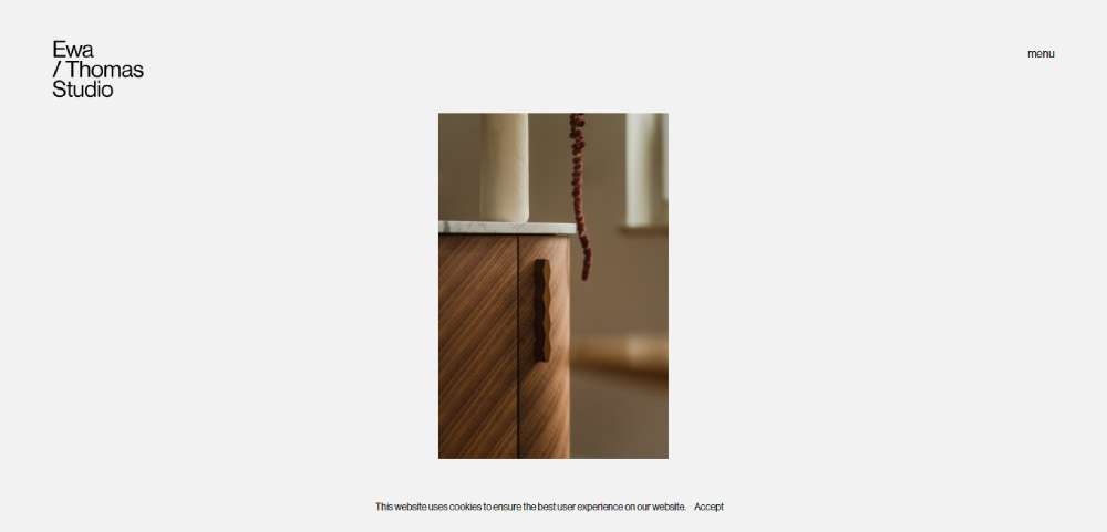
Think of the Ewa Thomas Studio's minimal portfolio website design as a quiet retreat in the bustling city of the web. It's a Polish architecture studio presenting a pastel-hued, minimal backdrop. Their portfolio lets one image shine at a time, directing viewer focus to what truly matters.
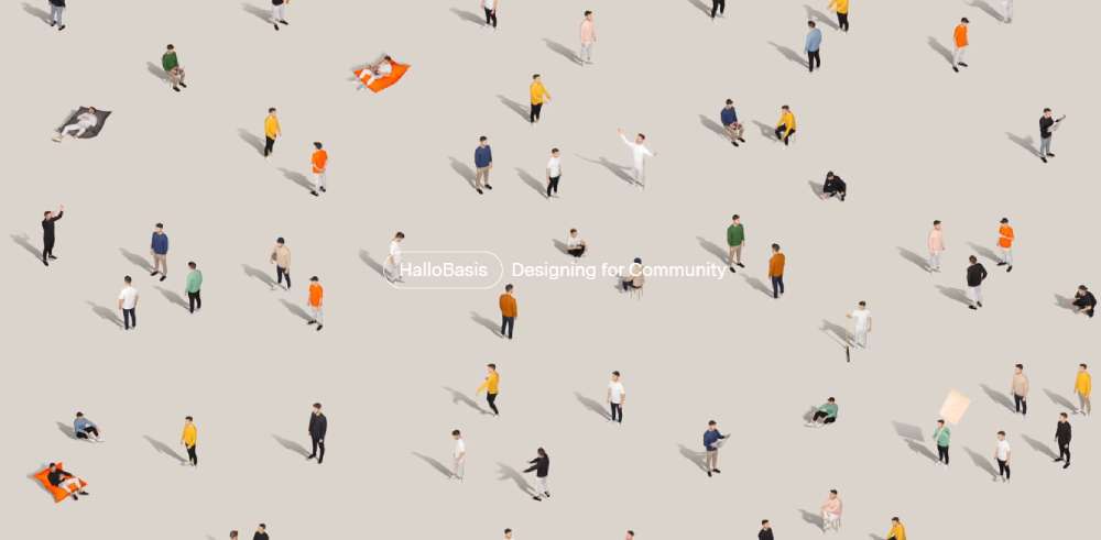
HalloBasis
HalloBasis, the creative venture of Felix Vorbeck and Johannes Winkler, excels at constructing projects that convey clients' messages effectively. Their portfolio site - a fantastic instance of a minimalistic WordPress website - showcases their unique approach to minimalist web design.
Germaine Days
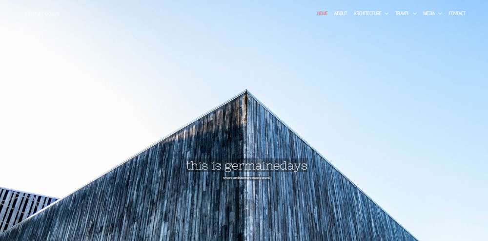
In Germaine Days, flat web design reigns supreme. Their homepage is a compilation of sections, each complemented by large background images. To add dynamism, they use parallax scrolling, while a sticky header ensures seamless navigation across the site.
BeMinimal2
Iglucraft
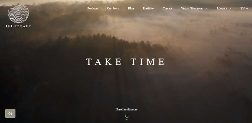
Iglucraft embraces the power of large images, not just on the landing page, but across the entire site. Thoughtful transition animations amplify the overall user experience.
Google Pixel Creator Labs
At Google Pixel Creator Labs, personal work takes center stage. It's a collaboration between Google & SN37 that visually nurtures the creative efforts of 30 artists, all harnessing the Google Pixel.
SVG Animations
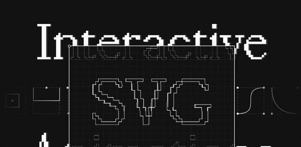
Dive into the world of SVG animations with Nanda Syahrasyad's interactive mini-course.
Jazz FM
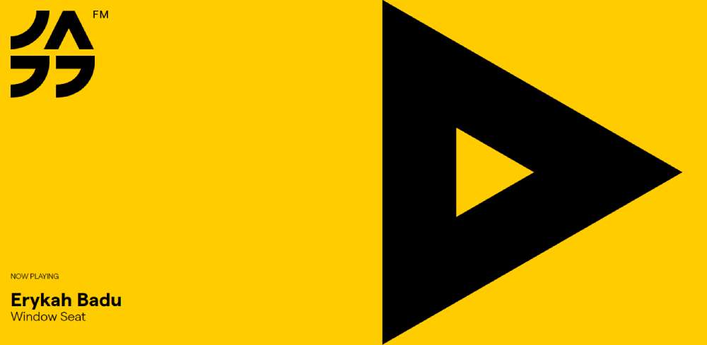
Jazz FM Romania's vibrant website design allows the music to take the spotlight. A striking contrast between black and yellow makes the minimalist design pop.
Beltrame
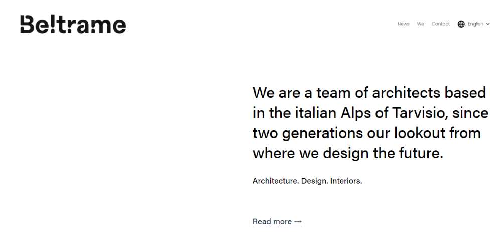
The Italian architecture and design firm Beltrame employs a clean layout in their digital space. The minimalistic vibe is amplified by a monochromatic color scheme, generous whitespace, and zero images above the fold on the homepage.
Empreinte
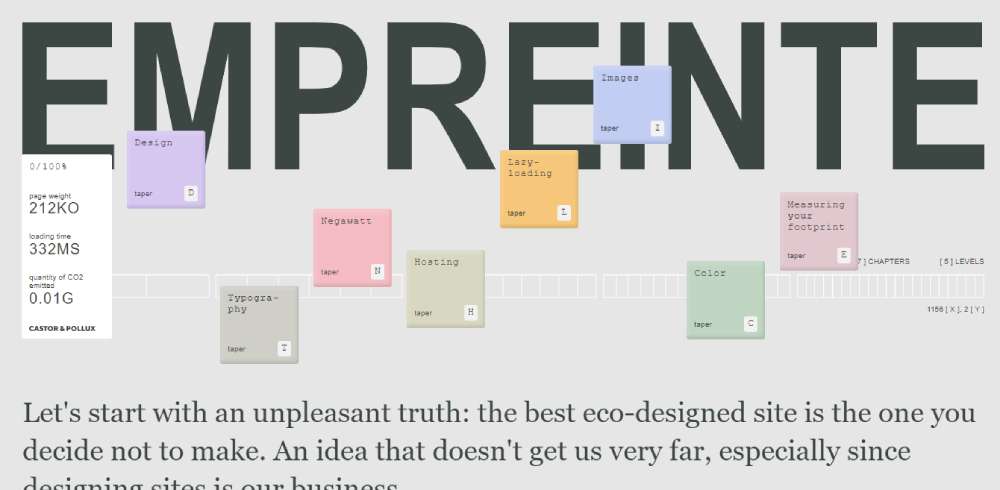
Empreinte is a testament to the art of compromise, launching as a platform to elucidate the primary principles of eco-design.
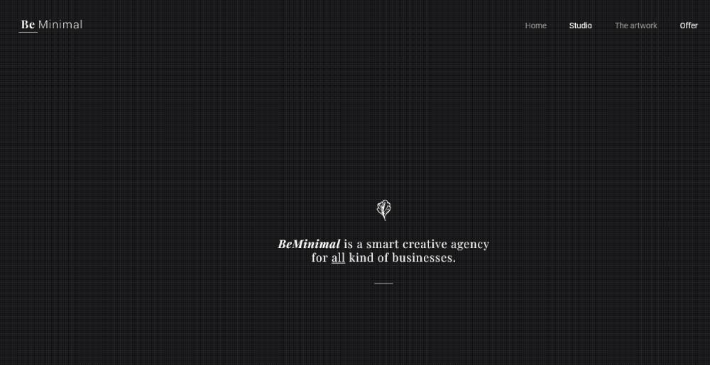
BeMinimal
Theo Plawinski
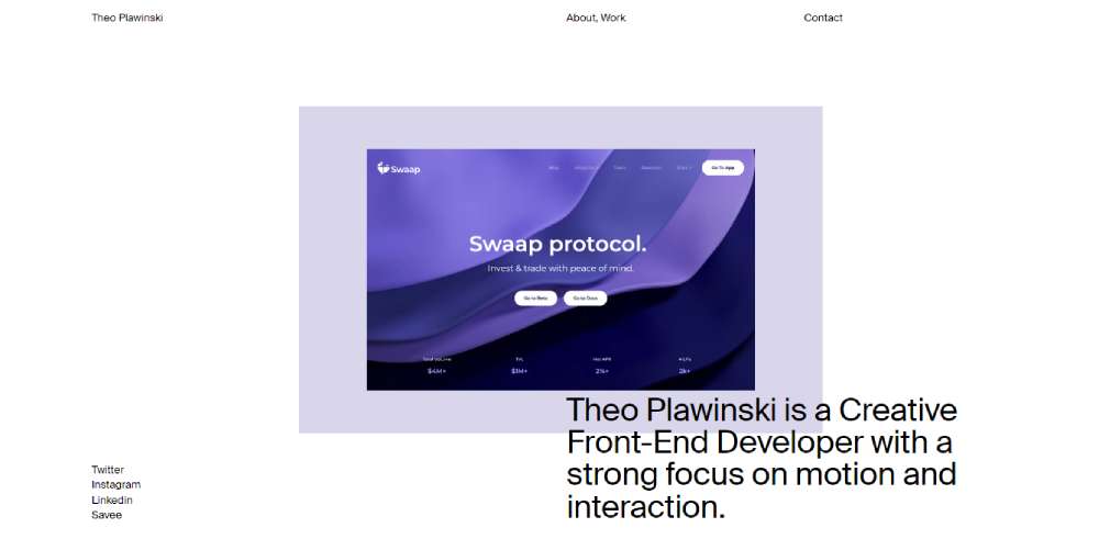
Meet Theo Plawinski, a Creative Front-End Developer renowned for his keen eye for motion and interaction.
Mission Site
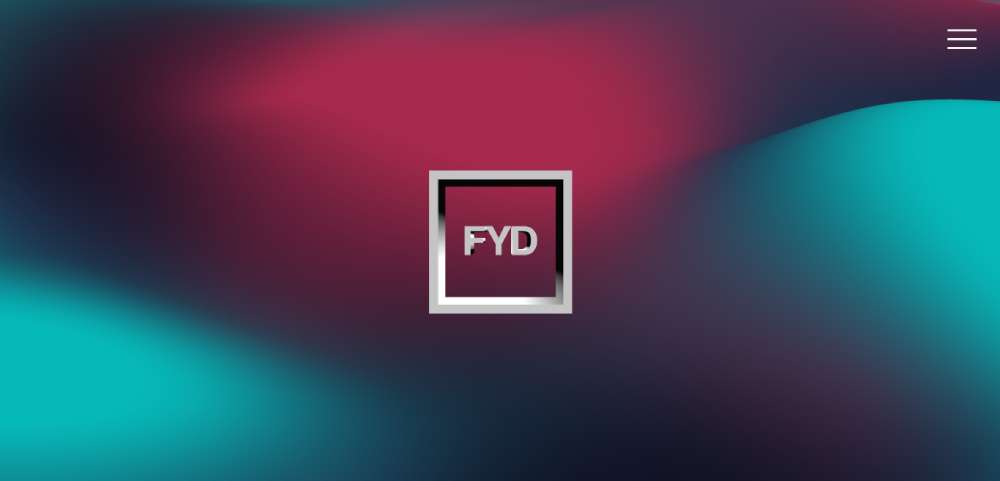
FYD's Mission Site stems from a passion for building brands. It's an exhibition of captivating creations, selected portfolio pieces, and offered services.
Matt D’Avella
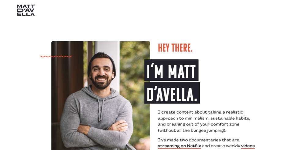
For a dose of simplicity, look no further than Matt D'Avella's personal website. As a content creator focusing on minimalism and productivity, his digital space reflects these principles. His homepage, for instance, is all about growing his email list.
Embracing the Aesthetics of Geometry with Alon Peres
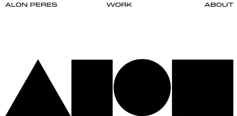
Alon Peres puts forward a bolder yet minimalistic design style. Geometric shapes, simple yet large, decorate the site. The tried-and-true combination of black-and-white sets the stage, with cool hover animations adding a delightful surprise. Contrary to the common rule, white space isn't abundant here.
Framer-Constructed Elegance by Gil Huybrecht
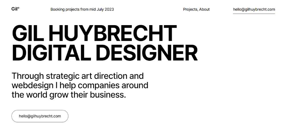
Gil's design portfolio site, built with Framer, is minimalism personified. Headlines in a bold sans-serif font harmonize well with the clean layout and restrained color scheme. It's the laptop mockup display of past projects that gives the images a distinct vibe.
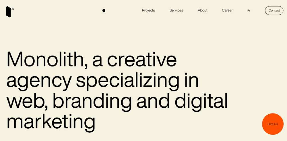
Industry-Specific Minimalism by Monolith Agency
Monolith exhibits web, branding, and digital marketing expertise with a minimalistic design approach. They specialize in designing visually appealing, unique, and consistent campaigns for varied industries.
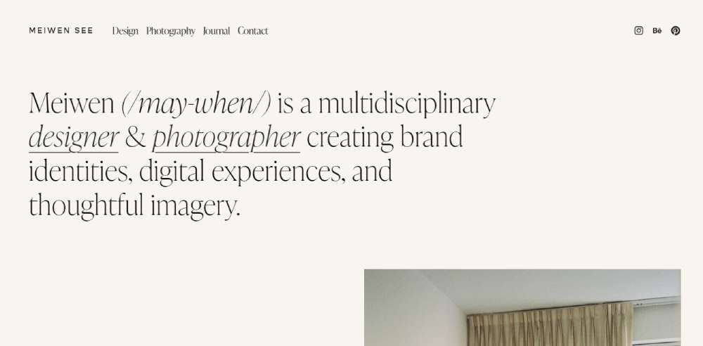
Typography Stands Out in Meiwen See's Design
Designer and photographer Meiwen See's portfolio site is a masterclass in minimalistic design. The light neutral background provides a refreshing deviation from the usual white. The typography is indeed a standout feature here, elegantly presenting Meiwen's work as soon as you land on the homepage.
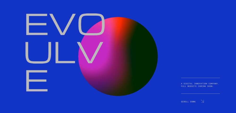
Futuristic Feel in Evoulve's Design
Evoulve, a company turning emerging tech into viable products, showcases a mesmerizing and minimalistic design. Few elements on screen, against a backdrop of a slowly rotating globe and a starry sky, create a mood of discovery.
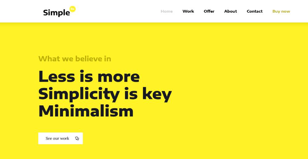
BeSimple2
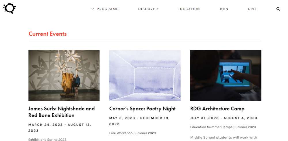
Non-Profit Minimalism in KANEKO
KANEKO, an arts and culture nonprofit, uses minimalistic typography as its primary visual stimulant. The pattern and color overlay on the header text outshine many photos or illustrations in an entirely unique way.
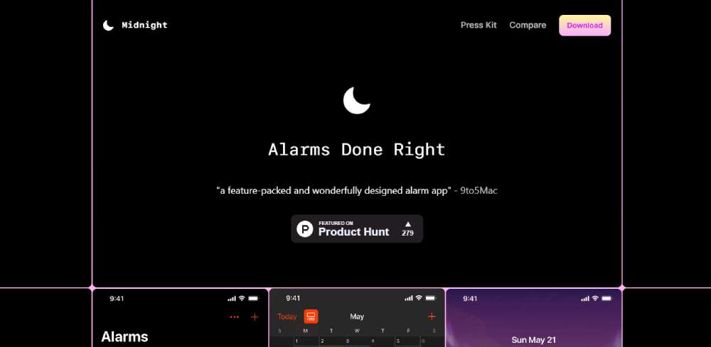
Breaking the Monotony with Midnight Alarm
Midnight Alarm is the epitome of 'Alarms Done Right'. The website makes the best of minimalistic design, prioritizing function and ease-of-use.
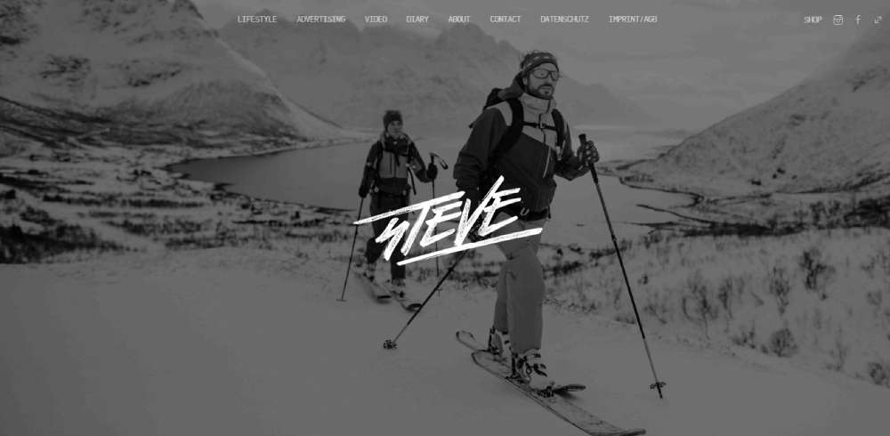
Monochrome Mastery in Studio Steve
Steve, a photographer from Germany, brings an edge to the simplistic approach of his website. Despite his colorful photos, the website base color remains grayscale, including the logo and menu. The prominent typography feature adds a unique spin.
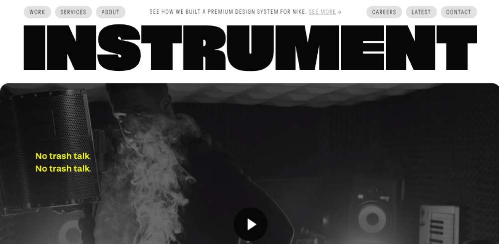
A Multidisciplinary Creative Approach by Instrument
Instrument is a multidisciplinary creative company that revolutionizes brands and experiences with its minimalist design approach.
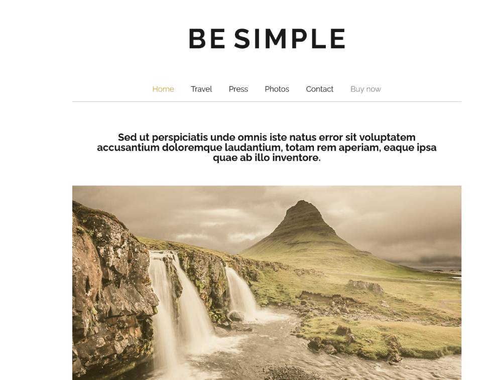
BeSimple
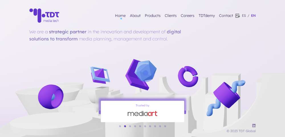
3D Dimension in TDI Global
TDI Global proves that a minimalistic website can shine in a 3D dimension. The bright colors beautifully balance the entirely-white 3D background. An elegant horizontal navigation is hidden behind a subtle burger menu in the upper right corner.
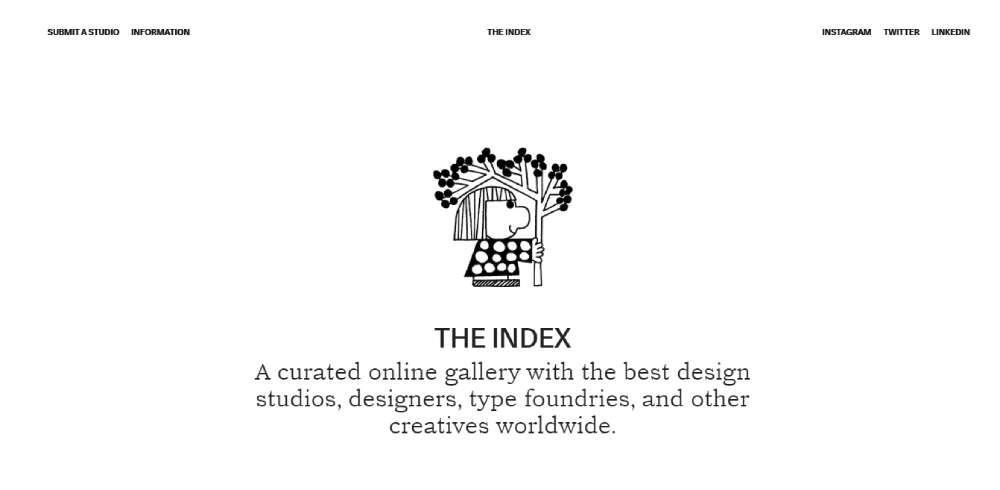
Online Gallery, THE INDEX
THE INDEX is a curated online gallery presenting the best design studios, designers, type foundries, and other creatives worldwide, and its minimalistic design serves as an excellent backdrop to this vast collection.
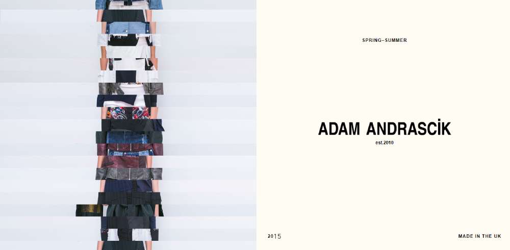
Fashion Forward Adam Andrascik
Fashion designer Adam Andrascik showcases his work on a one-page web design, providing a unique example of minimal design applied to a portfolio site.
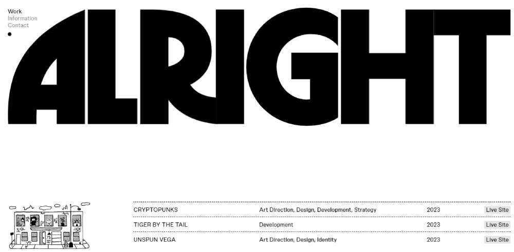
Dynamic Design in Alright Studio
Alright Studio is a full-service creative agency with a strategy, design, and technology focus that uses minimalistic design to deliver dynamic and deliberate creations.
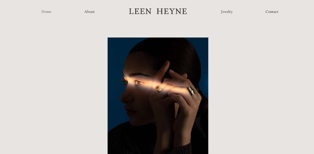
Get to know Leen Heyne
Consider this - a homepage where just the logo and company name are a spectacle, with a canvas of pure white around them. The result? Your gaze automatically lands on their gorgeous jewelry. That's the magic of minimalistic website design.
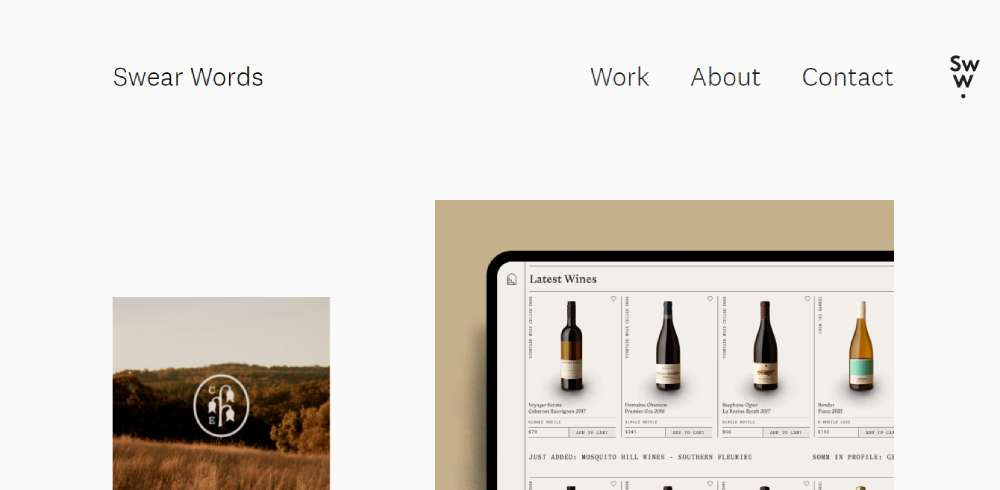
Step inside Swear Words
Swear Words gives a new spin to minimalism. Picture this - zero text, except for logo, navigation, and a tiny footer link. Project images take center stage, getting all the eyeballs. But imagine a little call to action here, some nudge there - wouldn't that step up the engagement game?
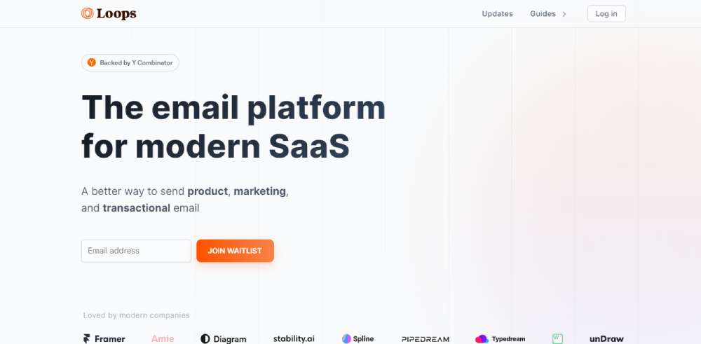
Check out Loops
Loops is the holy grail for modern SaaS companies trying to slay their email marketing game. Think beautiful email campaigns that are a breeze to create, send, and track.
Meet Takt Project
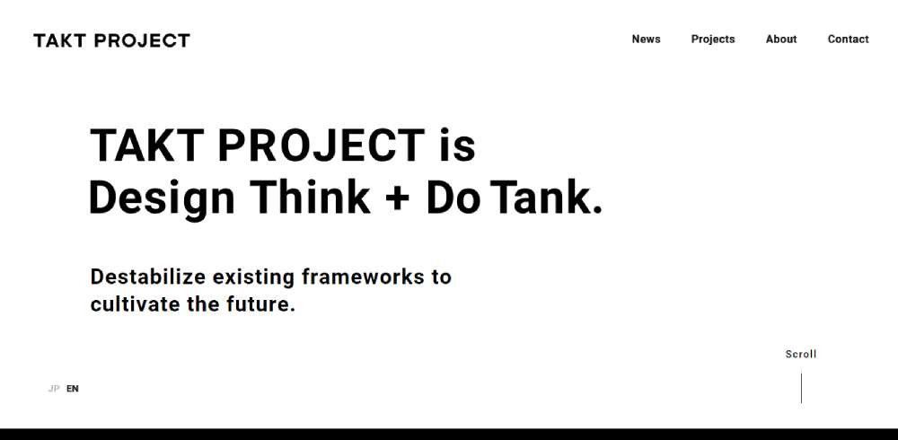
Takt Project dons the black-and-white chic attire with uber-cool sans serif headlines adding to the charm. Keep scrolling, and you'll be greeted by subtle animation effects that don't shout for attention but add character.
Tune in to Supertape
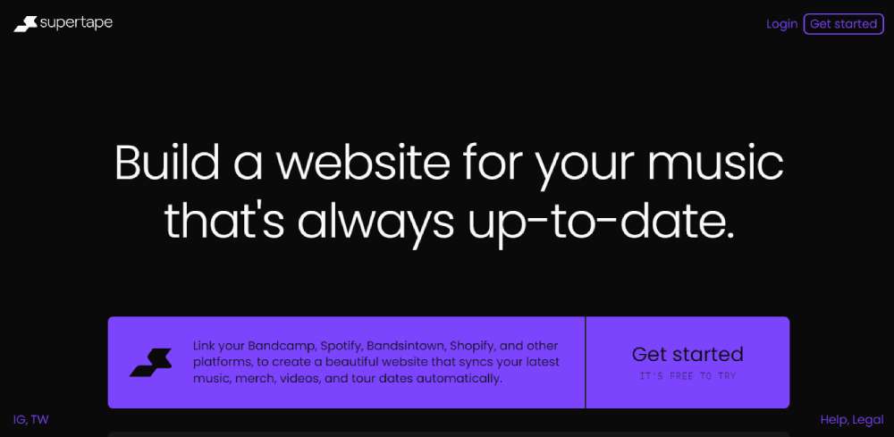
Supertape - a dream for musicians on the grind. It's a modern band website builder that checks all the right boxes.
Walk through The Minimalists
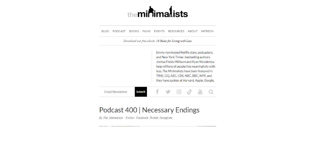
Step into the minimalist world of two content creators who know their game. This website screams minimalism - flat web design, intelligent use of white space, and a restrained color palette.
Discover We Ain't Plastic
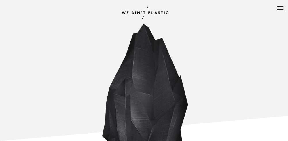
Meet German UX engineer Roland Lösslein's creation, We Ain't Plastic. Minimalistic website design shines here with a stunning contrast between the main image and the hovering text and icons.
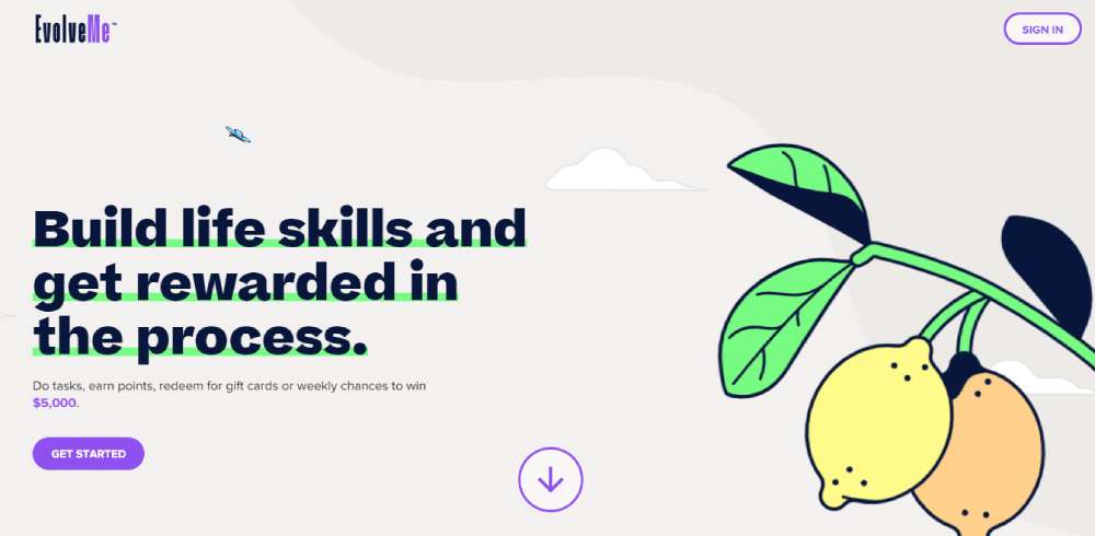
Explore EvolveMe
EvolveMe turns skill development into a fun game where you earn points and score prizes for diving into career exploration and life beyond school.
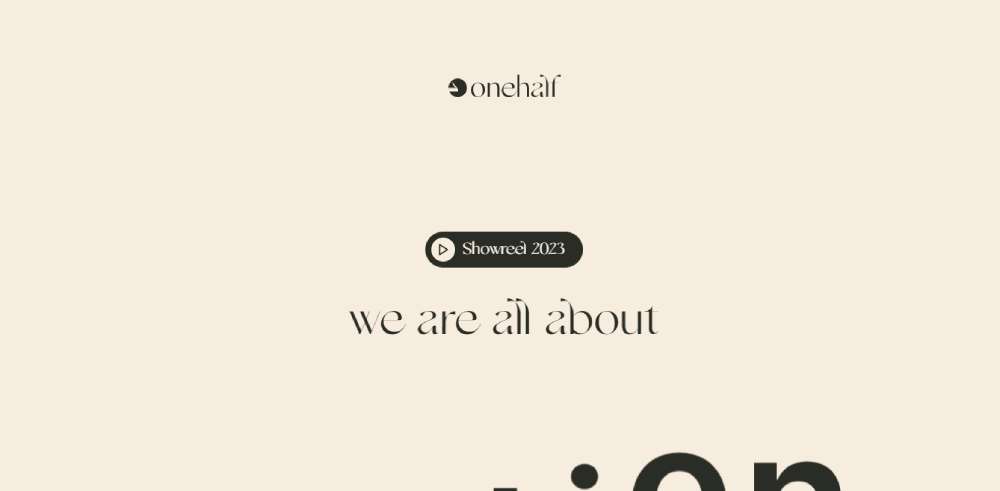
Know more about OneHalf
OneHalf - a creative powerhouse producing compelling video content for startups. Got a SaaS product, tutorial, explainer video in mind? Reach out to bring those ideas to life.
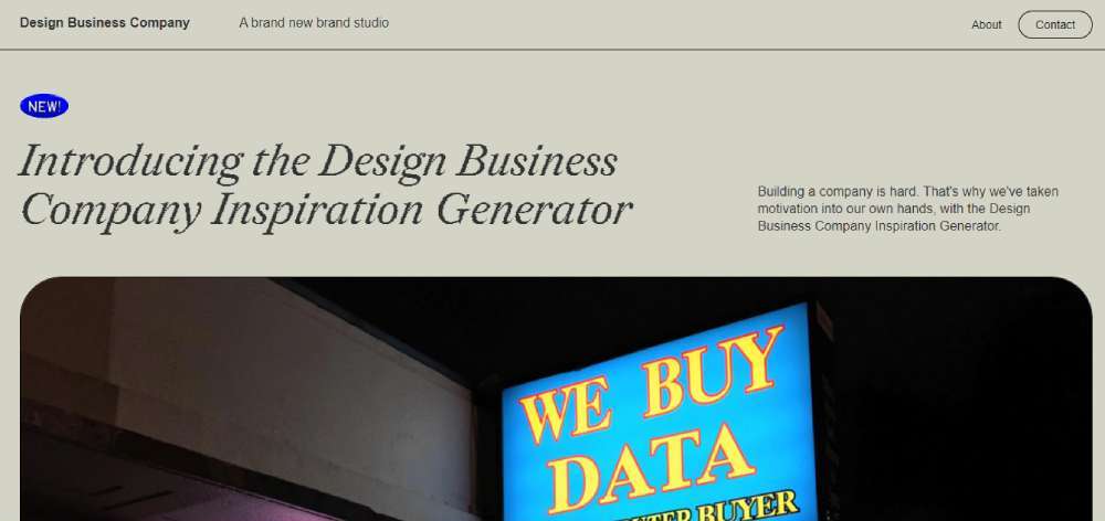
Learn from Design Business Company
Building a company isn't a walk in the park, and Design Business Company knows it. Their Inspiration Generator turns motivation into a fun exercise.
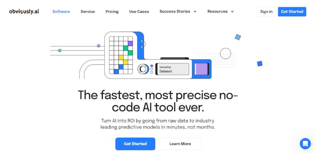
Experience Obviously AI
Ever imagined raw data transforming into predictive models in just minutes? Obviously AI makes it possible with its ultra-precise, no-code AI tool.
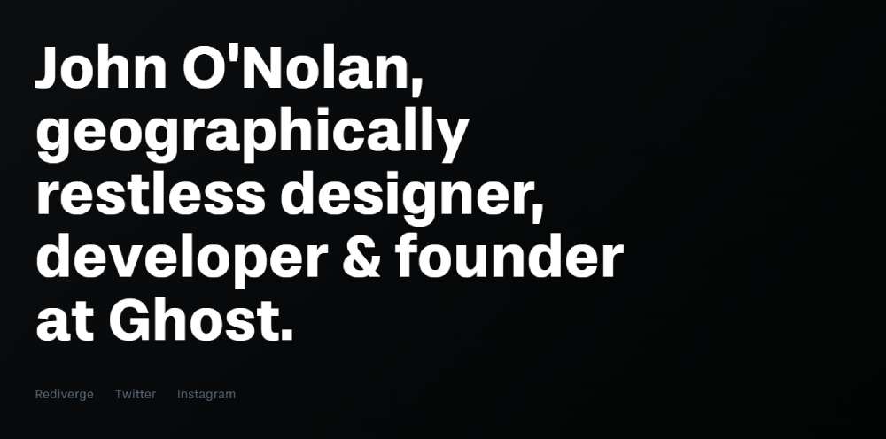
Visit John O’Nolan
Welcome to the one-page, minimalistic world of John O’Nolan, a designer, and developer. His site is an elegant invitation to his blog and social media platforms, with links waiting for you right at the bottom of the homepage.
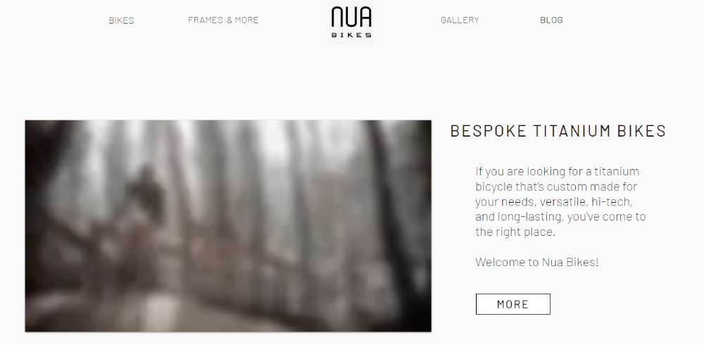
Ride with Nua Bikes
Nua Bikes takes minimalism for a spin. At first glance, it might seem simplistic, but take a closer look, and you'll notice clever text condensation and white space use, making their bikes the real hero.
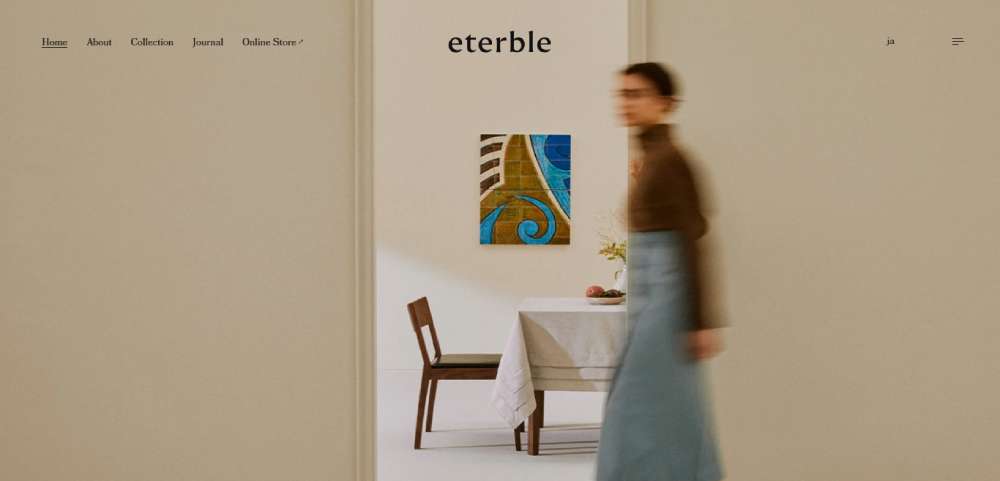
eterble: Eco-Friendly Tableware
eterble, a considerate tableware brand that holds dear our planet, brings joy with its carefully crafted tableware. It's all about merging sustainability and mindful thinking, which is also reflected in the design of their website.
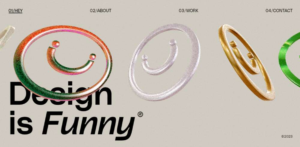
Funny by Design
Funny®, an extension of the creative mind of Daniele *Buffa, a Roman designer now stationed in London, is fun, vibrant, and full of character. His experience spans over a decade, designing for industry giants like Google, Sony, Headspace, and a mix of upcoming startups.
Sendamessage.to: Custom Messages With a Twist
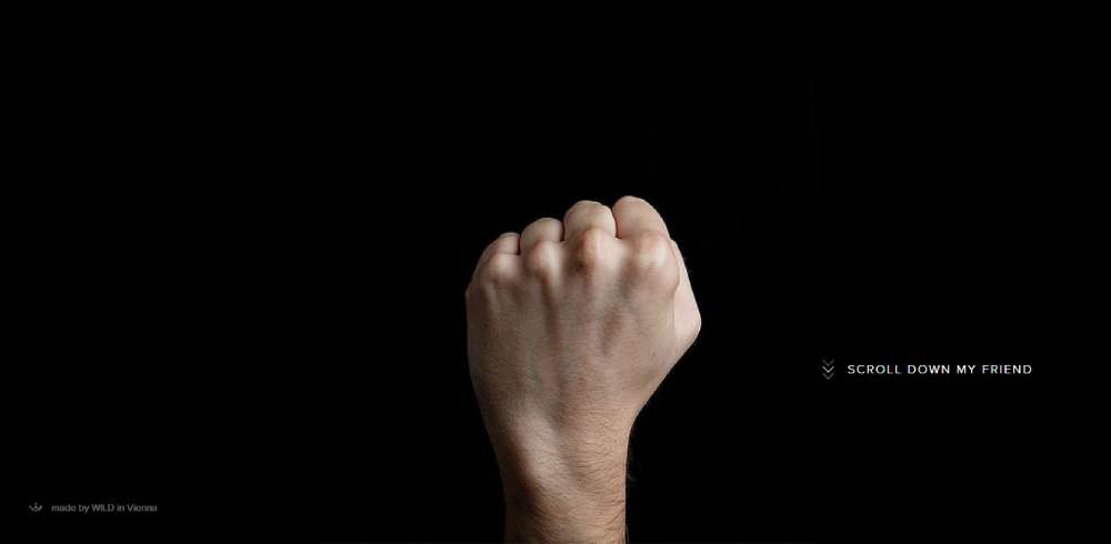
Sendamessage.to presents an amusing twist to messaging. The stark black backdrop lends emphasis to the main image and the bold white letters of the message, playing into a striking, minimalistic website design.
Jurgen Hassler: Berlin's Design Virtuoso
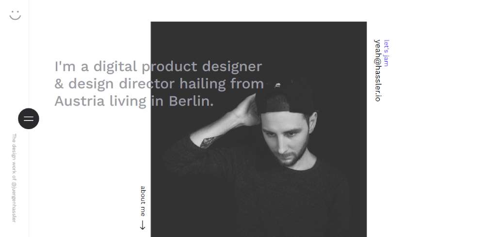
Jurgen Hassler, a designer hailing from Berlin, showcases a website that masterfully balances minimal design components and a good dose of white space. It's a smart way to convey a message, steering clear of information overload.
Plug & Play: The Dark Minimalists
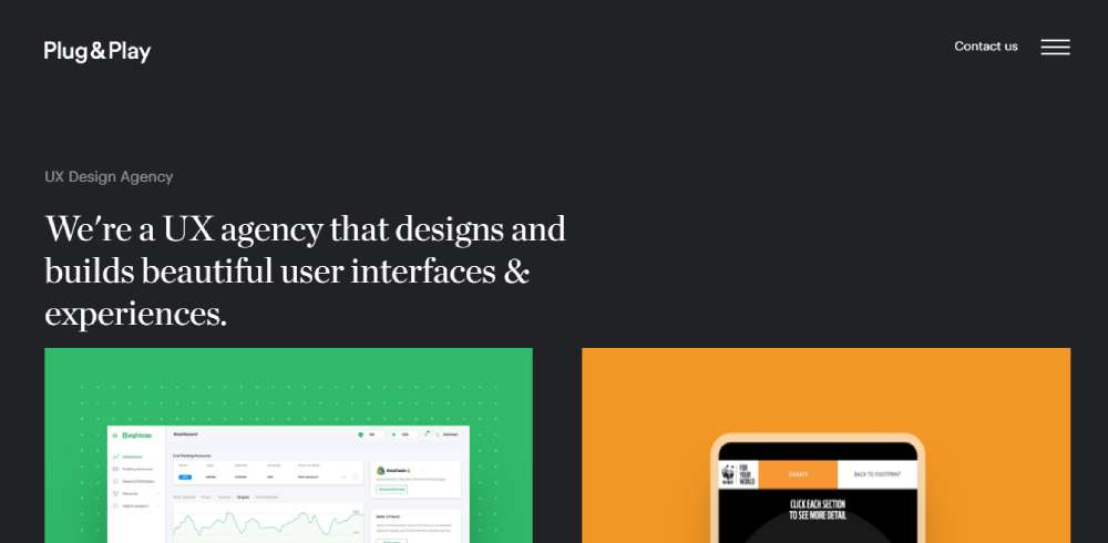
Minimalistic website design doesn't always equate to light or white backgrounds. Plug & Play, a UX agency, manifests that dark backgrounds can play into the minimalistic aesthetic just as well.
Andrea Mata: Digital Culture Enthusiast
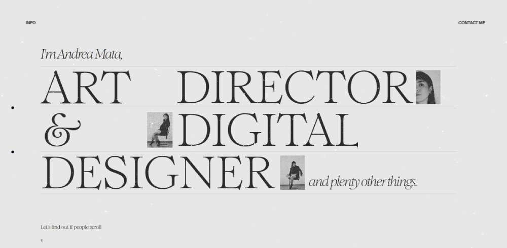
Art Director & Digital Designer Andrea Mata is constantly tuned in to the digital culture and how technology weaves into it. Working with teams and brands eager to innovate, Andrea contributes to various digital platforms and interactive experiences.
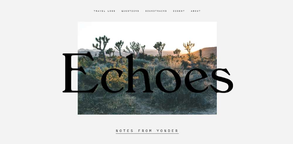
Echoes Magazine: Clean & Simple
Echoes Magazine stands out among other online magazines with its clean, straightforward design. The absence of ads and the prevalence of white space throughout the site add to the user-friendly and readable design.
Samuel Medvedowsky: Crafting Memorable Interfaces
French designer Samuel Medvedowsky has spent over a decade creating user interfaces that are unique, beautiful, memorable, and easy to use. He's currently the Creative Director at Metalab.
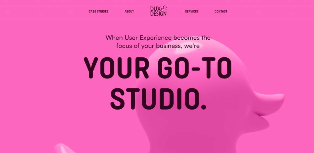
Dux Design: Your Digital Upgrade
Whether you're seeking a product upgrade or guidance for a successful launch, Dux Design's website shows they've got you covered.
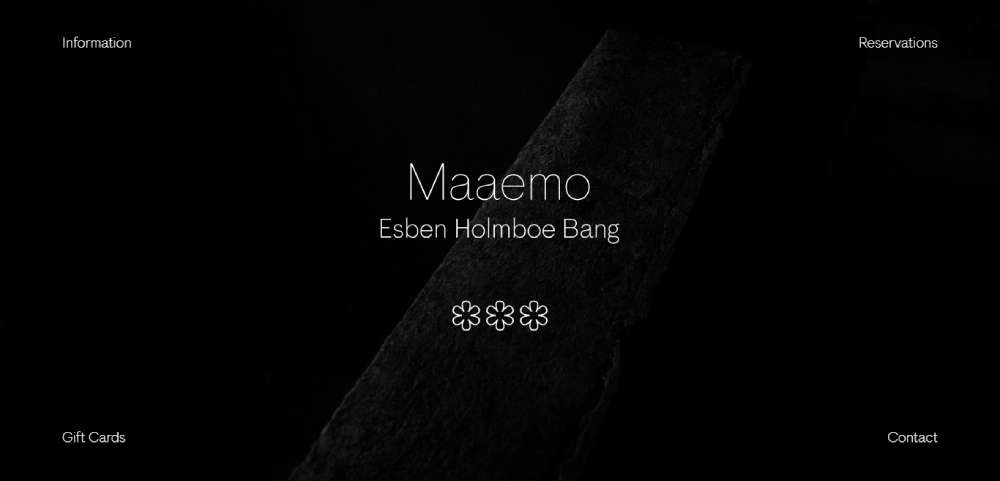
Maaemo: Minimalism with Class
Maaemo, a triple-Michelin-starred Norwegian restaurant, leverages minimalism to evoke a sense of elegance. Its website excels in visual storytelling with high-quality images of dish preparations.
Lovably: Showcasing Projects in B&W
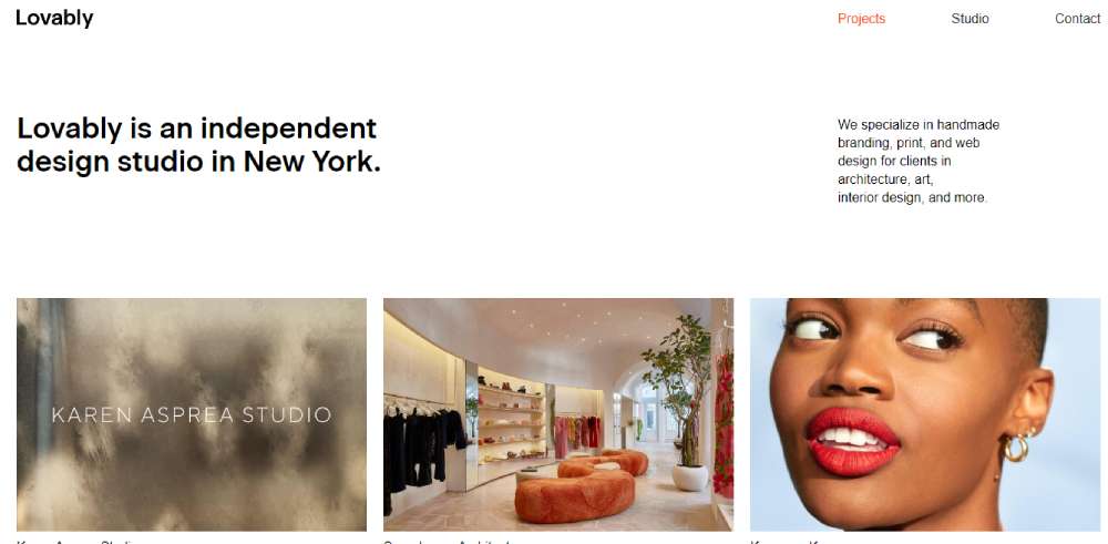
Lovably's homepage presents a brief studio intro followed by a grid showing images from past projects. The black-and-white theme lets the vibrant project images truly shine.
Zajno: Unconventional Digital Experiences
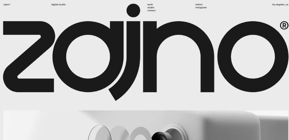
Zajno, a digital design studio, doesn't shy away from breaking conventional molds, specializing in crafting wildly unconventional digital experiences.
Wingmen: Less is More
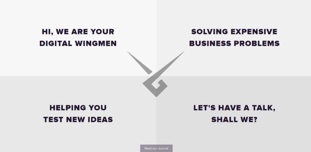
Wingmen's one-page website is a testament to the minimalist mantra "less is more." This approach allows the business to present itself without relying on a menu, widgets, or a sidebar, showcasing the effectiveness of a minimalistic website design.
Pam: Committed Brand Web Design
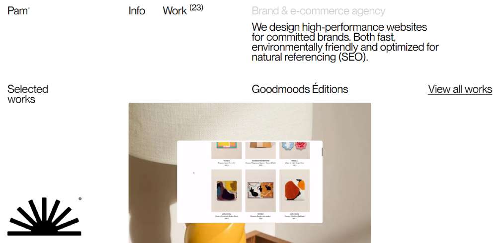
Pam, a brand & e-commerce agency, designs high-performance websites for dedicated brands that are both fast and environmentally friendly, optimized for natural referencing (SEO).
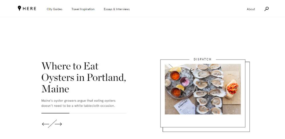
Here Magazine: Simple Navigation
Here Magazine's website offers a stunningly simple navigation menu despite being a magazine site. The homepage slider features a few recent articles, and there are just three top-level links.
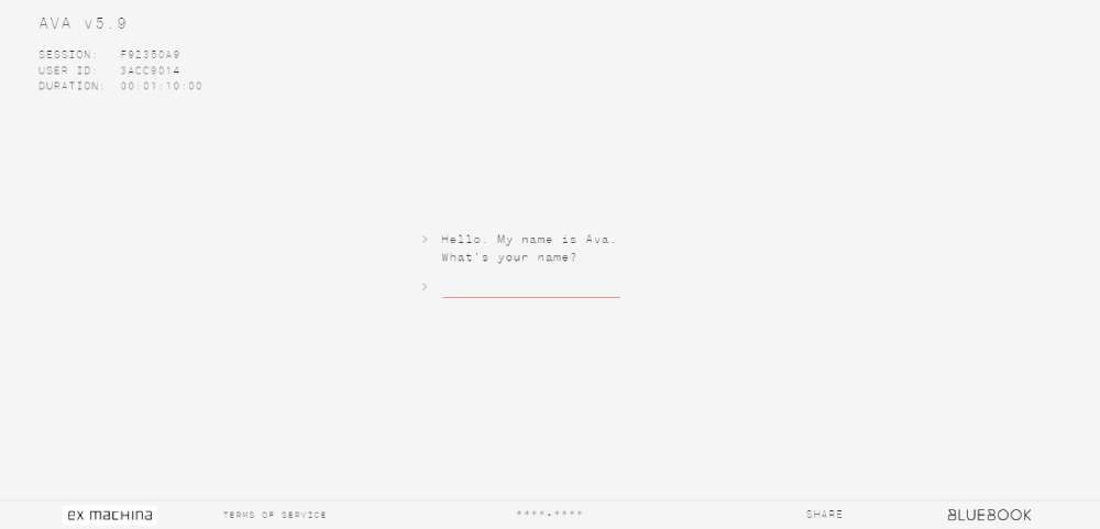
Ava: Focus on the Text
Ava's promotional site for the sci-fi thriller Ex Machina uses a monochrome color scheme and consistent typography to draw attention to the text—an interactive conversation with the film's AI star, Ava.
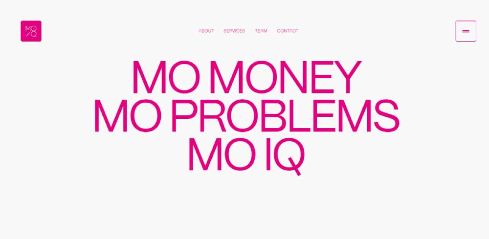
moiq capital: Investment Experts
moiq capital boasts an extensive background in investment, assets, and private wealth management.
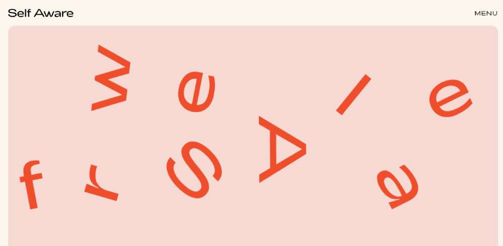
Self Aware: Web Design Studio
Self Aware is a design and technology studio based in Philly, specializing in bringing brands to life on the web with beautifully designed and highly performant websites.
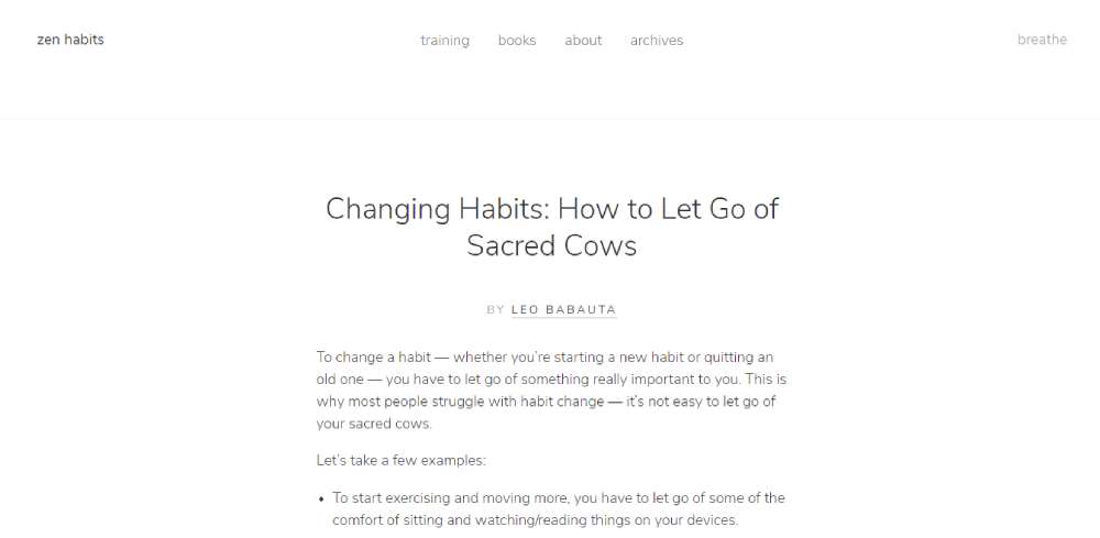
Zen Habits: Simplicity & Mindfulness
Zen Habits, a blog focusing on simplicity and mindfulness, integrates these concepts into its website design, directing attention to the most vital element—its blog posts.
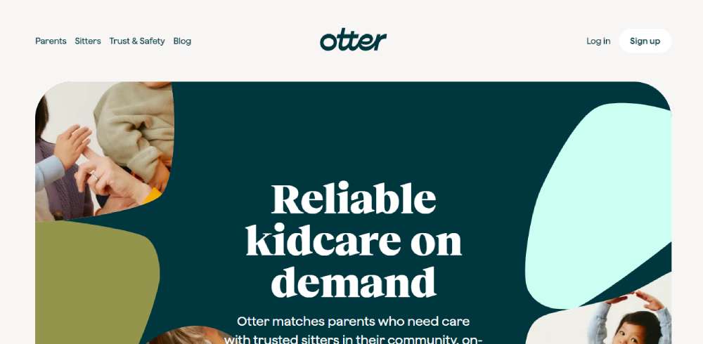
Otter: Kidcare On Demand
Otter pairs parents in need of childcare with trusted sitters in their community, available on demand.
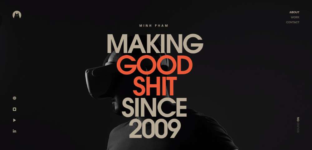
Minh Pham: Focused Product Designer
Minh Pham is a selectively skilled product designer committed to delivering high-quality, impactful digital experiences.
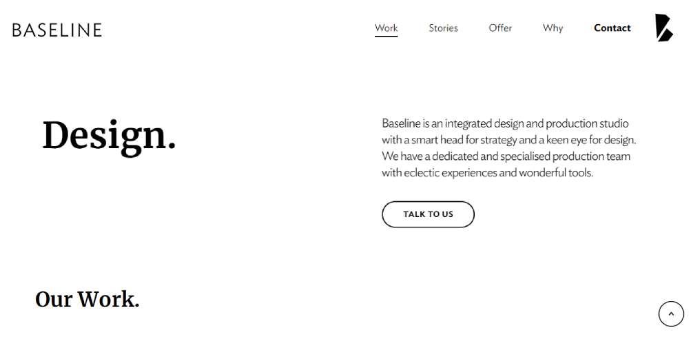
Baseline: Portfolio Communication
Baseline’s portfolio site effectively communicates its identity and services with text above the fold and a "talk to us" call-to-action button, the clean layout and ample white space making these elements stand out.
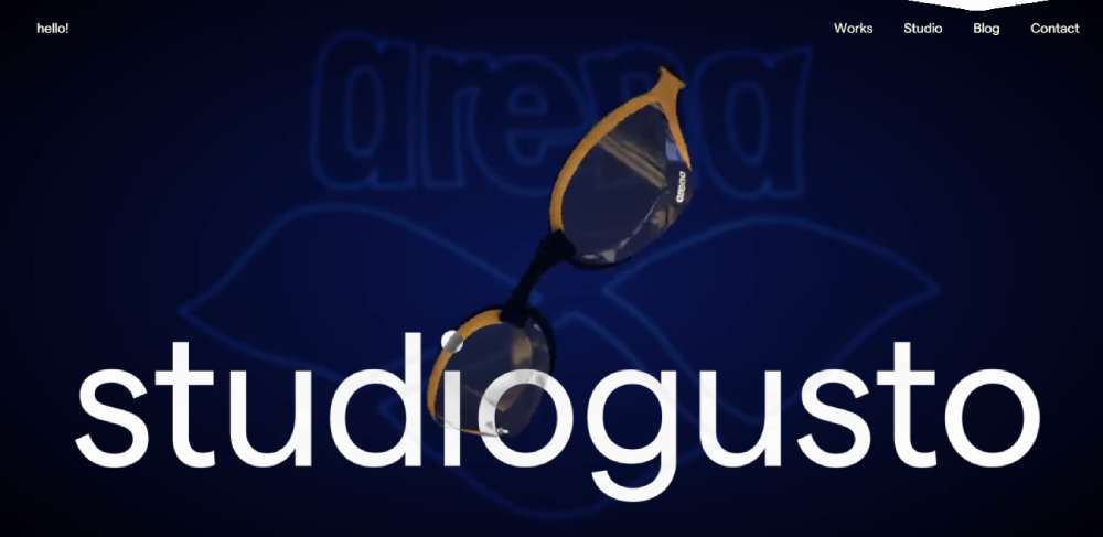
Studiogusto: Boutique Agency Excellence
Studiogusto is an international creative agency renowned as a boutique agency focusing on excellence.
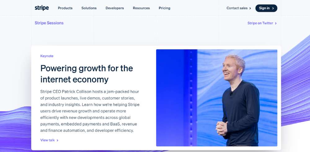
Stripe Sessions: Internet Economy Trends
Stripe Sessions is an event where business leaders and builders discuss significant internet economy trends, highlighting how businesses can navigate through times of change.
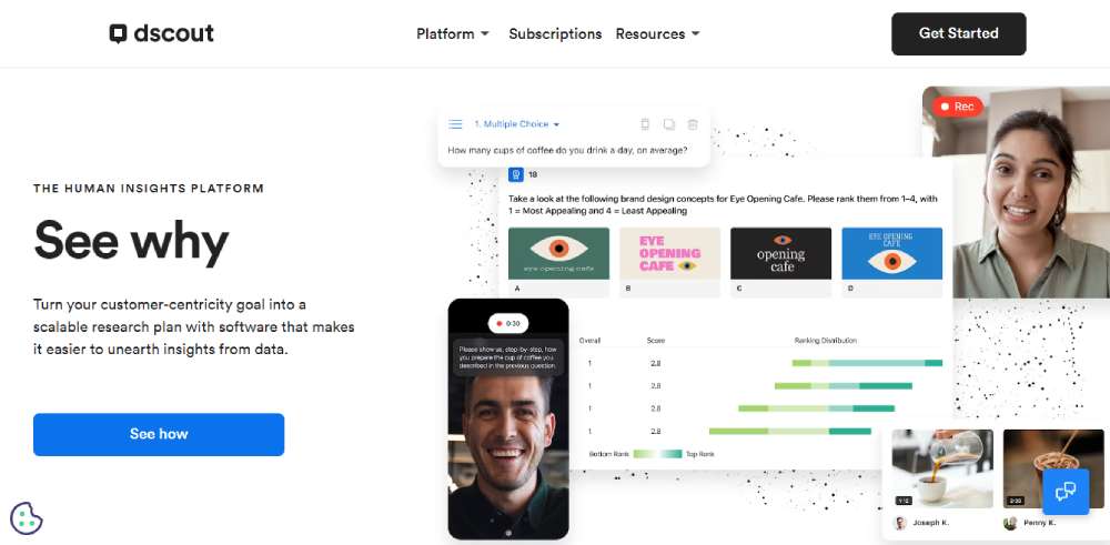
dscout: Purposeful Design
dscout’s website employs a well-arranged layout, a balance of images and visual elements, and a significant amount of white space, featuring only purpose-serving elements.
FAQ on Minimalistic Website Design
What is minimalistic website design?
Minimalistic website design is all about simplicity and focus. It uses clean design templates, whitespace layouts, and minimal color schemes to create a smooth user experience. By focusing on essential elements only, it ensures that users have a clear path to follow while navigating your site.
Why choose minimalistic design for a website?
Choosing a minimalistic design means prioritizing user experience and functionality. It helps in creating streamlined navigation, faster load times, and a focus on high-quality content. This style is top for modern web aesthetics, drawing attention to what's important without unnecessary clutter or distractions.
How do minimalistic designs affect user experience?
They make user interaction intuitive and hassle-free. By prioritizing visual hierarchy and focusing on essential design elements, users find content quickly and efficiently. This approach also helps in keeping the design as a content-first approach, emphasizing what's key for visitors.
What tools can create minimalistic websites?
Tools like Adobe XD, Figma, and Sketch are popular for designing these sites. They allow for prototyping with responsive frameworks and support interactive design elements. For coding, HTML, CSS, and JavaScript are essential to build and customize these sites efficiently.
What are common elements in minimalistic website design?
Common elements include white space, minimal typography, and flat design principles. The intention is to highlight content by using attention to detail, like simplified color schemes and essential design elements. Design portfolios often use these to display work in an elegant and clutter-free manner.
Are minimalistic designs mobile-friendly?
Absolutely. They're often designed with responsive frameworks in mind to ensure a smooth user experience across devices. Mobile-first design principles align well with minimalism, as simpler design layouts are naturally more adaptable to smaller screens, enhancing accessibility and usability.
How do minimalistic designs impact website performance?
Minimalistic designs typically boost performance metrics. Fewer elements mean faster load times and smoother navigation. Services like PageSpeed Insights often rate these sites highly, as minimalistic designs reduce server requests, ensuring that users enjoy quick and efficient access to content.
Can minimalistic websites include visual storytelling?
Yes, absolutely. Minimalistic websites can make visual storytelling more compelling by focusing on the narrative without distractions. By using strategic placement and fewer but impactful images, sites can guide users through a story effectively, ensuring engagement with the site's purpose.
What industries benefit from minimalistic web design?
While popular across many sectors, minimalistic website design is especially effective for creative industries like graphic design and photography. It's also a favorite for tech startups and personal blogs, as it allows for clear communication of ideas without distractions.
How do you maintain simplicity without losing functionality?
The trick is combining simplicity with smart use of interactive design features. Prioritize essential elements, feature streamlined navigation, and integrate crucial interactive features like hover effects. Ensuring a balance helps maintain both a user-friendly interface and the full functionality required.
Conclusion
Minimalistic website design examples demonstrate how simplicity can create powerful user interactions. Throughout this article, we've covered diverse designs, emphasizing the critical role of clean layouts and focused content.
Minimalism isn't just a trend; it's an important tool for streamlining web experiences, promoting user engagement, and enhancing functionality without excess distractions.
By using tools like Figma and leveraging minimalist principles, designers can create sites that aren't just visually appealing but also user-friendly. Using clear typography and careful white space, we've seen how these sites simplify user journeys.
Visitors can navigate effortlessly, finding what they need without searching through clutter. This approach works well for both modern startups and classic brands, proving its versatility.
If you enjoyed reading this article about Minimalistic Web Design, you should read these as well:

