Cutting-Edge Technology Website Design Examples
August 21, 2024
The Best WordPress Review Plugins For Your Site
August 28, 2024Tattoo aesthetics meet the digital canvas. Crafting an online presence for tattoo studios is about more than displaying ink design samples or showcasing artist portfolios. It’s about creating a complete visual tattoo experience that captures the modern tattoo graphics of your art.
From interactive tattoo pages to structured body art galleries, a well-designed site can elevate your brand and enhance visibility. In today's competitive field, knowing what works in tattoo website design examples is important for any studio hoping to grow.
Here, we’ll explore the essential elements of successful tattoo sites, like responsive design and SEO optimization, while highlighting real-world examples that get results. By the end, you'll understand how to integrate user interface features such as interactive booking systems and client testimonial sections to attract more visitors.
Let's get started on building your online reputation and connecting with a broader audience through killer design choices.
Creative Tattoo Website Design Examples
Create - Tattoos & Art
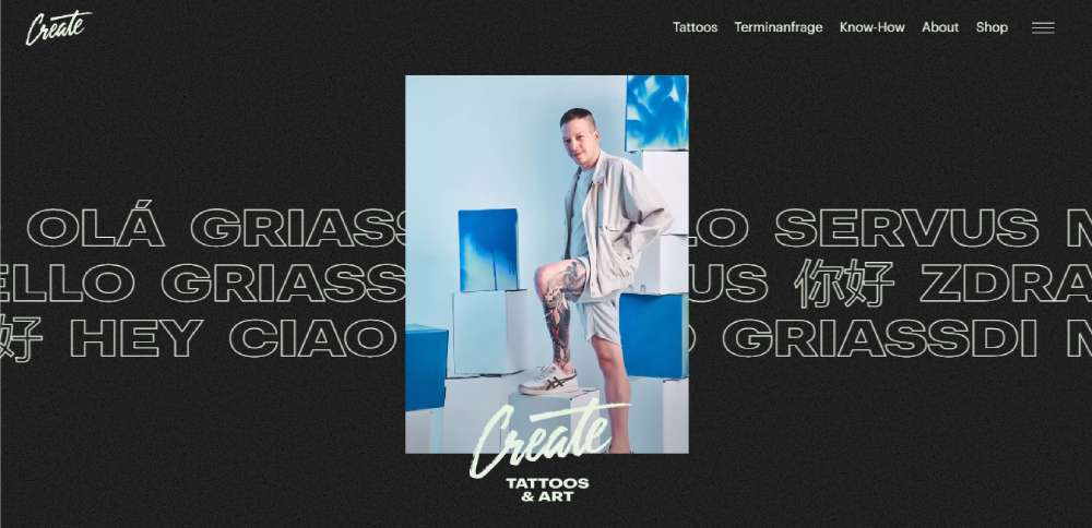
Imagine a place where fine lines meet bold statements. That's Create for you, a tattoo studio that's also an art gallery and a creative powerhouse. They're on a mission, and that mission is to bring color to the people.
Goodkind Tattoo Co
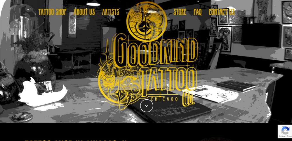
Goodkind is all about unique and custom work. The website spills the beans right in the intro, giving you all the info you need. And that's not all! There's a gallery, testimonials, a map, and a contact form. Everything you need, right at your fingertips.
Paper Crane Tattoo Studio
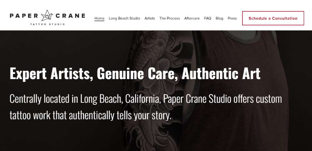
Ever seen a sleek black-and-white website that suddenly bursts into vibrant imagery? That's Paper Crane for you. It's like a sneak peek into what you can expect from your tattoo experience. And don't miss the gallery at the bottom. It's a clear showcase of their style.
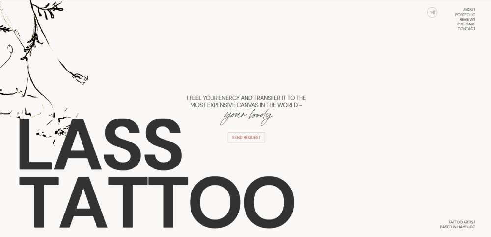
Lass Tattoo
A portfolio website for a tattoo artist from Hamburg. Simple as that.
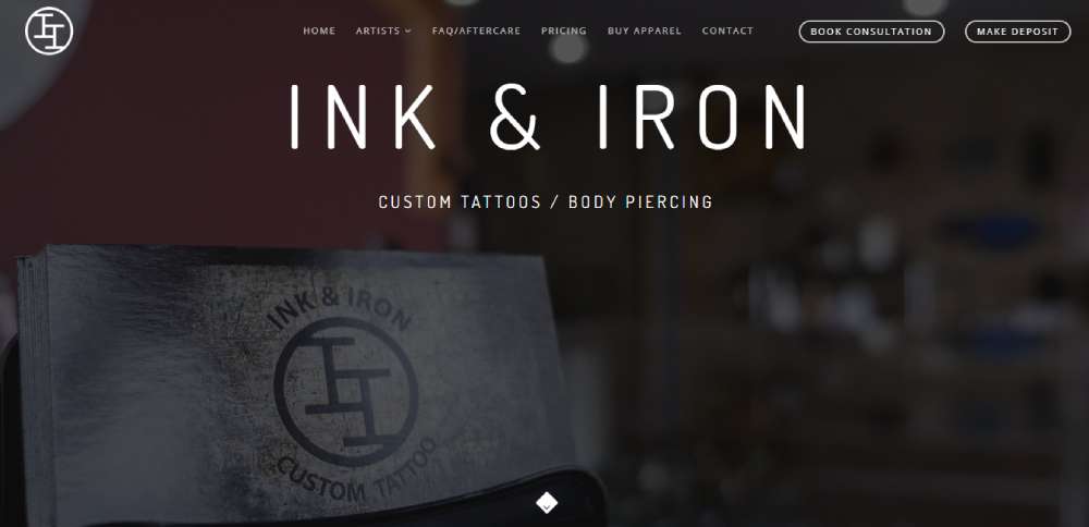
Ink & Iron
Modern vibes all around. Ink & Iron's tattoo website design is all about small fonts and white space, but don't let that fool you. The pictures of different tattoos from various artists are a feast for the eyes. And with testimonials, a map, and contact info, getting in touch is a breeze.
Atelier Eva
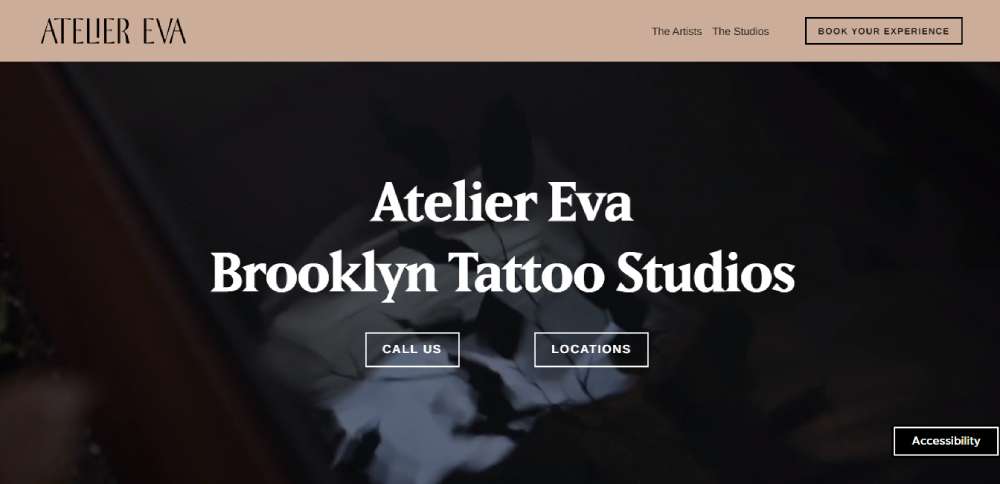
Last but not least, Atelier Eva. This one's got an animated header image that's overlaid with bold, readable text. It might not be of anything in particular, but it sure does catch the eye. And don't overlook the geographical info for SEO. It's all part of the package.
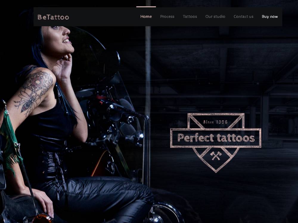
BeTattoo
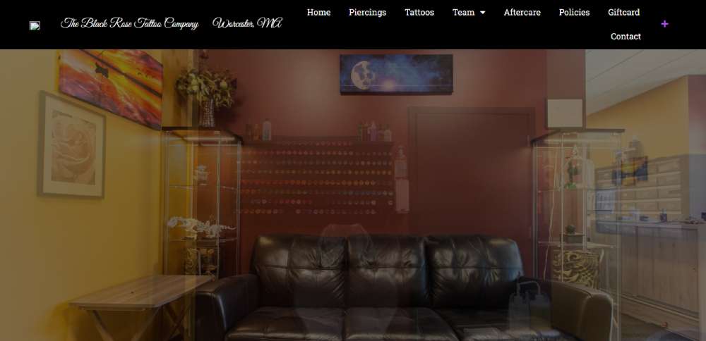
The Black Rose Tattoo Company
So, you land on The Black Rose Tattoo Company's homepage, and boom! Two pathways right in your face. Tattoos or piercings, what's it gonna be? Click on either, and you're in for a treat. A combined portfolio, info about the service, and links to each artist's profile. It's all there, easy to find, just like it should be.
Lark Tattoo
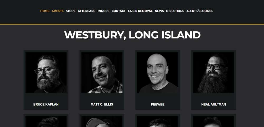
Lark Tattoo's got talent. I mean, one of the most talented crews in the tattoo business, right in New York. Want your dream tattoo? These folks have the artistic creativity to make it happen. No fuss, just pure talent.
Guns N Needles
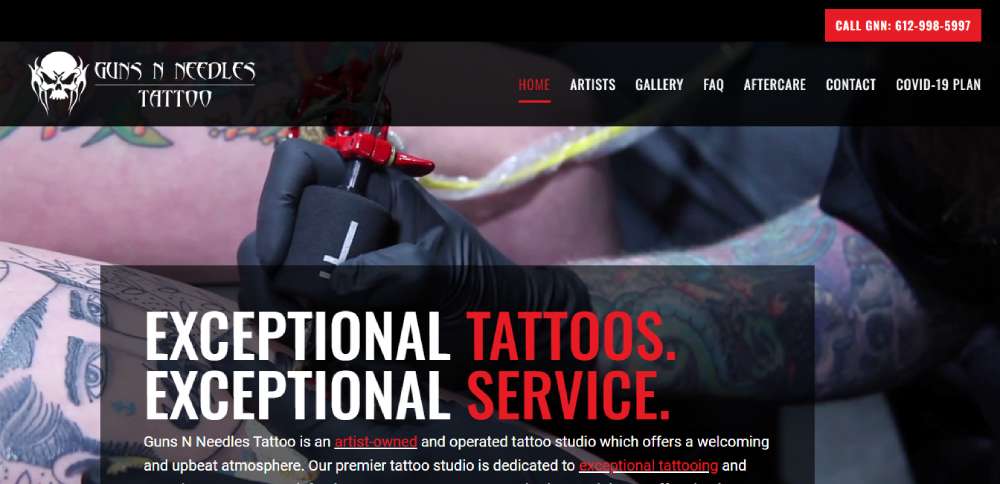
Guns N Needles knows what's up. Their tattoo website design is packed with info but not in an "I'm drowning" kind of way. Getting a tattoo can be stressful, right? They make sure you've got all the facts before you jump in. FAQs, aftercare instructions, all there, all easy to follow.
Jessi Cramer Tattoo Artist
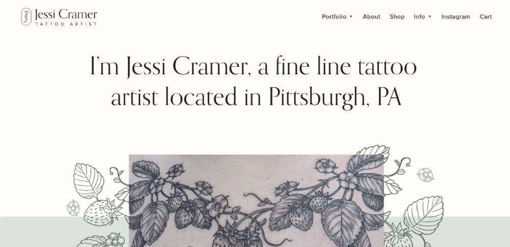
Jessi's got her niche down, and it's right there in the main header. Great for SEO, great for letting customers know what's what. Big fonts, clear and bold. Images? Crystal clear and vibrant. Colors? Pastel aesthetic with black and white overtones. It's all there, and it's all good.
Tattoo Studio
This one's a design-layout implementation for a design-studio partner. HTML-coding, GSAP animations, and guess what? Wordpress integration in the future. It's like a sneak peek into what's coming, and it's exciting.
BeDesign3
Kings Avenue Tattoo
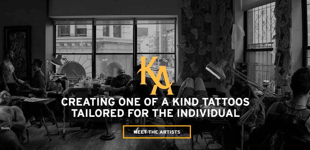
Kings Avenue Tattoo NYC, right on The Bowery. A street that's like a history lesson in tattooing. Opened its doors in April 2011, and it's overlooking some of Manhattan's big cultural centers. It's not just a tattoo place; it's a piece of history.
Dinkytown Tattoo
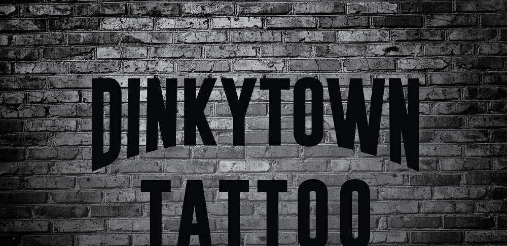
Dinkytown Tattoo keeps it simple. Some written content, a showcase of what they offer, and then the real deal. A section for the work they've done, organized by the artist. You like one artist's work more than the others? Easy pick. It's all there, all organized, all ready for you.
Living Art Tattoos
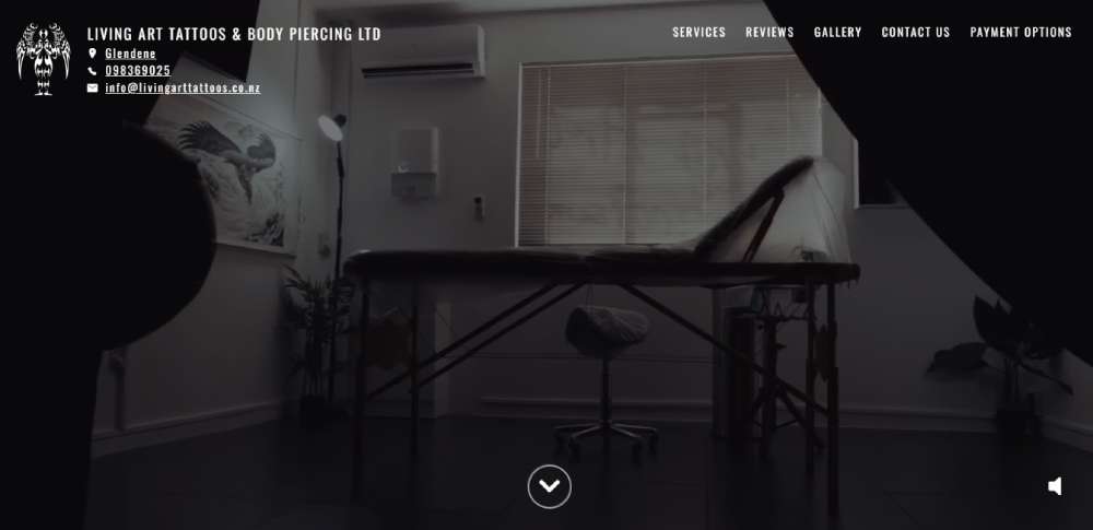
Picture this: a tattoo studio that's not just about ink and needles. Living Art Tattoos is all about a personal touch. International award-winning artist Rob Donovan is at the helm, and the studio? It's as welcoming as they come.
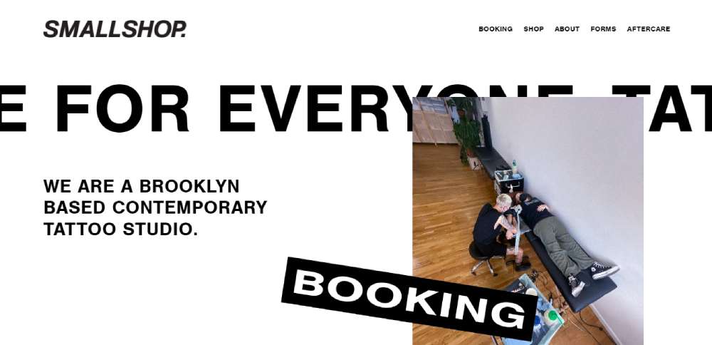
smallshop tattoo
Brooklyn's got something special. smallshop tattoo's Squarespace website is a visual feast. That BOLD sliding header? It's like a welcome mat. And the black-and-white scheme? Classic, but with a twist.
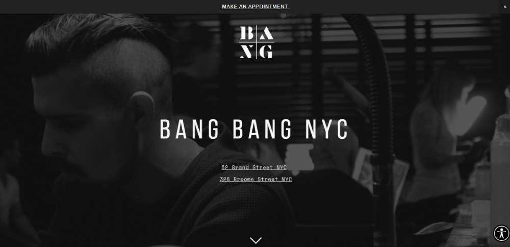
Bang Bang
Ever heard of Bang Bang? If not, Rihanna, Justin Bieber, and Miley Cyrus have. He's the tattoo artist to the stars. The most famous in the world? Maybe. But definitely the most famous to the most famous.
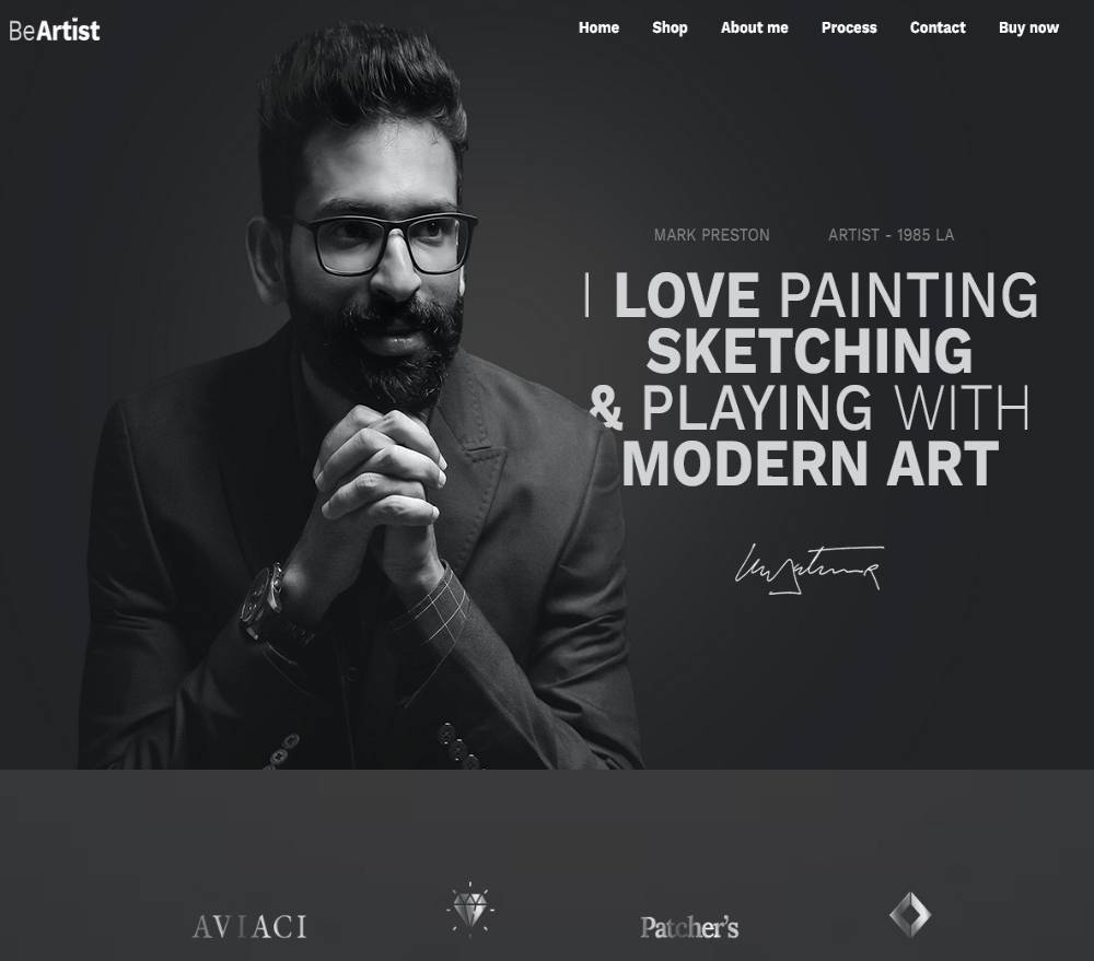
BeArtist3
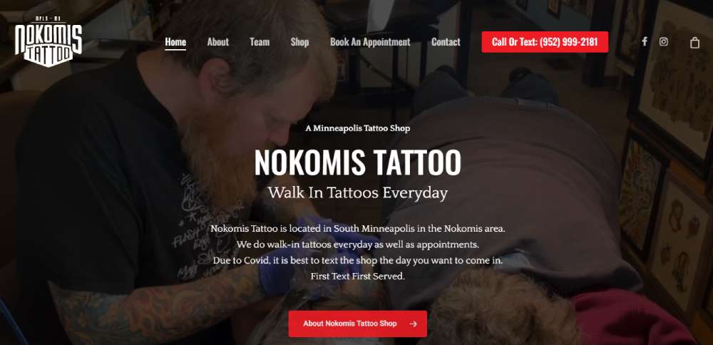
Nokomis Tattoo
Red. Bold red. That's Nokomis Tattoo for you. It's not just about the color; it's about the info. Appointments, walk-ins, they've got it all. And don't miss the blog, social media links, and contact form. It's all there, loud and clear.
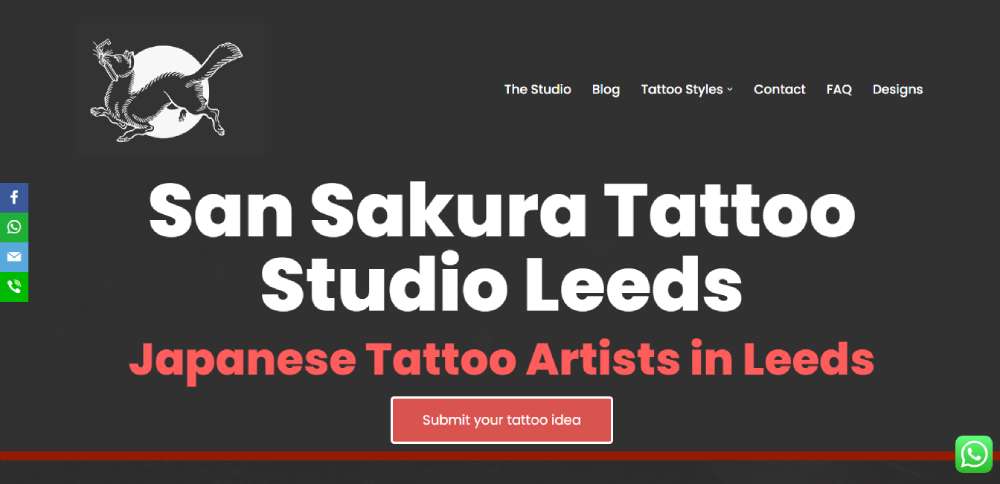
San Sakura Tattoo Studio
A Japanese Tattoo Studio. Simple, elegant, and full of tradition.
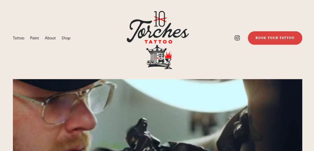
Ten Torches Tattoo
Boom! That bold header video content? It's like a visual punch. But it's balanced, with clear calls to action and vibrant images. Text? Who needs it when pictures say it all?
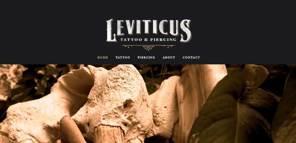
Leviticus Tattoo & Piercing
Cool pictures, tattoo designs, a video tour of the shop. Leviticus Tattoo & Piercing's website is like a visual buffet. And the navigation? Easy as pie.
Revolt Tattoos
Revolt Tattoos doesn't mess around. Red color scheme, bold capital letters, and everything's organized. Artists, locations, videos. It's all there, ready for you to explore.
BeArtist
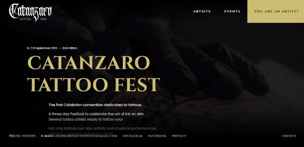
Catanzaro Tattoo Fest
Calabria's first tattoo convention. Three days of ink, art, and artists. Catanzaro Tattoo Fest is more than a website; it's a celebration.
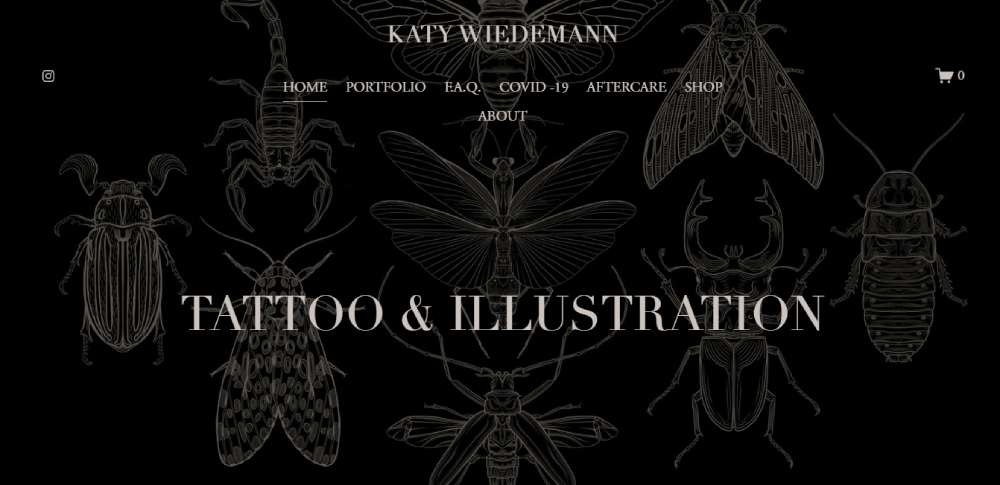
Katy Wiedemann
Science and tattoos? Katy Wiedemann makes it happen. A Scientific Illustrator turned tattoo artist, she's all about natural themes in an engraving style. It's like a love affair between science and art.
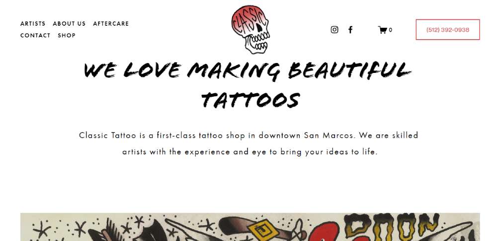
Classic Tattoo
Classic Tattoo's got some funky vibes. Matte red colors, crisp artist photos, and a layout that's just right. The SEO data in the main header? It's the cherry on top.
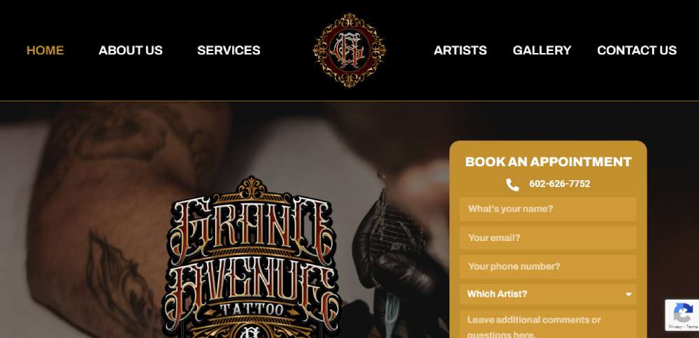
Grand Avenue Tattoo
Ever seen circular pictures on a website? Grand Avenue Tattoo's got 'em, and they're creative as heck. A gallery of past work? Check. A list of artists? Check. Want to connect? Facebook, Instagram, contact form, phone call - they've got it all.
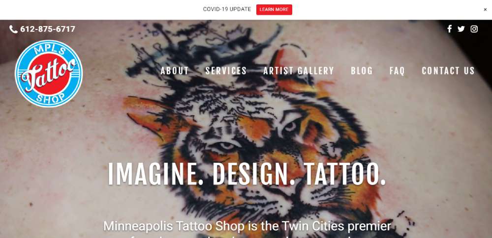
MPLS Tattoo Shop
Imagine landing on a tattoo website and seeing a video of someone getting inked. That's MPLS Tattoo Shop for you. Need more info? They've made it super easy to reach out. Phone numbers at the top and bottom, and a handy "Contact Us" link. It's all there.
BeMessage2
Mysta Electric
A portfolio site for Mysta Electric, a French tattoo artist. Simple, elegant, and all about the art.
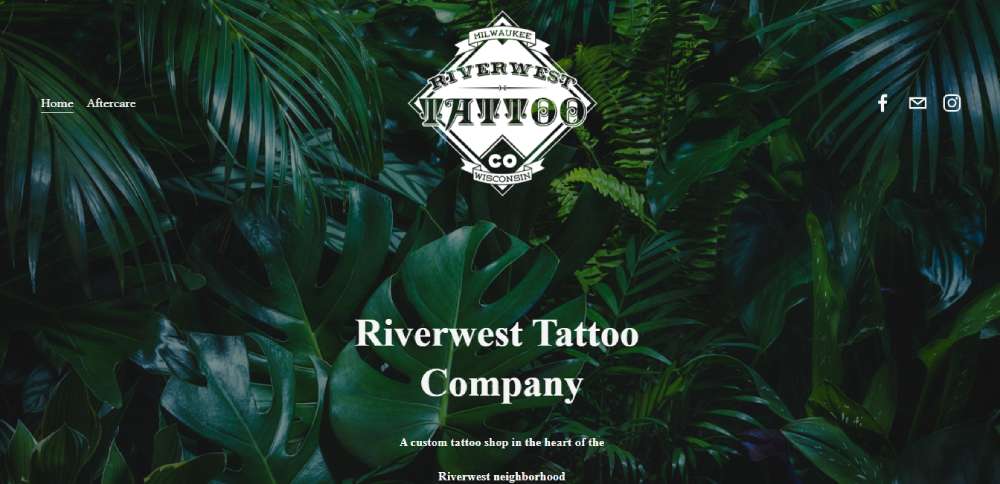
Riverwest Tattoo Company
Location data in the header, a beautiful logo, vibrant photos, artist portfolios. Riverwest Tattoo Company's website is a feast for the eyes. And the text? Only the important stuff, clear and emphasized.
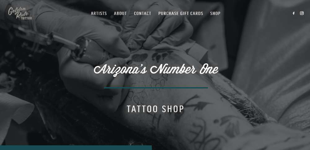
Golden Rule Tattoo
Golden Rule Tattoo keeps it simple. White space, a bit about themselves, and links to the rest. No information overload here. And don't miss the slider featuring the artist. It's a nice touch.
Bellwether Tattoo
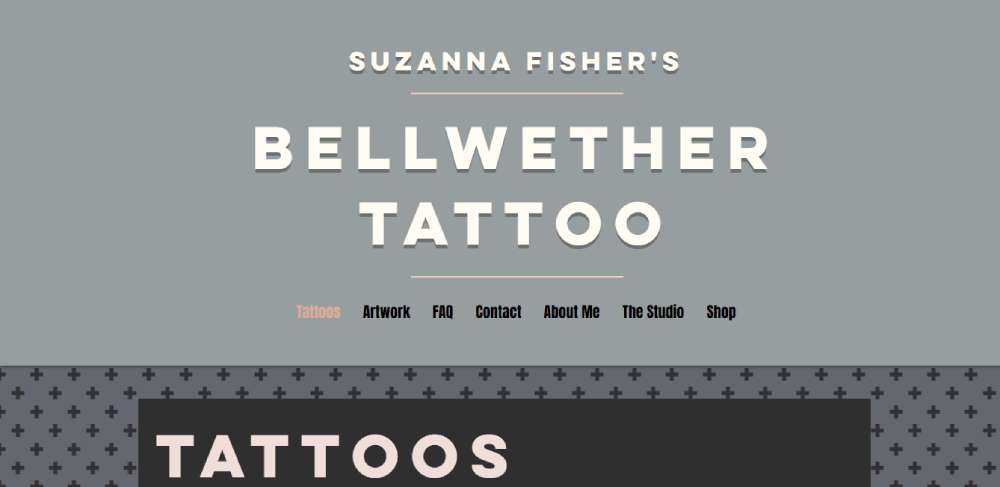
Bellwether Tattoo's website is a design treat. Content centered, a grey background with a black plus sign pattern, and links galore at the top. And the pictures? A showcase of what they can do.
Tattoo Life
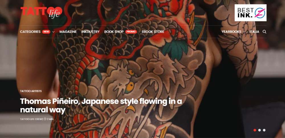
Tattoo artists, this one's for you. Professional advice, industry trends, free art plates for download. Tattoo Life adds three new styles each week. It's like a treasure trove of inspiration.
Amaryllis Tattoo Artistry
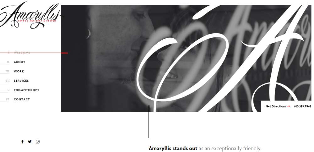
Lehigh Valley's got something special. A Tattoo Artistry & Design studio with a modern, clean layout. Black and white with touches of color. It's like a breath of fresh air.
Gold Rush Tattoo
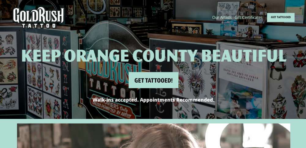
Header images, videos, team and artist photos. Gold Rush Tattoo's website is a visual feast. Friendly, passionate vibes all around. And the info, CTAs, and testimonials? They're the icing on the cake.
FAQ about tattoo website design
What platform is best for my tattoo site?
Hmm, there's a bunch out there, but the big ones are WordPress, Wix, and Squarespace. Honestly, it kinda depends on your vibe. Want to customize every tiny detail? Go with WordPress and use BeTheme.
What makes a tattoo website design stand out?
A unique tattoo website design needs a strong mix of visual storytelling and interactive features. Incorporate dashy modern tattoo graphics and a user-friendly layout. Add personalized elements like artist bios and a body art gallery to showcase work. These build a strong connection and attract potential clients.
How important is responsive design?
It's critical. Users access websites from different devices, so responsive design ensures a smooth experience on phones, tablets, and desktops. When a tattoo website adapts seamlessly, visitors stay longer. This boosts engagement and reduces bounce rates. Search engines also favor responsive sites in rankings.
What are key features to include?
Start with a tattoo booking system and high-quality image galleries. Add a blog to discuss trends and care tips. User testimonials build trust, while a simple contact form ensures easy communication. Social media integration helps promote new designs and events, growing your audience.
How do you incorporate SEO?
Use tools like meta tags and keywords related to tattoo services. Page load speed impacts ranking, so optimize images. Also, focus on local SEO to attract nearby clients. Ensure content is relevant; search engines appreciate quality, so structured data helps convey meaning.
What role do visual elements play?
Visuals are the heart of a tattoo website. Bold, high-resolution tattoo images and videos attract attention. Design themes should match your brand; whether minimalist or grunge, they set the tone. Ensure these visuals are optimized for fast loading to keep visitors engaged.
How can you highlight tattoo artists?
Profiles showcasing each artist's style and journey are essential. Use high-quality portfolio galleries and include details about their tattoo experience and technique specialties. Personal stories and client feedback add depth, connecting potential clients with the artist's unique approach.
Should online booking be included?
Yes, it simplifies scheduling and is expected by clients. Online booking tools offer convenience, allowing customers to view availability and select a time. This reduces administrative workload and optimizes client interaction. Ensure your booking system is easy to navigate and integrates well.
How to protect tattoo images online?
Protecting your tattoo designs is key. Use watermarks that don't overwhelm the art. Ensure website security with SSL certificates to guard data. Restrict download options where possible, and educate site visitors on why these measures maintain artistic integrity. Awareness is a strong tool.
What content should a tattoo blog have?
Focus on industry insights, tattoo care tips, and artist interviews. Discuss design trends and body art history. Teach readers about the tattoo process, helping them make informed choices. Blogs are essential for establishing expertise, engaging with audiences, and boosting search engine visibility.
How do you measure a website's success?
Use web analytics to track traffic and user behavior. Monitor metrics like bounce rate, conversion rates from forms, and social media shares. These insights offer a glimpse into what's working and what isn’t. Adjust strategies accordingly to ensure continual growth and engagement.
Conclusion
Exploring tattoo website design examples shows the importance of an engaging online presence. As we've found, the best sites mix visuals that highlight unique tattoo styles with features like mobile optimization and social media integration. Whether you're displaying the work of skilled artists or integrating a robust booking system, every detail counts.
Design should always prioritize the user. Easy navigation and fast page load speed are key to keeping visitors interested. Integrating digital galleries that showcase the tattoo design process improves client engagement, and helps convert visits into appointments. This strategic approach not only enhances user experience but also raises search visibility.
By implementing these design elements, your tattoo website can become a powerful tool. It attracts new clients, highlights artistry, and solidifies your brand in the tattoo field. Each click should draw people deeper into your online tattoo studio, fostering interest, trust, and long-lasting connections.
If you enjoyed reading this article about tattoo website design, you should read these as well:

