

What’s the best podcast WordPress theme out there?
October 8, 2023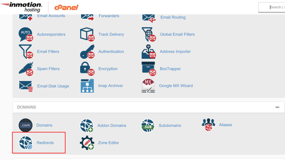
Redirect a WordPress page without a plugin
October 10, 2023So, why is website navigation so important for a user-friendly experience? The easiest way to answer this question is by defining the three-second rule. This rule points out that a person needs no more than three seconds to decide whether they remain on the website or not. The user's judgment call depends on how easily they can find the information they're looking for on the website. With a complicated navigation menu and content that doesn’t seem organized, visitors will leave your site within seconds.
Knowing this fact, you should be interested to learn more about website navigation design and which details make the difference between a website that keeps people engaged and one that doesn’t. This article will give you the best tips on obtaining user-friendly navigation.
What’s the purpose of website navigation design?
Good website navigation design is required to give people direction when they access a website. A consistent navigation system should enable users to choose what part of the website they want to reach immediately after loading a page. Consider these three factors when putting your website navigation design together:
- Business niche
- Goals
- Target audience
When you know where your website stands from these perspectives, it’s time to define your content. The amount of content that is included on each website differs from one niche to another. In some cases, the content might be so condensed that there’s not much to organize.
In other cases, a huge amount of content will require days to organize. However, there are rules to follow in every situation. The content must be aligned with the website’s goals. Is it meant to inform? Is it meant to sell? Deciding what you want to achieve through the website will help you organize the content properly.
There are two ways of sharing content with people: passive and interactive. Passive content refers to the bits of text that the user simply consumes when they access the website. Articles, guides, visual materials, and similar content fall into this category. Interactive content, also known as active content, is the type of content that involves the participation of the user. Online quizzes, tests, slide-shows, or games are the most popular types of active content. A balanced combination of passive and active content is recommended for the best results.
After figuring out what content types to use, it’s time to learn how navigation structure works. It is a crucial part of the website navigation design process and it can influence how the content is perceived and consumed.
What navigation structure should you choose?
Good structure might be the most important aspect of website navigation design. Your aim is to make navigation easy for the user and ensure a smooth experience with the website. The ultimate goal is to help users click through the site and find exactly the content they are interested in. Doing it right is highly appreciated by your users, and might turn newcomers into regular visitors. In order for your website to be intuitive, you will need to pay attention to:
Categorizing content
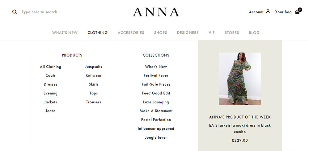
Even though your website might be high-quality, it’s all in vain if you don’t know how to structure it. You will need to put things in a logical order from the very beginning. Otherwise, the website will get cluttered and become impossible to fix as it grows larger and larger. Keep in mind that categorization is an essential part of website navigation design that shouldn’t be skipped. You should choose one of these logical groups and place your content in the proper categories:
- Task: This category should meet the goals of the user. Each category will present a different task available on the site (e.g. Shop).
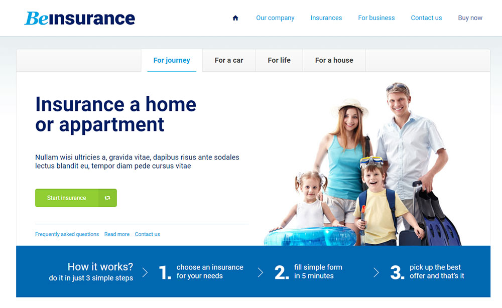
- Category: If you have all sorts of content on your site, it is best to structure it based on category. Include different categories in your navigation menu, such as blog topics for informative websites or product category for eCommerce websites.
- User: When the website’s target audience is sectioned according to multiple types of users (e.g. people who want to work vs. people who want to hire), separating them in the navigation menu is the best choice to help them find the info they need rapidly.
- Location: If your site is dedicated to people in different parts of the world, organize the content by location (the language of the site may differ too, based on this criterion).
- Date: This navigation structure approach is appropriate for websites that highly rely on when the content was published (e.g. travel agencies).
Content levels
There are three content levels that you should know about. These should be selected based on the complexity of your website. The levels are general, specific, and detailed information. You shouldn’t include more than three content levels on a website, no matter how complex it is. Any website should have a main menu, some submenus, and a landing page. You will find each one explained below:
Main menu
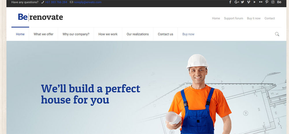
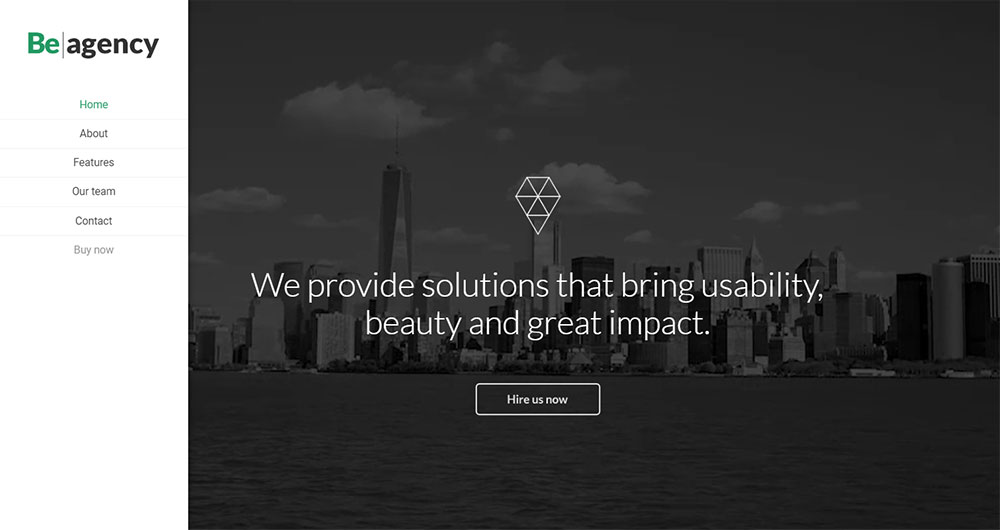
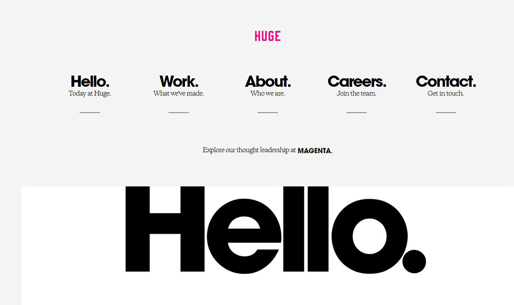
This is the primary navigation menu that people reach when they visit a website. It is usually located at the top or left side of a page, and it is designed in a way that suits the overall website’s style. The main menu should remain present at all times, regardless of where the visitor navigates to. The main menu shouldn’t contain more than seven pages for SEO purposes. The must-have pages included in the menu should be the About Us page, the Site Map page, and the Contact Us page.
Submenus
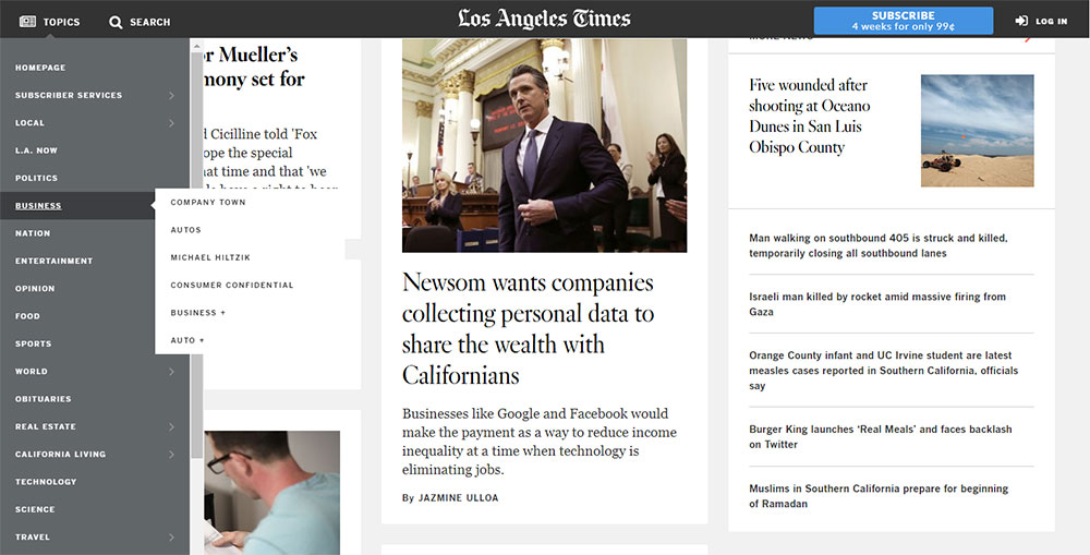
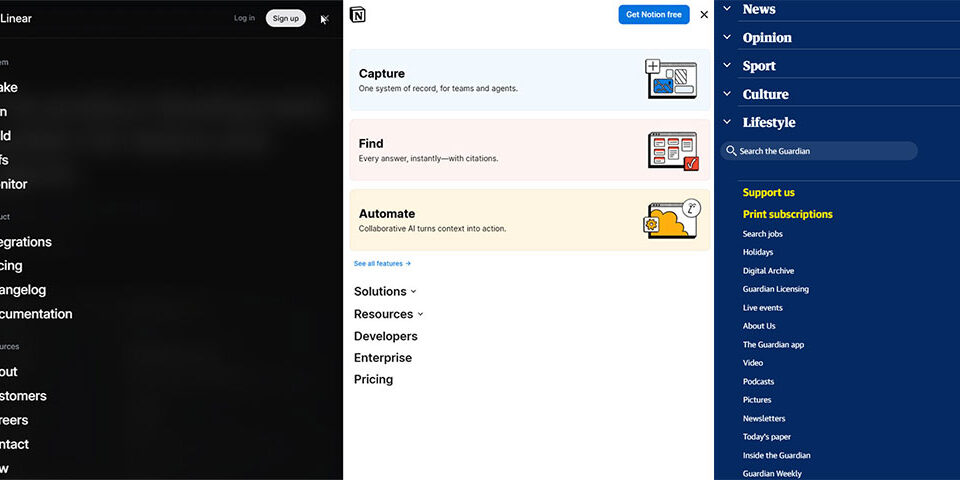
Submenus are usually found in the form of drop-down menus and they are used in website navigation design quite often. Even so, they are not the best way to present information, as some users might find them difficult to work with. Including submenus should only be done if they are an absolute requirement to keep content organized. If they aren’t an essential element, basic navigation links will do the job instead.
Landing pages
Instead of listing all information on one single page, you should use landing pages to present each category of content separately. Visitors can access landing pages using Call-To-Action buttons. These are symbolic elements that encourage website engagement. Users can simply click a CTA button and they will be redirected to a page that helps them fulfill their desired action.
Home page
Make sure that your website’s homepage is accessible at all times. Use an interactive website logo to send users to the homepage of the website, no matter where they currently are. Instead of having users click the Back button until they reach the homepage or navigate to the menu to click on it, give them the quick alternative. When accessing the home page, people are tempted to explore even further, spending more time on your website.
Labeling
Label your navigation menu categories properly. Using descriptive content to tell people what they are going to find in a category they click is the easiest way to keep the site organized. Using cryptic shortcuts or complicated words will confuse your visitors instead of helping them to navigate on the site. In website navigation design, keeping things clean is the primary principle you should follow.
Breadcrumb trails
Breadcrumb trails, also known as path analysis, is an element that establishes a communication between the user and the site’s hierarchy. Breadcrumb trails help users find their way around on a website by showing users their position. They can also be used to backtrack every movement that they’ve made on the site until they have reached their current position. This option is great for complex websites where returning to the homepage would ruin the experience.
Header and footer
Search
Every website should have a search bar. These are necessary to complete the navigation system on a website. If users don’t feel like searching for the category where they can find the information they are interested in, they will use the search bar. Optimize your keywords properly to avoid confusion, and take the search into account when naming important pieces of content.
Sitemaps
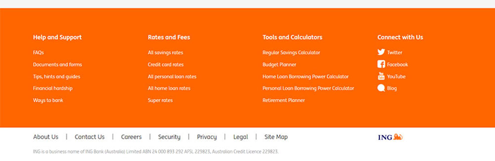
A site map contains all the categories of your website, gathered in one place. They show users the main idea of what kind of content your website contains. You should respect one website navigation design rule when creating a site map: keep it simple. The whole point is to present the categories as simpler than they look in the actual navigation menu.
Website navigation design tips
The way a website looks is just as important as how it works. For that, you will have to apply some website navigation design principles that apply to the looks of the menu. Here are some tips:
- Keep the style consistent throughout the whole website.
- Make sure that items are highlighted on hover in the navigation menu.
- Use headings and sub-headings in your content to make it easier to scan.
- Always use bolded CTAs.
- Use visual content with descriptive metadata, like captions.
- Make it scalable for devices with different screen sizes.
FAQ on website navigation
What's the main purpose of website navigation?
Ah, the age-old question. Look, website navigation is like the GPS of your site. It guides visitors, helping them find what they're looking for. Without it, they'd be lost. So, the main purpose? Guidance and usability. It's all about making the user's journey smooth and intuitive. If they can't find their way, they'll bounce. And we don’t want that, right?
How should I structure my navigation menu?
Alright, so here's the deal. Think of your navigation menu like the table of contents of a book. It should be clear, concise, and to the point. Group related items together, and keep the most important stuff at the top or beginning. And remember, less is more. Don't overwhelm your visitors with too many options. Keep it clean, keep it simple.
Is there a magic number of items to have in the menu?
Ah, the magic number. I've heard this one a lot. While there's no strict rule, many designers swear by the "7±2" principle. This means you should aim for between 5 and 9 items. But hey, it's not set in stone. It really depends on your content and what makes sense for your audience. Just ensure it's user-friendly and not cluttered.
Should I use dropdown menus?
Dropdowns, huh? They can be handy, but they're a double-edged sword. On one hand, they can help organize content without taking up too much space. On the other, they can be annoying if overused or if they hide essential content. If you do use them, make sure they're easy to navigate and mobile-friendly. And always ask yourself: is this truly necessary?
How important is mobile navigation?
Oh man, in today's world? Super important. With so many folks browsing on their phones, mobile navigation is crucial. It's got to be responsive, easy to use with a thumb, and just as intuitive as desktop navigation. If it's clunky or hard to use, you're gonna lose those mobile users. And trust me, that's a big chunk of traffic you don't want to miss out on.
What about search bars? Do I need one?
Search bars are like the unsung heroes of navigation. Especially for larger sites with tons of content. If a visitor can't find something quickly through the menu, a search bar can save the day. So, if you've got the space and the means, I'd say go for it. It's like a safety net for your users.
How do I make my navigation SEO-friendly?
Ah, SEO, the game everyone's trying to win. For navigation, it means using descriptive, keyword-rich text for your links. Avoid vague terms like "click here." Instead, be specific about what the link offers. And remember, a well-structured, user-friendly navigation can reduce bounce rates, which is a big thumbs up for SEO.
Should I use icons in my navigation?
Icons can be a great visual aid, but they're like spices – use them sparingly. If you do use them, make sure they're universally understood. And always pair them with text. You don't want users guessing what that fancy icon means. It's all about clarity and enhancing the user experience, not complicating it.
How often should I update my website navigation?
Website navigation isn't a "set it and forget it" deal. As your content grows and changes, your navigation should adapt. Regularly review and test it. See what works and what doesn't. Maybe once a year? Or whenever there's a significant change in your content or offerings. Stay flexible and keep the user's experience in mind.
How do I know if my navigation is effective?
Feedback, my friend. User testing is gold. Watch how real users interact with your site. Where do they click? Where do they get stuck? Analytics can also give insights. Look at metrics like bounce rate and time on page. And always be open to tweaking and improving.
Wrapping it up
By following the website navigation design advice presented in this article, there’s no way you can fail. Take into account that users should be able to find what they are looking for in just a few clicks. If that doesn’t happen with your website’s navigation system, you will have to simplify things. The navigation menu should be intuitive and bold to avoid confusion among your site’s visitors and to help enhance their experience.


