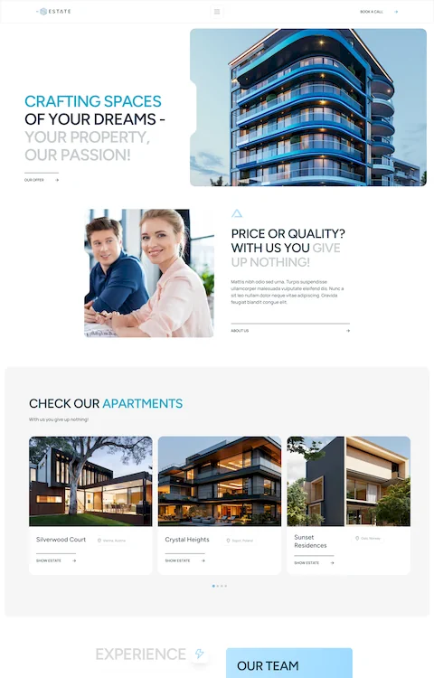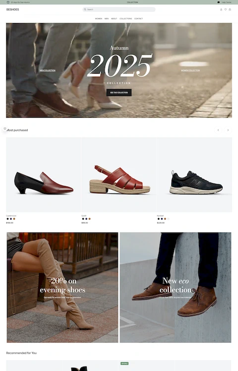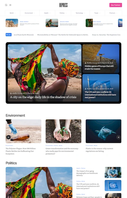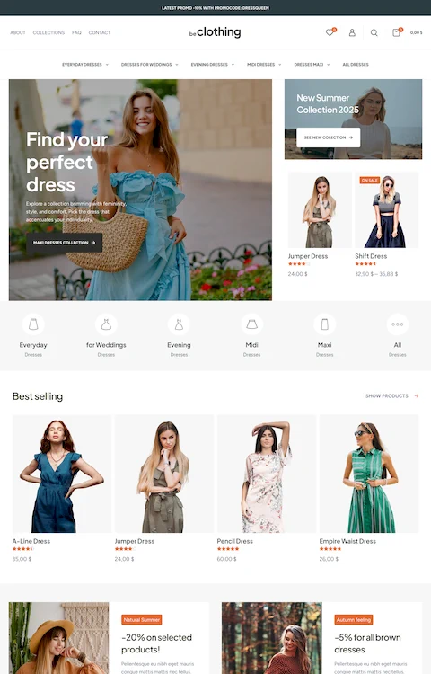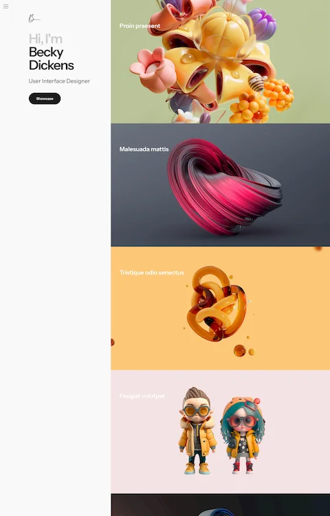
Graphic Designers’ Portfolio Websites That Look Amazing
July 3, 2025
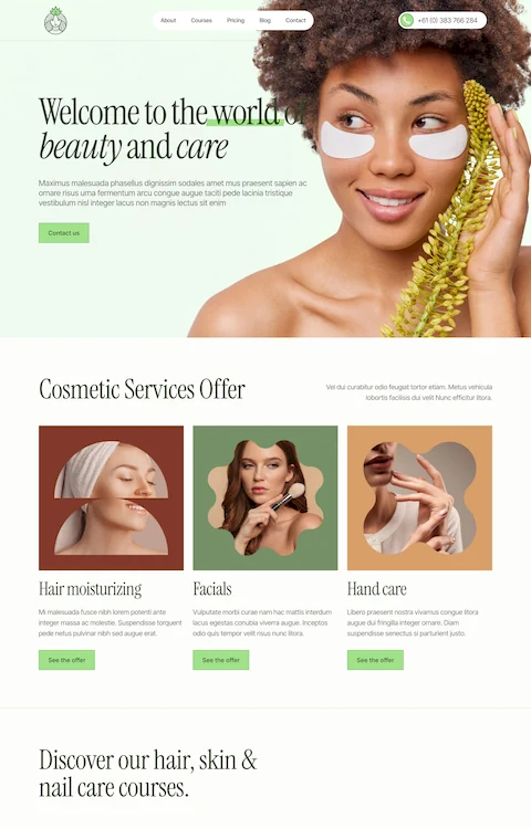
The Best Hair Salon Website Design Examples for You to See
July 4, 2025Your next client is searching "barbershop near me" right now. What they find determines whether they book with you or your competitor.
A dated website with no online booking costs you money every single day. The best barbershop website design examples prove that great design converts browsers into paying clients.
This guide breaks down 15 real barbershop websites that get it right. You'll see what makes them work, from Booksy integration to mobile-first layouts.
We'll cover booking systems, service menu formats, pricing displays, and the design patterns top shops use to fill their chairs.
Whether you're building from scratch on Squarespace or redesigning on WordPress, these examples show exactly what works.
What is Barbershop Website Design
Barbershop website design is a specialized category of web design built for men's grooming businesses.
These sites combine online booking systems, service menus, pricing displays, and brand storytelling into a single digital storefront.
The goal is simple: turn website visitors into paying clients through clear information and easy appointment scheduling.
Unlike generic small business websites, barbershop sites need specific features. Walk-in availability displays, barber profiles, portfolio galleries showing fade work and beard trims.
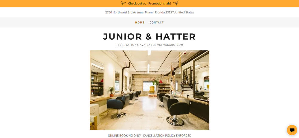
Most successful shops use platforms like Squarespace, Wix, or WordPress paired with booking software such as Booksy, Square Appointments, or Vagaro.
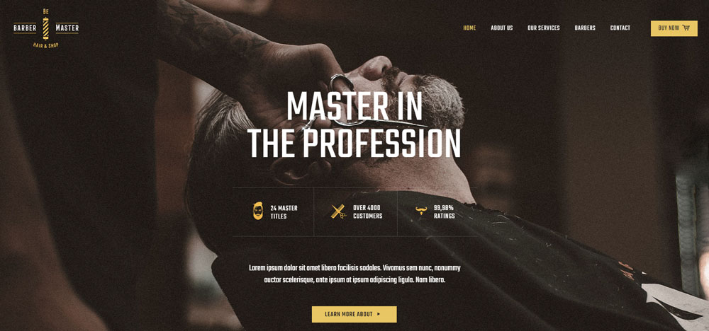
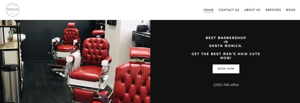
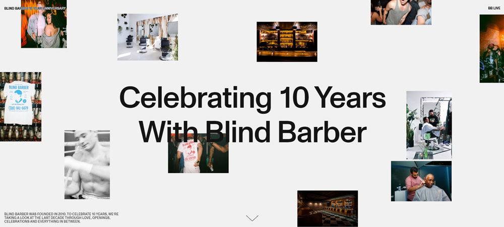
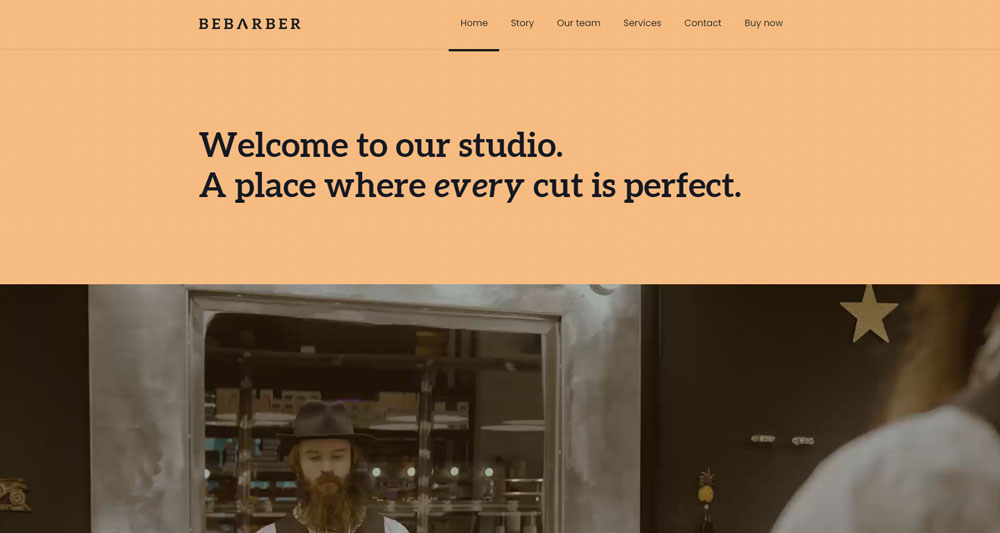
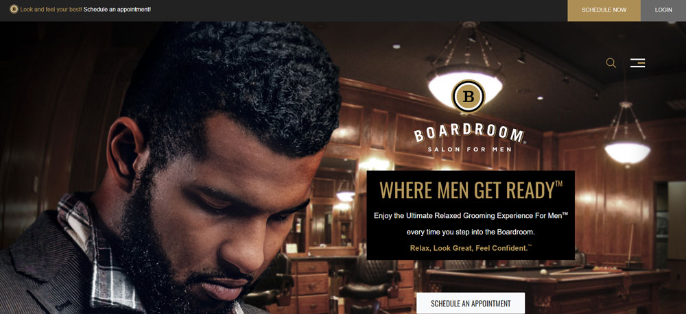
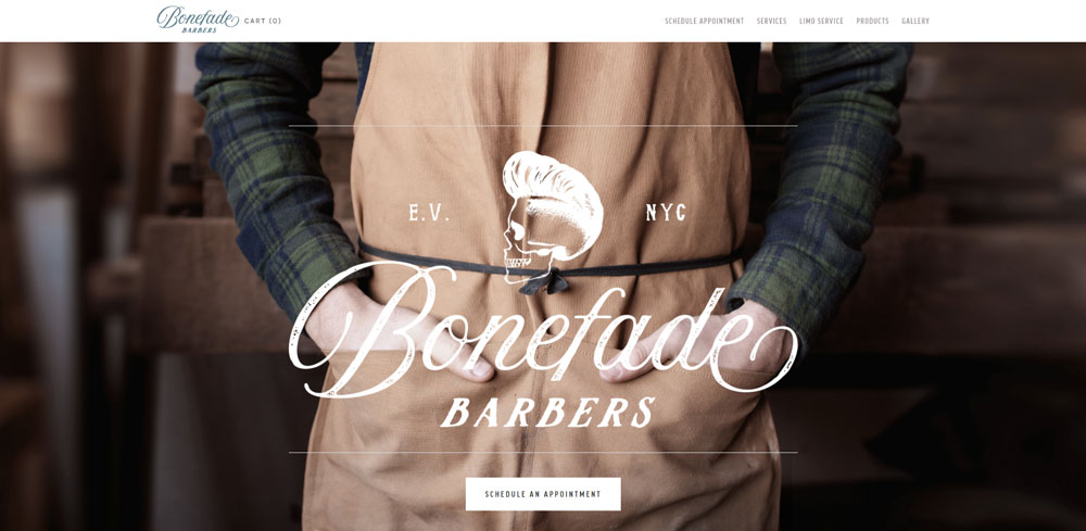
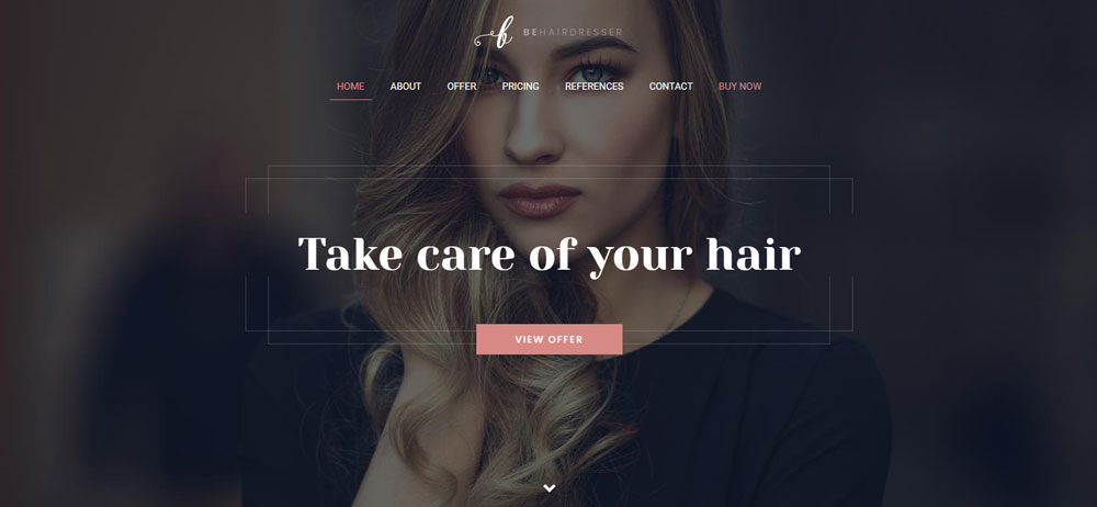
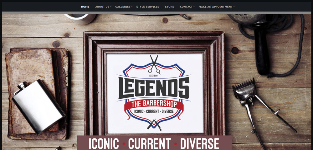
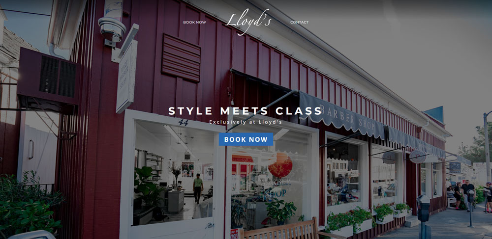
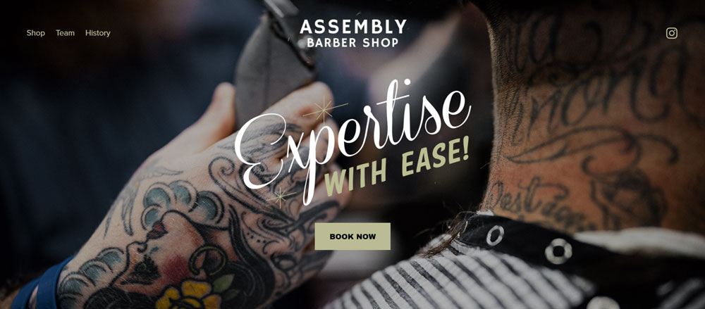
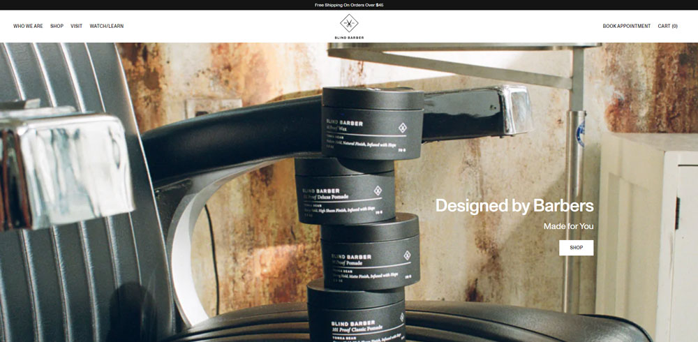
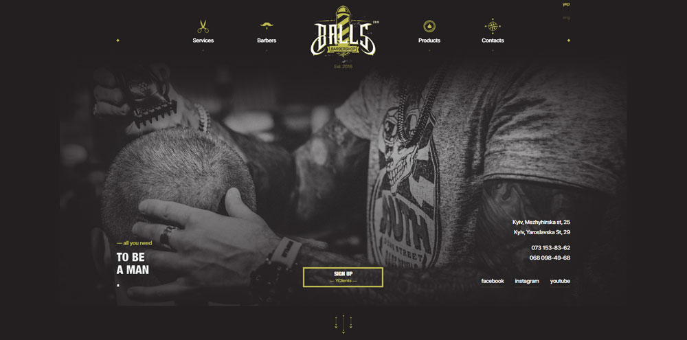
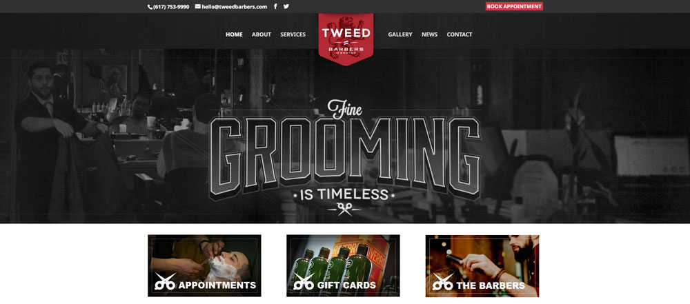
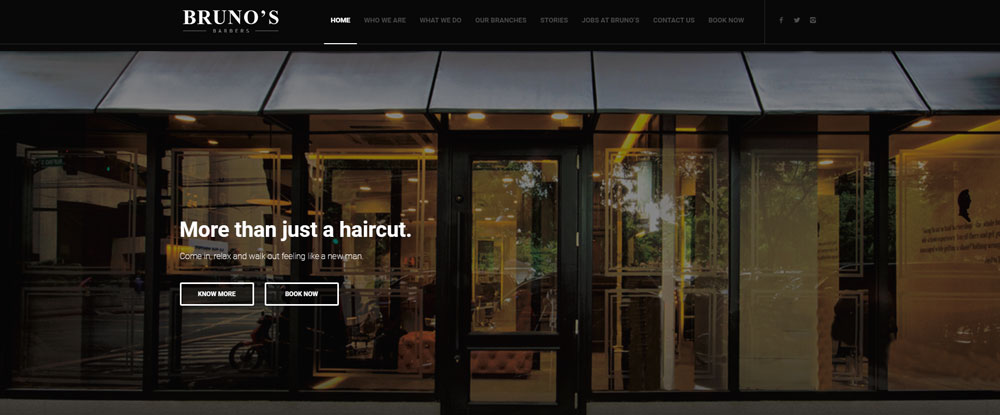
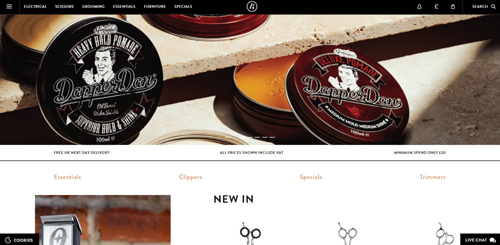
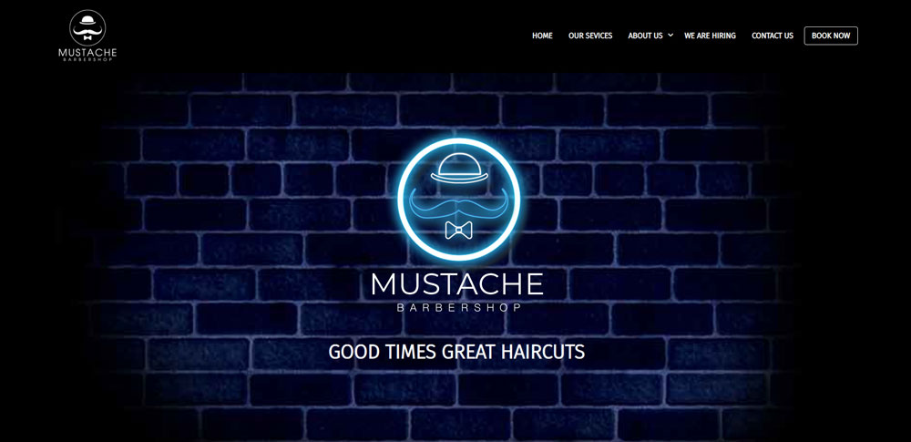
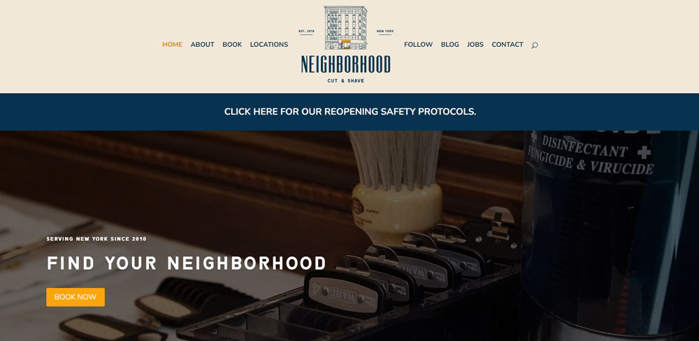
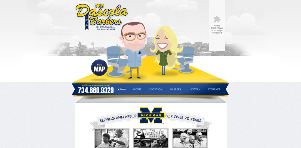
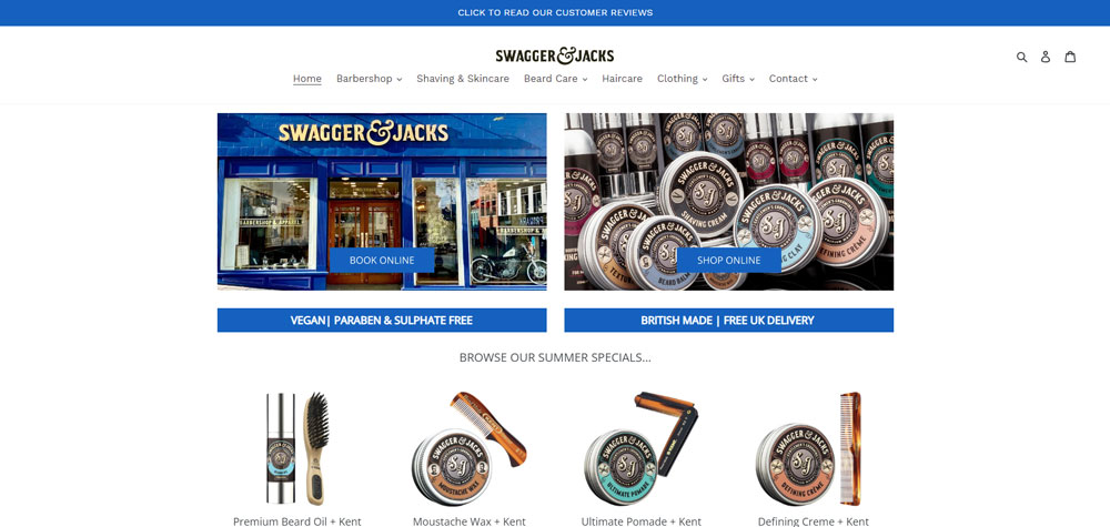
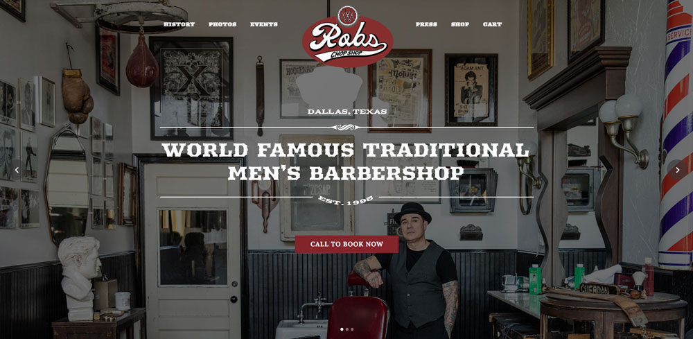
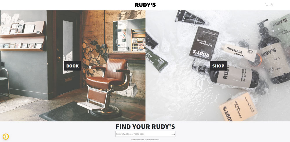
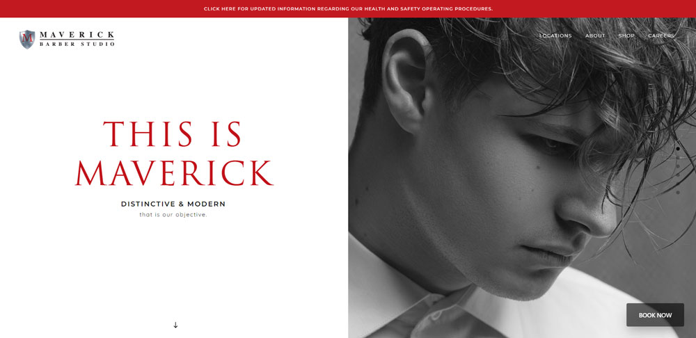
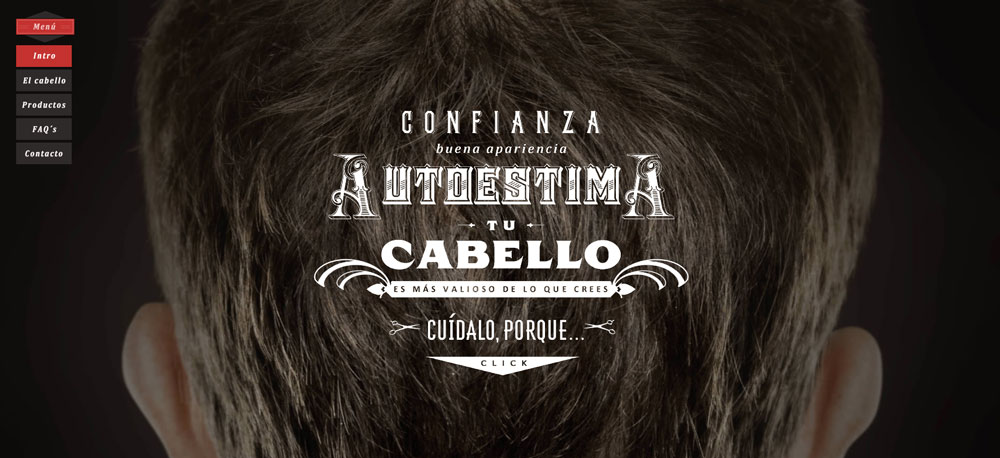
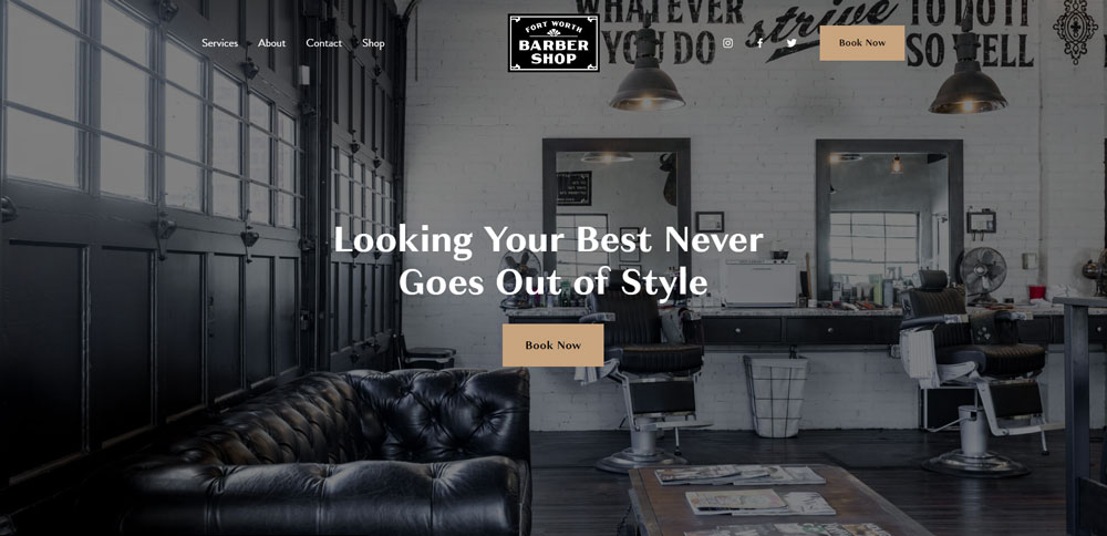
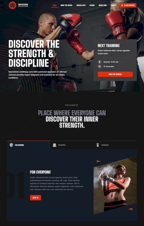
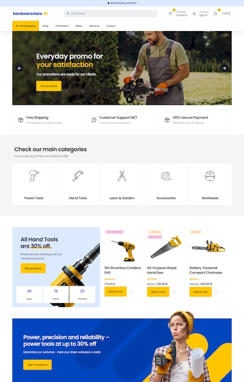
Barbershop Website Design Examples
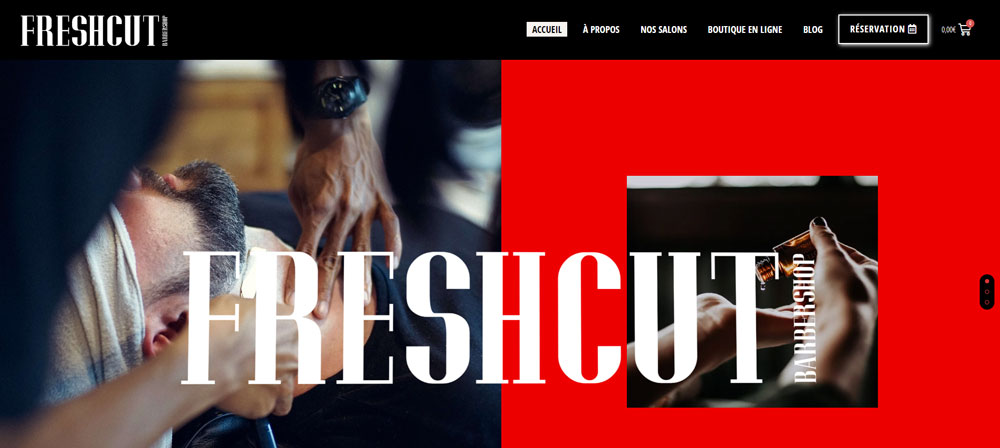
FreshCut Barbershop
Why Do Barbershops Need a Professional Website
Your Google Business Profile isn't enough anymore.
Clients research before they book. They want to see your work, check prices, and read reviews without calling or walking in.
A professional website builds trust before the first handshake. It separates established shops from fly-by-night operations.
Here's what a proper site delivers:
- 24/7 online booking (even while you're cutting)
- Service and pricing transparency
- Social proof through client testimonials
- Google search visibility for local queries
- Brand identity that matches your shop's vibe
Shops without websites lose clients to competitors who have them. That's the reality in 2024.
How Does Website Design Affect Barbershop Customer Acquisition
Design directly impacts whether someone books or bounces.
A cluttered homepage with no clear call to action? Gone in three seconds. A mobile-first design with a prominent "Book Now" button? That's a new client.
The conversion path matters. Visitors need to find booking, services, and location within one or two clicks.
Sites with good UX convert at higher rates because they remove friction. No hunting for information, no confusing navigation menus, no broken contact forms.
Page loading speed plays a role too. Slow sites on mobile devices kill conversions, especially when someone's searching "barbershop near me" on their lunch break.
What Makes a Barbershop Website Effective
Effective barbershop sites share common traits: clear visual hierarchy, fast load times, and obvious booking paths.
The design needs to reflect your brand while keeping functionality front and center.
What Visual Elements Work Best for Barbershop Websites
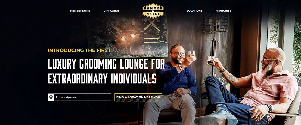
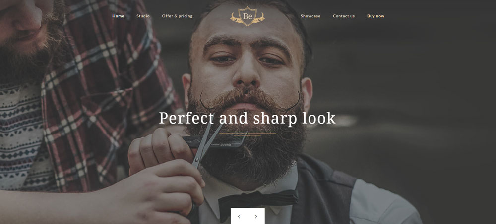
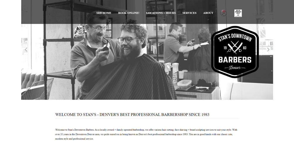
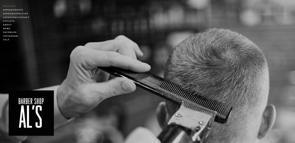
High-quality photos of your actual work, not stock images. Real barbers, real clients, real cuts.
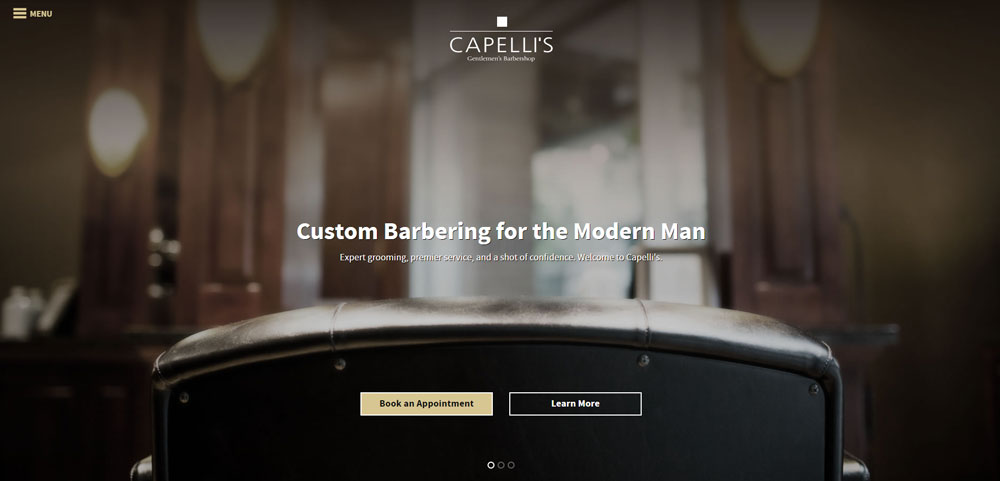
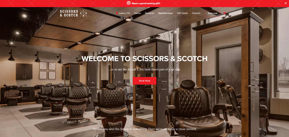
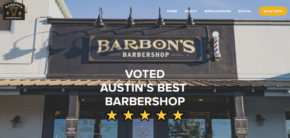
A strong hero section with your shop's interior or signature service grabs attention immediately.
What Color Schemes Do Successful Barbershop Websites Use
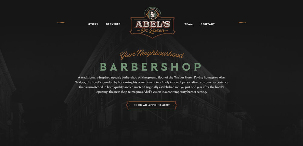
Most shops lean toward black, white, gold, and deep red. Classic combinations that signal masculinity and tradition.
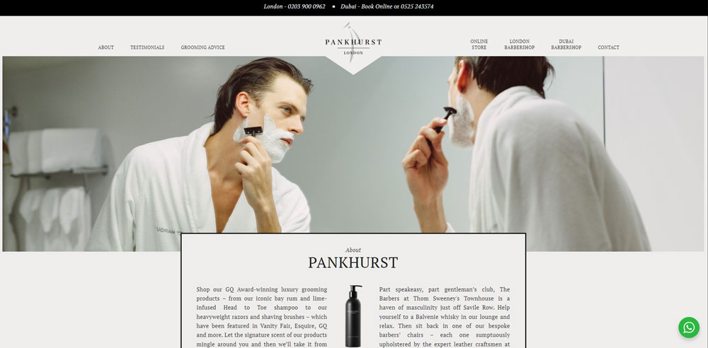
Modern shops sometimes flip this with minimalist designs using neutral tones and clean backgrounds.
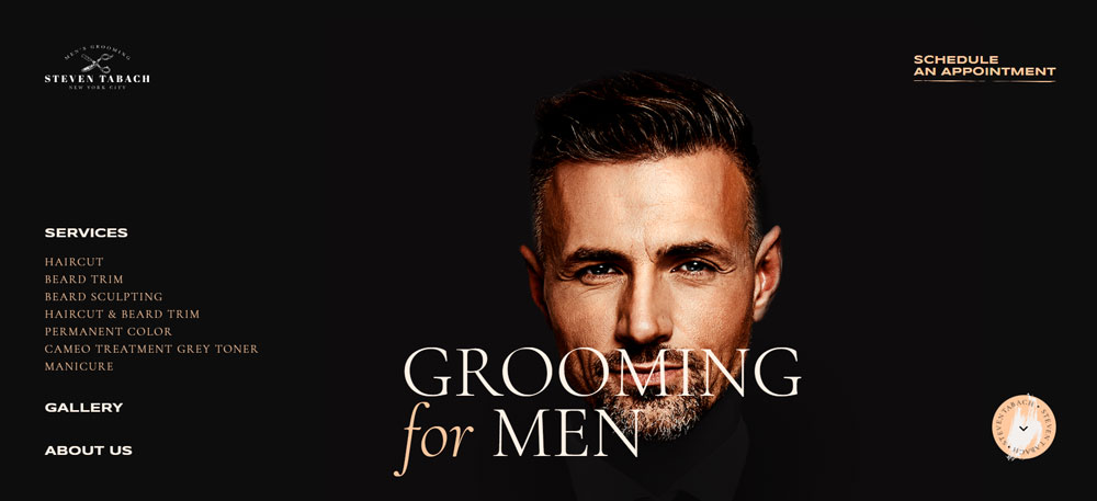
Understanding color theory helps match your site to your shop's personality. Vintage barbershop? Warm browns and cream. Contemporary fade specialist? Stark black and white.
What Typography Choices Represent Barbershop Brand Identity
Font selection sets the tone instantly.
Serif fonts and script lettering suggest traditional, old-school vibes. Think classic barbershop poles and straight razors.
Sans-serif fonts with bold weights read as modern and clean. Sites with strong typography feel more polished and professional.
Google Fonts offers free options like Playfair Display for headers and Montserrat for body text.
What Features Should a Barbershop Website Include
Every barbershop site needs core features that handle the basics: booking, services, pricing, gallery, and contact information.
Skip any of these and you're creating barriers between potential clients and your chair.
How Do Online Booking Systems Benefit Barbershops
Online booking eliminates phone tag and reduces no-shows through automated reminders.
Tools like Fresha, Booksy, and Square Appointments integrate directly with most website builders. Clients pick their barber, select a service, choose a time slot.
The booking form design matters. Keep fields minimal: name, phone, service, preferred time. Nothing else.
What Service Menu Format Works Best on Barbershop Websites
List services with clear names, brief descriptions, and prices. No ambiguity.
Group related services together: cuts, beard work, treatments, packages.
Example format:
- Classic Haircut - Scissor or clipper cut with neck cleanup - $30
- Skin Fade - Zero-guard fade with blend - $35
- Beard Trim - Shape and line up - $20
How Should Pricing Be Displayed on a Barbershop Website
Transparent pricing builds trust. Hidden prices feel shady.
Display costs directly on service pages or create a dedicated pricing page that's easy to find in your navigation.
Some shops use price ranges for services that vary by hair length or complexity. That's fine, just explain why.
What Role Does a Photo Gallery Play on Barbershop Websites
Your gallery is proof of skill. It shows potential clients exactly what they'll get.
Include before-and-after shots, different cut styles, beard work, and your shop's atmosphere. Similar to how hair salon websites showcase their stylists' portfolios.
Update it regularly. A gallery full of photos from 2019 doesn't inspire confidence.
How Do Client Testimonials Increase Trust on Barbershop Websites
Reviews from real clients carry more weight than any marketing copy you could write.
Pull testimonials from Google, Yelp, or ask loyal clients directly. Include names and photos when possible.
A well-designed testimonial section near your booking button reduces hesitation and pushes visitors toward conversion.
How to Evaluate Barbershop Website Design Quality
Not all barbershop sites perform equally. Use these criteria to assess quality:
- Mobile responsiveness - Does it work flawlessly on phones?
- Page loading speed - Under 3 seconds or clients bounce
- Booking system integration - Can visitors schedule in under 60 seconds?
- Visual brand consistency - Do colors, fonts, and imagery match the shop?
- Navigation clarity - Can users find services, prices, and contact in two clicks?
- Service presentation - Are offerings and costs clearly displayed?
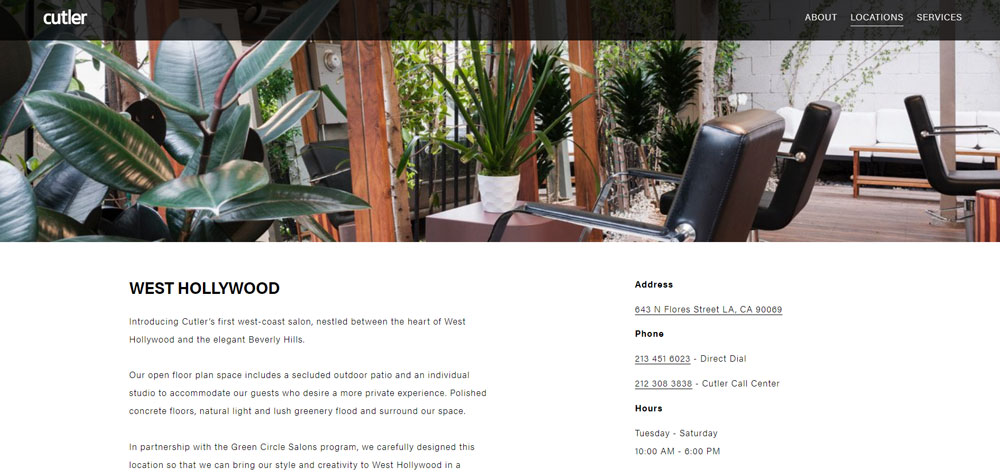
- Contact accessibility - Is the phone number, address, and map obvious?
Test any site on your phone first. That's where most clients will see it.
What Design Patterns Appear Across Top Barbershop Websites
Successful barbershop sites share structural patterns worth replicating.
What Header Layouts Do Successful Barbershop Websites Use
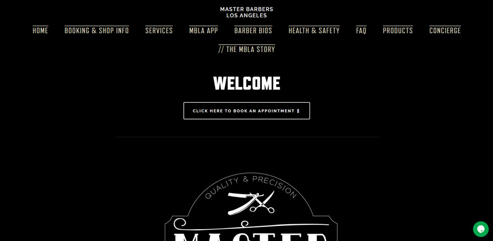
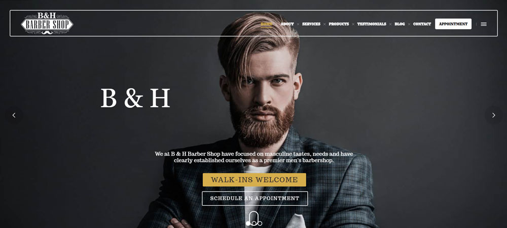
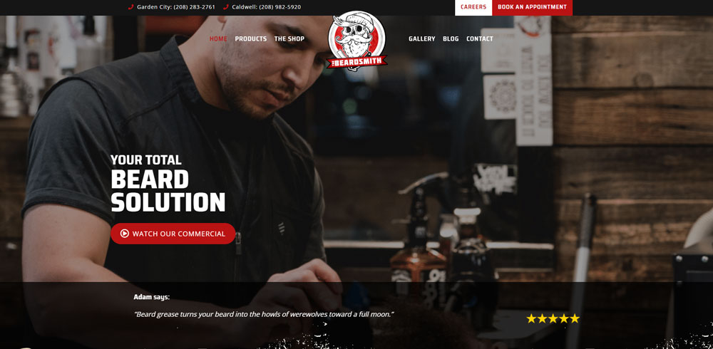
Fixed navigation bars with logo left, menu center or right, and booking button highlighted. Most use transparent headers over hero images.
The header design keeps the booking CTA visible during scroll.
What Homepage Structures Convert Best for Barbershops
Hero image with headline and booking button, followed by services overview, gallery preview, testimonials, location map, and footer with contact details.
The website layout prioritizes booking above the fold on every device.
How Do Top Barbershop Websites Handle Service Pages
Individual pages for major service categories with descriptions, pricing, duration, and direct booking links. Some include recommended add-ons.
What Footer Elements Appear on High-Performing Barbershop Sites
Address with map link, phone number (tap-to-call on mobile), business hours, social media icons, and secondary navigation.
The website footer serves as a final conversion point for visitors who scroll through entire pages.
What Website Builders Do Barbershops Use
Platform choice depends on budget, technical skill, and feature requirements.
How Does Squarespace Perform for Barbershop Websites
Best for design-focused shops wanting polished templates without coding. Strong Acuity Scheduling integration. Monthly cost: $16-49.
How Does Wix Support Barbershop Website Creation
Drag-and-drop flexibility with Wix Bookings built in. Good for DIY owners. Free tier available; paid plans $16-159/month.
How Does WordPress Handle Barbershop Website Needs
Maximum customization through themes and plugins. Requires more setup time. Best paired with booking plugins like Bookly or Amelia.
What Barbershop-Specific Website Platforms Exist
Platforms like Boulevard and Zenoti offer all-in-one solutions for salons and barbershops with integrated booking, POS, and marketing tools.
How Much Does Barbershop Website Design Cost
Costs vary wildly based on approach and requirements.
What Do DIY Website Builders Cost for Barbershops
$0-50/month for platforms like Wix, Squarespace, or WordPress with basic themes. Add $10-30/month for booking software if not included.
What Do Professional Barbershop Website Designs Cost
Freelance designers charge $500-3,000 for custom sites. Agencies range $3,000-15,000+ depending on features and complexity.
What Ongoing Costs Should Barbershops Expect
- Domain registration: $10-20/year
- Hosting (if not included): $5-30/month
- Booking software: $0-50/month
- SSL certificate: Often free with hosting
- Maintenance/updates: $50-200/month or DIY
What Booking Software Integrates With Barbershop Websites
The right booking tool depends on your platform and feature needs.
How Does Booksy Work With Barbershop Websites
Embeddable widget or link to Booksy booking page. Popular with independent barbers. Includes client management, reminders, and payments.
How Does Square Appointments Integrate With Barbershop Sites
Free for individuals; seamless integration with Square POS. Embed booking directly on any website via code snippet.
How Does Vagaro Support Barbershop Online Booking
Full-featured salon software with website builder included. Handles booking, payroll, inventory, and marketing in one platform.
What Mobile Design Considerations Matter for Barbershop Websites
Over 70% of barbershop site traffic comes from mobile devices.
Thumb-friendly buttons, tap-to-call phone numbers, and simplified navigation are non-negotiable. Test every page on actual phones, not just browser simulators.
Responsive design ensures layouts adapt automatically, but always verify booking flows work smoothly on smaller screens.
How Should Barbershop Websites Display Location and Hours
Put address and hours on every page, ideally in the header or footer.
Embed Google Maps for directions. Display hours in a scannable format with holiday exceptions noted.
Multi-location shops need a location selector that remembers user preferences.
What Social Media Integration Works Best for Barbershop Websites
Instagram is king for barbershops. Embed your feed directly on the homepage or gallery page to show recent work.
Link icons in the header or footer to active profiles. Skip platforms you don't actually use.
Connect Facebook for reviews and Yelp for reputation management. Google Business Profile integration helps local search visibility.
How Do Barbershop Websites Handle Multiple Locations
Each location needs its own page with unique address, hours, team members, and booking widget.
A location selector in the navigation lets visitors choose their preferred shop before browsing services or booking.
Individual location pages also help with local search rankings for "barbershop near me" queries in each service area.
FAQ on Barbershop Website Design
What is the best website builder for a barbershop?
Squarespace and Wix lead for ease of use with built-in booking features. WordPress offers more customization but requires plugins.
Choose based on your technical comfort and budget. Most shops do fine with Squarespace or Wix.
How much does a barbershop website cost?
DIY builds run $200-500 first year including domain, hosting, and platform fees. Professional designs cost $1,000-5,000+.
Add $20-50 monthly for booking software like Booksy or Vagaro if not included in your platform.
What features should a barbershop website have?
Online booking system, service menu with prices, photo gallery, location with hours, and contact information. These five elements are non-negotiable.
Add team profiles and testimonials to build trust with new clients.
How do I add online booking to my barbershop website?
Use scheduling software like Square Appointments, Fresha, or Booksy. Each provides embed codes or widgets for your site.
Most integrate with Wix, Squarespace, and WordPress through native apps or simple code snippets.
What colors work best for barbershop websites?
Black, white, gold, and deep red dominate traditional barbershop designs. These colors signal masculinity and craftsmanship.
Modern shops experiment with neutrals or bold accents. Match your color scheme to your shop's actual interior.
Do barbershops really need a website?
Yes. Clients research online before booking. A Google Business Profile alone isn't enough anymore.
Shops without websites lose clients to competitors who have them. It's a business website necessity in 2024.
What makes a good barbershop website?
Fast loading, mobile-friendly design with clear booking paths. Visitors should schedule appointments within 60 seconds of landing.
Real photos of your work, transparent pricing, and easy navigation separate good sites from bad design.
Should I use a template or custom design?
Templates work for most barbershops. Platforms like Squarespace offer professional templates that look custom after adding your branding.
Custom design makes sense only for multi-location shops or premium brands needing unique functionality.
How do I display services and pricing on my barbershop website?
Create a dedicated services page listing each offering with name, brief description, duration, and price. Group related services together.
Keep formatting consistent. Clients scan quickly, so avoid lengthy paragraphs about each service.
What photos should I include on my barbershop website?
Your actual work: fades, tapers, beard trims, lineups. Include shop interior shots and team photos.
Skip stock images entirely. Similar to hairstylist websites, authentic portfolio images build trust and showcase skill.
Conclusion
These barbershop website design examples share one thing: they make booking effortless. That's the entire point.
Pick a platform like Wix or Squarespace. Connect appointment scheduling software like Vagaro or Square Appointments. Add real photos of your fades and beard work.
Your digital storefront needs to match your shop's identity. Whether you go vintage or modern, keep the user experience tight.
Run through a website checklist before launch. Test every call to action button on mobile.
Track results with Google Analytics. Watch what pages convert and which ones bounce.
The best barbershop sites evolve. Update your portfolio gallery, refresh testimonials, and keep hours accurate. Your website works while you cut.


