

Elementor vs Divi vs BeBuilder: Which is the best?
June 28, 2024
An error occurred while processing this directive [Fixed]
July 2, 2024A beautiful website design stands out, like a vibrant canvas amidst grey walls. Why does this matter? Because in an age where first impressions are made in milliseconds, a site’s aesthetic allure is its best foot forward.
But the magic doesn’t stop at visuals. It's about weaving an experience that guides ease of use, embracing emerging design trends while grounded in solid design principles. Yet, the question lingers: How can one's own digital identity evoke the artistic expression seen in award-winning portfolios?
By diving into exquisite examples, showcased by renowned designers using web design tools and templates from WordPress, you're about to witness the intersection of creativity and functionality.
We’ll explore everything from minimalist layouts to dynamic interactions, revealing how effective user interface and intuitive navigation narrate compelling stories. By the end, crafting your own modern interface will become less a task, more a calling.
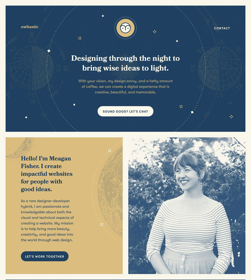
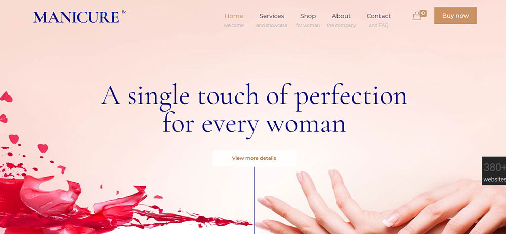
A Clean, Engaging Website Design Invokes Trust
Have a Plan:
You can’t just dive straight in into website design. If you want to be certain that your users’ needs are being met by your website, you’ll have to map out your buyer's journey from their first visit to your website to their decision to become your user.
Which pages will be viewed by them, which content will be read by them, and which offers will win them over? Comprehending these things will enable you to design a website which helps nurture leads through the sales funnel.
Make use of what you’re already familiar with regarding your users (or interview them) and look into what transformed them from visitors to users. You should then use this info to map out your strategy.
Utilize clear calls to action:
What do you want people visiting your website to do? Purchase your products?Subscribe to your email newsletters?Donate money to a certain cause?
Put thought into your website’s buttons. Choose a design that will allow them to grab a visitor’s attention. Also, the button’s text has to be brief and get to the point.
For example, a button saying “Contact Us” should be found near the design’s end after the visitor has learned something about your organization, whereas a good spot for a “Learn More” button is above the design’s fold.
Make the layout simple:
The simpler the structure of the site, the easier it is for users to navigate. There needs to be a story behind every section; the user needs to see a reason and a final outcome. The purpose of the website’s layout is to draw attention to the most important parts of the story behind the content.
Your website shouldn’t contain a large number of calls to action. Instead, everything should lead to the final question of: ‘What am I able to do here?’
Think of the simplest layout imaginable for a simple purpose, and then begin to add any needed parts.
You’ll soon find out how challenging it is to keep everything simple.
Make Good Color Choices:
When choosing colors for your website, go for cohesive and complementary colors which aren’t on the bright and distractive side. One of the most fundamental mistakes you can make as a website designer is picking distracting colors that will only end up confusing your users that are trying to view your content.
If you don't know where to start with picking colors, just look at your logo. If you don't have a good logo, then use a logo maker.
If your website uses a lot of colors, that will hurt the users’ eyes.
Go for a color that will act as the basis for your whole website design, whereas buttons and other interface elements should come in a contrasting accent color. Broaden your knowledge of choosing the right color palette for your organization.
The go-to standard for well designed websites is either a white or light-colored background with a simple black font or a dark background with a very light font. It’s difficult to read any content that uses a bright font on a light background or vice versa.
Add white space around elements to make them stand out:
White space, otherwise known as negative space, is about what isn’t there. Much like leading and measure, it allows your text to have some room to breathe.
If you want to draw attention to your elements, surround them with white space. Paragraphs will become easier to read if they’re padded enough.
Prioritize Scrolling Over Clicking:
Above the fold is old. Don't shy away from homepages that are on the long side. Believe it or not, the key is to insert everything into a single long page, even info that usually gets buried somewhere else.
This is backed up by an interesting case study by Crazy Egg. Their sales page used to be short and simple, and they then increased its length by 20 times.
This increase also led to a 30 percent increase in their conversions! You can’t ignore that increase. Users seemingly prefer scrolling over clicking.
For this reason, you should consider switching it up if all data regarding your product can be found across several different pages.
You can ensure that things will run smoothly by featuring 3-5 sections to point all new and recurring users to the corresponding areas of your website.
What should these sections consist of?
This could be an endless list, but some of the key factors that should be included are:
- Value proposition
- Intro Video
- Services Overview
- Product Features
- About Us
- Testimonials
- Case Studies/Success Stories
- Resources
We all want to impress people visiting our website with its content, but that’s often the exact reason why we fail. Our website’s content contains a lot of “we’s” and “our’s”.
Some often-used headers include: “Our benefits include...”, ‘We will increase revenue by..”. You might be trying to illustrate how your organization might be of assistance thanks to you and your products, but visitors might not get that impression.
Swap all the “our’s” and “we’s” for “you’s” and “your’s”. Instead of a header such as ‘Our Case Studies’, go for one that says ‘Your Potential Success Story’.
This might seem like a small thing to change, but it will subconsciously affect how your organization is viewed by your users.
Keep Visitors Engaged with a User-Friendly Website
Use the Right Images:
Not all images are suitable for whatever message you’re trying to get across. Not every image found on stock websites will be seen as genuine and trustworthy by your organization. It’s best to use pictures of people that actually are a part of your organization.
If you can’t use pictures of real organization members, there are ways to select the right type of stock photo. This will help your organization appear more realistic, and the selected images will correspond to your organization’s identity and your content’s story.
Guiding users is one of the main purposes of web design. This can be achieved by focusing differently on different elements, which will allow you to emphasize what’s important to you.
This can also be achieved through the use of more direct visual cues. For example, make use of the fact that humans tend to look in the same direction as the people that they view in ads. Steering the attention of your visitors isn’t something that requires subtlety.
Include Follow and Social Share Buttons:
You can only do so much with amazing offers and content if users can’t share anything.
If there are no social share buttons on your website, you might bemissing out on a lot of social media traffic that's brought about by your readers!
If you’re unfamiliar, social sharing buttons are those small buttons that can be found below or above blog posts. You’ll see numerous social media icons, allowing you to directly share the page to your preferred social media site.
The purpose of these buttons is to encourage your users to share your content via social media without being pushy about it.
If you are in search of tools to get you started, look no further thanShareaholic and SumoMe, two free social sharing tools.
Good websites will feature a breadcrumb system. Breadcrumbs are a short series of links which show off the structure of the website’s content. This includes not only blogs but also categories found ineCommerce.
Breadcrumbs assist users in returning to the website’s previous sections. Instead of losing your place in the site’s content, e.g. by pressing the back button, you can simply return to your starting point by clicking a certain link.
Breadcrumbs will help you maintain the quickness of your website.
More personal, More human:
Beautiful websites cannot resemble “abandoned spaceships” with not a person in sight.
I’vespoken with countless organizations over the years regarding their marketing, and there’s a certain pattern to be found.
Larger organizations try to appear smaller than they are, and vice versa. Isn’t that weird?
The thing is, organizations should simply strive towards a more personal and human image.

It’s frustrating having to deal with a website whose navigation interface is confusing or lacks organization. When working on the issue of website navigation, you have to make sure that visitors can find what they’re searching for without difficulty.
When it comes to navigation placement, it’s best to opt for the conventional framework which is then edited according to your needs:
Primary Navigation: This is the main point of focus for visitors looking to navigate your website. This bar can almost alwaysbe found in the page’s top right-hand corner.
This section can contain whatever you desire, but ideally, it should consist of your main CTA button, your contact page, and other pages of use. The content of this bar depends on your website’s purpose.
Categories should be included if your organization sells products, a contact page,and CTA are necessary if you sell services, whereas content groups are suitable for magazines. This bar shouldn’t have too much text.
Secondary Navigation: This will be the next set of menus designed for website navigation. Secondary navigation is usually featured as the aforementioned breadcrumbs that can be found between the menu and the page’s title.
For example, the breadcrumbs found on a PC monitor could be the following:
Electronics -> Peripherals -> Monitors -> BQ123 Monitor.
Thesebreadcrumbsaim to point you towards your location on the website. This simplifies your navigation back towards what you most likely want to view.
Tertiary Navigation: The final navigation menu will be this one. You can find it in the page’s footer and it will usually highlight important pages that aren’t visited by many users. For example, you can include information about your location, terms of use, your about page, disclosures etc.
Mobile Optimization
It’s important to focus on optimizing your site for mobile. In case you’re not yet familiar, 80% of internet users own a smartphone, and “Google says 61% of users are unlikely to return to a mobile site they had trouble accessing and 40% visit a competitor’s site instead”.
If I were in your shoes, I’d be a bit worried.
Your website should always be geared towards what its visitors need and want. You should ask yourself the following questions: Why would someone visit my page on their mobile? What would they be searching for? Are they able to achieve this without difficulty?
Get Found:
Your website needs to be easily found if you’re aiming to achieve a significant presence online.
The first step towards this is establishing an SEO strategy that factors in any search terms that your users would look up. It’s necessary to create content relevant to your users’ needs. Some examples of such content include blog articles, e-books, and videos.
Test Your Website before Launch
Test All The Time:
You should employ a good assurance team if you can afford it. This team’s job is to run in-depth tests if your website. If you don’t have the resources for this kind of team, then your website should be tested before launch by both internal and external individuals. Their job consists of testing out every possible feature on your website, e.g. testing services, clicking links, and filling out forms. This enables you to solve any issues before launching your website.
Identify Broken Links or Unknown 404’s:
Depending on how large your or old website is, you might come across the occasional link or page that no longer works. To make matters worse, you’ll never be notified by your visitors.
You need to set aside time to comb through your site for broken pages. You might discover websites that aren’t linked properly or unpublished pages that used to perform poorly.
FAQ on designing beautiful websites
What makes a website design beautiful?
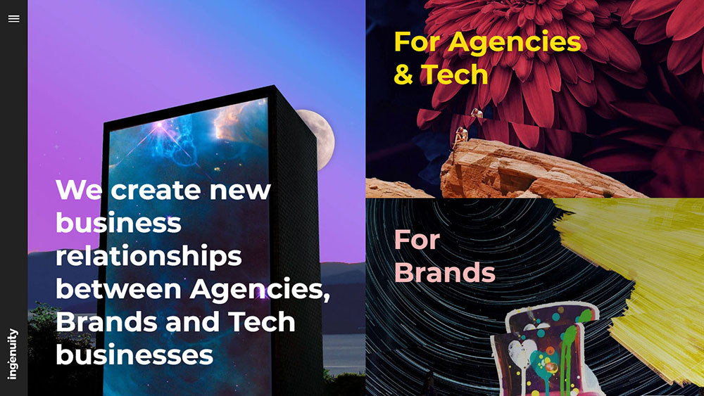
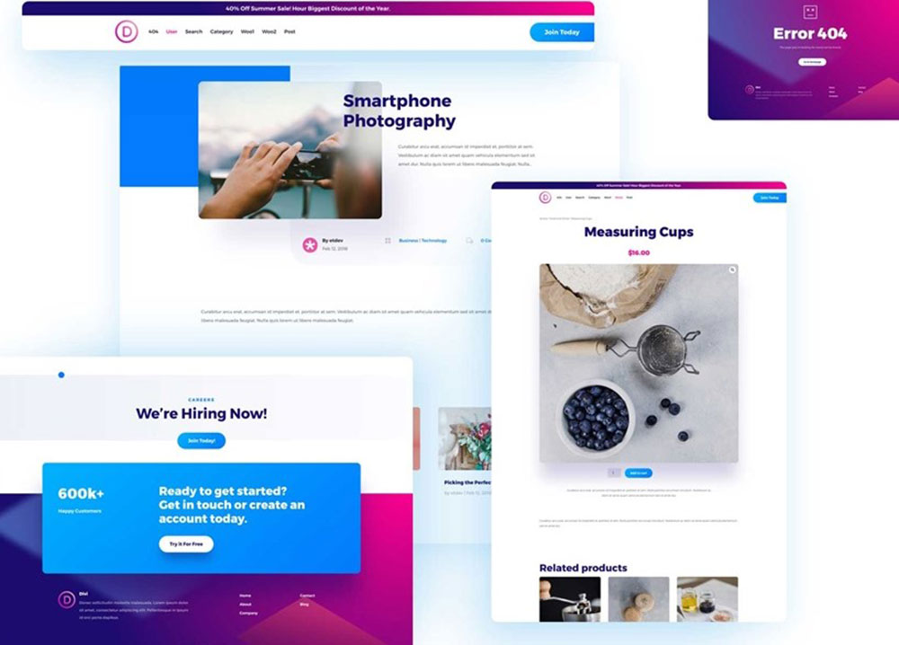
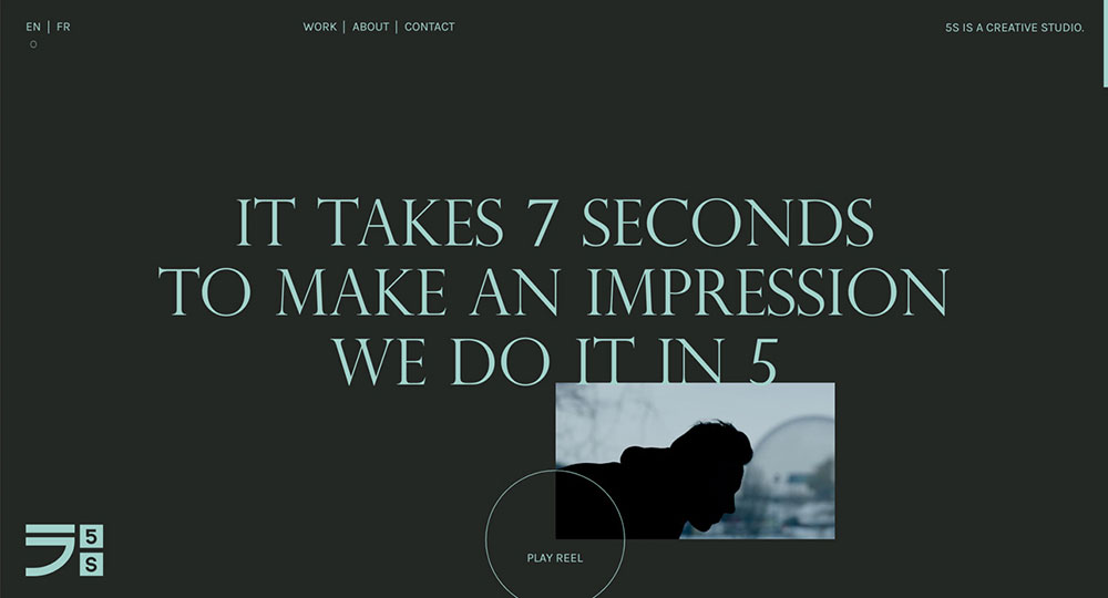
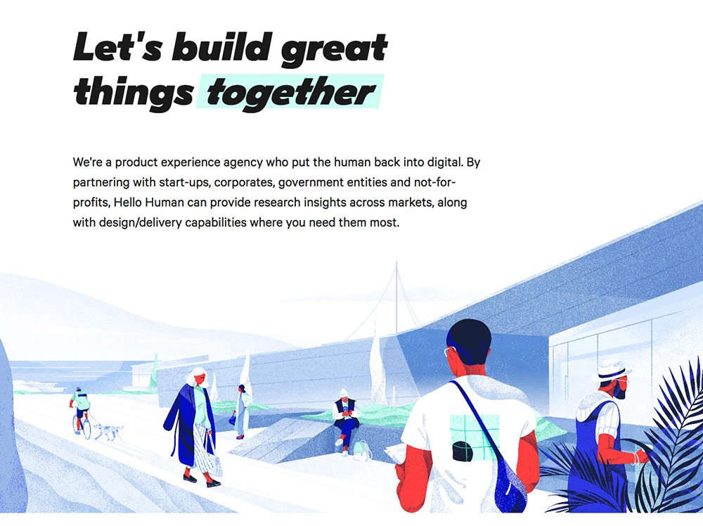
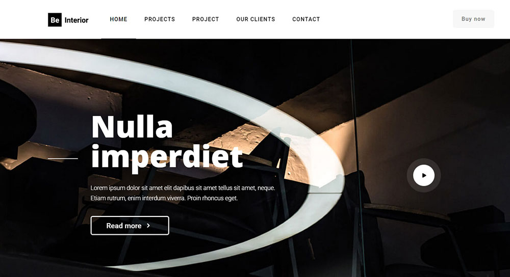
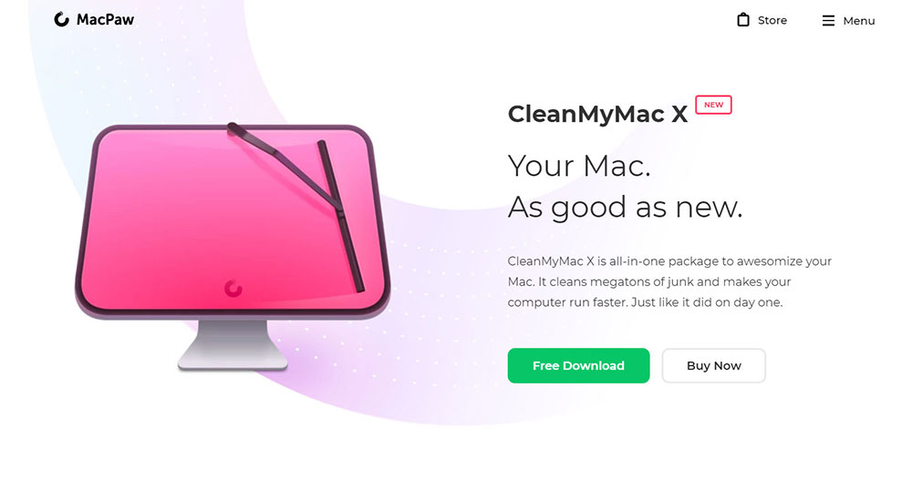
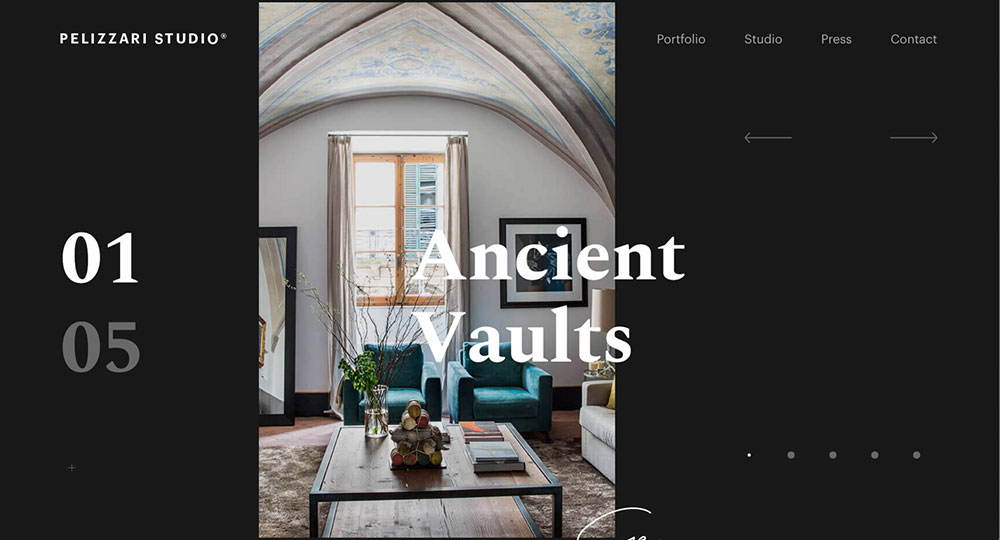
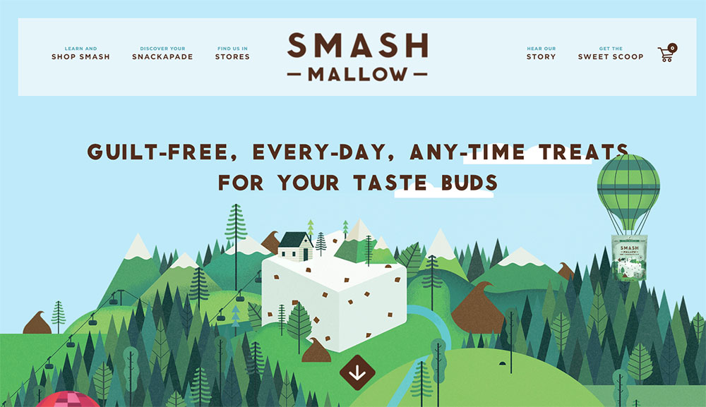
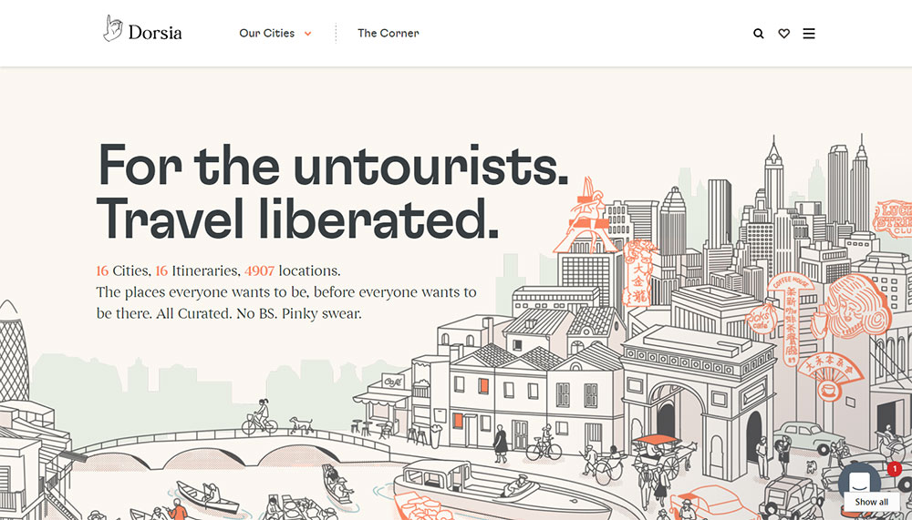
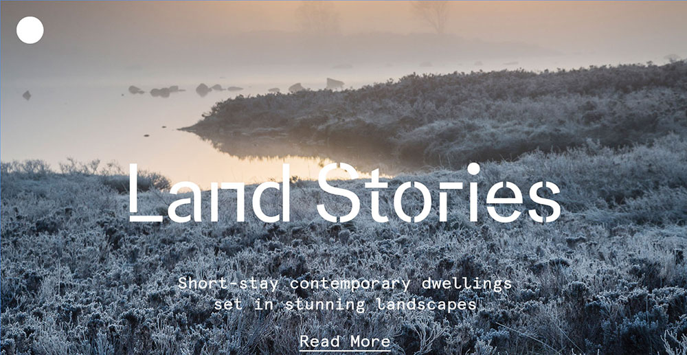
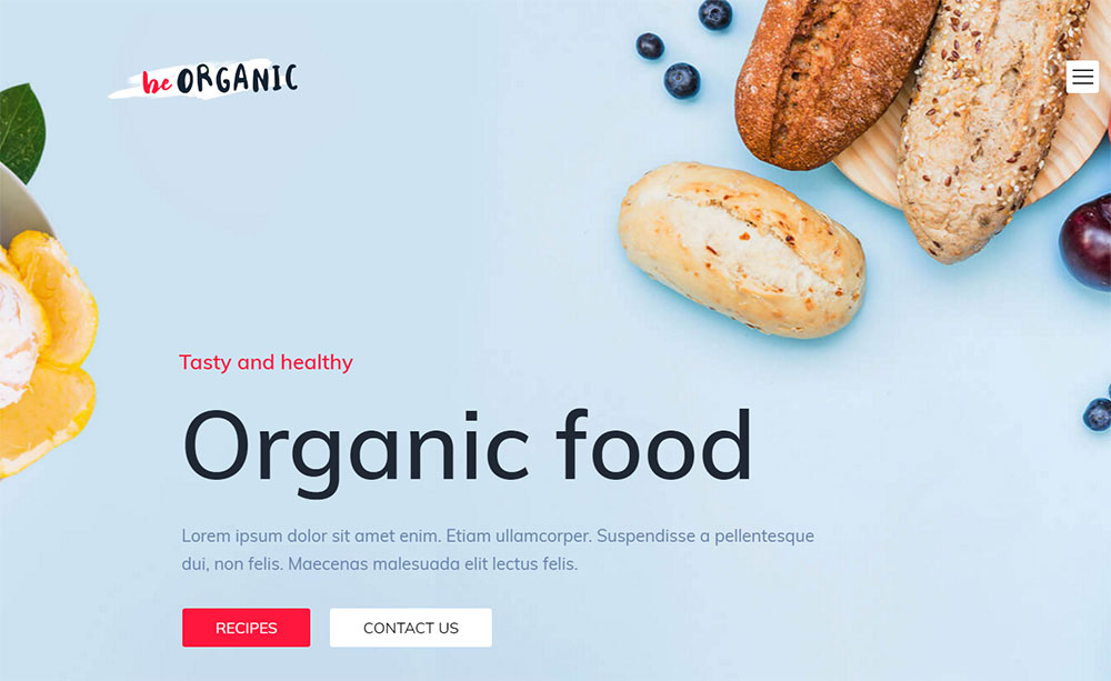
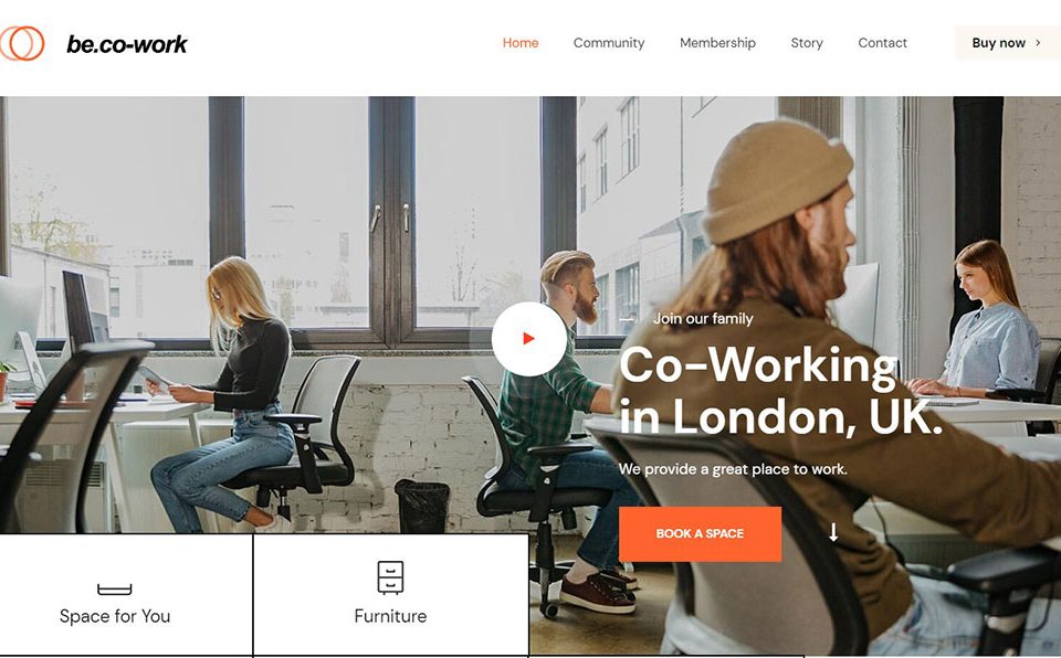
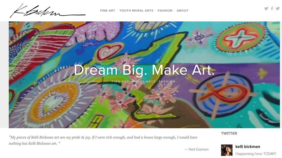
A beautiful website marries aesthetics with functionality. Vibrant color palettes, sophisticated typography, and visual hierarchy create immediate appeal. Yet, it goes beyond looks, considering user experience, intuitive navigation, and responsive design. It's a seamless blend of art and usability that captivates both the eye and mind.
Which elements are essential for modern interface designs?
Key elements in modern interfaces include minimalistic layouts, intuitive navigation, and interactive features. Visual storytelling plays a vital role, supported by clean design elements like white space and creative iconography. The focus remains on enhancing user experience and engagement without sacrificing visual allure and brand identity.
How do you find design inspiration?
Trends ignite creativity. I frequent design communities like Dribbble and Behance, watch digital aesthetics shift. Online portfolios reveal fresh ideas and global design principles. Stay curious. Boldly explore art, nature, or even bustling cityscapes. Inspiration lies in unexpected places, waiting to breathe life into your work.
Are there websites that specialize in showcasing design examples?
Absolutely, platforms like Awwwards and CSS Design Awards curate the crème de la crème of design. They spotlight cutting-edge techniques and innovative layouts, serving as a beacon of inspiration for designers seeking to learn from the best and stay ahead in a rapidly evolving creative landscape.
How does user experience impact website beauty?
User experience handles the soul of a website. Beautiful aesthetics mean little if usability falls short. Intuitive layouts, smooth navigation, and responsive design forge a connection with users. It’s where art meets utility, creating meaningful interactions that elevate perception and foster memorable brands.
Why is responsive design critical?
In an ever connecté world, responsive websites cater to all devices. A seamless transition between screens ensures every visitor, whether on mobile, tablet, or desktop, experiences the same beauty. Design consistency across platforms is paramount, reflecting commitment to quality and attention to user experience.
What tools do designers use for creating stunning websites?
Tools like Adobe XD, Sketch, and Figma are indispensable for crafting visual masterpieces. They empower designers to iterate with precision, foster collaboration, and breathe life into concepts. These platforms facilitate the realization of innovative designs that dazzle users while maintaining impeccable functionality.
How do award-winning designers approach web design?
Award-winning designers balance creativity and strategy. They align design with brand identity, employ visual hierarchy to convey messages effectively, and prioritize user-centered solutions. Mastery comes from continual learning, keeping abreast of trends, and infusing originality to produce captivating web experiences.
What role does typography play in web design?
Typography channels the voice of design. It augments visual storytelling, guides the reader’s eye, and establishes brand personality. Thoughtful typography choices—whether bold, elegant, or minimalist—contribute to the aesthetic appeal and readability, ensuring content resonates and the design remains unforgettable.
How can one keep a website design timeless yet modern?
Timeless design doesn't chase trends; it embraces elegance and simplicity. Use classic color schemes, versatile layouts, and subtle interactivity. A beautiful website remains modern by integrating new technologies and adhering to evolving best practices, ensuring it’s as relevant tomorrow as today.
Conclusion
In concluding our article about beautiful website design examples, it becomes clear that artistry is only half the battle. The real magic lies in transforming creativity into user-centric experiences. As we’ve seen, integrating key elements like modern interface designs, intuitive navigation, and seamless responsiveness can elevate a site beyond mere visual appeal.
Web design doesn’t just happen—it’s crafted through a careful balance of aesthetics and functionality, where each pixel and line of code plays its part. Recognizing the role of tools like Adobe XD and being inspired by platforms like Awwwards can keep creativity boundless.
Remember, the purpose is not just to look stunning but to engage and connect. By prioritizing user experience and weaving compelling stories through design, you enrich the digital landscape with unforgettable interactions. As the canvas evolves, so must our designs, ensuring they remain as vibrant and effective tomorrow as they are today.
Professionals web designers tend to have a few tricks up their sleeve. You can tell the difference between good and greatweb design training by looking at things such as insider knowledge, concealed hacks, and workflows that haven’t been won easily.
If you’re wanting to learn the secrets of how to design your website to get what you want from your users, look no further. This comprehensive guide will teach you about effective color use, page layout, ideal navigation form etc. We aim to provide you with everything necessary to create beautiful websites that will help your organization bloom.


