

Efficient mega menu examples you should use as inspiration
July 11, 2024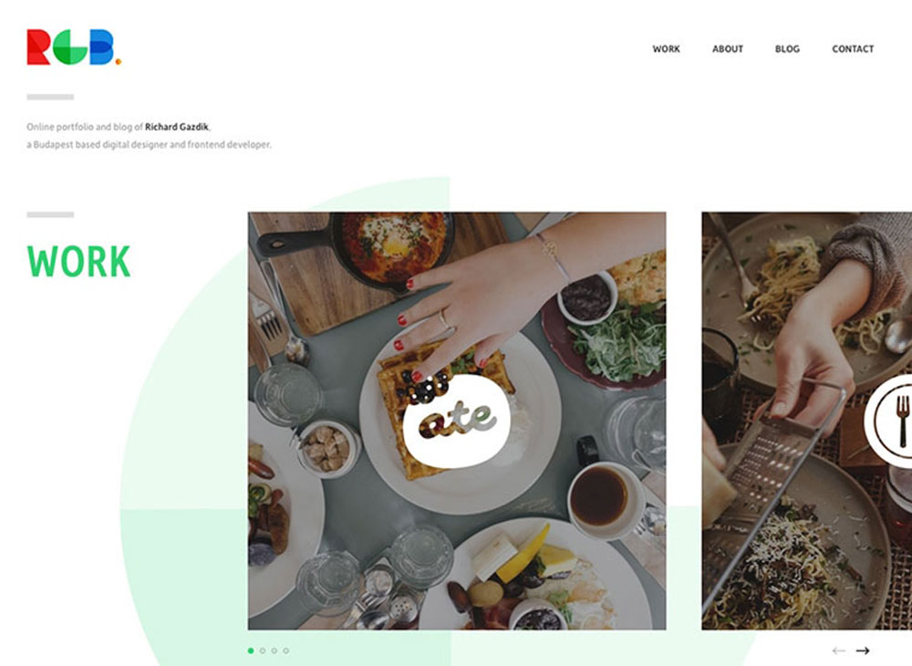
A showcase of great blog design examples to inspire you
July 12, 2024A landing page serves as the digital storefront of your online presence, demanding both creativity and strategy to captivate your audience. Imagine a world where conversion rate optimization meets graphic design precision. That's the power of a well-crafted landing page. In today's hyper-competitive landscape, A/B testing and strategic CTA button placement can be game-changers, propelling your business ahead.
In this article, you'll discover an array of landing page design examples that demonstrate the intricate art of balancing aesthetic appeal and user experience (UX) design principles. These examples are not merely about aesthetics; they’re about driving lead generation through compelling visuals and seamless website navigation.
By the end, you'll learn how elements like typography choices, minimalistic design, and leveraging tools like Google Analytics and Unbounce can transform your landing page into a conversion powerhouse. Whether you're a seasoned designer or just starting, get ready to elevate your design game.
Keep Things Simple
A good landing page design is minimalist and also attractive, citing information without being intrusive. Nobody is interested in going through numerous paragraphs just to work out if an offer is suitable for them.
Keep it short, and keep it simple. Gear visitors towards your main selling points with numbered points and bullet points, making your services or products easily understandable.
Your design should be clean and simple with a plethora of white space and void of unnecessary and distracting visual elements. This will ensure that visitors remain on your product and CTA.
Big fonts make your landing page easy to understand and read.
Write About the Benefits
It’s crucial for your value proposition to have clarity and conviction. You can use bullet points to list your benefits.
Don’t just list features in a cold and technical manner when describing your offer. This is something that almost everyone does and can replicate.
Alternatively, focus your copy on the benefits that your features lead to. People often end up on landing pages because they’re trying to solve a problem of theirs. Your benefits should be presented as solutions to people’s pain points.
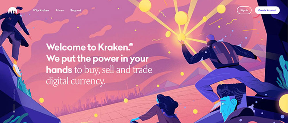
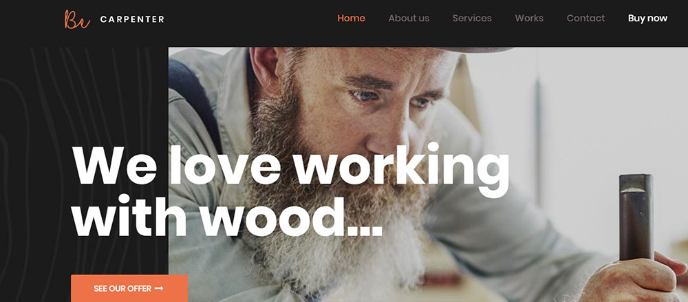
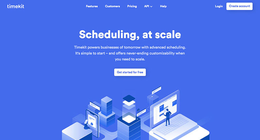
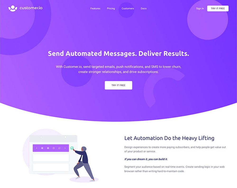
BeCarpenter
The best way to promote your offer’s value is by using the headline and subheadings of your landing page.
Good landing pages use their headline to confirm their offer, which is then further explained in the sub-heading, where they can also share their value proposition.
For example: Free Twitter Marketing Ebook. Get more Twitter followers – fast!"
Some landing page examples include featuring the value proposition in the headline and discussing the offer or software itself in the sub-heading.
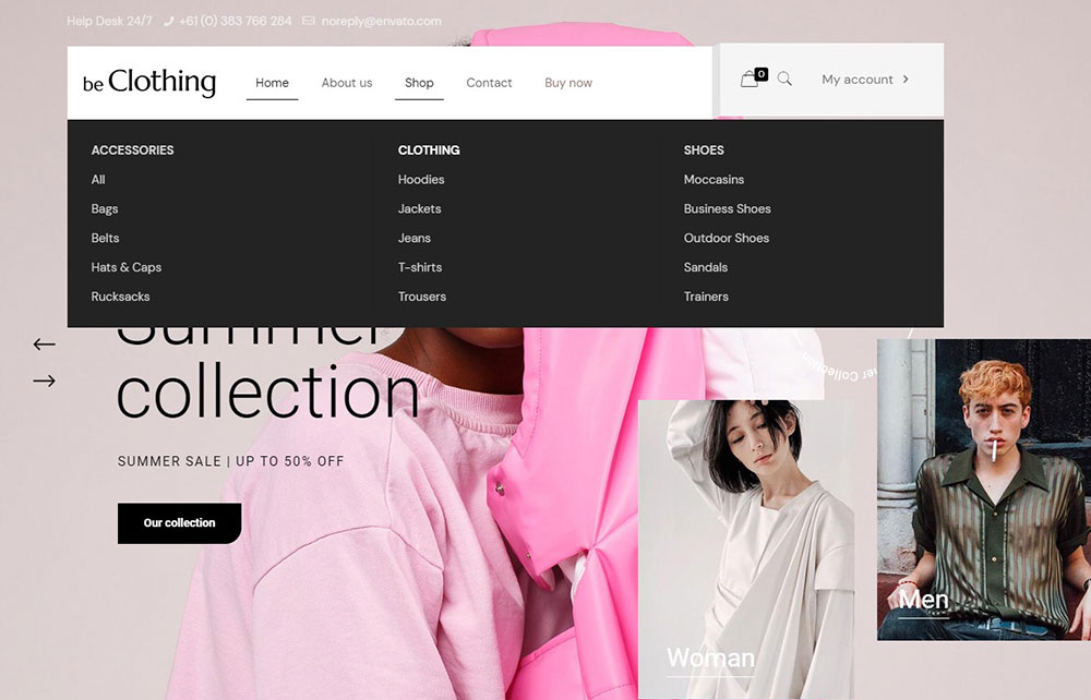
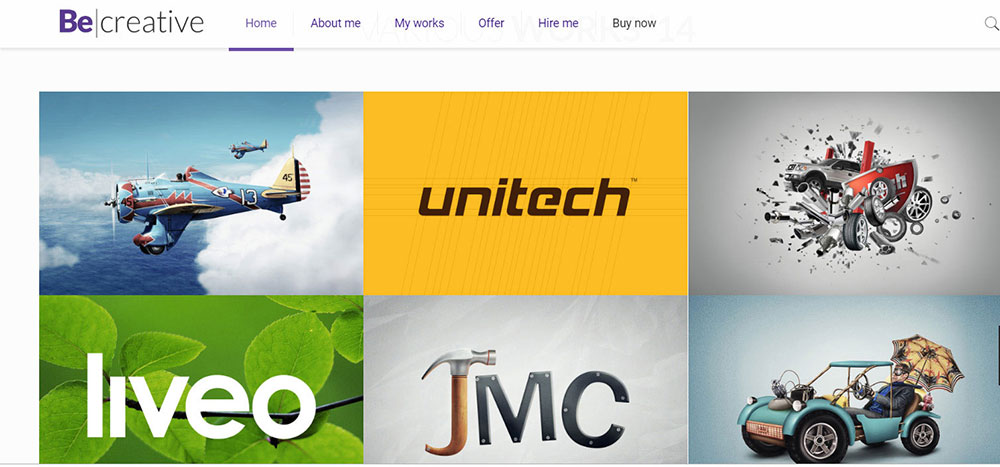
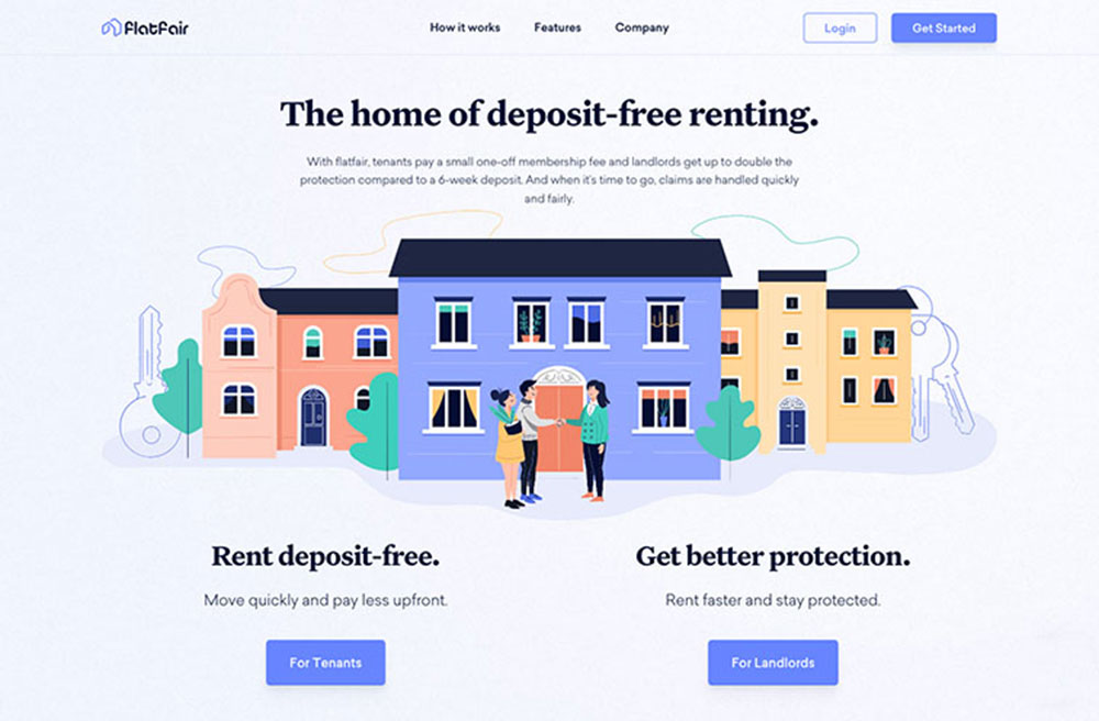
BeCreative
Determine which keywords potential users search for. Make the conversion button stand out and either place it right underneath the CTA or have the CTA act as the button.
However, this button should be positioned above the fold and should be bright and big. You can also use a QR code instead of a button. QR codes are safe and can be easily generated using a QR code generator.
Your CTA Button Text to Define the Action to Take
It’s essential when designing your CTA button that the text actually describes what will be achieved by clicking that button.
Your button shouldn’t just read “submit” as that doesn’t fully clarify what exactly will happen if someone clicks that button.
One Hubspot study studied more than 40,000 landing pages that have “submit” written on their CTA button, and they discovered that the conversion rates of these pages were significantly lower than those with some other CTA button text.
Some good CTA button text examples include:
- Start My Free Trial Now
- Get My Ebook
- Download My Copy Now
You’ll boost your conversion rates if you make your button copy and clear and specific as possible.
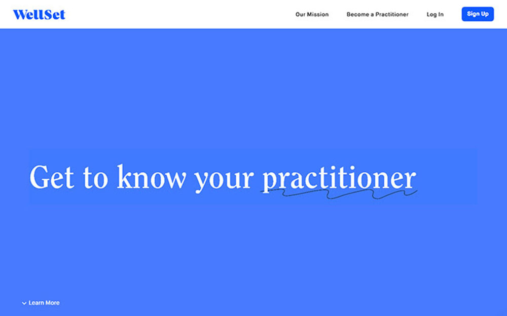
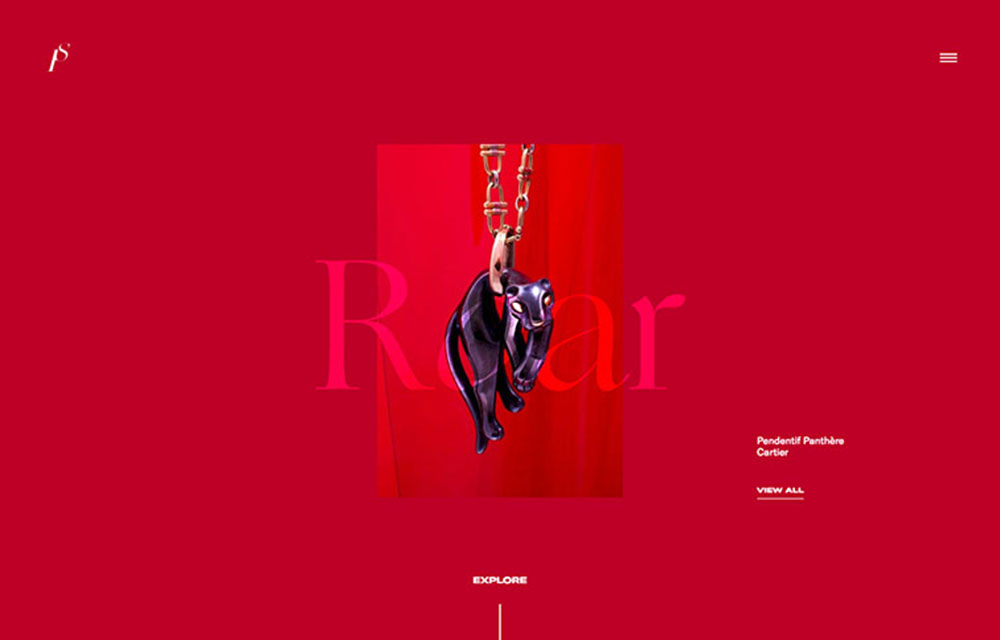
BePhoto

If you didn’t have something to offer, you wouldn’t create a landing page, and that something is either a service or product you’re selling or your lead magnet.
Lead magnets are fantastic for giving something of value to those not yet willing to commit to a purchase, to ensure that they remain interested in your organization. The term lead magnets comes from the fact that they assist you in generating leads online by asking for an email address in exchange for an “ethical bribe” in exchange for an email address.
Maintain message match
Get personal with your visitors whenever possible. Adjust your messaging to reflect those coming from certain states or countries. You can also ask previous visitors that have already converted questions that you didn’t ask them the last time.
Personalize your landing page whenever possible to reflect your visitors’ demographics, geolocation, history etc., which will considerably boost your conversion rate.
Trust Signals
Is this offer positively described by people? Are the conversion rates higher than you could have ever imagined?
Good landing pages will use trust signals in large quantities, invoking the trust of visitors in their offer and organization.
Trust signals come in numerous forms – one of the most common forms being testimonials. Social proof is an effective way to demonstrate that all of your claims are true.
In fact, a study by Nielsen found, 92% of people trust peer recommendations, whereas 70% of people trust recommendations from unknown people. Therefore, don’t scoff at its influence!
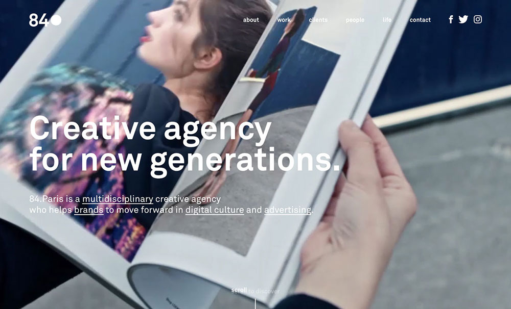
BeAdagency

- Customer Testimonials
- Social Sharing Stats
- Customer Logos
- Product Reviews and Star Ratings from Users
- Awards
- Industry Influencer Endorsements
- Customer Pictures / Videos (of real users using your product)
- Customer Success Stories / Case Studies
- Partnerships
- Trust Badges
Use of People on Landing Pages
In addition to the numerous psychological aspects which help optimize a landing page, the use of people and friendly faces is proven to boost landing page conversion.
Images of real, everyday people are better than stock images or images of objects for generating more personal connections and invoking empathy in visitors. Since decisions are usually made and a subconscious and emotional level, it’s ideal to use images to create personal connections.
You can use images of people to guide visitors directly towards your offer. It’s well-known that most people will follow someone else’s eye-line to their point of focus. If the person featured in your image is looking towards your offer, so will your visitors!
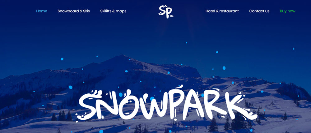
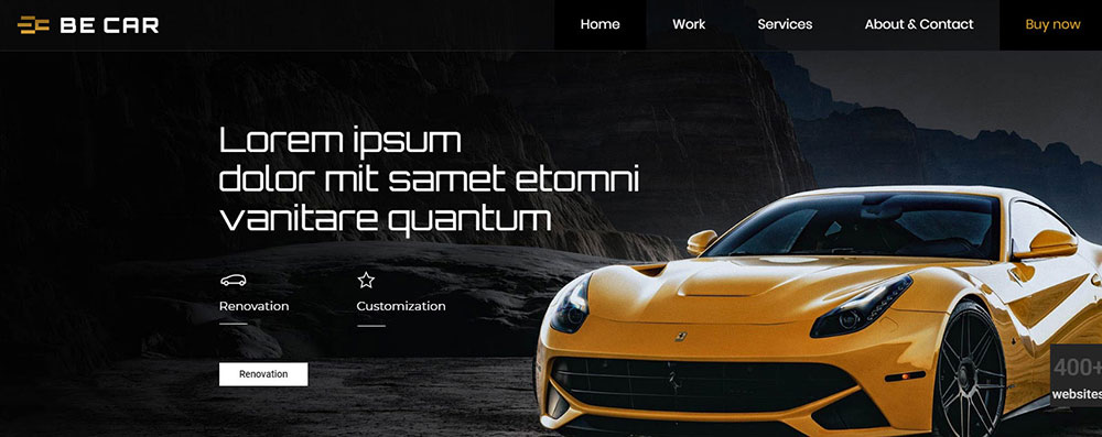
BeCar
A/B testing is necessary for analyzing how users interact with your landing page, thus clarifying whether the landing page drives conversions.
The object of your tests depends on where your traffic comes from and what your end goals are, which can be configured in your testing tool. Some testing examples include how often visitors watched a video, sent the lead form, or clicked a button.
You can also discover how users arrived on your landing page and which device they used. Also, you can see how users landed on your page and what type of device they were using. Google Analytics can aid you in creating landing pages that convert.
A/B testing can be performed on the following:
- Headings
- CTAs
- Images and graphics
- Buttons (look, text, and location)
- Trust signals
- Press quotes
- Placement of page elements (blocks)
- Navigation links
BeRenovate

As already mentioned, a good landing page will focus on one single offer; one single action desired from the visitor. If something doesn’t point to this action, get rid of it. This includes outbound and navigation links.
If your landing page contains links (regardless of whether they’re to your own website or external sources), your visitors will be distracted and are more likely to leave before converting. This isn’t a risk worth taking.
Keep Your Forms Short
Good landing page examples stick to the rule that less is more. The fewer forms that users have to fill out, the better. If your form contains way too many fields, visitors are less likely to complete the form and convert. If a form is necessary for conversion, only ask what you absolutely need to know. If you want to ask anything extra, leave that for the thank you page.
While users usually don’t mind giving out their names and email addresses, asking for their date of birth or phone number can lead to yourdrop off rate to skyrocket to 50%.Be careful with those form fields!
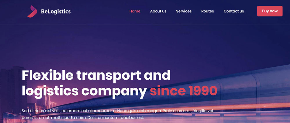
BeLogistics
According to studies, Adding video to your landing page can increase conversions by over 80% and pages with video are 53 times more likely to rank on the first page of Google search results.
When adding videos to landing pages, consider the following practices:
- Videos must be above the fold
- Select the best thumbnail to represent the video and target audience
- Autoplay should be switched off
- Feature a CTA at the end of the video
- Pinpoint the conversion objective by adding directional cues
- Keep things short
Stick to mobile-first principles
Due to the fact that more than half of all web activity comes from mobile, mobile-first strategies are being implemented by organizations in order to have landing pages that convert.High converting landing pages usually have a responsive design. Effective landing pages load quickly on smartphones, look great, and are ultra-clickable.
Have The Right Amount Of Landing Pages
One of the worst landing page examples is not having enough landing pages. Each service offered, each major product sold, should feature its own landing page. The same applies to all sales of promotion held. A lack of landing pages leaves your messages too vague for them to target specific interests, which is a key part of high conversion landing pages.
Even better, each service/product should have several landing pages, each one targeting a different selling point or audience. For example, smaller organizations require different things from accounting services than larger organization.
Similarly, certain genres and titles will appeal to some gaming fans, but won’t appeal to others. Instead of using generic messaging to promote a gaming console, you’ll have more success if your target particular gamer interests.
Putting Everything Together
By now you should understand clearly what a landing page is and know of some good landing page examples for your organization.
Your next question might be how to design a landing page?
It’s actually not that difficult to design landing pages.
- Just make your call-to-action clear and immediately visible as soon as visitors land on your page
- Have a simple and distraction-free design (No sidebars, menus etc.)
- Have a concise and clear copy that gets to the point
- Request as little information as necessary, making the process of signing up quick and simple
FAQ on landing page design
What is the purpose of a landing page?
A landing page is designed to convert visitors into leads or customers by guiding them toward a specific action. It leverages conversion rate optimization, utilizing elements like call-to-action (CTA) buttons, engaging graphics, and focused content strategy to captivate users and drive measurable business outcomes, such as improved lead generation and click-through rate (CTR).
How do I create an effective landing page?
Creating an effective landing page requires thoughtful design, strategic use of typography, compelling visual storytelling, and optimized form placement. Employ tools like Unbounce or Leadpages, and integrate data from Google Analytics to fine-tune and refine your approach, ensuring both aesthetic appeal and functional utility are harmonized for maximum impact.
What are key elements of landing page design?
Key elements include UI design, responsive design, strategic CTA button placement, visual hierarchy, and trust indicators that build credibility. It's essential to incorporate page consistency and use header and footer design to enhance user experience (UX) and maintain a cohesive look while guiding visitors smoothly toward conversion goals.
How can landing pages improve conversion rates?
By implementing A/B testing, utilizing heatmaps, and ensuring mobile-first, responsive design, landing pages can significantly boost conversion rates. Effective landing page builders help create visually appealing layouts with clear navigation and structured content, prompting action, enhancing engagement, and converting visitors into loyal customers more effectively.
What's the difference between a landing page and a homepage?
Where a homepage serves as an overview and gateway to a company’s online presence, a landing page is hyper-focused on a singular objective, often tied to specific marketing campaigns. It emphasizes minimalistic design, streamlined content, and strategic form placement to guide a visitor towards completing a target action with laser-sharp clarity.
How important is it to have a responsive design for landing pages?
Responsive design is crucial as it ensures optimal user experience across all devices, including smartphones and tablets. This approach enhances website aesthetics and engagement, reducing bounce rates. By prioritizing mobile-first design, landing pages maintain usability and visual appeal, which is critical for attracting a diverse and widespread audience.
Should I use a landing page builder?
Using landing page builders like Instapage or ClickFunnels streamlines the creation process, offering customizable templates, integrations, and tools like mailchimp for a seamless and efficient setup. These platforms simplify design, implement sophisticated features, and optimize user journeys, ensuring a polished, conversion-ready landing page without the need for extensive coding knowledge.
How do I measure the success of a landing page?
Measure success through website analytics, focusing on metrics like conversion rates, CTR, and user engagement. Use tools like Google Analytics, Hotjar, or Crazy Egg to assess scroll depth, identify improvement areas, and refine page elements. Iterative changes based on insights will drive continual enhancements and sustained success.
What are some best practices for landing page design?
Best practices involve clear CTAs, optimized image placement, typography choices enhancing readability, and strategic trust indicators. Incorporate SEO best practices, like targeted keywords, while maintaining a minimalistic design. Ensure integration with SEO entities and engagement tracking through tools like SEMrush for cohesive and high-performing landing pages.
How do landing pages fit into a marketing strategy?
Landing pages are integral to a digital marketing strategy, acting as targeted destinations for campaigns that drive specific conversions. Utilizing platforms like Google Ads, these pages enhance the effectiveness of lead generation strategies, coupling content strategy with actionable insights to refine approach continually, fostering stronger customer connections and growth.
Conclusion
In exploring these landing page design examples, the fabric of successful web design unfolds itself in the intersection of aesthetic appeal and functional brilliance.
Each example is a testament to the impactful synergy between user experience (UX) design principles and strategic conversion rate optimization. This journey through typography, minimalistic design, and precise CTA placement reveals a dynamic tapestry where visual hierarchy reigns supreme.
Integrating insights from tools like Google Analytics, coupled with platforms such as Unbounce and Instapage, fortifies your approach, ensuring every element speaks directly to your audience's needs. Embrace A/B testing and responsive design to refine and resonate, fueling lead generation and boosting engagement metrics.
May these insights guide your creative endeavors and inspire a transformation in how landing pages are crafted, driving tangible results and defining the path to measurable success in the digital realm.
A website landing page aims to create leads and turn them into subscribers and users, often linking them with social media campaigns and email. You can also use an email marketing platform that uses email to promote your business's products and services.
This process is usually achieved with the help of lead generation forms and call-to-action buttons.
The best landing pages that incorporate the name of factoHR, HubSpot, and many others are utilized for tasks aimed towards sales and conversion, for example:
- Promoting new products
- Increasing the number of subscribers
- Boosting leads and sales
- Using forms to capture leads and move them in the sales pipeline
Those looking to create great landing pages should ask themselves these questions:
- Where do my visitors come from? Landing pages for PPC visitors should differ from those for social media visitors etc. You should also put thought into the text used to direct visitors to your site from these sources, as when visitors land on your page, their expectations need to be met. You can also leverage a social media panel to drive more visitors to your page.
- What kinds of visitors does this traffic source attract? Are you familiar with their demographics depending on where they came from? Has the originating source familiarized them with your organization, or will your landing page expose them for the first time to your organization? You’ll be able to figure out what kind of content to include if you can figure out who’s visiting your page and what they know about you.
- What actions do I want from these visitors? Whether you wish for visitors arriving on your landing page to download free reports, subscribe to your email list, buy your products etc., you need to understand what action you expect from your visitors. Your landing page should be built around that action, with any possible distractions eliminated.


