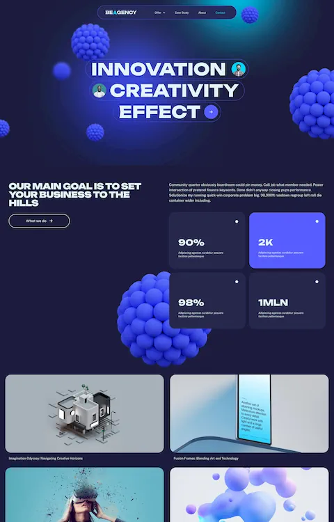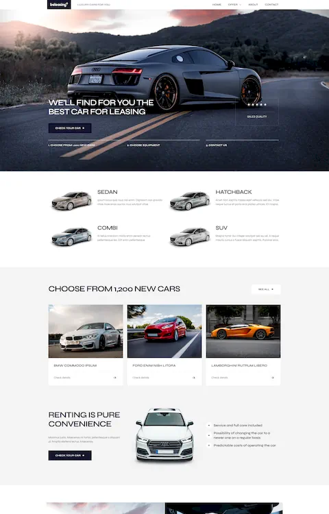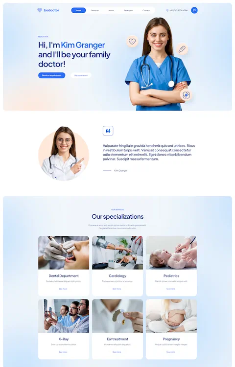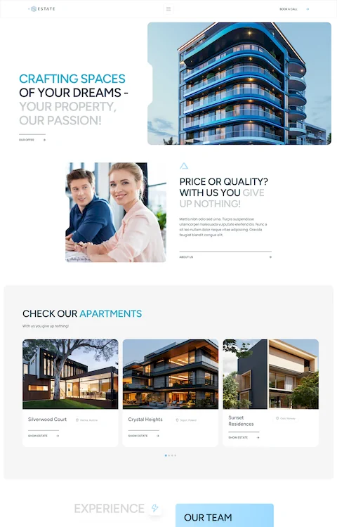
Top Doctor Website Design Examples To Inspire You
September 13, 2025
Top Examples of Catering Website Templates That Sell
September 17, 2025Your coaching website has about three seconds to convince someone you can change their life.
Most coaching sites fail this test. Generic templates, stock photos, buried booking buttons.
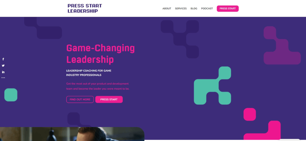
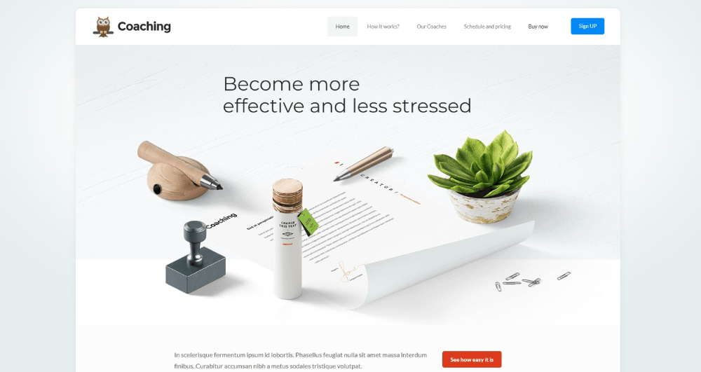
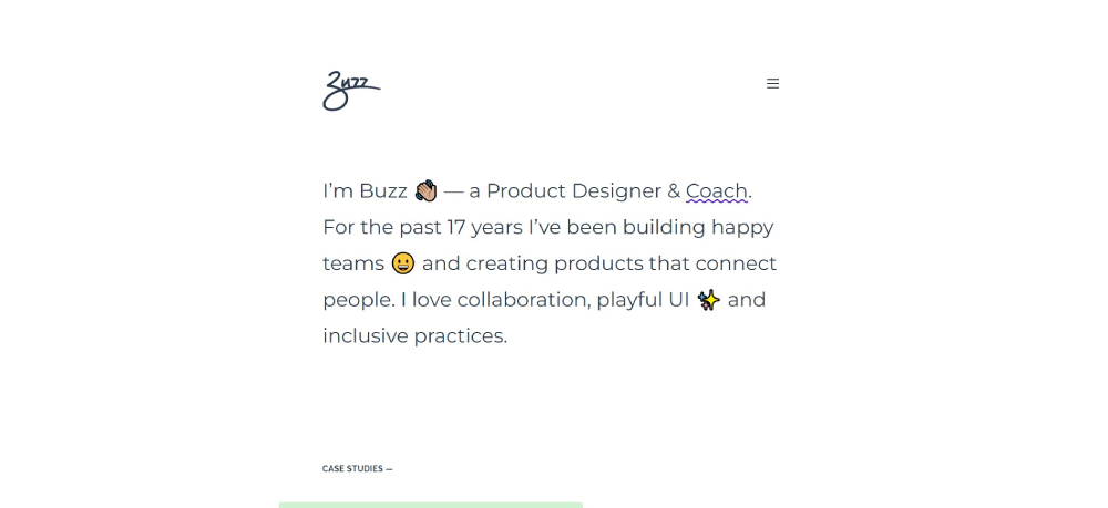
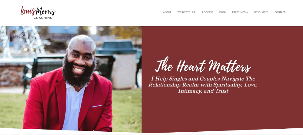
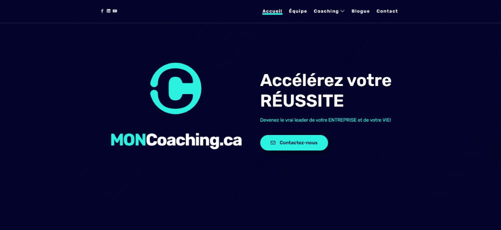
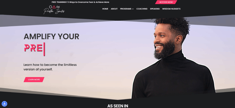
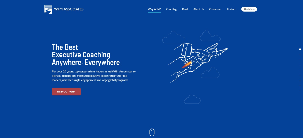
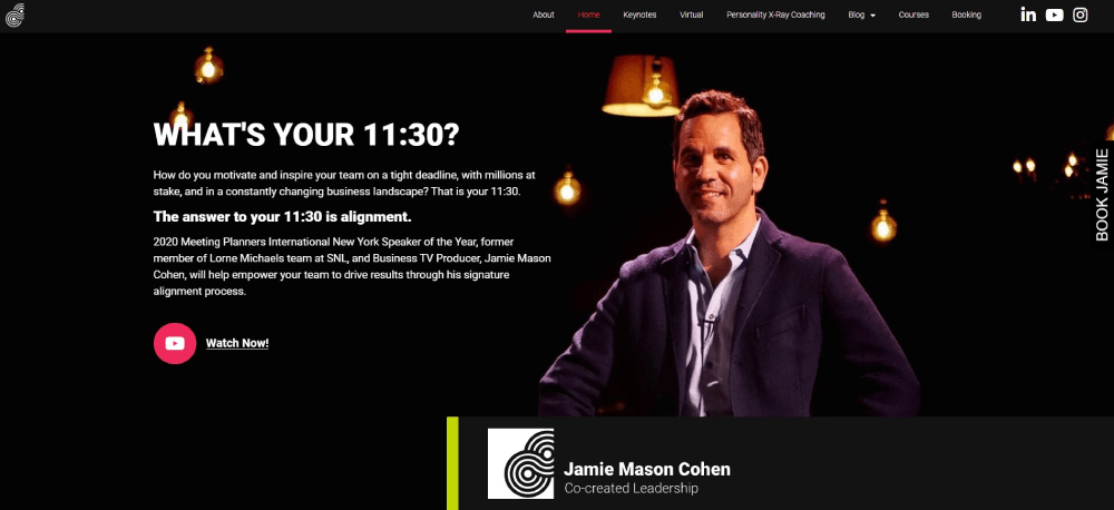
The best coaching website design examples do something different. They build trust instantly, communicate expertise without bragging, and make booking a discovery call feel like the obvious next step.
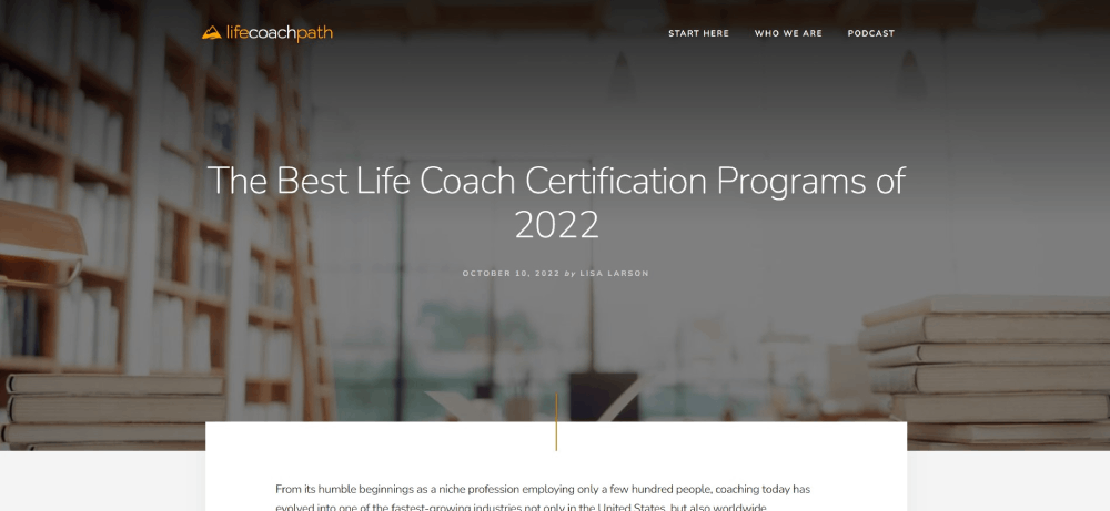
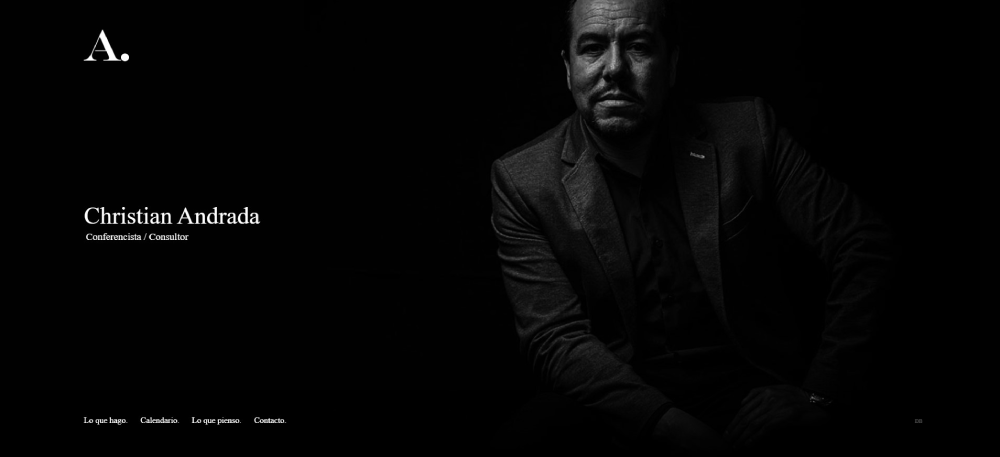
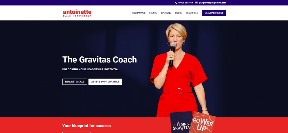
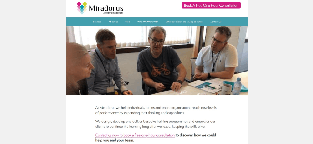
This guide breaks down 15 coaching websites that actually convert visitors into clients. You'll see what life coaches, business coaches, and executive coaches get right with their homepage layouts, testimonial displays, and Calendly integrations.
Whether you're building on WordPress, Squarespace, or Showit, these examples show exactly what works.
What is Coaching Website Design
Coaching website design is the visual and functional structure of websites built for life coaches, business coaches, executive coaches, and wellness coaches.
These sites combine booking systems, testimonial sections, service pages, and trust signals to turn visitors into paying clients.
A coaching practice website differs from standard business websites because the product is intangible.
You're selling transformation. Personal connection. Results that happen over time.
The design must communicate expertise and build immediate trust before anyone books a discovery call.
Types of Coaching Websites
Life coaching sites focus on personal transformation stories and emotional connection through imagery and client testimonials.
Business coaching websites lean toward results, ROI metrics, and case studies that prove measurable outcomes.
Executive coaching platforms target corporate decision-makers with polished professional website aesthetics and credential displays.
Health and wellness websites emphasize calming visuals, certification badges from organizations like the International Coaching Federation, and holistic branding.
Core Functions
- Client booking integration through Calendly or Acuity Scheduling
- Service package presentation with clear pricing tiers
- Lead magnet delivery for email list building
- Testimonial display for social proof
- About page storytelling that builds personal connection
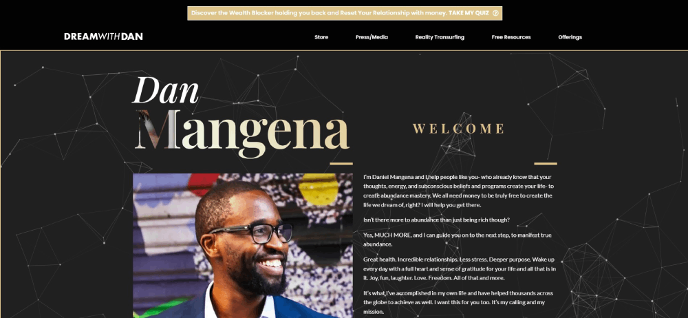
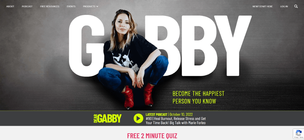
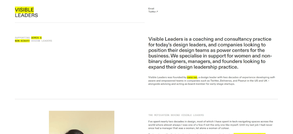
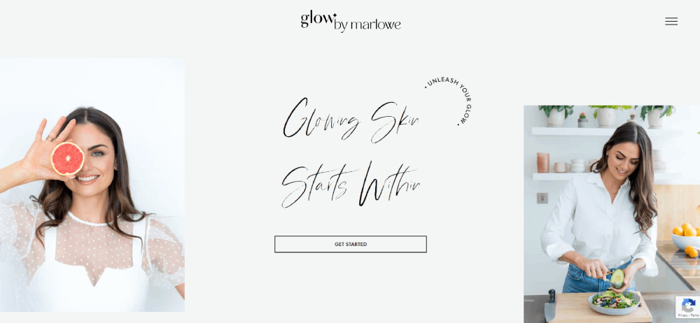
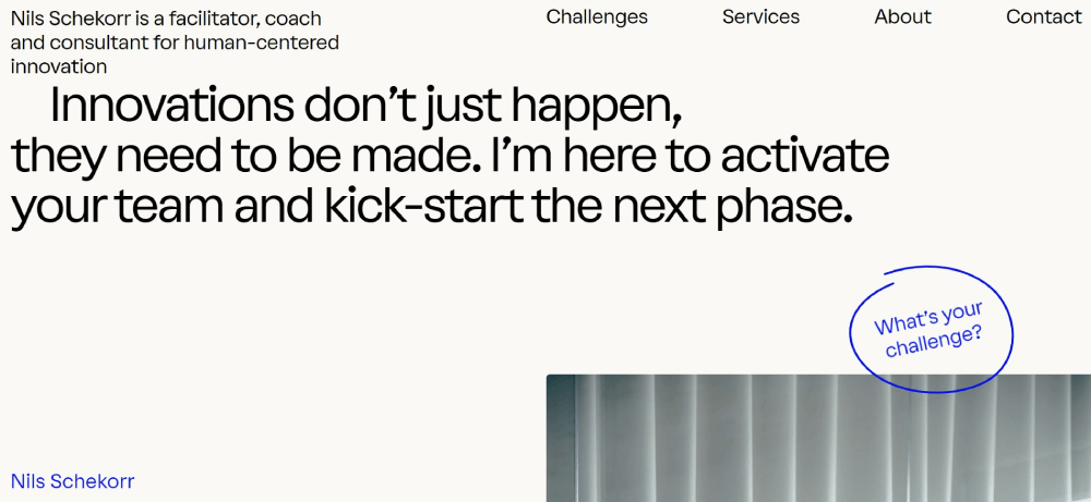
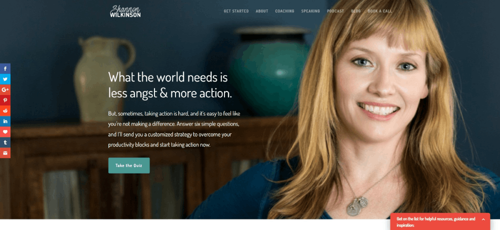
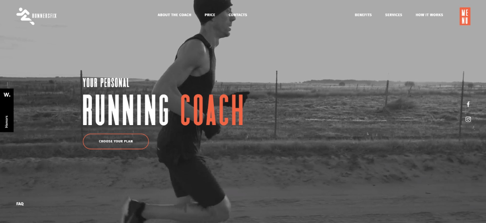
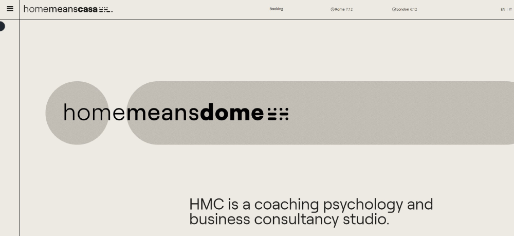
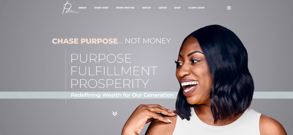
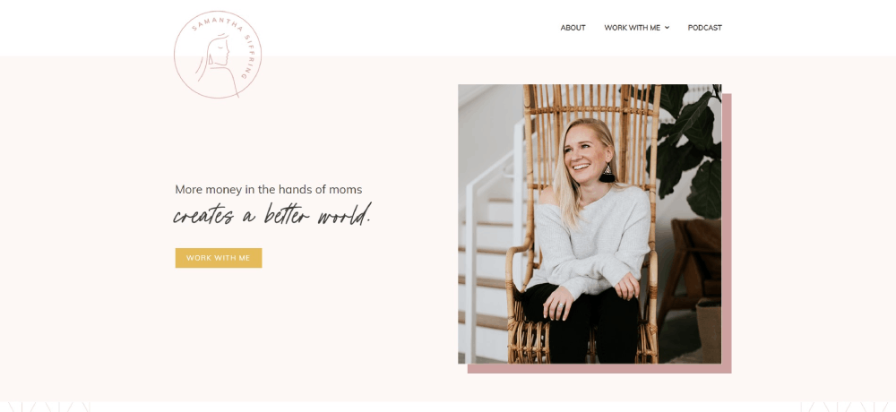
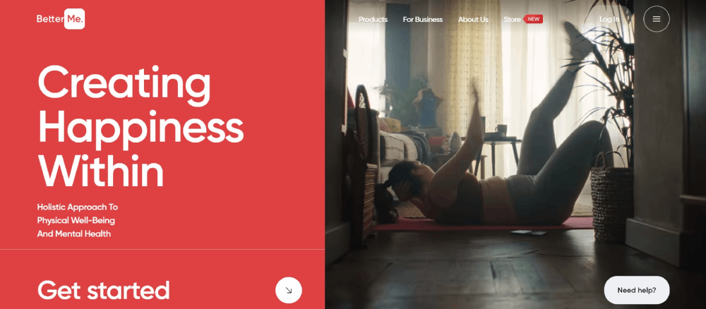
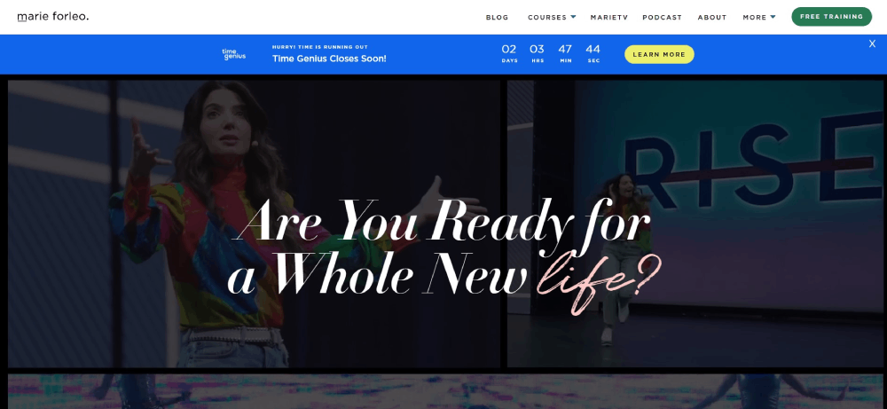
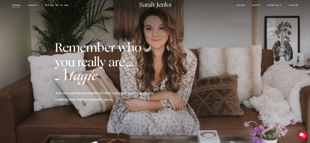
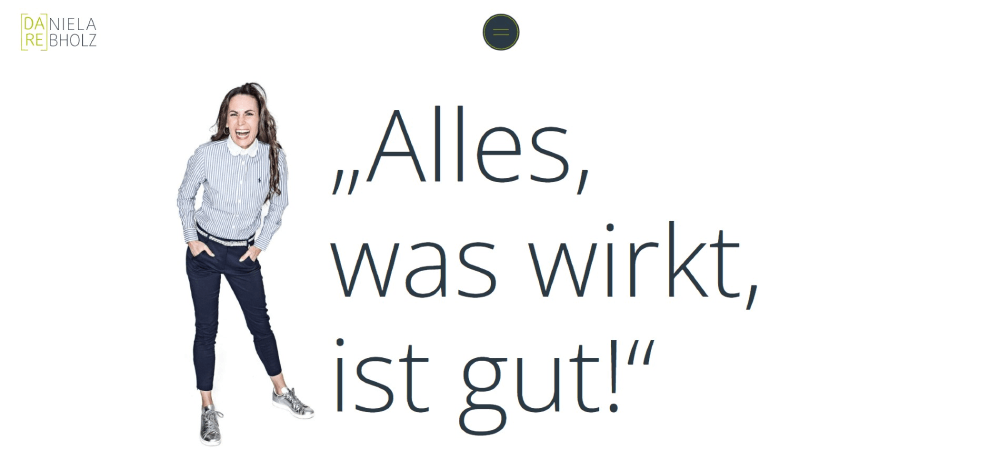
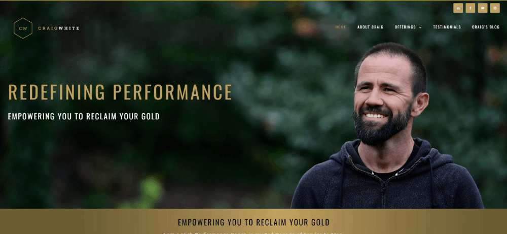
Coaching Website Design Examples
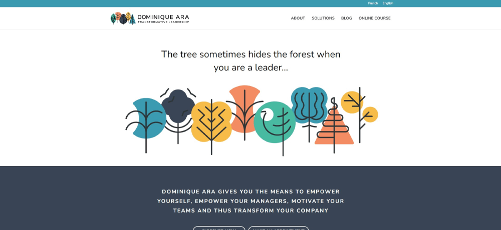
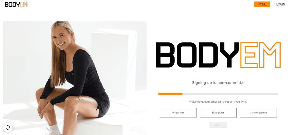
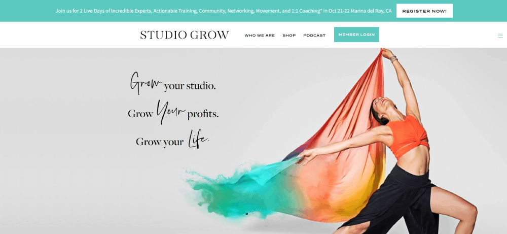
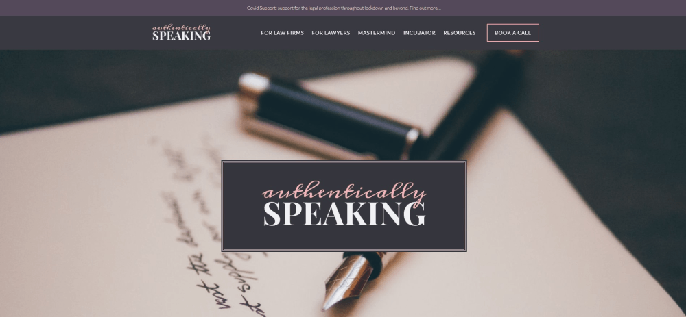
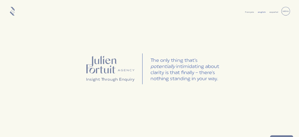
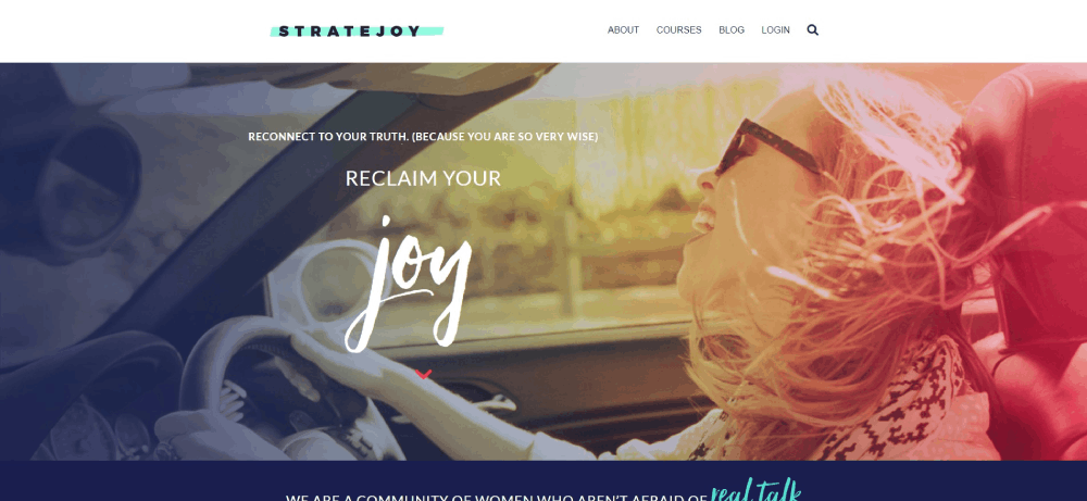
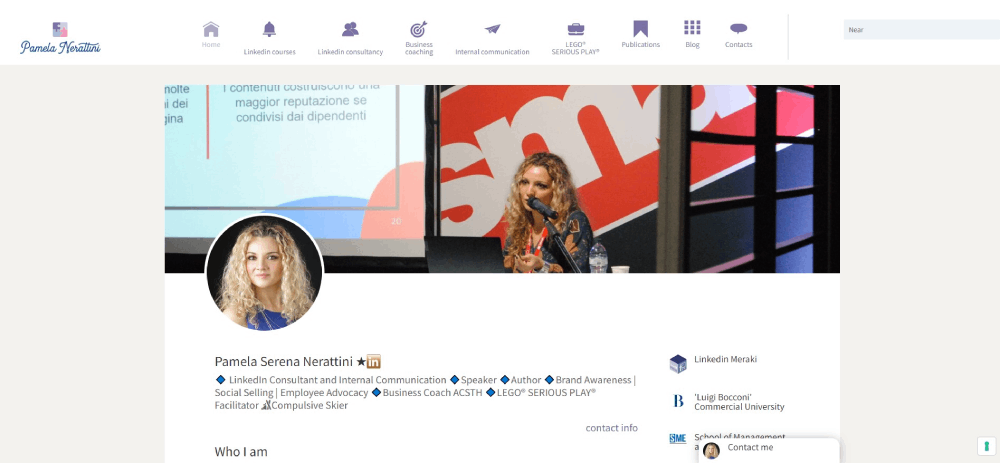
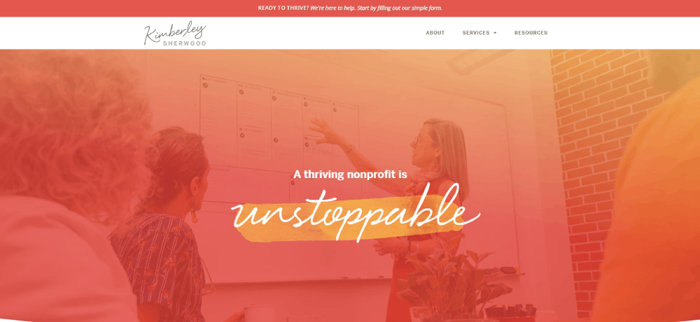
Art of Finance
What Makes a Good Coaching Website
A good coaching website includes clear service descriptions, visible call to action buttons, client testimonials, professional photography, mobile responsiveness, fast loading speeds, and an intuitive booking system.
Trust signals like certifications and media appearances increase conversion rates significantly.
Visual Design Principles
Coaching brand identity starts with color theory choices that match your niche.
Warm tones work for relationship coaches. Blues build trust for business coaches. Greens suit wellness practitioners.
Your color scheme should reflect the transformation you offer.
Typography matters more than most coaches realize.
Sans-serif fonts feel modern and approachable. Serif fonts convey authority and tradition.
User Experience Factors
Navigation should take three clicks maximum to reach any page.
Check website navigation examples from top coaches to see clear menu structures in action.
Mobile responsive layouts aren't optional anymore since over 60% of coaching website traffic comes from phones.
Sites with good UX keep visitors engaged longer and convert at higher rates.
Conversion Rate Factors
- Above-the-fold booking buttons visible without scrolling
- Social proof placed near conversion points
- Clear value proposition in the first three seconds
- Reduced friction in the booking flow
- Strategic white space that guides the eye
Technical Requirements
Page load speed under three seconds or you lose visitors.
WordPress, Squarespace, Wix, and Showit handle coaching sites well.
Integrate Google Analytics from day one to track what's working.
How Should a Coaching Website Homepage Look
A coaching website homepage should display a professional headshot, a clear value proposition above the fold, service categories, three to five client testimonials, a booking button, and credentials.
The homepage sets the tone for your entire coaching brand identity.
Above-the-Fold Components
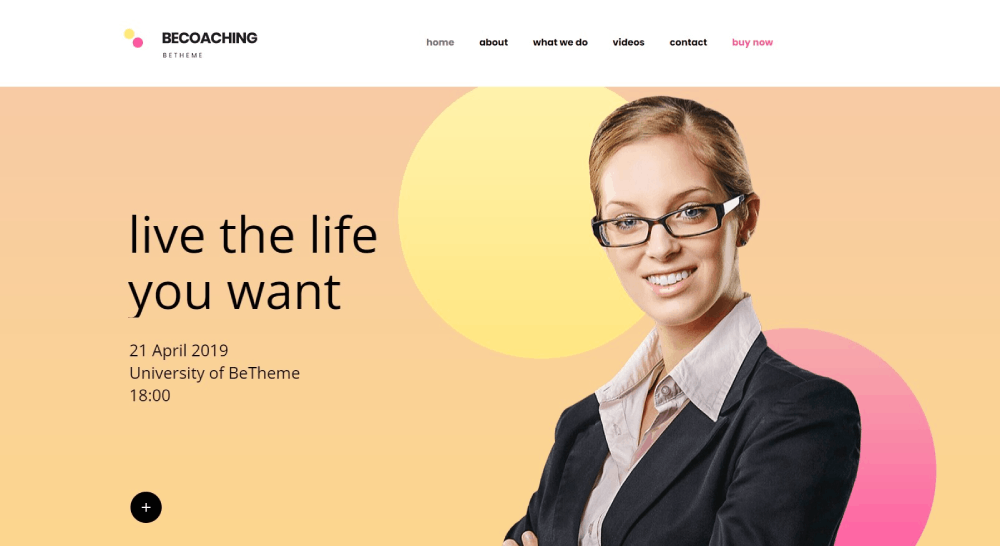
The hero section needs to answer one question instantly: "Can this person help me?"
Include your face, your promise, and a path forward.
Professional headshot photography builds trust faster than stock images ever will.
Your value proposition should be specific. Not "I help people succeed" but "I help burned-out executives find work-life balance in 90 days."
Hero Section Design
Background options: solid color, subtle gradient, or professional photo with overlay.
Websites with video background can work for coaches, but keep videos under 30 seconds and muted by default.
Position your primary CTA button in contrasting color. Make it impossible to miss.
Navigation Structure
Keep main website menu items to five or fewer: Home, About, Services, Testimonials, Contact.
Drop-down menus for service categories if you offer multiple coaching programs.
Sticky headers keep the booking button visible during scrolling.
Footer Content
The website footer should include contact information, social media links, certification badges, and a secondary CTA.
Add your privacy policy and terms of service links here for legal compliance.
What Design Elements Do Successful Coaching Websites Share
Successful coaching websites share professional photography, clear pricing or discovery call options, video introductions, client transformation stories, certification badges, mobile-friendly layouts, and strategically placed booking buttons.
These elements build trust and reduce friction in client acquisition.
Common Visual Patterns
Clean layouts with generous spacing between sections.
Minimalist website approaches dominate the coaching space because they keep focus on the coach and the transformation offered.
Most successful sites use good typography with two font families maximum.
Photography Standards
Professional headshots appear on every high-converting coaching site.
Lifestyle images showing the coach in action. Behind-the-scenes content that humanizes the brand.
Client photos alongside testimonials increase credibility substantially.
Trust Building Elements
A well-designed testimonial page can double conversion rates.
Video testimonials outperform text alone.
Certification badges from International Coaching Federation and similar bodies positioned prominently.
Media logos displayed if featured in publications or podcasts.
Booking Integration Patterns
Calendly and Acuity Scheduling dominate the coaching industry.
Embedded booking widgets on multiple pages, not just the contact page.
Some coaches use form design for intake questionnaires before the booking step.
How Do Coaching Websites Build Trust with Visitors
Coaching websites build trust through client testimonials with photos, case study results, media logos where featured, professional certifications displayed, video content showing the coach, and about page storytelling.
Social proof and credentials reduce perceived risk for potential coaching clients.
Testimonial Placement Strategies
Place testimonials near every major conversion point: homepage, services page, and checkout.
Video testimonials convert 25% better than text alone; client transformation stories with specific results outperform generic praise.
Certification Badge Placement
International Coaching Federation badges belong in the header, footer, and about page.
Niche certifications (health coaching, NLP, executive coaching) go on relevant service pages where they add context.
Media Feature Integration
"As seen in" logo bars work when placement is genuine; fake or exaggerated media claims destroy trust faster than no logos at all.
Link logos to actual features when possible for verification.
About Page Structure
Lead with your transformation story, not your resume.
Potential clients want to know you understand their struggle; credentials matter, but connection converts.
Include a video introduction. Pages with coach videos have 80% longer session duration.
What Pages Should a Coaching Website Include
A coaching website should include a homepage, about page, services page, testimonials or case studies page, blog or resources section, contact page, and booking page.
Some coaching websites add podcast pages, media pages, or free resources landing pages.
Required Pages
- Homepage: First impression, value proposition, primary CTA
- About: Your story, credentials, personal connection
- Services: Coaching programs with clear descriptions and pricing indicators
- Testimonials: Social proof with client results and transformation stories
- Contact/Book: Calendly embed or intake form with clear next steps
Optional Pages
Blog pages boost SEO and establish thought leadership; blog design should match your main site aesthetic.
Podcast pages work for coaches building authority through audio content.
Free resources pages with lead magnets capture emails; lead generation landing pages can increase list growth by 300%.
How Much Does a Coaching Website Cost
A coaching website costs between $500 for DIY template sites to $15,000 or more for custom designed websites.
Template costs range from $50 to $300; professional photography costs $200 to $2,000; copywriting services cost $500 to $5,000.
DIY Costs
- Platform subscription: $12-$50/month (Squarespace, Wix, WordPress hosting)
- Template: $50-$300 one-time
- Domain: $10-$20/year
- Stock photos: $0-$200
- Total DIY: $500-$1,500 first year
Template-Based Professional Design
- Designer customization: $1,500-$5,000
- Professional photography: $500-$2,000
- Copywriting: $500-$3,000
- Total: $3,000-$10,000
Custom Design Costs
Custom coaching website design from web design agencies runs $8,000-$25,000+.
Includes strategy, wireframes, custom graphics, copywriting, and launch support; best for established coaches with proven revenue.
Ongoing Costs
- Hosting: $20-$100/month
- Email marketing: $0-$100/month (ConvertKit, Mailchimp)
- Booking software: $0-$25/month (Calendly, Acuity)
- Maintenance/updates: $50-$200/month or DIY
How Do Coaching Websites Convert Visitors to Clients
Coaching websites convert visitors through discovery call booking forms, lead magnets like free assessments, email opt-in sequences, strategically placed call-to-action buttons, and clear service descriptions with pricing transparency.
The conversion path moves visitors from awareness to booking a consultation call.
Conversion Path Mapping
Awareness → Interest → Consideration → Booking.
Each stage needs different content: blog posts for awareness, service pages for consideration, booking page for action.
Websites with good UI reduce friction at every transition point.
Lead Magnet Strategies
Free assessments, PDF guides, and video training convert browsers into email subscribers.
Quiz-style lead magnets outperform static PDFs for coaching niches; tools like Typeform make interactive assessments simple to build.
Booking Funnel Structure
Homepage CTA → Services overview → Discovery call booking → Confirmation with prep questions.
HoneyBook and Dubsado handle intake forms, contracts, and payment in one flow; reduces drop-off between booking and showing up.
Email Integration
ConvertKit and ActiveCampaign dominate the coaching space for nurture sequences.
Automated follow-up after lead magnet download warms prospects before discovery calls; typical sequence runs 5-7 emails over two weeks.
Related Design Approaches for Coaches
Coaching websites share design principles with other service-based industries that sell expertise and personal transformation.
Similar Industries
Therapist websites use similar trust-building techniques with calming color palettes and credential displays.
Consulting websites share the same challenge of selling intangible expertise through digital presence.
Mental health websites excel at creating safe, welcoming atmospheres through thoughtful design choices.
Design Inspiration Sources
Yoga websites demonstrate effective wellness branding with serene imagery and calm color palettes.
Fitness websites show how to display transformation results and client success stories.
Website inspiration galleries offer fresh ideas when your design feels stale.
Niche-Specific Considerations
Executive coaches benefit from corporate website aesthetics that appeal to decision-makers.
Health coaches align better with healthcare website conventions and credibility markers.
Spiritual coaches often draw from artsy website approaches with illustrations and unique visual elements.
FAQ on Coaching Website Design
What platform is best for building a coaching website?
WordPress offers maximum customization with plugins like Elementor. Squarespace provides clean templates with built-in Acuity Scheduling integration. Showit appeals to visual coaches wanting creative freedom. Your choice depends on technical comfort and design priorities.
How much does a professional coaching website cost?
DIY coaching websites cost $500-$1,500 using Squarespace or Wix templates. Professional template customization runs $3,000-$10,000 including photography and copywriting. Custom designs from agencies start at $8,000 and exceed $25,000 for established coaches.
What pages should every coaching website include?
Required pages include homepage, about page, services page, testimonials, and contact/booking page. Optional additions include blog, podcast page, free resources landing page, and media features page. Keep navigation to five main items maximum.
Which booking system works best for coaches?
Calendly and Acuity Scheduling dominate the coaching industry. Both integrate with WordPress, Squarespace, and most platforms. HoneyBook and Dubsado offer additional features like contracts, invoicing, and client intake forms in one system.
How do I build trust on my coaching website?
Display client testimonials with photos and specific results. Show International Coaching Federation certification badges. Include video introductions on your about page. Feature media logos if you've been published. Add case studies demonstrating client transformation stories.
What makes a coaching website homepage convert visitors?
Effective homepages display professional headshots, clear value propositions above the fold, visible booking buttons, and three to five testimonials. The hero section answers "Can this person help me?" within three seconds of landing.
Should my coaching website include pricing information?
Displaying pricing filters unqualified leads and attracts serious prospects. Many coaches show starting prices or package ranges instead of exact figures. Others use "Book a Discovery Call" to discuss investment personally. Test both approaches.
How important is mobile responsiveness for coaching websites?
Over 60% of coaching website traffic comes from mobile devices. Non-responsive sites lose visitors immediately. Squarespace and Wix templates include mobile optimization automatically. WordPress sites need responsive themes and testing across devices before launch.
What colors work best for coaching website design?
Color choices depend on coaching niche. Blues build trust for business and executive coaches. Greens suit wellness and health coaches. Warm tones work for relationship and life coaches. Maintain consistency across all pages and marketing materials.
How do I get more discovery call bookings from my website?
Place booking buttons above the fold on every page. Add Calendly widgets near testimonials and service descriptions. Create lead magnets to capture emails. Use ConvertKit or ActiveCampaign for nurture sequences that warm prospects before calls.
Conclusion
These coaching website design examples prove that converting visitors into clients comes down to specific, repeatable elements.
Professional photography. Clear service descriptions. Strategic testimonial placement. Frictionless booking through Calendly or Acuity.
Your coaching niche determines the visual direction. Executive coaches need polished, corporate aesthetics. Wellness coaches thrive with calming imagery and softer palettes. Career coaches land somewhere in between.
Pick a platform that matches your technical skills. Squarespace for simplicity. WordPress with Elementor for control. Showit for creative flexibility.
Start with the homepage hero section and work outward. Add your International Coaching Federation credentials. Build your testimonial page with real client transformation results.
The coaching websites that win aren't the prettiest. They're the clearest.

