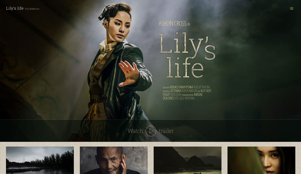
Movie Website Design – Check Out This Pre-Built Awesomeness
May 5, 2016
Freelance Business Etiquette – Keeping Your Clients Happy
May 25, 2016Designing a website for a small business that falls within a certain niche can be a challenge. Unless you are working to a specific set of requirements, you may find yourself facing some difficult design decisions.
Your objective should be to create a website that strongly emphasizes the company’s personality. An overly vague attempt could make the website look like any other, rather than one that uniquely represents your client’s business.
A carpenter’s website for example, shouldn’t have the look and feel of one that is better suited for a large corporation. Nor would you design a website with a somewhat playful look for an accounting firm. Still, you want to add just enough spice to give any website a pleasing, if not necessarily exciting, user experience.
The best approach will be to work with your client to ensure you receive a comprehensive, detailed brief to serve as your guide for your design.
The brief should include:
- The design goals and objectives.
- Budget and schedule (estimates if the client insists; but firm numbers and dates are better).
- Who the target audience or ideal customer is.
- The project’s scope.
- Do’s and Don’ts – especially key “Do Nots”
- Ideas on the desired look and feel.
BePrint – Dedicated to Print Studios, and Be Theme’s Latest Pre-built Website
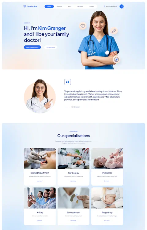
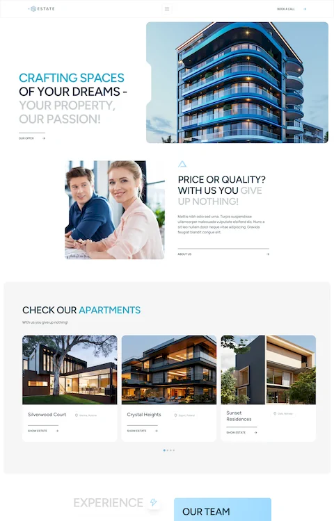
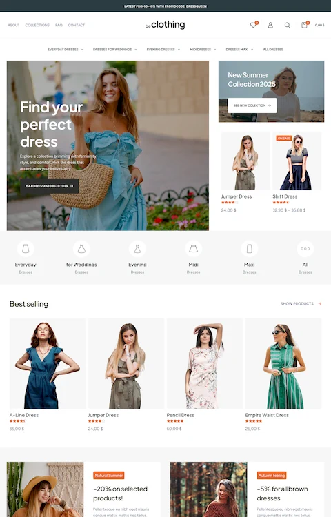
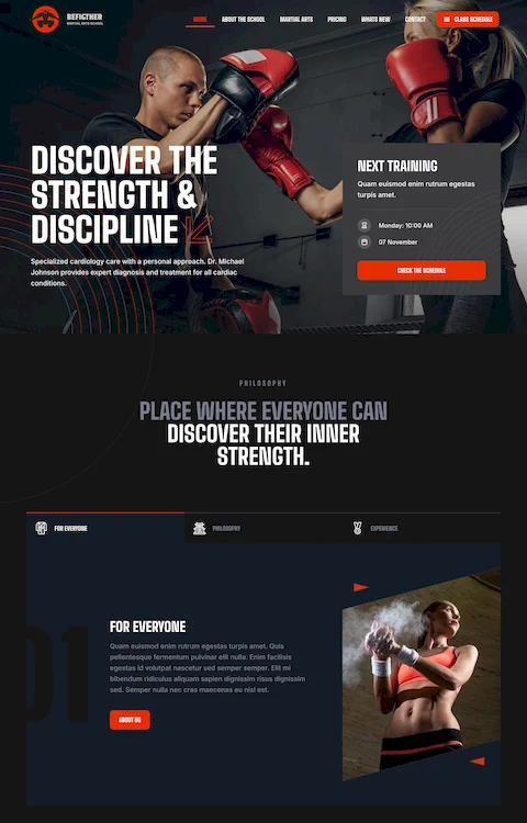
With your client’s brief in hand, the next step is to find a pre-built website that best fits the business’s intended online presence.
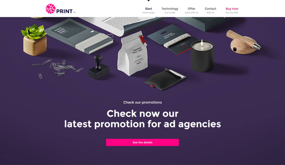
Assume the business in question is a print studio. Which pre-built website style would be most suitable? There are several that would make a good fit, but BePrint, Be’s latest release, is a perfect fit. It projects a modern, elegant vibe and a delightful UX.
BePrint’s home page features a simple, flat design. The choice of colors points to a rewarding UX, while the well-positioned calls to action focus on encouraging the user to further look into the offers. The About Us page is nice and clean, as are the remaining sections.
Other points of interest:
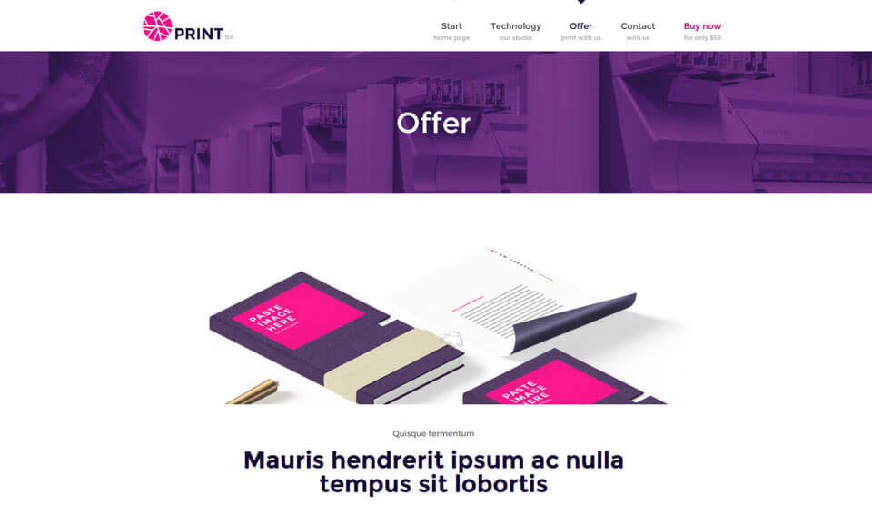
- This offer page is nicely structured. Prices are clearly presented.
- The printing technology page does an outstanding job of presenting a variety of useful content.
BePerfume
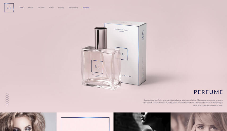
BePerfume is another new Be Theme release. It is the ideal choice for creating a presentation website dedicated to a perfume or to a signature fragrance series. BePerfume is a one-page website; just the right choice, when you want to place a strong focus on the essential information, and package that information in a beautiful form:
- A large image against a clear background showcases the product.
- The story behind the product is skillfully presented in an information area.
- Subtle effects characterize the area in which the perfume’s natural ingredients are introduced. As befits a one-page website, the amount of text is kept to a minimum, which adds to this area’s elegant appearance.
Note how the areas are separated by the clever use of images, including an additional image of the product itself that leads to information relating to how or where the product can be purchased.
BeECo
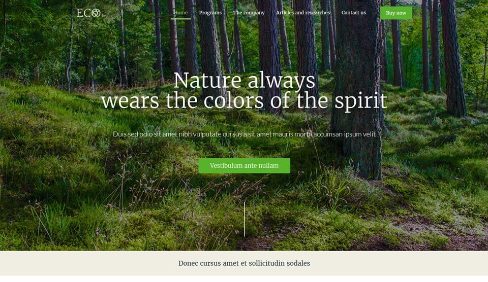
BeECo is another recently released pre-built website. It is dedicated to NGOs and promoters of ecological initiatives. These are people who understand the impact a good online presence can have on increasing and reinforcing public awareness of their message.
The header area is small, but it has a relevant, subtle effect that directs the user’s attention to the image, and to the call to action. The image is pleasant, but powerful enough to engage the user.
The icons have been well thought out. They are in line with the personality of the website, and consistent with the other website’s other elements.
The blog area design stresses readability. Notice the relaxing gray font, and how the photo galleries and quotation features tend to engage the user. The same is true for the post area, which also encourages the user to linger awhile.
About Be
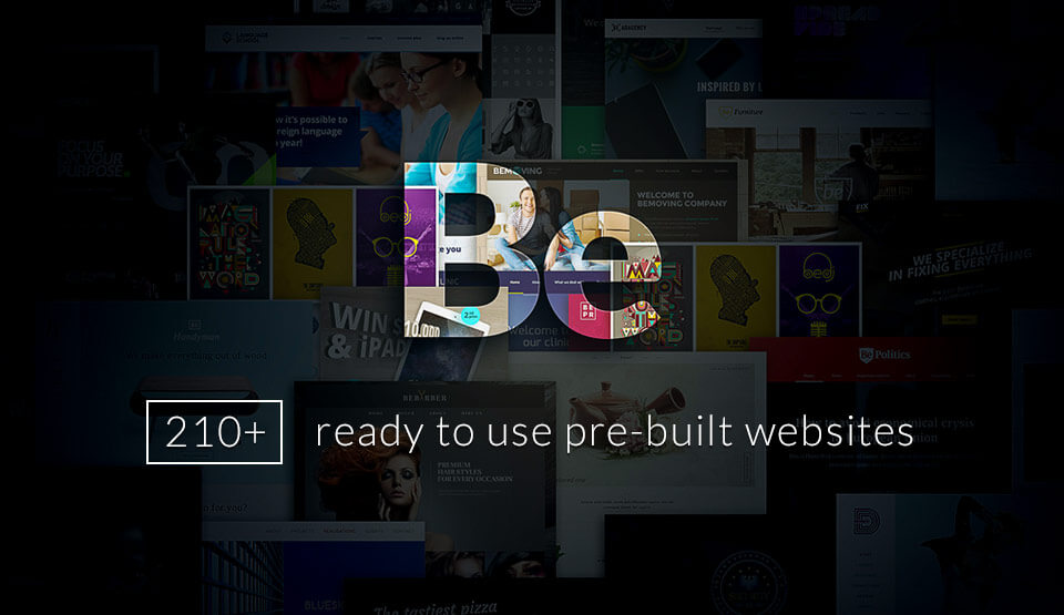
These pre-built websites are the newest additions to Be Theme’s 200+ collection. This means you can find just the right solution, no matter who your client is, or what type of business that client represents.
These pre-built websites are being used by more than 35,000 world-wide web designers. Be Theme, the biggest WordPress theme ever, has more than a huge user base and the more than 20 pre-designed websites. Its 40 core features add to the mix, and it is these features that enable you to turn out one pixel perfect, responsive, retina ready website after another.
You’ll love Be’s one-click demo import feature, its premier page builder, and the flexibility provided by the layout configurator with its many design options.
The importance of being able to work from a complete and comprehensive client’s brief cannot be overemphasized. Not every client is web savvy however, so there will be times when you may need to lend a helping hand. With the brief in hand, the next step is to carefully select the pre-built website you want to use.
Choose one that will give you the extra time you would like to focus on the look and feel of your website design. Let Be Theme take care of the coding and the rest of the development work.
