Trends in Web Design – Video Backgrounds
November 15, 2016
November – The Latest Pre-Built Websites
November 29, 2016A typical photography website’s objective is to show off photos or images in a way that will attract new clients. This is somewhat different than most business websites, where the primary objective is to make a sale. Insofar as photograph is an art form, a photography website is also different in that there is greater room for creativity.
Most photo portfolios have these three main elements:
- The gallery – where you want to highlight the only the best of your offerings.
- The contact section – which should be kept as simple and accessible as possible.
- The about section – to which you’ve added a clear, concise, and interesting bio, and self-portrait. This will likely be a highly-visited page.
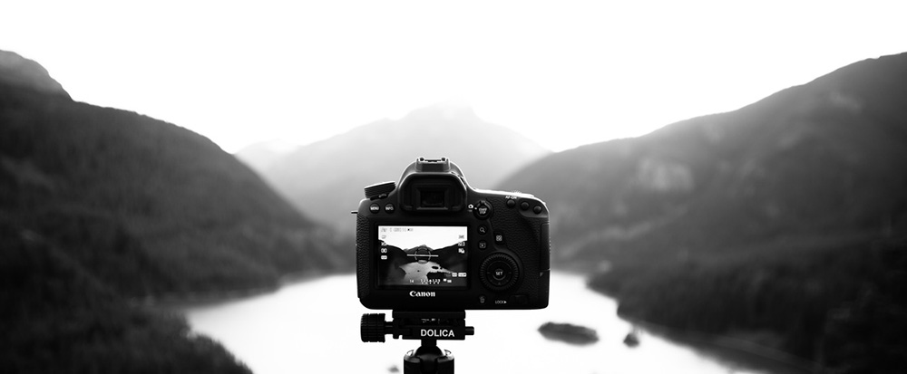
Skip the flashy web designs; good photography websites emphasize photos.
Photography websites tend to be visually rich. On the other hand, the design approach you take should be quite subtle – even minimalist. The purpose is to highlight the photos, and not the website’s design characteristics. Excessive clutter can be distracting, and draw your visitors’ attention away from the photos; the exact opposite of what you want to happen.
Advice for Your Client on Creating a Great Photo Portfolio
Your client may already know how to build a great portfolio. If so, so much the better. He or she may not however be familiar with the ins and outs of creating a great online portfolio, and will probably need your guidance and assistance to do so.
Here are some tips to share with your client for optimizing his or her portfolio:
Consider the Target Demographic – The portfolio might belong to a wedding photographer, a commercial photographer, a food photographer, or a fashion photographer. Each portfolio would require a layout that would appeal to a certain demographic.
High-Res Images are All-Important – Potential clients will expect nothing less that high-resolution photos. They are looking for quality at its best; so, don’t give them anything less. Include a single low-resolution photo, and guess which photo will stand out.
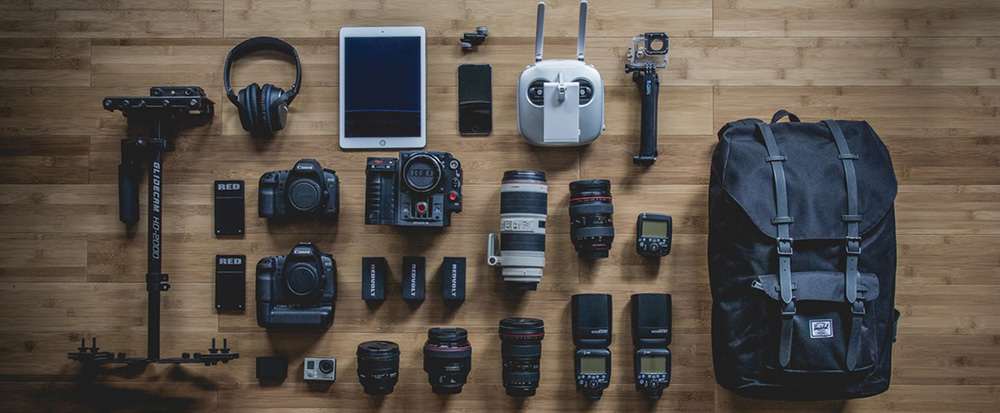
Minimize the Choice of Images – Limit the portfolio to the very best images. Load time also must be taken into account. A potential client will generally wait for 10-12 images to load, but probably not for 50.
Ordering the Photos – Applying little strategy pays off. Save the best images for first (to capture the visitor’s attention), and last (to give the visitor something to remember).
Include Pertinent Information – The challenge here is to tell something about at least some of the photos without adding clutter. Where the photo was shot, camera details, and who it was shot for would be of interest, but limit this information to a few words, or a sentence at most.
7 Cool, Eye-Catching Pre-Built Websites for Photographers
A website is one of the first things to create if you want to start a photography business. These Be Theme pre-built websites are ideal for creating awesome photography portfolios.
- They serve as a starting point. As they are flawlessly coded, customizing them to create outstanding websites is easy.
- The design lines are not intrusive. They have been kept subtle to ensure the attention goes to the photos.
- Since they require no coding skills, fine tuning is fast and easy.
Be Snapshot
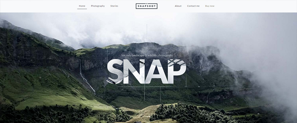
This modern pre-built website can be adapted to suit any type of photography. Once you’ve made your selection of any pre-built website, your imagination is your only limitation. When you decide on the direction to take, the overall flow and designed-in effects of this pre-built website which was originally destined for a wildlife photographer, makes it extremely easy to customize and work with.
Be Painter
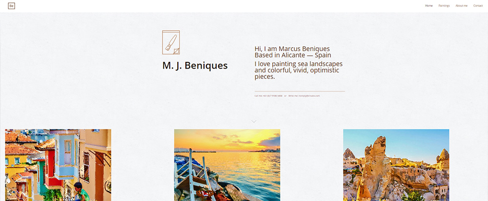
This pre-built website is created for a painter, but as you can see, it could easily be adapted for use as a photographer’s portfolio. Plenty of white space, combined with clean, well-structured layouts provides many possibilities.
Highlight the most important photographs on the homepage, and invite the visitor to click to a product page for a larger image and informative text.
Be Showcase
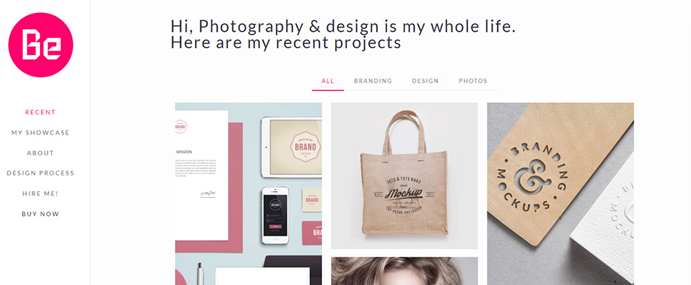
BeShowcase can be used for photography, painting, print making, or other creative endeavors. This pre-built website also provides a vehicle for multidisciplinary artists’ portfolios. The menu categories capture and communicate the artist’s world.
The artist’s introduction and invitation to explore further is on the homepage. Note how a mixture of arts and crafts can be displayed in a seemingly random manner without creating clutter.
Be Story
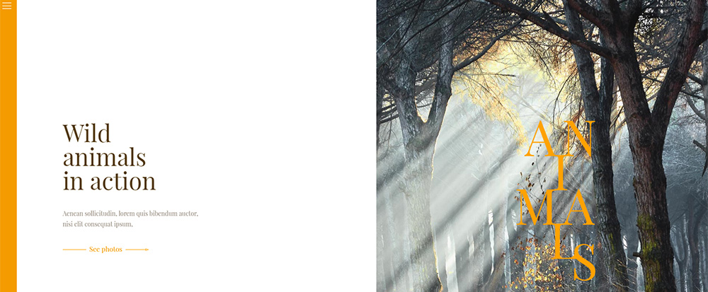
This BeStory pre-built website is destined to a wild animal photo portfolio. Yet, like the other examples show here, it can easily be transformed into a different photography portfolio type. It’s well-suited for those who favor large images and simplicity of design. The homepage is simplicity itself, a main image, a short description, and a call to action to explore the site’s content.
Be Art
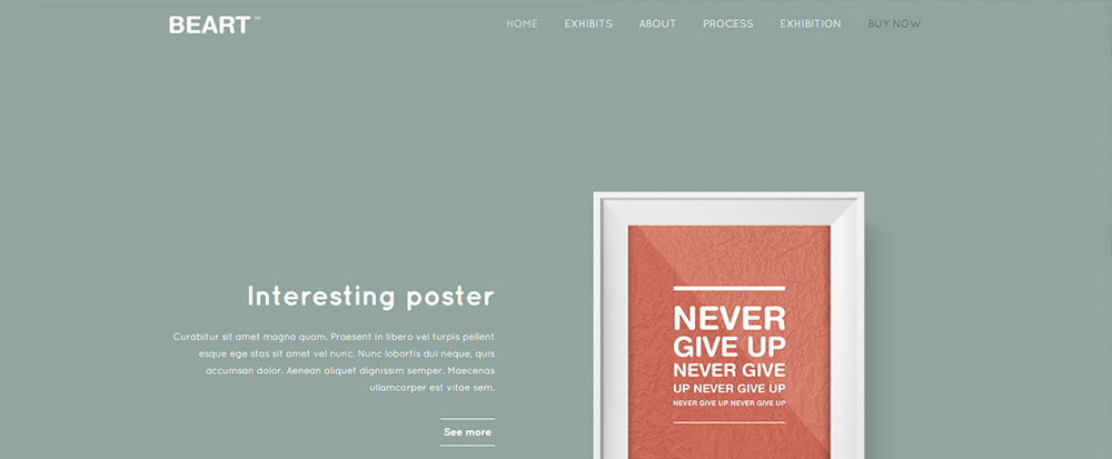
Destined for a graphics artist, this simple, chic, minimalist pre-built website’s homepage is definitely inviting. The categories listed are what you might expect in a conceptual artist’s or graphical designer’s website, but they can be customized to fit your client’s needs.
The product pages emulate the homepage’s strong background colors, effects, and style. The overall effect is one of coolness.
Be Photo
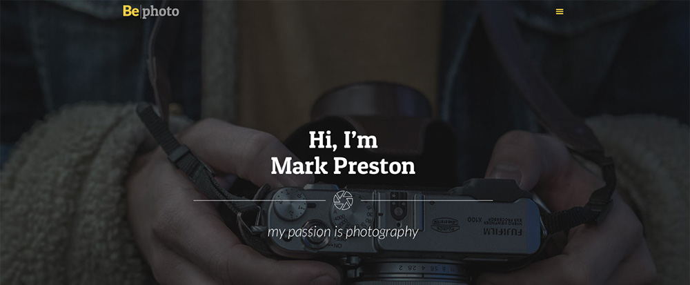
Be Theme has also created pre-built websites for freelancers, including freelance photographers. This layout focuses on communicating the artist’s style. The homepage slider provides a brief introduction of the artist, displays large background images that will be found in the portfolio, and provides a pleasant introduction to the artist’s world. The menu categories are standard; photo section, about section, and contact section.
Be B&W
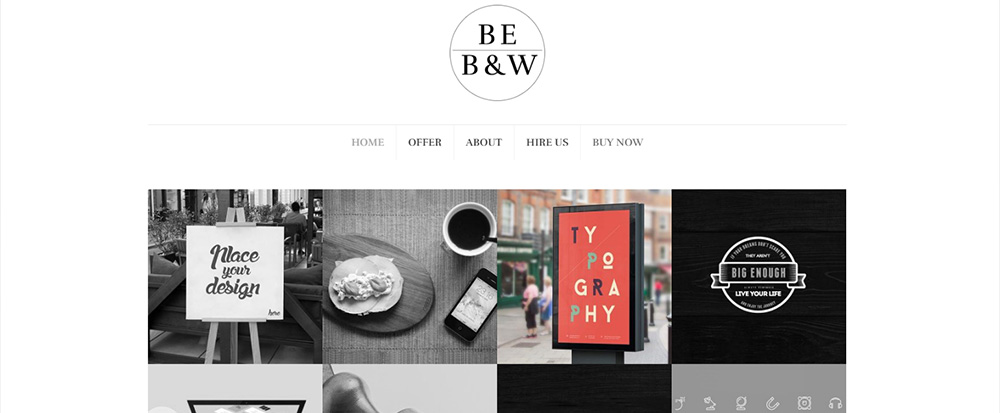
BeB&W is another example of a versatile pre-built website that a wide range of creative professionals will find useful. It is an excellent choice for creating a photography website, for a website for nearly any creative design domain, and even for a hobby website. This pre-built website’s black and white approach is a good example of using contrast to highlight the products.

