

Inspiring Examples of Video Landing Pages That Convert
May 27, 2025
Understanding the Different Types of Landing Pages
May 31, 2025The difference between a full house and empty seats often comes down to your event landing page.
Every day, thousands of potential attendees visit event landing pages to decide if they'll register or click away. These dedicated web pages serve as the front door to your event—whether it's a conference, webinar, workshop, or networking mixer.
What makes some event landing pages convert at 25% while others struggle to reach 5%?
This article will show you examples of high-converting event landing pages that turn visitors into registered attendees. You'll learn the essential elements every successful event page needs, see real examples that work, and discover the common mistakes that drive potential attendees away.
From design principles to conversion tactics, we'll cover everything you need to know to build event landing pages that fill seats and meet your registration goals.
Examples of Event Landing Pages
Tony Robbins - Unleash The Power Within
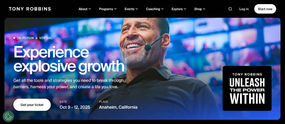
Strong contrast with dark backgrounds and bright accent colors creates visual impact. Hero section uses large background images with bold typography and clear CTAs. Testimonial sections feature video thumbnails in grid layouts. Strategic use of white space between content blocks improves readability. Mobile responsiveness maintains hierarchy across devices.
Tribeca Film
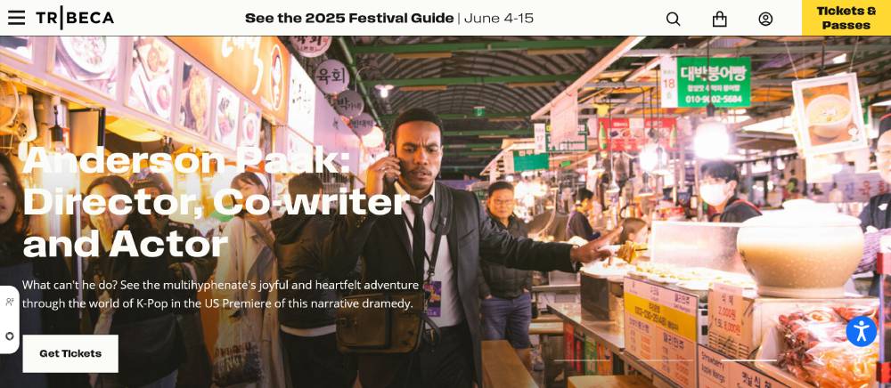
Clean, minimalist design with film-focused imagery. Typography uses sans-serif fonts with clear hierarchy. Content blocks organized in asymmetrical grids. Navigation structure balances simplicity with comprehensive event information. Interactive elements include expandable sections for schedule details and filmmaker information.
MCM Comic Con
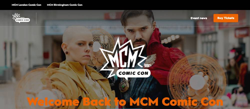
Vibrant color palette reflects pop culture theme. Custom icons and illustrations create unique brand identity. Card-based content arrangement for guests and activities. Fixed navigation with dropdown menus for category exploration. Interactive map interfaces for venue layout help attendees plan their visit.
Be Landing 2
EuroGamer - EGX
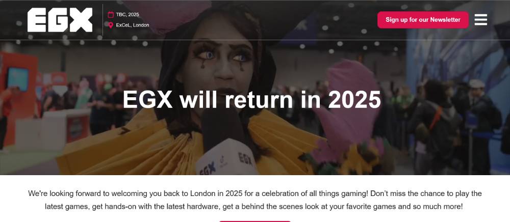
Immersive gaming aesthetic with animated transitions between sections. Split-screen layouts showcase multiple content types simultaneously. Countdown timers build anticipation for event dates. Sticky sidebar navigation persists during scrolling. Social media feeds integrated directly into page design show real-time community engagement.
Esports Travel Summit

Dynamic header with video background captures gaming energy. Section transitions use parallax scrolling effects. Two-column layouts balance text content with visual elements. Sponsor showcase uses logo carousels with consistent sizing. Registration form breaks complex process into multi-step progression.
Ideal Home Show
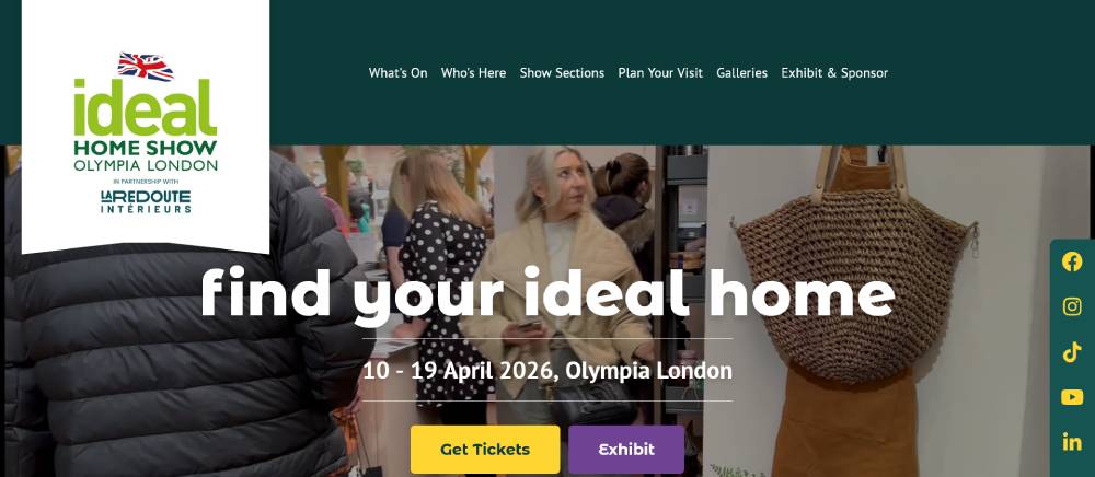
Gallery-style image displays showcase previous exhibitions. Category filters allow content sorting by interest area. Interactive floor plans help visitors navigate exhibits. Ticket purchasing interface uses clear pricing tables. Newsletter signup forms positioned at key scroll points throughout the page.
B2B Marketing Expo
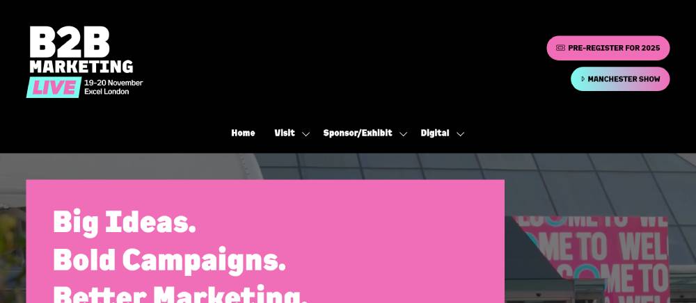
Corporate blue color scheme establishes professional tone. Statistics and metrics visualized with animated counters. Speaker profiles feature credentials and session topics. Exhibitor directory uses search and filter functionality. Sticky header maintains navigation access during content exploration.
BrightonSEO
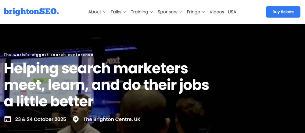
Playful design elements balance professional content. Workshop schedules use calendar-style interfaces with color coding. Speaker photos use consistent framing and sizing. Accordion sections expand to reveal detailed information. Prominent social proof sections highlight past attendee testimonials.
Be Landing 3
MicroConf
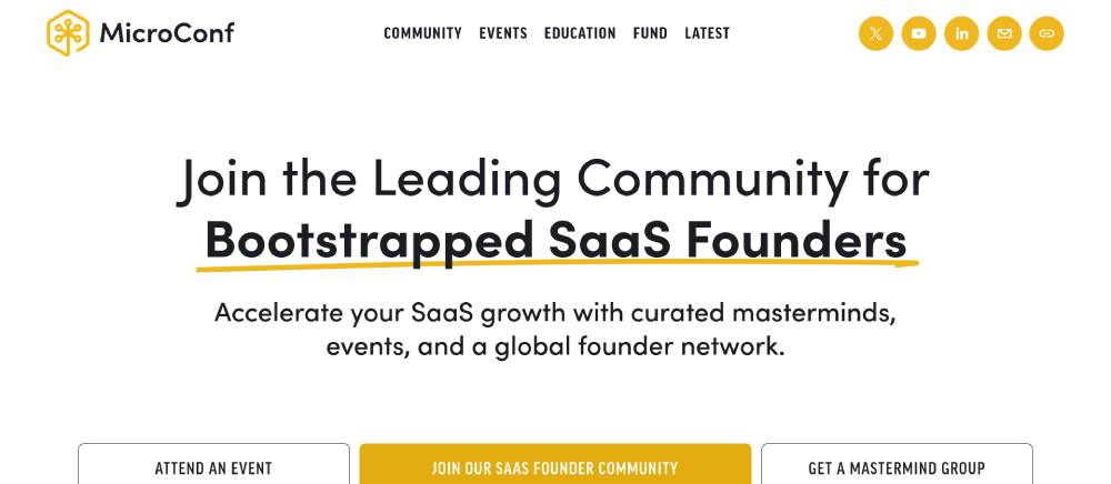
Minimalist design with focus on typography and white space. Subtle animations on scroll reveal content progressively. Community testimonials displayed in carousel format. Card-based layout for different conference tracks. Location imagery showcases venue atmosphere.
The UX Conf
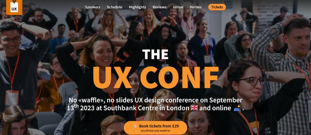
Clean, accessible design demonstrates UX principles. Workshop descriptions use expandable sections to manage information density. Speaker grid with consistent formatting. Location maps integrate with travel information. Early-bird pricing highlighted with countdown timers.
Mau Vegas - Mobile Apps Unlocked Conference
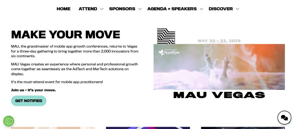
Dark mode design with neon accent colors creates tech atmosphere. Agenda interface uses tabs for different conference days. Speaker cards with social media integration. Sponsor showcase organized by partnership tier. Mobile-first approach evident in touch-friendly interface elements.
South by Southwest - SXSW Conference
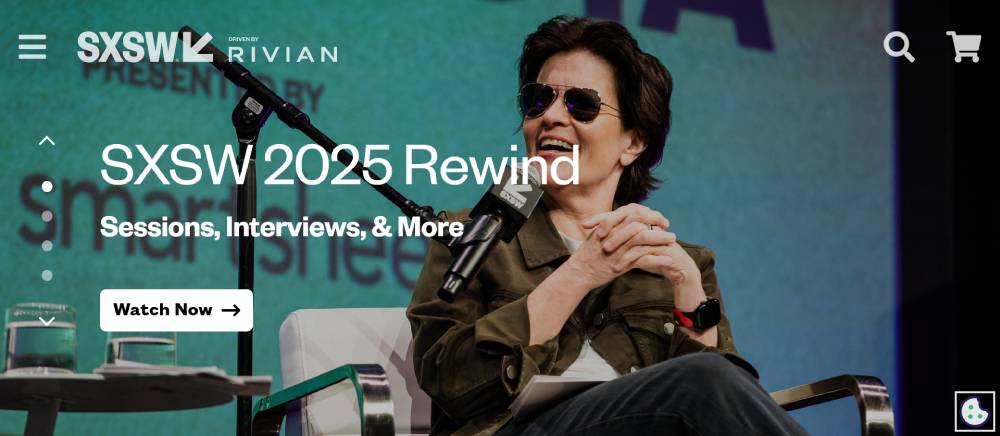
Content categorization through color-coding systems. Multi-level navigation handles extensive event categories. Calendar interfaces for session planning. Featured content sliders highlight key speakers. Registration flow handles complex ticket types with guided selection process.
FAQ on Event Landing Pages
What exactly is an event landing page?
An event landing page is a dedicated webpage designed specifically to promote and collect registrations for an event. Unlike general website pages, these landing pages focus solely on converting visitors into registered attendees through RSVP functionality and lead capture forms. They contain all essential information about the event while eliminating distractions that might prevent conversion.
How do I create an effective event landing page?
Creating effective event landing pages requires attention to several key elements. Start with compelling event page design featuring clear visual hierarchy. Include essential components like registration forms, speaker showcase sections, and agenda display options. Ensure mobile-friendly registration since many users browse on phones. Integrate event CRM integration for data management. Finally, implement conversion optimization techniques like A/B testing methods to continuously improve performance.
What information should I include on my event landing page?
Your event landing page should include:
- Event title, date, time, and venue information
- Clear registration call-to-action buttons
- Speaker biographies and session descriptions
- Pricing details with early bird registration options
- Event agenda or schedule visualization
- Social proof through testimonials from past events
- Contact information display for questions
- Social media sharing buttons to expand reach
- Event FAQ sections addressing common concerns
- Registration deadline notices to create urgency
How can I increase conversions on my event landing page?
To boost conversion rates on your event landing pages, focus on conversion rate optimization practices specific to events. Streamline your registration flow to minimize form abandonment. Use event countdown timers to create urgency. Display capacity indicators to trigger FOMO. Implement abandoned cart recovery emails for those who start but don't complete registration. Test different call-to-action placements and colors. Add trust signals on landing pages like security badges for payment processing integration.
Should my event landing page be part of my main website or standalone?
This depends on your goals and event marketing strategy. Standalone event landing pages often see higher conversion completion rates because they eliminate distractions and focus solely on registration. However, hosting your event page on your main site with proper event SEO can leverage existing domain authority. Many event management software platforms and landing page builders offer both options, allowing you to choose based on your specific needs.
How do I track the performance of my event landing page?
Track performance using event analytics integrated with Google Analytics to monitor key metrics. Set up UTM parameter tracking to identify which traffic sources bring the most registrations. Implement heat map analysis to see how users interact with your page. Monitor form field optimization to identify where users abandon the registration process. Calculate your event ROI by comparing acquisition costs to registration revenue. These insights help refine your event promotion strategies over time.
What are common mistakes to avoid with event landing pages?
Common mistakes include:
- Cluttered design that overwhelms visitors
- Complicated registration forms with too many fields
- Poor mobile responsiveness making smartphone registration difficult
- Slow page load speed driving impatient visitors away
- Missing critical event details like time or location
- Weak calls-to-action that don't motivate registration
- Lack of social proof elements like testimonials
- No confirmation emails after registration
- Insufficient attention to attendee data security
- Failure to test cross-browser compatibility
How far in advance should I create my event landing page?
Launch your event landing page as soon as you have the core event details confirmed. For major conferences, this might be 6-12 months in advance to capitalize on early bird registration periods. For smaller events or webinars, 1-3 months is typically sufficient. The key is having enough lead time to build momentum through email marketing campaigns and social promotion using your event hashtags. Update the page regularly with new speaker announcements and agenda updates to give visitors reason to return.
What role does design play in event landing pages?
Design is crucial for event landing pages. Strong branding consistency establishes professionalism and trust. Clean visual hierarchy guides visitors' attention to key information and registration buttons. Proper use of event photography display and promotional video embedding can convey the event's atmosphere. Mobile responsiveness ensures a seamless experience across devices. Good design creates an emotional connection that influences the decision to attend, while poor design can undermine even the most compelling event content.
How can I differentiate my event landing page from competitors?
Stand out by focusing on your event's unique value proposition. Use customer journey mapping to understand your audience's specific needs. Showcase distinctive event categories or content themes. Consider unique registration incentives like group booking options or event series subscription discounts. Personalize the user experience through attendee segmentation, showing different content to different visitor types. Invest in professional copywriting for microcopy optimization throughout the page. Most importantly, focus on solving specific problems your attendees face rather than just listing features.
Conclusion
Event landing pages remain the cornerstone of successful event marketing in today's digital landscape. By focusing on conversion optimization and attendee management, you can transform casual browsers into committed participants. Remember that each element—from registration forms to session descriptions—plays a crucial role in the conversion funnel.
Start small. Test one element at a time. Learn from your analytics.
The most effective event page builders understand that mobile-friendly registration is non-negotiable in 2025. Your event CRM integration should seamlessly capture leads while maintaining attendee data security. Don't overlook post-event feedback forms—they provide invaluable insights for your next campaign.
Above all, your event landing pages should tell a compelling story that resonates with your target audience. When you combine technical excellence with emotional connection, you create more than just a registration point—you create anticipation for an experience worth attending. Now go build pages that convert!
If you liked reading this article on event landing pages, you should check these articles also:


