


The Best Agency Website Design Examples
January 20, 2026
News Website Design Examples That Redefine Journalism
January 23, 2026Your furniture website has three seconds to convince visitors to stay. Most fail.
These furniture website design examples show what separates IKEA's 2 billion annual visits from struggling online furniture stores that burn cash on ads but can't convert traffic.
We analyzed leading furniture e-commerce platforms, product page layouts, and checkout flows to identify what actually drives sales. You'll see specific techniques from Wayfair, West Elm, Article, and Restoration Hardware that you can implement immediately.
This breakdown covers navigation structures, product visualization methods, mobile optimization, and conversion-focused design elements backed by real furniture brand websites.
What is Furniture Website Design
Furniture website design is the visual and functional layout of online platforms that showcase furniture products, organize product categories, and facilitate purchase decisions through structured information presentation and user interface elements.
The design encompasses everything from homepage layouts to checkout flows. Product visualization, navigation structures, and filtering systems work together to create the shopping experience.
Most furniture e-commerce platforms balance aesthetic presentation with technical performance. The goal? Help visitors find products fast while displaying materials, dimensions, and pricing clearly.
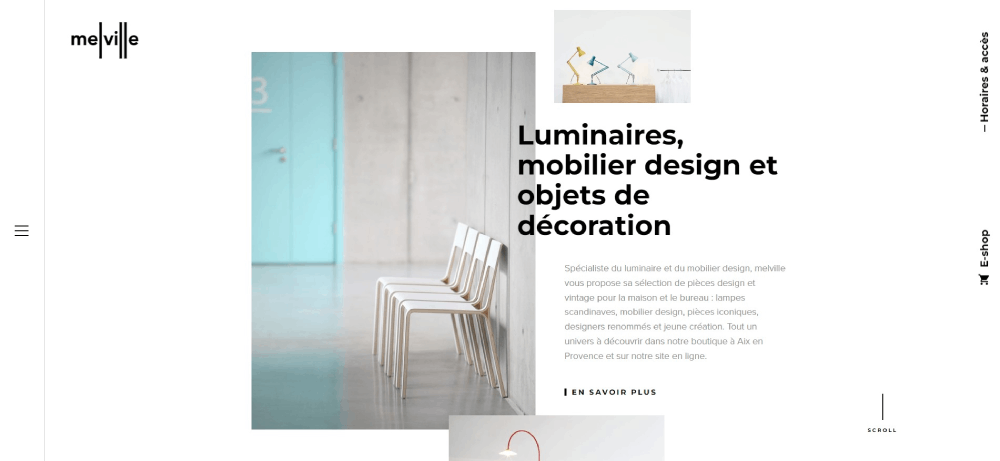
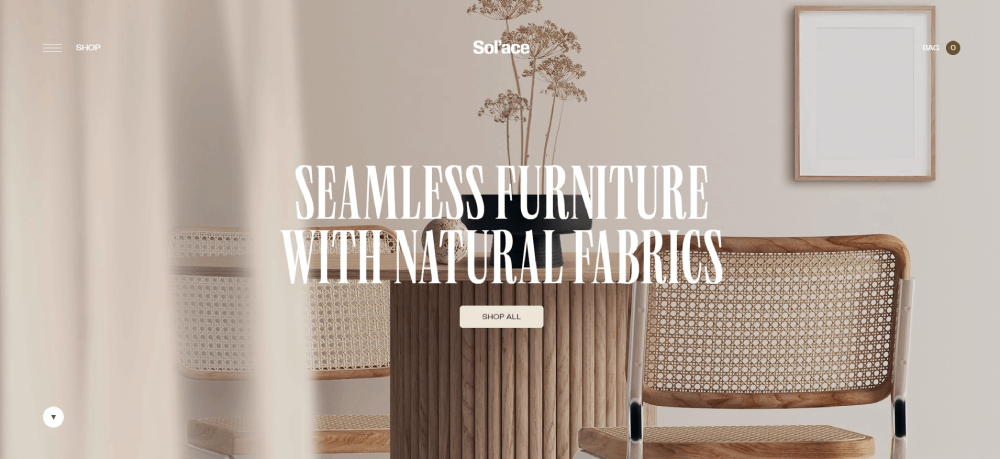
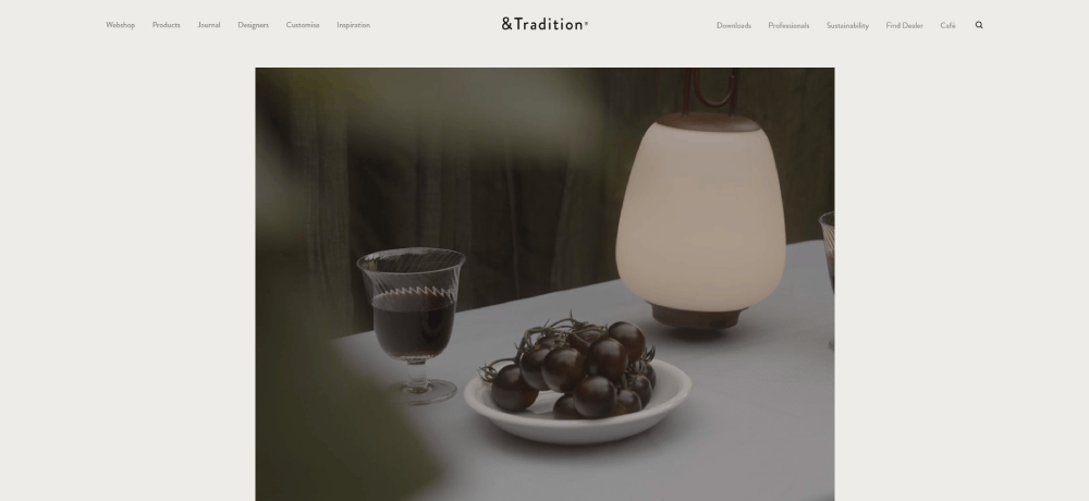
Furniture Website Design Examples
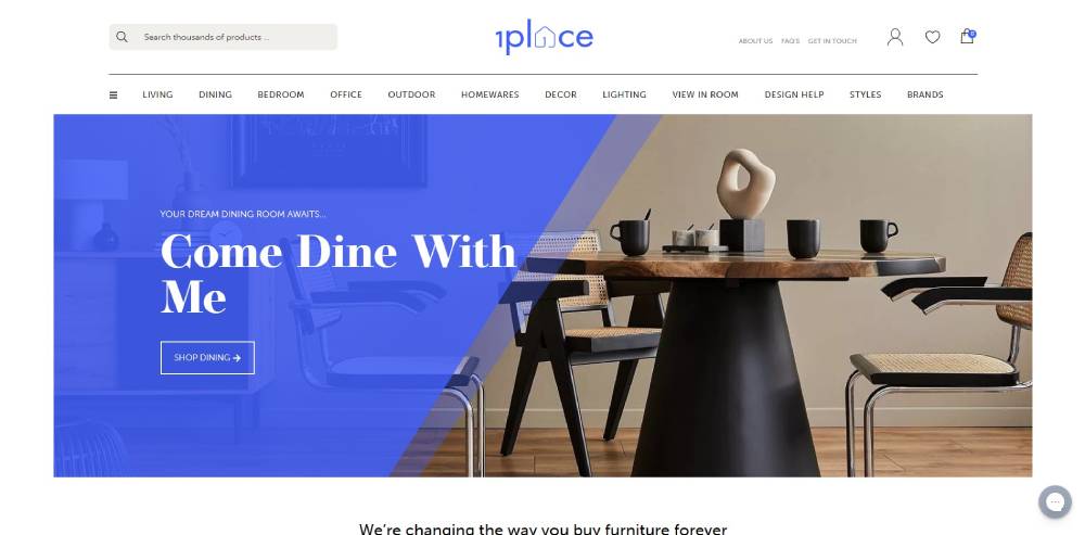
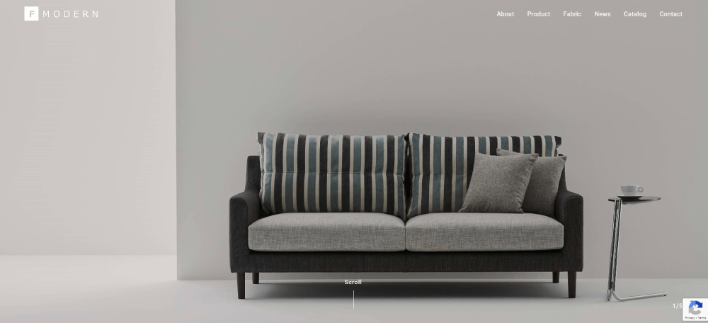
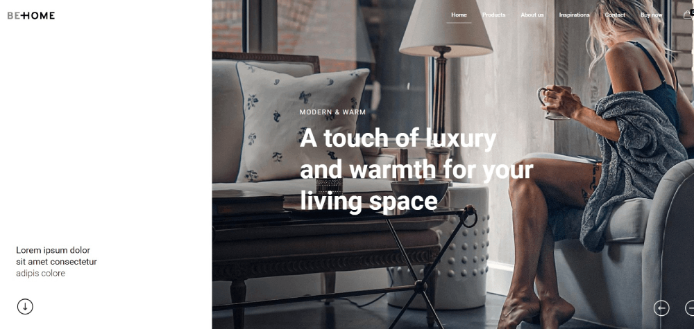
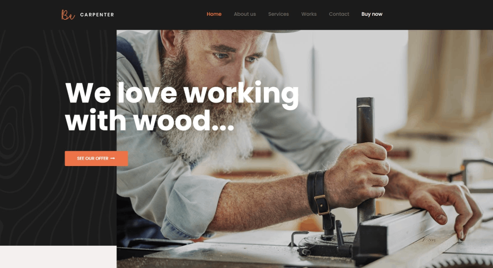
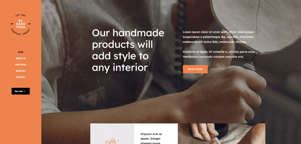
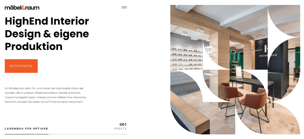
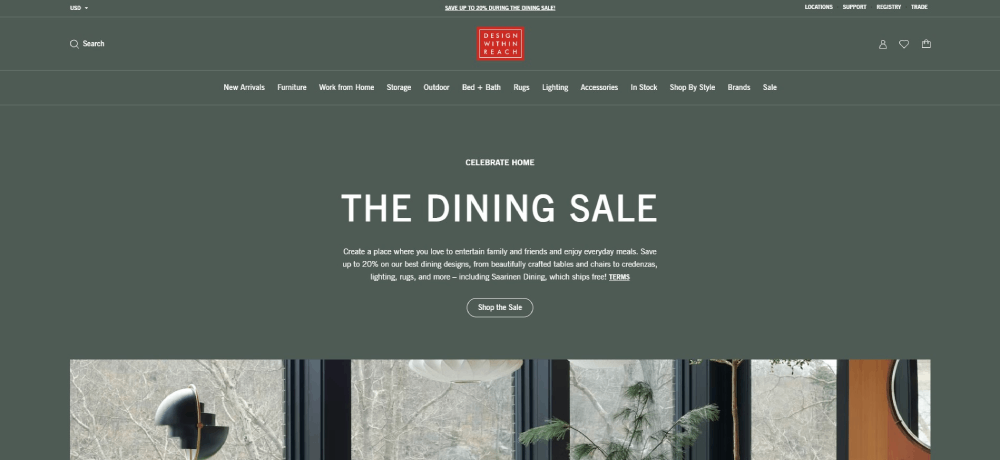
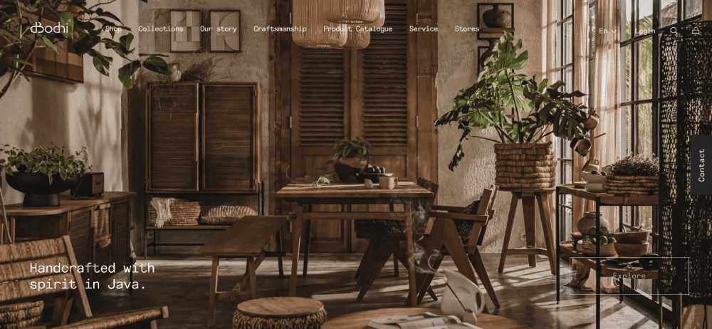
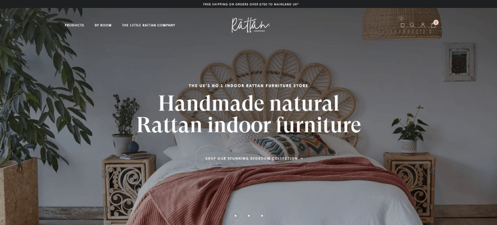
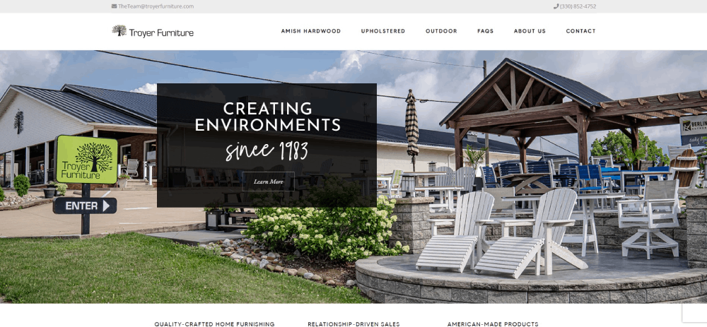
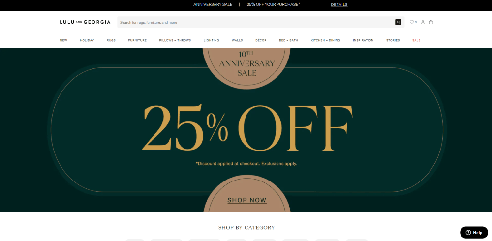
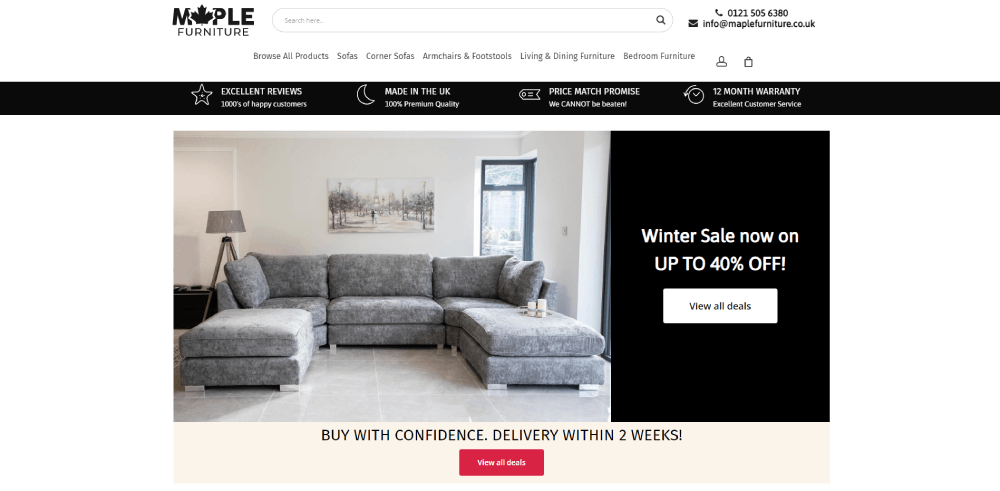
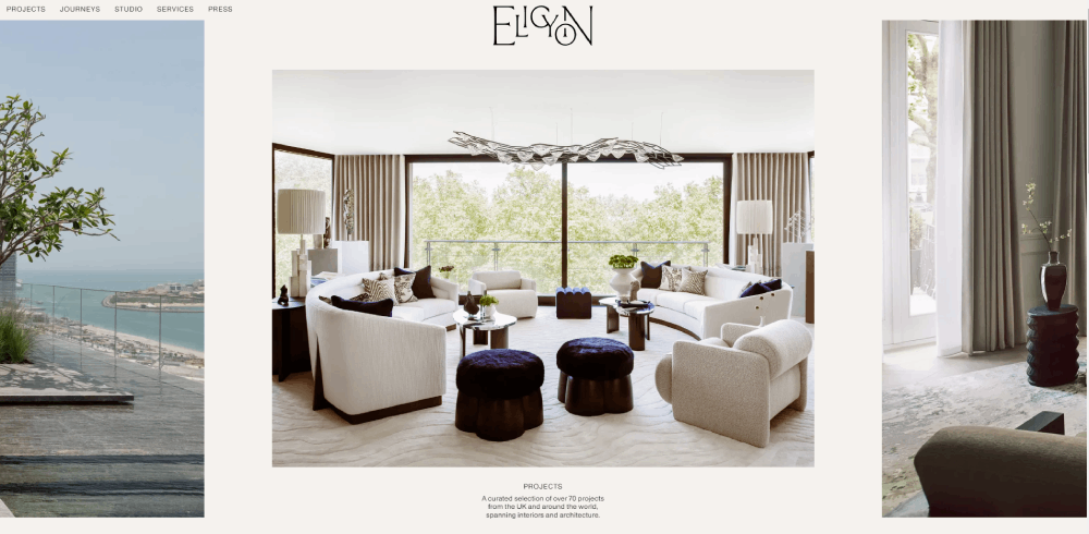
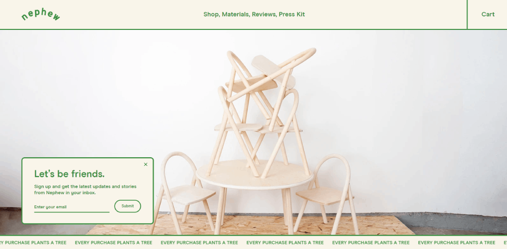
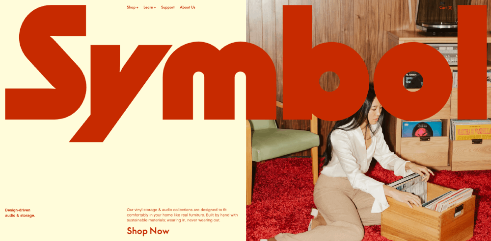
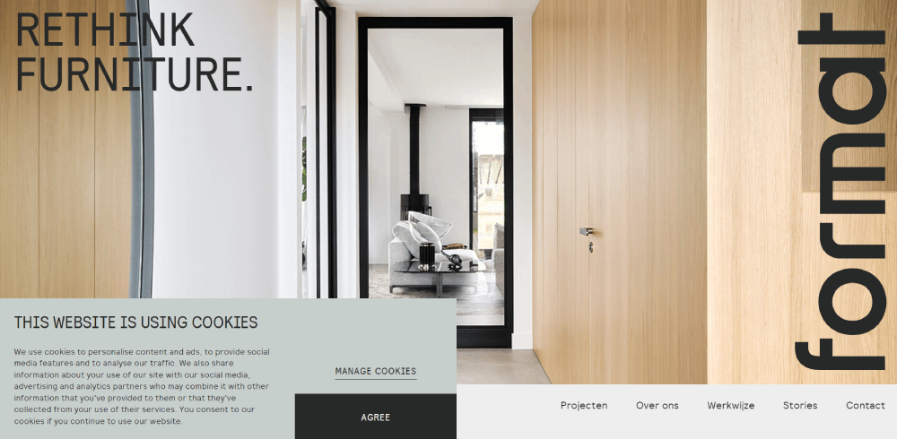
1place

Website Structure Approaches for Furniture Brands
Furniture retail websites follow distinct structural patterns based on brand positioning and target audience. IKEA uses information-dense product grids while Restoration Hardware opts for luxury-focused full-width imagery.
The structure determines how users navigate categories, filter options, and discover products.
Product-Focused Layout Systems
Root characteristics include catalog organization, filtering mechanisms, and search functionality. Rare characteristics involve 3D product visualization, AR integration, and room planning tools.
Unique characteristics differentiate brands: custom material selectors at Design Within Reach, bespoke configuration interfaces at Room & Board.
Most furniture websites organize products by room type (living room, bedroom, dining), furniture type (sofas, tables, storage), or style categories (modern, traditional, industrial).
Homepage Design Patterns
The hero section typically features lifestyle photography or seasonal collections. West Elm rotates hero images showcasing styled rooms with multiple products.
Category navigation appears in mega menus or visual grid formats. Article presents large category tiles with representative product photography.
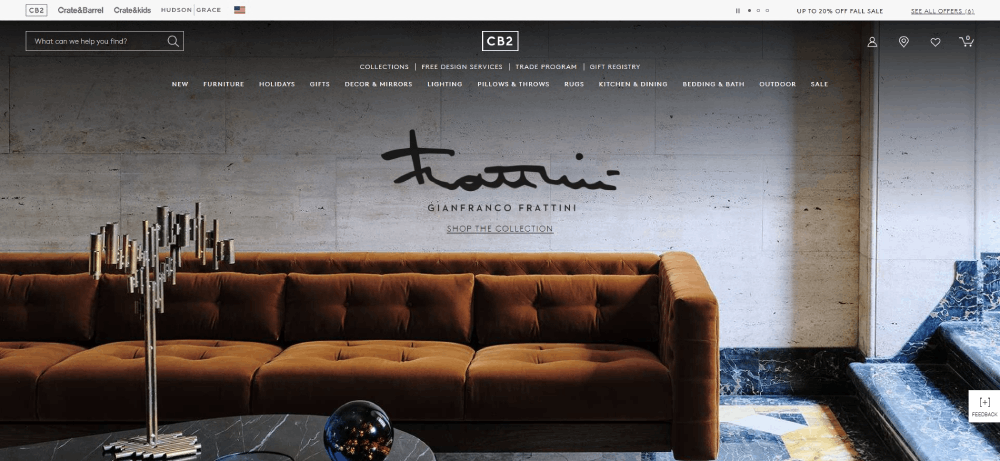
Trust signals cluster near the footer: delivery guarantees, return policies, sustainability certifications. CB2 places shipping information and customer service links prominently.
Product Page Architectures
Image galleries dominate product pages. 360-degree views, lifestyle photography, and detail shots appear in carousel formats or grid layouts.
Specification tables display dimensions, materials, weight capacity, and care instructions. Wayfair organizes specs in expandable accordions to reduce page length.
Related product recommendations use algorithms based on style, price range, or room groupings. "Complete the look" sections suggest complementary pieces.
Technical Implementation Methods
Performance and image optimization determine whether furniture websites convert browsers into buyers. Slow load times kill conversions, especially on mobile where 53% of users abandon sites taking over 3 seconds.
Image Optimization Techniques
WebP format reduces file sizes 25-35% compared to JPEG without visible quality loss. Fallback to JPEG ensures compatibility with older browsers.
Lazy loading defers off-screen images until users scroll. Initial page load displays hero images and above-the-fold products only.
Responsive image strategies serve different resolutions per device. A 2000px product image on desktop becomes 800px on mobile, saving bandwidth.
Multiple resolution serving uses srcset attributes: thumbnail, medium, large, and extra-large versions. Browsers select appropriate size based on viewport and pixel density.
Performance Optimization Practices
Core Web Vitals metrics measure user experience: Largest Contentful Paint under 2.5s, First Input Delay under 100ms, Cumulative Layout Shift under 0.1.
JavaScript bundle management splits code into critical and non-critical chunks. Cart functionality loads immediately; customer reviews load on interaction.
CSS optimization removes unused styles and inlines critical CSS. Above-the-fold styles embed in HTML; remaining styles load asynchronously.
Database query efficiency matters for large catalogs. Indexed product attributes (material, color, size) speed up filtering operations from seconds to milliseconds.
Search and Filter Systems
Faceted search implementation allows multiple simultaneous filters. Users combine "Fabric: Velvet" + "Color: Blue" + "Price: $500-$1000" to narrow 5000 products to 12.
Attribute-based filtering covers material (wood, metal, upholstery), size (dimensions, seating capacity), color (actual swatches), style (modern, traditional, transitional), and price ranges.
Sort functionality includes popularity, price (low to high, high to low), newest arrivals, customer rating, and sometimes "trending" based on recent views.
Search query handling uses autocomplete and synonym matching. "Couch" returns sofa results; "dining table" suggests room sets and chair pairings.
Conversion-Focused Design Elements
Every element on a furniture shopping platform either builds trust or creates friction. Conversion rates jump when design removes purchase hesitation.
Product Detail Presentation
Specification tables format dimensions, materials, and technical details in scannable rows. Clear labels ("Seat Height: 18 inches") beat paragraph descriptions.
Measurement display methods include actual dimensions, comparison to common objects ("fits through standard 32-inch doorway"), and room size recommendations.
Material information presentation uses close-up photography, fabric names with composition percentages, and durability ratings. "100% polyester velvet, 50,000 double rubs" communicates quality.
Care instruction placement near material specs reduces support questions. "Spot clean only" or "Machine wash removable covers" influences purchase decisions.
Trust and Credibility Signals
Customer review integration shows star ratings, verified purchase badges, and photo uploads. Reviews with images get 3x more trust than text-only.
Warranty information display highlights coverage length and what's included. "5-year frame warranty, 1-year upholstery" beats generic "limited warranty" claims.
Return policy presentation uses clear timelines and conditions. "30-day returns, free return shipping" removes purchase anxiety.
Shipping timeline communication sets expectations: "Ships in 2-3 weeks" or "In stock, delivers Tuesday." Payment security indicators include SSL badges and accepted payment icons.
Purchase Path Design
Add-to-cart interaction patterns provide immediate feedback. Button changes to "Added to Cart" with checkmark animation, then displays "View Cart" option.
Cart page layout options show product images, quantities, remove buttons, and running subtotal. Mini-cart overlays let users edit without leaving current page.
Checkout flow configurations range from single-page to multi-step. Single-page shows all fields; multi-step breaks into Shipping > Payment > Review stages.
Guest checkout implementation reduces friction by 20-40%. Account creation as optional post-purchase step increases completion rates.
Mobile-Specific Design Considerations
Mobile accounts for 60-70% of furniture website traffic but converts 30% lower than desktop. Design differences matter.
Touch Interface Optimization
Button sizing follows Apple's 44x44px minimum, Google's 48x48px recommendation. Anything smaller causes mis-taps and frustration.
Swipe gesture implementation works for image galleries and product carousels. Left swipe shows next image; right swipe returns to previous.
Tap target spacing maintains 8-10px between interactive elements. Zoom functionality for product images uses pinch gestures or double-tap activation.
Mobile Navigation Patterns
Hamburger menu alternatives include bottom navigation bars with icons for Home, Categories, Search, Cart, and Account. Bottom placement reduces thumb travel on large screens.
Sticky headers keep cart access and search visible while scrolling. Category quick access uses horizontal scrolling chips below the header.
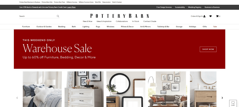
Pottery Barn's mobile site uses a persistent bottom menu with five core functions, eliminating the need to scroll back to top.
Accessibility Standards in Furniture Websites
WCAG compliance isn't optional anymore. Legal requirements aside, accessible design expands your customer base by millions.
WCAG Compliance Methods
Color contrast requirements mandate 4.5:1 ratio for normal text, 3:1 for large text. Product price and description text must meet these minimums against background colors.
Alt text for product images describes what's visible: "Gray velvet sectional sofa with chaise lounge, brass legs, three seat cushions." Screen readers announce this to visually impaired users.
Keyboard navigation support allows tab-through of all interactive elements. Users navigate filters, product grids, and checkout without a mouse.
Inclusive Design Practices
Font size minimum sits at 16px for body text. Smaller sizes strain readability, especially on mobile devices.
Form label associations connect every input field to its label programmatically. Error message clarity states the problem and solution: "Zip code required. Enter 5-digit zip code."
Focus state visibility shows which element is currently selected. Blue outlines or background color changes indicate keyboard position.
E-commerce Platform Selection
Platform choice determines what's possible, what's expensive, and what breaks during Black Friday sales. Each handles furniture catalogs differently.
Shopify for Furniture Retail
Theme customization capabilities include drag-and-drop builders and liquid template editing. Furniture-specific themes from Symmetry and Editions handle large product images well.
Variant handling supports size, fabric, and finish combinations. One product listing shows 40+ variants with separate SKUs and inventory tracking.
Integration ecosystem connects to Augmented Reality apps, 3D configurators, and room planning tools through the Shopify App Store.
WooCommerce Implementation
WordPress flexibility allows complete design control. Plugin ecosystem includes furniture-specific extensions for dimension calculators and material swatches.
Customization depth reaches template-level code editing. Developers modify every aspect of product pages, checkout flows, and category displays.
Hosting requirements scale with traffic. Shared hosting fails under 10,000 monthly visitors; managed WordPress hosting or VPS becomes necessary.
Custom-Built Solutions
Development costs start at $50,000 for basic implementations, reach $200,000+ for complex catalogs with AR integration and custom configurators.
Scalability advantages include optimized database queries for 100,000+ product catalogs and custom caching strategies. Maintenance requires dedicated development team or retainer with agency.
Visual Design Trends in Furniture E-commerce
Photography, typography, and color choices communicate brand positioning before users read a single word.
Photography Styles
White background product shots isolate items for clean catalog views. Lifestyle staging shows furniture in designed rooms with complementary decor and lighting.
Dimensional drawings provide top, side, and front views with labeled measurements. Material close-ups display wood grain, fabric texture, and finish details at macro scale.
Typography Choices
Serif fonts (Freight, Tiempos, Canela) suggest traditional, luxury positioning. Sans-serif options (Gotham, Proxima Nova, Inter) communicate modern, accessible brands.
Heading hierarchy uses size jumps: H2 at 32-40px, H3 at 24-28px, H4 at 18-20px. Body text readability requires 16-18px with 1.5-1.6 line height.
Price display formatting varies by brand: "$1,299" (Wayfair), "$1,299.00" (RH), "1299" (IKEA). Consistency matters more than format choice.
Color Scheme Applications
Neutral palette dominance (white, gray, beige backgrounds) lets product photography carry visual weight. West Elm uses 90% neutrals with accent colors in CTAs only.
Brand color integration appears in logos, buttons, and trust badges. Product color accuracy requires calibrated monitors and color-managed photography.
Looking at examples of effective color schemes shows how furniture brands balance product visibility with brand identity.
Information Architecture for Furniture Catalogs
How you organize 5,000 products determines whether users find what they need or bounce to competitors.
Category Taxonomy Development
Room-based categorization groups by Living Room, Bedroom, Dining Room, Home Office, Outdoor. Furniture type classification organizes as Seating, Tables, Storage, Beds, Lighting.
Style-based grouping creates Modern, Traditional, Transitional, Industrial, Scandinavian categories. Collection organization bundles designer collaborations or seasonal releases.
Product Attribute Systems
Material classification includes Wood (oak, walnut, pine), Metal (brass, steel, iron), Upholstery (fabric, leather, velvet), and Composite materials.
Dimension standards specify width, depth, height, seat height, and clearance requirements. Style descriptors use industry terms: mid-century modern, coastal, farmhouse, contemporary.
Price range segmentation creates browsable tiers: Under $500, $500-$1000, $1000-$2000, $2000+. Some brands use five or more ranges.
Internal Linking Strategies
Related product connections suggest items frequently bought together. Category cross-linking ties "Dining Tables" to "Dining Chairs" and "Dining Storage."
Collection linking groups products by designer, material, or aesthetic. Room ensemble suggestions show complete furniture sets with "shop the look" functionality.
Checkout Experience Design
Cart abandonment hits 70% in furniture e-commerce. Checkout design either recovers those sales or loses them permanently.
Multi-Step vs Single-Page Checkout
Step progression indicators show "Shipping > Payment > Review" with visual progress bars. Form field organization groups related inputs: shipping address fields together, payment information separate.
Error handling displays inline validation: red borders and messages appear next to incorrect fields immediately. Completion time drops 40% with autofill support for addresses and payment details.
Delivery Options Presentation
Shipping method selection displays Standard (5-7 days, $49), Expedited (2-3 days, $99), White Glove (scheduled, $199+) with radio buttons and clear pricing.
White glove delivery shows included services: room placement, assembly, packaging removal. Scheduling interface uses calendar picker with available time slots.
Content Integration Approaches
Educational content reduces returns, support tickets, and buyer hesitation. The right guides answer questions before customers ask.
Buying Guides and Educational Content
Measurement guides teach sofa sizing for room dimensions, dining table capacity by seating needs, bed sizes with mattress compatibility.
Material comparison articles explain leather vs. fabric durability, wood species characteristics, metal finish maintenance. Style identification content helps users name their preferred aesthetic.
Care instruction resources provide cleaning methods per material type, stain removal techniques, and maintenance schedules for different furniture categories.
Room Planning Tools
Dimension calculators determine if furniture fits through doorways, stairwells, and elevators. Space planning features use room measurements to suggest appropriate furniture sizes.
Style quiz integration asks lifestyle questions to recommend aesthetics. Inspiration boards let users save products and create mood boards for room designs.
FAQ on Furniture Website Design Examples
What platform works best for furniture e-commerce websites?
Shopify dominates for brands under 10,000 products with built-in payments and app integrations. WooCommerce offers deeper customization for WordPress users. Custom solutions suit enterprises like Wayfair needing advanced filtering and AR features beyond standard platforms.
How should product images be displayed on furniture websites?
Use 6-8 images per product: white background shots, lifestyle photography, dimensional views, and material close-ups. Include 360-degree rotation or video. WebP format reduces load times while maintaining quality. IKEA combines clean product shots with room settings effectively.
What navigation structure converts best for furniture catalogs?
Hybrid navigation combining room-based and furniture-type categories performs strongest. Mega menus show both "Living Room" and "Sofas" simultaneously. Add filtering by style, material, price, and dimensions. West Elm's dual navigation approach increases product discovery by 40%.
How do mobile-optimized furniture websites differ from desktop?
Mobile requires bottom navigation bars, larger tap targets (48x48px minimum), and simplified checkout flows. Product grids show 1-2 columns versus desktop's 4-5. Sticky cart access and swipeable image galleries replace hover states. Article's mobile interface prioritizes touch gestures.
What checkout features reduce cart abandonment for furniture purchases?
Guest checkout, progress indicators, and delivery date estimates lower abandonment rates. Display shipping costs early. Offer white glove delivery with scheduling. Save cart contents for 30 days. Furniture shopping platforms see 25% completion rate improvements with these elements.
How should furniture specifications be presented on product pages?
Use expandable tables showing dimensions, materials, weight capacity, and care instructions. Include both metric and imperial measurements. Add comparison to common objects ("fits through 32-inch doorway"). Room & Board's specification format balances detail with scannability.
What trust signals matter most on furniture retail websites?
Customer reviews with photos, clear return policies, warranty details, and delivery timelines build credibility. Display security badges and accepted payment methods. Show real customer room photos. Pottery Barn integrates verified purchase reviews prominently, increasing conversion by 18%.
How do AR and 3D features impact furniture website conversions?
Augmented Reality placement tools reduce returns by 35% and increase conversion rates 20-40%. Users visualize furniture in their actual space before buying. IKEA Place and Wayfair's View in Room drive higher purchase confidence for expensive items.
What content improves SEO for furniture e-commerce sites?
Buying guides, style identification articles, room planning tips, and measurement tutorials attract organic traffic. Material comparison content and care instructions answer common questions. Create collection pages around design trends. Interior design website content builds topical authority beyond product listings.
How should color and material variants be handled in furniture catalogs?
Display swatches with clear labels below product images. Each variant needs separate photos showing actual color/material. Update price and availability per selection. Avoid dropdown menus; visual swatches increase engagement. Crate & Barrel's swatch interface converts 30% better than text lists.
Conclusion
These furniture website design examples reveal patterns that separate high-converting platforms from digital showrooms that drain marketing budgets without results.
Wayfair's filtering systems, IKEA's mobile optimization, and Article's editorial layouts didn't happen by accident. They solved specific friction points in the online furniture shopping experience.
Your furniture brand website needs three things: fast-loading product images, intuitive category navigation, and transparent delivery information. Everything else is secondary.
The furniture e-commerce platform you choose matters less than how you implement product visualization, checkout flows, and mobile responsiveness. Crate & Barrel runs on custom code; smaller brands thrive on Shopify.
Start with user experience patterns that reduce purchase hesitation. Test room planning tools and AR integration after nailing the basics.


