


The Best Interactive Websites You Can Play Around With
June 4, 2026
Inspiring artist websites you should check out
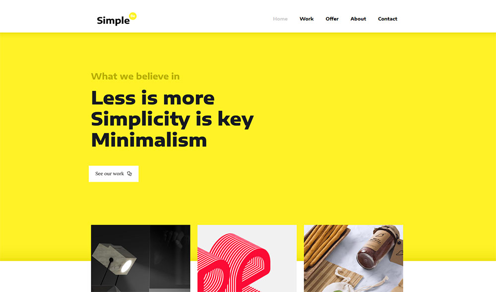
June 8, 2026Less is genuinely more. And the best minimalist website design examples prove it with load times, conversion rates, and user satisfaction scores.
Minimalism in web design isn't a trend that peaked and faded. It's the dominant visual language across SaaS, ecommerce, portfolio, and agency sites right now, because it works technically and commercially.
This article covers what actually defines a minimalist website, the most-referenced real examples across industries, the typography and color palette decisions behind them, common mistakes to avoid, and the tools used to build them.
By the end, you'll have a clear picture of what separates intentional minimalism from a site that's just underdressed.
What Is Minimalist Website Design?
Minimalist website design is a visual approach that removes every element that doesn't serve a direct function. The layout, color, and typography all work toward a single purpose, with nothing left over.
It's not the same as "clean design." A clean site can still carry layers of complexity. True minimalism removes until there's nothing left that shouldn't be there.
Visitors form their opinion of a site in 50 milliseconds (Mindfeeder, 2024). That split-second judgment is based entirely on visual design. A cluttered layout communicates noise before a single word is read.
ScienceDirect research from 2025 found that minimalist interfaces consistently outperformed cluttered counterparts in task completion speed, cognitive load reduction, and overall user satisfaction.
The core criteria are straightforward:
- A limited color palette, typically 1 to 3 colors
- Generous negative space, used deliberately rather than left empty by default
- Reduced navigation, usually 3 to 5 items maximum
- No decorative elements that don't serve a functional purpose
Structurally, minimalist sites favor single-column layouts, large typography as a layout tool, and hero sections built around one clear call to action.
There's also a technical argument. Fewer assets mean faster load times, and a 1-second delay in page load reduces conversions by 7% (Hostinger, 2024). Minimalist design and performance optimization point in the same direction.
The core principles of web design that govern spacing, hierarchy, and visual balance are what make minimalism work. Without those foundations, reducing elements just produces an incomplete site, not a minimal one.
What Are the Most-Referenced Minimalist Website Design Examples?
The most-studied minimalist websites aren't minimal by accident. Each one makes specific, deliberate choices that define the whole visual system.
| Site | Core Palette | Primary Minimalist Device | Industry |
|---|---|---|---|
| Apple.com | White, black, grey | White space as hierarchy | Consumer tech |
| Stripe.com | White + purple accent | Animated gradients as the only decoration | Fintech / SaaS |
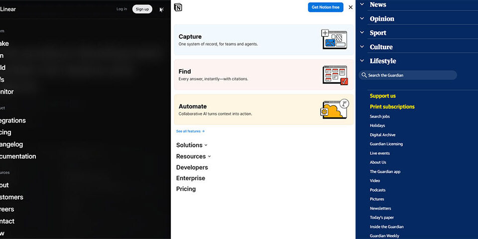
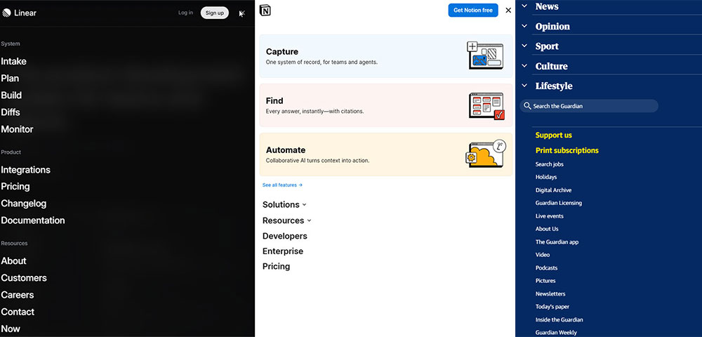
| Linear.app | Black + white | Dark mode, monochrome, Inter typeface | SaaS / Dev tools |
| Notion.so | White, black, blue accent | Typographic layout, no hero image | Productivity SaaS |
| Everlane.com | White, muted neutrals | Product photography as the design element | Ecommerce / Fashion |
Minimalist SaaS Website Examples
Linear and Vercel are the two most-referenced minimalist SaaS sites right now. Both use dark backgrounds, monospace type elements, and dense information hierarchy without visual decoration.

Linear treats speed as an aesthetic. The whole site communicates technical credibility through restraint, not through imagery or illustration.
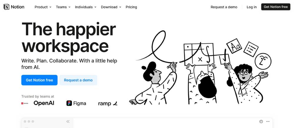
Notion takes the opposite palette approach: white background, abundant white space, product visuals as the only "image" layer. Notion's landing page focuses on one message and one call to action at a time (Todaymade, 2025).
Inter dominates minimalist SaaS typography. It's used by Notion, Linear, Shopify, and dozens of others, and has become the default choice for a reason (FullStop, 2026).
Minimalist Ecommerce Website Examples
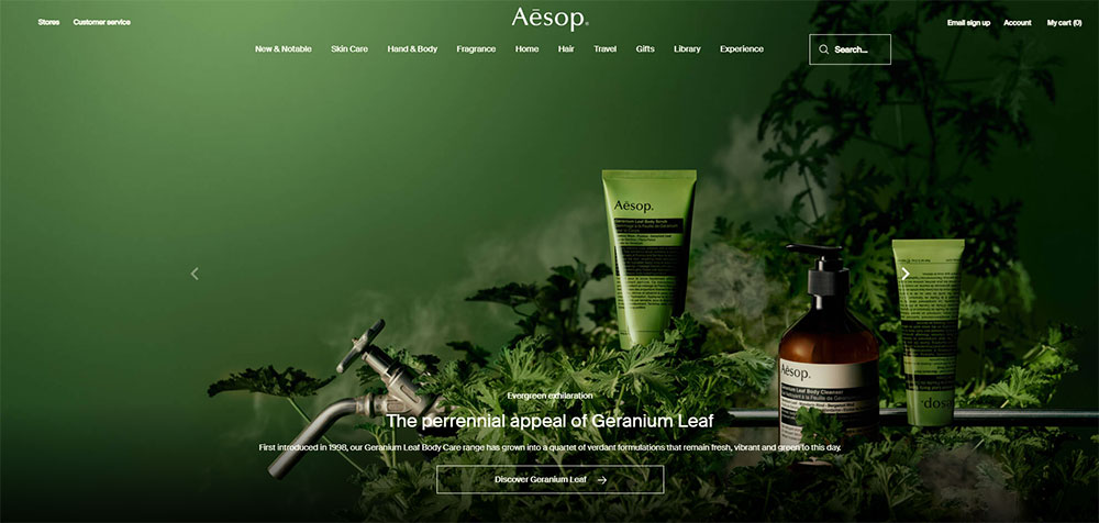
Aesop is the standard reference for minimalist ecommerce done right. Neutral colors throughout, thoughtful white space directing attention, and small product collages replacing traditional mega-menus.
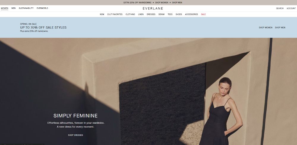
Everlane uses large product photos on a strictly white background. No promotional banners, no decorative graphics. The product is the design. Muji follows the same logic: white background, minimal copy, product images scaled by popularity.
These three brands show that minimalist ecommerce homepage design works best when the product itself is strong enough to carry the visual weight.
Minimalist Portfolio Website Examples

Portfolio sites have the most to gain from minimalism. The work should do the talking.
Tobias van Schneider's site uses a single typeface, one accent color, and a grid of project images with no descriptive copy on the homepage. Lars Tornoe goes further: a two-column image grid with zero copy anywhere, including the footer.
Common traits across the best minimalist portfolios:
- Navigation reduced to 3 to 4 items
- Project work displayed without decorative framing
- Monochrome or single accent color palette
- Name or studio name as the primary typographic element on the homepage
Well-structured portfolio design consistently comes back to the same rule: reduce the frame so the work fills it.
What Do the Best Minimalist Portfolio Website Examples Have in Common?
The most effective minimalist portfolios share a structural logic, not just a visual style. Each design decision removes something that competes with the work itself.
94% of first impressions come down to design, covering layout, color, typography, and spacing, before a visitor reads a single word (Stanford Web Credibility Research, 2025). In a portfolio context, that means the container needs to disappear so the work is what registers.
Navigation: 3 to 4 items maximum. Work, About, Contact, and sometimes a journal or blog. Nothing else.
Color: Most successful minimalist portfolios use monochrome or a single accent. The accent, when present, typically appears only on hover states or a single call-to-action element.
Typography: One typeface family, two weights maximum. The name or studio name at large scale on the homepage functions as both branding and layout element.
Project display: Work shown without decorative framing, labels kept minimal, case study text reserved for inner pages.

Femke van Schoonhoven's portfolio is a good reference point. The homepage is a grid of project thumbnails with a floating navigation bar and nothing else. No tagline. No hero image. The work earns the first impression on its own.
For graphic designers building portfolio websites, this level of restraint is harder than it looks. The instinct is to fill space. The skill is knowing what to remove.
What Makes Minimalist Ecommerce Websites Work?
Minimalist ecommerce design isn't just an aesthetic preference. It has measurable performance implications.
An ecommerce site loading in 1 second converts 2.5 times more visitors than a site loading in 5 seconds (HubSpot, 2024). Minimalist design reduces asset count by default, which pushes load times down without requiring performance optimization as a separate effort.
How Product Photography Replaces Decoration
The defining move in minimalist ecommerce is using product photography as the primary visual layer. There's no need for background graphics, promotional banners, or illustrated sections when the product images are strong enough to carry the page.
Aesop does this with neutral-colored product shots on warm backgrounds. Everlane uses large images on pure white. Muji scales product images by sales volume, giving the bestsellers the most visual real estate.
The result is a page that loads faster, directs attention more clearly, and communicates product quality through the photography itself.
How Navigation Structure Affects Ecommerce Conversion
Hick's Law states that decision time increases logarithmically with the number of available choices. More navigation options don't help users find products faster. They slow the decision-making process down.
Minimalist ecommerce navigation typically means:
- No mega-menus
- 5 or fewer top-level categories
- Subcategories accessed through filtering on category pages, not through nested menus
Aesop replaces traditional category navigation with small product collages that act as visual entry points. It's a navigation system that looks like editorial layout, which keeps the minimal feel intact while still directing users efficiently.
Well-designed ecommerce landing pages in the minimalist category consistently follow this pattern: one clear visual focus, one action per screen section, and navigation that recedes until the user needs it.
Checkout Page Minimalism
The checkout flow is where minimalism has the clearest conversion argument. Removing distractions at the point of purchase reduces abandonment.
Minimalist checkout means: no navigation header, no promotional banners, no cross-sell widgets. Just the order summary, the form, and the payment button.
Vodafone tested this direction in 2021. A 31% improvement in LCP scores led to a 15% improvement in their lead-to-visit rate and an 11% improvement in cart-to-order conversion (Web.dev). The performance gains and the design simplification came from the same decisions.
How Do Minimalist Agency and Studio Websites Use White Space?
White space in minimalist agency websites isn't empty area. It's an active layout tool that communicates confidence.
A site that fills every pixel signals anxiety. A site with generous negative space signals that the work doesn't need to compete for attention. For creative agencies, that's a positioning statement before the portfolio loads.
According to research on how white space functions in web design, strategic use of negative space around headlines and images separates content zones more clearly, reduces the feeling of crowdedness, and directs the user's eye along a defined path (Diva Portal, 2024).
Grid Discipline in Agency Minimalism
Most minimalist agency sites use strict 12-column grids with wide outer margins. The margins themselves are a design element, not wasted space.
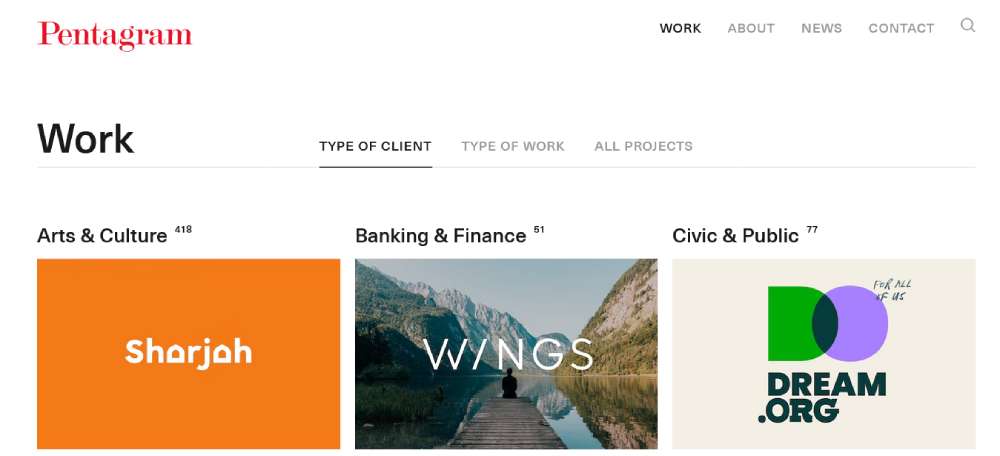
Pentagram is the reference here. The site uses a uniform project grid, restrained typography, and no decorative elements whatsoever. The entire visual weight sits with the project photography.
Wide margins are particularly effective at forcing hierarchy. When content is constrained to the center portion of the viewport, the outer white space creates emphasis without adding visual elements.
Motion as the Only Complexity Layer
Minimalist agency sites frequently use motion as the single point of complexity. Everything else stays static; one layer moves.
| Motion Type | Where It Appears | Effect |
|---|---|---|
| Hover state reveals | Project thumbnails | Keeps grid clean until interaction |
| Custom cursor effects | Global | Adds personality without visual clutter |
| Scroll-triggered fades | Section transitions | Creates pacing without decorative breaks |
| Text reveals on load | Hero headline | Frames the first impression as an event |
Instrument, a design and technology studio, uses this approach. The site is predominantly white with minimal color. The only complexity is in hover interactions and cursor behavior. At rest, it reads as completely still.
The best web design agency websites consistently demonstrate this: restraint in the static state, richness in the interactive layer.
What Typography Choices Define Minimalist Website Design?
When decoration is removed, typography carries the entire visual workload. The typeface choice, scale, weight, and spacing aren't supporting elements anymore. They are the design.
88% of users are unlikely to return to a website after a bad experience (Blacksmith Agency, 2024). Poor typography is one of the fastest ways to produce that bad experience, especially on minimalist sites where there's nothing else to fall back on.
Typeface Categories Used in Minimalist Design
Geometric sans-serifs dominate minimalist web design. Helvetica Neue, GT Walsheim, Aktiv Grotesk, and Inter all appear across the reference sites covered in this article.
Inter specifically has become the default for SaaS and developer-tool minimalism. Notion, Linear, and Shopify all use it. The typeface is engineered for screen legibility, which aligns with the performance-first logic of minimalist design (FullStop, 2026).
Transitional serifs are common in editorial and portfolio minimalism. They bring warmth and character to layouts that might otherwise read as clinical. The contrast between a serif headline and a sans-serif body creates hierarchy without requiring color or graphic elements.
Type as Layout
On sites with no hero imagery, the headline itself becomes the visual anchor.
Linear uses this approach. The homepage headline runs large, white on black, and carries most of the visual weight for the above-the-fold section. No illustration, no product screenshot in the hero, just type and space.
Key spacing variables that function as white space tools within text:
- Line height set at 1.5x to 1.7x for body text improves readability and opens visual space
- Tracking (letter spacing) on uppercase labels creates visual distinction without a second font
- Generous paragraph spacing separates content zones without dividers or horizontal rules
This is worth studying alongside broader guidance on how typography functions in web design, particularly around contrast ratios and hierarchy. WCAG 2.1 requires a 4.5:1 contrast ratio for normal text, which minimalist monochrome palettes can violate if white text is placed on light grey rather than true black.
Monotype vs. Type Pairings
Minimalist sites split roughly into two camps here.
Single typeface, multiple weights: This approach creates hierarchy through weight variation alone. Linear, Vercel, and most developer-tool sites use this method. It's disciplined and cohesive, but requires a typeface with a strong weight range to work well.
Deliberate pairings: A display face for headlines, a utility face for body and labels. Mailchimp switched from Cooper BT to Means (Commercial Type) and saw a 33% increase in user engagement across campaign materials (FullStop, 2026). The right pairing can do significant brand work without adding visual complexity.
Looking at sites with strong typographic systems is probably the fastest way to calibrate your own choices. The difference between a site that uses typography well and one that uses it poorly is visible in seconds, even to non-designers.
What Color Palettes Do Minimalist Websites Use?
Color decisions in minimalist design carry more weight than in complex layouts, because there's less else to look at. A palette choice that works fine in a busy layout becomes the defining visual decision when it's the only color on screen.
75% of consumers judge a company's credibility by how its website looks (Made for Web, cited in Designforce, 2025). On minimalist sites, color is one of the primary signals that judgment relies on.
The Three Dominant Palette Approaches
Monochrome (black, white, grey): The most common minimalist palette. Linear uses true black (#000000 base) with white type. Vercel follows the same logic. The approach reads as technical, confident, and premium.
Neutral base with single accent: Notion uses a white base with a blue accent (#2EABFF) reserved for interactive elements. The accent appears only where action is required, so it always reads as a signal rather than decoration.
Muted earth tones: Aesop and Everlane both sit here. Warm off-whites, stone greys, and natural browns. This palette reads as premium and tactile, which aligns with their product positioning.
Why Minimalist Sites Avoid Background Gradients
Gradients add complexity to the first visual layer. On a minimalist site, the background is the canvas. Putting a gradient there means the canvas itself becomes an element competing for attention.
The exception: Stripe uses animated gradients, but they function as the single decorative layer in an otherwise very restrained design system. It works because everything else is white. The gradient is the one allowed complexity.
Dark Mode Minimalism as a Separate Category
Dark mode minimalism has its own palette logic. Vercel uses near-black (#0A0A0A) with white type and subtle grey dividers. Raycast follows a similar approach, with gradient accents as the only color element.
This palette communicates speed and technical precision. It's the right choice for developer tools, security products, and performance-focused SaaS. It's a poor fit for consumer wellness, food, or anything where warmth is part of the product promise.
Color decisions in minimalist design connect directly to broader questions about color theory applied to web design. The same principles around contrast, temperature, and saturation apply, but the stakes are higher when you're working with 1 to 3 colors instead of 8 to 10.
Sites built around strong, restrained color schemes make the underlying theory visible in a way that complex palettes don't. Studying them is genuinely useful.
How Does Navigation Design Differ on Minimalist Websites?
Navigation is where minimalism either works or breaks. Get it right and users move through the site without thinking about it. Get it wrong and the restraint reads as confusion.
Simplified navigation can reduce bounce rates by up to 40%, according to Loopex Digital (2026).
Hamburger Menus vs. Persistent Minimal Nav
Persistent minimal nav suits content and ecommerce sites. Users can always see where they are and where they can go, which matters when they're mid-task.
Hamburger menus suit portfolio and agency sites, where the work itself is the primary experience. Hiding the nav removes visual competition from the content.
The choice comes down to one question: how often does the user need to navigate mid-visit? If frequently, keep it visible. If rarely, hide it.
The Five-Item Rule and Why It Holds
Hick's Law is the principle that decision time increases logarithmically as the number of choices grows. Applied to navigation, it means every item added above 5 slows user movement through the site.
Most minimalist sites cap primary navigation at 3 to 5 items. Secondary links get moved to the footer, where they're available without cluttering the primary visual path.
Google's homepage is the clearest example of this. Two buttons. One input. No navigation header. Decision time is essentially zero, which is exactly what the experience requires.
Footer as Navigation Fallback
Minimalist sites with hidden or reduced navigation rely on the footer to carry secondary links.
A well-structured footer can include contact details, secondary page links, legal pages, and social links without appearing on the main visual path at all. Siteinspire and Minimal Gallery both use this approach, with dense footers behind otherwise sparse layouts.
Exploring real website navigation examples across different site types shows how the footer-as-secondary-nav pattern scales: from small portfolios to large ecommerce sites, the principle holds.
For a closer look at the structural decisions behind minimalist navigation, the breakdown on website menu design covers the specific patterns in more detail.
What Are the Most Common Minimalist Web Design Mistakes?
Most minimalist design failures come from the same 3 places: removing too much, ignoring contrast requirements, or treating minimalism as a static aesthetic rather than a functional system.
WebAIM found that low-contrast text is the most common accessibility error, affecting 83.9% of homepages (Level Access, 2024). Minimalist palettes, especially grey-on-white combinations, are a primary source of this problem.
Confusing Empty with Minimal
Empty design happens when elements are removed randomly until the page looks sparse. Minimalist design happens when each remaining element is evaluated against a clear communication goal.
The practical test: if a user can't find the information they need because it was removed in the name of simplicity, that's a usability failure, not minimalism. Removing content users need is omission, not restraint.
A minimalist ecommerce site studied in cognitive load research removed product category labels to reduce visual noise. Users reported increased uncertainty and higher decision fatigue. The design reduced visual complexity but increased cognitive complexity (Medium, Bootcamp, 2024).
Contrast Errors in Monochrome Palettes
WCAG 2.1 Level AA requires a 4.5:1 contrast ratio for normal text against its background. This is where minimalist grey palettes most often fail.
Common violations:
- Light grey text (#999) on white backgrounds (fails at approximately 2.85:1)
- White text on medium grey (fails below #767676)
- Interactive element borders with less than 3:1 contrast against the background
95.9% of homepages had detectable WCAG failures in 2024, down only slightly from 96.3% in 2023 (BOIA, 2024). Minimalist design trends toward monochrome contribute to this persistently high rate.
Missing Micro-Interactions
A minimalist site without hover states, focus rings, and transition feedback feels broken, not minimal.
Hover states confirm that an element is interactive before the user commits to clicking it. Without them, buttons and links are visually indistinguishable from static text, which increases errors and frustration.
Focus rings are not optional. They're required for keyboard navigation accessibility under WCAG 2.1, and removing them to preserve visual cleanliness is a compliance failure.
Micro-interactions are the one layer of complexity that minimalist sites should never strip out. They're functional, not decorative.
The full breakdown of what separates intentional minimalism from under-designed sites is covered in the guide on websites with strong UI systems.
What Tools and Resources Are Used to Build Minimalist Websites?
The tools professionals use to design and build minimalist sites reflect the same philosophy as the sites themselves: purpose-built, without unnecessary complexity.
59% of designers and developers were already using AI tools in their workflows in 2024 (Figma, 2024). The tools below are what the remaining workflow runs on.
Design Tools
Figma is the standard design tool for minimalist web projects. Its Auto Layout feature maps directly to the spacing and grid discipline that minimalist design requires. Component-based systems in Figma enforce consistency across type scale, spacing tokens, and color.
Figma and Webflow work best together, covering different stages: Figma handles design and prototyping, Webflow handles build and deployment (Amply, 2026). For no-code minimalist builds, Webflow gives designers direct control over spacing, type, and interaction without a development handoff.
Development Frameworks
Three frameworks dominate minimalist site builds in 2024 and 2025:
- Next.js: Used by Vercel, Linear, and Stripe. Server-side rendering improves LCP scores directly, which aligns with minimalism's performance logic
- Tailwind CSS: Utility classes enforce spacing discipline. Margin and padding decisions become systematic rather than arbitrary
- Webflow: Best for no-code minimalist portfolio and marketing sites where design precision matters more than custom functionality
Performance and Audit Tools
Passing Core Web Vitals requires LCP under 2.5 seconds, INP under 200 milliseconds, and CLS under 0.1 (Google Search Central, 2024). Minimalist sites reach these targets more easily than complex sites, but still need to be tested.
Google Lighthouse runs local performance audits. PageSpeed Insights combines Lighthouse lab data with real Chrome User Experience Report (CrUX) field data. Sites that pass all three Core Web Vitals thresholds see 24% lower bounce rates (Digital Applied, 2026).
For anyone reviewing the full process of building a minimal site from concept to launch, the website design checklist covers the key technical and design gates before publishing. The complete overview of web design tools goes deeper on tool comparisons across the full stack.
How Do Minimalist Websites Perform Against Non-Minimalist Designs?
The performance case for minimalism is grounded in data, not aesthetics. Fewer assets, simpler structure, and lower cognitive load all produce measurable outcomes.
| Metric | Minimalist Design Impact | Source |
|---|---|---|
| Page load speed | Faster by default; fewer assets to fetch | Illustrate Digital, 2024 |
| Bounce rate | Simplified nav reduces bounce up to 40% | Loopex Digital, 2026 |
| Conversion rate (landing page) | No-nav landing page increased CVR by 336% | Cropink, 2025 |
| Core Web Vitals | Lower asset count improves LCP and CLS directly | Google Search Central, 2024 |
Load Speed and Asset Count
Website weight increased by approximately 35% between 2016 and 2023 for WordPress-based sites, driven by added plugins, heavier images, and third-party scripts (Illustrate Digital, 2024).
Minimalist sites run counter to this trend by design. Fewer images, no decorative scripts, and simpler DOM structures all reduce the total bytes the browser needs to fetch and render. A 1-second page delay reduces conversions by 7% and increases bounce probability by over 30% as load time grows from 1 to 3 seconds (Mindfeeder, 2025).
Conversion Rate Evidence
A landing page with no navigation menu increased conversion rates by 336%, from 3.12% to 13.64% in a documented case study (Cropink, 2025).
That's an extreme example. But the principle scales. Every element that competes for the user's attention at the decision point reduces the probability of conversion. Minimalist checkout flows, reduced navigation on product pages, and single-CTA hero sections all apply this logic incrementally.
79% of consumers say they would buy from the same company again after a positive digital experience (Digital Silk, 2026). The minimalist sites that perform best are the ones where the experience itself is invisible.
Cognitive Load and Task Performance
ScienceDirect research (2025) found minimalist interfaces consistently outperform cluttered ones on task completion time, error rate, and user satisfaction scores using the NASA Task Load Index.
The mechanism is straightforward. Every visual element on a page requires cognitive processing. Fewer elements mean less processing, which means users reach their goal faster and with less frustration. The experience feels effortless, which is the point.
For context on how this applies to specific site categories, the analysis of user-friendly website design covers the UX principles that bridge minimalist aesthetics and functional performance. The breakdown of sites with genuinely strong UX gives real examples across industries.
What Are the Best Minimalist Website Design Galleries and Inspiration Sources?
Finding good minimalist reference material takes less time than most designers think. A handful of curated galleries cover the range, from strict Swiss-grid minimalism to warm editorial restraint.
The difference between these galleries matters. Awwwards covers a broad design spectrum and includes jury scores and technical breakdowns. Minimal Gallery and Siteinspire operate with a much higher exclusivity threshold, so the reference quality per entry is higher.
Primary Curation Sources
Siteinspire is the go-to for minimalist web design research. It's filterable by style, type, subject, and platform. The "Minimal" category is one of the most-used filters on the site (Ouiflow, 2024). Built and curated by Daniel Hows, it maintains a consistent quality floor that most other galleries don't.
Minimal Gallery (minimal.gallery) was created by designer Piet Terheyden in 2013 and updated daily. The selection is strict. Entries that don't meet the minimalist criteria don't make it in, which keeps the reference value high over time (UIUX Showcase, 2025).
Secondary Reference Sources
For more specific use cases:
- Awwwards Minimal tag: Includes jury scores and full technical write-ups. Better for studying award-winning work than for broad inspiration sweeps
- Land-book.com: Focuses on landing pages. Useful for conversion-focused minimalist reference rather than full-site design
- Httpster.net: Broader in scope but filterable. Good for finding minimalist examples in niche industries
Platform-Specific Inspiration
Beyond galleries, the best current minimalist SaaS examples live on the sites themselves. Linear, Vercel, and Anthropic are cited consistently as the canonical references for minimalist landing page craft in 2024 and 2025 (Grid Rebels Studio, 2026).
Studying the actual sites in a browser, with DevTools open, gives more information than any screenshot gallery. Computed styles, grid structures, and spacing values are all visible and learnable.
For designers exploring minimalist templates as a starting point rather than building from scratch, the simple website templates collection covers clean, minimal starting structures across different categories. The broader aesthetic website templates roundup includes minimalist options alongside other restrained visual approaches.
For portfolio-specific templates, the artist website templates selection includes several stripped-back, image-first layouts. Architecture and interior design categories also run minimalist by default. The architecture website templates and interior design website templates pages show how minimalist visual systems are applied in project-display contexts.
For anyone building a minimalist landing page from reference rather than from scratch, seeing how other conversion-focused minimal pages handle the CTA, spacing, and navigation is the fastest way to calibrate the layout before touching design tools.
FAQ on Minimalist Website Design
What is minimalist website design?
Minimalist website design removes every element that doesn't serve a direct function. It uses limited color palettes, generous negative space, reduced navigation, and typography-led layouts to focus the user on a single purpose.
What are the best examples of minimalist websites?
Apple.com, Linear.app, Stripe.com, Notion.so, and Everlane.com are the most-referenced examples. Each uses a restrained color palette, clear visual hierarchy, and product-first layouts with no decorative elements.
What makes a website truly minimalist?
True minimalism means nothing remains that doesn't earn its place. That includes navigation items, decorative graphics, background textures, and copy. A clutter-free layout backed by intentional white space use is the baseline.
Is minimalist design good for ecommerce websites?
Yes. Minimalist ecommerce sites load faster, reduce cognitive load at the decision point, and let product photography carry the visual weight. Brands like Aesop, Muji, and Warby Parker use it effectively across product and checkout page design.
What fonts do minimalist websites use?
Geometric sans-serifs dominate. Inter, Helvetica Neue, GT Walsheim, and Aktiv Grotesk are the most common choices. Most minimalist sites use a single typeface family with two weights, letting typographic hierarchy replace visual decoration.
How many colors should a minimalist website use?
Typically 1 to 3 colors. The most common approaches are monochrome black and white, a neutral base with one accent color, or muted earth tones. The accent color appears only on interactive elements, not as decoration.
Does minimalist design improve website performance?
Directly. Fewer assets mean faster load times. Minimalist sites naturally score better on Core Web Vitals metrics like LCP and CLS. A 1-second delay in load time reduces conversions by 7%, so the performance benefit is also commercial.
What are common mistakes in minimalist web design?
The three most frequent are low-contrast text that fails WCAG 2.1 requirements, removing content users actually need, and omitting micro-interactions like hover states and focus rings. Minimalism requires precision, not just removal.
Where can I find minimalist website design inspiration?
Siteinspire, Minimal Gallery, Awwwards Minimal tag, and Land-book.com are the primary sources. For SaaS inspiration specifically, Linear.app, Vercel.com, and Anthropic.com are the most-cited minimalist landing page references right now.
What tools are used to build minimalist websites?
Figma for design, Webflow for no-code builds, and Next.js with Tailwind CSS for custom development. Google Lighthouse and PageSpeed Insights handle performance auditing. Most professional minimalist sites use at least two of these in combination.
Conclusion
This conclusion is for an article presenting minimalist website design examples across SaaS, ecommerce, portfolio, and agency categories.
The pattern is consistent. Sites that strip layouts down to their functional core, think restrained color palettes, tight typographic hierarchy, and deliberate negative space, outperform busier designs on load speed, bounce rate, and conversion.
Brands like Aesop, Linear, and Everlane didn't arrive at minimalism by accident. Each design decision was made against a clear communication goal.
The mistakes are equally consistent: low contrast ratios that fail WCAG 2.1, missing micro-interactions, and removing content users actually need.
Minimalism done right is precise, not sparse. The difference shows up in the metrics.


