


Awesome VR Website Design Examples
January 19, 2026
The Best Agency Website Design Examples
January 20, 2026A patient looking for an eye exam will judge your practice before they ever walk through the door. That judgment happens on your website, usually within three seconds.
Most optometrist website design examples floating around online look the same. Blue background, stock photo of someone wearing glasses, a buried phone number. Patients bounce. Appointments don't get booked.
This guide breaks down real optometry practice websites that actually convert visitors into patients. You'll see what works in homepage layout, mobile responsiveness, eyewear product display, color choices, booking systems, and ADA compliance.
Each example highlights a specific design strength you can apply to your own eye care practice site.
What Is Optometrist Website Design
Optometrist website design is the process of building a digital presence specifically for eye care practices, covering layout, branding, patient conversion tools, and visual presentation tailored to optometry services.
It goes beyond picking a template and dropping in a logo. The site has to handle appointment booking, eyewear product displays, insurance information, and patient education content about conditions like myopia, astigmatism, and glaucoma.
Solo practitioners, multi-location clinics, and optical retail shops all use these designs. But each type of practice needs a different structure. A solo doctor website leans heavy on personal branding, while a chain with five locations needs consistent navigation and location-specific pages.
The best optometry websites combine medical credibility with retail appeal. Patients are shopping for both a healthcare provider and a pair of frames, sometimes in the same visit.
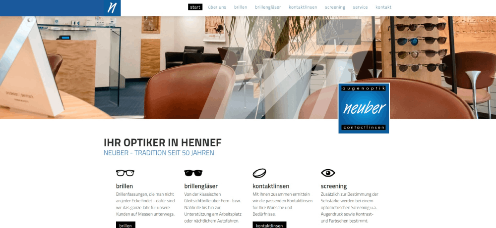
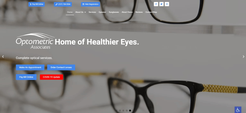
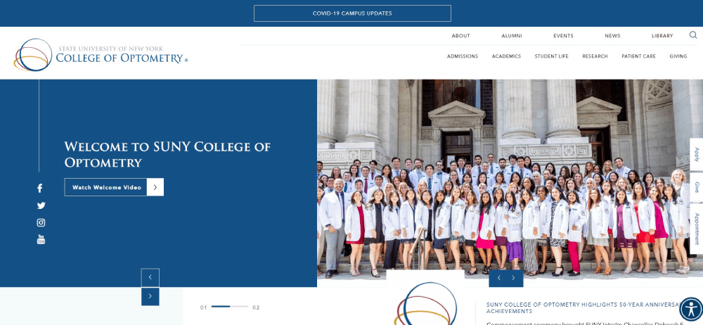
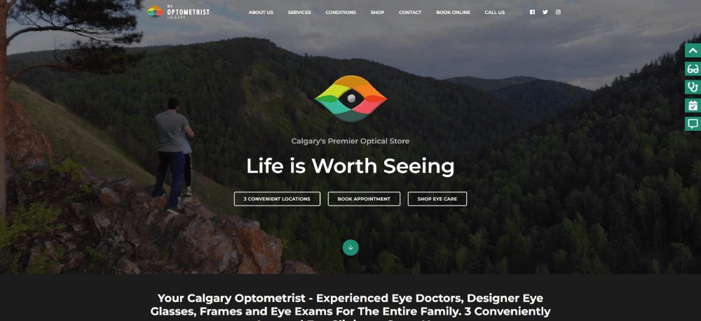
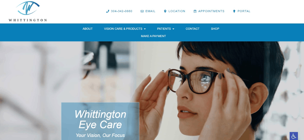
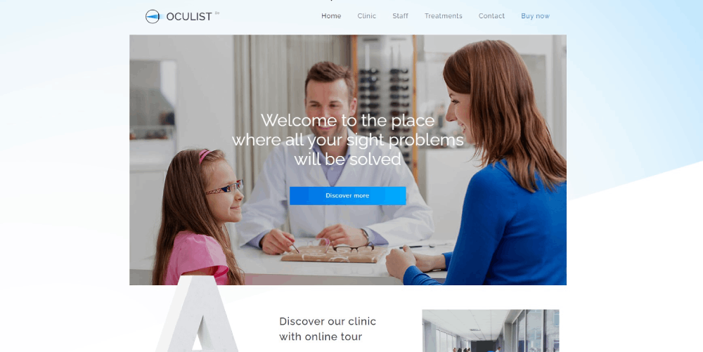
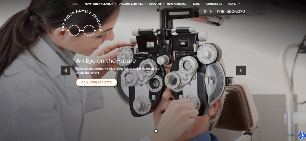
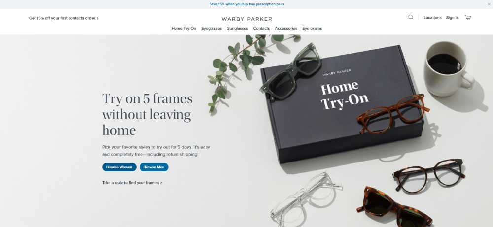
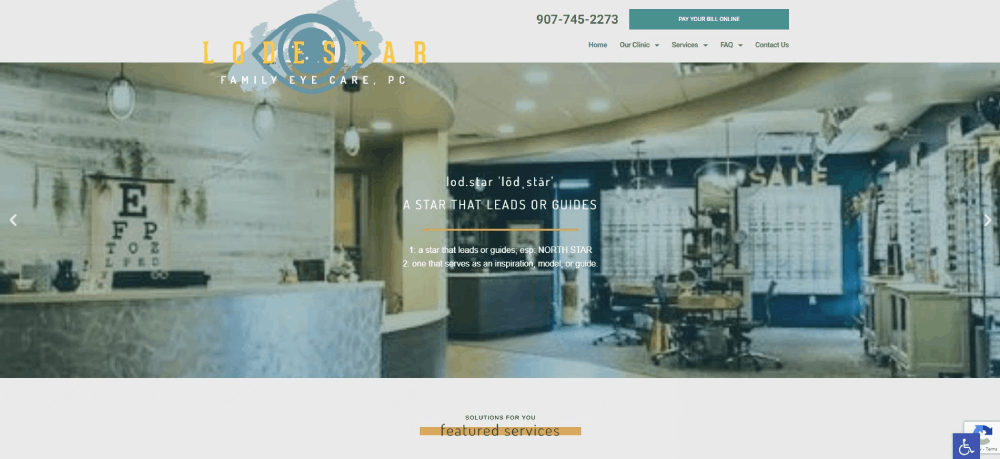
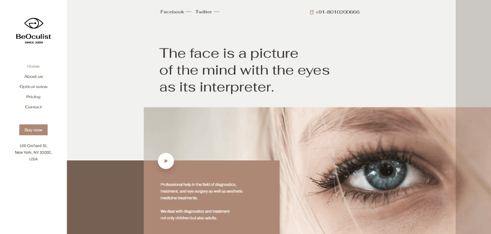
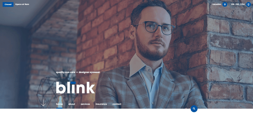
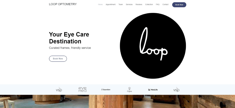
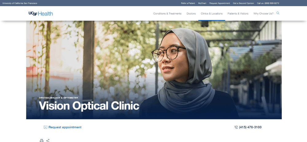
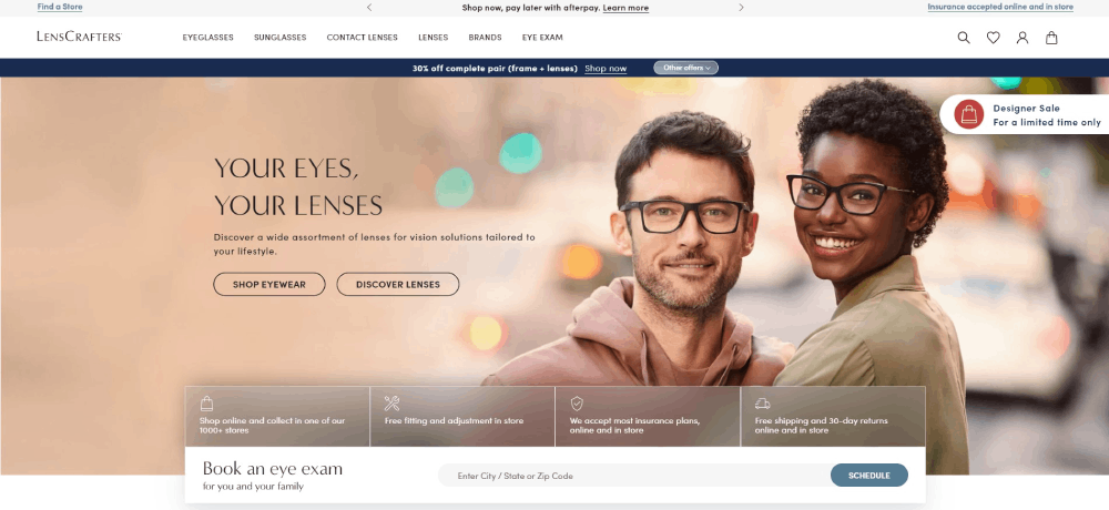
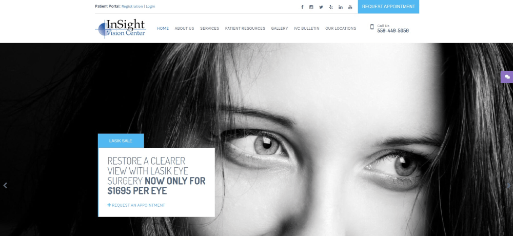
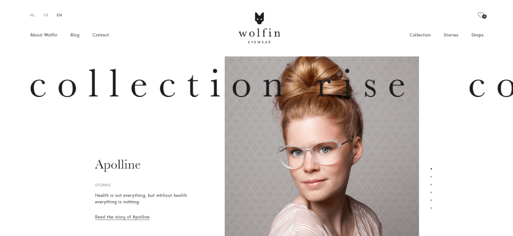
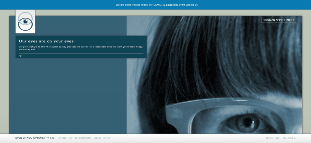
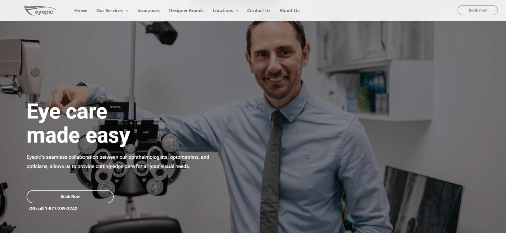
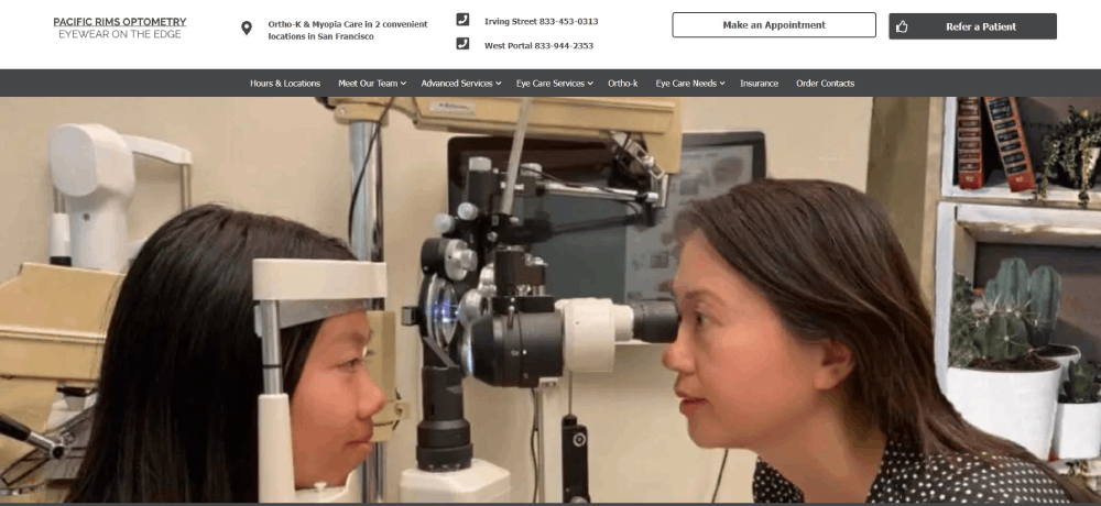
Optometrist Website Design Examples
Look Deeper


How Optometrist Websites Differ From General Healthcare Websites
Most healthcare websites focus on one thing: getting patients to book. Optometry sites do that too, but they also function as product showcases.
Think about it. A dermatologist's site doesn't need a frame gallery. A pediatrician doesn't sell sunglasses. Optometrist websites sit at the intersection of clinical care and retail, and that changes everything about how the site gets built.
Here's what separates them from standard medical practice sites:
- Eyewear product catalogs with brand filtering for Ray-Ban, Oakley, and other designer frames
- Virtual try-on tools that let patients preview glasses using their webcam
- Contact lens ordering and reorder portals tied to prescription data
- Educational content libraries covering eye exams, lens types, and vision conditions
- Insurance verification sections for VSP Vision Care, EyeMed, and other vision plans
General healthcare sites lean toward clinical tones with safe blue-and-white palettes. Optometry practices have more room to experiment because they're also selling a lifestyle product.
Some practices go full luxury with dark themed designs and high-end photography. Others keep things warm and approachable, especially pediatric-focused clinics.
The hybrid retail-clinical nature also affects site architecture. You need service pages for comprehensive eye exams AND category pages for progressive lenses, photochromic lenses, and anti-reflective coatings. That's a lot of content to organize without making the website navigation feel cluttered.
What Makes an Effective Optometrist Website Design
An effective eye care website converts visitors into booked appointments. Everything else is secondary.
That sounds obvious, but I've seen plenty of optometry sites that look gorgeous and completely fail at getting people to pick up the phone or click "Book Now." Pretty doesn't equal functional.
Three things drive conversion on optometrist sites: homepage layout, color choices, and mobile performance.
How Does Homepage Layout Affect Patient Conversion
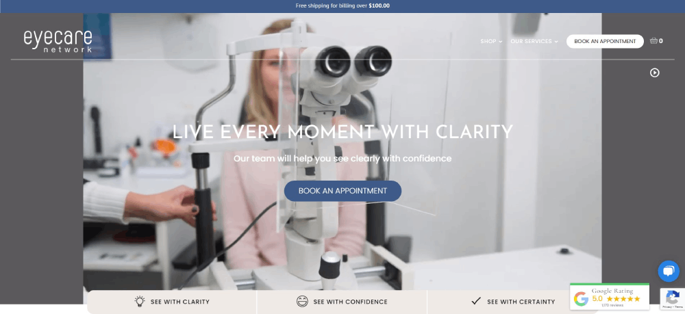
The hero section decides whether someone stays or bounces. Place the practice name, a clear value statement, and a call to action button above the fold.
Video backgrounds showing eye exams or frame shopping work well here. Sites using video backgrounds tend to hold attention longer, but only if the file is compressed properly. A 15MB hero video kills your Google PageSpeed Insights score.
Phone number placement matters more than most people realize. Top-right corner of the header, visible on every page, with click-to-call enabled on mobile. That's the standard.
What Role Does Color Scheme Play in Optometry Websites
Navy blue and white dominate optometry websites. There's a reason for that: patients associate these colors with medical professionalism and trust.
But not every practice has to look the same. A good color scheme reflects the practice's positioning. Luxury optical boutiques pull off burgundy, black, and gold. Pediatric eye care clinics use brighter, friendlier tones.
Contrast ratios matter for ADA compliance. WCAG 2.1 requires a minimum 4.5:1 contrast ratio for normal text. Light gray text on white backgrounds, which I still see on way too many sites, fails this test every time.
How Does Mobile Responsiveness Impact Optometry Practice Visibility
Over 70% of healthcare searches happen on mobile devices. If the site doesn't work on a phone, the practice is invisible to most potential patients.
Google's mobile first indexing means the mobile version of your site is what gets ranked. Not the desktop version. The mobile version.
Key mobile requirements for optometry sites:
- Tap-to-call buttons that work without zooming
- Responsive image galleries for eyewear collections
- Appointment booking forms that don't require horizontal scrolling
- Core Web Vitals scores passing Google's thresholds on mobile
Took me a while to accept this, but desktop-first design for medical sites is dead. Build for the phone screen first, then scale up.
What Features Should Every Optometrist Website Include
How Does Online Appointment Scheduling Reduce Patient Drop-Off
Online booking removes the biggest friction point in patient acquisition: calling during office hours. Tools like NexHealth, Weave, and Calendly integrate directly into optometry websites and let patients schedule 24/7.
Practices using online scheduling report fewer no-shows because automated SMS reminders go out before each appointment. The booking widget should live on the homepage, not buried on a "Contact" page three clicks deep.
What Contact Information Placement Converts the Most Visitors
Phone number in the top-right header on every page, with click-to-call enabled for mobile users. An embedded Google Maps widget on the contact page. Practice address, hours, and phone number (NAP data) matching exactly what's listed on the Google Business Profile.
NAP consistency across your website, Google Maps listing, and directory profiles directly affects local search rankings. Even small differences like "Suite 200" versus "Ste. 200" can cause problems.
How Do Patient Testimonials and Reviews Influence New Bookings
Patient reviews displayed on the homepage act as social proof. Google Reviews integration showing a 4.8-star average next to the booking button removes hesitation for first-time visitors.
Video testimonials outperform text reviews for engagement, but they're harder to collect. At least in my experience, a mix of both works best: two or three video testimonials on the homepage, plus a dedicated review section with 15 to 20 written reviews.
What Type of Content Should an Optometrist Blog Cover
Blog content on optometry sites serves two purposes: patient education and search visibility. The topics should match what patients actually search for, not what the doctor finds interesting.
High-performing blog categories for eye care practices:
- Eye conditions (myopia, glaucoma, astigmatism, macular degeneration)
- Lens care guides for contact lens wearers
- Children's vision and pediatric eye exams
- Digital eye strain from screen time
- Seasonal eye care (allergies, UV protection, dry winter air)
- Eyewear buying guides comparing frame materials and lens coatings
Each post should target a specific question patients ask. "How often should I get an eye exam?" is a better article than "The Importance of Eye Health." One answers a query directly. The other is filler content that ranks for nothing.
How to Choose the Right Design Style for Your Optometry Practice
What Should a Solo Optometrist Prioritize Versus a Multi-Location Clinic
Solo practitioners build around personal branding. The doctor's photo, bio, and credentials take center stage. A single-location practice can get away with a simpler site structure, maybe 10 to 15 pages total, focused on services, eyewear, and a strong "About" page similar to a personal website.
Multi-location clinics need location-specific landing pages with unique NAP data, staff directories for each office, and consistent branding across all locations. The site architecture gets more complex fast. A website menu with a location selector in the header is the standard approach.
How Does Your Target Patient Demographics Shape Design Decisions
The patient you're trying to attract dictates every design choice. Pediatric practices use larger fonts, friendly illustrations, and bright color palettes. Practices targeting seniors keep navigation simple, increase button sizes, and avoid animations that cause confusion.
Luxury optical boutiques go the opposite direction. Dark backgrounds, refined typography, and high-end product photography styled like fashion websites. The site should feel like walking into a premium retail store, not a medical clinic.
Budget-friendly family practices stick with warm, approachable designs. Think bright whites, soft blues, real photos of the staff, and prominent insurance acceptance badges.
Common Optometrist Website Design Mistakes to Avoid
Most eye care websites fail for the same handful of reasons. These are the mistakes I see over and over on optometry practice sites:
- Uncompressed images tanking page speed, especially hero images and eyewear galleries
- Missing mobile optimization when over 70% of patients search on phones
- Contact information buried on a subpage instead of visible in the header
- No clear call-to-action on the homepage, just a wall of text about the practice history
- Outdated stock photos of models pretending to be patients
- Missing doctor bios or bios without credentials and professional photos
- No patient reviews section anywhere on the site
- Ignoring ADA and WCAG 2.1 accessibility requirements
- Content that reads like it was written for search engines instead of actual patients
- No SSL certificate, which Chrome flags as "Not Secure" and scares visitors away
The worst offender? Sites built on WordPress with five-year-old themes that were never updated. Broken layouts on mobile, slow load times, and security vulnerabilities. If the site runs on an outdated content management system, a full website redesign is the only real fix.
Run the site through Google PageSpeed Insights and Lighthouse before anything else. If the performance score is below 50 on mobile, design improvements won't matter until the technical foundation gets sorted out.
Check the website checklist for a complete list of items to audit before launching or redesigning any practice site.
FAQ on Optometrist Website Design Examples
How much does an optometrist website cost?
A custom optometry website ranges from $3,000 to $15,000 depending on features like online appointment scheduling, eyewear galleries, and patient portal integration. Template-based options on WordPress or Squarespace start around $500 to $2,000 with limited customization.
What platform works best for optometry websites?
WordPress dominates the optometry space because of its flexibility with plugins for booking systems, HIPAA compliance, and eyewear catalogs. Squarespace and Wix work for solo practitioners who want simpler setups without heavy customization needs.
Do optometrist websites need to be HIPAA compliant?
Any site collecting patient health information through forms, portals, or online scheduling requires HIPAA compliance. This includes SSL certificates, encrypted data storage, and secure contact forms. Standard website builders don't cover this by default.
What colors work best for eye care websites?
Navy blue, white, and teal are the most common choices for optometry practice sites because patients associate them with medical trust. Luxury optical boutiques use darker palettes, while pediatric practices lean toward brighter, friendlier tones.
How important is mobile responsiveness for optometry sites?
Over 70% of healthcare searches happen on mobile devices. Google's mobile first indexing ranks the mobile version of your site, not desktop. A non-responsive optometry website loses both patients and search visibility.
Should an optometrist website include an online store?
Practices selling eyewear and contact lenses benefit from an integrated online store with brand filtering and virtual try-on features. It adds a revenue stream beyond in-office visits. Smaller practices can start with a product gallery linking to in-store purchases.
What pages should every optometrist website have?
Homepage, services page, eyewear gallery, doctor bio, contact page with embedded Google Maps, patient reviews section, blog, and an online booking page. Multi-location practices also need individual location pages with unique NAP data.
How do I add online booking to my optometry website?
Tools like NexHealth, Weave, and Calendly integrate with most optometry practice management systems. Place the booking widget on the homepage and service pages for maximum visibility. Avoid sending patients to external scheduling sites.
What makes a bad optometrist website?
Slow load times from uncompressed images, buried contact information, missing doctor credentials, no patient reviews, outdated stock photos, and zero mobile optimization. If the site fails Google PageSpeed Insights on mobile, everything else is secondary.
How often should an optometry website be updated?
Content updates every month through blog posts keep the site fresh for search engines. Design and structural updates should happen every two to three years. Staff changes, new services, and insurance plan updates require immediate revision.
Conclusion
These optometrist website design examples prove that a well-built eye care site does more than look good. It books appointments, sells eyewear, and builds patient trust before anyone picks up the phone.
The practices that get results share common ground: fast page speed, clear CTAs, mobile-friendly layouts, and content that answers real patient questions about vision care.
Start with the basics. Run your site through Google Lighthouse, fix Core Web Vitals issues, and make sure your Google Business Profile matches your on-site NAP data.
Then focus on what sets your practice apart. Whether that's a premium frame collection, pediatric eye exams, or advanced diagnostic equipment, your optometry website should reflect it clearly.
Patients have options. Make sure your site gives them a reason to choose you.


