Redirect a WordPress page without a plugin
October 10, 2023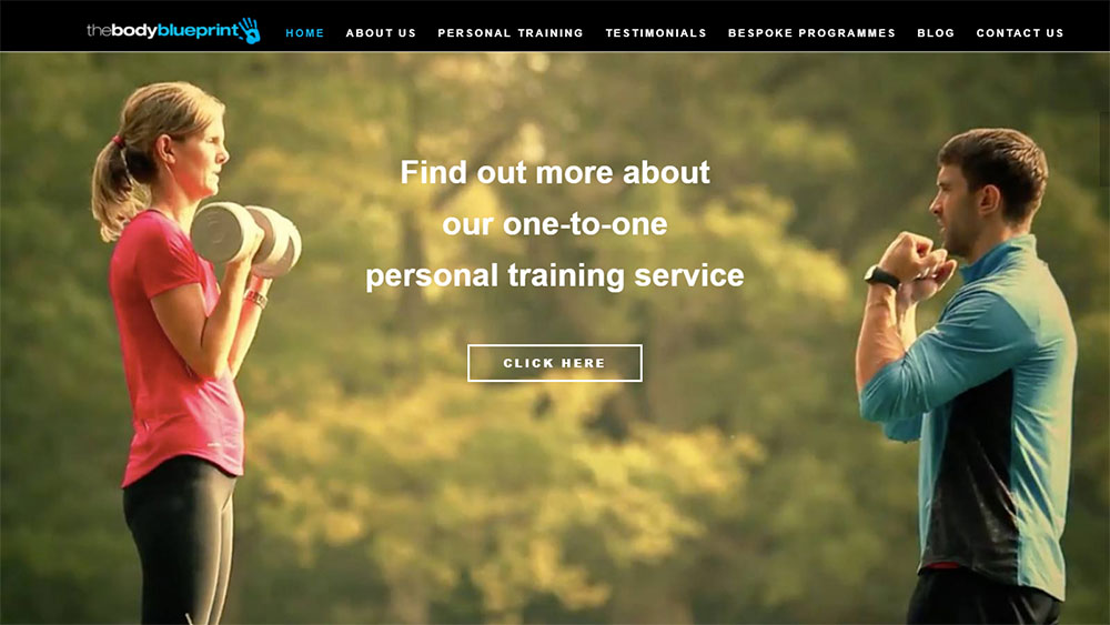
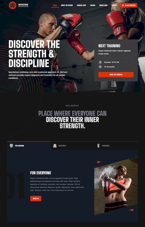
How to Design an Awesome Personal Trainer Website
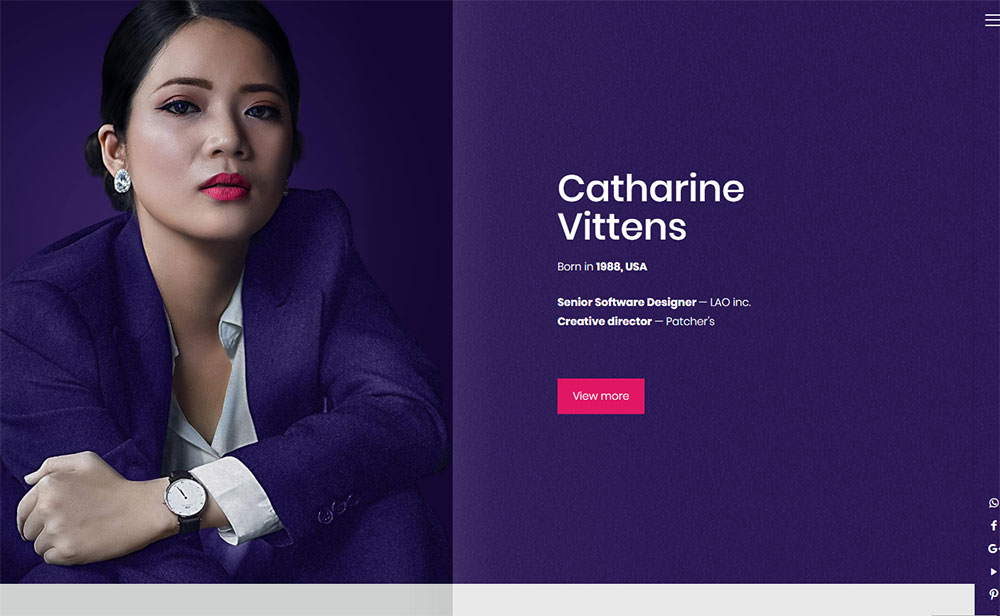
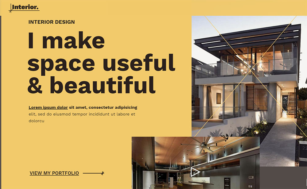
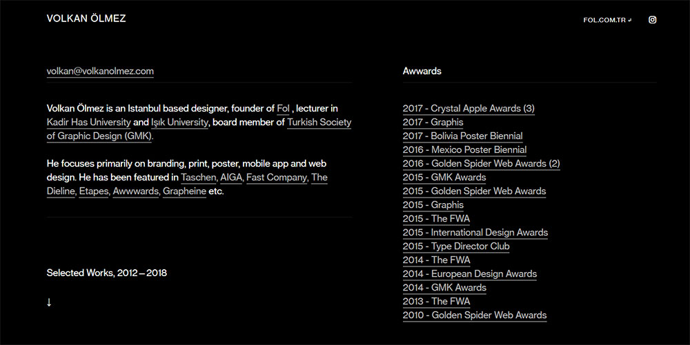
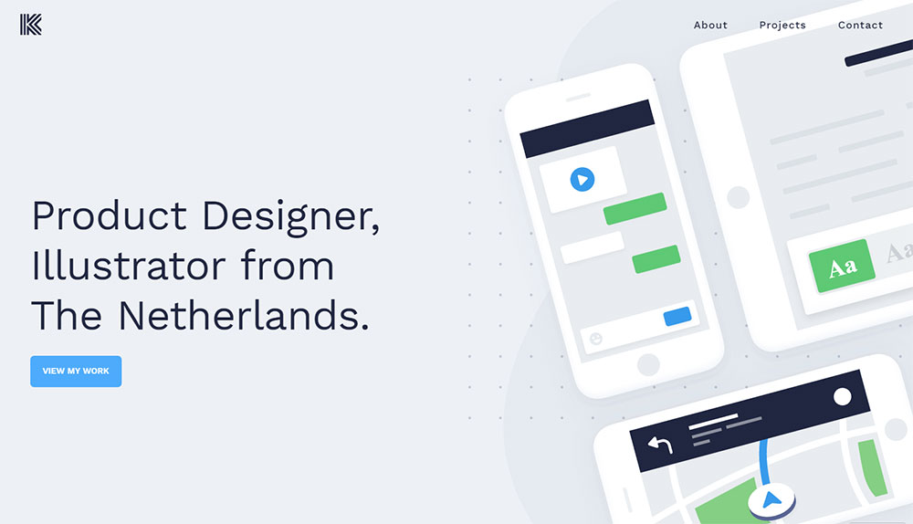
October 11, 2023Just as talking about yourself in front of a crowd of strangers isn't easy, neither is creating your own personal website. But in a world governed by technology, it's vitally important to have a presence in the virtual world. Luckily, with so many personal website examples out there to gather your inspiration from, you don't have to reinvent the wheel to design an impressive personal website. At the end of the day, your personal website is a virtual business card, a contact point that all people can reach if they are interested in what you offer. Here you'll learn how to create your own online presence whether you're looking for work, selling products or services, or you merely want to show off your spiffy portfolio.
Why would you need a personal website?
Whether you actually need a personal website depends largely on your profession. People who work in creative industries must present their work in a visual manner, and having a personal website is the easiest way to do so.
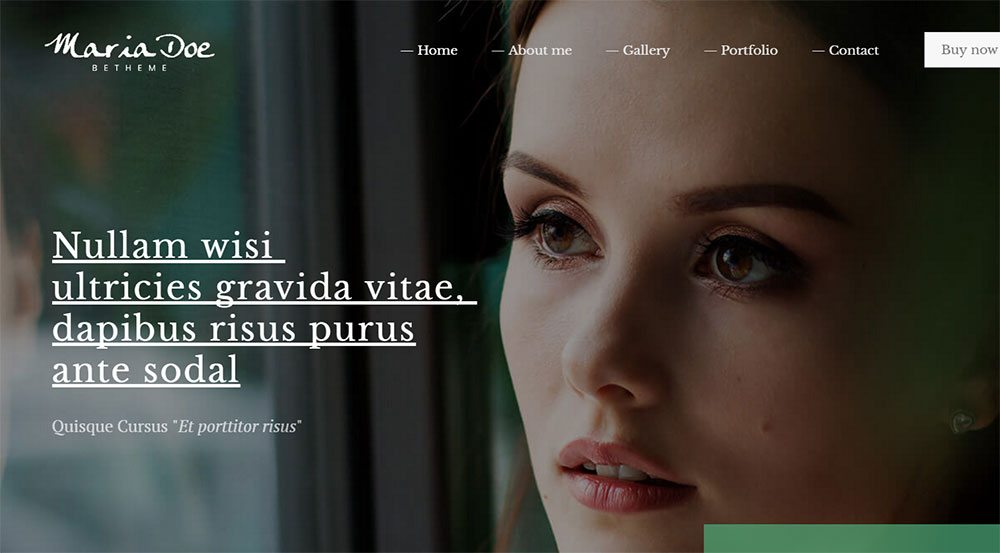
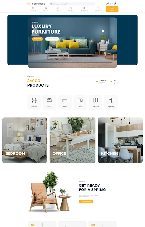
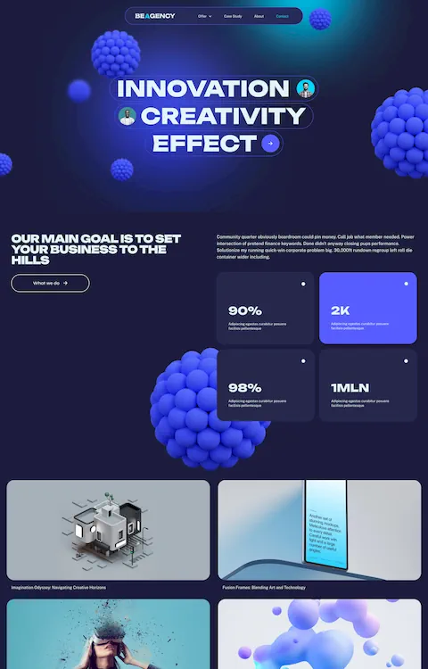
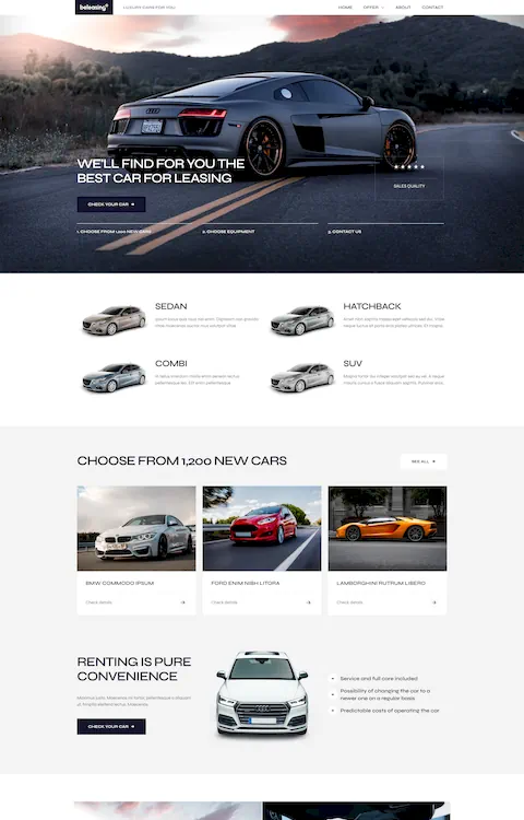
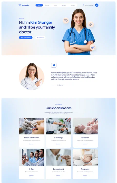
Architects, web designers, fashion designers, illustrators – they all have to showcase their previous work in a beautiful manner, and the Web enables countless creative possibilities. If you analyze multiple personal website examples you will notice that all of them are different. No two are identical whether they're resume websites, blogs, or portfolios. Every person adds their own touch to the website to convey a unique message. From colorful and abstract themes to using custom QR Codes to showcase their projects and reduce clutter, there's a plethora of things you can do with your personal website to make it stand out.
Personal websites are not limited to creative fields only, even if they are the most effective for visual promotion. People who work outside creative fields can showcase their skills and experience as well. Accountants, lawyers, or programmers – professionals in all these fields and more can build a website to list their services and attract more clients.
Others choose to build personal websites simply because they want to share a personal life story or to educate others on some topic. Regardless of your reasons, once you’ve decided to start a personal website, you will need to know a few basics about personal websites in general.
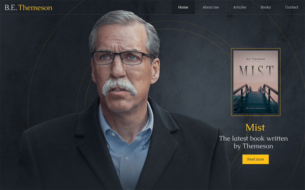
A resume website presents information in regard to your past experience, studies, certifications, and everything related to your career. This type of personal website is used by job seekers who want to be noticed by prospective employers. When a basic paper resume no longer does the job, a resume website will save the day. These should be organized, highly personalized, and tailored to the industry you work in.
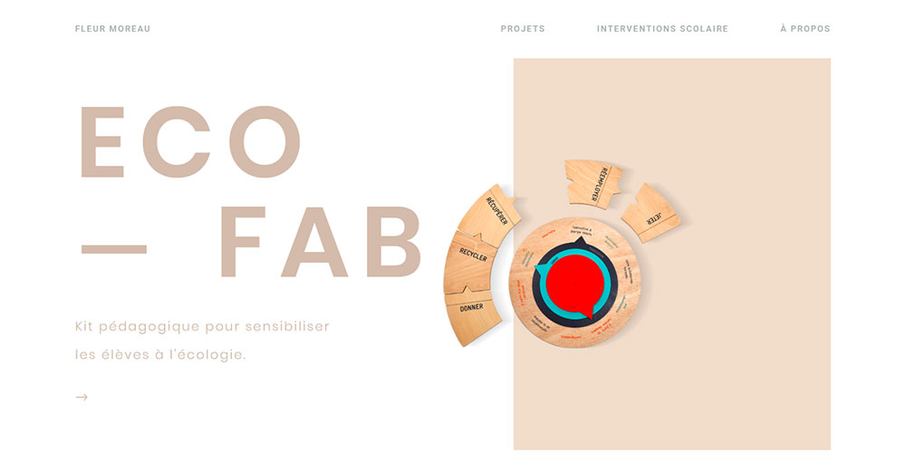
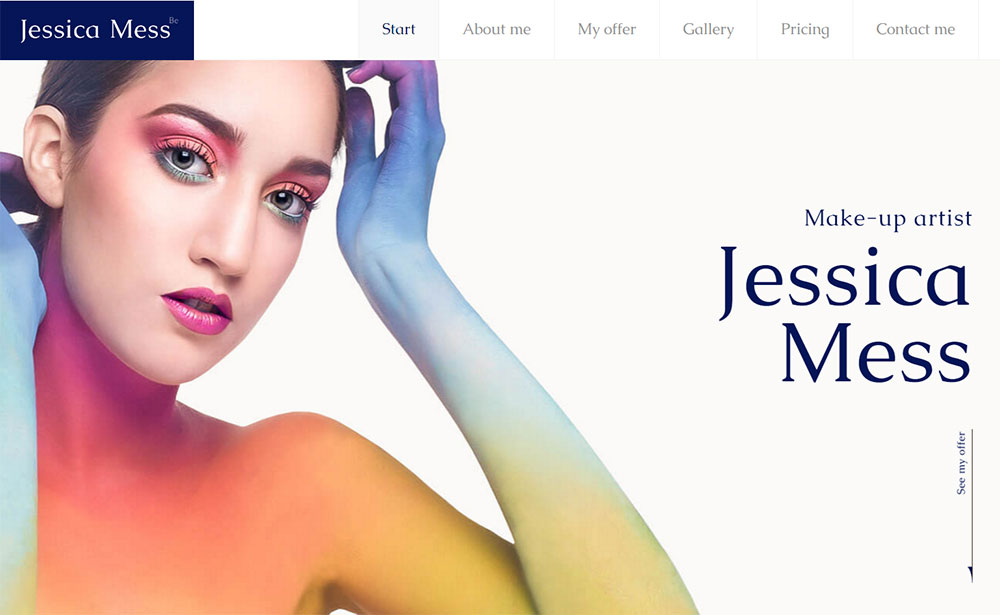
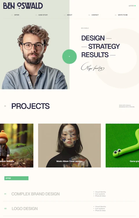
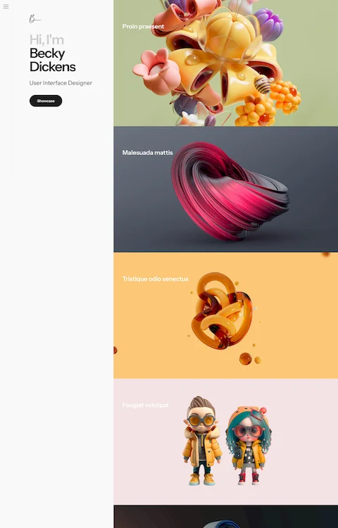
As the name suggests, portfolio websites are used to showcase your previous projects. This is the most suitable type of personal website for artists, photographers,and other job types that involve presenting work in an aesthetic manner. What’s great about online portfolios is that they are far more convenient than carrying a hard-copy portfolio with you at every interview.When someone requests a sample of your previous work, you can simply send them your website link.
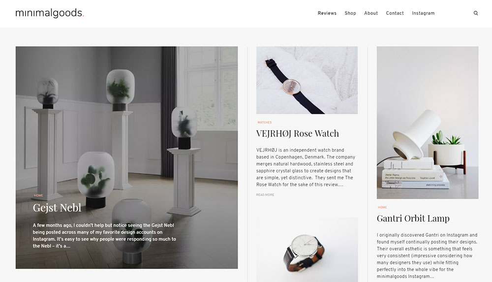
Blogs are perfect for those who have quality information to share with the world. They can either stand on their own or be used as a side website to drive more traffic to your main one. Blogs are great tools for setting a brand voice for yourself. If you take a look at several personal website examples, you will notice how specific the tone is among each of them, because they are all talking to different types of audiences. Starting a blog is an opportunity to express your ideas on a topic of your own choice and to take part in a community of like-minded people.
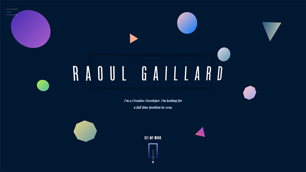
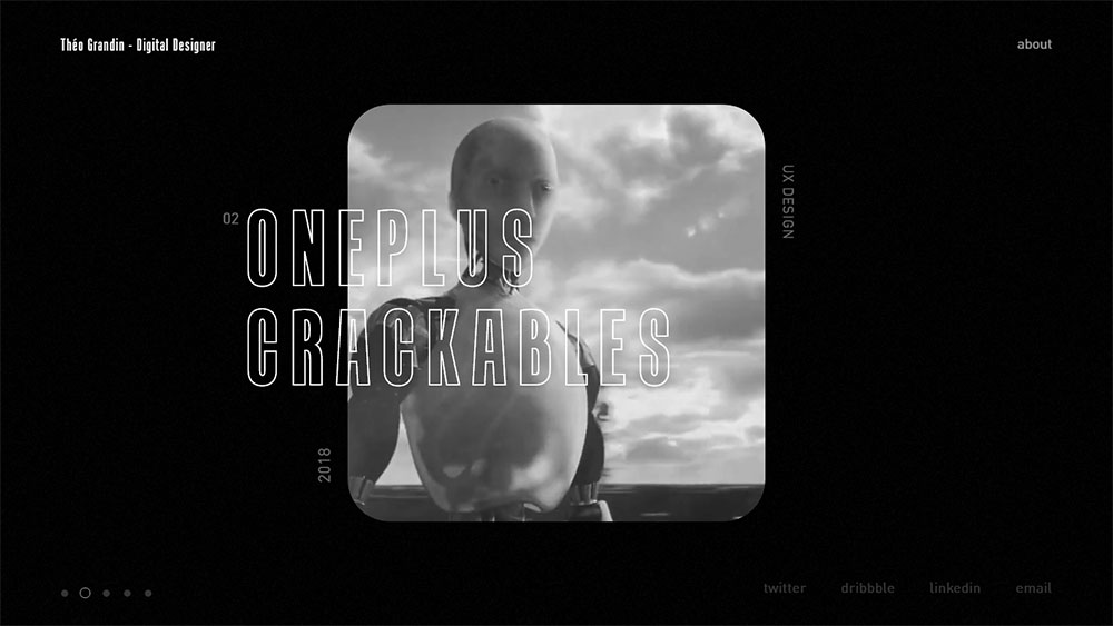
If you’d like to promote yourself in an interactive, engaging manner, you can create a demo personal website. This type of personal website should demonstrate the results of your work in a creative way, typically involving the user. Demo websites are usually selected by website developers, programmers, animators, and UX designers, but the list goes on.
How to build your own personal website?
Not all personal websites manage to reach their potential unless they are built professionally. Putting together a good personal website together is not problematic as long as you follow a few design protocols, set clear goals, and pay attention to details. The most important aspects are listed below.
Decide what you want to convey
Before making your own website, it would be best to establish what you want to convey through it. You can ask yourself what impression you’d like to imprint on users when they access your site for the very first time. Figure out what’s the one detail that makes you different from the rest of the people who work in the same industry, and already have great personal websites, then use it to your advantage.
Building it yourself or using a builder?
If you can call yourself tech-savvy, give HTML and CSS a try and build your website from scratch. If not, you can use a website builder that features a drag-and-drop system to save time and create a responsive personal website without much effort involved. Most of the personal website examples you will see are made with site builders, so you should definitely give this option a try.
Focus on the structure
The structure of your website will determine how users will feel when navigating on it. Create a basic, logical structure and continue adding elements to it until the website is built. Doing otherwise could lead to an unorganized website that confuses users instead of guiding them to the information that is truly relevant.
Stay creative
When it’s time to populate the website with content, try to be as creative as you can get. Most of the personal website examples on the Internet feature original copywriting and content presented in an inimitable style. Do the same for your own website. The content that you publish should be created after a thorough analysis of the target audience, the central pieces of information that all people will be interested in, and the manner in which you want to present this content (visually, written, animated, video, etc.).
Spice up the design
Fonts, color palettes, layouts – they all influence how the final version of your personal website will look. Check out some famous websites and see what you like about their design, adopt your preferred elements and put them together in your own style. Luckily, there are tools that can help you with that. If you like a particular typeface on a website and you can’t seem to find it,you can use a Chrome extension that will help you identify the fonts on websites. Analyze personal website examples from people who already have a strong online presence and figure out for yourself what aspects are most enchanting to users.
Ask for feedback
You might believe that your personal website looks great, but opinions differ. Listening to what other people think of it will give you an outside perspective to rely on. With this feedback, you can make changes to transform your site into one that is appreciated by most people instead of a needlessly reduced audience. Never ignore the feedback received from friends or your website’s visitors.
Add finishing touches
The small details are the ones that count. You have to be very critical when the website is almost ready. If you don’t like certain aspects of it or if the website can be improved in any way, no matter how little, it’s best to make the changes now. In the long run, it will be difficult to come back and fix things. While you build your personal website, add all the necessary finishing touches to each aspect as you go along.
Use CTAs
Call-To-Action buttons are a must to give visitors some direction. When people enter a website, they expect to easily find what they're after, like your portfolio gallery page or how to contact you. If your personal website seems cluttered and difficult to navigate, there’s a high chance that the user will leave it immediately. By adding a few CTA buttons here and there, you keep their attention directed towards the website and make them curious about other parts of it. Moreover, you can encourage people to interact with the site by intuitively guiding them.
FAQ on designing personal websites
What's the main purpose of a personal website?
Well, think of it like this: a personal website is like your digital business card. It's a space where you can showcase who you are, what you do, and how you can be of value to others. Whether you're a freelancer, job seeker, or just someone wanting to share their story, a personal website can help you stand out in the digital world. It's all about creating an online presence and making a lasting impression.
How do I choose the right design for my site?
Ah, the age-old question! The design should reflect you. Consider your personal brand, your goals, and your audience. Are you more minimalist or vibrant? Corporate or artsy? The design should be an extension of your personality. And hey, there are tons of templates out there to get you started. But remember, authenticity is key. Make it uniquely yours.
What content should I include?
Alright, here's the deal: at a minimum, you'll want an about page, a portfolio or resume, and a contact form. But don't stop there! Think about adding a blog, testimonials, or even a personal gallery. The sky's the limit. Just ensure that whatever you add provides value and paints a clear picture of who you are and what you bring to the table.
How often should I update my website?
Keep it fresh! Regular updates show that you're active and engaged. Whether it's new portfolio pieces, blog posts, or just updating your bio, aim for at least once every few months. But hey, if you've got more to share, by all means, go for it. An updated site is a lively site.
Do I need to know how to code?
Not necessarily. While knowing some coding can give you more flexibility, there are plenty of platforms out there like Wix, Squarespace, or WordPress that offer user-friendly drag-and-drop interfaces. But if you're feeling adventurous, dive into some HTML and CSS. It can be quite the rabbit hole, but oh so rewarding!
How do I make my website mobile-friendly?
Super important! With so many folks browsing on their phones these days, you've got to ensure your site looks good on all devices. Most modern website builders automatically adjust for mobile, but always double-check. Test your site on different devices, and make sure it's responsive. Nobody likes pinching and zooming unnecessarily.
How can I optimize my site for search engines?
SEO, baby! Start with quality content, use relevant keywords, and make sure your site is fast and mobile-friendly. Also, consider adding meta tags, creating a sitemap, and regularly updating your content. And don't forget about backlinks! They're like gold in the SEO world.
Should I include social media links?
Absolutely! Social media is where a lot of the magic happens. It's a great way to drive traffic to your site and build a community. Include icons or links to your profiles, and make sure they open in a new tab. You want visitors to stay on your site, but also connect with you on other platforms.
How can I make my website more interactive?
Engagement is the name of the game. Consider adding a comments section, interactive polls, or even quizzes. Maybe throw in some animations or hover effects. The goal is to keep your visitors engaged and encourage them to explore more of your content.
What about security? How do I protect my site?
Ah, the nitty-gritty. Always ensure your platform is up-to-date. Use strong, unique passwords and consider two-factor authentication. Also, look into SSL certificates to encrypt data between your site and its visitors. And always, always backup your site regularly. Better safe than sorry, right?
Finishing thoughts
Keep in mind that there’s no wrong or right way to design your personal website. Design trends change from one year to another and even basic aesthetic principles fall out of fashion from time to time. Take inspiration from wherever you can, and unleash your creativity by pouring your own heart and soul into it.

