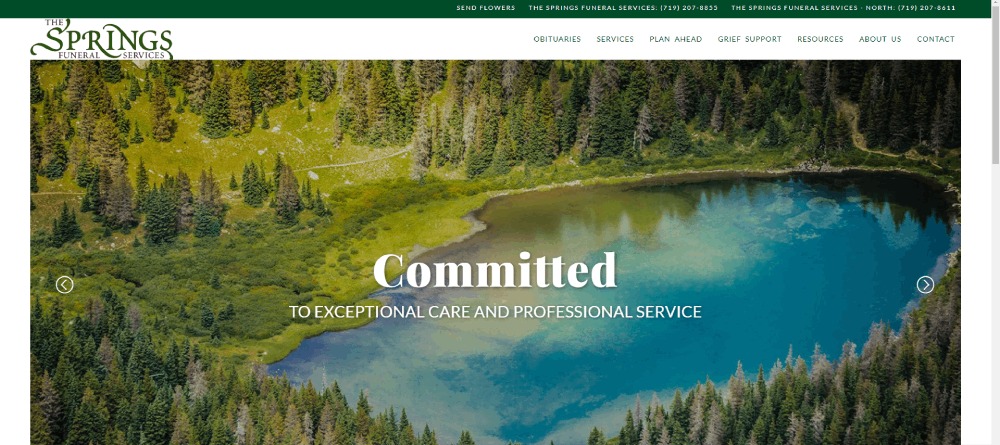
Sombre Funeral Websites With Interesting Web Design
January 4, 2024
How to fix the “WordPress publishing failed” error
February 5, 2024Ever wondered how the tap of design unleashes a flood of business for plumbers?
Imagine this. A tap, styled with sophistication, not just dripping, but gushing with potential clients. That's your website – or at least, it could be.
Here, it's about crafting digital storefronts that do more than just exist; they perform. You'll delve into plumber website design examples that blend responsive design with branded online presence; think plumbing web development meets art gallery showcasing what you've mastered beneath the sinks and behind the walls.
By the final punctuation mark, you'll be armed with know-how. An arsenal to turn a simple click into a call-out.
Ready for a tour? We'll navigate through the core of effective web design for plumbing contractors, dissect the anatomy of user-friendly navigation, and ensure your pages scream reliability louder than a pristine plumbing service layout.
Plumber Website Design Examples
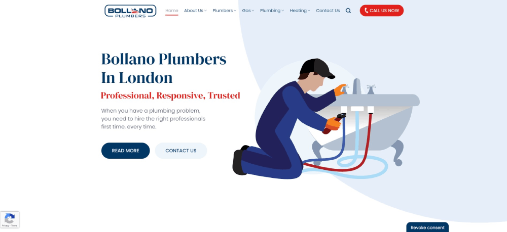
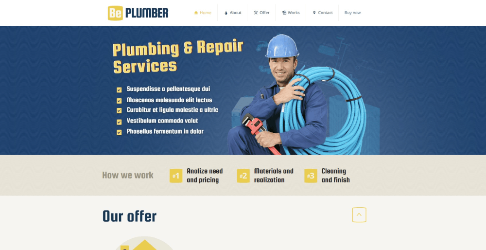
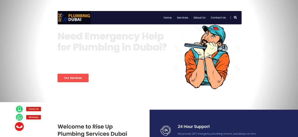
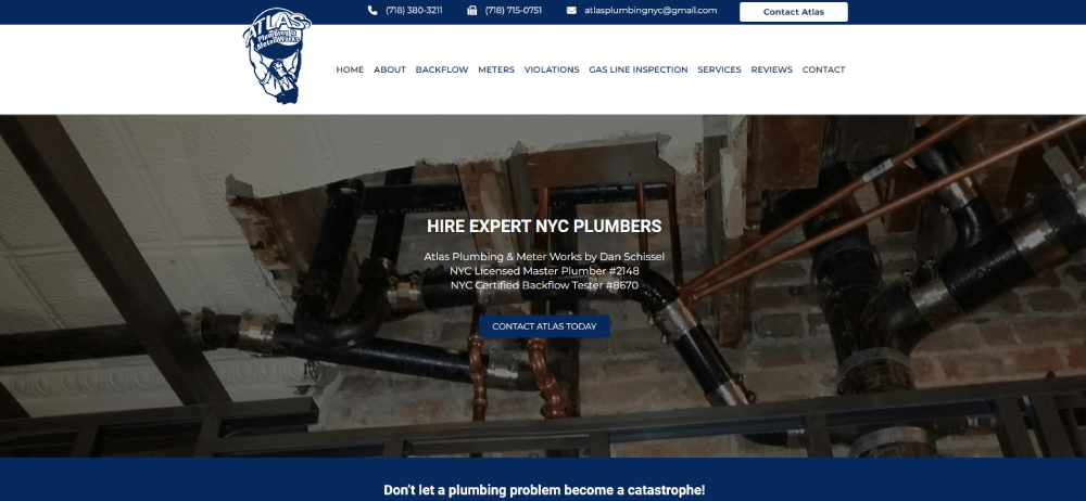
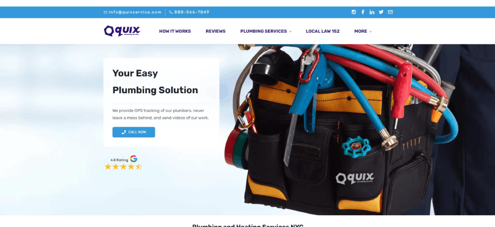
Bollano Plumbers
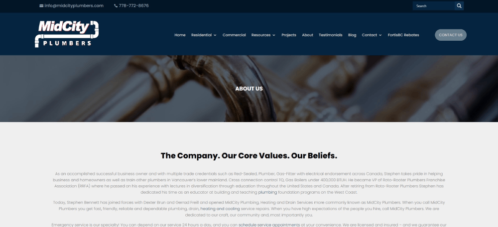
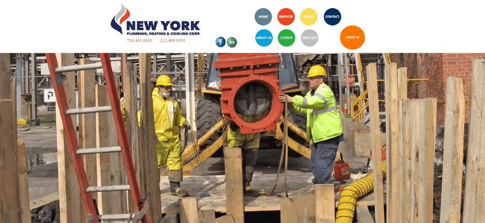
An important section of the MidCity Plumbers website is the About” section. It gives background information, such as company beliefs and values. Going down the page, you can find other things that make this plumbing business special. A nice touch is the pictures and bios of the team members.
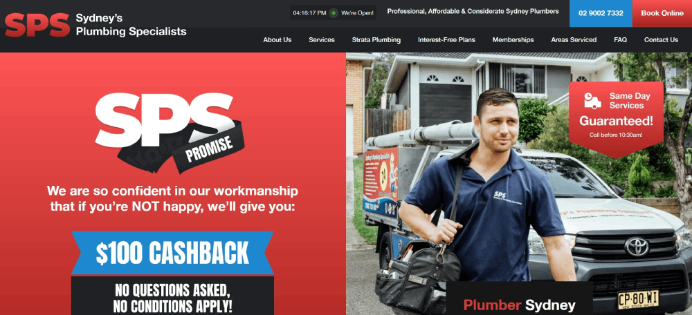
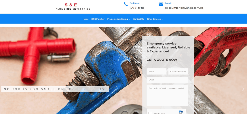
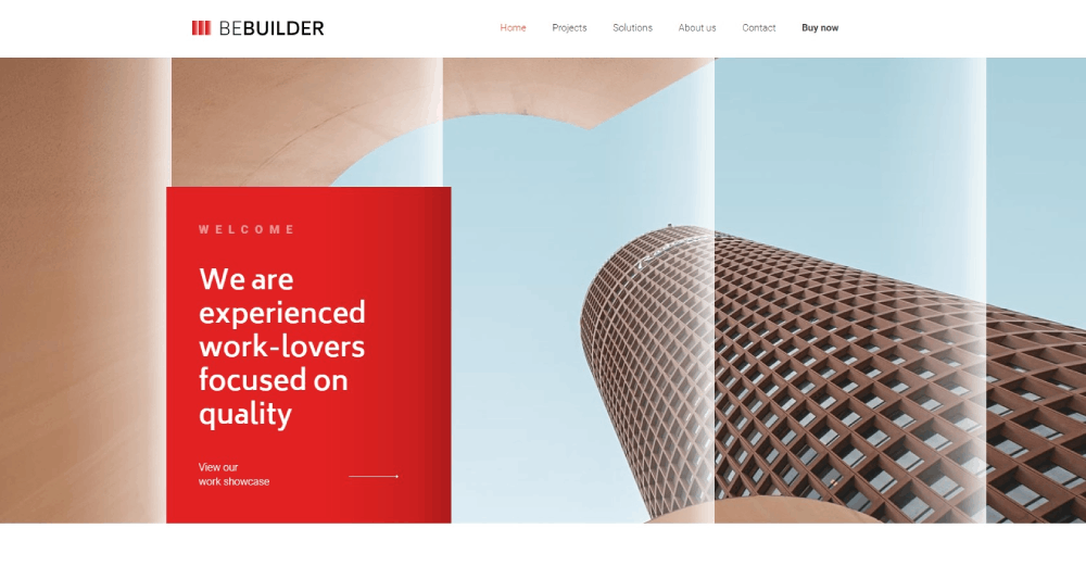
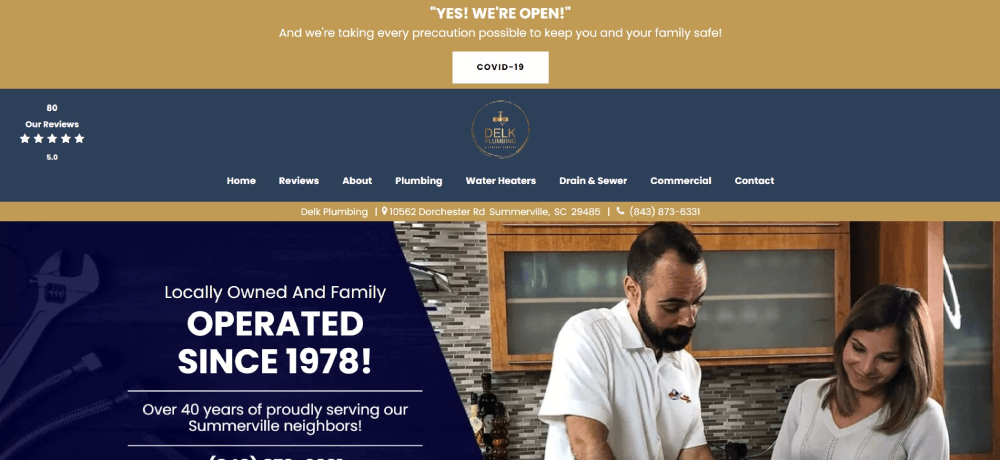
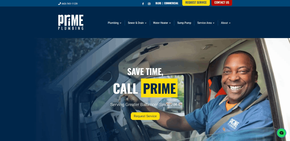
SPS Plumbers
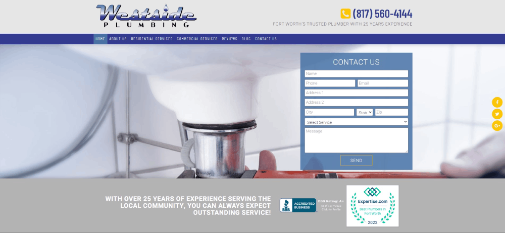
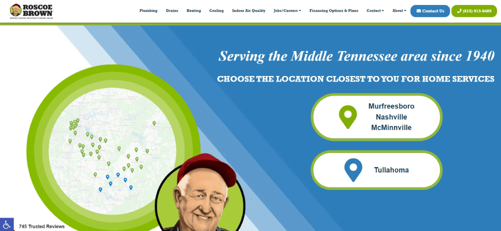
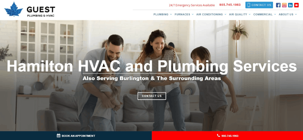
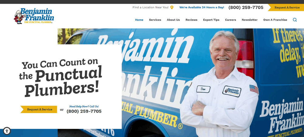
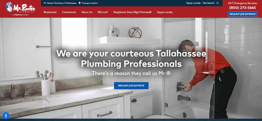
This plumber website design has great content, uses plenty of white space, and is overall stunning. It makes sure that the important information is right at the top of the page. Visitors who have plumbing needs can find the phone number right away. The S&E Plumbing website is an awesome blend of creativity with the practical side.
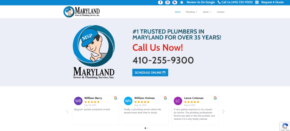
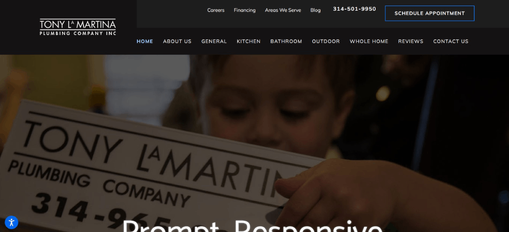
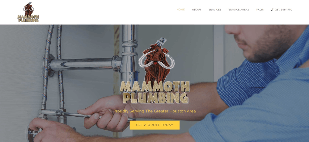
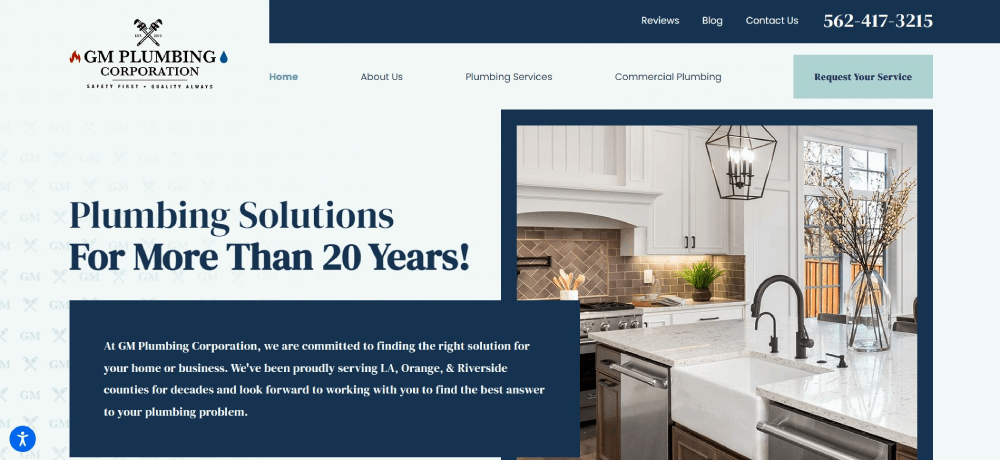
MD Sewer
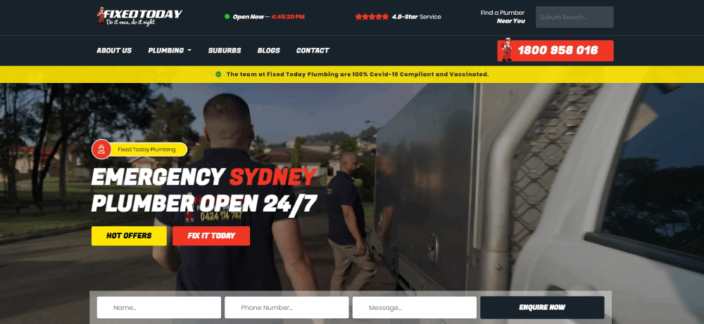
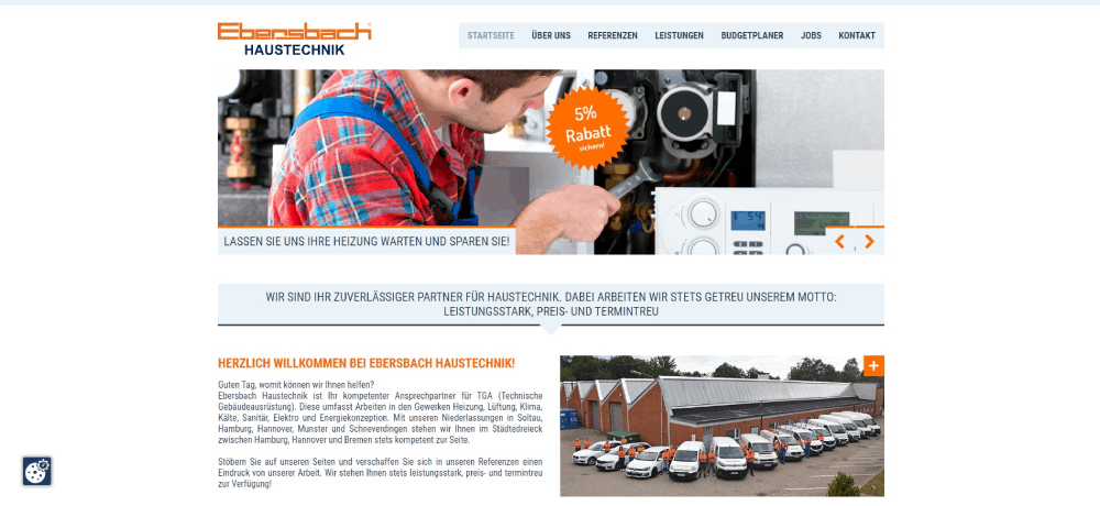
Responsiveness is important if you want to cater to users who have different types of devices. It means that a web design can adjust to different screen sizes. This plumbing website design looks great both on a desktop computer and on a smartphone. This plumbing website has something else that you may want to add to your plumbing company’s website: a click-to-call button.
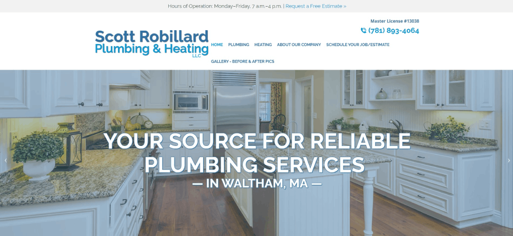
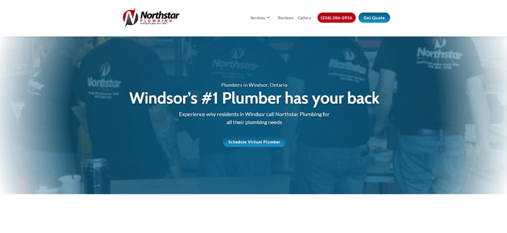
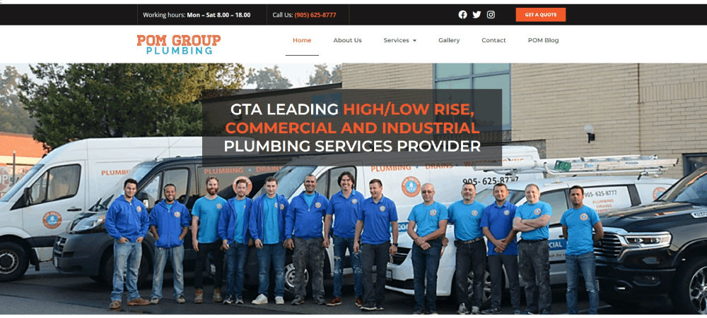
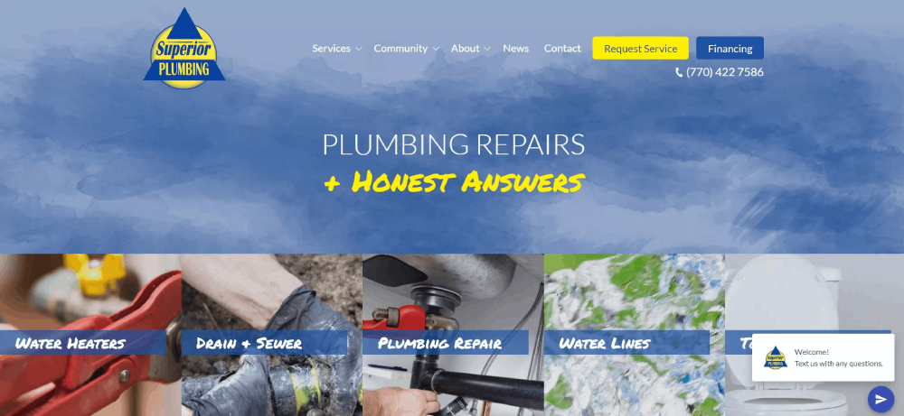
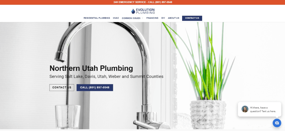
North Star Plumbing
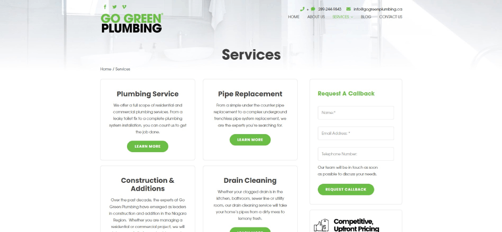
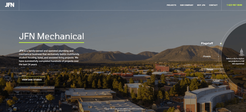
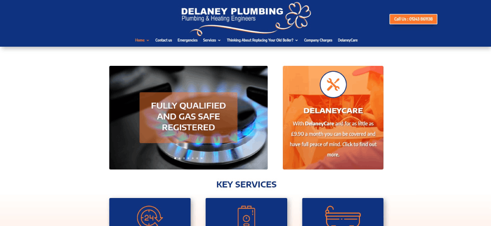
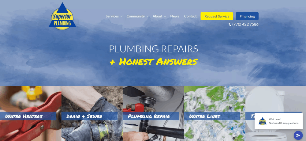
The “Services” page of the Go Green Plumbing website has brief descriptions of the services the company offers. Visitors can learn more by clicking on each service. The page also gives information about response times and who to contact. Customers can get information and book without having to leave the page.
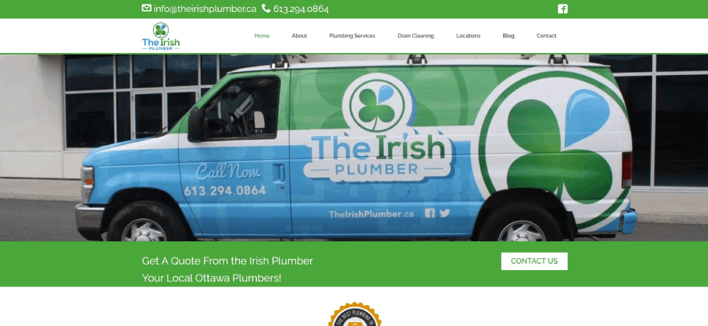
The Irish Plumber
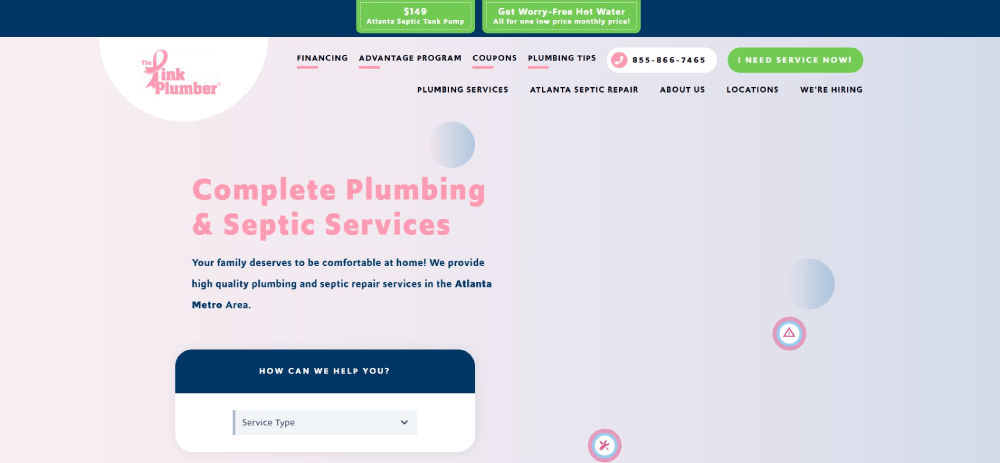
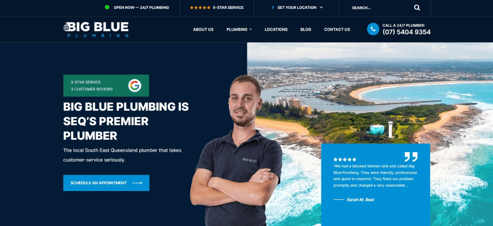
The last on this plumbing websites list is Modern Plumbing & Heating. Their website shows the awards the company has received. It also has a list of more than 575 five-star reviews.
FAQ on Plumber Website Design
What's the ideal layout for a plumber's website?
You've gotta think user-first. The ideal layout marries simplicity with functionality. A clear menu, services at a glance, and visible contact info are must-haves. Include a gallery of past work and customer reviews for that trust factor. Bottom line: make everything a visitor needs just a click away.
Are mobile-responsive themes crucial for a plumber's website?
Absolutely, they're non-negotiable. Most folks whip out their phones the minute something drips or leaks. Your site needs to look slick and work smoothly on all devices. That totter between form and function? It's gotta tilt towards seamless mobile experience, else you're leaving money on the table.
How vital is SEO for a plumber's website?
It's like the wrench in your toolkit – can't do without it. Good SEO puts you right where clients are looking: the top of search results. Think local SEO, snappy titles, and handy keywords. After all, your site's no good if it's hidden down the pipes of the internet, right?
What colors work best for plumbing websites?
Think water, think cleanliness. Blues and greens are on point, reflecting trust and a fresh vibe. That said, don't flood the place. Accent colors, like a bold red for 'emergency call' buttons, make sure clients know where to click when the pressure's high.
Should I include customer testimonials on my website?
Testimonials? Goldmine. They're like a friendly nudge from a next-door neighbor. Real words from real folks build credibility faster than you can say 'leaky faucet.' Plus, a sprinkling of praise from satisfied customers never hurt any business, did it? Let those five-star experiences do some of the talking.
Do I really need a professional photographer for my website?
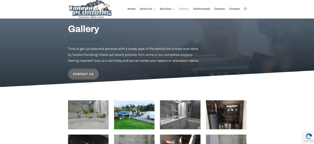
You know, it's one of those things. Smartphone snaps are okay, but pro photos? They put that professional sheen on your site. Show off those neat pipe jobs, shiny installs - this stuff speaks volumes about the quality of your work. So, yeah, worth considering for sure.
How often should I update my plumbing website?
Keep it fresh, keep it flowing! Battles with backlogs or showcasing shiny new services, that stuff should hit your site pronto. Regular updates keep your digital storefront in line with your ever-evolving biz. Let's say, seasonally? That’s a good rhythm to roll with.
What's the best way to display plumbing services on a website?
Clarity is key here. List 'em out – clear, concise, and easy to find. Break it down by category if you've got a range. A dedicated page for each service isn't just good for user-friendliness; it's great for those all-important SEO perks too.
Is it worth having a blog on a plumber's website?
Blogs, they're sneaky good. Not just for sharing tips on pipe maintenance or what to do in a flood crisis. They pull double duty. Valuable content draws in traffic, eyes on site, and establishes you as the go-to pipe guru all while giving SEO a healthy boost.
Can social media integration help my plumbing website?
Think of social media as the pipes connecting you to your customers. Done right, it creates a flow of communication and trust. Flaunt finished jobs, share quick tips, or announce flash deals. It's this kinda real-time rapport building that can really make your business stand out online.
Conclusion
Picture this. You're one click away from waving goodbye. But before you do, let’s recap the splashes made today, diving into plumber website design examples. You've seen how the coupling of mobile-responsive themes with SEO-optimized content creates not just a site, but a lead magnet.
Think of your newfound insights as blueprints; your next project just might be the talk of the town. Whether it’s through a user-friendly navigation or this clever interplay of subtle color schemes, the takeaway is crystal: a plumber's website can be both a workhorse and a show pony.
Remember, digital storefronts for plumbers aren’t just about looking good – they're your virtual handshake. And now, you're set to make that first impression count, turning dripping taps into rolling contracts. So dive in, the water's fine – let your site reflect the craftsmanship you bring to every job.
If you enjoyed reading this article about plumber website design, you should check out these with hairstylist websites, florist websites, wedding photographer websites, and massage therapist websites.
We also wrote about similar topics like chiropractic websites, pizza websites, optometrist websites, furniture website design, coaching websites, surfing websites, and gym website designs.

