How to increase the WordPress memory limit
January 24, 2026
Top Industrial Website Templates That Convert Visitors
January 26, 2026Your website isn't just a digital business card anymore. It's your best lead generator, your 24/7 sales rep, and often the first impression potential clients get of your real estate business.
Realtor website design directly impacts whether visitors browse listings or bounce to a competitor. The difference between a site that converts and one that frustrates comes down to smart choices about property search functionality, mobile responsiveness, and IDX integration.
This guide breaks down what actually works. You'll see design principles that turn casual browsers into qualified leads, navigation patterns that keep users engaged, and technical features that make or break the home buying experience online.
We're covering everything from MLS integration to lead capture forms that don't feel like interrogations.
What Is Realtor Website Design
Realtor website design is the process of building a site specifically for real estate agents that displays property listings, captures leads, and builds trust with buyers and sellers.
It covers layout, typography, IDX/MLS integration, property search functionality, lead capture forms, and responsive design tailored to how people actually search for homes.
A realtor website is not just a digital business card. It works around the clock as a lead generation tool, a listing presentation platform, and a local market resource.
According to the National Association of Realtors (NAR), all home buyers now use the internet during their property search. That makes your site the first interaction most clients will have with your brand.
The best realtor websites combine professional photography, intuitive navigation, and fast mobile performance with clear calls to action that turn visitors into appointments.
Realtor Website Design Inspiration
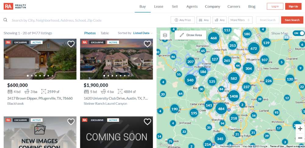
Austin Board of REALTORS®
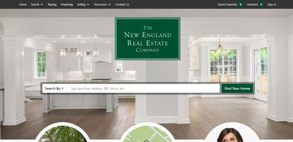
The New England Real Estate Company
Ryan Serhant
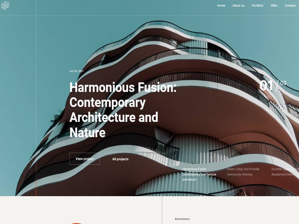
BeArchitect6
Crest
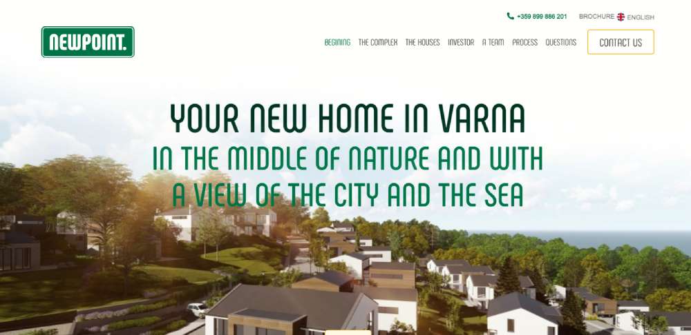
New Point
Lief Amsterdam
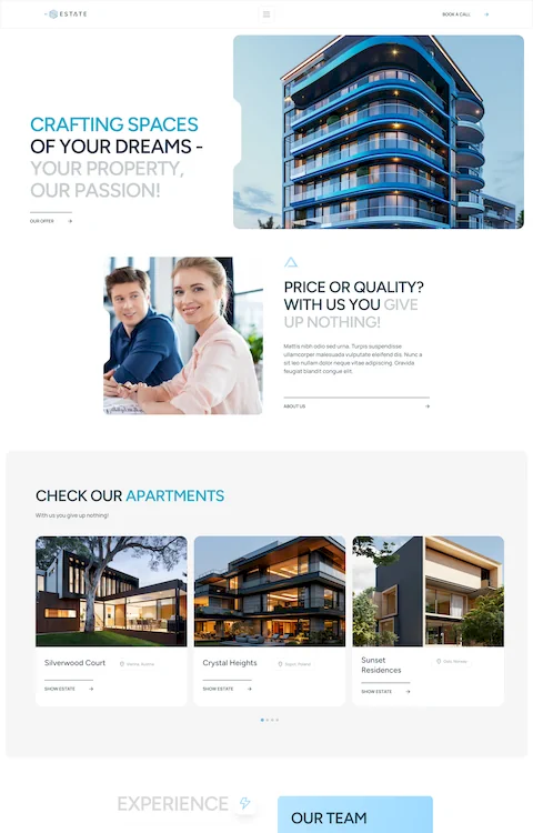
BeEstate4
Maison Bosk
Speicher Group
Perch Houses
Le Logge Mantova
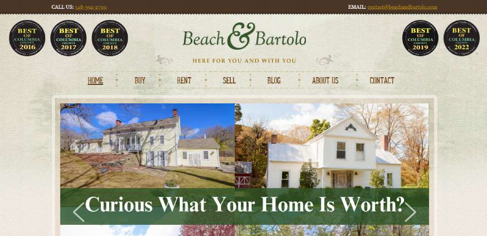
Beach & Bartolo
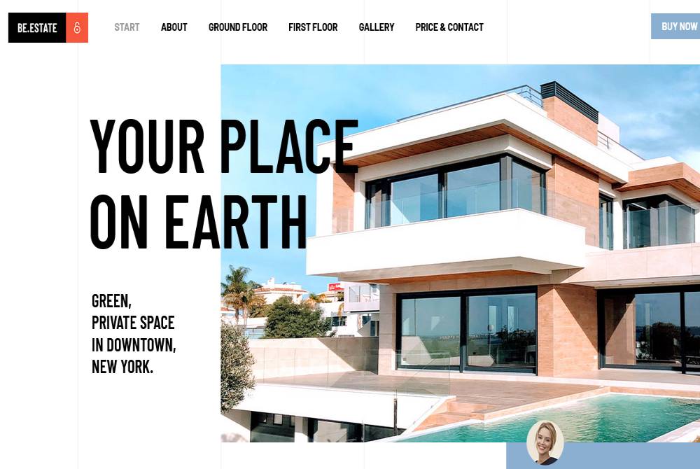
BeEstate3
Reilly Realtors
Houses Of The World
The Coley Group
Dawn McKenna
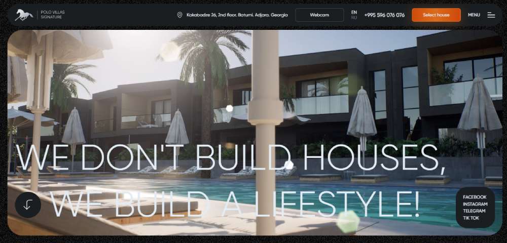
Polo Signature
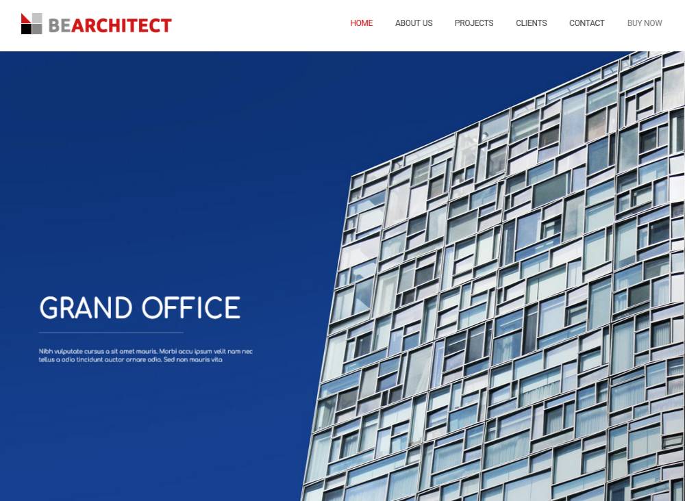
BeArchitect
Inland Homes
C.W. Urban
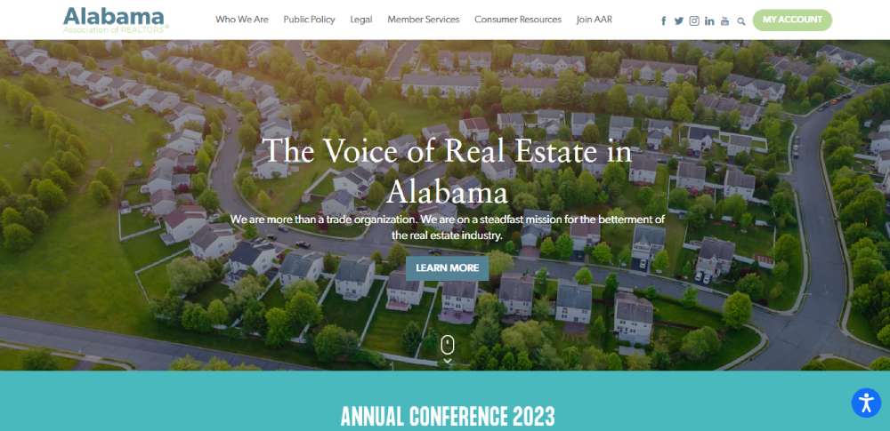
Alabama Association Of Realtors
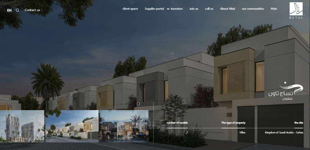
RETAL
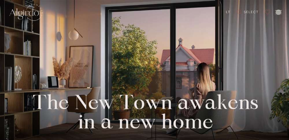
Algirdo Promenade
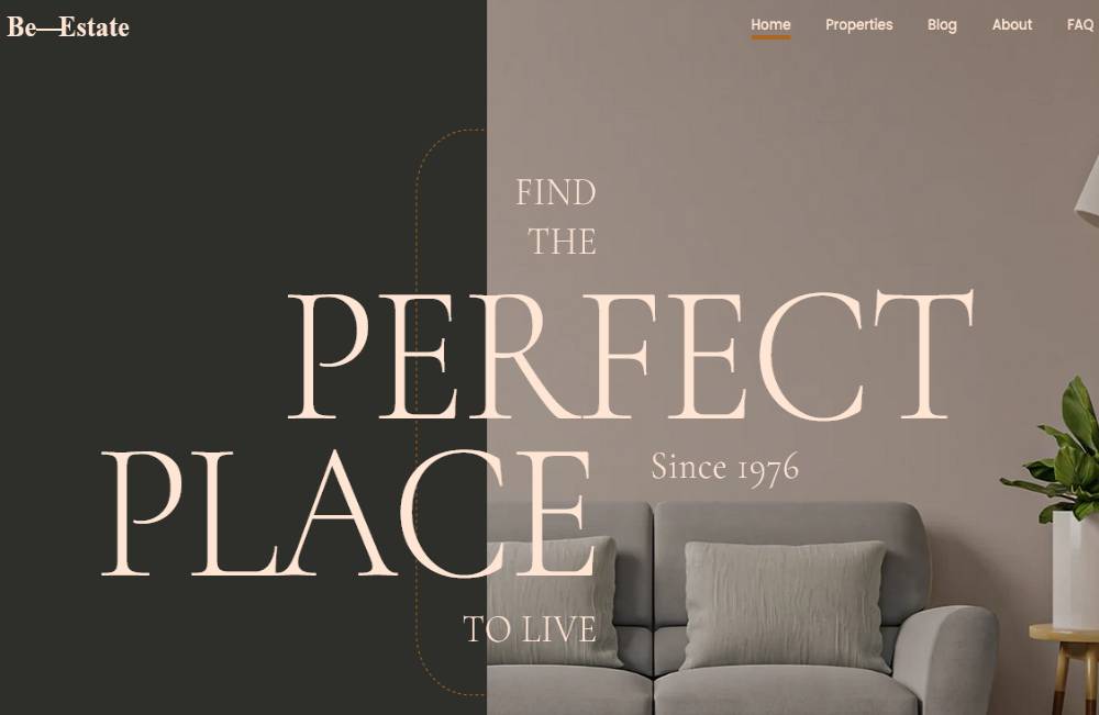
BeEstate
WM DESIGN, INC.
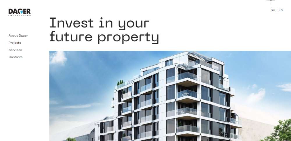
Dager Engineering
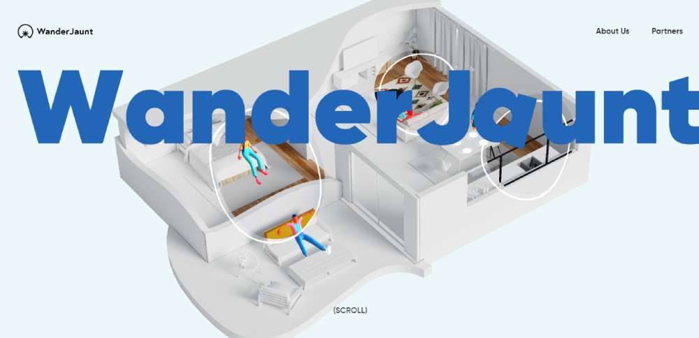
WanderJaunt
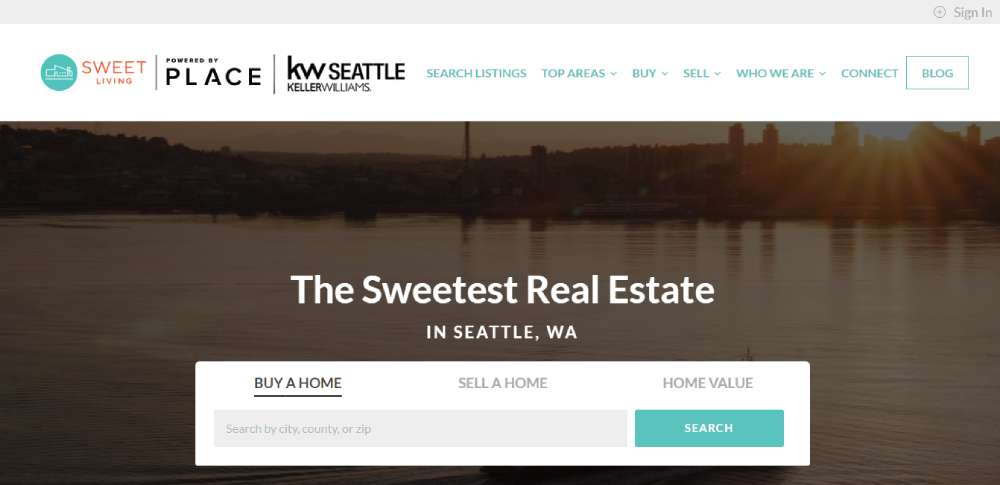
Sweet Living Realty
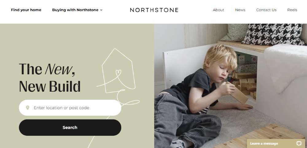
Northstone
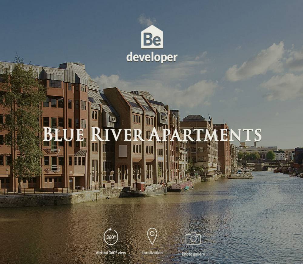
BeDeveloper
C3CC
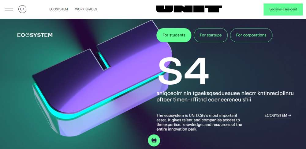
Unit Innovation City
Matter Real Estate
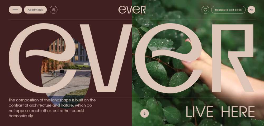
Ever
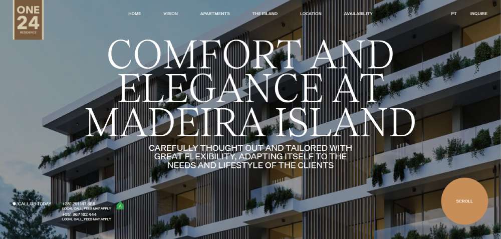
ONE 24
Park Group Real Estate
Kobu
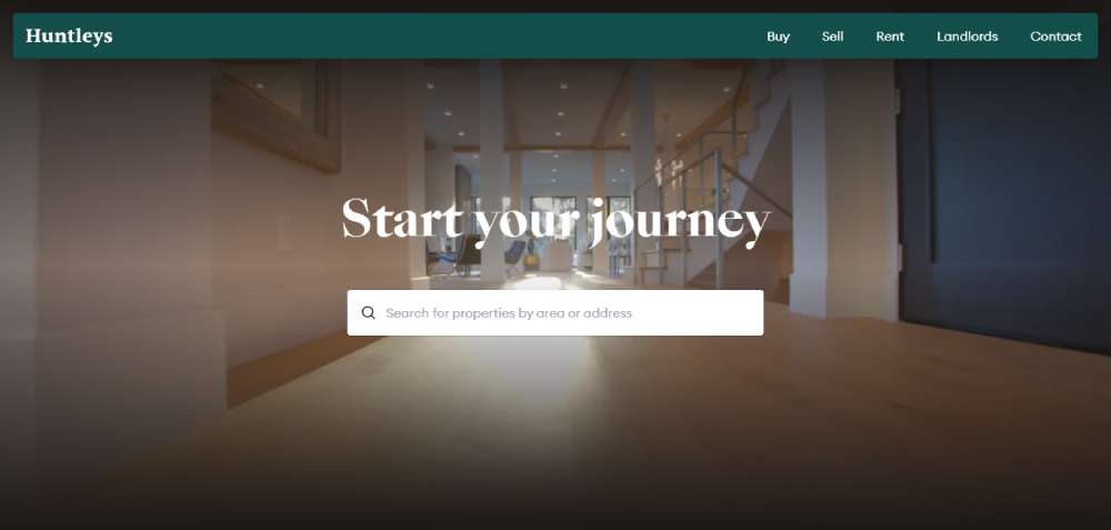
Huntleys
Agora Real Estate
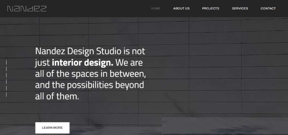
Nandez Design Studio
Tammi Montgomery
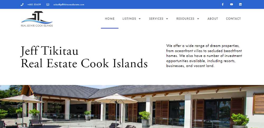
Jeff Tikitau
Hanging Miracle Gardens
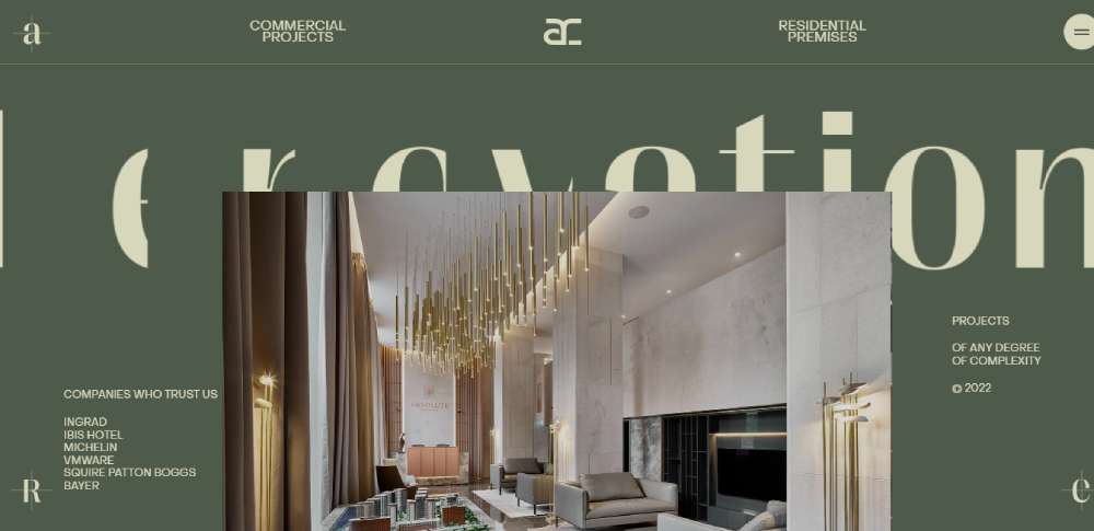
ARC
Saslove & Warwick
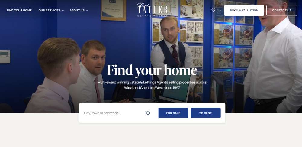
Karl Tatler Estate Agents
Alpha Estate
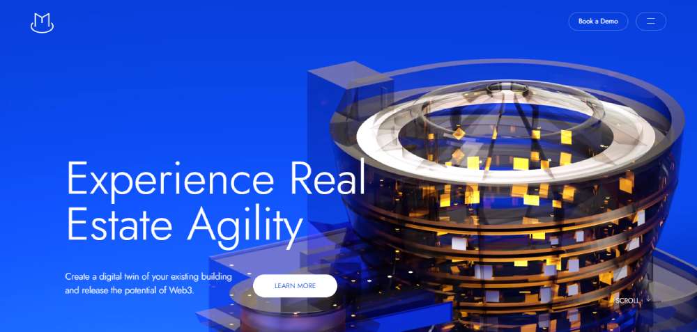
Magma
Aaron Kirman
How Does Realtor Website Design Differ from General Real Estate Website Design
General real estate websites serve brokerages, property management companies, and developers. Realtor website design focuses on individual agents or small teams who need personal branding front and center.
The difference shows up in structure.
A brokerage site like Keller Williams or RE/MAX highlights the company brand, office locations, and hundreds of agents. A realtor site puts one person (or a small team) at the center of everything.
Here is where the two split:
- Personal branding - agent headshot, bio, credentials, and story appear on nearly every page
- Single-agent focus - the site architecture revolves around one person's listings, sold properties, and market expertise
- Hyper-local content - neighborhood guides, school district pages, and local market reports specific to the agent's farm area
- Direct lead capture - contact forms, scheduling tools, and home valuation widgets route straight to the agent, not a general inbox
A Coldwell Banker corporate site and a solo agent's Luxury Presence site solve completely different problems.
The corporate site needs to accommodate thousands of agents and office pages. The realtor site needs to make one person look like the obvious choice in their market.
Realtor sites also lean harder into testimonial pages. Buyers and sellers want proof that this specific agent delivers results, not that the brand is well known.
That personal trust factor changes everything about how the site gets built, from the hero section down to the footer.
What Criteria Define a High-Performing Realtor Website Design
The examples above were evaluated against specific criteria. Not gut feeling. Here is what separates a site that converts from one that just looks nice.
- Visual hierarchy - does the layout guide visitors toward a clear action within seconds?
- Page load speed - Google PageSpeed Insights scores above 80 on mobile, tested with real listing pages loaded
- Mobile responsiveness - full functionality on phones, not just a scaled-down desktop version
- IDX/MLS integration quality - property search that updates in real time from the Multiple Listing Service feed
- Lead capture placement - forms, home valuation widgets, and CTAs positioned at multiple scroll points
- Local branding - neighborhood-specific imagery, community pages, and market data tied to the agent's farm area
- Trust signals - testimonials, awards, NAR credentials, and media mentions placed where they support conversion
- Photography quality - professional listing photos, agent headshots, and area photography (not stock images)
A site can score high on aesthetics and still fail at lead generation. The best professional websites balance both.
What Are the Key Pages Every Realtor Website Needs
What Should a Realtor Homepage Include
A property search bar above the fold, featured listings, a brief agent intro with headshot, and at least one clear CTA. Trust badges from NAR, local MLS boards, or media mentions belong here too.
The website layout should give visitors three paths immediately: search properties, learn about the agent, or make contact.
What Should a Realtor About Page Include
Agent bio with credentials, years of experience, transaction history, and local expertise. A professional headshot (not a selfie). Links to closed deals, press mentions, or community involvement.
Buyers and sellers decide whether to trust you within seconds of landing on this page. Keep the copy direct and skip the generic "passionate about real estate" language.
What Should Realtor Property Listing Pages Include
High-resolution photos (minimum 15-20 per listing), virtual tour embeds from platforms like Matterport, floor plans, and a mortgage calculator widget.
Neighborhood details matter here: school district ratings, walkability scores, nearby amenities, and recent comparable sales. Include save and share buttons so visitors can send listings to partners or family.
What Should a Realtor Contact Page Include
A short contact form (name, email, phone, message), a direct phone number, office address with embedded Google Map, and a scheduling tool like Calendly.
Set a response time expectation. Something like "I respond within 2 hours during business days" builds confidence that the form is not going into a void.
What Design Elements Improve Lead Generation on Realtor Websites
A home valuation landing page is the single highest-converting tool for seller leads. Place it in the main navigation and as a persistent widget across all pages, the way Joyce Rey does it.
Other elements that move the needle:
- Sticky CTAs that follow the user on scroll
- Pop-up lead forms triggered after 30-60 seconds of browsing (not immediately)
- Chatbot or live chat for instant engagement
- Gated content like quarterly market reports or buyer guides
- "Schedule a showing" buttons on every listing detail page
- Newsletter signup offering local market updates
Every page should have at least one conversion point. If a visitor can scroll through an entire page without seeing a way to contact you, that is a design failure.
Took me a while to accept this, but lead generation landing pages outperform general pages for capturing seller and buyer info nearly every time.
How Does IDX Integration Affect Realtor Website Design
IDX (Internet Data Exchange) is the system that pulls live property listings from the MLS directly into a realtor's website. Without it, agents are stuck manually uploading listings or linking out to Zillow and Realtor.com, which sends traffic away from their own site.
IDX integration changes the site architecture significantly. It adds property search pages, individual listing detail pages, map-based search functionality, saved search features, and filtered browse pages.
Providers like Showcase IDX, IDX Broker, and platforms such as Sierra Interactive or kvCORE handle this differently. Some offer iframe-based solutions (easier to install, less design control). Others provide native integrations that match the site's look completely.
The design impact is real. A poorly integrated IDX feed creates a jarring experience where the search tool looks and feels like a completely different site. The best implementations, like those from Real Geeks or BoomTown, blend property search into the overall design so visitors never notice the transition.
What Role Does Photography and Video Play in Realtor Website Design
Stock photos kill credibility instantly. Buyers can spot a generic living room image from three pixels away.
Professional property photography is not optional. Drone footage for aerial views, Matterport 3D tours for virtual walkthroughs, and agent video introductions have become standard among top-performing sites.
Video content also affects search visibility. Sites with embedded video tend to keep visitors on page longer, which sends positive engagement signals. Neighborhood video guides, where the agent walks through a local area, build trust and local authority at the same time.
The Altman Brothers site shows what happens when you treat listing photography like a photographer's website. Every image is composed, lit, and edited to sell a lifestyle, not just square footage.
How Does Mobile Responsiveness Impact Realtor Websites
More than half of all property searches start on a phone. NAR data confirms this consistently. If a realtor's site does not perform well on mobile, it loses the majority of its potential leads before they even see a listing.
Mobile first design is not about shrinking the desktop layout. It means designing for the phone screen first, then scaling up.
Practical requirements:
- Touch-friendly buttons and navigation (minimum 44px tap targets)
- CTAs placed within the thumb zone, the lower third of the screen
- Compressed images that load under 3 seconds on a 4G connection
- Property search filters that work as well on a 6-inch screen as a 27-inch monitor
- Click-to-call phone numbers on every page
Core Web Vitals scores directly affect how Google ranks real estate pages. A slow, jumpy mobile experience pushes your site down in local search results, exactly where buyers are looking.
What Typography and Color Choices Work Best for Realtor Websites
Font pairing and color theory decisions set the tone before a visitor reads a single word.
Serif fonts (like Playfair Display or EB Garamond) signal luxury and tradition. Most high-end agents in markets like Beverly Hills or the Hamptons use them. Sans-serif fonts (like Inter or Montserrat) feel modern and approachable, which works better for first-time buyer markets.
Color patterns across top realtor sites:
- Navy and gold for luxury positioning. Village Properties and Joyce Rey both lean into this range.
- Deep green with cream accents for eco-conscious or rural markets
- Neutral tones (warm grays, whites, soft beiges) for clean, minimalist layouts
- Black and white with a single accent color for bold, aesthetic website branding like Inked Real Estate
Avoid bright reds, neons, or overly saturated palettes. Real estate is a high-trust, high-dollar transaction. The colors need to feel stable, not loud.
What Are Common Realtor Website Design Mistakes
Seen these too many times:
- Stock photos instead of real listings. Instant credibility killer.
- Buried contact information. If visitors have to hunt for a phone number, they leave.
- No IDX search. Linking out to Zillow sends your traffic (and leads) to a competitor.
- Auto-playing music or video with sound. Just don't.
- Cluttered homepage. Trying to show everything above the fold shows nothing effectively.
- Missing mobile optimization. A desktop-only site in 2026 is like a realtor without a phone.
- No SSL certificate. Google Chrome flags non-HTTPS sites as "Not Secure." Buyers notice.
- Weak CTAs. "Contact us" is not a compelling call to action. "Get your free home valuation" is.
- Slow page speed. Heavy uncompressed images, bloated plugins, and cheap hosting tank performance.
Compare these against sites with bad design in any industry. The patterns are identical: ignoring the user in favor of what looks good in a screenshot.
How Does Local Branding Influence Realtor Website Design
A realtor who serves Scottsdale, Arizona should not have a website that could belong to an agent in Portland, Maine. Local branding is what separates a forgettable template from a site that feels like home.
Village Properties proved this. Their Spanish revival color palette instantly tells visitors "this is Santa Barbara." That kind of design decision builds connection before a single listing loads.
Ways to embed local branding into a realtor site:
- Use photography of the actual neighborhoods, not stock cityscapes
- Build dedicated community pages for each area you serve, covering schools, restaurants, parks, and commute times
- Publish monthly or quarterly local market reports with real MLS data
- Feature sold properties with location-specific context ("This 1920s Craftsman sits three blocks from downtown Chatham")
- Match the site's visual tone to the architecture and landscape of the area
Google Business Profile and local search algorithms reward this kind of specificity. A site packed with neighborhood-level content ranks better for "[city name] realtor" queries than a generic site with identical pages swapped for different zip codes.
Hyper-local design also builds referral trust. When past clients share your site, it should immediately feel like it belongs to their community. That kind of business website design creates word-of-mouth momentum that paid ads cannot match.
FAQ on Realtor Website Design
What makes a realtor website effective?
Property search functionality paired with IDX integration. Your site needs fast loading speeds, mobile responsiveness, and clear calls-to-action that capture leads without overwhelming visitors.
Quality images and virtual tours seal the deal.
How much does a realtor website cost?
Templates run $50-200 annually. Custom builds start around $3,000-10,000 depending on features like MLS integration and CRM systems.
Monthly hosting and maintenance add another $50-200. Agent website builders offer middle-ground solutions.
Do I need IDX on my realtor website?
Yes. IDX pulls live MLS listings directly to your site, keeping property data current without manual updates.
It's what separates professional real estate sites from basic brochures. Most buyers expect searchable, up-to-date inventory.
What pages should a realtor website include?
Home page with featured listings. Property search with filters. Agent bio showcasing expertise. Neighborhood guides and market reports.
Contact forms on every page. Testimonials for social proof. Home valuation tools boost engagement significantly.
How important is mobile optimization for realtor sites?
Critical. Over 70% of home searchers browse on phones.
Google prioritizes mobile-responsive design in rankings. If your property listings don't display properly on smartphones, you're losing qualified leads to competitors with better mobile first design.
Should I build my realtor website myself?
Depends on your technical skills and budget. WordPress real estate themes work if you're comfortable with basic customization.
Pre-built platforms like Placester simplify the process. Custom development delivers better branding but requires professional help.
How do I generate leads from my realtor website?
Strategic lead capture forms on high-traffic pages. Home valuation calculators, neighborhood reports, and listing alerts in exchange for contact info.
Live chat features catch browsing visitors. Drip campaigns nurture prospects automatically through your CRM system.
What's the difference between IDX and MLS integration?
MLS is the database where agents list properties. IDX is the technology that displays those listings on your website.
Think of MLS as the source, IDX as the bridge. You need both for functional property search.
How often should I update my realtor website?
Blog posts weekly if possible. Market reports monthly. Listings update automatically through IDX integration.
Refresh your agent bio and testimonials quarterly. Outdated content kills credibility faster than bad design does.
Can I use stock photos on my realtor website?
Avoid them for property listings and agent photos. Buyers spot fake images instantly.
Stock photos work fine for blog headers or generic sections. Authentic photography of actual listings and real team members builds trust and demonstrates first-hand expertise.
Conclusion
These realtor website design examples prove that a high-converting agent site requires more than a template and a headshot. IDX integration, mobile performance, local branding, and smart lead capture placement all work together.
The agents ranking highest in local search results invest in professional photography, Matterport virtual tours, and neighborhood-level content that Zillow and Realtor.com cannot replicate.
Pick a platform that fits your budget, whether that is Placester, WordPress with Showcase IDX, or a custom Luxury Presence build. Then focus on what actually moves the needle: fast load times, clear CTAs on every page, and a design that reflects your specific market.
Your site should make one thing obvious to every visitor. You know your area better than anyone, and you are the easiest agent to reach.


