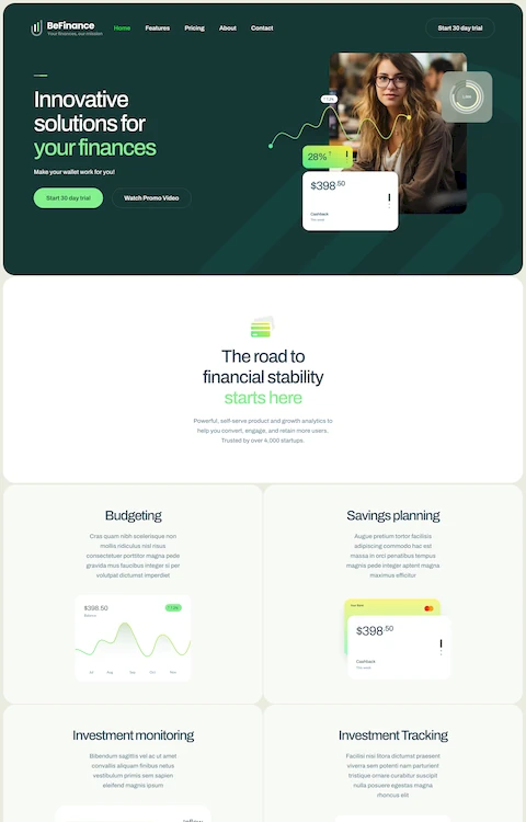
Inspiring Examples of Technology Website Templates
September 24, 2025
The Best Florist Website Design Examples
October 4, 2025Surf brands live and die by their visual identity online. The wrong website kills credibility faster than a closeout wave.
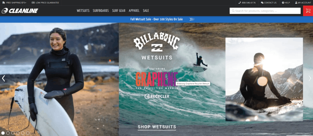
These surfing website design examples show what actually works for brands like Billabong, Rip Curl, and independent shapers like Channel Islands Surfboards.
You'll see how top surf companies handle ocean-themed layouts, e-commerce functionality, and mobile-first responsive design for audiences checking conditions from Huntington Beach to the Gold Coast.
We break down hero sections, color palettes, typography choices, and the technical requirements that separate amateur surf sites from professional builds.
Whether you're launching a surf school booking platform, surfboard shaper portfolio, or full e-commerce surf store, these examples provide the blueprint.
What is Surfing Website Design
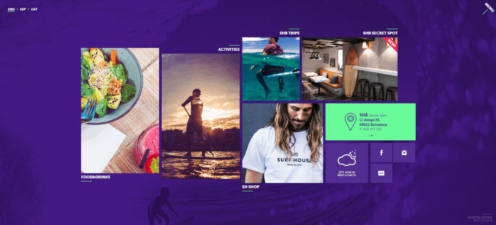
Surfing website design is a specialized approach combining ocean-themed visuals, action photography, and functional layouts for surf brands, surf schools, board shapers, and surfing media publications.
These sites serve Billabong, Rip Curl, Quiksilver, and independent shapers like Channel Islands Surfboards or Firewire Surfboards.
The visual language pulls from coastal color palettes, wave photography backgrounds, and the beach lifestyle that defines surf culture.
Most surf websites fall into one of six categories: e-commerce surf stores, surf school booking platforms, surfboard shaper portfolios, surf magazine layouts, surf forecast services like Surfline or Magicseaweed, and surf travel websites.
Each type demands different functionality but shares the same DNA: bold imagery, mobile-first responsiveness, and layouts that feel as fluid as the ocean itself.
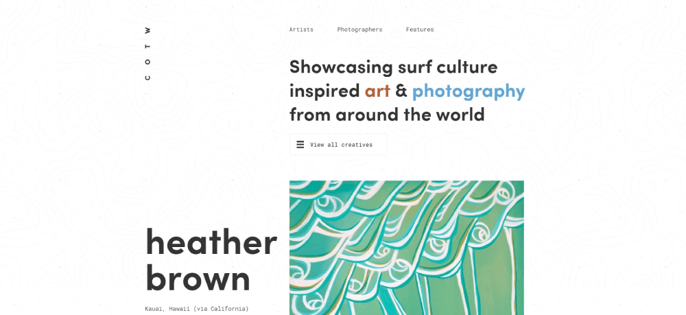
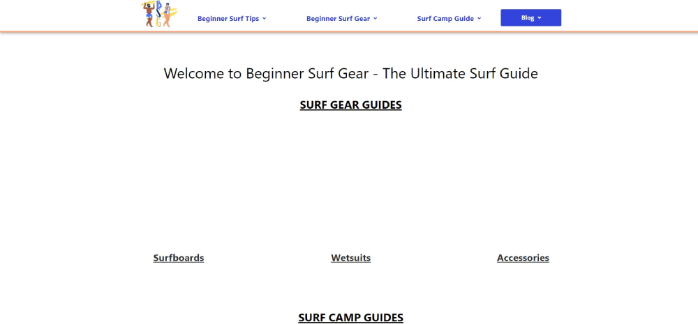
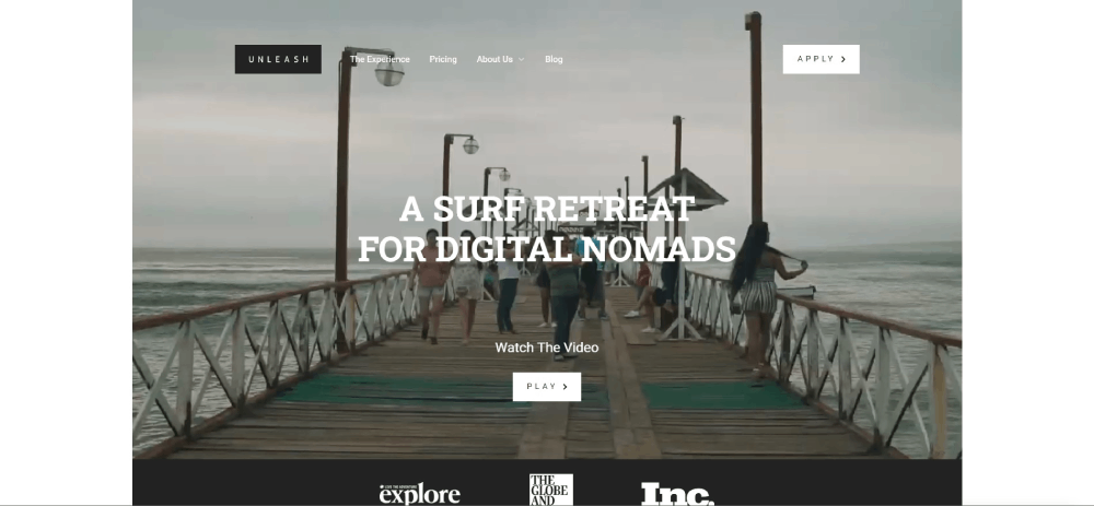
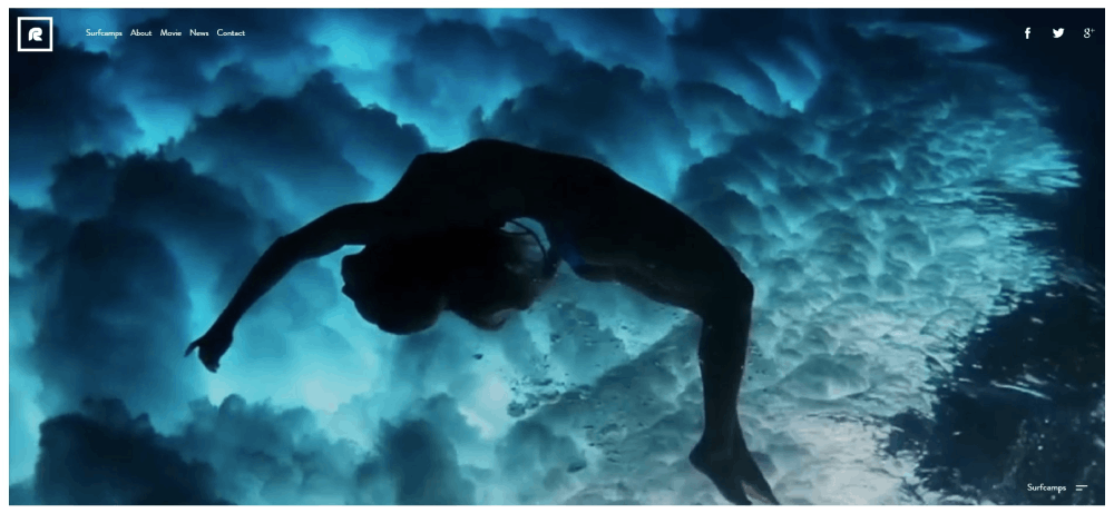
Surfing Website Design Examples
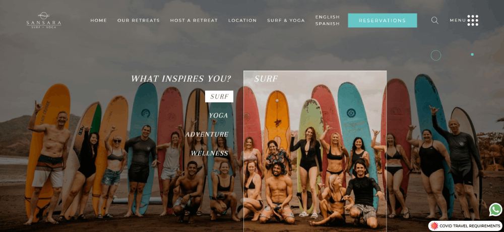
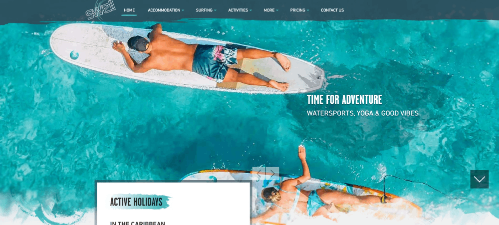
Sansara Surf & Yoga Resort
How Surfing Website Design Differs from Standard Sports Websites
Standard sports websites prioritize stats, scores, and team schedules.
Surf websites prioritize mood, lifestyle, and visual storytelling.
The World Surf League site looks nothing like an NFL homepage. And that's intentional.
Visual Language and Color Palettes in Surf Websites
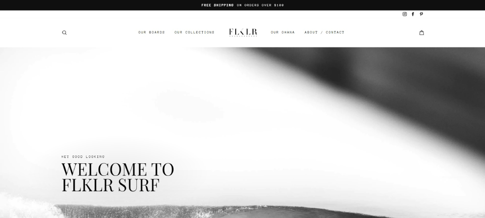
Ocean blues, sunset oranges, sandy neutrals. That's the color scheme foundation for most surf brands.
Patagonia's surf section uses muted earth tones; O'Neill leans into high-contrast blacks and electric blues.
The color theory here connects directly to the environment: turquoise waters, golden hour light, white sand beaches.
Photography and Video Integration Methods
Surf photography isn't decoration. It's the product.
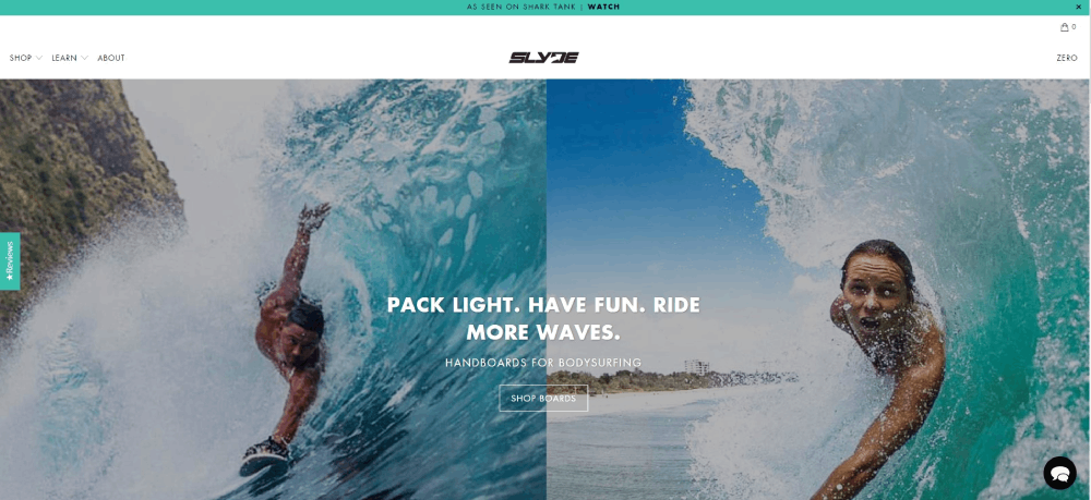
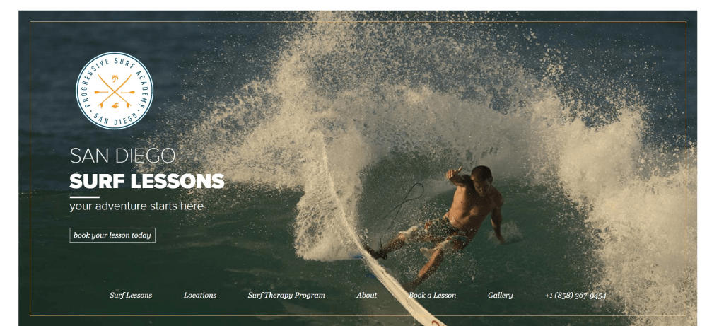
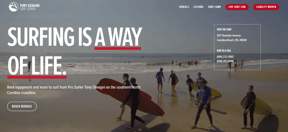
Brands like VISSLA and Hurley use full-bleed barrel photography as hero backgrounds. Websites with video backgrounds showing wave riding footage convert better than static images for surf schools.
Lost Surfboards and JS Industries showcase board photography with 360-degree viewers and zoom functionality that lets customers inspect rail contours and fin setups.
Navigation Patterns for Surf Culture Audiences
Surf audiences expect speed and simplicity. They're checking conditions on phones at 5 AM before dawn patrol.
Clean website navigation examples from top surf brands show minimal menu items: Shop, Forecast, Team, About.
The best surf sites avoid mega menus. Too much clutter kills the vibe.
What Makes a Surfing Website Effective
Pretty doesn't mean functional. A surf website needs to perform as well as it looks.
Huntington Beach surf shops and Gold Coast retailers learned this the hard way. Beautiful sites that load slowly lose customers to competitors.
Loading Speed Requirements for Media-Heavy Surf Sites
High-resolution surf photography creates a problem: stunning visuals versus page speed.
Use Cloudflare CDN for global surf audiences. Compress images to WebP format. Lazy load everything below the fold.
Target under 3 seconds on mobile. Surfers in Hossegor and Pipeline check conditions on cellular networks, not fiber connections.
Mobile Responsiveness for Beach and Travel Users
Responsive websites aren't optional for surf brands. Over 70% of surf site traffic comes from mobile devices.
Users check wave forecasts at the beach, browse boards during travel layovers, book surf lessons from hotel lobbies.
Mobile first design means designing for the phone screen before the desktop. Not the other way around.
E-commerce Functionality for Surfboard and Gear Sales
Surfboard e-commerce store design requires specific features standard shops don't need.
Custom surfboard configurators let customers select dimensions, fin systems, and graphics. Board volume calculators help intermediate surfers find the right size.
Shopify powers most surf brand stores. WooCommerce handles the rest. Both integrate wetsuit size guides, fin selector web tools, and product filtering by skill level.
Product websites in the surf industry need detailed spec tables: length, width, thickness, volume, recommended weight range.
Content Layout for Surf Forecasts and Editorial Features
Surf magazine digital editions combine editorial content with forecast data.
The layout needs clear separation between evergreen content and time-sensitive conditions. Wave report API integration pulls real-time data into custom widgets.
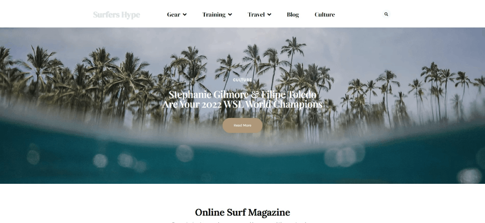
Blog design for surf publications prioritizes photography above headlines. The barrel shot hooks the reader; the headline explains what they're looking at.
Types of Surfing Websites by Purpose
Surf Brand E-commerce Websites
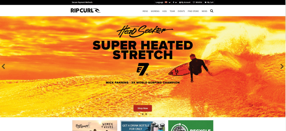
Clothing websites for surf apparel need size guides, fabric details, and lifestyle context. Hurley and O'Neill excel at mixing aspiration with transaction.
Surf School and Lesson Booking Websites
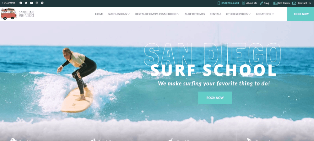
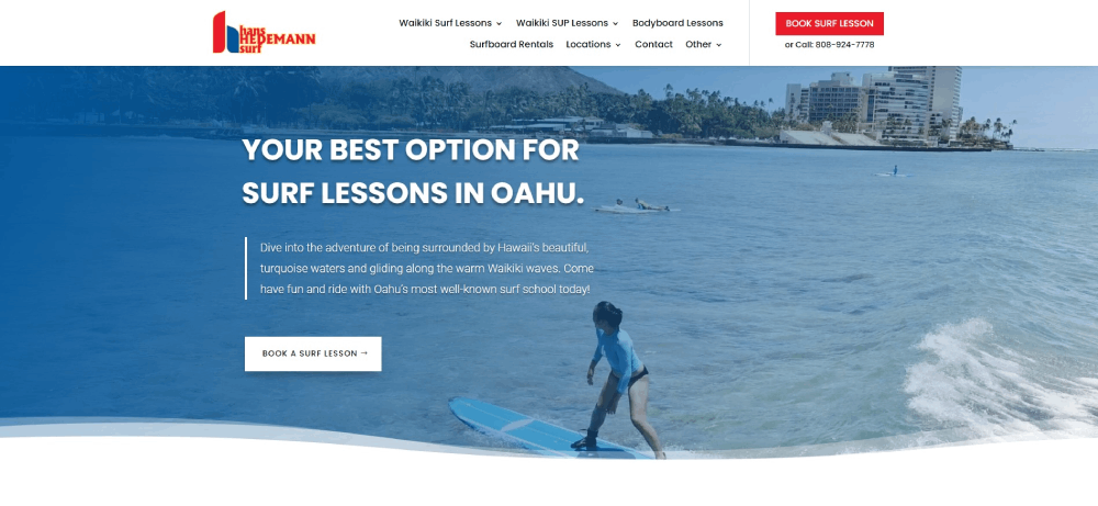
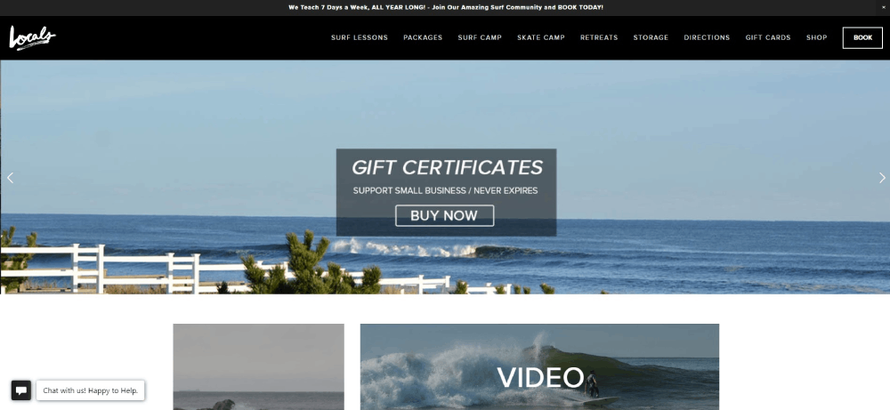
Surf lesson scheduling software integration is critical. Calendar availability, instructor profiles, group size options displayed upfront. Form design keeps booking friction minimal.
Surfboard Shaper Portfolio Websites
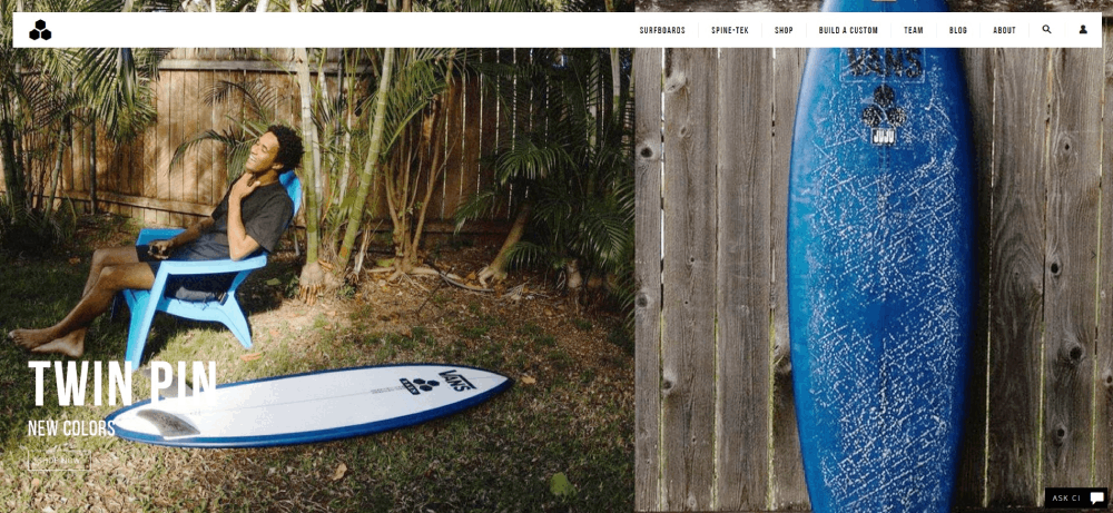
Portfolio sites for board shapers showcase craftsmanship. High-resolution detail shots, shaping process videos, custom order inquiry forms.
Surf Media and Magazine Websites
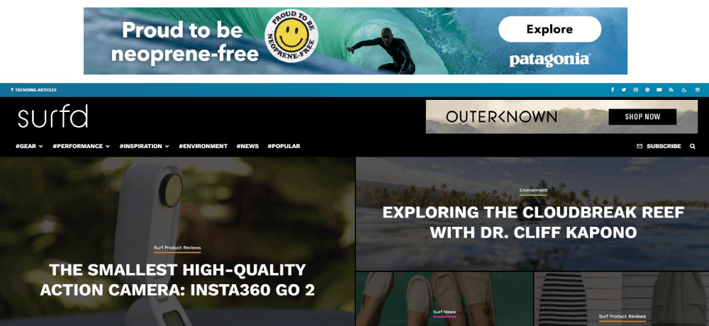
News websites covering surf contests, athlete profiles, and industry stories. The Inertia and Stab Magazine balance advertising with editorial integrity.
Surf Forecast and Conditions Websites
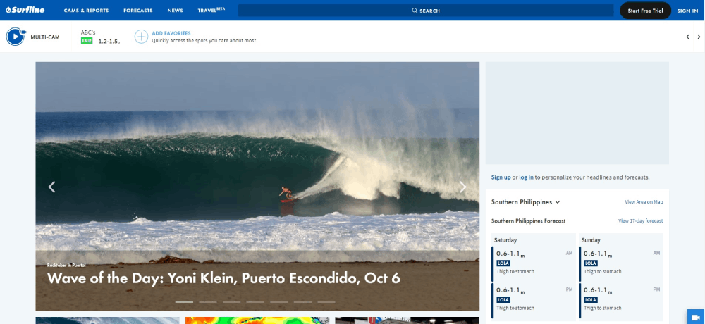
Magicseaweed and Surfline dominate this space. API-fed always-on articles deliver fresh numeric values for tide forecasts and swell data.
Surf Travel and Destination Websites
Tourism websites for surf destinations like Gold Coast or Hossegor combine trip planning with conditions data. Surf camp testimonial sections build trust for booking decisions.
Design Patterns Common in Surfing Websites
Hero Section Layouts for Surf Brands
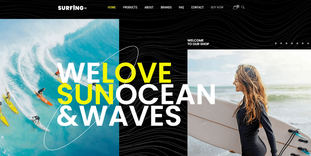
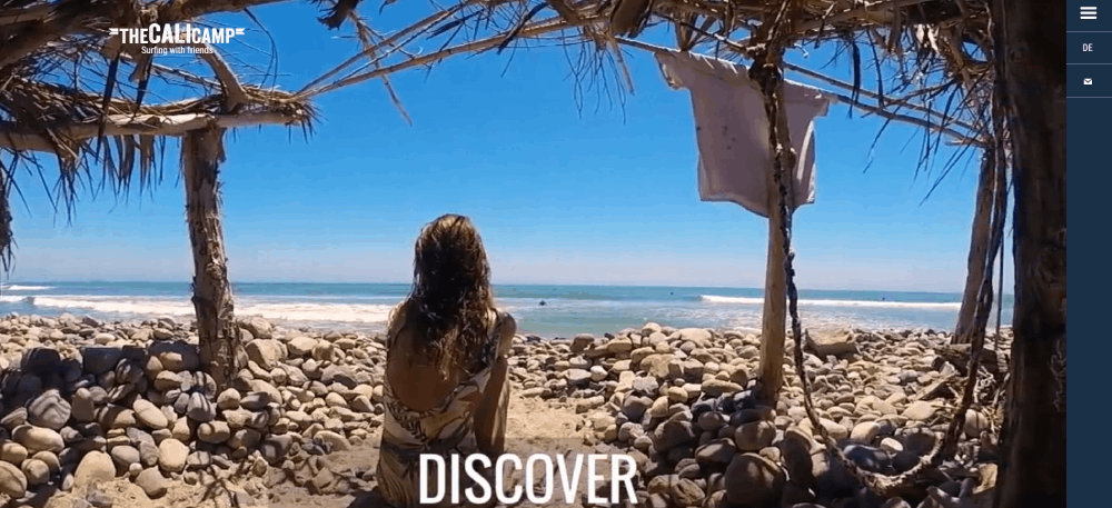
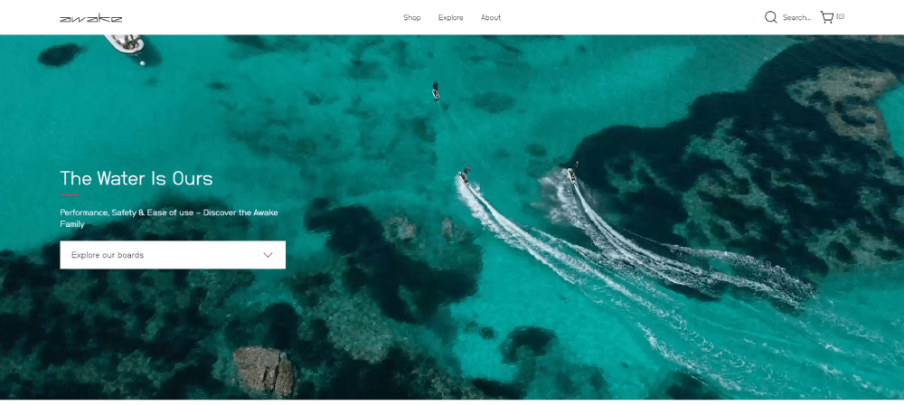
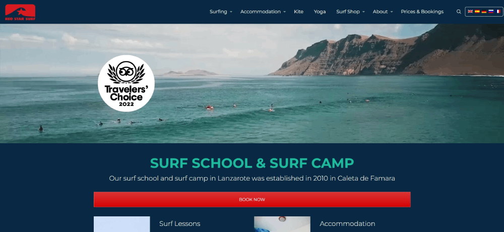
Full-width barrel photography or wave riding video headers. Text overlay minimal; image does the storytelling. Header navigation often transparent over imagery.
Product Grid Variations for Surfboards
Board displays need more vertical space than standard product landing pages. Dimensions shown on hover; quick-view modals for specs.
Video Background Implementation Techniques
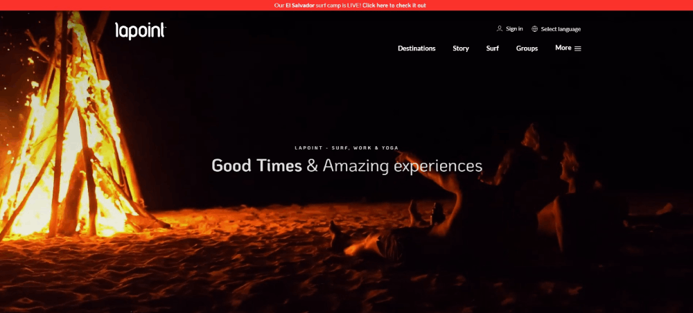
Animated websites using surf footage autoplay muted, loop seamlessly. File size under 5MB keeps load times acceptable. Fallback static images for slow connections.
Blog and Editorial Template Structures
Featured image dominant. Pull quotes from athlete interviews break text blocks. Related articles display by surf spot or rider.
Booking and Scheduling Interface Designs
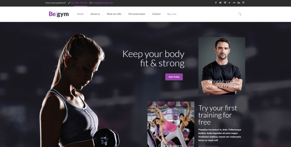
Surf school sites need calendar widgets showing instructor availability. Similar to personal trainer websites but with tide-dependent scheduling options.
Technical Requirements for Surfing Websites
Image Optimization for High-Resolution Surf Photography
WebP format reduces file size 30% versus JPEG. Responsive images serve different sizes based on viewport. Cloudflare CDN caches assets at edge locations near surf destinations worldwide.
Video Hosting and Streaming Solutions
Vimeo Pro for branded players without ads. YouTube embeds work for editorial but hurt brand perception on premium websites. Self-hosting only viable with proper CDN configuration.
CDN Configuration for Global Surf Audiences
Surfers access sites from Australia, California, France, Indonesia, Portugal. Edge servers in each region reduce latency. Cloudflare or AWS CloudFront handle most surf brand deployments.
CMS Options Used by Surf Brands
- Shopify Plus: Billabong, Quiksilver, Rip Curl
- WordPress + WooCommerce: Patagonia, smaller shapers
- Squarespace: VISSLA, boutique brands
- Webflow: Design-forward surf startups
- Custom builds: Surfline, Magicseaweed forecast platforms
Color Schemes in Surfing Website Design
Ocean Blue and Teal Combinations
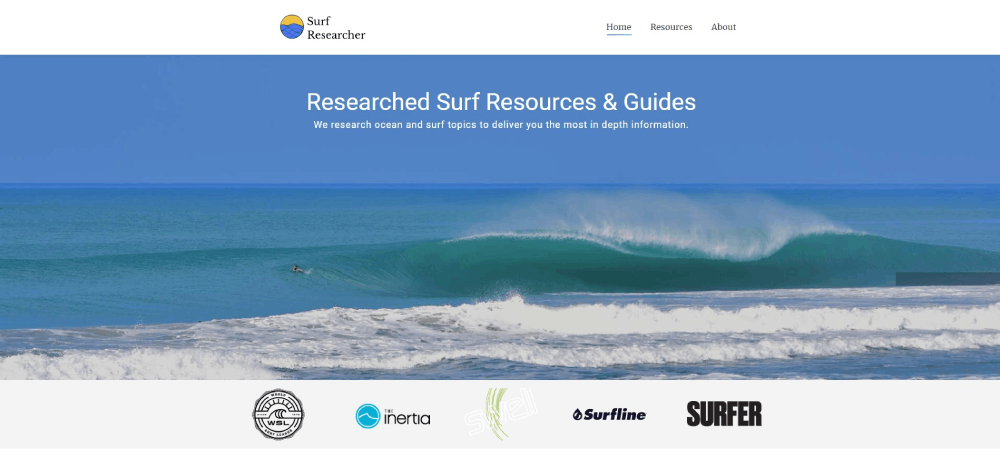
Hex codes like #0077B6, #00B4D8, #90E0EF appear across surf brands. These shades reference tropical waters and work against white backgrounds. Blue websites dominate the surf forecast category.
Sunset Orange and Warm Palettes
Orange color palette variations (#FF6B35, #F7931E) evoke golden hour sessions. Rip Curl's SearchGPS campaigns use warm tones extensively. Pairs well with dark backgrounds for contrast.
Minimalist White and Natural Tones
Sandy beiges (#F5F5DC), driftwood browns (#8B7355), seafoam greens. Minimalistic websites for sustainable surf brands favor earth tones over vibrant hues.
High Contrast Action Sport Palettes
Electric yellow (#FFE135) against black. Neon green (#39FF14) for youth-focused brands. Colorful websites targeting younger surfers use bolder combinations.
Typography Choices in Surf Website Design
Display Fonts for Surf Branding
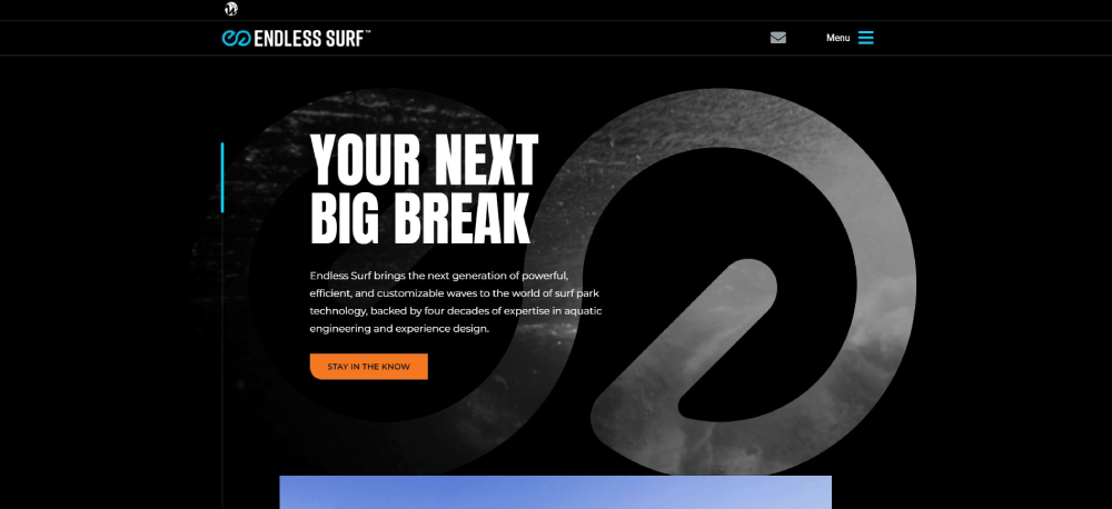
Condensed sans-serifs like Bebas Neue, Oswald, and Industry create bold headlines. Custom lettering appears on heritage brands. Typography carries brand personality beyond the logo.
Body Copy Fonts for Readability
Open Sans, Lato, and Source Sans Pro dominate body text. Surfline uses system fonts for faster rendering on data-heavy pages. Minimum 16px for mobile readability.
Font Pairing Examples from Surf Brands
- Billabong: Custom display + Helvetica body
- Channel Islands: Industry Black + Open Sans
- Patagonia: Custom serif headlines + clean sans body
- VISSLA: Hand-drawn display + geometric sans
How to Choose a Surfing Website Design Style
Questions to Identify Your Surf Brand Positioning
- Performance-focused or lifestyle brand?
- Premium positioning or accessible price points?
- Core surfers or broader beach culture audience?
- E-commerce primary or content-driven with secondary sales?
- Regional focus or global distribution?
Matching Design Style to Target Surf Audience
Core surfers want function: fast load times, clear specs, minimal fluff. Lifestyle audiences respond to editorial content and aesthetic websites with mood-setting photography.
Good UX means understanding who's visiting and why.
Budget Considerations for Surf Website Development
- $500-2,000: Squarespace or Shopify theme customization
- $2,000-10,000: Custom theme development on existing platforms
- $10,000-50,000: Full custom design and development
- $50,000+: Enterprise e-commerce with API integrations, multi-regional setup
Use a website checklist to scope requirements before requesting quotes from web design agencies.
FAQ on Surfing Website Design
What platform do most surf brands use for their websites?
Shopify Plus powers major surf brands like Billabong, Quiksilver, and Rip Curl. Smaller shapers use WooCommerce or Squarespace. Webflow handles design-forward surf startups. Forecast platforms like Surfline run custom builds for API integration.
What colors work best for surfing website design?
Ocean blues (#0077B6), sunset oranges (#FF6B35), and sandy neutrals dominate surf brand palettes. Coastal color schemes reference the beach environment. Sustainable brands like Patagonia favor earth tones over vibrant hues.
How do surf websites handle high-resolution photography?
WebP format reduces file sizes by 30%. Lazy loading delays off-screen images. Cloudflare CDN caches assets globally for surfers accessing from Gold Coast, Hossegor, or Pipeline. Target under 3 seconds load time on mobile.
What features do surfboard e-commerce sites need?
Custom surfboard configurators for dimensions and fin systems. Board volume calculators for sizing. Detailed spec tables showing length, width, thickness. Fin selector tools and wetsuit size guides. Integration with dealer networks for stock availability.
How should surf school websites handle bookings?
Surf lesson scheduling software with calendar availability display. Instructor profiles with certifications. Group size options and skill level filtering. Mobile-responsive booking forms for beach access. Tide-dependent scheduling when relevant.
What makes surf forecast websites different from other sports sites?
Wave report API integration pulls real-time conditions. Surf spot directories organize locations by region. Data-forward design prioritizes function over aesthetics. Magicseaweed and Surfline update numeric values constantly for swell height and wind speed.
Should surf websites use video backgrounds?
Yes, for brand sites. Wave riding footage converts well for surf schools and lifestyle brands. Keep files under 5MB, autoplay muted, loop seamlessly. Provide static fallback images for slow mobile connections at the beach.
What typography works for surf brand websites?
Condensed sans-serifs like Bebas Neue for bold headlines. Open Sans or Lato for readable body copy. Custom lettering for heritage brands like Channel Islands. Minimum 16px font size for mobile surf forecast checks.
How much does a professional surf website cost?
Theme customization runs $500-2,000. Custom design on Shopify or WordPress costs $2,000-10,000. Full custom builds range $10,000-50,000. Enterprise setups with multi-regional e-commerce like Rip Curl exceed $50,000.
What CMS do surf media websites use?
WordPress dominates surf magazine digital editions and editorial sites. Custom post types handle athlete profiles, contest coverage, and gear reviews. Integration with Instagram feeds and YouTube embeds for surf film content.
Conclusion
These surfing website design examples prove that function and aesthetics can coexist. From Firewire's sustainability-focused layouts to Surfline's data-driven forecast interfaces, each approach serves its specific audience.
The best surf websites share common traits: fast load times, mobile-responsive design, and visuals that capture the ocean lifestyle without sacrificing usability.
Whether you're building for a wetsuit manufacturer like O'Neill, a board shaper portfolio, or a surf travel platform targeting destinations like Indonesia and Portugal, the fundamentals remain consistent.
Start with your audience. Core surfers want specs and speed. Lifestyle customers respond to editorial content and wave photography.
Pick your platform wisely. Shopify handles scale; Webflow delivers design flexibility; WordPress powers content-heavy surf media sites.
Now build something worth paddling out for.

