
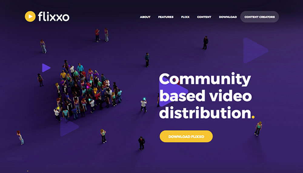


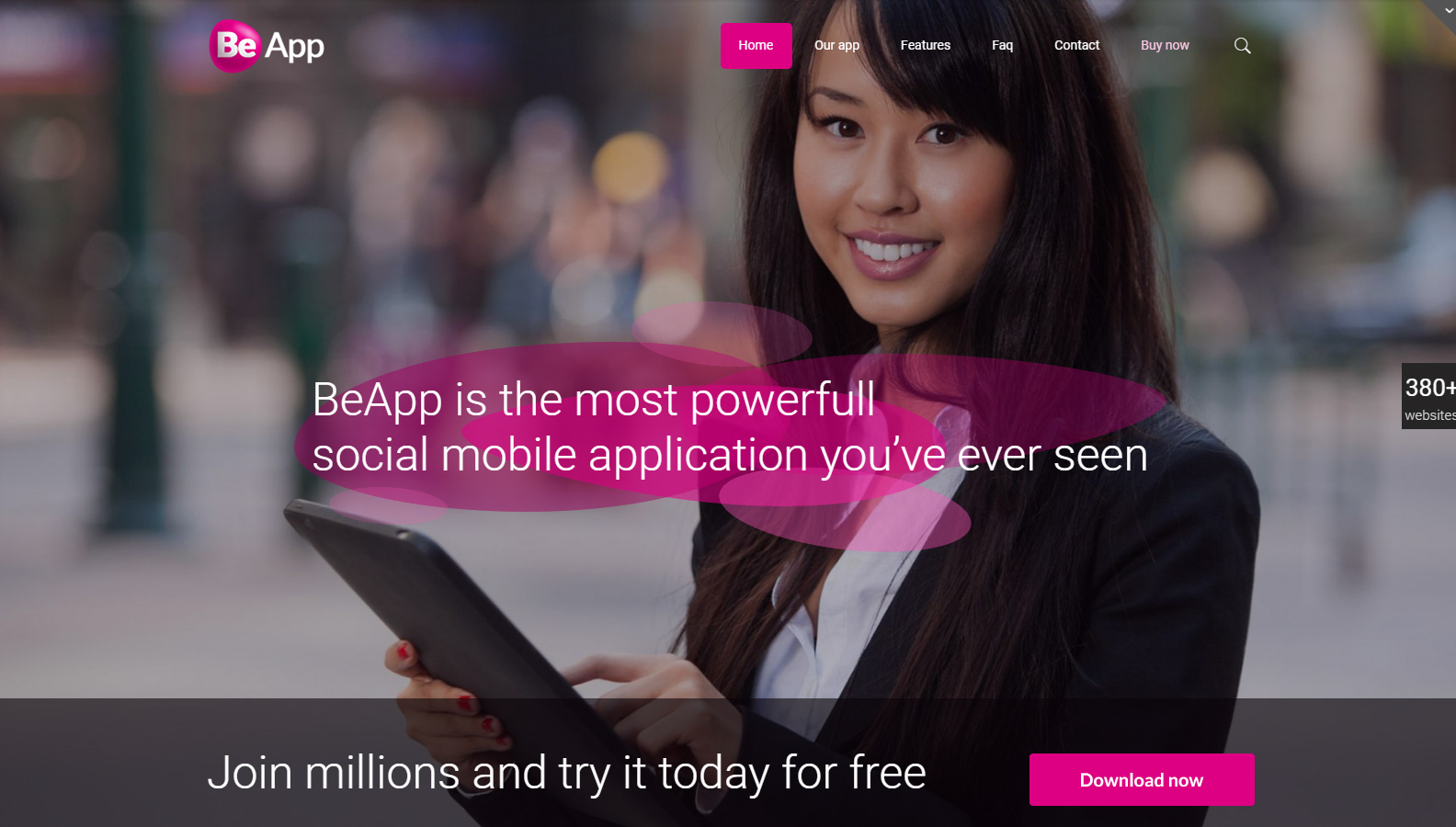
Website inspiration: where to look for the recent design trends
February 12, 2019
How to fix the HTTP error when uploading images to WordPress
April 10, 2019All organizations want their website to inspire visitors to get to the next level, and that is buying their product/service or contacting them. This is what is known as a conversion, which is when leads convert into users. If your website’s getting a lot of traffic, but the number of conversions doesn’t match, you need to figure out why.
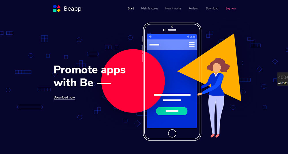
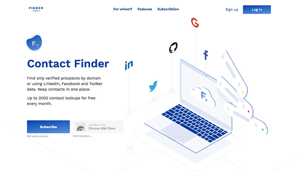
Software websites are used by organizations as a tool of conversion and the focal center point of their marketing campaigns. In order to become competitive, you need to use your software website to provide visitors with detailed information and conversion touching points without them being overwhelmed. This is why you need to be strategic when designing software websites.
It’s crucial to apply conversion strategy – along with a modern design – like those mentioned here:
- Calls to action that are well-placed and relevant
- A value proposition that is strong and in key places
- Analytics and A/B tests to boost low-converting elements
- Social proof
- A growth-driven model
These nine design tips for software websites will ensure that your organization’s website is turned into a powerful lead generation tool.
Clear UVP
The best value proposition is a combination of your organization’s strong points, your users’ needs, and competitive differentiation. Your organization’s uniqueness gets combined with its users’ main priorities.
Do you know what your unique value proposition is? If not, then that’s the first problem you have. Your second problem is that your website’s visitors are probably not aware of your UVP. You need to clearly convey right from the start why they should choose you.
Probably the most challenging part of creating a software product’s landing page is that those products usually have a plethora of use cases and features. It seems almost impossible to concisely communicate their value. That’s why it’s crucial for your landing page to focus more on the user than on the product.
Your audience doesn’t consist of “people” requiring “software.” It consists of Linda, who wants to put her first drip-nurturing strategy into action. There’s also Craig who’s dealing with a boost in leads but doesn’t know how to grade them. It’s countless individuals who all have their own needs; your task is to address each of those needs as soon as you can.
Once visitors gain interest, they’ll read more about the organization, but it’s a clear value proposition that will get them hooked.
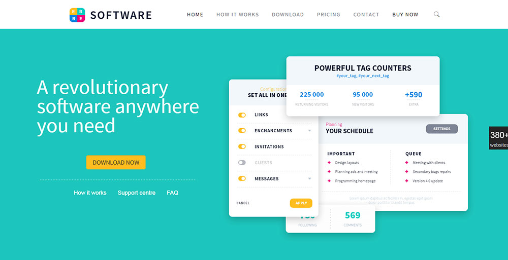
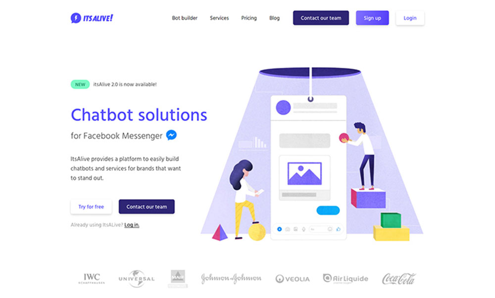
Calls-to-Actions (CTAs) Should be Big, Bold, and Relevant
Your website’s CTA buttons play a huge role in pushing users through the sales funnel and converting them. Here are some of the best CTA practices:
- The bigger, the better
- Place it above-the-fold so that you don’t need to scroll down
- Make it contrast
- Feature strong copy
- Use QR codes (create using one of these best QR code generators)
The above tips are important because the CTA needs to be visible to users, so it needs to be large, contrast the page’s color, include alluring copy, and be above-the-fold allowing them to click it. Another important CTA factor is relevance. Each page’s CTA must be relevant to the position the user’s currently in the sales process.
For example, your homepage won’t contain a “Purchase” CTA as users don’t yet know anything about your organization or product. The CTA needs to contribute to the page’s value, therefore they should be customized by the user’s journey.
Prospective users aren’t willing to share their surname, pet’s name state, city and six other pieces of info just for a free download. Be short and sweet: a first name, email, and zip code are more than plenty. Try turning off your captcha test to see if your response rate goes out – without your spam going up as well.
Run split tests into various phrasings, graphics, and designs to see which boosts your conversions the most. A great tool for testing conversion strategy and gradually making simple improvements is marketing automation such as HubSpot.
You can also use Google Chrome’s Page Analytics extension or the Hotjar heatmap to discover which parts are the most and least clicked on. This information will then help you revamp certain page elements or change the website’s structure to boost conversions.
You can go one step further and find out where prospective users sign you're your website by analyzing motion and bounce rate (a great free tool is Google Analytics).
Virtual Chat
Software websites with too many images or text or whose color balance is awkward won’t attract visitors. Due to the fact that software marketing consists of price points, technical specifications, and features that need to be shared, software websites that make good use of white space will offset information overload.
Trust Symbols
85% of users will read as much as 10 reviews before they’re able to trust an organization (BrightLocal). Some examples of trust symbols include PayPal’s certification logo and badges from review sites such as Yelp.
Users require a plethora of information and proof that the software they’re interested in works and will give them results, which is especially the case when it comes to technology products. Use case studies or customer testimonials to give them this proof.
Your objective is to ensure that prospective users feel that you can be trusted to provide a good product or experience.


