How the “Gig Economy” is Influencing Your Web Design Work
July 4, 2016
How to Research and Create a Web Design Persona
July 11, 2016One of the more popular website trends being put into play by web designers is that of parallax scrolling. The concept of parallax is nothing new. The ancient Greeks were the first to define it. In more recent times, the parallax effect was used in video games to give them a 3-D look.
Web designers and users that are familiar with the concept definitely recognize it when they see its presence in a website. Those who are unfamiliar with the concept, will nevertheless be impressed. Three groups of people stand to gain when parallax is used as a website special effect:
- End users, who are treated to a more engaging user experience.
- Clients, whose brand and image is given a fresh, modern look.
- Web designers like you, who can spruce up their portfolios and enhance their popularity.
Understanding and applying parallax scrolling techniques is a worthy investment of your time.
What is Parallax Scrolling All About?
Parallax comes from the Greek word parallaxis (παράλλαξις ). It means the apparent movement of an object in a given direction, as seen from two different points that are not on a straight line with the object. The impression given is one of making two stationary objects appear to be moving in different directions relative to one another.
When a background image appears to be moving with respect to the foreground image (which could be an object or text), it creates an illusion of depth.

With Be Theme, it’s a simple task to incorporate parallax effects into a website’s home page and/or key landing pages for any of the following reasons:
- Page depth and animation are two ways to more effectively engage a user. Parallax creates both effects.
- Parallax lends itself to storytelling, and it can also be used to guide a user through the site.
- Visitors are encouraged to scroll through an entire page to see what’s next.
- People are curious beings. They find moving patterns or objects difficult to ignore.
- Parallax is an effective means of directing visitors to calls for action.
- Employing this innovative trend reinforces website credibility.
Although parallax scrolling has been in use for some time, is a modern trend in the sense that a steadily increasing number of web designers have come to understand and appreciate its benefits.
Examples of Pre-Built Websites that Use Parallax Scrolling
The judicious use of parallax scrolling in website design can have an extremely positive influence on the user experience, with an emphasis on “judicious”. Special effects are usually most successful when used sparingly. An excessive use of parallax in your websites could cause them to resemble video games, which is probably not your intention.
- Don’t overdo it. Excessive use of parallax can make your site unnecessarily complicated.
- Using parallax can be a highly effective way to help tell a story.
- Using layering to achieve a feeling of depth makes your site a fun and engaging place to visit.
- Using parallax can be a great way to steer your visitors to calls for action.
The use of parallax may not always be compatible with older browsers or some responsive and mobile design implementations. That was definitely the case some time ago, but solutions have since been found that enable parallax functionality to be used across all devices. It’s always best to test to be sure.
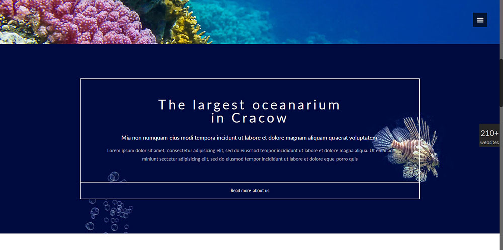
Be Underwater
This website is dedicated to an oceanarium. What better use of parallax than to give the user an experience similar to scuba diving near a coral reef, or watching a fish tank?
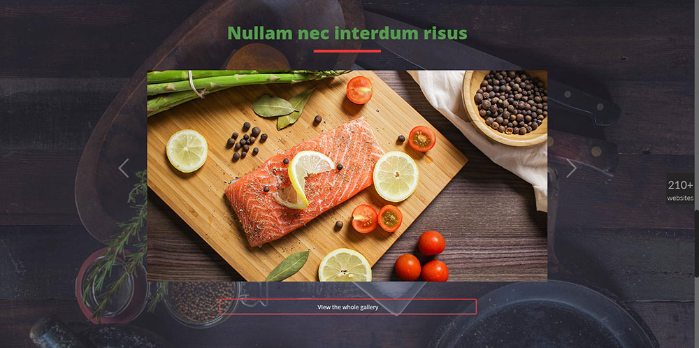
Be Bistro
This website is good example of a subtler use of parallax. The play between the website’s theme and its elements sets the stage for presenting associations designed to fully engage the user.
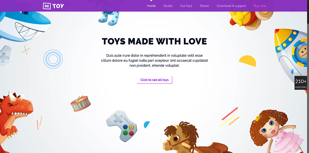
Be Toy
Be Toy presents the user with a delightfully whimsical atmosphere where the clever use of illustrations combined with parallax offers a totally engaging UX. This pre-built website is the perfect starting point for a toy manufacturer or a retailer.
Be Theme’s Main Features
Be Theme is the biggest WordPress theme ever. While its most notable feature may be the 210+ pre-built websites, the quality built into this design tool is what sets it apart.
Visit the website, take note of the benefits Be’s 40 core features offer, and you’ll see why this WordPress theme is used and loved by over 30,000 web designers.
- Be’s drag and drop Muffin Builder has always been popular. The new Muffin Builder 3, with its spruced up interface, added functionality, and superior response time, is even more popular.
- The Admin Panel makes customization quick and easy. Its unlimited number of design options makes coding unnecessary. Together with the Muffin Builder, it gives you a powerful one-two punch to work with.
- When faced with the need to create one or more truly unique page designs in a website, the Layout Configurator can be your best friend. Select a grid system and header option, and off you go.
- The Shortcode Generator makes it an easy task to incorporate complex design elements and functionalities into a page – again, without having to rely on coding.
There’s much more, but one last feature is worthy of mention here. When you purchase Be Theme, Lifetime Updates, often based on user feedback, will always keep your web design capabilities up to date.


