
Trends in Pre-Built Website Design – Minimalist Approach
September 8, 2016
September’s Latest Pre-Built Websites
September 30, 2016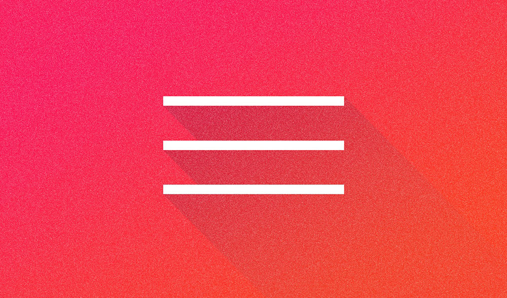
Occasionally, you’ll spot an icon consisting of three horizontal lines at the upper far left or right of your screen. You may have to click on it to find out what it does; which users who have an aversion of the unknown are sometimes reluctant to do.
This three-line icon is called a hamburger menu. Touch, tap, or click on it, and a side menu opens. Some web and app designers love the hamburger menu. It takes up very little space, and it fits in nicely with the minimalist look.
Others are not quite so fond of it.

Their view is, it’s function is not obvious.
If you expect your users to access your menu, they have to know what to look for.
Nevertheless, as demonstrated in the BeCarver pre-built website, letting users find out for themselves, is not at all difficult. Because of its small size and shape, the hamburger menu is popular with mobile device users.
The History of the Hamburger Icon
The hamburger menu has been around for a while. It was created by Norm Cox in 1981, and it first appeared in the graphical user interface, the Xerox Star. Cox considered the three-line icon to be self-explanatory, since its three horizontal lines gave the appearance of a menu list.
To say the icon didn’t catch fire would be an understatement. It virtually dropped out of sight for a number of years. In fact, it really never came back into regular use until the introduction of smartphones and their accompanying apps. The hamburger menu was first noticed on the iOS Voice Memos app, where users were more than happy to put it do good use.
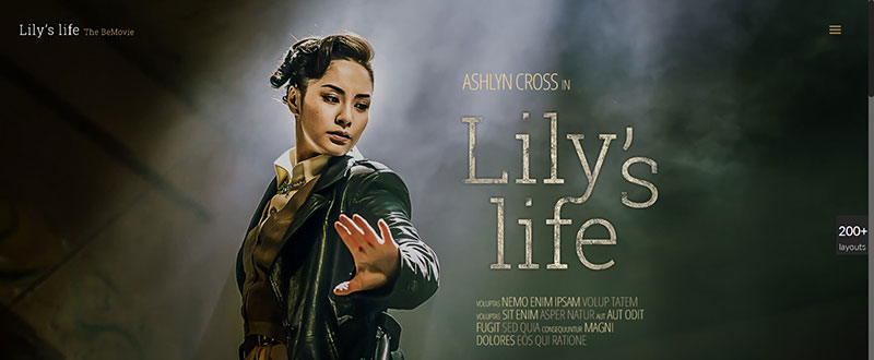
Notice how subtly the hamburger menu appears in this BeMovie pre-made website. It’s easily spotted but does not detract from the primary visual.
In 2009, the icon was used on Twitter’s first mobile app, Tweetie. This greatly influenced the hamburger icon’s usage and popularity; especially after it was taken up by Facebook, which started with a two-row grid on their app, progressed to a three-row grid, and finally settled on the familiar three bars in 2010.
Its critics still contend that while designers and developers know what the icon stands for, many do not. This appears to be changing however. According to a recent study, the hamburger menu button is one of the five most popular buttons on mobile sites.
Best Practices for, and Advantages of, Implementing the Hamburger Menu
UX designers from a UI/UX design studio have a wide selection of design elements to work with. The challenge is to make appropriate use of the ones selected. Put somewhat differently, the icons you work with should be used to streamline and aid a user’ experience; and they should also tend to simplify a web page’s look and feel.
Best Practices
- Make sure the hamburger menu is obviously clickable. Placed in a wrong location, or forced to compete with other design elements, the button may appear to be purely decorative.
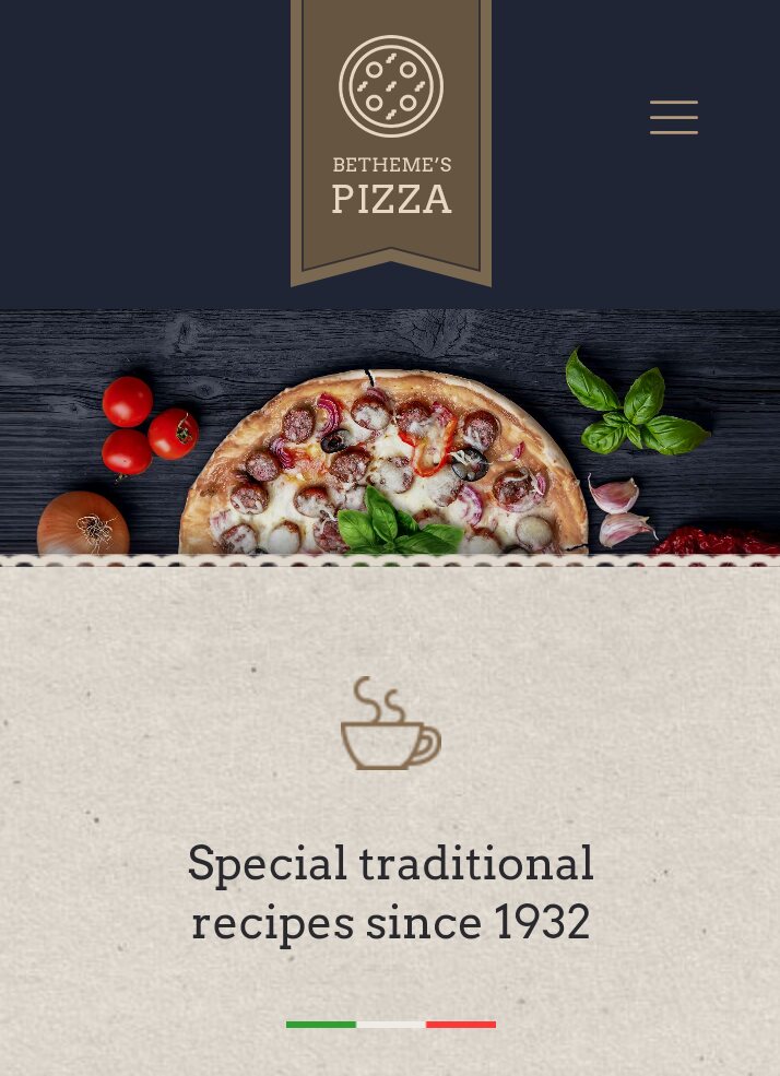
The hamburger menu effectively maintains the economy of elements in the smaller mobile device screens, as shown in this BePizza 2 example.
- Pair it with a strong CTA. If you are providing a clear path by some other means, such as an in-content link, it may be beneficial to hide your menu. If such a clear path doesn’t exist, hiding your menu can create a barrier to navigation. The hamburger menu in BePizza2 is almost begging to be clicked or tapped; even if the user doesn’t know what it symbolizes.
- Pair it with a label. This will be a help to those who have an aversion to clicking on unfamiliar icons or buttons.
- Don’t hide main navigation links. Keeping main navigation links in the open helps the user, while hiding the others keeps the user from consistently having to choose from an overabundance of options.
Advantages
A hidden menu, with its hamburger icon, is clean, unobtrusive, and widely appreciated by those web and UX designers who like to keep their designs simple or minimalist. A hidden menu works to a designer’s advantage when visual simplicity takes precedence over functional simplicity.
People like options, but they don’t necessarily like too many of them. There is such a thing as decision fatigue, which hidden menus can help to avoid. The goal of the designer should be to help users stay on the path that has been pre-set for them.
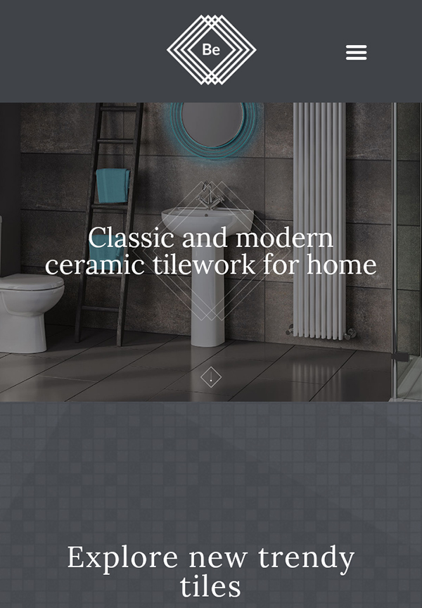
The Be tiles pre-built website – as seen on a mobile device.
This brings up an important point. Every web page should have a goal, and you’ve defined that goal, your design should point your users to a clear, bold CTA. It should provide the user with a yellow brick road leading to the Emerald City, and not a series of detours that make reaching the Emerald City more difficult, or don’t lead to it at all. A clear road sign leads to a CTA, which leads to conversions.
How to Decide If a Hamburger Menu is Suited for Your Website
The advantages of using this type of menu for mobile sites seems obvious, but what about desktop sites?
In both cases, it’s beneficial if your site has a single, clear CTA, or whose landing pages are designed to encourage users to click on in-context CTAs. Users shouldn’t have to click from landing page to landing page to find their destination.
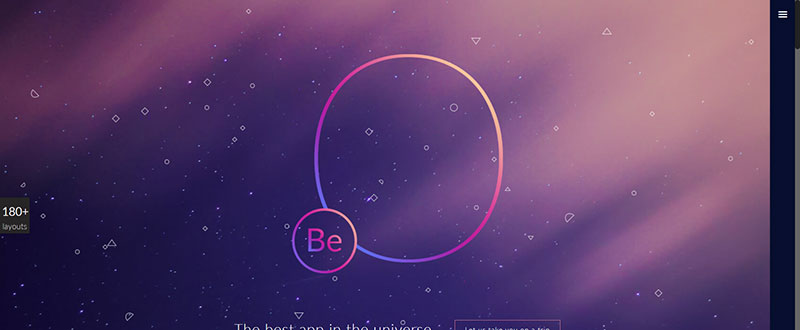
Unobtrusive, yet easily located: The hamburger menu in BeApp2’s desktop variant.
Ask yourself these questions:
- How many menus do I have? Chances are, more than a few; but it’s all about context – which to display and which to hide, while keeping the user on your pre-set path.
- Web app or simple responsive website? Keep in mind that the UI needs to reflect usage patterns and their repetitions, some of which you may wish to store off-canvas.
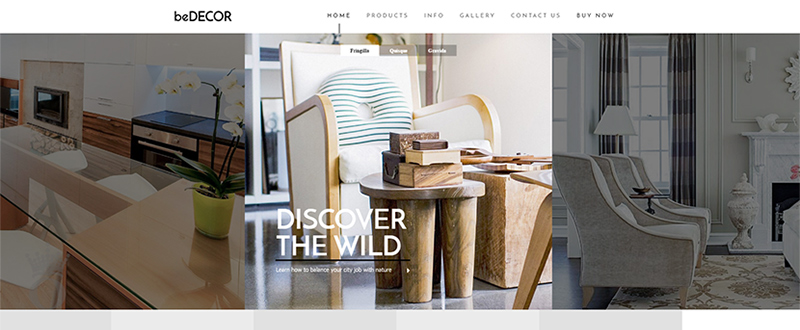
A classical menu like the one presented in the BeDecor pre-built website is always a UX option.
- Which features should always be present? Ecommerce sites are somewhat unique, since carts, wish lists, product searches, all serve as navigation items. They can however add clutter, so adding them to a flyout menu makes sense.
- Is my content’s structure built around a solid conversion strategy? Look into inbound marketing practices to find the answer. Otherwise you may need to avoid an off-canvas navigation capability.


