Mobile first design: How to make the most out of it
October 11, 2023
The types of websites that you can design and tips to do that
October 11, 2023Beautiful backgrounds are not just something that is cool to have on a website; a website background is one of the critical parts of the website's UX design.
Not only can website backgrounds help you create emotional impact for the users, but they can also help you tell your story creatively and appealingly. That being said, if you want a good web background, there are several things to keep in mind.
You can choose website background images, illustrations, a solid block color, or a combination of those, but picking the right website background is a choice that is not to be made lightly.
With that in mind, today we are going to go over all the essential things that you should consider for your webpage backgrounds.
The Best Practices
Choose the right website background images
For web backgrounds, you should only pick high-quality images (300 dpi). Keep in mind that you need to make a powerful first impression if you want the users to stay on the site longer for just a few seconds.
Cool images can grab your users’ attention even before the other UI elements load on the page. Therefore, only use high quality visual when designing your pretty backgrounds, but be smart with the file type to avoid slowing down your website. You need a high-quality image that will both look great and not interfere with the site’s performance.
And speaking of the file types, if you are using images with lots of detail for colorful backgrounds, you should go with JPEG. JPEG combines the high quality with the compatibility across different platforms, and the lowest possible file size.
Compression
The page loading time is something you should always keep in the back of your mind. High-quality images are only good for your website if you do not sacrifice the website’s speed for the quality. You need the right combination of both the excellent performance and the beautiful look.
Luckily, there are some measures that you can take to ensure that your images are the right size for your website. One of the best things to do here is image compression.
If you’re saving images for the web in Photoshop, you can use the ‘Save for Web’ option that will automatically compress the image to fit the web. If you are not a Photoshop user, you can use one of these free image compressors: Compressor.io,Kraken,TinyPNG, Or any other that you like, for that matter.
Choose the right name for the images
When it comes to any kind of content you are adding to your website, you want it to rank high in the search engines. The same goes for the website background images.
Use the relevant keywords and always put the most important keyword first.
Instead of ‘img1034.jpg’, the image above would perform much better with a name like ‘labrador-retriever-diet-exercise.jpg’ with ‘Labrador Retriever’ being the most important term and ‘Diet’ and ‘Exercise’ being additional descriptors.
If you are choosing a background for your online store, choose the name that matches the product you sell. This way, when somebody searches for the product, the images will show up as well.
Use UI color wisely
Colors are a powerful and impactful detail of every design that can influence how the users see your website and whether or not they want to stick around. However, the excellent color choice, in this case, is not just something easy on the eyes but also something practical that will make the text readable.
Make sure that the text and the background textures contrast enough to make the text scannable and readable. However, too sharp a contrast might be too heavy on the eyes. Try to hit just the right contrast ration for the best effect possible.
Position the website background images right
Designing cool backgrounds is not only about choosing the right colors and images but also about positioning them right. For example, a full-screen background image can sometimes detract from other UI elements on the page.
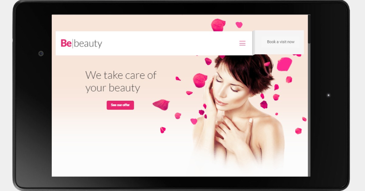
It is all about finding the right balance and about the story you want your image to tell. Generally speaking, we use background images and hero images in two different ways. Hero images are pinned to the header section of a website and relate to the content that sits directly beneath. They are used to tell a specific story or deliver a specific message.
Background images, on the other hand, are visible as the user scrolls down the page instead of being pinned to the page. They are used for creating the overall tone of the website rather than for delivering one particular message.
Background images have to be responsive
Responsive design is essential, now more than ever with people preferring their mobile phones and tablets for browsing the internet instead of the desktop computers.
When choosing your website background images for your background design, test how they display on different screen sizes and different browser window widths. Keep in mind that the users’ expectations have grown and they expect the content to adapt to their devices perfectly.
Free Images Download
Let’s take a look at the sources of some awesome free desktop backgrounds of all kinds; abstract backgrounds, free textures, cool patterns, and other free background images.
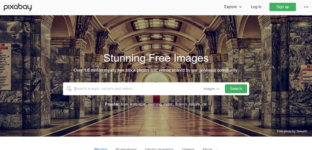
Pixabay
If you are looking for free backgrounds, Pixabay should be one of the first places you should visit. You will get to choose from over 420,000 beautiful images that will adapt to your backgrounds perfectly.
There are no confusing image licenses to worry about. You can use any Pixabay image without attribution in digital and printed form for both commercial and personal use.
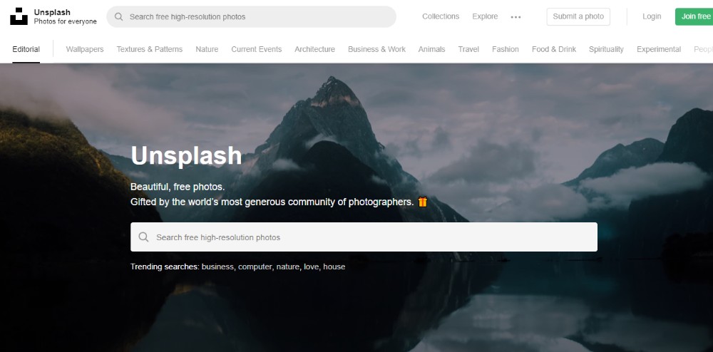
Unsplash
Unsplash is a great source of awesome backgrounds and background patterns. You can even subscribe to get10 new images delivered to your inbox every ten days. You can get a free background pic here in the form of a free png or free jpg which you can then alter, copy, and distribute in any way you see fit because Unsplash images fall under the Creative Commons Zero (CC0) license. However, if you want to give back to the community, you can always give credit where credit is due.
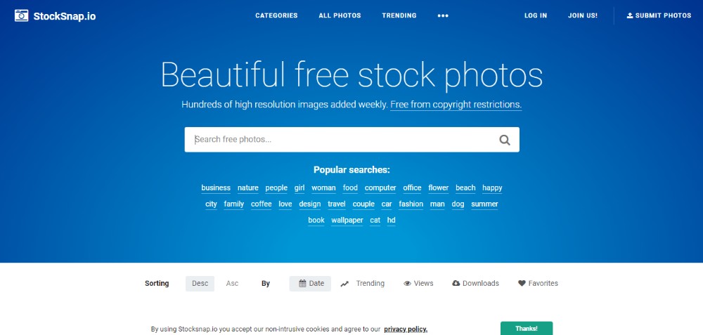
StockSnap
The images, textured backgrounds, subtle patterns, tile patterns, etc. found on StockSnap are free from copyright restrictions, and they do not require attribution. If you do not find there what you need today, don’t worry – hundreds of new images are added every week.
The useful feature of this site is the possibility to see the trending photos for getting instant access to what is currently popular. All StockSnap images fall under the CC0 license.
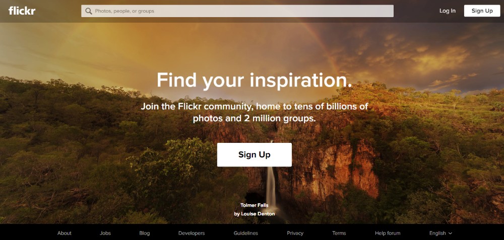
Flickr
Flickr has always been around for quite a while, and it has stayed a great source of free background images for websites. However, you have to be familiar with the Creative Commons license attached to the images of your choice. There are eight license categories and not all images on Flicker fall under the same license.
For example, the images in the Free Use Photos section are available for anyone, and you are not required to give credit to the creator. However, not all images found on Flick can be used in this way.
Pexels
FAQ on website background images
What's the deal with website background images?
Man, website background images are like the unsung heroes of web design. They set the mood, tone, and overall vibe of a site. Think of them as the wallpaper of the digital world. They can be subtle patterns, breathtaking landscapes, or even animated wonders. But, they've got to be chosen with care, you know? Too loud, and they distract; too soft, and they're unnoticed. It's all about balance.
Why are high-resolution images a must?
Alright, so here's the thing. We're living in an age of 4K monitors and retina displays. If you slap a low-res image as your background, it's gonna look pixelated and just... off. High-resolution images ensure that your site looks crisp, clean, and professional on all devices. It's like wearing a tailored suit instead of a baggy one. Makes a difference, right?
How do I optimize these images without losing quality?
Optimizing is the name of the game! You want your site to load fast, but you also don't want to sacrifice the image quality. There are tools out there, like image compressors, that can help you reduce the file size without making it look like a blurry mess. Remember, it's not just about the looks; it's about the performance too.
Can I use videos as background?
Oh, absolutely! Videos can add dynamism and a touch of professionalism. But, and this is a big BUT, they can also slow down your site if not optimized properly. If you're going for a video background, make sure it's short, loops seamlessly, and doesn't auto-play with sound. Nobody likes unexpected noise, trust me.
What about mobile devices? Do backgrounds matter there?
You bet they do! More people are browsing on mobile than ever before. But, mobile screens are smaller and data can be limited. So, you might want to consider using a different, more optimized image for mobile, or even skipping the background altogether in favor of a solid color. Adaptability is key.
Are there copyright issues to consider?
Oh man, don't get me started on this. YES! Always make sure you have the rights to use an image. There are plenty of stock photo sites where you can buy images, or free ones with open licenses. But always, always check the license. The last thing you want is a nasty letter from a lawyer.
How do patterns fare as backgrounds?
Patterns can be super cool! They're often subtle and can add a touch of sophistication to a site. Think of those classy wallpapers in old libraries. But, like everything, moderation is key. You don't want to overwhelm your visitors with too much going on.
Do colors in the background image affect user behavior?
Color psychology is real, my friend. Different colors evoke different emotions. Blues might calm, while reds can excite. It's essential to choose colors that align with your site's goals and your brand's message. So, yes, the colors in your background image can totally influence how users feel and act on your site.
How often should I change my website's background image?
This isn't a one-size-fits-all answer. If your site is tied to seasons or events, you might change it more frequently. But, in general, it's good to refresh things every once in a while. Keeps things fresh and users engaged. But don't change just for the sake of change; have a reason.
Animated backgrounds: Yay or Nay?
Animated backgrounds can be super fun and engaging! But, like with video backgrounds, they can be heavy and slow down your site. If you're going for it, make sure it's subtle and doesn't distract from your main content. It should enhance, not overshadow. And always, always test it out on different devices to ensure it looks good everywhere.
Conclusion
Unique backgrounds are some of the creative elements that can make your website really stand out and grab the users’ attention immediately. Above, you can find a list of great source of background images free of charge and choose the best website background images that will fit the style and the voice of your website just right.

