


Website design ideas that work and generate conversions
October 11, 2023
Website Background Images: Best Practices and Free Image Sources
October 11, 2023Mobile first design became quite popular nowadays when building a website or an application. The reason behind that is because users started to focus more on the portability of mobile phones rather than desktop. The huge number of users that prefer using their phones pushed developers to focus on mobile first design and making it as responsible as possible.
Table of contents
- Mobile first design – definition and classification
- Why should people focus on mobile first design?
- A few tips that should help you with mobile first design
Mobile first design – definition and classification
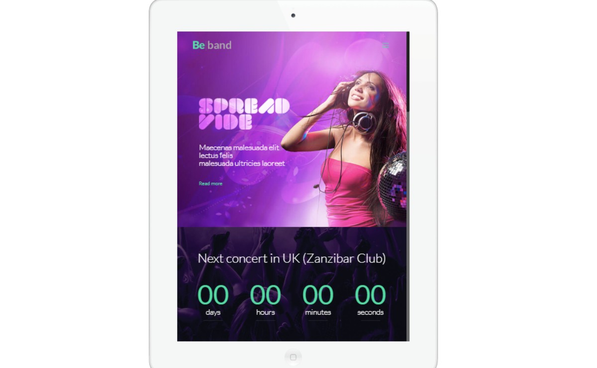
In order to understand mobile first design, you need to know what a responsive website is and how it is developed. Responsive Web Design (RWD) refers to making a website fit the screens of diverse devices, without encountering bugs or visually altering itself. A responsive website should display content beautifully and fast. Whenever users have to zoom in or scroll left to right, the website has problems with RWD. Mobile first design allows building a website so that it fits mobile platforms in the first place.
To better understand RWD, it is important to define two other concepts that are directly related to it. The first one is called progressive advancement, and it refers to building a website to be displayed on a slower browser, such as the ones found on mobile phones. Usually, progressive advancement begins with a very basic version of the website and it is slowly upgraded to fit the needs on other platforms as well, such as a tablet or a computer.
Progressive advancement is based on the principle that the mobile design version should be done the very first, even though it is more complicated, and it may raise some questions in the long run. After that, developing the website for more capable platforms will be easier and rapid.
The second concept is called graceful degradation, and it represents the other way around compared to progressive advancement. Here, the process starts with developing a website or an app for desktops and tablets or other powerful devices. This version would contain the most advanced features that it can have. Then, the version is adapted for mobile devices, by cutting functions.
Graceful degradation might not be as useful as the first method mentioned above because it doesn’t offer the benefits that progressive advancement does, but the choice strictly depends on the needs of the user. For mobile-first design and considering the design user flow, progressive advancement can be considered the heart of the user experience, as developers will slowly develop other features in the future. On the other hand, graceful degradation can limit the process and cut down the user experience visibly.
Why should people focus on mobile first design?
When talking about responsive vs adaptive, the latter one tends to lose the battle. To make it clearer, the adaptive meaning can be condensed in a few words – adapting the width of the website to the dimensions of the device used. Basically, it snaps the website into place and that’s all. Responsive website design makes the user experience fluid. Not only that the website is adapted to the size of the device, but it also offers an optimized and complete experience for the users, not losing many functions that are available on a higher-performing platform.
Mobile first design became so important in product design because of the explosion of mobile phone usage. Mobile devices are everywhere and using them rapidly surpassed the use of bigger devices such as laptops because of the convenience they bring to the table. Nevertheless, mobile phones have overtaken computer sales in the past few years. People shouldn’t need any more reasons to stick with mobile first design in today’s world.
A few tips that should help you with mobile first design
After understanding what responsive design is and how mobile app design works, it’s time to understand how the mobile first design can be successfully done. Here are some tips that can help you in this sense:
Mobile first design is based on good content
When the developed website presents well on a mobile device, it is ready to be displayed on all sorts of devices in the future. Because mobile first design raises a lot of challenges and has many limitations in the first place, you have better chances to build a great website by following this method.
The content present on the website must be prioritized, as mobile devices don’t offer as much space as the display of a laptop. Content has to be well-thought and managed so that the users can have a good experience with it. Users mostly focus on content, which means that a mobile first design method is equal to a content-first method.
Use an HTML Framework
A responsive website is easy to build when using HTML as a framework. HTML is based on grids when working with content. The content is structured in rows and columns, which helps to design a friendly interface that is also highly responsive. HTML is easy to customize, and the content can be sectioned clearly. This means you have the chance to define every part according to the screen size the website is displayed on. When the website is accessed from a device that has a limited display, some features can be hidden. Other frameworks that are suitable for mobile first design are Bootstrap and Foundation.
Focus on user experience

The main role of website design is to please the user. When the user experience is good enough to have him stay on the website and find the information he looks for it means that the website is optimized and comfortable to use. There are multiple elements that have to be optimized for mobile usages, such as fonts and sizes. Keep everything smooth and clean for great user experience.
Everything should remain fast

Besides the fact that the website must be improved in terms of looks, speed has to be considered as well. One part of the user experience that determines how many people remain on the website once they’ve accessed it is represented by how fast the website is. Google discussed this problem officially and determined that the loading speed will become a ranking factor for future searches in terms of mobile.
Thus, maximum page speed should be obtained for the website. You can do that by installing caching plugins, CDNs, installing an SSL certificate to transform the website in a secure one and compress all the images present on the website.
Simplified interactions are recommended
When the website is too complicated and interacting with it is difficult, you ruin the user experience. In mobile first design, you need to simplify everything and make the website easy to utilize. The navigation should be smooth and intuitive. Think about mobile interactions and make them available on your website – interactive buttons, swiping and tapping should all be present on your mobile-friendly site.
Testing is a must
You can’t come up with a mobile first design without testing it first. Test the website on different platforms and devices and see how it behaves. Around 3% of people still use Internet Explorer for their searches which means that you have to make your website accessible to all sorts of requirements. Consider split testing to optimize your website pages the best.
FAQ on mobile-first design
What's the big deal with mobile-first design anyway?
Well, you see, mobile-first design is all about crafting digital experiences primarily for mobile devices. With the explosion of smartphone usage, it's become super crucial. Think about it: more folks are browsing on their phones than ever before. So, if you're not prioritizing mobile, you're kinda missing out on a massive audience. It's like setting up a shop but ignoring most of your potential customers.
Why can't I just resize my desktop site for mobile?
Ah, I get this one a lot. Simply shrinking your desktop site isn't the solution. Mobile users have different needs and behaviors. Plus, there's the whole touch screen thing. Mobile-first means considering these factors from the get-go. It's not just about size; it's about the entire user experience. Imagine trying to wear oversized shoes; sure, they fit, but are they comfortable or functional?
How does mobile-first impact SEO?
Oh, big time! Google and other search engines are all about user experience these days. They've even shifted to mobile-first indexing. What's that? Well, they primarily use the mobile version of content for indexing and ranking. So, if your mobile design is on point, it can give you a sweet SEO boost. It's like getting the VIP treatment in the search engine club.
Do I need to ditch my desktop design?
Nope, not at all! Mobile-first doesn't mean mobile-only. It's more about starting with mobile and then expanding to larger screens. It's like building a house; you start with a solid foundation (mobile) and then add the upper floors (desktop). Both are important, but the foundation comes first.
What tools should I use for mobile-first design?
There's a bunch out there! But some popular ones include Bootstrap, Foundation, and Adobe XD. These tools have features that make designing for mobile a breeze. It's like having a Swiss Army knife for mobile-first design. Super handy!
How do I test my mobile-first design?
Testing is key! Use emulators, real devices, and even ask friends or colleagues to give it a whirl. Different devices and browsers can render things differently. It's like trying on clothes; you gotta make sure it fits and looks good everywhere.
What about mobile-first vs. responsive design?
Great question! While they're related, they're not the same. Responsive design adjusts to different screen sizes, while mobile-first starts with mobile and scales up. Think of it like cooking. Responsive is adjusting the recipe based on who's eating, while mobile-first is picking a main ingredient (mobile) and building around it.
How do I handle images in mobile-first design?
Images can be tricky. You want them to load fast and look crisp. Use responsive images and consider formats like WebP. Also, think about the file size. On mobile, every byte counts. It's like packing for a trip; you gotta be efficient and only take what you need.
Are there any common pitfalls in mobile-first design?
Oh, for sure! Some folks forget about touch targets, or they don't optimize for speed. Remember, on mobile, users expect things to be snappy and intuitive. Avoid clutter and prioritize essential content. It's like setting up a room; you don't want to trip over unnecessary stuff.
Lastly, why is mobile-first so important for the future?
Well, mobile usage is only going up. As technology evolves, we'll see even more devices and ways to connect. Mobile-first design ensures you're ready for whatever the digital future holds. It's like having a crystal ball, but for web design. Stay ahead of the curve, and you'll be golden.
Final thoughts
No matter what method you want to apply for your website design process, keep in mind that user experience remains the most important factor. A mobile first website is more sensitive when it comes to user experience because a lot of work is involved in adding all the necessary features and coming up with the greatest design, but – in the end – it’s all worth it.


