


How to Do a Website Redesign the Right Way and Why
October 11, 2023
Mobile first design: How to make the most out of it
October 11, 2023Boosting conversions on a website is the main goal of marketers, and the tool that can be used in this sense is represented by design. Many people look for website design ideas that are currently appreciated by the viewers to make their own websites appealing.
Of course, looks are not everything and this factor needs to be combined with good SEO and social media practices. To get to more technical details, you have to come up with a beautiful design for the website and add the necessary features in the long run.
The website design you choose will dictate how much time users spend on it and how often they come back, so you definitely have to invest resources into it.
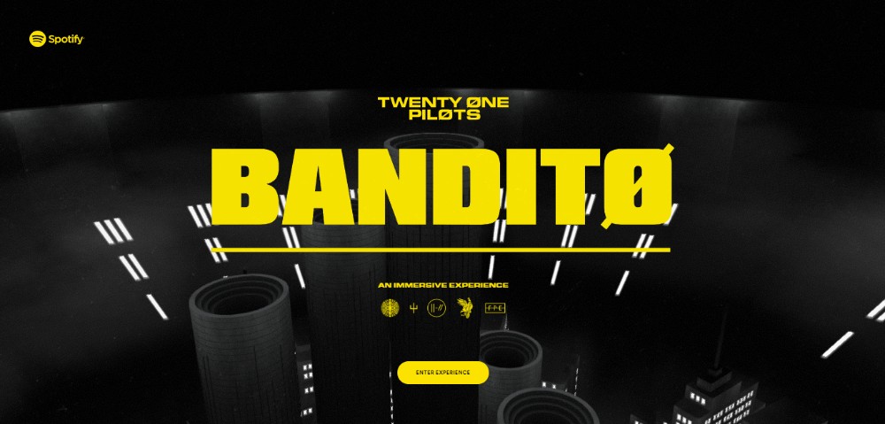
Website design ideas that are used to generate conversions
These are several website design ideas that should help you build an appreciated website, following today’s trends and requirements. Apply these and the outcome will surely be visited recurrently.
Branding – how to build it
First, you need to search for design inspiration and see how other people do it. Next, you need to find an image for your own brand. Consistent branding is the practice of maintaining a specific image for your company throughout all the platforms you use, including your website. In this sense, you need to come up with a responsive logo design (try a free logo maker) that you should incorporate on your website pages and social media accounts.
Another branding decision that you should stick with has to do with creating a brief headline next to the logo that people can easily remember. Whenever you add something new to the website or when you create materials for your customers, use the layout designs you selected for your brand.
Apple is one of the companies that made people familiar with the designs they choose, both for their websites and their products. The branding decisions of Apple include a distinctive logo, expressing brand goals through short headlines and sleek product photos. People can easily remember the branding scheme that Apple selected, and you should follow this example when building your own brand.
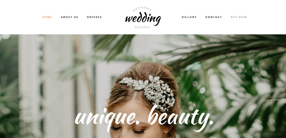
Using negative space
Modern websites use negative space to give visitors the chance to rest their eyes before going to the next key point. Negative space, also known as white space, represents the area on your website that has no content on it.
Positive space is the area that contains all the elements on your website. Negative space can help you make the site more scannable if you use it right. It should be used between larger paragraphs of text or product images.
Negative space is just as important as the content on your website because it helps to define the limits of the positive space and brings balance to the whole composition of the page.
Understanding the balance between negative and positive space is crucial when learning how to create a website from scratch, as it can greatly enhance the user experience.
The existent space between blocks of text, between lines of text or even between letters, is considered negative space and it helps in one way or another to make the website easier to read. Here are some good practices for using negative space into your modern website design:
Use medium to big fonts, as smaller ones require bigger line spacing and it might look odd. In case you choose a smaller font, use the proper negative space to make reading easy for the visitors. Don’t forget to check how responsive it is on other devices.
- If you use CSS, set the line-height to 1.5. In other cases, line-height should be equal to 150% of the font size used in the body;
- Large blocks of text should be separated into smaller ones and delimited with negative space. This makes the website cleaner and engages visitors to read it;
- Add negative space on the website using margins for the sidebar.
Picking a color palette
When you design a website, you should know a few things about color psychology. Colors evoke emotions for the people who see it – that’s why brand logos rely on colors to express something. Once you have the main idea of how your brand should look like, check out Adobe’s Color Wheel.
You can upload an image with your logo or your layout design and it the software will generate a color scheme based on that image. This way, you can use the generated color scheme for building your website’s design. If you want to make slight changes, you can do it from the Color Wheel as well.
Making use of contrast
Good web design boosts conversion rates, and contrast plays a great role in making the design of your website noticeable. Contrast is used to make certain elements stand out. The first contrasting element on a website is the background color and the text color. The most common combination is a white background and black text. No matter what colors you choose, the text should be easy to read.
Other elements or buttons used should be colored differently than the rest of the site, so that they stand out. The highlight colors should match the rest of the website’s design. Otherwise, the final result might not be aesthetic and the website won’t look professional. Look for website design ideas to check out how other people did it.
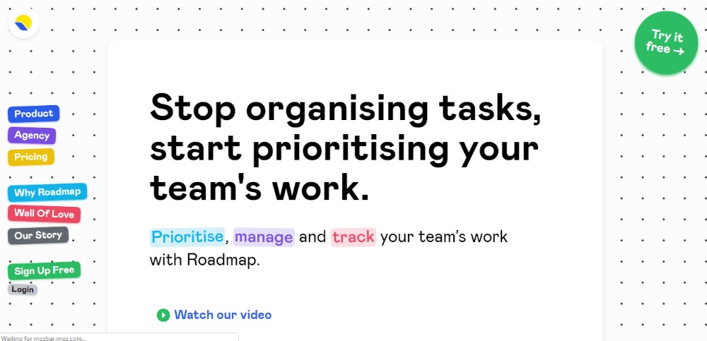
Using CTAs
CTA translated as call-to-action are phrases, words or buttons that are supposed to convince visitors to do something. In website design, CTA buttons make people who visit the page more engaged. Most CTAs involve encouraging visitors to insert their contact information to stay up to date with any news related to the website. Subscribe buttons and share buttons are usually the CTAs that people select.
CTA buttons can also be used to rapidly send people to a certain page, such as the resources one, where they can download the materials you want to share with them. Any button that invites visitors to do something should be strategically placed within the website. Keep in mind that call-to-action buttons should not be used abusively on the website if you want it to look trustworthy and professional.
Check your website’s speed
People who surf the internet are not that patient, which means that your website should be rapid enough to make them stay on it. Page loading speed is also a factor that Google considers when ranking websites. One of these free tools should help you determine whether your website is rapid enough or not:
In case your website didn’t turn out to be as fast as expected, you can try compressing the images. A simple website design along with compressed images should have an improved page loading speed. MachMetrics is a website speed monitoring service and the specialists said the best time for a page to load is 3 seconds. If your website images are not optimized, the page loading speed will be too slow. Compressing images will drastically reduce the page load time.
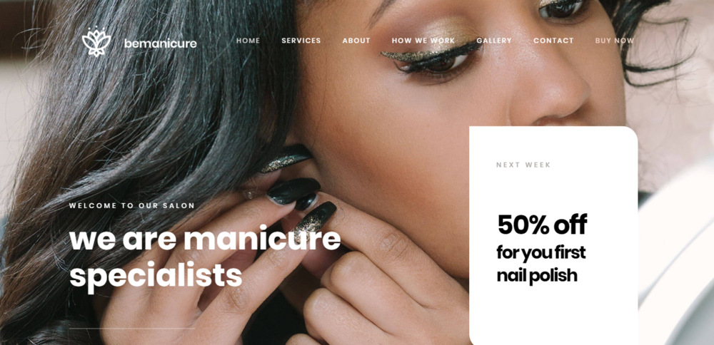
Getting personal
People trust websites that are more personal and subjective, that is recommended by others and seem professional. In order to achieve that result, you should incorporate actual people’s faces on your website’s content. Happy customers, extensive case studies and testimonials for people who used your products or services should be included on the website for more creativity. You can also get a professional photo shoot for yourself and upload images with your face on the website.
Sliders and carousels are no longer appreciated
Website layout designing changed a lot in the past few years. If sliders and carousels were popular last year, today you should focus on simplicity. Carousels and sliders can make your website slower. Visitors no longer appreciate wasting their time reading the information they are not interested in. Eliminate these elements to boost the conversion rate on your website and use something else instead to present your information.
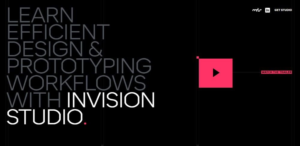
Videos have a big impact
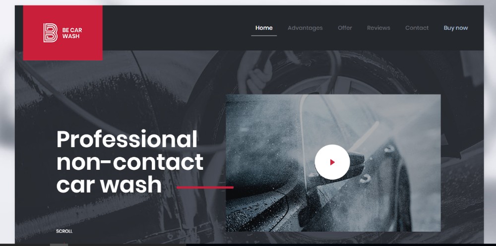
Today, it’s all about videos. Most website design ideas you will find contain presentation videos on their landing pages. Videos are the fastest way to deliver a message or essential information to your visitors. As long as it doesn’t make the site too slow, you are good to go. Using short videos is a good idea as well, considering how popular such videos are on platforms like Instagram.
Prioritizing content
In responsive website design, the fold is represented by the orientation and position of content on a website. Above-the-fold content refers to the content that makes people scroll down if they are interested in what you presented there. Below-the-fold content can be less relevant sometimes if the attention of users is not captivated in the first place. 57% of user’s time is spent reading above-the-fold content.
Prioritizing social proof
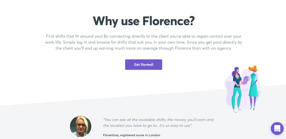
Conformity refers to the fact that people tend to do what other people do. If your website is appreciated by many people, other visitors will get interested in it. Showing social proof of how happy clients or visitors are with your website might make other people do the same. Media mentions, press releases, and testimonials shouldn’t miss from your website.
Rules and principles in website design
The 8-second Rule explained
This rule is as simple as it sounds – you have no more than 8 seconds to gain the attention of a visitor and make him stay on the website. The human attention span is approximately 8 seconds, as proven by scientists. This is a very short-termed opportunity to make users remain on your website, which proves how important its design is. Looking for the right website design ideas and coming up with a visually-pleasing, the fast website should be your main focus at the moment.
Grabbing attention is also related to the content present on the website. Here are some ways that will keep users on the website:
- Using catchy headlines – create headlines that concentrate a benefit to grab attention fast
- Using visuals – images are your strongest tool to transmit a message and direct the eyes of the user towards something you want
- Using buttons – sign-up buttons and other call-to-action buttons should not be considered spam by the users; keep them clear and few
- Using power words – action verbs and strong words will make the content on your website more interesting, which will lead to retaining the attention of the customers for a longer time
- Using animations – animations can distract users and make them more interested in spending time on the website.
Hick’s Law explained
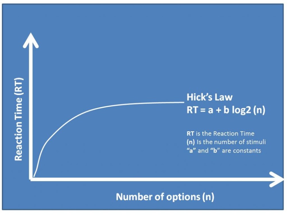
Hick’s Law is a theory used in website design and other industries that are based on visuals. The law was invented by William Edmund Hick and bears his name. He was a psychologist and he developed this theory in order to explain the relationship between the variety of choices a person has and the amount of time he spends making a decision. This is very important in designing a website because the more choices a person has on a site, the more time that person will require to make a decision.
To boost conversions on a website, one must limit the numbers of choices available. Of course, this can be perceived in a negative way too because some people might prefer a large variety of products, but these cases are rarely encountered. If you have a large pool of objects that people can choose from you can also select a few and direct attention towards them, to make the decision easier to make.
Besides simply viewing your website, visitors will also need to decide how they want to scroll down on the page if you offer multiple choices for that; to scan the website quickly and focus on what they are interested in; to make a purchase or read reviews and so on.
The decisions a potential customer makes on your website are diverse, which means you should keep everything as organized and minimal as possible. See some minimalist website design ideas to understand what it means to own a website that helps you make decisions faster.
The Rule of Thirds explained
When looking for website page design ideas, you will surely stumble upon the Rule of Thirds. This rule is also used in interior design and other similar industries, such as photography. The rule applies to web design as well. The Rule of Thirds is based on using horizontal and vertical lines so that they intersect to form nine equal squares.
From these squares, the middle intersections are the most important and they represent the main point of interest for people who visit the website. In these squares, you should strategically place the products that you want your visitors to buy. Thus, the conversion rate should be boosted rapidly.
Principles of visual hierarchy
The Rule of Thirds is mostly based on visual hierarchy, but there are a few other principles you should follow in web page design. Every website on the Internet has a visual hierarchy that dictates what people see first on the page and where their eyes are directed next. In a visual hierarchy, you need to pay attention to the arrangement of objects on the website, the size of them, the colors used and so on.
Simple designs always contain visual hierarchy because this is the only way to establish order in your content. By using the principles of visual hierarchy, you help users follow a specific path while they browse your page. This way, you can decide what order their eyes will follow and you can end it with a call-to-action button.
FAQ on website design ideas
What's the latest trend in website design?
Oh man, you wouldn't believe how fast things change in the world of web design. Right now, minimalism is huge. Think clean lines, lots of white space, and simple color palettes. It's all about letting the content shine and not overwhelming the user. But remember, trends come and go. It's essential to design with the user in mind, not just what's in vogue.
How can I make my website more user-friendly?
You know, it's funny how often this gets overlooked. The key? Simplicity. Make sure your navigation is intuitive. Don't make folks hunt for what they need. Also, ensure your site loads quickly. Nobody likes waiting. And, oh! Mobile optimization. Can't stress that enough. More people are browsing on their phones than ever. Make sure your site looks good and functions well on all devices.
What colors work best for websites?
Ah, the age-old question. Colors can evoke emotions, right? So, it depends on your brand and message. Generally, cooler colors like blues and greens are calming, while warmer colors like reds and yellows grab attention. But, here's a pro tip: always check for contrast. Make sure your text is readable against your background. And don't forget about color-blind users. Accessibility matters!
How important is responsive design?
Let me tell you, it's crucial. With so many devices out there, from smartphones to tablets to desktops, your site needs to look good everywhere. If it doesn't, you're gonna lose visitors. And that's a no-no. Responsive design ensures your site adjusts to any screen size. It's not just a nice-to-have; it's a must-have.
Should I use videos on my website?
Videos can be a game-changer! They can engage users and convey information quickly. But, and this is a big but, they need to be done right. Ensure they're high quality, relevant, and not too long. And please, for the love of all things digital, make sure they don't auto-play. Nothing's more annoying than unexpected noise when you open a webpage.
How can I make my website stand out?
Originality is the name of the game. Sure, you can draw inspiration from others, but infuse your unique voice and style. Use custom graphics, play with unique layouts, and maybe even throw in some interactive elements. And always, always prioritize content. Stellar content paired with a killer design? That's the golden ticket.
What's the deal with parallax scrolling?
Oh, parallax! It's that cool effect where the background moves slower than the foreground. Gives a sense of depth. It can be super engaging and add a touch of sophistication. But, like all things, moderation is key. Overdoing it can make your site feel gimmicky or even disorient some users. Use it wisely.
How often should I update my website's design?
You know, there's no hard and fast rule here. But, in the fast-paced digital world, it's good to refresh every 2-3 years. Not necessarily a complete overhaul, but tweaks here and there. Keep up with the latest design practices, ensure your content is current, and always, always listen to user feedback.
How do I choose the right fonts?
Fonts, my friend, can make or break a design. Stick to 2-3 max. One for headings, one for body text, and maybe a wildcard. Ensure they're readable and reflect your brand's vibe. And remember, some fonts look great in headers but are a nightmare in long paragraphs. Test, test, and test again.
Are sliders still a thing?
Sliders, or carousels, have been a staple for a while. They can showcase multiple pieces of content in limited space. But, and this is a biggie, they can also be annoying if not done right. If you're gonna use them, make sure they're not too fast, and users can control them. And always consider alternatives. Sometimes, a well-placed static image or a video can do wonders compared to a slider.
Final thoughts
After gathering your website design ideas, it’s time to put the principles into practice. Think about how can you incorporate all these tips in one single website, and the results will be the ones you expected. Don’t forget to learn from the brands that managed to impress millions of people through their website layout.
If you enjoyed reading this article, you should read these as well:


