


Stunning Clothing Website Design Examples That Turn Heads
February 19, 2026
Beauty Website Templates to Elevate Your Brand Online
February 22, 2026A corporate website has about five seconds to earn trust. Most fail.
The best corporate website design examples do more than look polished. They combine clear visual hierarchy, fast load times, and brand consistency into something that actually converts visitors into customers.
This article breaks down real sites from Apple, Stripe, IBM, Airbnb, Dropbox, Patagonia, and Linear. You'll see what each company gets right, from responsive layouts and navigation structure to typography systems and mobile-first performance.
No generic advice. Just specific design decisions you can study and apply to your own corporate site.
What Makes a Corporate Website Design Stand Out
Most people decide whether they trust a company based on how its website looks. 94% of first impressions are design-related, according to research compiled by BusinessDasher.
That's not a soft metric. It's the line between someone staying on your page or bouncing to a competitor.
A strong corporate site gets a few things right at the same time. Visual hierarchy pulls attention to the right content above the fold. Brand consistency runs through every page, from typography choices to icon systems. And the whole thing loads fast enough that nobody notices.
But looks alone aren't enough. Forrester data shows that a strong UX design can push conversion rates up by 400%. That's a direct connection between how a site feels to use and how much money it generates.
The best corporate websites also share these traits:
- Clear website navigation that doesn't collapse under the weight of a massive product catalog
- Responsive layouts that perform across every screen size, not just desktop
- Accessibility compliance that meets WCAG standards without sacrificing visual quality
- A content strategy that serves both stakeholders and first-time visitors
GoodFirms research from 2025 found that 84.6% of designers consider cluttered layouts a top mistake small businesses make. The takeaway? Corporate sites that stand out do so by removing friction, not by adding decoration.
What separates a forgettable business homepage from one that earns trust comes down to a mix of performance, readability, and brand identity working together. The companies below get that balance right.
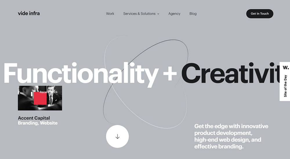
Corporate Website Design Examples
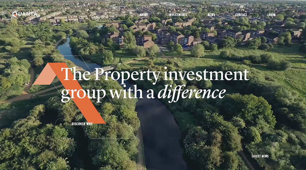
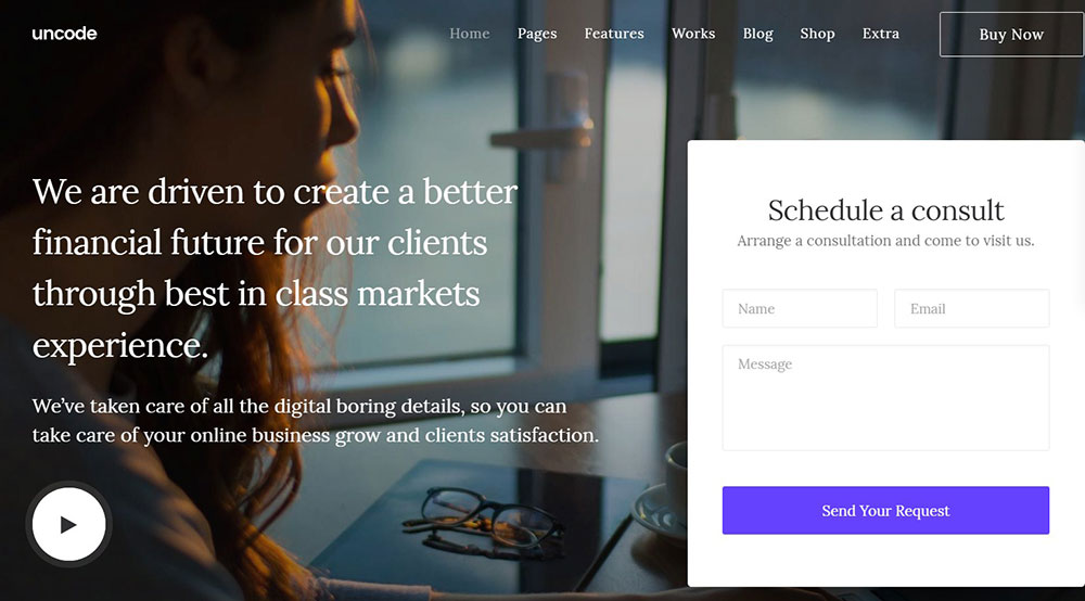
Quanta

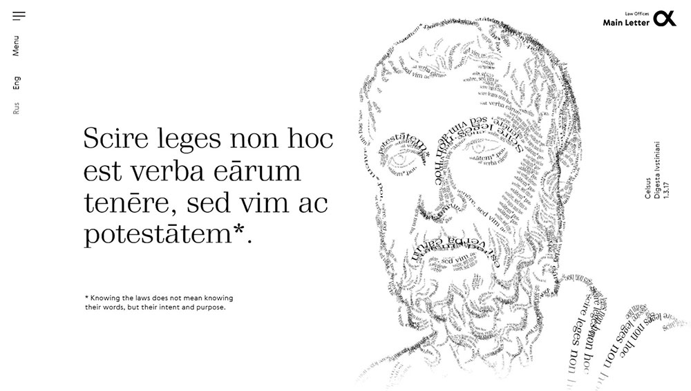

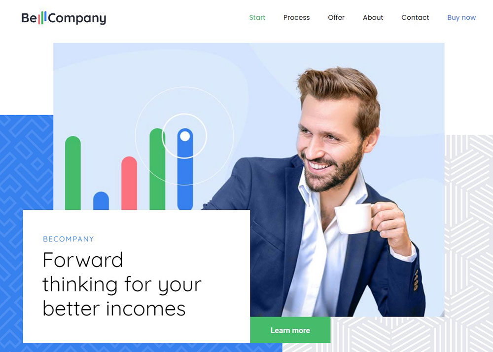
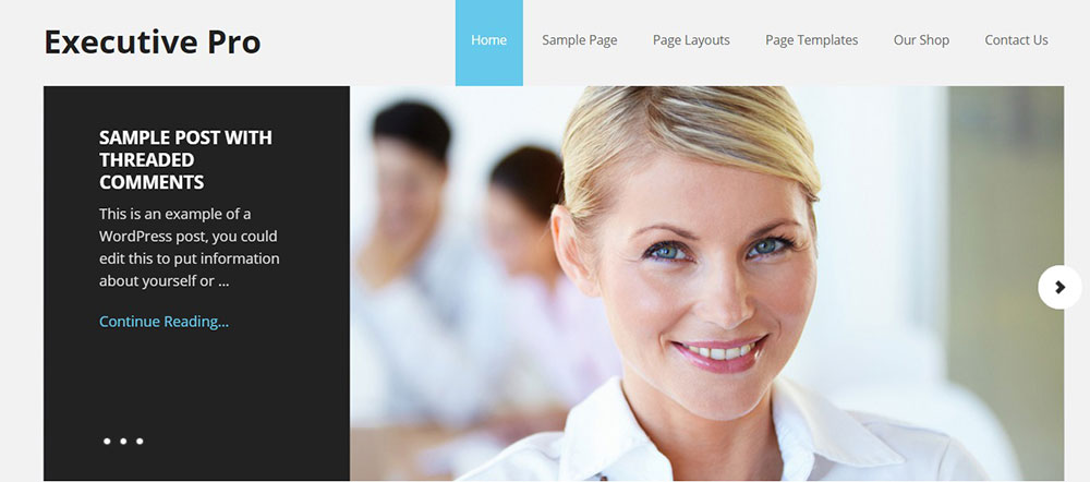
BeTheme is one of the best WordPress themes for small business sites. It’s a ThemeForest top 5 best seller with a great reputation. Features include customizable options and design features, good support, and page building tools.
It can be used for nearly every type of business model or niche. BeTheme offers more than 160 easy to install, pre-made layouts. This means that your customized design can be as minimal or as complex as you’d like.
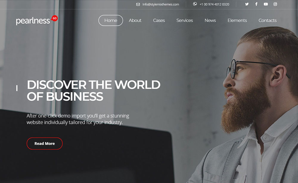
Kallyas
Common Patterns Across the Best Corporate Websites
Patterns repeat across every site on this list. Not because these companies copied each other, but because certain design decisions just work at scale.
Clutch research shows 50% of consumers consider web design a primary factor in judging a company's brand. The details below explain what "good design" actually means in practice.
| Pattern | Who Does It Best | Why It Works |
| Variable & Custom Typefaces | IBM (Plex), Airbnb (Cereal) | Variable fonts now adapt weight and width dynamically based on screen brightness and user accessibility settings. |
| Intent-Based Search | Airbnb, Perplexity | Moves beyond "keywords." AI-driven search anticipates the intent (e.g., "places for a quiet work retreat") rather than just filtering tags. |
| Intelligent Design Systems | Stripe, IBM (Carbon) | In 2026, Carbon uses AI to "auto-fix" design drift, ensuring that thousands of global pages remain perfectly aligned without manual audits. |
| Dark Mode as Baseline | Linear, Vercel | No longer a toggle; it’s the default "Pro" aesthetic. It reduces OLED power consumption by ~40% and caters to the 80%+ of developers who prefer it. |
| Spatial Glassmorphism | Apple, Microsoft (Fluent) | Borrowing from VisionOS, 2026 web design uses depth, translucency, and "Z-axis" layering to create clear visual hierarchies on flat screens. |
Layout and Grid Systems Worth Studying
Apple and Stripe both use generous container widths (around 1200-1400px max) with heavy padding on either side. The content never feels cramped, even on large monitors.
12-column grids remain the standard, but most of these sites break the grid intentionally for hero sections and feature callouts. Figma research on 2026 design trends confirms that asymmetric layouts and broken grids are growing in adoption across corporate sites.
Breakpoint handling varies. Airbnb uses a fluid approach where content reflows naturally. IBM's Carbon system defines fixed breakpoints at specific widths. Both work. The right choice depends on content density.
Mobile-First vs. Desktop-First in Corporate Design
DesignRush data shows 61% of global website traffic came from mobile devices in 2024. Google stopped indexing non-mobile-friendly sites entirely as of July 2024.
That settles the debate for most corporate teams.
Clearly mobile-first: Airbnb (58% of bookings via app), Patagonia (mobile-first responsive UX was a stated priority)
Desktop-adapted: IBM (content-dense pages that benefit from wider viewports), Stripe (three-column documentation layout)
Responsive design now covers 90% of all websites, according to Hostinger. The question isn't whether to be responsive. It's whether your design starts from the smallest screen and scales up, or starts from desktop and adjusts down. For most responsive websites, the mobile-first route produces cleaner results with fewer overrides.
How to Apply These Design Principles to Your Own Corporate Site
Looking at Apple's homepage or Stripe's documentation is inspiring. But inspiration without a plan just leads to a mood board that never ships.
Here's how to actually use these examples.
Audit Your Current Site Against These Patterns
Start with the basics. Open your site on a phone. Time the load. Check if your navigation collapses cleanly. Look at your header on a small screen.
Then compare against the patterns from this article:
- Does your homepage have a clear visual hierarchy, or does everything compete for attention?
- Is your call to action button placement consistent across pages?
- Can a first-time visitor understand what your company does within five seconds?
McKinsey's "Business Value of Design" study found that companies with strong design practices grew revenue up to twice as fast as competitors. That gap starts with honest assessment of where your site currently stands.
Prioritize Changes by Impact
High impact, low effort: Fix your typography scale, clean up navigation labels, compress images, improve color contrast.
High impact, high effort: Build a design system, redesign your homepage layout, implement a footer that actually helps users.
Low impact, skip it: Adding parallax animations, custom cursor effects, or any visual flourish that doesn't serve a user need.
Hostinger reports that a one-second delay in page load can reduce conversions by 7%. Speed and usability improvements almost always beat visual upgrades in terms of measurable results.
When to Hire an Agency vs. Build In-House
Every company on this list except Linear has a dedicated in-house design team, often with dozens of people.
If you don't have that kind of team, a web design agency can get you to a strong baseline faster. Patagonia worked with BASIC/DEPT for its e-commerce redesign. Dropbox brought in Collins for the rebrand. Both are examples of companies that had internal teams but still needed outside help for major shifts.
Tools like Figma for prototyping, Google Lighthouse for performance auditing, and WebPageTest for speed benchmarking are free and available to anyone. Use them before spending money. A thorough website checklist can help you figure out what actually needs professional attention versus what you can fix yourself.
The best corporate sites didn't get built in one sprint. They're the result of continuous iteration, real user data, and design systems that grow alongside the business. Start with what matters most, ship it, measure it, and improve from there.
FAQ on Best Corporate Website Design Examples
What makes a corporate website design effective?
Clear visual hierarchy, fast page speed, and consistent branding across every page. The best corporate sites prioritize user experience over decoration. Clean navigation, readable typography, and responsive layouts do the heavy lifting.
Which companies have the best corporate website designs?
Apple, Stripe, IBM, Airbnb, Dropbox, Patagonia, and Linear are frequently cited. Each takes a different approach, but they all share strong brand identity, fast performance, and intentional content structure.
How important is mobile responsiveness for corporate websites?
Non-negotiable. Over 61% of global web traffic comes from mobile devices. Google stopped indexing non-mobile-friendly sites in 2024. A responsive corporate site isn't a bonus feature anymore. It's the baseline.
What role does typography play in corporate web design?
Typography sets the tone before anyone reads a word. Companies like IBM use custom typefaces (IBM Plex) and Dropbox licensed 294 Sharp Grotesk fonts to create a distinct visual voice across all pages.
Should a corporate website use dark mode?
It depends on the audience. Linear and Stripe use dark mode effectively for tech-savvy users. Research shows 82% of users prefer it on their devices. But content-heavy enterprise sites like IBM work better with light backgrounds.
How fast should a corporate website load?
Under two seconds. Sites that take longer lose up to 60% of visitors. A one-second delay can cut conversions by 7%. Speed affects both user experience and search engine rankings through Core Web Vitals.
What is a design system and why do corporate sites use them?
A design system is a reusable component library with guidelines for layout, color, and typography. IBM's Carbon Design System powers over 20 million pages. It keeps brand consistency at scale without slowing teams down.
How do corporate websites handle navigation for large product catalogs?
Most use mega menus, sticky headers, or search-first homepages. Apple fits a massive catalog into a compact top nav. Airbnb skips traditional navigation entirely and leads with a search bar.
Can a corporate website rebrand improve business results?
Yes, when it's strategic. Dropbox's 2017 rebrand shifted perception from file storage to creative platform. Patagonia's e-commerce redesign drove a 25% increase in mobile revenue. But cosmetic changes without a plan rarely move numbers.
What tools help evaluate corporate website design quality?
Google Lighthouse audits performance and accessibility. WebPageTest measures load speed across devices. Figma handles prototyping and design system management. All three are free and used by the teams behind these top corporate sites.
Conclusion
The best corporate website design examples covered here share one thing. They treat design as a business tool, not a creative exercise.
Apple proves that restraint sells. Stripe shows that developer experience can be a design feature. IBM built a design system that scales across 20 million pages. Airbnb turned a homepage into a booking engine. Dropbox used typography to reposition an entire brand.
None of these sites happened by accident. They're the result of clear page experience goals, real performance benchmarks, and design systems that grow with the company.
Pick one pattern from this list. Audit your site against it. Fix what's broken before adding anything new.
That's how good corporate web design actually starts. Not with inspiration boards, but with honest assessment and focused execution.


