


The Essential Elements of Web Design Any Designer Should Know
March 25, 2024Showcase Success: Websites of Top Digital Marketing Agencies
March 28, 2024Your website is judged in 50 milliseconds. That is faster than a blink, and design is doing almost all the talking.
Finding the right modern website design examples helps you understand what actually works, not just what looks good in a screenshot.
This article covers real sites across SaaS, e-commerce, portfolios, editorial, and nonprofits. You will see what visual design traits, performance standards, and motion choices separate modern sites from dated ones.
By the end, you will know which design decisions drive results and which tools professionals use to build them.
What Is Modern Website Design
Modern website design is the combination of current visual standards, functional structure, and performance benchmarks that meet user expectations. It is not just about aesthetics. It is about how fast a page loads, how clearly it communicates, and whether it works on the device in your pocket.
The global web design market reached $43.5 billion in the US alone in 2024, reflecting how much businesses now depend on their online presence (Hostinger, 2024).
What separates a modern site from a dated one comes down to a few clear signals. Skeuomorphic textures, table-based layouts, non-responsive grids, and pages crammed with copy all mark a site as old. Modern design strips those away and replaces them with intentional simplicity.
What Modern Web Design Is Not
Common signs of outdated design:
- Fixed-width layouts that break on mobile screens
- Auto-playing audio or video with no user control
- Stock photography that looks like it was taken in 2009
- Navigation menus with six levels of dropdowns
These are not just visual problems. They affect bounce rates, session time, and conversion. A poorly structured site loses visitors in seconds, and first impressions form in under 50 milliseconds (Mindfeeder, 2025).
The Core Traits That Define Modern Sites
Fast load time: Under 2.5 seconds for Largest Contentful Paint, per Google's Core Web Vitals thresholds.
Mobile-first layout: Built for small screens first, scaled up for desktop. Not the reverse.
Accessible UI: Contrast ratios, keyboard navigation, and semantic HTML that works for every user.
Minimal friction: Clear paths to the action the user came to take, with nothing in the way.
Tools most associated with modern builds today include Figma for design, Webflow or Next.js for development, and Tailwind CSS for utility-first styling.
What Makes a Website Design Modern
Modern web design is defined by specific visual and technical decisions, not vague trends. Each choice either serves the user or it does not.
Mobile traffic exceeds 60% of total web usage in 2025 (Medium, 2025), which makes mobile-first layout a baseline requirement, not a bonus feature.
Visual Design Traits
Typography in modern sites does more than label sections. Large-scale type hierarchies, variable fonts, and tight type scales built on an 8px grid create layouts where text itself becomes structure.
Android Authority research found that 81.9% of users prefer dark mode for its comfort and visual appeal (Today Made, 2025). Dark mode is no longer optional on professional sites.
Color palettes are restrained. Most modern sites use 2 to 3 primary colors plus neutrals. High-contrast combinations drive readability. Purposeful whitespace (not padding, actual breathing room) guides the eye to what matters.
Asymmetric grids and full-bleed sections have replaced rigid column layouts. Container queries let components respond to their parent container rather than just the viewport, which gives layouts far more flexibility.
Functional and Performance Standards
| Metric | What It Measures | Modern Standard |
|---|---|---|
| LCP (Largest Contentful Paint) | Load speed of main content | Under 2.5 seconds |
| INP (Interaction to Next Paint) | Response time to user input | Under 200 milliseconds |
| CLS (Cumulative Layout Shift) | Visual stability during load | Score under 0.1 |
Image formats on modern sites have shifted from JPEG to WebP and AVIF. Lazy loading, font-display: swap, and preloaded critical assets are standard practice, not optimizations for later.
Scroll-triggered animations powered by GSAP or Framer Motion add motion without hurting performance, as long as they respect the prefers-reduced-motion media query. That query is not optional for accessible modern design.
What Are the Best Modern Website Design Examples in SaaS
SaaS websites carry a specific design burden: they have to communicate what complex software does, build trust quickly, and convert visitors who may never have heard of the product.
According to Unbounce's 2024 benchmark report, the median conversion rate for SaaS landing pages is just 3.8%, which is 42% lower than the all-industry average. The sites that beat that number share a clear pattern: real product visuals in the hero, pricing visible without a sales call, and a primary CTA repeated at every scroll height.
Dark Mode and Developer-Focused SaaS Design

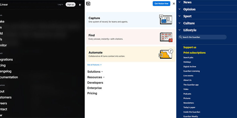
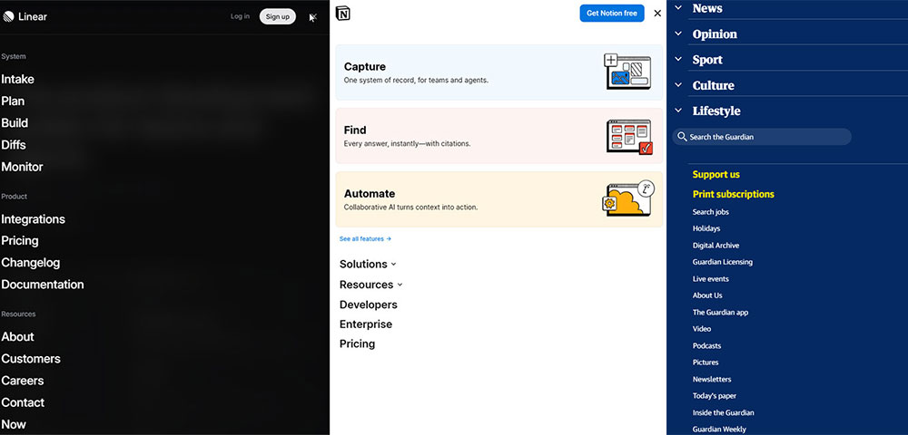
Linear is the most referenced example in SaaS design right now, and it earns that status. The homepage opens with a single positioning line about how the product feels, not what it does. Below that, a real product clip shows the interface in action.
The dark aesthetic is not a stylistic choice. It is a signal to the audience. Engineering teams who live in dark-mode tools feel at home immediately, before they have read a word (Striped Horse, 2025).
Developer-focused SaaS sites share 3 design signals:
- Dark backgrounds with monospace typefaces that mirror terminal aesthetics
- Real product screenshots, not illustrated placeholders
- Code snippets or API references embedded in the hero or above the fold
Vercel follows the same logic. Clean typographic hierarchy, fast time-to-interactive, and a homepage that speaks to developers without needing to over-explain what a deployment platform does.
Product-Led Design in B2B SaaS
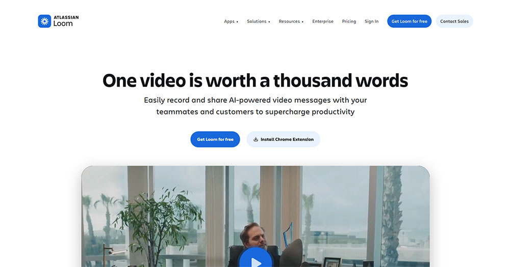
Loom's homepage leads with a real product recording in the hero, not a description of what async video is. The CTA is "Get Loom Free," not "Request a Demo." That one choice tells you the entire go-to-market strategy: trial-led, not sales-led.
HubSpot research found that video-inclusive landing pages convert at 86% higher rates than static pages (2024). Loom uses the product format to demonstrate the product itself.
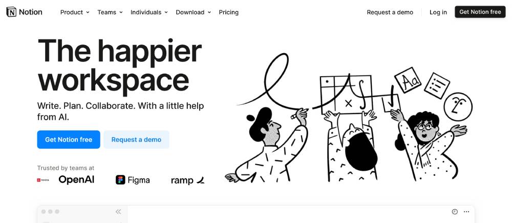
Notion takes a different path. Its layout is editorial rather than product-forward, which makes sense because the product is a blank canvas. The design mirrors the experience of using Notion itself: clean, structured, and surprisingly flexible.
If you are building in this space and want a head start, there are solid SaaS website templates worth reviewing before you commit to a custom build.
What Are the Best Modern Website Design Examples in E-Commerce
E-commerce websites carry a different set of pressures. They need to sell, which means every design decision is measured against cart adds, session time, and checkout completions.
Mobile devices account for 80% of e-commerce traffic in 2025 (Omnisend, 2026). A site that performs poorly on mobile is not just a design problem. It is a revenue problem.
DTC Brand Design Patterns
Allbirds is a clean study in how restraint builds trust. The site uses neutral colors, generous white space, and high-quality product photography. Navigation is minimal. Product pages present materials, sustainability data, and sizing clearly without overwhelming the visitor.
The results back the approach: Allbirds reduced cart abandonment by 30% and boosted mobile sales by 60% on Shopify Plus (Shero, 2026).
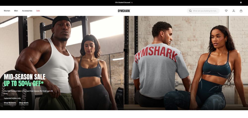
Gymshark operates on a headless architecture, which allowed the brand to handle traffic spikes and increase conversion rates by up to 10% (Omnisend, 2026). In 2024, Gymshark reported turnover exceeding £500 million. The site is high-energy but structured, with a clear destination selector that lets users filter by fitness goal rather than just product category.
Good e-commerce homepage design like this consistently applies the same principle: get the visitor to product faster, with fewer clicks.
Mobile-First E-Commerce Layouts
Patterns shared across the best-performing e-commerce sites:
- Sticky navigation that persists through scroll without blocking product content
- One-click or accelerated checkout flows (Shop Pay, Apple Pay, Google Pay)
- Compressed images in WebP format with lazy loading for off-screen product grids
- Social proof (reviews, ratings) positioned before the fold break on mobile
These are not design trends. They are conversion fundamentals that the best e-commerce landing page design examples have been applying consistently for the past three years.
What Are the Best Modern Website Design Examples in Portfolio and Agency Sites
Portfolio and agency sites operate under different rules. There is no conversion funnel to optimize, no cart to fill. The only job is to make someone trust that the team behind the site can do great work.
This gives designers significantly more freedom, and the best of them use it without losing clarity.
Experimental Design as Portfolio Proof
Bruno Simon's portfolio is probably the most-referenced example in this category. The entire site is a 3D environment built with Three.js and WebGL, where navigation happens by driving a tiny car through a virtual world. It sounds gimmicky. It is not.
The reason it works: the concept is consistent. There is no part of the experience that breaks the metaphor. The interaction is the portfolio.

Active Theory takes a different approach. Cinematic transitions, narrative scroll sequences, and heavy use of motion. Still, every interactive element demonstrates capability rather than decorating around it.
What separates good experimental design from bad: the interaction demonstrates skill. If the animation exists only to look impressive on first load and then gets in the way of understanding what the studio does, it is not good design. It is distraction.
What Awwwards-Winning Sites Share
| Design Element | How It Shows Up | Risk Level |
|---|---|---|
| Custom cursor interactions | Morphing cursors, magnetic hover states | Medium (can frustrate users) |
| Scroll-driven animation | Elements entering, exiting, transforming on scroll | Low (if performance is tight) |
| WebGL or 3D elements | Product viewers, environment navigation, particle systems | High (heavy on performance) |
| Typographic layout | Oversized display type used as layout structure | Low (most accessible option) |
For studios building a client-facing portfolio site, the best web design agency websites offer practical framing for how to balance creative risk with usability.
What Are the Best Modern Website Design Examples in Editorial and Media
Editorial and media sites have a specific problem: they need to compete with native apps for reading experience while managing enormous content volumes, advertising constraints, and fast-changing headlines.
The sites that have solved this tend to be smaller, more focused publications rather than legacy media giants.
Data-Driven Editorial Design
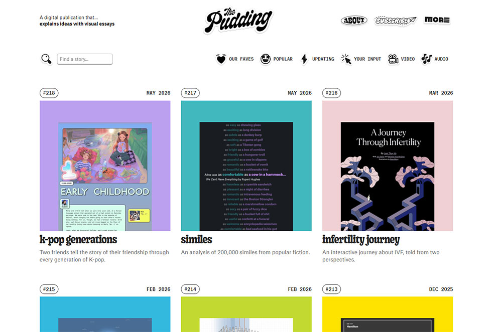
The Pudding is the clearest example of editorial design used as a storytelling medium. Each piece uses custom scroll interactions, data visualizations, and layout decisions specific to that story's content.
This is the opposite of a template. Every article is its own design problem. That approach requires significant production resources, but it results in content that people share because of how it looks, not just what it says.
What The Pudding gets right:
- Data presented visually rather than listed as text
- Scroll interactions tied directly to data changes, not just decoration
- Mobile layouts that simplify without removing the core visual argument
Premium Feel Through Restraint
Stripe Press is an editorial site for a payments company, which is an odd combination, but it works. The layout is book-like. Wide margins, careful type sizing, high-quality cover photography, and very little interface noise.
It feels expensive without using expensive tricks. No heavy JavaScript, no video backgrounds. Just typographic hierarchy and whitespace doing exactly the work they should.
Rest of World applies similar logic to global journalism. Strong typographic identity, a color system that signals editorial seriousness, and mobile reading experience that rivals the best news apps.
Websites with good typography consistently show that the reading experience is almost always the first thing sacrificed on high-traffic media sites. The ones that protect it build audience loyalty faster.
What Are the Best Modern Website Design Examples for Nonprofits and Causes

Nonprofit websites solve a design problem that commercial sites rarely face: they need to generate emotional response and financial action from visitors who came in with empathy but may leave with hesitation.
Trust signals, clarity of impact, and frictionless donation flows are not optional features here. They are the design system.
Immersive Storytelling in Mission-Driven Design
Charity: water is the most-cited example of nonprofit design done right. The site leads with impact: photographs, water project tracking, real beneficiary stories, and a clear counter showing exactly where donations go.
That transparency is the conversion mechanism. Donors do not give to abstract causes. They give to specific outcomes they can visualize.
Key design decisions on charity: water:
- 100% model prominently explained above the fold
- GPS-tracked water project maps as proof of delivery
- Full-screen photography that puts faces to the mission
Accessibility as a Design Priority
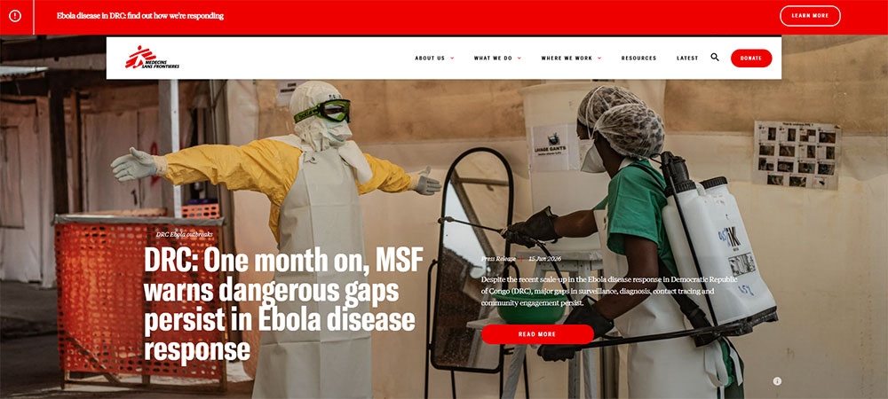
Doctors Without Borders takes a different approach: clarity over decoration. Navigation is direct, content is dense but readable, and the design makes no aesthetic demands on the visitor. The focus is the mission, not the layout.
For nonprofit sites, accessibility is both a legal and mission-aligned priority. A cause that claims to serve all people cannot afford a website that excludes users with visual impairments or older hardware.
Accessible website examples across industries show that accessible design and beautiful design are not competing goals. The best nonprofit sites prove this consistently.
Non-profit website design research shows that sites with clear impact metrics, visible donation allocation, and simplified giving flows consistently outperform those focused primarily on brand aesthetics.
For organizations starting from scratch, charity website templates built with accessibility and conversion in mind provide a better starting point than general-purpose themes adapted for nonprofit use.
How Modern Landing Page Design Differs from Full Website Design
Landing pages and full websites solve different problems. Treating them as the same thing is one of the most common structural mistakes in professional web design.
The median conversion rate for a landing page across all industries is 6.6% as of Q4 2024, while the average full-site conversion hovers near 2.9% (Unbounce, 2024). The gap exists because landing pages eliminate everything that does not serve a single action.
What Defines a Landing Page Structure
Single-goal design: No persistent navigation. No internal links pulling visitors away. One CTA, repeated at every scroll height.
Above-fold priority: Value proposition, primary visual, and CTA all visible without scrolling. This is non-negotiable on mobile, where 82.9% of landing page traffic now arrives (Involve.me, 2025).
Social proof placement: Reviews, logos, and trust signals appear before the fold break, not buried in a testimonials section lower on the page.
Superhuman, Framer, and Raycast are clean examples of this structure applied well. Each page has one job. Nothing on the page competes with that job.
What Full Website Architecture Requires Instead
Full websites handle multi-path user journeys. A visitor might land on a blog post, move to a product page, compare pricing, check an about page, and then convert. The design has to support that entire path without losing them.
Pages loading in 1 second convert at nearly 3x the rate of pages loading in 5 seconds for B2B sites (WP Rocket, 2024). That pressure applies to every page in a full site architecture, not just the homepage.
| Element | Landing Page | Full Website |
|---|---|---|
| Navigation | Removed or minimal | Full persistent nav |
| Goal | Single conversion action | Multiple user paths |
| Internal links | None (distraction risk) | Core to architecture |
| Content depth | Focused on one offer | Covers full topic range |
A common mistake is applying landing page thinking to a full website homepage. Removing navigation from a homepage that needs to serve 5 different audience types creates confusion, not conversions. Context determines the right structure.
For industry-specific applications, modern landing pages show how single-goal structure varies by sector, and resources like types of landing pages help identify which structure fits which campaign goal.
What Role Typography Plays in Modern Website Design
Typography is the single most visible differentiator between a modern site and a dated one. Get it wrong and nothing else on the page compensates for it.
52% of users leave a website if the text is hard to read, and 94% of first impressions are design-based (DeveloperUX, 2025). Both numbers trace directly back to type choices.
Variable Fonts and Performance
Variable fonts consolidate multiple weights and widths into a single font file, which cuts HTTP requests and reduces load time compared to loading 4 separate weight files.
Medium increased reading time by 40% after switching to 21px body text. Airbnb improved engagement by 12% by refining their text hierarchy (DeveloperUX, 2025).
What variable fonts give designers:
- Continuous weight and width axes rather than fixed steps
- Fluid typography via CSS clamp() that scales between breakpoints
- Optical sizing adjustments for display vs. body contexts
Type Scale and Visual Hierarchy
Figma (2026) identifies typography as taking center stage in 2026, moving beyond legibility into active storytelling. Hero sections now use kinetic lettering, oversized headlines, and variable fonts that respond to scroll or interaction.
94% of designers opt for larger font sizes over heavier weights for emphasis, with 76% combining both (Toner Buzz, 2024). Display type used as a layout element (not just a label) is what separates Stripe, Linear, and Vercel's visual systems from average product sites.
Practical type standards for modern sites:
- Body text: 16-20px minimum across breakpoints
- Line height: 1.5x for body, 1.1-1.2x for display
- Line length: 45-75 characters for optimal readability
- Contrast: 4.5:1 minimum ratio per WCAG 2.1
Typefaces appearing consistently across top modern sites include Neue Haas Grotesk, General Sans, Plus Jakarta Sans, and Söhne. None of these are novelties. They work because they are readable, well-spaced, and neutral enough to let layout do the visual work.
For a deeper look at how font choices shape user experience across different site types, typography in web design covers the principles behind pairing, scale, and spacing decisions.
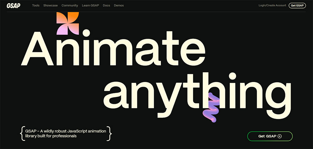
How Animation and Motion Affect Modern Web Design
Motion design done well adds clarity and confidence. Done poorly, it adds weight, distraction, and accessibility failures. The line between those outcomes is mostly about purpose.
GSAP is deployed on over 12 million sites globally and went MIT-licensed in 2025 after Webflow's acquisition, removing the historical commercial licensing barrier that limited agency adoption (Art of Styleframe, 2026).
Motion That Improves Usability
Micro-interactions are the highest-value motion category. Button press feedback, form validation states, hover transformations on navigation items. These animations are small, fast, and directly tied to user action.
Motion that adds usability:
- Load state indicators that prevent double-clicks or confusion
- Scroll-triggered reveals that sequence content without overwhelming the layout
- Hover states that confirm interactive elements before a click
CSS scroll-driven animations (introduced in 2024) now run off the main thread with no JavaScript dependencies, which makes them faster than GSAP for simple reveal sequences. For complex multi-element choreography and scroll-pinned sequences, GSAP ScrollTrigger still handles it more reliably (Art of Styleframe, 2026).
Motion That Hurts Performance and Accessibility
Auto-playing animations that start before the page content loads kill LCP scores. Parallax effects on mobile create scroll jank on mid-tier Android devices. Flashing transitions between colors can trigger seizures in users with photosensitive epilepsy.
The prefers-reduced-motion media query is not optional. It is a WCAG compliance requirement. Users with vestibular disorders specifically set this preference to prevent dizziness caused by large-scale movement on screen (GSAP Documentation, 2024).
Two questions to ask before any animation ships:
- Does it work with prefers-reduced-motion set to reduce?
- Does removing it make the page harder to use, or just less visually impressive?
If the answer to the second question is "less impressive," the animation is decoration, not function. Decoration has a cost in performance and accessibility. It needs to earn its place.
For practical examples of motion in context, animated websites and parallax scrolling websites show where these techniques land on the usability-to-spectacle spectrum.
How Page Speed and Core Web Vitals Shape Modern Design Decisions
Performance is not a post-design concern. Every visual decision, from image format to font loading strategy to animation choice, affects the numbers Google measures and users feel.
Sites passing all Core Web Vitals thresholds rank 2.3 positions higher on average. Mobile scores carry 63% of ranking weight under Google's mobile-first indexing (AI SEO Masters, 2025).
How Design Choices Hit Each Metric
Swappie, a refurbished phone retailer, improved their LCP by 55% and CLS by 91% through targeted performance work. The result: a 42% increase in mobile revenue (Search Engine Land, 2024). The design did not change. The performance did.
LCP (target: under 2.5 seconds): Largest above-fold image or text block. Hero images in JPEG on a slow server kill this. WebP or AVIF format with a preload tag fixes most of it.
INP (target: under 200ms): Third-party scripts contribute to 54% of INP problems. A design that loads 8 analytics scripts for a marketing page is a performance decision disguised as a business requirement.
CLS (target: under 0.1): Images without explicit width and height attributes, late-loading fonts that shift layout, and ads injected above content all cause layout shift. Setting dimensions in CSS at design time prevents them.
Image and Font Decisions That Change Scores
A 0.1-second improvement in page speed increases conversions by 8.4% for retail and 10.1% for travel sites (Deloitte, cited in LinkQuest, 2024). That is not a rounding error.
Format decisions for modern sites:
- WebP for photography: 25-35% smaller than JPEG at equivalent quality
- AVIF for hero images: 50% smaller than WebP, but encoder speed is slower
- SVG for icons and illustrations: resolution-independent, tiny file size
Font loading strategy matters as much as format. font-display: swap prevents invisible text during font load. Preloading the critical woff2 file eliminates the flash of unstyled text on first paint. Limiting web font weights to 3 or fewer cuts load time without reducing design flexibility.
For a working reference on how design and performance intersect in practice, responsive website design covers the layout decisions that directly affect load behavior across breakpoints. And a website design checklist is a practical way to audit both visual and performance decisions before launch.
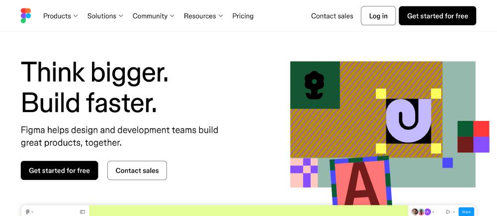
What Tools and Platforms Are Used to Build Modern Websites
The modern design stack has consolidated significantly since 2022. Most professional teams now work within a narrow set of tools, with Figma as the near-universal design layer and a short list of frameworks and CMS options below it.
React.js is the most popular web development framework in 2025, with around 42.5% of developers using it. Tailwind CSS now leads all CSS frameworks at 37% usage, overtaking Bootstrap in developer satisfaction surveys (State of CSS, 2025).
Design and Prototyping Tools
Figma continues to lead as the dominant UI/UX design tool. Its collaborative canvas, component system, and auto-layout features have made it the default handoff format between designers and developers across the industry.
Framer sits in a different category: design-to-publish. It handles the gap between Figma prototype and live site for teams that want interactive motion and visual design without custom development. It is commonly used for portfolio sites, marketing pages, and product landing pages.
How the tools split by use case:
- Figma: UI design, component libraries, design systems, developer handoff
- Framer: Design-to-live publishing, interactive portfolios, marketing sites
- Adobe XD: Declining in adoption; most teams have migrated to Figma
Frontend Frameworks and CMS Options
Next.js grew roughly 60% year-over-year from 2020 to 2024 and crossed 100,000 active domains in October 2023 (Hippotool, 2026). It is the default choice for performance-first React sites, particularly those needing server-side rendering or static generation.
Astro has gained strong adoption for content-heavy sites. Its zero-JS-by-default approach ships faster pages than most React frameworks without requiring developers to manually optimize JavaScript bundles.
| Tool Category | Leading Option | Best For |
|---|---|---|
| Design | Figma | All design and handoff work |
| Frontend framework | Next.js | Performance-first React sites |
| CSS framework | Tailwind CSS | Utility-first styling, design systems |
| No-code/low-code | Webflow | Marketing sites, visual development |
| Headless CMS | Sanity / Contentful | Content-driven sites, editorial |
Webflow sits in a productive middle ground for marketing teams that need visual control without engineering resources. Its output is clean HTML and CSS, which makes it more performance-friendly than most drag-and-drop builders.
For teams building on WordPress, the range of available starting points is wide. Options like professional website templates and premium website templates offer modern visual design systems with the CMS flexibility that custom builds require. For specific verticals, purpose-built options like software website templates or B2B website templates reduce the design-to-launch timeline considerably.
The right tool choice depends on team composition, content volume, and how often the site needs to change. A Next.js build with Sanity is the right call for a product team with engineers. Webflow or a WordPress theme is the right call for a marketing team that needs to iterate without a developer on call.
Regardless of stack, the fundamentals do not change: web design principles around hierarchy, performance, and user intent apply to every build, from a no-code landing page to a headless commerce platform.
FAQ on Modern Website Design
What makes a website design modern?
Modern sites combine mobile-first layouts, fast Core Web Vitals scores, clean visual hierarchy, and purposeful whitespace. Typography, motion, and color work together. Dated design relies on fixed-width grids, decorative elements, and layouts that ignore mobile users entirely.
What are the best modern website design examples for SaaS?
Linear, Vercel, Loom, Stripe, and Notion consistently rank among the strongest SaaS examples. Each uses real product visuals, tight copy, and fast load times. Developer-focused tools lean dark and minimal. Consumer-facing SaaS sites use warmer palettes and editorial layouts.
What is the difference between a modern landing page and a full website?
Landing pages remove navigation and focus on a single conversion action. Full websites support multi-path user journeys with internal linking and broader content architecture. Applying landing page structure to a full homepage creates confusion for visitors with different goals.
How does typography affect modern web design?
Typography sets visual hierarchy and readability before any other design element registers. Variable fonts reduce load time while adding flexibility. Sites like Stripe and Linear use display type as a structural layout element, not just text sitting on a background.
What role do Core Web Vitals play in modern website design?
Sites passing all Core Web Vitals thresholds rank 2.3 positions higher on average. LCP, INP, and CLS directly reflect design decisions around image formats, font loading, and third-party scripts. Performance and visual design are not separate concerns on modern sites.
What tools do professional web designers use?
Figma dominates UI design. Next.js and Astro handle frontend development. Tailwind CSS leads CSS frameworks at 37% usage. Webflow covers no-code marketing sites. Headless CMS options like Sanity and Contentful manage content. GSAP and Framer Motion handle animation.
How does animation affect user experience on modern websites?
Micro-interactions improve usability by confirming actions and guiding attention. Auto-playing animations that delay content load hurt both LCP scores and accessibility. Every animation should implement prefers-reduced-motion support. Motion that serves no functional purpose adds weight without adding value.
What are the best modern e-commerce website design examples?
Allbirds and Gymshark are the most referenced DTC examples. Allbirds reduced cart abandonment by 30% through minimal, clarity-first design. Gymshark uses headless architecture to handle traffic spikes. Both prioritize mobile-first product pages, fast checkout flows, and social proof above the fold.
What is the difference between modern and minimalist website design?
Minimalist design is one aesthetic within modern design, not a synonym for it. Modern design can include heavy motion, rich color, and complex layouts. Minimalism specifically strips elements to essentials. A site can be modern without being minimal, and minimal without being current.
How do I evaluate whether a website design is truly modern?
Check Core Web Vitals scores, mobile layout behavior, and typography system first. Then assess visual hierarchy, motion use, and accessibility compliance. Good modern design passes technical benchmarks and communicates clearly. A site that looks current but loads in 6 seconds is not modern.
Conclusion
This conclusion is for an article presenting modern website design examples across SaaS, e-commerce, portfolios, editorial, and nonprofit categories.
The pattern across every example is consistent: clarity beats decoration, and performance is not separate from design.
Typography systems, Core Web Vitals compliance, mobile-first layouts, and purposeful motion all contribute to sites that convert and rank.
Tools like Figma, Next.js, Tailwind CSS, and Webflow have lowered the barrier to professional-quality builds. The constraint is no longer technical access. It is decision-making.
Study the sites that work. Understand why each choice was made. Then apply those decisions to your own user experience design with the same intentionality.


