


The Best Wedding Website Templates You Can Get
May 22, 2024
WordPress Add Media Button Not Working and How to Fix It
May 27, 2024Picture your website as the central hub of your digital presence, seamlessly adapting to fit every screen it graces—from the palm-sized smartphone to the expansive desktop monitor.
This isn't just convenience; it's an essential strategy in today's multi-device world. Responsive website design ensures your site's effectiveness and accessibility, no matter the viewing context.
In this guide, we'll dive deep into why turning to responsive design is not merely an option but a necessity to stay relevant and competitive. You'll learn the nuts and bolts of crafting sites that not only look good but work well across various devices.
We'll cover grid systems, CSS media queries, and flexible images, along with insights on enhancing user experience and boosting your site's SEO potential.
By the finale of this article, expect to have a clear blueprint on how to transform your site using responsive design principles, ensuring it performs seamlessly across all platforms.
Prepare to make your website adaptable, efficient, and ready to meet modern user demands with grace and precision.
Responsive Website Design Examples
Dropbox
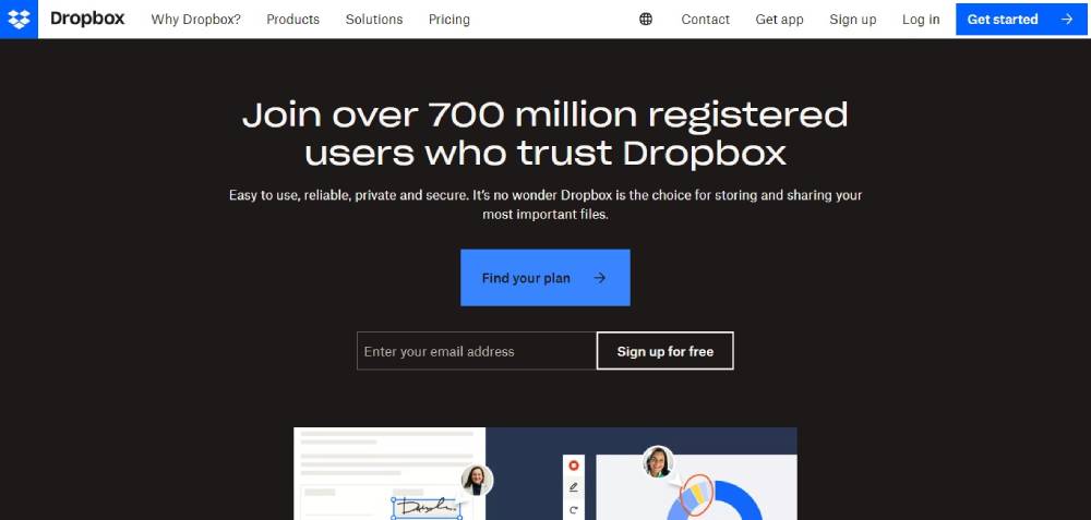
The essence of fluid layouts shines in Dropbox's responsive website design, seamlessly adapting to different screen sizes and resolutions.
Its intuitive user interface simplifies file management, making collaboration streamlined and efficient. The use of HTML5 enhances its cross-device compatibility, ensuring a consistent experience from desktops to mobile devices.
Dribbble
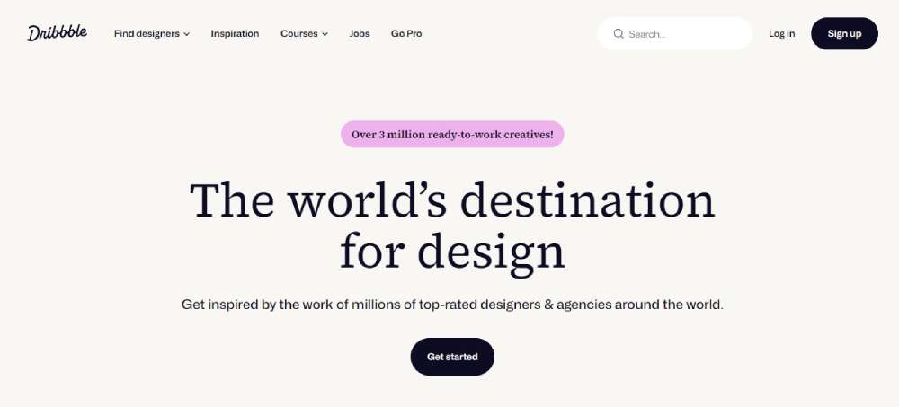
Dribbble’s portfolio platform utilizes a grid layout, embodying a modern approach to adaptive web design.
This site caters brilliantly to the creative community, with SVG elements that scale perfectly for high-resolution displays. The responsive sliders enhance visual exploration, fostering engagement and connectivity across various devices.
GitHub
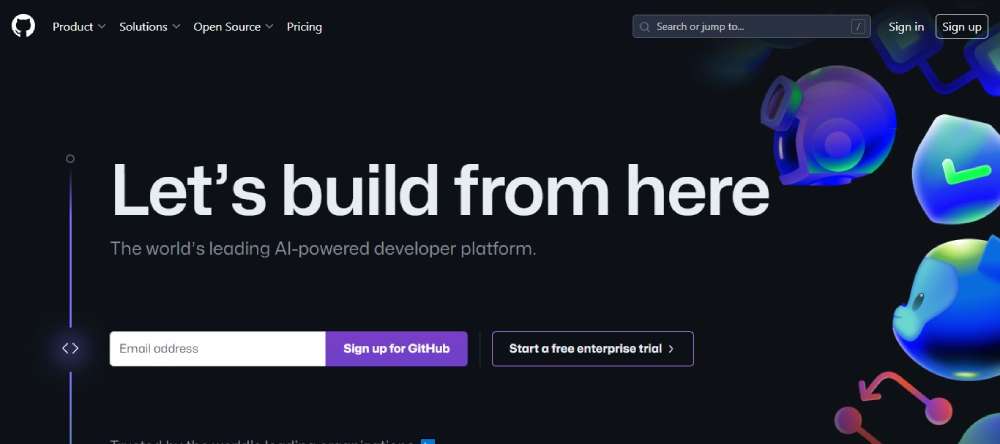
GitHub integrates a CSS media queries approach, ensuring their expansive code repository and collaboration tools are accessible on any device.
The implementation of a flexbox layout provides structural flexibility and ease, vital for delivering a superior user experience and facilitating software development ecosystems globally.
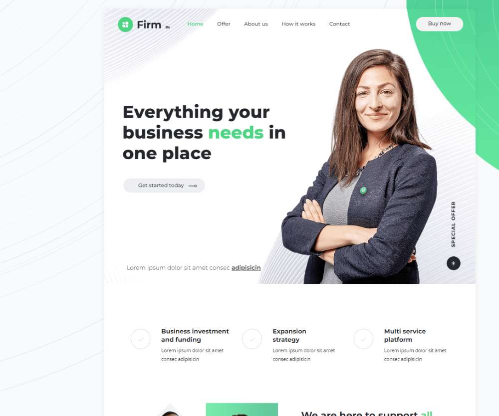
Befirm2
Klientboost
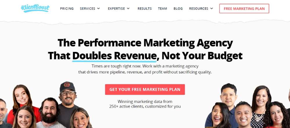
Klientboost employs a vibrant design with compelling viewport settings, creating an inviting user experience.
This site leverages CSS breakpoints to deliver a versatile viewing experience, showcasing their digital marketing expertise through slick, engaging interactions regardless of the accessing device.
Magic Leap

Magic Leap’s website is a gateway into augmented reality, with a design that’s as futuristic as the technology it represents.
Responsive images and typography scale immaculately, ensuring information is legible and engaging on any screen, complementing their ethos of pushing digital boundaries.
Shopify

Shopify’s ecommerce platform features a mobile-first design approach that boosts conversion rates through enhanced usability and tailored content presentation.
Their use of progressive enhancement ensures that core functionalities remain accessible, even when newer, advanced capabilities depend on device capabilities.
Smashing Magazine
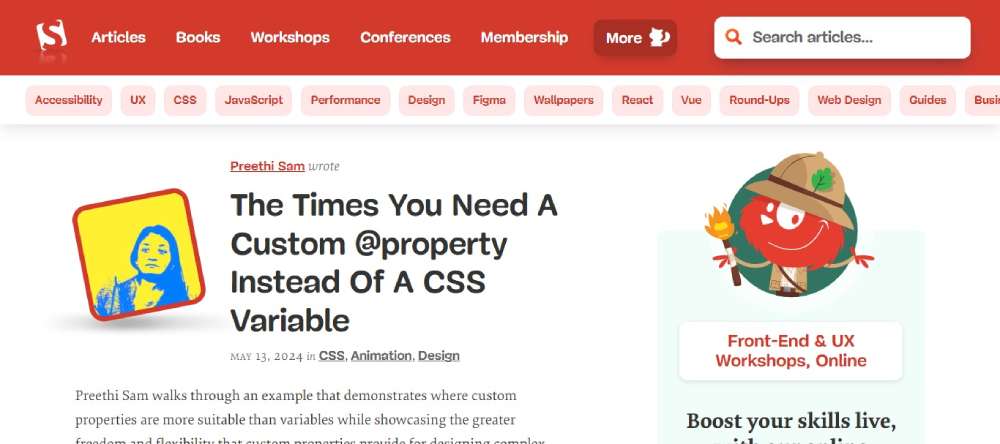
As a hub for web design and development, Smashing Magazine’s site leverages a content reflow strategy that adjusts articles and visuals seamlessly across devices.
They're providing a resourceful and accessible learning environment for the digital design community.
Slack
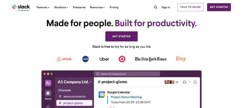
Slack’s responsive interface focuses on maintaining a harmonious balance between functionality and design, embracing a mobile-friendly design that facilitates on-the-go communications.
Its application of fast loading pages and optimized navigation structures ensures users can interact with the platform efficiently, enhancing team collaboration across any device.
Finance3

Treehouse
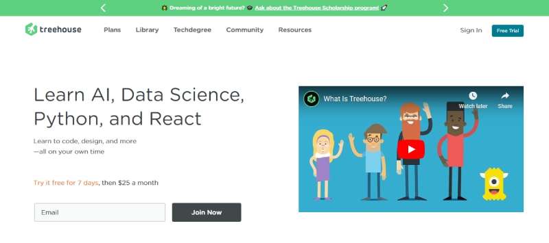
Treehouse uses a clean, accessible design that promotes its educational platform through effective use of clear font size and legibility, ensuring learners can navigate courses effortlessly.
The responsive design respects the user’s device preferences, adapting content delivery to meet diverse learning environments.
WillowTree
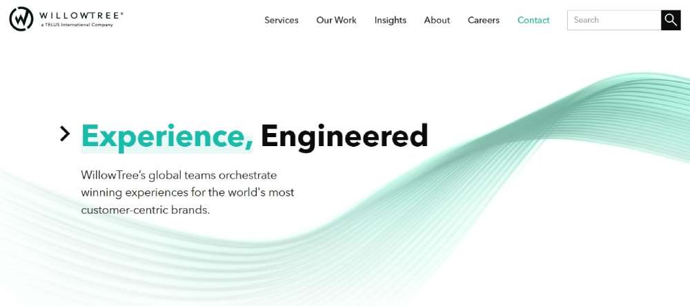
WillowTree showcases a sophisticated design that mirrors their bespoke app development services.
The site’s responsive nature is finely tuned with touchscreen optimization, which enhances the navigation experience on handheld devices, reflecting their expertise in crafting user-centric mobile applications.
WIRED
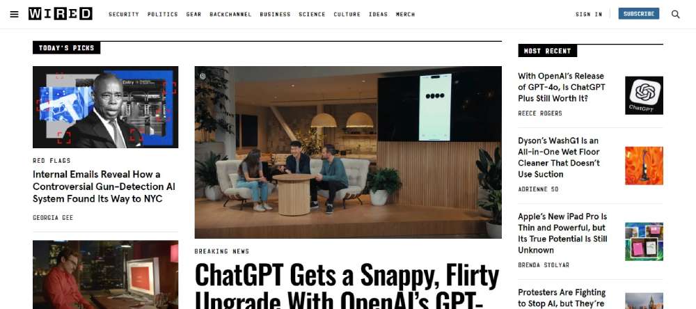
WIRED’s online presence commands attention with a dynamic responsive design, incorporating media features that adjust to the viewer's environment. The seamless shift between multimedia content types caters to a technology-savvy audience, maintaining engagement through various user interaction points.
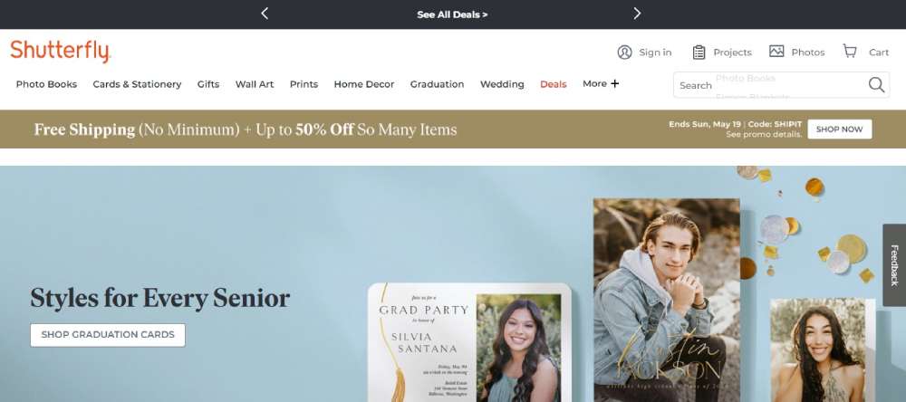
Shutterfly
Typeform delivers an exceptional form-filling experience with a design that’s as responsive as it is engaging. The use of minimalistic layouts with ample white space accentuates user input fields, easing the completion process across devices—ideal for gathering data with style and efficiency.
Etsy
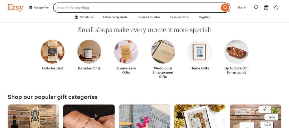
Etsy’s marketplace thrives on a responsive design that showcases their vast array of handmade and vintage items with grace. Search engine optimization (SEO) friendly content layout helps products get discovered easily while shopping, which is optimized for any device, enhancing user engagement and seller success.
Bebusiness3

Adrian Zumbrunnen
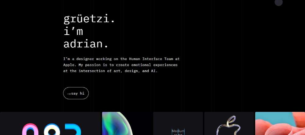
Adrian Zumbrunnen’s personal portfolio is a testament to innovative responsive design, utilizing bold typography and interactive elements that invite viewers into his world of UX/UI design. The engaging user interface adapts smoothly across devices, reflecting his expertise in creating captivating digital experiences.
Elf on the Shelf

Elf on the Shelf’s website brings festive joy with a design that adjusts content and imagery perfectly for families to explore stories and activities.
The playful interface incorporates responsive images and holiday-themed graphics that keep the magic alive on screens of all sizes.
Evernote
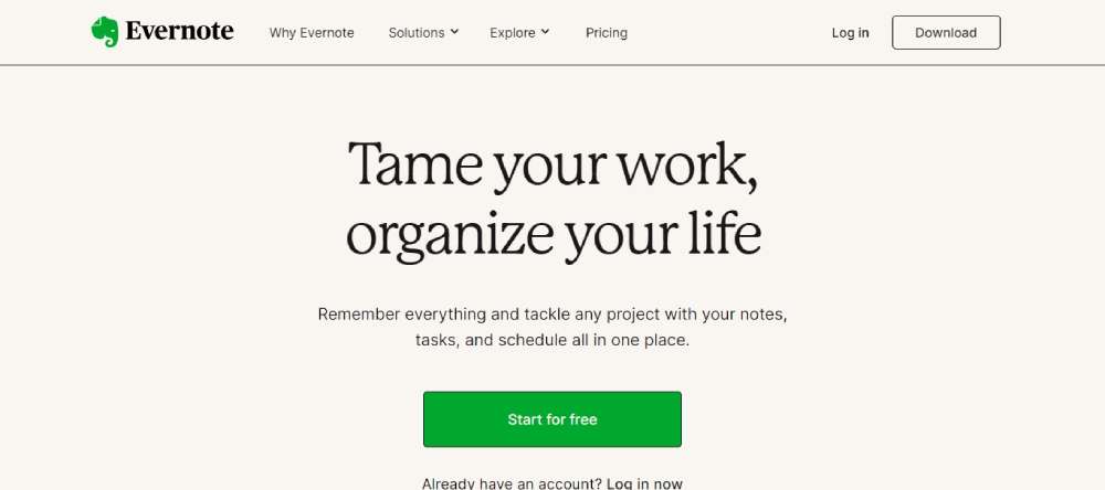
Evernote's design prioritizes functionality with a clean layout that adapts seamlessly across devices, supporting its goal of enhancing productivity.
The site uses content reflow techniques to ensure notes and information are easily accessible and readable, no matter the device used.
Huffington Post

Huffington Post delivers news and commentary through a design optimized for readability and speedy navigation.
The progressive enhancement approach ensures core content loads quickly, with additional visual elements and interactions enhancing the experience based on the user’s device capabilities.
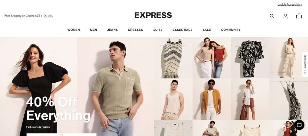
Express
Express aligns its fashion retailing with a responsive design that showcases clothing lines with stylish efficiency.
Usability testing results in intuitive navigation and quick access to product categories, optimizing the shopping experience for fashion-savvy users everywhere.
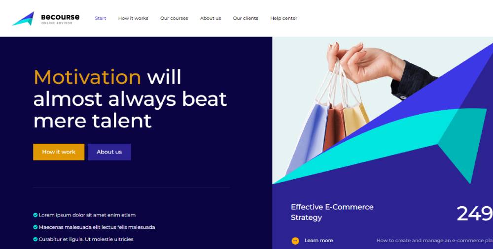
Becourse2
Nationwide Insurance
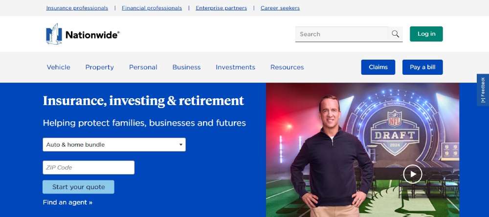
Nationwide Insurance offers a secure, responsive web platform that makes obtaining insurance information straightforward and hassle-free.
The site provides easy navigation and form accessibility, crucial for users seeking insurance solutions on multiple devices.
Squaredot
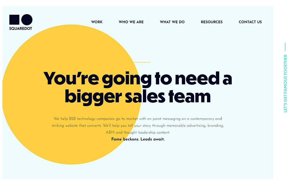
Squaredot’s digital marketing expertise is reflected in their site’s strategic use of conversion rate optimization (CRO) techniques.
The responsive design maintains a balance between aesthetic appeal and practical functionality, ensuring marketing content is digestible across all devices.
Zappos
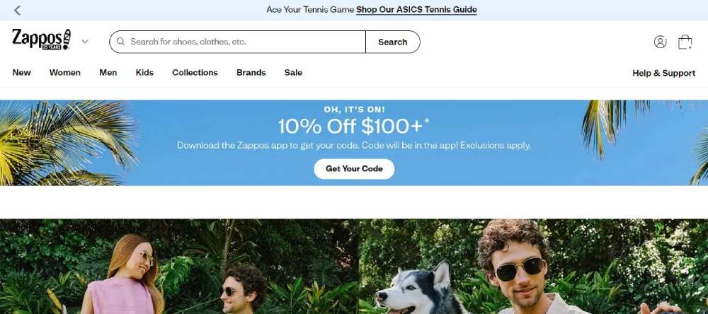
Zappos excels in e-commerce with a responsive design that enhances customer shopping experiences.
The site’s layout adjusts to provide optimal usability, which is critical for browsing and purchasing products in a mobile-centric world, reinforcing their commitment to customer satisfaction.
ABC
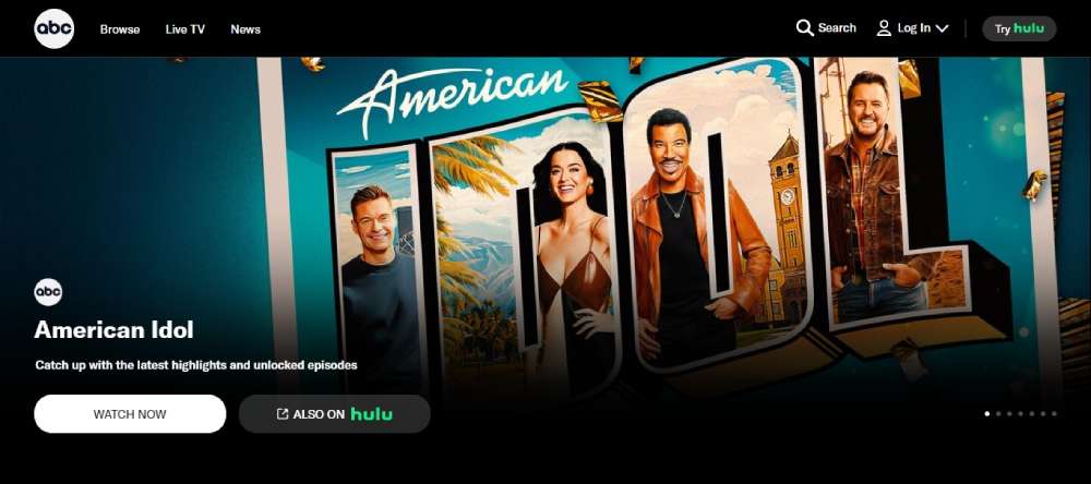
ABC’s digital platform broadcasts entertainment with a design that keeps viewers hooked regardless of their viewing device.
Incorporating video content optimization strategies ensures seamless streaming of programs, offering an impeccable viewing experience on screens big and small.
Lean Labs
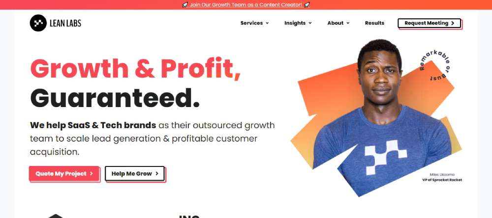
Lean Labs presents a streamlined, responsive website that embodies their lean approach to marketing and web design.
The use of strategic SEO-friendly elements, like meta tags and structured headings, enhances their visibility while providing a smooth user experience across different devices.
Pipsnacks

Pipsnacks captivates with a crisp, clean design that reflects their wholesome snack line. The responsive site focuses on product visibility and easy navigation, incorporating fast loading pages to keep potential buyers engaged and likely to convert, from desktop browsers to mobile shoppers.
FAQ On Responsive Website Design
What exactly is responsive website design?
Responsive website design is a method to create a site that automatically adjusts and reflows its content to fit the screen size and device it's being viewed on.
This approach uses CSS media queries, fluid grids, and flexible images to ensure seamless display across mobiles, tablets, and desktops.
Why is responsive design so important?
In an era dominated by mobile devices, responsive design ensures that your site provides an optimal viewing experience—fast loading, navigable, and easy to read—no matter what type of device is being used.
It significantly improves user experience and boosts SEO by reducing bounce rate.
How does responsive design affect search engine rankings?
Google emphasizes mobile-first indexing, meaning it predominantly uses the mobile version of content for indexing and ranking.
Responsive websites have a single URL and HTML code for all devices, which streamlines Google's crawling efficiency, improving your SEO standing.
What are the main elements of responsive design?
Key elements include fluid grid systems that resize elements based on screen proportions, CSS media queries to apply different styles for different devices, and flexible images that resize within their containing elements. This trio ensures that the website performs well across all devices.
Can responsive design improve website speed?
Yes, when properly implemented, responsive design can improve website speed. Techniques like image optimization, correct use of viewport settings, and minimizing CSS and JavaScript can reduce load times significantly, enhancing user experience and supporting SEO efforts.
What's the difference between responsive and adaptive design?
Responsive design fluidly changes at any screen size due to its dynamic grid system and flexible images.
Conversely, adaptive design uses static layouts that only adjust when hitting predefined breakpoints. Thus, responsive is more fluid and comprehensive than adaptive.
How do I test a website for responsiveness?
Use tools like Google's Mobile-Friendly Test to check responsiveness. Additionally, manually testing your site on various devices, or using browser developer tools (Chrome, Firefox) to simulate different screen sizes can help ensure your site adjusts well across all devices.
What are the challenges of implementing responsive design?
One major challenge is ensuring that large content rich pages do not become too slow or unresponsive on devices with smaller screens. Maintaining design integrity, functionality, and performance across diverse devices demands meticulous coding and frequent testing.
How does responsive design impact user experience?
Responsive design directly enhances user experience by making websites accessible and easy to navigate regardless of device. It eliminates the frustration of zooming and side-scrolling and increases content readability, leading to higher satisfaction and engagement from visitors.
What future trends are impacting responsive design?
Emerging technologies like CSS Grid Layout and Flexbox offer more sophisticated ways to create responsive designs.
Moreover, the increasing importance of mobile-first designs in SEO strategies and the continuous introduction of varied device sizes and screen resolutions keep pushing the boundaries of responsive web design.
Conclusion
Embarking on the journey to create a responsive website design allows for an expansive reach across all device landscapes—from the tiniest mobile screens to large desktop displays. Mastery of this approach not only bridges gaps in user accessibility but resonates strongly with Google's mobile-first indexing strategy, enriching your SEO potential immensely.
- User-friendly navigation
- Fluid images
- Flexible grid systems
These are your tools to construct a website that not only looks stellar but also climbs swiftly up the search engine result pages. As you adjust CSS media queries and streamline viewport settings, your site will sprint ahead, delivering swift, seamless interactions to every user, every time.
If you enjoyed reading this article on responsive website design, you should check out these articles also:


