


Construction Website Templates Built to Impress
February 23, 2026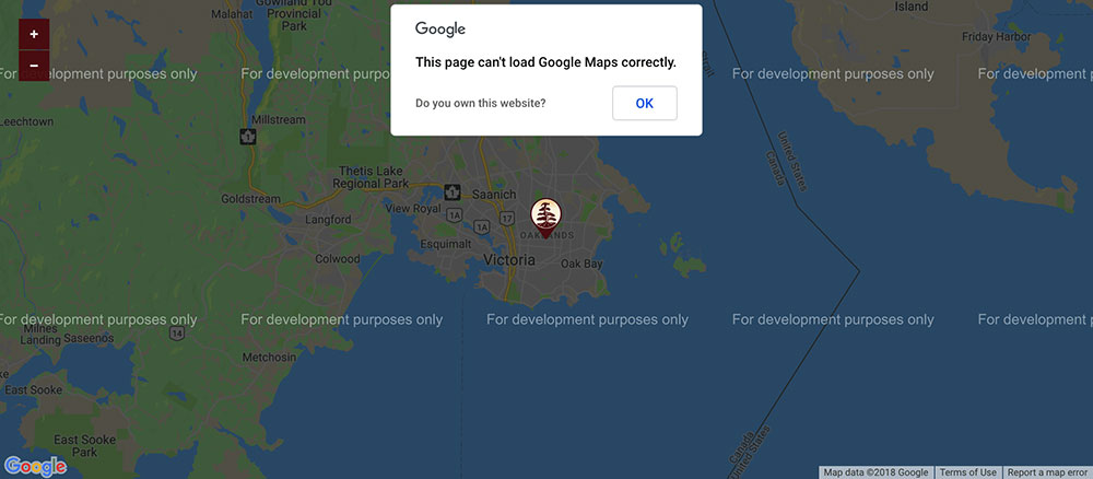
How to Fix “This Page Can’t Load Google Maps Correctly”
February 24, 2026Most recipe websites fail their visitors before a single ingredient gets measured.
The best recipe website design examples share one thing: every visual and layout decision serves the person actually cooking, not just the search engine.
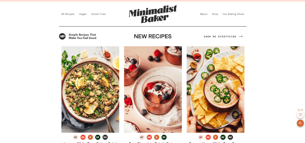
Food blog design has gotten more competitive. Simply Recipes pulls over 15 million monthly visitors. NYT Cooking built a subscription business on it. Minimalist Baker earns millions from a clean grid and fast load times.
There's a pattern behind all of it.
This guide covers what separates high-performing cooking sites from the rest, including:
- Recipe card UI patterns that drive clicks and return visits
- Homepage and category page structure that keeps people browsing
- Mobile design built for real kitchen conditions
- Tools and platforms powering the best food blogs today
What Makes a Recipe Website Design Work
A recipe website lives or dies by one thing: can people find what they need fast, cook with it, and come back? That's it. Everything else, the fonts, the grid, the color palette, is in service of that goal.
87% of U.S. consumers use recipes to guide their food purchases, according to Recipe Kit data from 2024. That tells you exactly who's on these sites and what they expect to walk away with.
Visual Hierarchy Specific to Food Content
Food content has a unique hierarchy that doesn't map onto other content types. A hero image needs to do the selling before a single word is read.
- Hero image dominates above the fold, ideally filling 60–80% of screen width
- Recipe title sits close to the photo, not buried below a personal essay
- Key details (cook time, servings, difficulty) appear early as a visual block, not scattered through body text
- Ingredient list and step-by-step cooking instructions hold equal visual weight
The jump-to-recipe button deserves its own mention. Allrecipes, which pulls over 81 million visits per month (Semrush, 2026), has faced repeated criticism for burying recipe content under long scrolls. That's the design problem every food site has to solve.
Navigation Patterns Unique to Recipe Sites
Standard website navigation doesn't translate well here. Recipe sites need filters, category pages, and search working together.
Navigation type: What it does and when it matters
| Navigation Type | Best Use | Example |
| Mega menu | Large recipe libraries with many categories | The Kitchn, Food Network |
| Filter system | Dietary, cuisine, cook time browsing | Minimalist Baker, Skinnytaste |
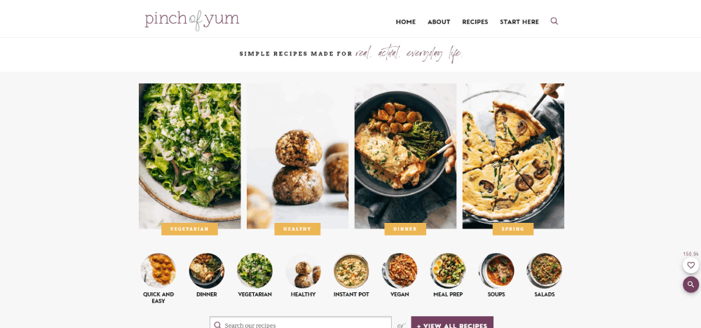
| Recipe index page | Dedicated browsing separate from blog posts | Pinch of Yum |
| Sticky search bar | Intent-driven visitors who know what they want | NYT Cooking, Allrecipes |
The way navigation is structured directly affects how long people stay. A visitor who can't filter by "30-minute meals" or "gluten-free" will leave for a site that can.
Performance and Trust Signals
Recipe Tin Eats pulls an estimated 16 million visits per month (DebugBear, 2025). Sites at that scale can't afford slow load times. And they don't have them: the DebugBear 2025 analysis of 63 food and recipe sites found most users are having a good experience on most sites, most of the time.
Still, mobile pages take on average 71% longer to load than desktop pages (Email Vendor Selection, 2024). For a site loaded with food photography, that gap matters.
Trust signals worth building into the design from day one:
- Author bylines with real bios and photos
- Recipe rating systems with visible review counts
- Print-friendly recipe card layouts
- Clear nutritional info placement
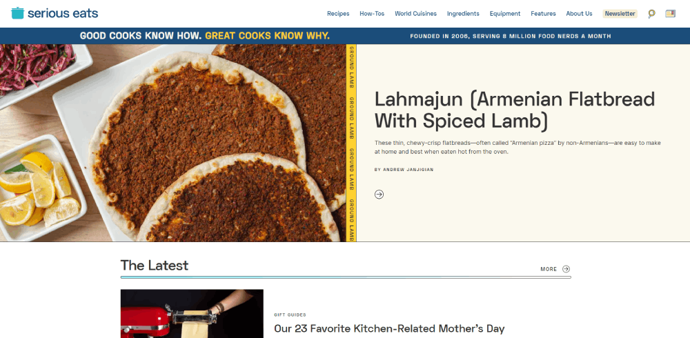
Recipe website design examples
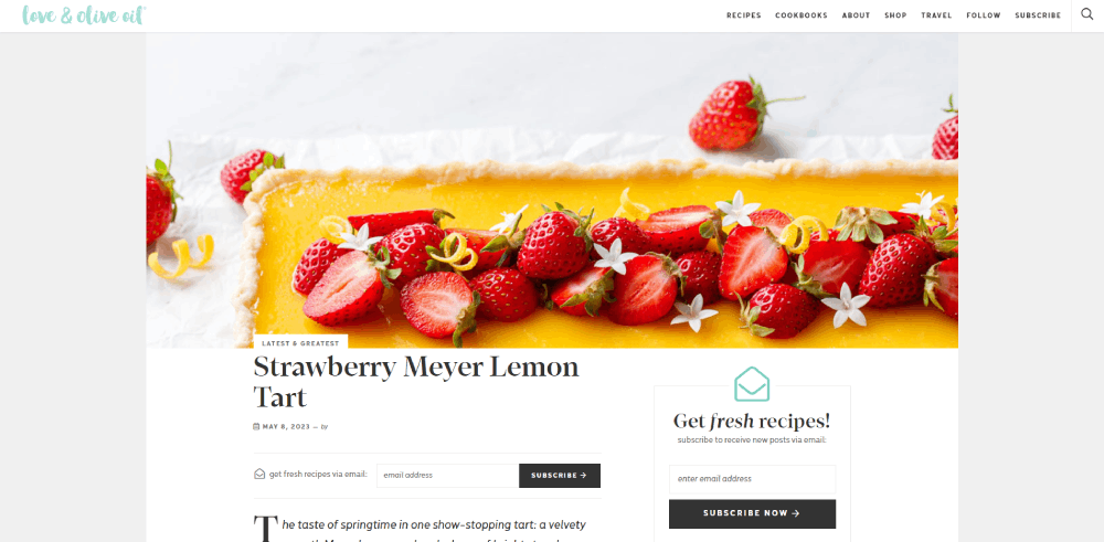
Tried & True Recipes
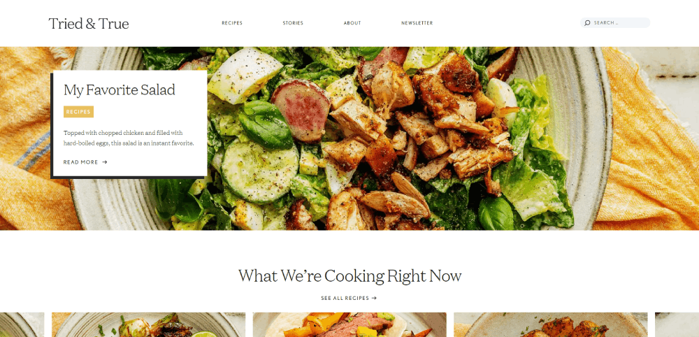
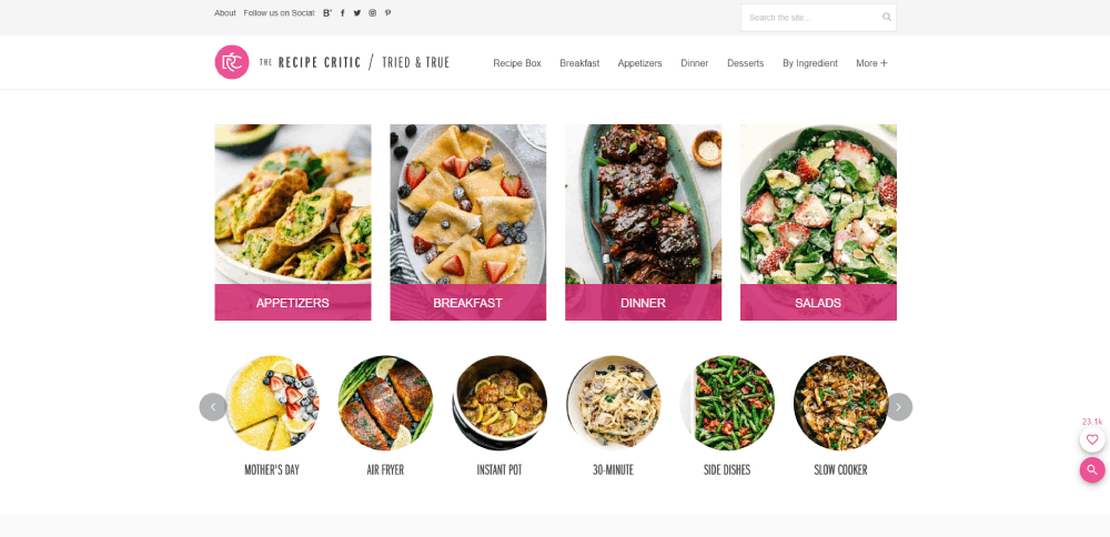
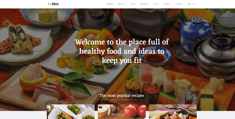

This food blog makes it easy for visitors to get the maximum benefit from their resources. The website design is user-friendly and minimalistic. The well-organized content leaves visitors with a good impression of the website. The beautiful images add to the visual appeal of the site.
Green Kitchen Stories
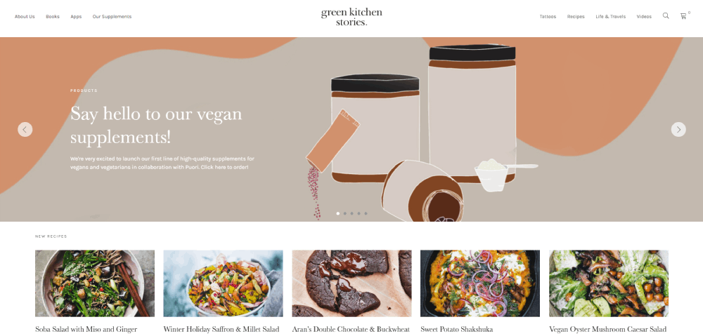
This website includes things that you might not encounter on other food blogs. For example, you can buy supplements and even temporary tattoos on the website as well. They also include more traditional information you would find on a recipe website. They have an excellent collection of recipes across a variety of categories. The website also features some travel-based content.
a fork and a pencil
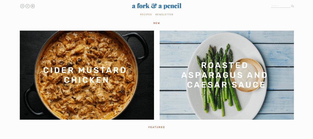
This food blog presents recipes that are quick to make and delicious, but don't cost a fortune to make. The design is both elegant and modern. The hero header features the latest post and the social media and subscription links. This food blog also makes great use of other features, like advertising banners, sticky headers, and search features.
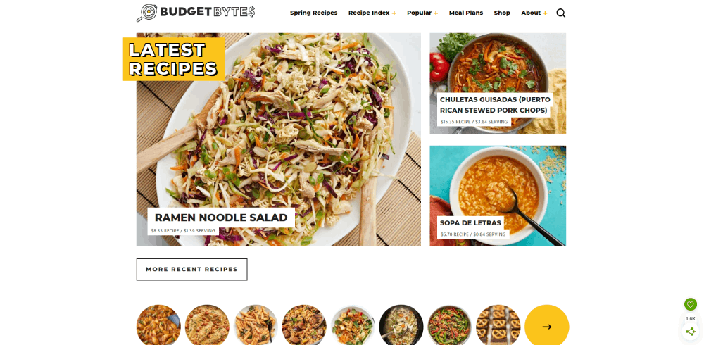
Budget Bytes
This recipe website is a great example of presentation. Even foods that are on clearance are presented in a way that makes them appealing. This website design and the recipes prove that you don't need an elaborate design or a lot of money to create something beautiful (and delicious).
Instinct Origine
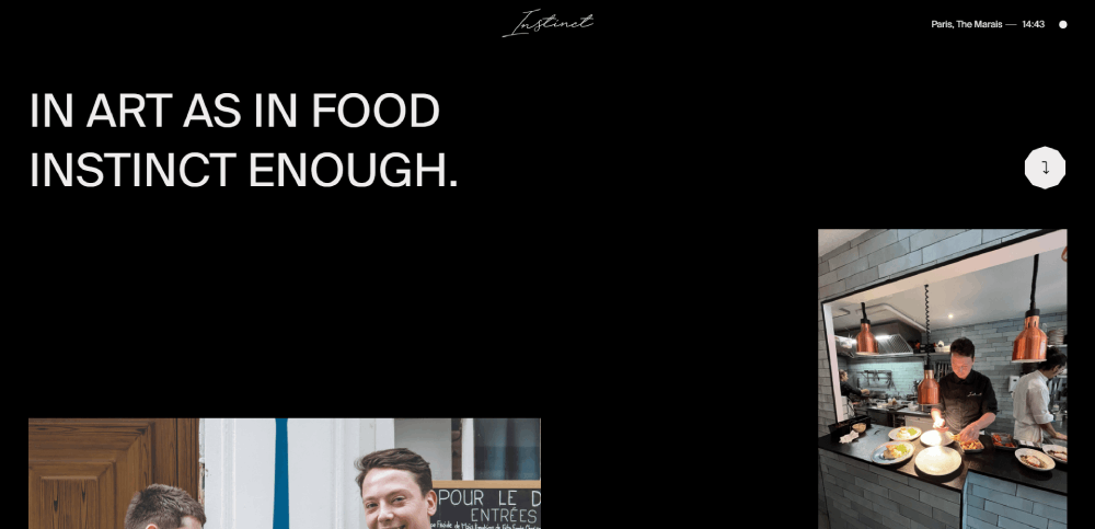

This fun food blog shares seasonal food recipe ideas. The homepage design uses a boxed layout, which looks well-organized and makes it easy to navigate. Instead of featuring the latest blog post in the hero header, Alexandra Cooks features a subscription block. This food blog also makes good use of images to entice visitors to keep looking around.
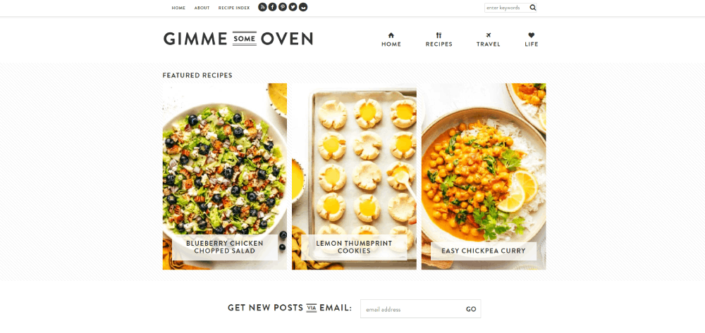
Gimme Some Oven
Recipe Card Design Patterns That Perform Well
The recipe card is the single most important UI element on any cooking site. Everything else supports it. Get the card wrong and the whole site suffers.
Structured Data Integration in Card Design
Nestlé measured an 82% higher click-through rate for pages showing as rich results vs. non-rich result pages (Google case study). The Food Network converted 80% of their pages to enable search features and saw a 35% increase in visits (Google Search Central).
That data exists because of how recipe schema markup integrates with card design. The visual elements on the card (star ratings, cook time, serving size, thumbnail image) are the same properties that Schema.org Recipe markup communicates to search engines. They're not separate concerns. Good card design and good structured data are the same work.
Required Schema.org Recipe properties that should also be visible on-card:
- Name and image (required by Google for rich results)
- Cook time and prep time
- Aggregate rating with review count
- Recipe yield / servings
Print-Friendly and Jump-to-Recipe Patterns
These two features annoy users when they're missing. A lot.
Jump-to-recipe anchors are so expected now that sites without them actively lose users. Print-friendly layouts need separate CSS: no ads, no sidebar, no social sharing buttons, just the recipe card with clean typography optimized for paper.
Pinch of Yum's Tasty Recipes plugin handles both, adding jump links, print buttons, ingredient scaling (including US-to-metric conversion), and built-in cook timers inside a single consistent card format. That's the benchmark for recipe card UI in the WordPress ecosystem.
Ingredient Scaling and Interactive Elements
Serving size toggles are a small UI detail that significantly increases time on page. When someone can adjust a recipe from 4 to 12 servings without recalculating, they stay. When they have to do mental math, they often leave.
Ingredient checklist UI (where users click to cross off ingredients as they cook) solves a real in-kitchen problem. It's available in WP Recipe Maker and Tasty Recipes. Not every food blog implements it. The ones that do tend to have stronger return visitor rates.
Rakuten found that users spend 1.5x more time on pages with structured data vs. non-structured data pages, plus a 3.6x higher interaction rate on AMP pages with search features (Google Search Central case study). Recipe cards with rich interactive elements are a measurable driver of that engagement difference.
Homepage and Category Page Design in Recipe Sites
The homepage sells the site. The category page keeps people browsing. Most recipe sites underinvest in both.
Grid vs. List Layouts for Recipe Browsing
Grid layouts dominate recipe sites for a reason: food is visual, and a grid shows more images per scroll. But the grid-vs-list decision is actually more nuanced than that.
Grid layout: High image density, best for browsing and discovery. Works well when photography is consistent and high quality. Can feel overwhelming if image quality varies.
List layout: Better for search results and filtered views where users know what they want. Supports longer recipe titles and more metadata per item. Faster to scan for specific attributes like cook time.
Minimalist Baker uses a grid archive. Serious Eats uses a hybrid depending on the section. Both are right for their use cases.
Filter and Category Architecture
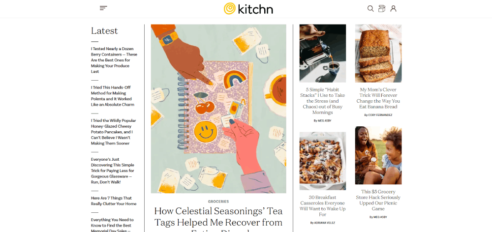
The Kitchn uses a mega menu to display submenus simultaneously, making large recipe libraries browsable without requiring multiple clicks. Colorlib's analysis highlights this as a standout feature of The Kitchn's food blog design.
Pinch of Yum's recipe index page goes further, filtering by:
- Popularity
- Course (breakfast, dinner, dessert)
- Dietary restrictions
- Season
- Ingredient type
- Cooking method (Instant Pot, etc.)
That level of filter granularity requires careful taxonomy planning before a single line of CSS gets written. It's an information architecture decision, not a visual one. But it shows up visually as a filter bar or category hub that users can actually navigate.
Internal Linking Through Visual Category Hubs
Category pages are one of the most underused internal linking opportunities in food blog design. A well-designed category hub page serves two audiences at once: the reader browsing "Italian recipes" and the search engine trying to understand what the site covers.
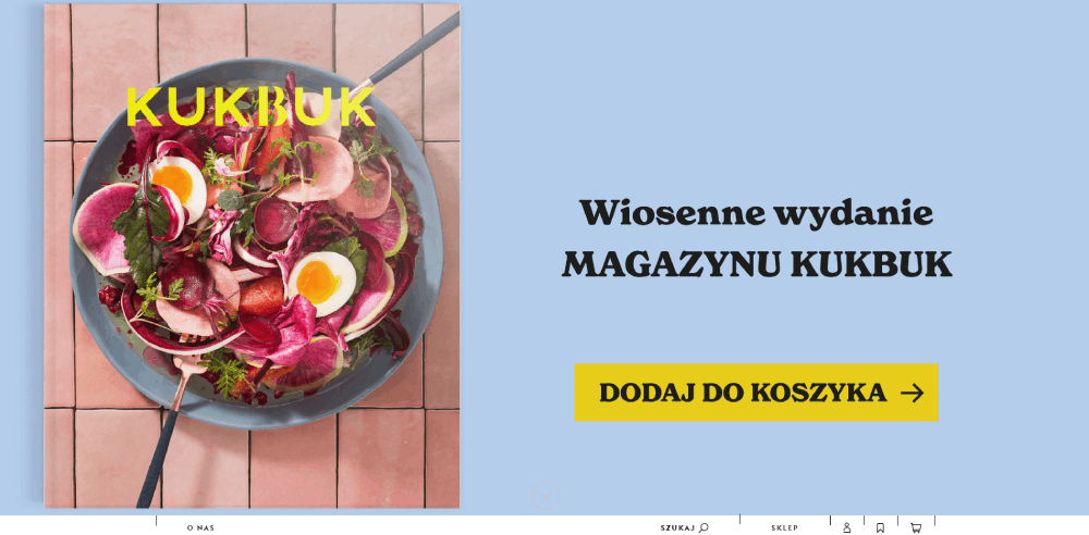
Visually, this means curated grids with seasonal or trending content placement, not just a chronological dump of every post tagged with a keyword. The homepage of Kukbuk (highlighted in Colorlib's food blog design roundup) uses an asymmetrical layout with a split-screen hero to separate featured articles from browsable content. It's a smarter use of above-the-fold space than a standard full-width hero image.
Photography and Visual Design Standards
Food photography on the web isn't just about looking good. It's about loading fast, communicating instantly, and not destroying your Core Web Vitals score in the process.
Aspect Ratio and Image Format Decisions
The average page load time across the top 100 websites in 2024 is 2.5 seconds on desktop and 8.6 seconds on mobile (Email Vendor Selection, 2024). Recipe sites with dozens of large food photos are fighting that number constantly.
WebP format is now the standard answer. It delivers significantly smaller file sizes than JPEG at comparable visual quality. Most modern food sites have moved to WebP, often through image CDNs like Cloudinary that handle format conversion automatically.
Aspect ratio conventions worth knowing:
- Hero images: 16:9 or 3:2 landscape for desktop, 4:5 or square for mobile
- Recipe card thumbnails: 4:3 or square, consistent across the grid
- Inline step photos: flexible, but consistent within a single recipe
Photography Style and Brand Consistency
Photography style is a brand decision. Light and airy vs. dark and moody affects the entire visual identity of the site.
Colorlib's 2024 food blog design analysis notes that dark color schemes give food sites "a sleek, modern feel that makes imagery stand out." That works when the photography is shot for it: dark backgrounds, dramatic lighting. It completely fails when lighter, natural-light photography gets dropped onto a dark-themed template.
The best food sites shoot photography with their site's color palette in mind. Minimalist Baker's bright, clean backgrounds match the white grid layout. It's not a coincidence.
Video Integration in Recipe Page Layouts
SimilarWeb industry analysis shows that video content dramatically increases engagement metrics for food brands. Static product pages and recipe cards don't compete with video.
But video integration has a layout cost. Autoplay video destroys page speed. Embedded YouTube or Vimeo adds external dependencies. The better approach most sites now use: a static thumbnail that loads a video player on click, rather than loading the player (and its scripts) on page load.
NYT Cooking handles this well. Videos are prominent but never autoplaying. The recipe page layout treats video as supplementary, not the primary content driver. That keeps the Core Web Vitals score intact while still offering video for users who want it.
Typography and Color in Recipe Website Design
Typography in recipe websites has to work in a specific, uncomfortable context: someone has their hands covered in flour, their phone propped against the backsplash, squinting at a step-by-step list. Most type choices aren't made with that scenario in mind. They should be.
Font Choices and Reading Comfort
Typography in web design becomes a real usability question for recipe sites. The font has to be readable at arm's length, on a mobile screen, in varying kitchen light conditions.
Current trends in top recipe sites:
- Serif fonts for display headings (recipe titles, section headers): gives an editorial, trustworthy feel
- Clean sans-serif for body copy and instructions: maximizes legibility at small sizes
- Larger base font size than typical blog content (18–20px minimum for instruction text)
- Generous line-height in step-by-step sections (1.6–1.8) to allow quick re-finding of your place
NYT Cooking uses a serif heading + clean sans-serif body combination that's become something of a benchmark for editorial food design. Food52 leans more heavily serif throughout, which works with its lifestyle-magazine visual identity.
Color Palettes and Food Brand Identity
Color choice in food site design isn't decoration. It affects appetite appeal and trust.
Pinch of Yum's purple and orange accent system is a good example of a deliberate choice. Purple isn't an obvious food color. But it distinguishes the brand from the sea of red-and-green food sites, and the accents are used consistently on interactive elements only, not background colors, which keeps the white photography from competing with the palette.
Common color directions by site type:
| Site Type | Typical Palette | Why It Works |
| Health / Plant-based | Greens, whites, soft neutrals | Signals freshness and clean eating |
| Baking / Comfort food | Warm browns, creams, dusty oranges | Evokes warmth and home cooking |
| Editorial / Premium | Black, white, single accent | Positions site as authoritative |
| Community / High volume | Bold primary colors, high contrast | Accessible, recognizable at scale |
Dark Mode and Accessibility Considerations
Dark mode support is still rare on recipe sites. Most food photography is shot for light backgrounds, which makes dark-mode implementation tricky without reshooting or heavy image editing.
Colorlib's analysis of food blog designs specifically calls out dark color schemes as giving sites "a sleek, modern feel." But this works as an intentional design direction, not as a system-preference dark mode toggle. The two are different problems.
Contrast accessibility matters more practically. The Web Content Accessibility Guidelines (WCAG) require a minimum 4.5:1 contrast ratio for body text. Recipe instruction text that's light gray on white, a common lazy choice on food blogs, often fails that threshold. If someone is cooking from your site, they need to actually read it. That's a website accessibility issue, not just an aesthetic one.
Mobile Design Considerations for Recipe Sites
Over 75% of consumers look up recipes on their phones while grocery shopping, and nearly 60% of adults aged 25 to 34 use their mobile devices as cooking companions (SideChef, 2024).
That context changes everything. Mobile recipe design isn't just about responsive breakpoints. It's about someone standing at a stove, hands sticky, phone propped on the counter.
Sticky Headers, Progress Indicators, and Step Flows
80% of recipe app users access content on smartphones (Coolest Gadgets / Electroiq, 2024). The implication for web design: mobile layout decisions affect the vast majority of your audience.
What actually helps in-kitchen mobile UX:
- Sticky "jump to step" buttons that follow scroll position
- Large tap targets on checkboxes (minimum 44x44px per Apple HIG guidelines)
- Step-by-step mode that shows one instruction at a time, full-screen
- Screen wake-lock support, or a clear reminder to keep the screen on
Allrecipes' UX redesign study (Aiden Schrock, Medium) specifically recommended mobile-first wireframing because the majority of users access the site on a phone or tablet while cooking. The site still doesn't fully solve this. There's an opportunity here for smaller sites to outperform at the mobile experience layer.
Touch Targets and Ingredient Interactions
Ingredient checkboxes are one of those features that sound minor until you're actually cooking. Being able to tap each ingredient as you add it prevents re-reading the whole list.
Interactive features like timers and ingredient checkboxes boost app engagement by 42%, according to Electroiq's 2024 recipe app market analysis. The same logic applies to recipe websites.
The Tasty Recipes plugin (used by Pinch of Yum and many others) includes ingredient checkbox functionality inside its recipe card UI. WP Recipe Maker offers the same. Both are designed with touch interaction in mind, not just desktop clicks.
Ad Placement vs. Readability on Mobile
Nothing kills mobile recipe UX faster than ads stacked between every other instruction step. SideChef's UX best practices analysis puts it bluntly: clicking into a recipe only to be hit with pop-ups, autoplay video, and 10+ ads before seeing the actual recipe erodes trust and tanks engagement.
Strategic placement vs. disruptive placement:
Works: Sticky footer ad, single mid-content placement between intro and recipe card, sidebar on tablet landscape.
Fails: Interstitial pop-ups on entry, ads injected between instruction steps, autoplay video that repositions content mid-scroll.
Bootstrapped Ventures' 2025 food blog design analysis confirms: over 60% of food blog traffic comes from mobile users, making mobile ad balance a direct revenue decision, not just a UX preference.
Mobile-First Design Approach
The Feast Plugin, used by many of the most successful food blogs, explicitly prioritizes mobile. Their header size recommendation (320x100px) exists specifically because most food blogs get the majority of traffic from mobile screens under 400px wide (Feast Design Co.).
Designing mobile first means starting with the smallest viewport and adding complexity upward, not stripping down a desktop layout. For recipe content, this order matters: recipe card, hero image, key metadata (cook time, servings), then everything else.
| Element | Mobile Priority | Desktop Priority |
| Jump-to-recipe button | Critical: Must be above the fold to improve UX. | Helpful, but less urgent for navigation. |
| Recipe card | Full-width with large tap targets for thumbs. | Can sit in a narrower column with sidebar space. |
| Sidebar content | Usually hidden or moved below the main content. | Sticky alongside the recipe to drive ad revenue. |
| Food photography | Highly compressed for fast loading on 5G/4G. | Higher resolution acceptable for retina displays. |
Design Tools and Platforms Used to Build Recipe Sites
WordPress powers 43% of the web (Recipe Kit, 2024). In the food blog space, that number is almost certainly higher. The ecosystem built around food blogging on WordPress is deep enough that most designers working in this niche never seriously consider alternatives.
WordPress Themes Built for Food Blogs
Foodie Pro by Feast Design Co. is widely cited as the most popular WordPress theme for food blogs (Approaching Home, 2024). It's the number 1 selling Genesis child theme, and its minimalist approach is one of the main reasons for that.
Key themes in the WordPress food blog ecosystem:
- Foodie Pro: Minimalist, Genesis-based, best for recipe-focused blogs with large archives
- Brunch Pro: Also Feast Design Co., slightly more lifestyle-forward layout
- Kadence: More flexible page building, works well for custom food blog visual branding
- Kale Pro: Built-in recipe cards, suits baking and dessert-focused blogs
The Feast Plugin (which bundles access to all five Feast themes plus performance and SEO features) is now the recommended setup by Food Blogger Pro's WordPress expert, described as "performant, well-supported, and built around food blog best practices" (Food Blogger Pro, 2025).
Recipe Card Plugins: Where Design and Function Meet
Recipe card plugins are where good recipe website UI actually gets built. The plugin controls the card layout, structured data output, interactive features, and print formatting. Choosing the wrong one affects both the user experience and search visibility.
WP Recipe Maker: Flexible templating, strong structured data, good for sites with custom design systems.
Tasty Recipes (by WP Tasty / Pinch of Yum): Built specifically for food bloggers, includes ingredient scaling, unit conversion, timers, and checkboxes out of the box.
Foodie Digital, which has audited hundreds of food blog sites, backs only two recipe plugins: WP Recipe Maker and Tasty Recipes. Their reasoning: other plugins have been abandoned, lost feature parity, or generate schema errors that hurt search visibility (Foodie Digital, 2024).
Page Builders and Headless CMS Options
Elementor and Kadence Blocks handle layout customization for sites that need more visual flexibility than a theme provides out of the box. Both work with food-specific themes and don't break recipe plugin schema output, which matters.
Larger food media brands like Dotdash Meredith (which owns Serious Eats, Food and Wine, Simply Recipes) run custom builds. The performance results back that up: DebugBear's 2025 analysis ranked Dotdash Meredith sites as top performers in Core Web Vitals across 63 food sites studied. Custom headless CMS setups allow this level of optimization, but they're not realistic for independent bloggers.
Platform comparison by use case:
| Platform | Best For | Limitation |
| WordPress + Feast Plugin | Independent food bloggers seeking speed | Less visual flexibility without coding |
| WordPress + Kadence | Custom design-forward sites | Increased setup time and learning curve |
| Squarespace / Wix | Simple restaurant or portfolio sites | Lack of robust schema-heavy recipe support |
| Headless CMS (Custom) | Large media brands with high traffic | High development and maintenance costs |
The right web design tools matter less than the decision architecture behind them. A well-structured WordPress site with Foodie Pro and Tasty Recipes will outperform a custom-built site with poor navigation and no structured data every time.
Common Design Mistakes in Recipe Websites
Bad design on recipe sites is rarely about aesthetics. It's almost always structural. The mistakes that lose readers aren't ugly colors or inconsistent fonts. They're friction points that come up during the actual use of the site.
Excessive Ad Placement Destroying the Reading Experience
The most consistent complaint about recipe sites across user behavior research and reader feedback is ad density. SideChef's 2024 UX analysis describes the experience: "pop-ups, autoplay videos, and 10+ ads before even seeing the actual recipe."
This isn't just a user frustration issue. Aggressive ad placement directly reduces time on page and return visit rates. The irony: sites with higher ad density often earn less per session than sites with strategic, lower-density placement, because visitors leave faster.
Bootstrapped Ventures' food blog design research identifies the specific layout errors:
- Ads injected between instruction steps (breaks cooking flow completely)
- Autoplay video that repositions content mid-read
- Full-screen interstitials on mobile entry
Missing Jump-to-Recipe Functionality
This one is non-negotiable at this point. Readers know the jump-to-recipe button exists. When it's absent, the signal it sends is that the site doesn't care about the user's time.
Grace + Vine Studios' 2022 food blog design audit lists the jump-to-recipe link as a basic requirement. Not having it is a mistake. Having it anchored inconsistently (sometimes working, sometimes not) is almost as bad.
The secondary issue: some sites have the button but bury it below a long intro paragraph. The button needs to be visible at the top of the post, before any scrolling. Full stop.
Poor Image Compression Wrecking Load Speed
The average mobile page load time in 2024 across the top 100 websites is 8.6 seconds (Email Vendor Selection, 2024). Food sites with uncompressed hero images and multiple step-by-step photos push well past that.
The specific mistakes: uploading full-resolution camera files without resizing, skipping WebP conversion, loading all step photos at full resolution even when most won't be scrolled to.
Lazy loading fixes the last issue. Cloudinary or similar CDNs fix the first two automatically. Neither requires custom development on WordPress. Both are standard practice on well-optimized food blogs and completely absent on many others.
Ignoring Structured Data
Only 30% of websites currently use Schema.org markup (Searchmetrics / Search Engine Land). In recipe publishing, the gap between sites with and without recipe schema is stark: rich results get clicked 58% of the time vs. 41% for non-rich results (KeyStar Agency, 2025).
Foodie Digital's audit of hundreds of food blogs found structured data errors and warnings as a consistent pattern. The fix: use a maintained recipe card plugin (WP Recipe Maker or Tasty Recipes) and validate output regularly in Google Search Console's rich result status report.
What's worse than no schema? Broken schema. Incorrect cook time formatting, missing required fields, or schema that conflicts with visible page content all trigger Google penalties against rich result eligibility.
Inconsistent Recipe Card Design Across Categories
Sites that start with one recipe plugin and switch to another mid-archive end up with inconsistent card design across their posts. Older posts show different card layouts, different structured data formats, different print outputs.
This is a visible UX problem. A reader who prints one recipe and gets a clean card, then prints another and gets a mess of formatted HTML, loses confidence in the site's quality. Grace + Vine Studios specifically flags using multiple recipe card plugins as a common and avoidable mistake (2022).
The fix is migrating all recipes to a single plugin before the archive gets large enough to make migration painful. Most sites wait until it's already painful. The hallmark of a site with good UX is consistency you can feel across every page, not just the homepage.
FAQ on Recipe Website Design
What makes a recipe website design effective?
Clear visual hierarchy, fast load times, and a well-structured recipe card are the core requirements. Navigation needs category filters, a search bar, and a jump-to-recipe button. Everything else is secondary to helping users cook quickly.
Which recipe websites have the best design?
NYT Cooking, Minimalist Baker, and Pinch of Yum are consistently referenced as top recipe website design examples. Each solves a specific design problem well: editorial consistency, load speed, and recipe archive structure respectively.
What platform is best for building a recipe website?
WordPress dominates food blog design. The Feast Plugin with Foodie Pro theme is the most recommended setup for independent bloggers. Squarespace and Wix work for simple sites but lack recipe plugin support.
How important is mobile design for recipe sites?
Critical. Over 75% of users look up recipes on their phones, often while actively cooking. Mobile-first layout, large tap targets, and ingredient checkboxes are not optional features for a competitive food site.
What recipe card plugin should I use?
WP Recipe Maker and Tasty Recipes are the two most maintained options. Both generate clean Schema.org markup, support ingredient scaling, and include print-friendly layouts. Other plugins have been abandoned or generate structured data errors.
Does recipe schema markup actually improve traffic?
Yes. The Food Network saw a 35% increase in visits after converting 80% of pages to enable rich results. Nestlé measured an 82% higher click-through rate for pages showing as rich results versus standard listings.
What are the most common recipe website design mistakes?
Excessive ad density, missing jump-to-recipe buttons, uncompressed images, and broken or absent structured data. Inconsistent recipe card design across a blog archive is also a common and avoidable problem.
How should food photography be handled in recipe site design?
Use WebP format, consistent aspect ratios per content type, and lazy loading for step photos. Hero images should load fast above the fold. Photography style needs to match the site's overall color palette and brand identity.
What typography works best for cooking websites?
Serif headings paired with clean sans-serif body copy is the current standard. Instruction text needs a minimum 18px base size and generous line-height. Readability in kitchen conditions, one hand busy, poor lighting, should drive every font decision.
How do I improve my recipe website's page speed?
Switch to WebP images, implement lazy loading, use a CDN like Cloudinary, and choose a performance-optimized theme like Foodie Pro. Run regular Core Web Vitals checks in Google Search Console to catch regressions early.
Conclusion
This conclusion is for an article presenting recipe website design examples that actually work, not just ones that look good in screenshots.
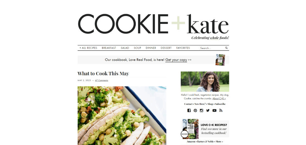
The pattern is consistent across Serious Eats, Food52, Cookie and Kate, and every other high-performing cooking site: design decisions serve the person cooking, not the content calendar.
Fast load times, clean recipe card UI, structured data, and mobile-first layouts aren't advanced concepts. They're table stakes.
Schema.org Recipe markup, WebP images, ingredient scaling, and print-friendly formatting all compound over time into measurable traffic and engagement gains.
Pick one area to fix first. Structured data if you have none. Mobile layout if your bounce rate is high. Recipe card consistency if your archive is a mess.
Good food blog design is just good UX applied to cooking content. Start there.


