


Top Marketing Website Templates to Boost Conversions
February 25, 2026
Gaming Website Design Examples to Inspire You
February 26, 2026Most educational websites lose students before a single lesson loads.
Poor navigation, inaccessible layouts, and cluttered homepages push learners away fast. The best educational website design examples prove that structure and clarity aren't optional. They're the whole product.
This article breaks down real platforms across K-12, higher education, open learning, and online course markets. You'll see what works, what fails, and which design patterns actually support learning outcomes.
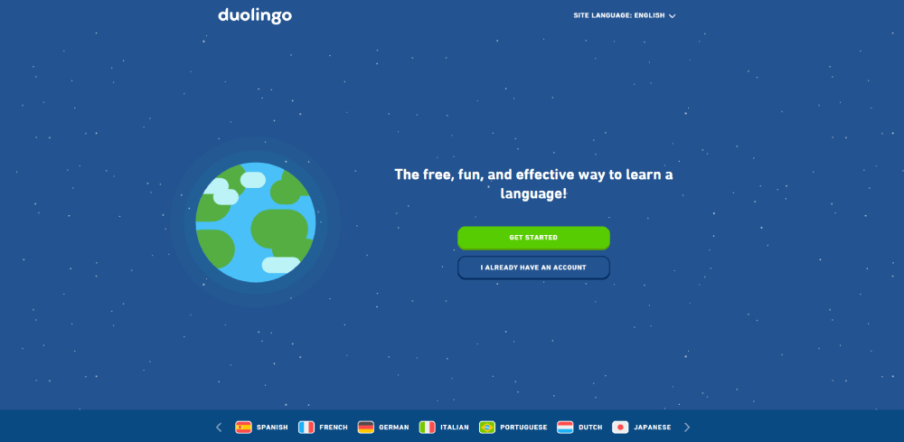
From Khan Academy's subject-based navigation to Duolingo's gamified student dashboard layout, the examples here cover:
- Effective course catalog and content hierarchy decisions
- Accessible, mobile-first learning platform design
- Tools and platforms behind the best-performing sites
What Is Educational Website Design
Educational website design is the practice of building digital spaces that support learning outcomes. Not just presenting information. Actually helping users understand, retain, and act on it.
That distinction matters more than most people realize. A marketing site wants you to convert. An educational site wants you to learn. Those goals pull design in completely different directions.
The global e-learning market reached USD 342.4 billion in 2024, according to IMARC Group, and is projected to nearly double by 2033. That kind of growth puts real pressure on design quality across K-12 portals, university sites, and self-paced learning platforms.
Three audiences show up repeatedly in educational web design, and they rarely want the same things:
- Students want fast access to content, progress tracking, and mobile-friendly layouts
- Educators want resource organization, class management tools, and clear dashboards
- Administrators or parents want trust signals, accreditation info, and enrollment paths
What separates educational design from other categories like SaaS websites or B2B websites is that the primary user goal isn't purchasing or converting. It's comprehension. That changes everything: content hierarchy, navigation depth, typography choices, color logic.
Well, and there's another layer. The user base is often non-voluntary. Students don't always choose their school's LMS. They're stuck with it. So usability isn't just a nice-to-have. It's the whole game.
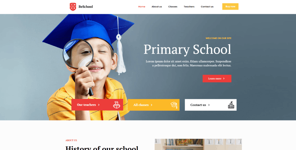
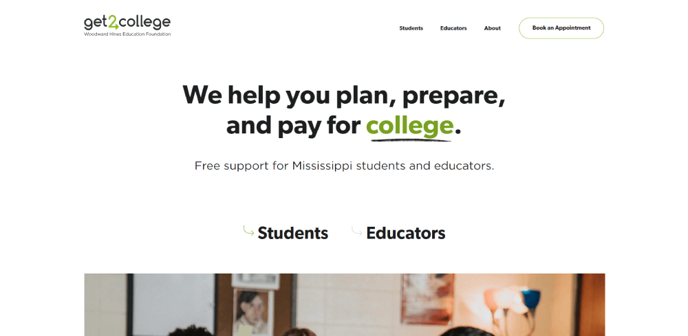
Educational Website Design Examples
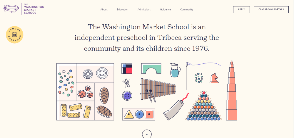
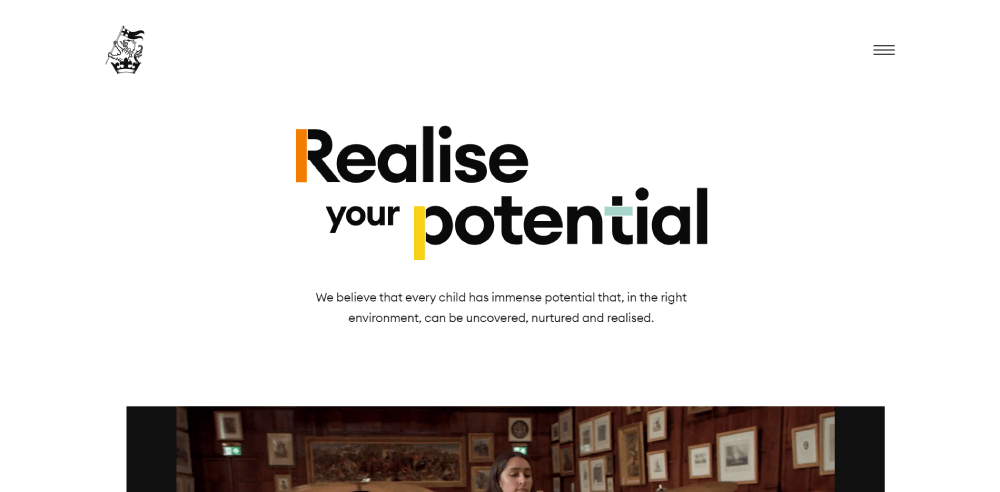
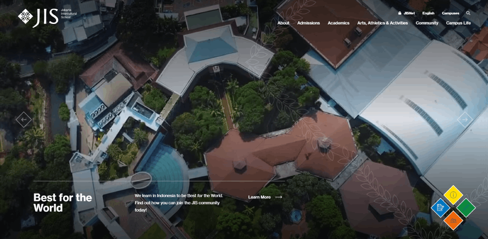
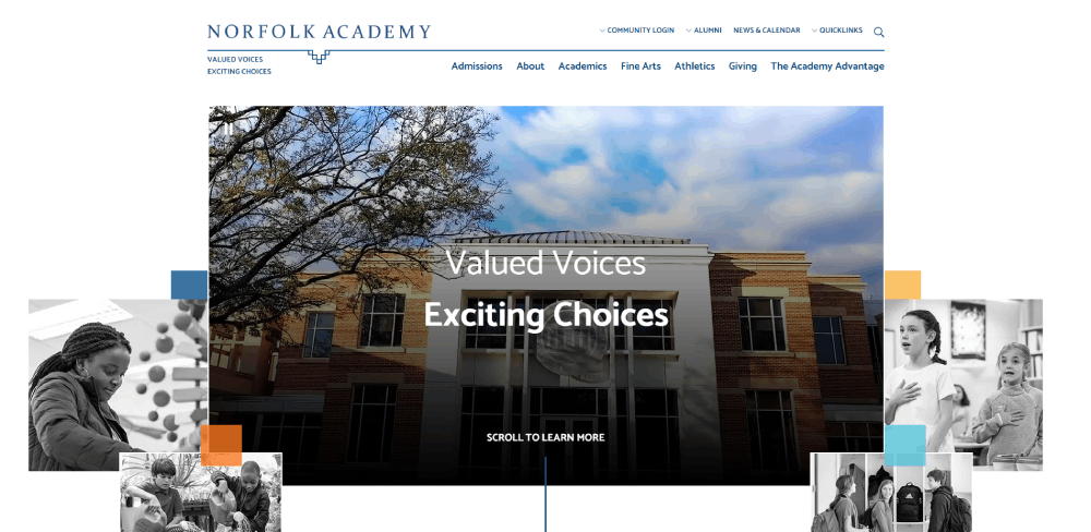
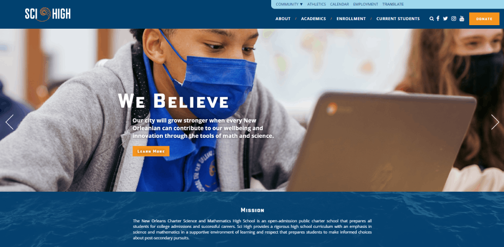
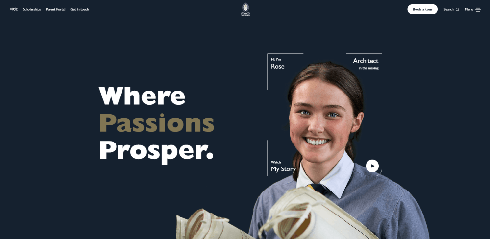
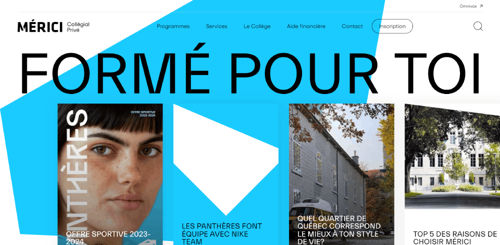
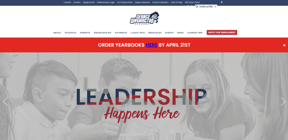
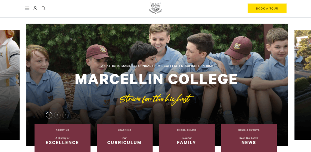
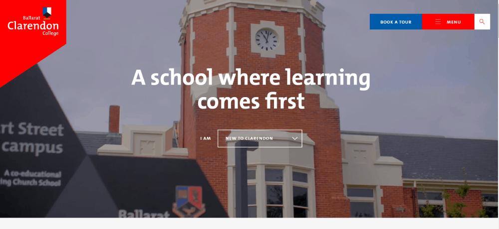
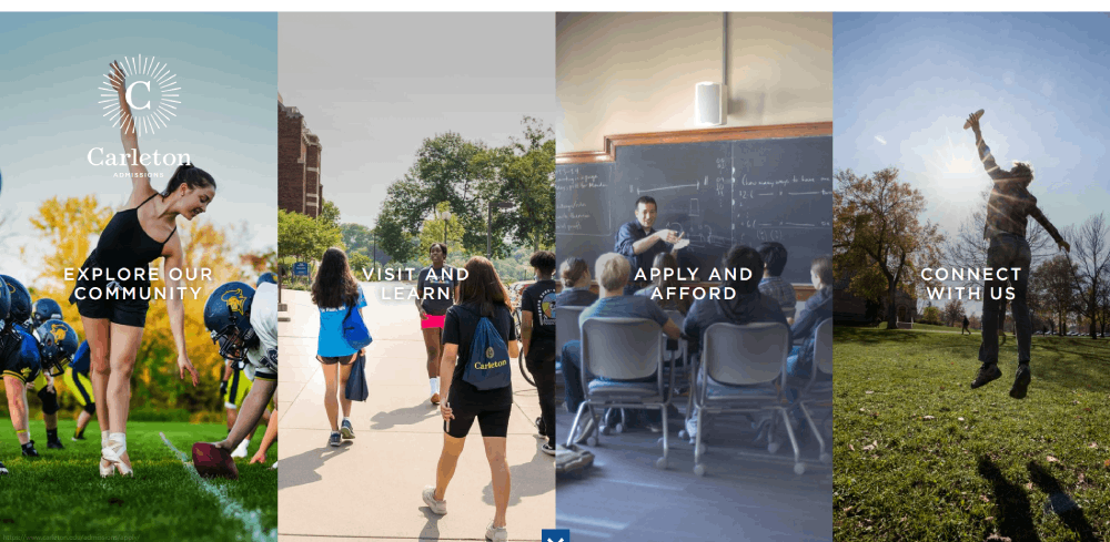
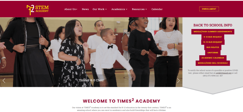
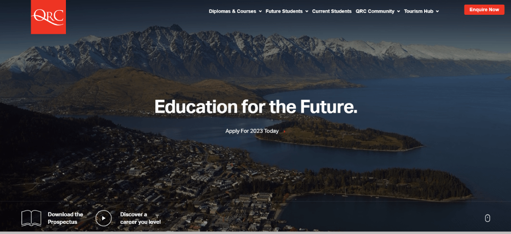
Wellington College


What Makes an Educational Website Design Effective
A few things keep coming up when you look at high-performing educational sites. None of them are surprising in isolation. Together, they're harder to get right than they look.
Navigation and Content Structure
Educational sites carry enormous content loads. Hundreds of courses, dozens of subjects, multiple user roles. Getting lost is easy. Good navigation prevents that from happening on the first visit.
The most common structural patterns across top-performing platforms:
- Audience segmentation on the homepage (students / teachers / parents / institutions)
- Subject-based navigation trees with clear visual hierarchy
- Persistent search with autocomplete for deep catalog browsing
- Breadcrumb trails on course and lesson pages
Khan Academy handles this well. Their left-side subject tree lets students drill down from "Math" to "Algebra 1" to a specific unit in a few clicks, without losing context. Looking at website navigation examples across industries, educational sites tend to use deeper hierarchies than almost any other category.
Accessibility and Inclusivity Standards
96.3% of homepages failed WCAG 2 compliance in 2023, per WebAIM's Million report. Educational sites aren't exempt from this problem. Actually, they're disproportionately affected.
The education sector entered the top three for accessibility lawsuits for the first time in 2023, according to Accessibilitychecker.org research. That's partly because the stakes are higher. A student with a visual impairment who can't access course materials isn't just frustrated. They're blocked from learning entirely.
The non-negotiable baseline for any educational site:
- WCAG 2.1 AA compliance minimum
- Screen reader compatibility across all course content
- Color contrast ratios that pass automated checks (low-contrast text appeared on 81% of homepages in WebAIM's 2024 report)
- Alt text on all instructional images
- Keyboard-navigable interfaces
Around 86% of universities globally have started implementing or formalizing digital accessibility policies, according to Tenet research. The gap between having a policy and actually executing it is still wide, though.
Accessible educational sites also tend to rank better. Search engines favor structured, semantically correct HTML. The same markup practices that help screen readers also help crawlers. That's a useful alignment to know about when making the case internally for accessibility investment.
| Design Element | Common Failure | Best Practice |
| Text Contrast | Low contrast on body copy | Minimum 4.5:1 ratio for normal text |
| Images | Missing alt text on diagrams | Descriptive alt text on all instructional visuals |
| Forms | Unlabeled input fields | Explicit labels linked to inputs; no placeholder-only labels |
| Navigation | Mouse-only menu interactions | Full keyboard navigation and visible focus states |
Key Design Patterns Across Educational Websites
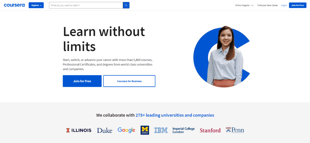
Spend enough time across Khan Academy, Coursera, BBC Bitesize, and university sites and patterns start repeating. Not because designers are copying each other. Because some structural decisions work at scale and others don't.
These are the ones that keep showing up.
Audience Segmentation and Homepage Routing
Every major educational platform routes users by role before serving them content. Students, teachers, parents, and institutions all want different things from the same domain.
The execution varies a lot:
- Tab-based routing (Scholastic's three audience tabs)
- Login-state detection (Khan Academy shows different homepages pre/post login)
- Subdomain separation (many universities split student.edu from main .edu)
Getting this wrong creates a homepage that feels like it's shouting at everyone and serving no one.
Progress and Engagement Indicators
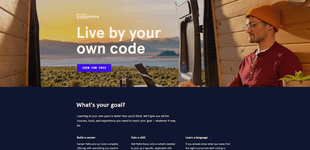
Duolingo's streak mechanic has over 500 million registered users partially hooked on a design pattern. That's not accidental. Progress indicators close the psychological loop between effort and reward.
Common implementations across the category:
Completion bars: percentage done at course or unit level.
Mastery signals: color or icon changes that mark topics as learned vs. practiced vs. new.
Certificates: Coursera and edX both found completion rates increased when certificates became more prominent in the UI.
The detail that separates good from great: showing progress in relation to a goal, not just as an absolute number. "You're 70% done" lands differently than "You completed 7 of 10 units."
Search-First vs. Browse-First Navigation
Two camps. Pick the wrong one for your audience and you'll feel it in your engagement metrics.
| Approach | Best For | Example |
| Search-first | Users with high intent and specific queries | MIT OpenCourseWare, Wikipedia |
| Browse-first | Users exploring topics or seeking inspiration | Skillshare, Udemy, BBC Bitesize |
| Hybrid | Mixed intent audiences requiring discovery + precision | Coursera, Khan Academy |
Most large platforms now default to hybrid. Prominent search bar plus a browsable subject grid, with personalized recommendations layered in for returning users.
Color as Wayfinding
This one's underrated. Khan Academy uses subject-specific color coding so consistently that students build spatial memory around it. Math is blue, science is green, and so on across the entire platform.
BBC Bitesize does the same across curriculum levels. The color theory application here isn't decorative. It's functional navigation infrastructure.
Building a solid color scheme into the information architecture from the start is significantly easier than retrofitting it later. Platforms that do this well rarely deviate from it. Platforms that don't end up with inconsistent color use that creates cognitive load instead of reducing it.
Common Design Mistakes in Educational Websites
Education website bounce rates hit 55.19% on average in OHO's 2022 measurements, up from 43.2% before 2017. Mobile traffic explains some of that. Poor design explains the rest.
These are the failure patterns that show up consistently.
Overloaded Homepages
Trying to serve too many audiences at once without routing them first. The result is a homepage that's visually busy, structurally ambiguous, and functionally useless for everyone.
Took me a while to pinpoint why some university homepages feel exhausting to look at. It's usually this: no clear primary action, no dominant visual hierarchy, and content blocks competing for attention at the same weight. The hallmarks of bad design in educational contexts often start here.
The FAFSA website is a well-documented case. Students reported confusing terminology and unclear multi-step flows that disproportionately affected lower-income applicants who lacked outside support to navigate it.
Broken Mobile Experience
53% of mobile visitors leave if a page takes more than 3 seconds to load, according to Google research. Educational sites with heavy video content and complex quiz interfaces are especially vulnerable.
The specific failure modes that keep appearing:
- Quiz interfaces with tiny tap targets (designed for mouse clicks, not thumbs)
- Video players that don't adapt to portrait orientation
- Multi-column layouts that collapse poorly on narrow screens
- Forms that trigger desktop keyboards instead of appropriate mobile input types
Education website bounce rates trend higher on mobile than desktop across every benchmark report. The gap between mobile and desktop experience is still wide for most platforms outside the top tier.
Accessibility Shortcuts That Fail Real Users
WebAIM's 2024 Million report found low-contrast text on 81% of homepages. Educational sites are in the education sector, which ranked third for accessibility lawsuits in 2023 for the first time. That overlap is not a coincidence.
The most common shortcuts that don't actually solve the problem:
Alt text added as an afterthought: "image.jpg" or blank alt attributes on diagrams that carry instructional content.
Overlay tools without real remediation: The European Disability Forum has stated clearly that accessibility overlays can interfere with users' assistive technology settings, sometimes making sites less accessible than before the overlay was added.
Real accessibility in educational UX requires structural work from the start. Form design that properly labels every input, keyboard-navigable quizzes, transcripts for video content. These aren't checkbox items. They're architecture decisions.
Burying the Course Catalog
Marketing copy above the fold. Course search three clicks deep.
This is the single most common navigation failure on mid-tier education platforms. Most visitors arrive with a specific subject or skill goal. If they can't find the catalog fast, they leave. The page load-to-browse window for new visitors is short.
A good website redesign process for an educational platform should start by tracking exactly how many clicks it takes to reach the first relevant course from the homepage. The answer is usually too many.
Tools and Platforms Used to Build Educational Websites
Canvas holds 50% of the North American higher education LMS market by enrollment, according to On EdTech's Year-End 2024 report. That dominance shapes what the underlying tech stack looks like for most institutional sites.
But LMS and front-end website design are different problems. Here's how the tooling actually breaks down.
LMS Backends
Canvas (Instructure): dominant in US higher ed, strong API, customizable front-end themes.
Moodle: holds 25% of the European LMS market (Grand View Research 2024), open-source, highly customizable but requires technical resources to implement well.
Google Classroom: second-largest in North American K-12 with 18% market share (ListEdTech). Minimal design flexibility but near-zero setup friction.
LearnDash / LifterLMS: WordPress-based LMS plugins for smaller institutions and course creators who want full front-end control without enterprise contracts.
Front-End Build Tools
The platform a site is built on determines the design ceiling more than most people admit upfront.
| Tool | Best For | Used By |
| WordPress + LearnDash | Small institutions, course creators | Independent educators, boutique bootcamps |
| Webflow | Visually custom, marketing-heavy sites | Smaller ed-tech startups, high-design cohorts |
| React / Next.js | Large-scale, performance-critical platforms | Coursera, Duolingo, Khan Academy |
| Moodle (Custom Theme) | Open-source institutional LMS | Universities in Europe, Latin America, Non-profits |
Coursera, Duolingo, and Khan Academy all run custom React or Next.js builds. The performance requirements at their scale (millions of concurrent users, global CDN distribution) make off-the-shelf solutions impractical.
For most institutions and smaller platforms, the choice between WordPress with an LMS plugin versus a headless CMS with a custom front-end comes down to one thing: do you have a developer on staff or not?
Testing and Accessibility Tools
No educational platform ships without running these. Or should be running them.
- axe DevTools for automated WCAG scanning during development
- WAVE (WebAIM's browser extension) for quick accessibility audits on live pages
- Hotjar for session recording and heatmaps on course and enrollment pages
- Google PageSpeed Insights for Core Web Vitals monitoring
Most platforms use at least two of these in combination. Automated tools catch around 30% of WCAG issues, per WebAIM's own research. Manual testing covers the rest. Both matter.
How to Apply These Design Examples to Your Own Educational Site
Looking at what Coursera, Duolingo, and Khan Academy do is useful. Knowing how to translate those observations into decisions for your own site is what actually matters.
Start with Audience Segmentation
Before touching colors, fonts, or layouts. Map your user types and what each one needs from your homepage. Then decide how you'll route them.
If you have a single audience (say, adult professional learners only) you can skip the segmentation overhead and design for one user type from the start. That's actually an advantage. Platforms like Skillshare and LinkedIn Learning do exactly this.
Most institutions don't have that luxury. Students, faculty, parents, and prospective applicants all arrive at the same domain. Figure out your routing logic before your visual design, or you'll be retrofitting it later at real cost.
Set One Primary Goal Per Page
Browse. Enroll. Learn. Review. Pick one.
The clearest educational sites in this list are clear because each page has a dominant purpose. Khan Academy's lesson pages are for learning. The dashboard is for navigating. The homepage is for entry-point routing. None of those pages try to do each other's job.
Mixed-purpose pages are where call to action buttons get buried and user flow breaks down. If a lesson page is also trying to upsell a premium subscription and surface related courses, the learning experience suffers. Your mileage may vary depending on your business model, but the principle holds.
Audit Your Mobile Experience Against Real Benchmarks
Education website bounce rates above 55% on admissions or enrollment pages indicate a mobile problem worth investigating, per Cube Creative's school website benchmark research.
Three things to check immediately on mobile:
- Does the page load in under 3 seconds on a 4G connection?
- Can a user find and complete the primary action (search, enroll, contact) without pinching or zooming?
- Do all form inputs trigger the right keyboard type (email, number, text)?
A mobile-first design approach from the start is significantly easier than auditing and patching a desktop-first site. Building responsive from the beginning is the better path for any new educational platform in 2025.
Run Accessibility Checks Before Launch
Not after. Run axe or WAVE during development, not as a final pre-launch checklist item.
The earlier an accessibility issue is caught, the cheaper it is to fix. Retrofitting keyboard navigation or restructuring heading hierarchy on a published site takes ten times longer than getting it right in the design phase. Building user-friendly websites starts with structural decisions in the wireframe, not the final code review.
Check your contrast ratios, label your form inputs, add meaningful alt text to every instructional image, and test keyboard navigation on your most complex interactive elements (quizzes, course players, progress dashboards). Those five things eliminate the majority of common WCAG failures before your site ever goes live.
Benchmark Your Speed Against Top Platforms
Khan Academy's lesson pages load fast. Coursera's course browse pages load fast. That's not accidental. Both platforms invest heavily in front-end performance because they know their users are on mobile, often on weaker connections, and won't wait.
Pull your Core Web Vitals in Google PageSpeed Insights. Compare your LCP (Largest Contentful Paint) against the 2.5-second threshold. If you're over it consistently, especially on mobile, that's where you start. Web design tools like Figma are helpful for prototyping, but performance is a development concern that needs measurement, not estimation.
The gap between what the top platforms get right and what mid-tier educational sites get wrong isn't budget. It's priorities. Decide early that navigation clarity, accessibility, and load speed are non-negotiable. Then build backward from those constraints. That's actually how most of the sites in this list got where they are.
FAQ on Educational Website Design
What makes a good educational website design?
Clear navigation, accessible layouts, and fast load times. Good educational website design puts the learner's goal first. Every page should have one dominant purpose: browse, enroll, or learn. Audience segmentation and mobile-first structure are non-negotiable.
What are the best educational website design examples?
Khan Academy, Coursera, Duolingo, and BBC Bitesize consistently rank among the strongest examples. Each handles content hierarchy, progress tracking, and mobile learning differently but effectively. MIT OpenCourseWare is worth studying for minimal, distraction-free course layout.
How should an educational website be structured?
Start with audience segmentation, then build subject-based navigation from there. A clear student dashboard, browsable course catalog, and persistent search cover most use cases. Keep the homepage routing simple: students, teachers, or admins should know immediately where to go.
What platform is best for building an educational website?
It depends on scale. WordPress with LearnDash works for smaller institutions. Canvas or Moodle suits universities. Large platforms like Coursera and Khan Academy run custom React or Next.js builds for performance at millions of users.
How important is accessibility in educational website design?
Critical. The education sector ranked third for accessibility lawsuits in 2023. WCAG 2.1 AA compliance is the minimum baseline. Low-contrast text, missing alt text, and unlabeled form inputs are the most common failures across learning platform interfaces.
What colors work best for educational websites?
Color should function as wayfinding, not just decoration. Khan Academy assigns distinct colors per subject so students build spatial memory. Any color scheme used on an educational site should pass contrast accessibility standards without exception.
How do you design a K-12 educational website?
Segment by audience first: students, teachers, and parents each need different entry points. Use larger typography, shorter content blocks, and clear visual hierarchy for younger users. BBC Bitesize and Scholastic both handle this segmentation at the design-system level, not just through content.
What is the difference between an LMS and an educational website?
An LMS like Canvas or Moodle manages course delivery, assessments, and student data. An educational website is the public-facing layer students and visitors see first. Many institutions run both: a custom front-end site with an LMS handling the actual learning management system backend.
How do online learning platforms handle mobile design?
The best ones design mobile-first from the start. Duolingo and Khan Academy both have fully functional lesson interfaces on narrow screens. Coursera reports significant mobile usage across its catalog. Poor mobile experience is the most common reason learners abandon a course mid-session.
What are common mistakes in educational website design?
Overloaded homepages trying to serve every audience at once. Course catalogs buried behind marketing copy. Inaccessible quizzes with small tap targets on mobile. Slow load times on video-heavy lesson pages. And skipping accessibility audits until after launch, when fixes cost significantly more.
Conclusion
This conclusion is for an article presenting educational website design examples across K-12, higher education, open learning, and dedicated e-learning platforms.
The pattern is consistent: the sites that work best treat structure as a learning tool, not an afterthought.
Platforms like Duolingo, Coursera, and MIT OpenCourseWare succeed because they align their student portal layout, course catalog design, and accessibility standards with actual learner behavior.
Audience segmentation, mobile-first design, and WCAG compliance aren't advanced features. They're the baseline every educational site should clear before launch.
Whether you're building on Moodle, WordPress with LearnDash, or a custom React stack, the principles stay the same: one purpose per page, fast load times, and navigation that gets out of the way.


