

The best relaxing websites to calm you and relieve stress
March 19, 2024
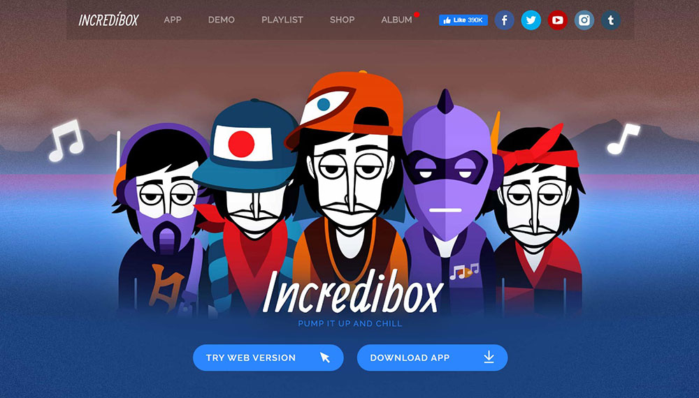
Stunning Car Detailing Website Designs to Inspire You
March 21, 2024Imagine the spine-tingling sensation of entering a sleek, well-orchestrated digital realm. The realm where every pixel serves a purpose, every choice in color and typography isn’t just happenstance; it’s strategic artistry designed to resonate with you—the user.
In the world of websites, web design principles are akin to the cardinal rules that guide this artistry. A blend of science and creativity, these principles are the bedrock upon which exceptional user experiences are built.
Here, we delve deep—not just into aesthetics, but functionality, accessibility, and the elusive dance of engaging a visitor from the first click.
You’ll journey through the secrets of responsive layouts, the wisdom of visual hierarchies, and how to wield typography that speaks volumes more than words alone.
By articulating these fundamentals, we’re constructing more than just a site; we’re sculpting digital experiences that resonate.
So transform your curiosity into knowledge as we navigate the cornerstones of crafting a compelling web presence, where every element from UX design to mobile-friendly interfaces harmonizes to serve the modern internet dweller.
This article isn’t merely an exploration; it’s your map to mastering the medium, ensuring every site you touch becomes a digital masterpiece.
Principle of Visual Hierarchy
Imagine you walk into a room for a party. Your eyes dart about, and you quickly see where the action is, right? Who’s dancing, who’s eating, where the drinks are at. That’s sort of what visual hierarchy does on a web page. It’s all about laying out bits and bops so that visitors can tell at a glance what’s what.
Organizing elements by order of importance – that’s the core of it. You’ve got your kings, your queens, and all the way down to the pawns. The big cheeses get the spotlight while the little guys support from the shadows. It’s like when you’re scanning a menu; the delish dishes stand out, so you don’t have to wade through all the blah stuff.
You gotta guide the user’s attention like you’re a tour guide in the jungle. A flick of the wrist here, a little “looky-loo” there, and bam! They see the stuff that matters most. You gotta be slick about it, and a good visual hierarchy is your trusty map.
Implementation Strategies
Every Harry and Sally has a trick to make things pop on a webpage. Let’s break it down:
Size and scale – It’s a no-brainer, really. You see something big, you look at it; it’s catch-your-eye-101. So, slap your big deals in big fonts or images, and shrink down the less vital stuff. Just like at a rock concert, the lead singer is front and center, larger than life, and the drummer’s chilling in the back, still cool but less in-your-face.
Color and contrast – It’s like graffiti art. Throw in some bold colors against a bland backdrop, and boom, you’ve got a masterpiece. Play with colors – a neon sign against a dark alley, that’s the vibe you wanna be hitting.
Spatial positioning – Where you park stuff on your page matters like crazy. Top, down, left, right – it’s all real estate gold. Put your VIP content in the penthouse slots where eyes land first. Sidebar content, that’s your ground floor – important but not the glitzy penthouse suite.
The Golden Ratio and Divine Proportions
Way back, like, ancient times back, folks stumbled upon this wicked pattern in nature. They called it the Golden Ratio, a fancy term for a simple idea: certain proportions just look good, feel right.
Origin and mathematical foundation – Picture a spiral seashell or the way branches grow out from a tree. That’s nature riffing on the Golden Ratio. Math geeks vibrate with excitement over it because it pops up everywhere, from the Parthenon to Mona Lisa’s smile. It’s like the universe has this secret design playbook, right?
Application in art and architecture – Yo, it’s not just about old stuff tucked away in museums. It’s the blueprint for coolness — an invisible grid that artists and architects jam on to create eye-catching marvels. They knew this secret sauce of ratios could make their work a feast for the eyes.
Application in Web Design
Fast forward to the screen you’re glued to. Those principles of web design we all dig, they haven’t ditched the Golden Ratio. It’s as rock ‘n roll today as it was in Leonardo da Vinci’s day.
Layouts and grid systems – You lay down some grids on your web page, basing them on the Golden Ratio, and what you get? A layout that’s got groove. It’s like laying out a vibe that guides the eyes across the page, making everything feel just right.
Typography and image placement – Dive into the typefaces and where stuff sits on a page. The Golden Ratio can help you scale headers, subheaders, images, even text blocks so everything looks harmonious, like all elements are best buddies jamming in a band.
Hick’s Law in Web Design

Alright, imagine you’re at an ice cream stand with like, a bazillion flavors. It’s awesome but also kind of paralyzing, right? That’s Hick’s Law in the wild. The more options you’ve got, the longer it takes for you to choose.
Decision time and the number of choices – It’s like, every extra flavor is a few more seconds of “Umm, uh.” Now slam that thinking onto a webpage. Every button, link, or flashy doo-dad is another scoop of choice. ‘Course you want to give folks options, but you also want them to get a move on and not bail.
Implications for web design — See, it’s not just about dropping choices left and right; it’s about setting the table so it’s easy to pick. Slap down too much, and that table gets messy. You want people feeling good about picking, not running for the hills. So, when you’re laying down those principles of web design, Hick’s Law is like your friendly neighborhood traffic light saying, “Easy there, cowboy. Keep it chill with the choices.”
Simplifying Choices for Users

Just because you’ve got a paintbox with all the colors doesn’t mean you use ’em all at once, right? It’s about picking the right shades for the moment. Same goes for web stuff.
Navigation menus – Think about those nav menus. They’re like the signposts of the digital highway. Too many signs, and it’s chaos, like a spaghetti junction. Keep it straightforward, and it’s smooth sailing. Your mission: get folks where they’re going with just enough signs so they don’t get lost but also don’t crash from sign overload.
Forms and call-to-actions (CTAs) – Every form’s like a convo and every CTA like a handshake deal. Keep ’em clear and easy. No one wants to fill out a million fields or click through a maze to get stuff done. Hit ‘em with the sweet spot: enough info to get the job done, zero fluff.
Fitt’s Law and Interaction Design
So get this, Fitt’s Law – it’s like the physics of how we interact with stuff on screens, from zapping aliens in a game to just scrolling through a feed. If you’ve gotta poke a teeny tiny button or make a loooong trek across the screen with your mouse, that’s gonna feel like a chore, right?
The relationship between target size, distance, and usability — Think of it as a game of darts. The closer and bigger the bullseye, the easier it is to nail it. That’s your big hint for designing stuff you interact with. Keep the bullseyes – your buttons and other clickables – within easy reach and big enough to hit without sweating it.
Implications for interface design — So if you’re putting together a page and want folks to click on stuff without throwing their mouse out a window, you’ve gotta get cozy with Fitt’s Law. It says, “Hey, make it a breeze to click or tap.” You respect the Law, and users will zip around your site, happy as clams.
Optimizing Web Elements
Let’s break it down – you want your site to be like that one buddy’s place everyone wants to chill at. Comfy, easy, no hassle. That’s how you want your buttons and menus to feel.
Button design and placement — Buttons should be like those easy-to-spot signs at a concert telling you where the bathrooms are. Obvious, easy to find, and not a brain-buster to use. Slap those suckers where people expect them to be and give ’em enough size to not need a magnifying glass.
Interactive elements and touch targets — Now, we’re not all playing on giant screens or baby-sized smartphones. Nope. We’re dealing with all sorts of screens, all day, every day. But a fingertip’s still a fingertip, whether on a phone or a tablet. Make sure those touch targets are roomy enough for even the biggest thumb in the room.
The Rule of Thirds in Composition
Let’s chat about the Rule of Thirds – it’s like the secret sauce behind those snaps that get all the likes. Break your screen into a grid, three by three, sort of like tic-tac-toe, and boom, you’ve got your guide.
Visual composition and balance – You plonk the important bits, the real eyeball grabbers, where those lines cross or along the lines themselves. It’s like placing the cherry on top of a cake so it looks just right, not too far left, not too wonky to the right.
Enhancing aesthetic appeal – Doing this isn’t just about following some rigid rules; it’s about feeling the flow. It’s taking that wild idea in your head, and using the Rule of Thirds to give it structure, making it as catchy as a pop tune’s chorus.
Application in Web Design
So, here’s how it rolls out in the digital world, the realm where pixels and code get all mixed up into the cool stuff we browse every day.
Image placement and cropping — Snag an image. Now chop and screw it using the Rule of Thirds, so the juicy parts are sittin’ pretty in those power spots. It’s about making visuals that stick in someone’s mind long after they’ve scrolled past.
Layout structuring for content and sidebars — It ain’t just about pretty pictures; it’s about where you drop your text boxes, sidebars, even your calls to action. Use the Rule of Thirds as your grid map and watch content snap into place like Lego blocks.
Gestalt Design Laws

So, there’s this brainy concept called Gestalt Psychology, right? It’s all about the big picture — how our noggins prefer to see things as whole shapes and patterns, not just a mish-mash of parts.
Overview and principles — We’re wired to see structures and figures in everything, finding faces in clouds and whatnot. That’s just us trying to make sense of the chaos. And these principles? They help us understand the “why” behind what we see and dig.
Relevance to visual perception — It’s not just fancy talk for the nerdy crowd; it’s core stuff for what looks good and feels right. When you line up your visuals in a way that’s tight with Gestalt principles, you deliver an experience that feels like your favorite track — everything in harmony, nothing jarring or out of place.
Key Gestalt Laws Applied to Web Design
Here’s where we zoom in on some of those laws and go, “Okay, how do we make this web party pop?” It’s about crafting those principles of web design so that they hit home and stick with folks.
Law of Proximity — Buddies hanging close together are seen as a group. Same goes for buttons or images. Pack ’em close, and folks will see them as related. Like cupcakes on a tray, you just know they’re all about the sweet tooth party.
Law of Similarity — Things that look similar are seen as part of a team. Round up designs or color themes, and it’s like they’re wearing the same jersey, playing for the same side.
Law of Closure — Ever seen a broken circle but still know it’s meant to be a circle? That’s closure. Your brain fills in the gaps. Use that on webs, and you can create neat icons or layouts that feel complete even when they’re playing peek-a-boo.
Law of Symmetry — We dig balance, like an evenly loaded see-saw. Symmetrical designs give off a vibe of calm and order. It’s like walking into a well-organized room and thinking, “Yeah, this is the spot.”
Law of Common Fate — Elements moving in the same direction? We see them as part of a convoy on a road trip to the same destination. Think parallel sliders or scrolling animations that guide your gaze through the page.
White Space and Clean Design
So picture this: You’re chilling in your room, and there’s space to breathe, no clutter. That’s what white space does on a website. It’s about giving each part of the page room to stand out — like each element gets its own spotlight.
Improving readability and focus — Think about cracking open a book that’s not jammed with text. The margins, the line spacing — they’re like a visual sigh of relief. They make you wanna keep reading, not run for the hills.
Balancing design elements — It’s all about not going bananas with content. Slap stuff all over and it’s like a yard sale gone wild. But if you space things out, it’s more like an art gallery. Each piece gets its due and the whole vibe is just more zen.
Strategies for Effective Use
Alright, let’s dig into making that clean design sing.
Margins and padding — Talking about that breathing room around blocks of text or images. The space inside a button, that’s padding. The gap around it? Margins. It’s like personal bubbles in web form, and everyone’s got space to not feel cramped.
Breaks in content and visual resting points — Ever binge-watch a show and just need a pause? It’s like that. Intervals between different sections of a website give your eyeballs a break. You can actually take stuff in without feeling blitzed by info.
Occam’s Razor: Simplicity in Web Design
Ever heard of Occam’s Razor? It’s this idea that the simplest path is usually the right one. Like, why wear two watches when one tells the time just fine?
The simplest solution is often the best – It’s all about cutting the fluff. You land on those websites that are clean and easy, and you think, “Ah, everything makes sense here.” That’s Occam’s Razor at play. It’s not being lazy; it’s being clever.
Application to web design decisions — Every time you’ve gotta make a call on your project, Occam’s whispering, “Hey, keep it real. Simple is fly.” Take those principles of web design and strip them down to what’s tight and right. No more, no less.
Achieving Simplicity
Seems easy, right? But real talk, simplicity’s a craft. It takes a savvy kind of know-how to look at all the jazz you could do and say, “Nah, let’s go minimalist.”
Minimizing unnecessary elements — It’s like decluttering your room but for your website. Tossing out those knick-knacks that just collect dust and keeping the stuff that matters. ‘Cause when you clear out the clutter, the gems get to shine.
Focusing on core content and functionality — Zoning in on what your visitor’s there for. Not the blinking ads or the flashy, what-the-heck-do-they-even-do buttons. Just the good stuff, the meat and potatoes.
FAQ On Web Design Principles
What are the fundamental principles of web design?
Solid web design starts with a clear purpose. Every element, whether it’s the color scheme or navigation, must cater to the end user’s experience.
Think user-friendly interfaces, cohesive visual hierarchy, and responsive layouts that adapt across devices. Designing for accessibility is also non-negotiable; everyone deserves a seamless web experience.
How does color theory impact web design?
Color theory isn’t just about making things look pretty; it’s psychological. Colors evoke emotion, denote importance, and guide users through your site.
A well-thought-out color palette can increase brand recognition and drive user behavior. It’s about the strategic use of contrast and palette to create a harmonious and functional user interface.
Why is typography important in web design?
Typography is a silent ambassador of your brand. It boosts readability, creates atmosphere, and ensures easy navigation through the web content.
The right font pairing improves user comprehension and engagement. It’s not just what you say, but how it’s presented that can turn skim-readers into absorbed audiences.
What is responsive design?
In a world where your website might be viewed from a smartphone, tablet, or desktop, responsive design ensures a consistent, functional experience.
It’s the art of crafting a site that adjusts gracefully to any screen size, maintaining usability and aesthetic without compromise—vital for keeping users happy and on-page no matter their device.
Can you explain the importance of mobile-first design?
Sure, mobile-first means designing for the smallest screen first and scaling up. It prioritizes load speed and navigation for touchscreens, tapping into the vast mobile-using demographic.
It’s not just a trend; it’s a recognition that a majority of web traffic is mobile. A seamless mobile experience is now expected.
What does ‘user experience’ encompass in web design?
User experience is the totality of emotions and attitudes someone has interacting with your website. It’s not just about looks; it’s about how easy it is to find information, how quickly the site loads, and how pleasant it is to navigate. Superior UX keeps users coming back.
How does a website’s layout affect user behavior?
A layout is like a map for your visitors—it guides them where to go. A good layout ensures that the most important information catches the user’s eye first.
Predictable navigation patterns, the strategic placement of CTAs, and the efficient use of white space make for intuitive site interactions.
In what ways do SEO and web design intersect?
SEO-friendly design is about more than keyword counts. It intertwoles with site structure, mobile optimization, page speed, and user-friendly layouts.
These elements work synergistically, improving your site’s visibility while ensuring visitors stay longer and interact more—the dream team of enhanced user experience and search engine love.
How do accessibility standards play into web design principles?
Accessibility ensures every visitor, regardless of disability, can interact fully with your site. It’s a commitment to inclusive design that involves screen reader compatibility, keyboard navigation, and clear content structure.
It’s not only ethical but broadens your audience while boosting SEO—Google favors accessible sites.
What role do visuals play in web design?
Visuals are the hook that snags attention. They break up text, explain complex ideas simply, and set an emotional tone.
When used judiciously, visuals can increase engagement, comprehension, and retention. They’re the sprinters on your relay team, carrying the baton of communication swiftly to your audience.
Conclusion
Let’s reel it back in. We’ve journeyed through the realm of web design principles, charting the course from typography to responsive design, from user experience to the might of mobile-first approaches. It’s clear, isn’t it? The devil’s in the details—the subtle play of colors, the crispness of an image, the fluidity of transitioning across devices.
We’ve unraveled the wisdom behind the why, pulling back the curtain to reveal the driving forces that make a website not just good, but undeniably great.
- Harmonious layouts,
- Intuitive navigation,
- A pinch of visual flair,
they’re not just ideals; they’re indispensable tools in a digital artisan’s kit. As we part ways, remember—embracing these principles isn’t a checkbox exercise. It’s a constant pursuit of digital excellence, where each pixel serves a purpose. Now go forth, craft with purpose, and elevate the web one design at a time.
If you enjoyed reading this article on web design principles, you should check out this one about accessible website examples.
We also wrote about a few related subjects like the best corporate websites, the best-looking tourism websites, hotel website design, product landing pages, cool-looking personal trainer websites, top-notch musician websites, the most impressive luxury websites, and impressive animated websites.


