


Custom Variation Swatches in WooCommerce: How to Implement Modern Product Variations in the Betheme
March 18, 2026
The Best Interior Design Website Templates For Stylish Portfolios
March 19, 2026Your tourism website is often the first thing a potential traveler sees, and most sites lose that visitor in under 10 seconds.
The best tourism website design examples share specific traits: fast load times, clear booking flows, destination photography that earns trust, and navigation that works on any device.
This article breaks down what those sites actually do well, with real examples from destination boards, tour operators, and boutique hotel properties.
You will find design patterns worth borrowing, common mistakes worth avoiding, and a practical look at the tools and platforms behind high-performing travel sites.
What Is Tourism Website Design?
Tourism website design is the process of building digital platforms that convert destination curiosity into confirmed bookings, inquiries, or itinerary plans. It is not general web design applied to a travel topic.
The distinction matters. A standard business site presents information. A tourism site has to move a visitor emotionally, answer practical trip-planning questions, and close a booking, often within the same session.
Core components of a tourism website
4 functional layers define every well-built tourism site:
- Destination storytelling: Visual content that creates want before logic kicks in
- Booking or inquiry flow: The path from interest to confirmed action
- Trust infrastructure: Reviews, accreditations, cancellation terms, real photography
- Local content layer: Itineraries, maps, seasonal guides, and practical logistics
Miss any of these and the site becomes either a brochure (no conversion path) or a booking form (no emotional pull).
How tourism web design differs from other site types
The buying cycle is longer and more emotional. A traveler is not buying a product they can return. They are pre-committing to an experience months in advance, often spending thousands of dollars on something they cannot fully evaluate until they arrive.
That psychology shapes every design decision, from how photography is selected, to how cancellation policies are presented, to how many steps sit between landing page and payment.
The typical traveler visits 38 websites before confirming a booking (WeGoPro, 2024). Tourism site design has to earn re-visits and reduce drop-off at every stage of that research loop.
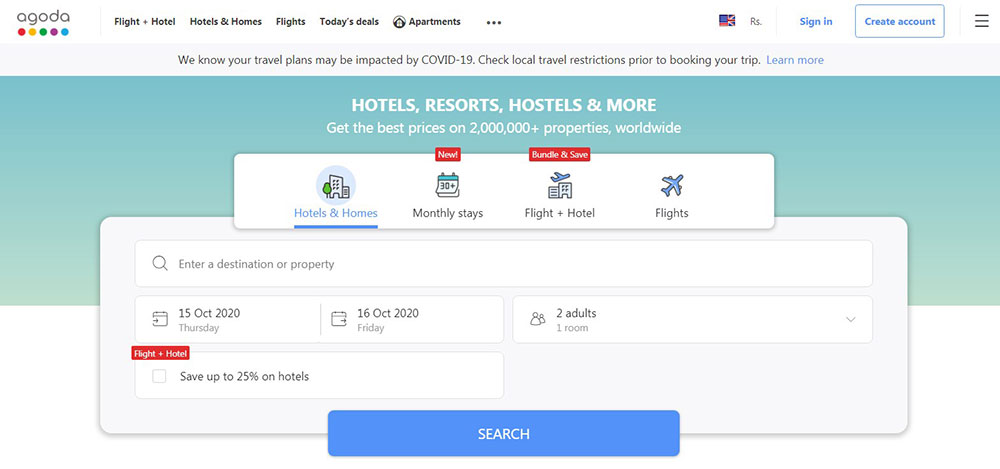
Common platforms used to build tourism sites
| Platform | Best For | Booking Engine Options |
|---|---|---|
| WordPress | Tour operators, DMOs, small-mid agencies | WP Travel Engine, WooCommerce Bookings |
| Webflow | Design-led boutique travel brands | Third-party embed (FareHarbor, Rezdy) |
| Custom React/headless CMS | Large destination boards, OTAs | Contentful + custom API |
| Squarespace | Very small operators, travel bloggers | Limited native options |
Most independent tour operators land on WordPress with WP Travel Engine because the setup cost is low and the booking functionality covers 90% of use cases without custom development.
Tourism Website Design Examples
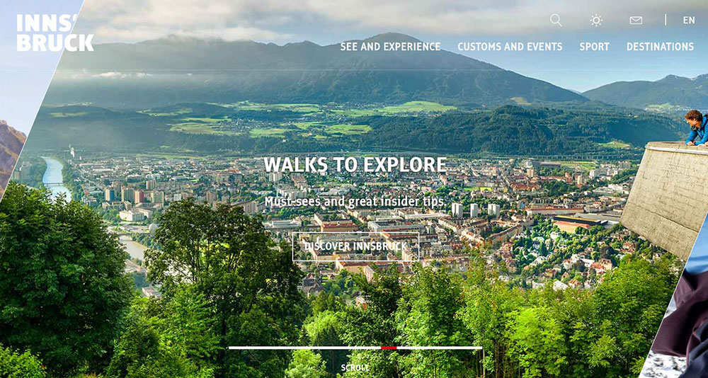
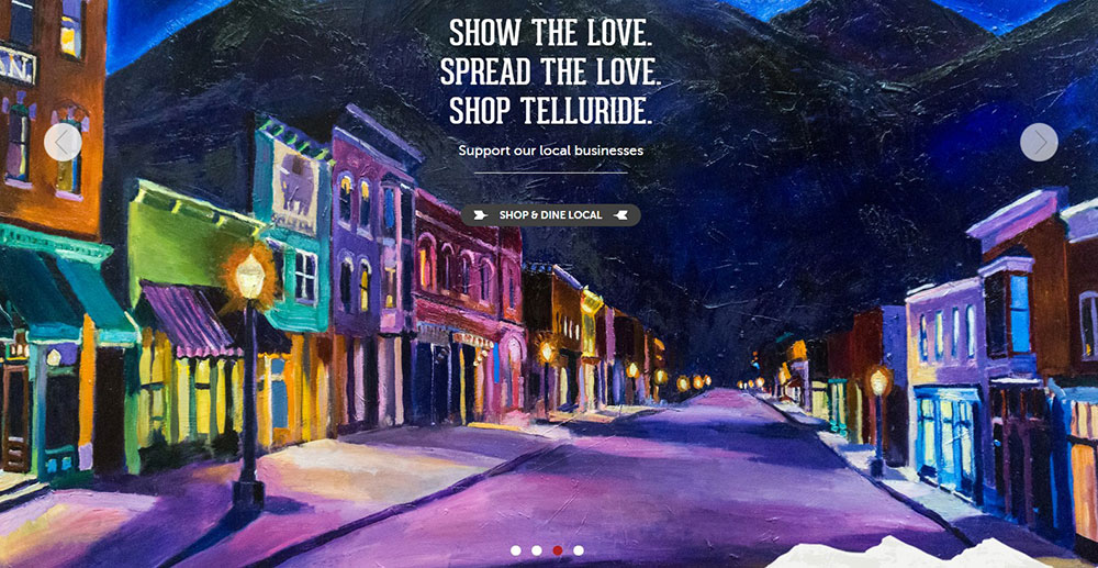
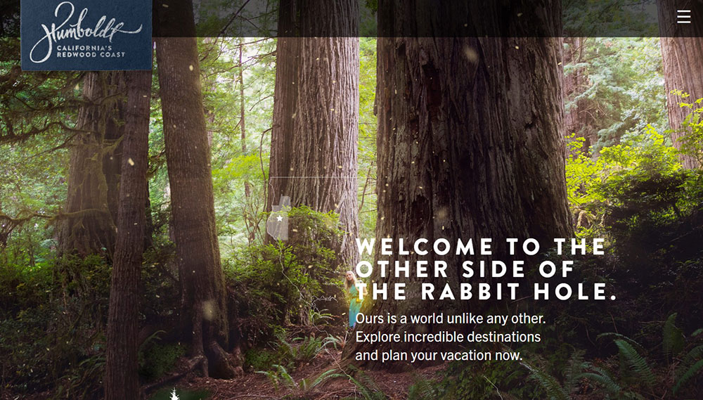
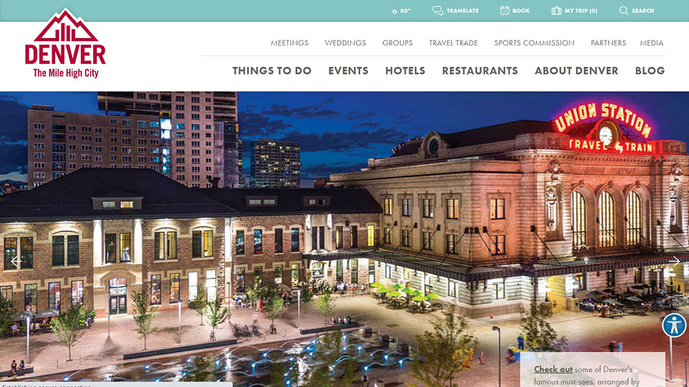
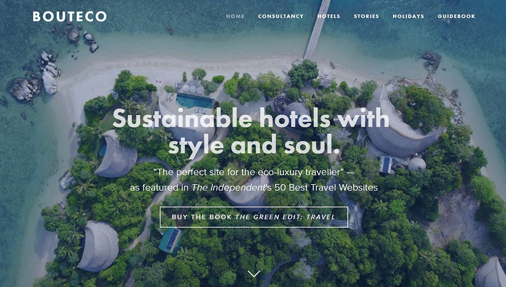
Telluride, Colorado

What Makes a Tourism Website Design Effective?
Effective tourism website design moves visitors from inspiration to action without friction. It is measurable: 69% of tourism sales occurred online in 2023 (Statista), and the sites capturing that revenue share specific design characteristics.
Page speed and Core Web Vitals
Travel sites load slowly by default. High-resolution destination photography and video backgrounds are standard, and both destroy load times if unoptimized.
Google's Core Web Vitals directly affect search rankings for travel queries, which are heavily location-based. A site with a Largest Contentful Paint score above 4 seconds loses organic visibility and users at the same time.
The fix is not removing visuals. It is serving compressed WebP images, lazy loading below-the-fold content, and offloading video to CDN delivery rather than hosting directly.
Visual hierarchy and the path to conversion
Most tourism homepages fail at one specific point: they inspire but do not direct. A visitor feels excited, then has no obvious next step.
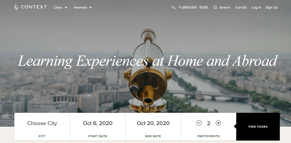
Strong visual hierarchy solves this by placing the booking or inquiry CTA within the first viewport, supported by a hero image or video that sets destination context immediately. The hero section is not decoration. It is the first conversion prompt.
Baymard Institute research found that 30% of travel accommodation sites fail to make the booking search feature the primary element on the homepage. That is a direct conversion loss.
Trust signals that reduce booking hesitation
Travel bookings involve high financial commitment and zero ability to preview the experience. Trust signals exist to close that gap.
3 trust signals that show up consistently on high-converting tourism sites:
- Third-party review integration (TripAdvisor widgets, Google Reviews) near booking CTAs
- Real guest photography mixed with professional shots, not stock images exclusively
- Transparent cancellation terms visible before the payment step
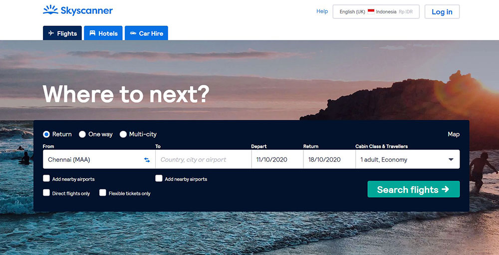
Baymard found that 85% of tour and experience sites fail to link to third-party reviews. Skyscanner is a notable exception, clearly labeling sponsored results and building trust through transparency.
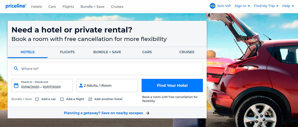
Booking flow friction points
3 steps is the benchmark. High-performing travel sites keep the path from search to confirmation to 3 clear steps when the product allows it. Each step has one task.
Research from UlanSoftware shows mobile drives about 65% of travel visits but converts at only 0.7%, compared to 2.4% on desktop. That gap is not intent-based. It is design-based. Long forms, small tap targets, and multi-page checkout are the culprits.
Multilingual support and accessibility
International tourism sites that serve multiple source markets need WPML or equivalent multilingual support baked into the build, not added later.
Accessibility is not optional for destination marketing organizations (DMOs) receiving public funding. Proper contrast ratios, keyboard navigation, and alt text on destination photography are baseline requirements, not nice-to-haves.
What Design Patterns Appear Across Top Tourism Websites?
Strong tourism sites do not look the same, but they share 5 structural decisions that appear consistently across the best examples.
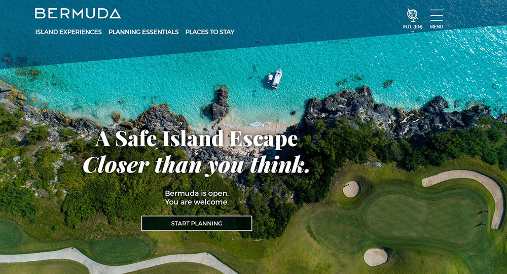
Full-width hero imagery or video above the fold
Every destination board and most tour operator sites open with a full-width visual. This is not a trend. It is a response to how travel decisions actually start: with emotional pull, not rational evaluation.
The debate is whether to use a static hero image or a video background. Video creates more immersion but carries real performance costs. Sites using video backgrounds that perform well do 3 things: compress aggressively, load a static image fallback for slow connections, and keep the video under 15 seconds before looping.
Visit Iceland and Tourism Australia both use full-width hero visuals with booking search positioned directly beneath, not separated by additional content blocks.
Sticky navigation with a visible booking CTA
Sticky headers solve a specific tourism UX problem. Users scroll through destination content, get inspired, then have to scroll back up to find the booking entry point. A sticky nav with a persistent "Book Now" or "Plan Your Trip" button removes that friction entirely.
Checking the navigation patterns used by high-converting sites, sticky headers with a contrasting CTA button appear in roughly every top-performing example in the category.
Interactive maps for destination exploration
57% of tour and experience sites fail to provide a map on the tour details page, according to Baymard Institute. That is a significant gap because maps answer one of the most common pre-booking questions: "Where exactly is this, and how does it fit into my trip?"
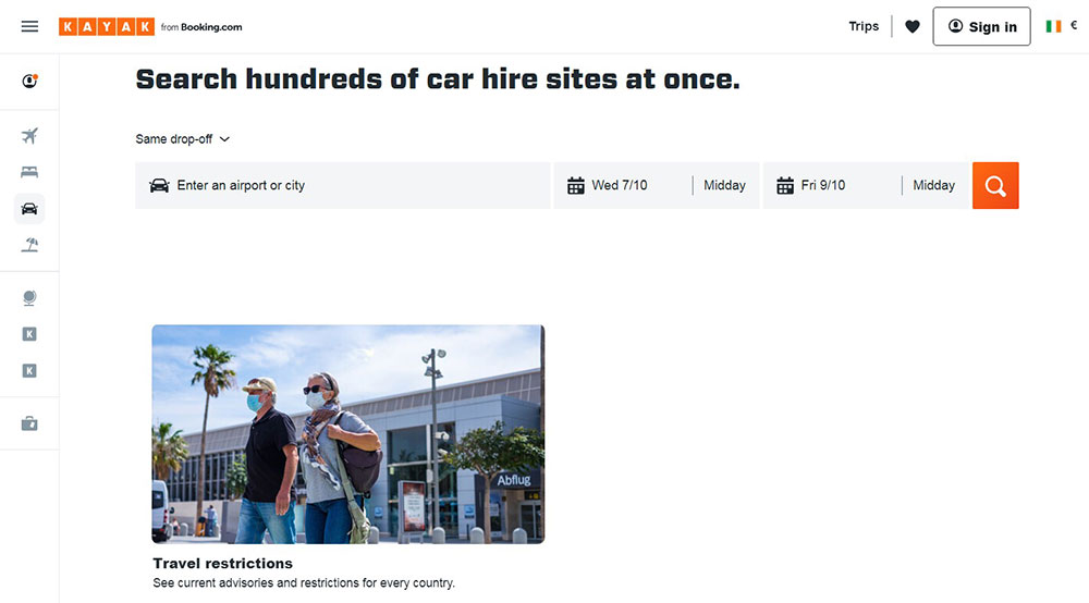
Kayak uses a dynamic interactive map showing flight prices from a detected location, updating in real time as users adjust dates and budget. On The Grid organizes its entire city guide content through an interactive map interface. Both approaches reduce the research effort users need to invest.
Social proof placement near CTAs
Review counts, star ratings, press mentions, and accreditation badges placed near booking CTAs (not buried in a footer or standalone review page) show a consistent pattern in conversion-focused tourism design.
4 in 5 hotel customers who are asked to leave a review do so (TripAdvisor data). The supply of social proof is not the problem. Placement is. Sites that surface TripAdvisor ratings directly on package cards and tour listing pages outperform those that link to a separate testimonials page.
Seasonal content and availability indicators
Dynamic content blocks that reflect seasonality (winter vs. summer itineraries, current weather, "limited spots remaining") reduce the mental work users do when planning.
Travel Oregon's site includes a "Surprise Me" button that surfaces random destinations. Devil's Lake, ND uses arrow-shaped navigation to direct visitors into a personalized guide based on interest type. These features answer a real problem: too much choice creates paralysis, and paralysis kills bookings.
How Do Tourism Websites Handle Mobile Design?
Mobile drives 68% of all travel and hospitality website traffic (ContentSquare via Statista, 2024), but desktop converts at 7.6% versus just 2.6% on mobile. That conversion gap is the defining challenge in tourism mobile design right now.
Why the mobile conversion gap exists
The gap is not explained by user intent. Travelers on mobile are not less motivated to book. The problem is interface design.
3 design failures cause most mobile drop-off on tourism sites:
- Booking forms built for desktop that require excessive scrolling on small screens
- Date pickers and calendar widgets that are difficult to use with thumbs
- Payment pages that feel insecure or are difficult to read on small viewports
Booking.com's app saw 66 million downloads in 2024 (Prostay, 2024). That scale comes partly from years of mobile UX refinement: large tap targets, autocomplete on form fields, and a checkout flow that stays under 3 steps for returning users.
Thumb-zone design and touch-friendly navigation
The thumb zone is the screen area reachable without shifting hand grip. On a standard smartphone, this covers the bottom 60-70% of the display. Critical CTAs, filters, and navigation elements placed outside this zone increase drop-off.
High-performing mobile tourism sites use sticky bottom bars with the booking CTA, collapse filter menus behind a single tap, and give immediate visual feedback after every interaction so users know the app registered their input.
Mobile image compression and fallback behavior
Tourism sites are visually heavy by nature. On mobile, that weight becomes a load-time problem. Sites serving full-resolution JPEG hero images to mobile connections regularly score poorly on PageSpeed Insights.
The pattern that works: WebP format with responsive sizing (srcset), lazy loading for below-fold images, and a compressed static image as fallback for video backgrounds. Visit Iceland applies this correctly. Their mobile scores reflect it.
Mobile booking flow specifics
| Flow Element | Best Practice | Common Failure |
|---|---|---|
| Date picker | Native mobile calendar or large-touch custom widget | Desktop-style small calendar |
| Guest configuration | Stepper buttons (+/-) for guest counts | Dropdown menus with tiny tap areas |
| Payment form | Autofill enabled, card scanning option | Manual entry only, no formatting |
| Confirmation | Single-screen summary with edit option | Multi-page confirmation requiring back navigation |
Around 35% of all travel bookings are now made on mobile devices (Stratos Jets, 2024). Sites that still treat mobile as a secondary experience are ceding a third of their potential bookings to competitors with better mobile UX.
What Visual Design Choices Work Best for Tourism Websites?
Visual design in tourism is not about aesthetics alone. Every color, typography, and image decision either supports or undermines the destination's identity and the site's conversion goals.
Color palettes tied to destination identity
The most memorable tourism sites build their color scheme around the destination's dominant visual environment, not generic travel industry conventions.
Inspired by Iceland uses electric blue, warm coral, and bright yellow. Those colors match Iceland's geothermal landscape and brand personality without defaulting to the blue-and-white palette that every generic travel brand reaches for first.
Under30Experiences uses parsley green and pink to signal youth and accessibility. Luxury travel sites tend toward neutral palettes (cream, charcoal, deep navy) because visual restraint reads as premium. The luxury color palette choices on sites like Secret Escapes reinforce brand positioning before any copy is read.
Typography decisions on destination photography
Text over photography is a constant in tourism design and a constant source of legibility failures.
Two approaches that actually work:
- Dark semi-transparent overlay behind white text on high-contrast images
- Text positioned on solid-color areas of the image (sky, sand, water)
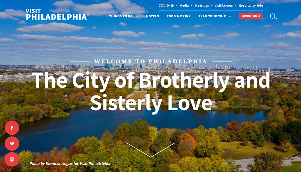
Visit Philly uses Georgia serif typography at large sizes. That choice gives the site a formal editorial quality that separates it from the sans-serif default every competing city tourism board uses. Typography used with this kind of intentionality creates brand recognition before users notice they are responding to a font choice.
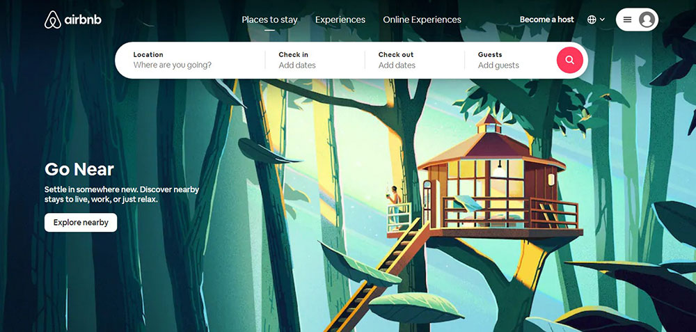
Photography strategy: UGC vs. professional shoots
Real guest photography converts better than stock. This is not a preference, it is a pattern visible across the industry. Stock images of generic beaches and smiling couples in restaurants do not communicate destination specificity.
Airbnb pioneered the UGC photography model at scale, using guest-submitted images as primary content rather than relegating them to a reviews section. That approach builds trust because it answers the question every prospective traveler asks: "What does this place actually look like to a real visitor?"
Professional photography still has a role, particularly for hero images where technical quality matters. The balance most high-performing sites strike: professional images in hero positions, UGC in listing cards, reviews, and social proof blocks.
White space in destination content layouts
Tourism sites tend to overload pages with destination options, package cards, and promotional content. The result is visual noise that makes it harder for users to focus.
White space used strategically in destination detail pages gives each image and description room to land. Secret Escapes' design collection page is a strong example: it removes almost everything except the photography, trusting the images to do the work. Conversion follows focus.
How Do Tourism Websites Structure Their Navigation?
Navigation on tourism sites serves a different purpose than on most other site types. Users arrive with highly varied intent: some are in early inspiration mode, some are ready to book a specific tour, and some are mid-research comparing options across sites. The navigation has to serve all three without feeling cluttered.
Top-level navigation categories
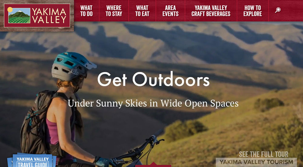
The most functional top-level structures across strong tourism sites keep primary navigation to 5-7 items. Fewer than 5 tends to hide important content. More than 7 creates cognitive overload.
Standard high-performing structure:
- Home
- Destinations (or Experiences)
- Plan Your Trip
- About
- Reviews or Stories
- Book Now (CTA, styled differently from nav links)
Japan National Tourism Organization structures navigation by region first, letting users self-segment before being shown content. On The Grid goes further, organizing its entire nav alphabetically by city, which works because their audience knows what destination they are researching.
Mega menus vs. simple dropdowns
Large destination catalogs need mega menus. A simple dropdown with 20 destinations listed vertically is difficult to scan and even harder to use on touch devices.
A well-designed mega menu groups destinations by region or experience type, includes thumbnail images for visual orientation, and keeps hover states large enough for accurate mouse or thumb targeting.
Visit Singapore and MySwitzerland both use structured mega menus that show content categories with visual cues. Users can orient themselves spatially within the destination catalog without needing to load a separate page.
Search functionality placement and behavior
Search on tourism sites is a conversion tool, not just a navigation shortcut. Users who use site search convert at higher rates than those who browse, because they have already defined what they want.
3 search behaviors that matter:
- Autocomplete with destination suggestions reduces typing friction on mobile
- Search positioned in the hero section (not just the header) captures high-intent users immediately
- Flexible date search (Skyscanner's model) serves users who know their destination but not their dates
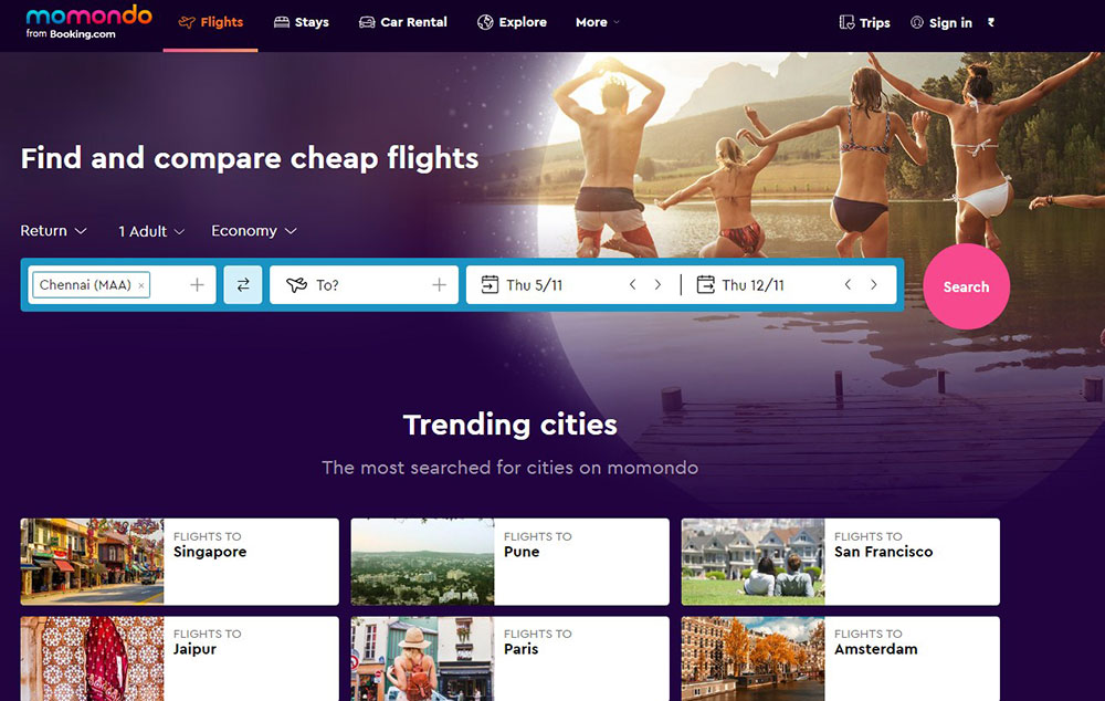
Kayak's dynamic map search is one of the best executions in the industry. It detects user location, visualizes hundreds of flight prices on a world map, and updates in real time as filters change. That is search and discovery merged into a single interface.
Breadcrumb structures for multi-destination sites
Destination boards covering entire countries or regions need breadcrumb navigation to keep users oriented. Without it, users who land on a regional page through search have no clear path to related content or to the homepage.
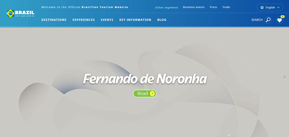
Brazil's tourism site handles this well. The country is broken into distinct regions with clear structural hierarchy, breadcrumbs at every level, and contextual links to related destinations. The architecture reduces the drop-off that happens when a user finishes reading about one destination and has no natural next step.
How Do Tourism Websites Build Trust With First-Time Visitors?
Referral traffic converts at 9.5% in the travel sector, the highest of any channel, according to Ruler Analytics. That number exists because trust already existed before the click.
First-time visitors arriving cold need that trust built on-page, fast. The design decisions that do this are specific, not generic.
Review integration near booking CTAs
96% of users prefer reading reviews before planning a trip or booking accommodation (TripAdvisor data). The supply of reviews is rarely the problem. Placement is.
Reviews buried on a standalone testimonials page do less work than star ratings placed directly on tour listing cards or immediately above a "Book Now" button. Sites that surface TripAdvisor aggregate scores within the booking widget context convert better than those linking out to a separate testimonials page.
Trustpilot research found that showing positive star ratings and reviews makes consumers 85% more likely to purchase. That lift applies directly to tourism booking flows.
Real photography vs. stock images
76% of TripAdvisor users say traveler-submitted images impacted their booking decision most (TripAdvisor). Not professional photography. Not drone shots. Real guest photos.
Stock images of empty hotel lobbies and generic beach scenes actively reduce trust because they signal the property does not have enough real guest content to fill the page. Sites like Airbnb built their entire visual model around UGC photography for exactly this reason.
Transparent pricing and cancellation terms
24% of travelers abandon bookings because they are forced to create an account, and 22% leave because the checkout feels too long or complicated (Baymard Institute, 2024). Hidden fees surface at checkout and trigger a third abandonment category.
3 pricing transparency decisions that reduce abandonment:
- Show total price (including taxes and fees) on the listing card, not only at checkout
- Display cancellation policy on the same page as the booking CTA
- Avoid requiring account creation before showing price
Accreditation badges and industry trust marks
Displaying trust signals like security badges and accreditations increases conversions by up to 32% (Market.us CRO data). For tourism sites specifically, industry accreditations carry extra weight because travelers are committing to non-refundable experiences.
The relevant signals depend on the operator type. ATOL protection for UK package travel, USTOA membership for US tour operators, and SSL payment badges near checkout forms all serve the same function: reducing the perceived risk of booking with an unfamiliar provider.
How Do Tourism Websites Structure Their Booking Flow Designs?
The average cart abandonment rate for online travel agencies is 81% (Checkout.com, 2024). That is not a demand problem. It is a design problem.
Booking flow design is where tourism UX either recovers or loses the visitors that destination storytelling already converted emotionally.
Step count and flow structure
3-step flows outperform longer alternatives when each step has a single task. The pattern that works: search and select, review and configure, pay and confirm. Nothing else between those points.
Today's average checkout flow contains 5.1 steps and 11.3 form elements (Baymard Institute, 2024). Cutting that to 3 steps with 6-7 essential fields removes the effort perception that kills bookings at step 2 or 3.
Date picker and availability display
A date picker that shows unavailable dates in grey is not an optional UX detail. It is the difference between a user clicking an unavailable date, hitting an error, and leaving versus the user understanding availability before investing intent.
Availability display best practices:
- Grey out booked dates upfront
- Show pricing per date on the calendar where possible (Airbnb model)
- Label availability states clearly ("Selling fast", "Last 2 spots")
- Keep the calendar widget large enough to tap on mobile
Abandoned booking recovery
Revinate benchmarks show cart abandonment email campaigns average 66% open rates and 10% conversion among nearly-booked travelers. Those guests were not lost. They were interrupted.
Exit-intent overlays offering a saved itinerary link, or post-session emails with a direct "Resume Booking" URL, recover a meaningful share of abandoned sessions. The Cosmopolitan Hotel in Las Vegas saw guests who engaged with chatbot recovery spend 30% more than similar non-engaged guests (Stratos Jets data).
Guest configuration UI
Dropdown menus for guest counts are a persistent mobile UX failure. Selecting "2 adults, 1 child" from a dropdown on a phone screen requires precision tapping that frustrates users and generates mis-selections.
Stepper buttons (+/-) eliminate this entirely. One tap per guest type, large enough to hit accurately with a thumb. It is a small fix with a measurable impact on mobile booking completion rates.
How Do Tourism Websites Use Interactive Features?
Interactive design in tourism is not about showing off technical capability. It is about reducing the mental effort of trip planning, which is the real reason users abandon research sessions before booking.
Interactive maps and destination exploration
Kayak's dynamic pricing map is the best-known example in the industry. It detects user location, visualizes flight prices across hundreds of destinations in real time, and updates as filters change. Users get a spatial answer to "Where can I go for X budget?" without reading a single listing.
Destination boards handle this differently. Brazil's tourism site breaks the country into regions on an interactive map, each linking to destination-specific content. That structure reduces the overwhelm of a country covering nearly half a continent.
57% of tour sites fail to include a map on the tour details page (Baymard Institute). Adding one answers "where exactly is this meeting point?" before a user has to open Google Maps separately.
Filterable destination catalogs
Filters that update results in real time outperform those requiring a "Search" button click. The instant feedback model (used by Booking.com and Airbnb) keeps users in the discovery flow rather than interrupting it with page reloads.
Devil's Lake, ND uses an arrow-shaped navigation that directs visitors into a personalized guide based on interest type: arts, dining, outdoor recreation, family fun. That is filtering without looking like a filter. It is smart UX design dressed as editorial navigation.
Virtual tours and 360-degree imagery
Travel decisions involve imagining an experience the visitor cannot yet have. Virtual tours and 360-degree imagery close that gap partially.
2 use cases where 360-degree content pays off:
- Hotel room and property previews where layout and space are key decision factors
- Adventure tour locations where terrain context (river width, cliff height, trail difficulty) affects booking confidence
Brazil's tourism site includes 360-degree views for vacation spots alongside standard photography. The combination serves different user types: those who decide visually from images and those who need spatial context before committing.
Trip recommendation quizzes and tools
Travel Oregon's "Surprise Me" button is deceptively simple. Users with destination fatigue (too many options, no clear preference) get a random featured destination. That removes the paralysis of choice without removing the user from the site.
More structured versions of this concept appear as quiz-based tools: "What kind of traveler are you?" flows that end with a curated destination or package recommendation. These interactive experiences increase session depth and reduce bounce from high-traffic landing pages where users arrived without a specific destination in mind.
What Are Common Design Mistakes on Tourism Websites?
Most tourism site failures are not obscure technical problems. They are predictable, repeated errors that show up consistently across operator sites, destination boards, and hotel properties.
Overloaded homepages with no primary CTA
A tourism homepage that tries to feature 6 destinations, 3 promotional banners, a newsletter signup, social media icons, and a booking widget simultaneously gives users no hierarchy to follow. Every element competes for attention. None wins.
Baymard research found 30% of travel accommodation sites fail to make the booking search feature the primary homepage element. That is 30% of sites where the most important conversion action is not the dominant design decision. Poor design choices like these compound across the entire user journey.
Unoptimized video backgrounds
A one-second delay in page load time reduces conversions by 7% (research cited by Market.us). Tourism sites using uncompressed video backgrounds can add 3-8 seconds of load time on average mobile connections.
The failure pattern is consistent: a designer adds an atmospheric video, the developer does not compress it, the site launches, and no one checks mobile load times. PageSpeed Insights flags it. The team deprioritizes it. Bounce rate stays high.
Poor contrast text over photography
White text over a light sky, dark text over forest photography, headline copy that disappears into the hero image as the page scrolls. These are not edge cases.
38% of users will stop engaging with a website if the content or layout is unattractive (UserGuiding, 2024). Legibility is the floor, not a design preference. WCAG contrast ratio minimums (4.5:1 for normal text) exist for this reason, and most tourism hero sections fail them without a text overlay or color treatment.
Outdated content without date context
Expired tour offers, 2022 event listings on a 2025 page, seasonal guides that no longer reflect current pricing. These are trust-killers. A visitor who notices an outdated offer questions whether the entire site is reliable, and that doubt extends to the booking form.
The fix is structural, not editorial. Content management workflows that flag time-sensitive pages for review on a set schedule prevent the problem at the source rather than relying on manual audits. A basic website checklist built around expiry dates catches this before it affects users.
What Tools and Platforms Are Used to Build Tourism Websites?
Platform choice shapes every subsequent design and functionality decision. The right choice depends on operator size, booking volume, technical capacity, and how much of the stack needs to be owned versus outsourced.
WordPress for content-heavy tourism sites
WordPress powers over 40% of all websites globally, and its plugin ecosystem covers most tour operator needs without custom development. WP Travel Engine handles booking flows, itinerary pages, and availability management at a base price of $9, making it the most cost-accessible booking layer for small-mid operators.
WPML adds multilingual support. WooCommerce Bookings handles accommodation-linked purchases. The combination covers the full destination guide plus booking platform use case without a custom build.
The limitation: WordPress sites require ongoing maintenance, update management, and security monitoring. Teams without a developer on call often accumulate plugin conflicts and outdated dependencies.
Webflow for design-led boutique brands
Webflow suits operators where brand differentiation is the primary competitive advantage. It offers design flexibility that WordPress page builders cannot match and produces clean, performant code without requiring a custom development team.
The tradeoff is booking functionality. Webflow has no native booking engine, so operators embed FareHarbor or Rezdy widgets. Those widgets are functional but visually mismatched against a premium Webflow design. That disconnect is a known limitation in the stack.
Booking engine comparison
| Platform | Pricing Model | Best For | Key Limitation |
|---|---|---|---|
| FareHarbor | 6% commission, no monthly fee | New operators, low fixed cost | Commission scales with revenue |
| Rezdy | $49-$199/month, 2% on OTA bookings | Operators building direct booking channel | Higher upfront cost |
| Checkfront | Flat monthly fee | Multi-activity operators | Less suited to small volumes |
| Bokun | $49/month + per-booking fees | Operators needing Viator/GetYourGuide reach | TripAdvisor-owned, data dependency |
An operator doing $300,000 in direct bookings annually pays $18,000 in FareHarbor commissions (Hamza Liaqat analysis, 2025). At that scale, switching to a flat-fee model like Rezdy or Checkfront pays for itself quickly.
Headless CMS for large destination boards
National and regional destination marketing organizations (DMOs) typically outgrow WordPress. A headless CMS setup, usually Contentful paired with a custom React front end, separates content management from presentation and allows multiple front-end experiences (web, mobile, partner feeds) from a single content source.
The responsive design demands of a large DMO, serving international visitors across dozens of device types and connection speeds, make headless architecture the practical choice. The development cost is higher, but the long-term content flexibility justifies it for organizations managing thousands of destination pages.
Web design tools used in the build process
Figma leads tourism site design workflows for the same reason it leads web design generally: collaborative design, prototyping, and handoff in one tool. Most agency-built tourism sites start in Figma before touching a CMS.
Hotjar and similar session recording tools are underused in tourism specifically. Running session recordings on booking flow pages reveals exactly where users hesitate, re-read, or abandon. Those recordings are more actionable than analytics alone. Any serious look at web design tools should include session analysis alongside design software, especially for high-stakes booking interfaces.
FAQ on Tourism Website Design Examples
What makes a tourism website design effective?
An effective tourism website combines fast load times, clear booking flows, and destination photography that builds trust. It moves visitors from inspiration to action without friction, with a visible booking CTA above the fold on every key page.
What are the best tourism website design examples to learn from?
Visit Iceland, Visit Singapore, G Adventures, and Inspired by Iceland are consistently referenced for strong design. Each handles destination storytelling, mobile optimization, and booking flow differently, making them useful references across operator types.
How important is mobile design for tourism websites?
Mobile drives 68% of travel site traffic but converts at just 2.6% versus 7.6% on desktop (ContentSquare, 2024). Mobile-first design is not optional. Most conversion losses in travel happen on poorly built mobile booking flows.
What platform should a tour operator use to build their website?
WordPress with WP Travel Engine works for most small-to-mid operators. Webflow suits design-led boutique brands. Large destination marketing organizations typically use a headless CMS setup, such as Contentful paired with a custom React front end.
Which booking engines integrate best with tourism websites?
FareHarbor, Rezdy, and Checkfront are the three most widely used. FareHarbor charges no monthly fee but takes 6% commission. Rezdy suits operators building direct booking channels, with flat monthly pricing and lower per-booking fees on direct sales.
What visual design choices work best for destination websites?
Full-width hero imagery, color palettes tied to the destination's environment, and real guest photography over stock images. Typography contrast over photography is a common failure point. Text needs a dark overlay or solid-color placement to stay legible.
How should a tourism website handle trust signals?
Place TripAdvisor ratings and guest reviews near booking CTAs, not buried in a footer. Show cancellation terms before checkout. Accreditation badges and SSL indicators near payment forms reduce hesitation. Displaying trust signals can increase conversions by up to 32%.
What navigation structure works best for tourism sites?
Keep top-level navigation to 5-7 items. Use a mega menu for large destination catalogs, grouped by region or experience type with thumbnail images. A sticky header with a persistent booking CTA removes the friction of scrolling back to convert.
What are the most common design mistakes on tourism websites?
Overloaded homepages with no clear primary CTA, unoptimized video backgrounds that kill page speed, and outdated content without date context. Poor contrast text over hero photography and checkout flows requiring account creation before quoting price are also frequent failures.
What interactive features improve tourism website engagement?
Interactive maps, filterable destination catalogs, and real-time availability indicators increase session depth. Trip recommendation tools, such as Travel Oregon's "Surprise Me" button, reduce decision paralysis on high-traffic landing pages where visitors arrive without a specific destination in mind.
Conclusion
This conclusion is for an article presenting tourism website design examples that span destination boards, tour operators, and boutique accommodation sites.
The pattern across every strong example is consistent: destination storytelling earns attention, but booking flow design determines whether that attention converts.
Trust signals placed near CTAs, real guest photography over stock images, and mobile-optimized checkout flows are not optional extras. They are the difference between a site that inspires and one that actually sells.
Whether you are building with WordPress, Webflow, or a headless CMS setup, the platform matters less than the decisions made inside it.
Take the patterns from sites like Visit Iceland, G Adventures, and Kayak, apply them to your context, and test what moves your booking numbers.

The tourism websites on this list are all unique and inspirational. They stimulate the desire to travel and provide the information necessary for users to do so. They also generate trust with an organized, user-friendly design.
Three basic design principles govern these tourism websites. They are: using visuals, keeping it simple, and providing useful information.
To put the inspiration and design principles to good use, it is necessary to have the right tool. BeTheme is a web building tool to help make your tourism website a reality. With BeTheme it’s possible to build a website in minutes, without coding knowledge. It saves time, is beginner-friendly, and you can adapt it to any project.
Some features include:
- Fully responsive
- Retina ready for sharper images
- One-click installation
- Unlimited menu options
- Customizable layout
- Customizable skins and fonts
- Unlimited color options
- Visual icon selector
Equipped with BeTheme and the above design principles, you will be able to build one of the best-looking tourism websites.
If you enjoyed reading this article on the best looking tourism websites, you should check out this one about accessible websites examples.
We also wrote about a few related subjects like hotel website design, product landing page, best corporate websites, great looking spa websites, cool looking personal trainer websites, top notch musician websites, the most impressive luxury websites, impressive animated websites and 25+ Travel WordPress Themes Perfect for Hotels & Travel Agencies.


