


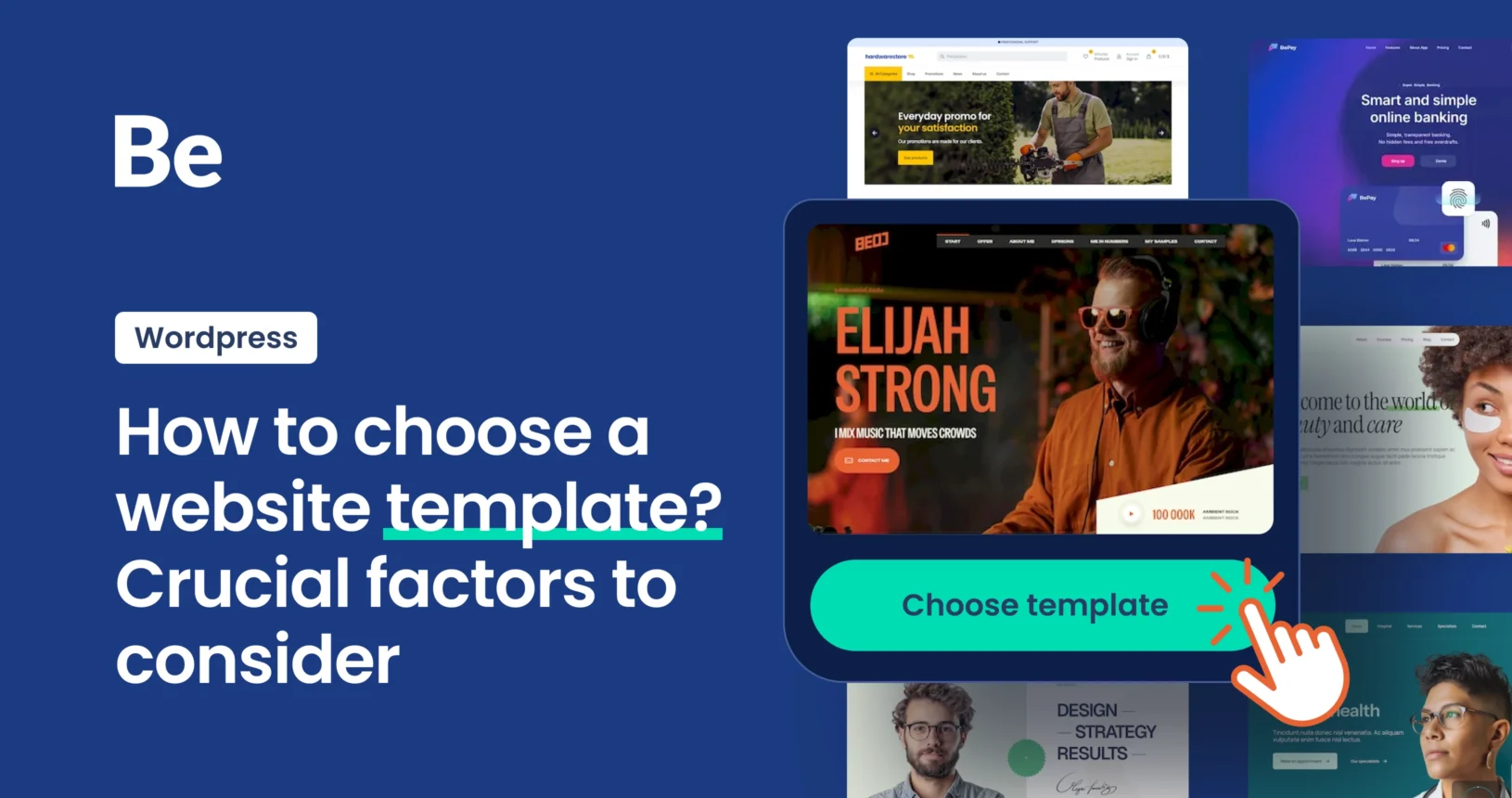
Explore Top Examples of Premium Website Templates
November 14, 2025
Great Examples of Software Website Templates
November 17, 2025Website footer design is the bottom section of a webpage containing navigation elements, legal information, contact details, and supplemental content.
This area serves functional purposes for users seeking specific information and structural purposes for site architecture.
Footers act as the final touchpoint where visitors find critical business data, support links, and secondary navigation paths.
What is Website Footer Design
Core Components in Footer Design Structure
Navigation Elements
Primary links placement follows a left-to-right hierarchy on desktop layouts. Most sites position their main category links in the leftmost footer column.
Secondary navigation appears in middle columns or stacked below primary links on mobile devices.
Sitemap integration connects users to deeper site pages while supporting internal linking structure for search engines.
Category clustering groups related pages under descriptive headings (Products, Resources, Company), reducing cognitive load.
Legal and Compliance Information
Privacy policy positioning typically appears in the bottom-most row of footer content.
Terms of service sit alongside privacy statements, usually separated by vertical pipes or bullet points.
Copyright notice formatting includes the © symbol, year range, and company name (© 2024 Company Name. All rights reserved).
Cookie consent integration varies by region, EU sites display persistent banners while US sites often link to preferences.
Contact Information Architecture
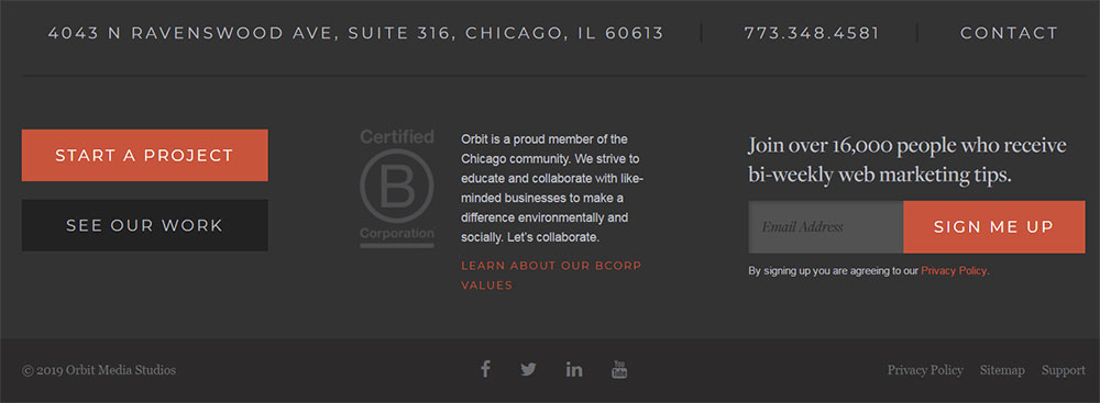
Physical address display methods range from simple text to structured schema markup for local businesses.
Email contact formats use clickable mailto: links that open default mail clients directly.
Phone numbers become tap-to-call on mobile devices through proper HTML5 tel: protocols.
Social media icon arrangements follow platform popularity (Facebook, Instagram, LinkedIn typically lead).
Footer Layout Patterns and Templates
Single Column Footer Design
Single column footers work for minimalist sites with limited supplemental content.
Perfect for personal portfolios, landing pages, or startups prioritizing conversion over navigation depth.
Content prioritization places critical items at the top (newsletter signup above social icons).
Mobile responsiveness simplifies since no column collapse logic is needed.
Visual hierarchy relies on typography size, weight, and spacing rather than horizontal divisions.
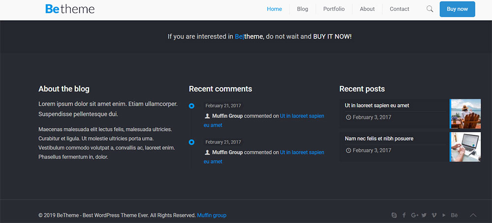
Multi-Column Footer Structure
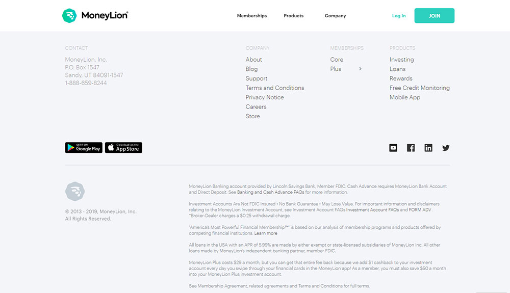
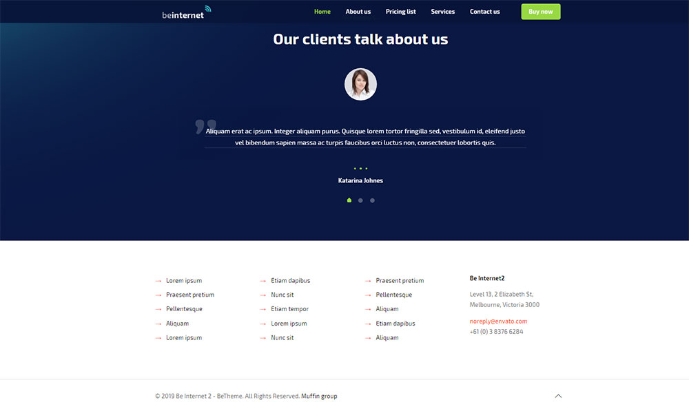
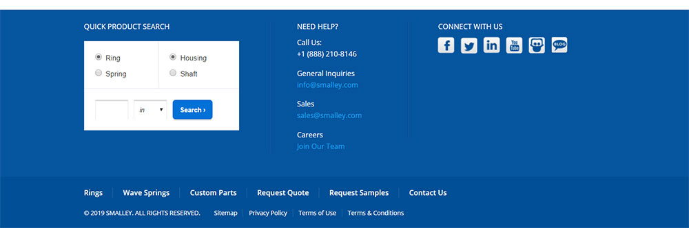
Three-column configurations dominate e-commerce and corporate sites. Left column typically houses primary navigation, middle contains company info, right displays contact details.
Four-column layouts add flexibility for content-heavy sites or those with multiple product lines.
Column width ratios often follow 40-30-30 or 25-25-25-25 splits depending on content importance.
Content distribution strategies group semantically related links, all support pages cluster together, all social elements appear in one location.
Responsive breakpoints collapse columns on tablets (three to two) and mobile (all to single stack).
Mega Footer Design Patterns
Enterprise websites deploy mega footers with 50+ links organized across multiple rows and columns.
E-commerce platforms use these to showcase product categories, customer service options, and company resources simultaneously.
Content organization follows card-based layouts with clear visual separation between sections.
Category grouping mirrors main navigation structure while adding depth (Shop → Men's → Shoes → Running).
Background colors or borders delineate sections, preventing visual overwhelm despite high information density.
Font Size Selection
Body text sizing standards range from 12px to 14px for optimal legibility at footer position.
Heading differentiation uses 16px-18px for column titles, creating clear information architecture.
Link text specifications match body size but employ different font weights or colors for distinction.
Legal text sizing drops to 10px-11px minimum while maintaining WCAG contrast requirements.
Mobile viewports bump sizes up 1-2px (body becomes 13px-15px) due to smaller physical screens.
Color Contrast Requirements
Background color selection determines entire footer contrast strategy. Dark backgrounds (charcoal, navy) require white or light gray text.
Text color accessibility must meet WCAG AA minimum contrast ratio of 4.5:1 for normal text, 3:1 for large text.
Link state variations include default (often blue or brand color), hover (typically underlined or color shift), visited (muted shade), and active states.
Brand color integration happens through accent elements (icons, buttons, borders) rather than full background application.
High contrast modes now required by WCAG 2.2, test footers at Windows High Contrast and prefers-contrast: high media queries.
Spacing and Padding Specifications
Vertical rhythm patterns establish consistent spacing multiples (8px base → 16px, 24px, 32px, 48px).
Horizontal spacing standards allocate 20-40px gutters between footer columns on desktop.
Mobile touch target sizing requires minimum 44x44px clickable areas per Apple/Google guidelines.
Desktop layout proportions dedicate 60-80px top padding, 40-60px bottom padding, creating breathing room.
Line height for footer text sits at 1.5-1.6 for body copy, 1.2-1.3 for headings.
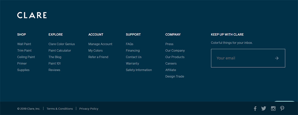
Navigation Link Organization Methods
Primary Navigation Links
Product category placement occupies the leftmost column in Western layouts (reversed for RTL languages).
Service offering links cluster under "Services" or "Solutions" headings with 4-8 items maximum per group.
Resource section organization includes Blog, Case Studies, Whitepapers, Documentation under single parent label.
Company information positioning appears in rightmost column: About, Careers, Press, Contact follow standard ordering.
Priority follows user intent data, most-clicked footer links earn top position within their section.
Secondary Link Structures
Support documentation access requires dedicated column space on SaaS websites and technology platforms.
Blog or news links appear under "Resources" umbrella alongside other educational content.
Career page placement sits within Company section, though some sites elevate it to primary navigation.
Partner or affiliate sections occupy footer real estate when strategic relationships warrant visibility.
Accessibility statement positioning must be easily discoverable, bottom row or dedicated accessibility section.
Footer-Specific Links
Accessibility statement positioning follows WCAG recommendations (first link or clearly labeled section).
Language selector placement varies, some sites put it top-right of footer, others in bottom-most row.
Currency switcher integration sits adjacent to language selectors for international e-commerce sites.
Regional site selector methods include dropdown menus or dedicated country/region link lists for global corporations.
Legal disclaimers and certifications appear in the footer's final row, smallest text size permissible.
Physical Location Presentation
Single location display formats use simple address text with city, state, zip on separate lines.
Multiple location organization requires dropdown selectors or tabbed interfaces showing region-specific addresses.
Interactive map integration through Google Maps or Mapbox provides visual location context with clickable directions.
Regional office listing works best in multi-column layouts with location names as headings.
Communication Channel Display
Email link formatting uses mailto: protocol (mailto:[email protected]) triggering default mail clients.
Phone number clickability requires tel: links (tel:+1234567890) for mobile tap-to-call functionality.
Contact form access points appear as buttons or text links directing to dedicated contact pages.
Live chat integration methods include persistent chat widgets or footer-based chat launchers for immediate support.
Social Media Integration
Icon selection standards favor SVG over icon fonts for scalability and accessibility.
Platform priority ordering follows audience demographics—B2B sites lead with LinkedIn, B2C with Instagram.
Custom icon vs standard icons debate continues, though brand consistency usually wins.
Link opening behavior defaults to new tabs (target="_blank" with rel="noopener") preventing session loss.
Legal Content Formatting Standards
Privacy and Terms Links
Placement best practices position legal links in footer's bottom-most row for universal findability.
Link text formatting uses standard blue or subtle underlines distinguishing from body text.
Modal vs dedicated page choice depends on content length: short policies work in overlays, comprehensive ones need full pages.
GDPR compliance displays require explicit consent mechanisms, often through checkboxes on forms.
Copyright Notice Formats
Year display methods show either current year dynamically or range (2020-2024) indicating site age.
Company name presentation matches legal business name, not just brand shorthand.
Rights reserved statements vary globally; "All Rights Reserved" remains common despite Berne Convention.
International variations include regional legal requirements like Australian ACN numbers or UK company registration.
Regulatory Compliance Elements
Industry-specific requirements dictate footer content; financial sites need FDIC logos, healthcare requires HIPAA notices.
Regional legal variations span from California's "Do Not Sell My Info" to Europe's cookie consent.
Certification badge placement clusters trust seals (SSL, BBB, ISO) in dedicated footer sections.
Trust seal integration links badges to verification pages proving authenticity.
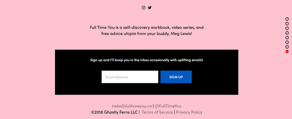
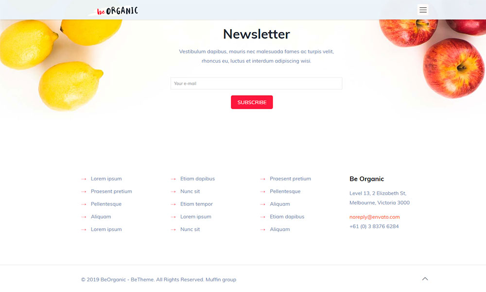
Newsletter Subscription Components
Sign-up Form Design
Input field specifications require visible labels, placeholder text, and proper input type="email" validation.
Button design standards include high contrast, adequate padding (12px vertical minimum), clear action verbs ("Subscribe" beats "Submit").
Inline vs separate section depends on footer real estate—cramped footers use modal forms.
Mobile form optimization stacks elements vertically with full-width inputs for easier thumb typing.
Privacy Reassurance Elements
Consent checkbox placement sits below email input with linked privacy statement.
Privacy statement links open policies in new tabs without disrupting subscription flow.
Unsubscribe information transparency builds trust—mention easy opt-out upfront.
Data usage transparency explains what subscribers receive and email frequency.
Success State Display
Confirmation message design replaces form with success text and email verification instructions.
Thank you page integration redirects to dedicated pages with next steps or content offers.
Email verification notices inform users to check inbox and spam folders.
Error handling methods display inline validation messages below problematic fields in red text.
Logo Placement Options
Size specifications keep footer logos 30-50% smaller than header versions maintaining hierarchy.
Positioning variations include centered (symmetrical layouts), left-aligned (Western reading patterns), or right-aligned (rare).
Clickability standards dictate logos link to homepage, though some minimalist websites skip this.
Mobile adaptations further reduce logo size or switch to icon-only versions conserving space.
Tagline and Mission Statement
Character count guidelines recommend 60-80 characters maximum for footer taglines.
Placement options include directly below logo or in separate "About" column.
Typography selection uses lighter weights and smaller sizes than primary headlines.
Multi-language handling requires dynamic content swapping based on user locale settings.
Brand Asset Display
Award badges positioning creates dedicated "Awards" or "Recognition" footer sections.
Certification logos validate expertise—Google Partner, HubSpot Certified, industry-specific credentials.
Partner logos arrangement showcases strategic relationships through grayscale or colored icon grids.
Media mention displays feature publication logos ("As Seen In") linking to actual coverage.
Mobile Footer Design Adaptations
Responsive Breakpoint Strategies
Column collapse patterns follow 4-to-2-to-1 progression at 768px and 480px breakpoints typically.
Accordion menu implementation hides footer sections behind expandable headers conserving vertical space.
Stacked content ordering prioritizes newsletter signup, then navigation, finally legal links.
Touch target sizing enforces 44x44px minimum per Apple Human Interface Guidelines.
Mobile-Specific Patterns
Sticky footer considerations keep critical actions (signup, chat) accessible during scroll.
Fixed bottom bars work for app websites mimicking native app behavior.
Expandable sections reduce initial footer height—users tap "Company Info" to reveal links.
Scroll-to-top buttons appear after 300-500px scroll distance, positioned bottom-right typically.
Navigation Simplification
Link prioritization methods show top 3-5 links per category, hiding rest behind "More" toggles.
Menu reduction strategies cut footer navigation by 40-60% on mobile versus desktop.
Icon-only options replace text labels with universally recognized symbols (phone, email, location).
Progressive disclosure reveals content in stages preventing overwhelming small screens.
Load Time Considerations
Script loading strategies defer non-critical footer JavaScript until after above-fold content renders.
Image optimization methods compress logos/icons, serve WebP with PNG fallbacks.
Icon font vs SVG decisions increasingly favor inline SVG for flexibility and performance.
Third-party widget impact—each social feed or map embed adds 100-500kb and 200-800ms load time.
Above-the-Fold Priority
Lazy loading implementation delays footer image/iframe loading until user scrolls near.
Deferred content loading uses Intersection Observer API triggering at 200px above footer.
Critical CSS strategies inline footer styles preventing render-blocking for below-fold content.
Resource hints (dns-prefetch, preconnect) prime connections to footer third-party domains.
Widget Integration Impact
Social feed performance suffers from API calls—static screenshots linking to profiles perform better.
Map embed optimization lazy loads Google Maps, showing static image until user interaction.
Newsletter form scripts load asynchronously preventing blocking page render.
Analytics implementation tracks footer interactions through event listeners added after page load.
Accessibility Standards for Footers

ARIA Label Implementation
Navigation landmark roles use <nav aria-label="Footer Navigation"> for screen reader context.
Link descriptions provide aria-label for icon-only links (aria-label="Visit our Facebook page").
Form field labels require visible <label> elements, not just placeholder text.
Icon alternative text supplies descriptive alt attributes or aria-hidden with adjacent text labels.
Keyboard Navigation Support
Tab order logic follows left-to-right, top-to-bottom reading patterns.
Focus indicator visibility requires 3:1 contrast ratio per WCAG 2.1 guidelines.
Skip navigation links let users jump past footer to top or next section.
Screen reader considerations announce footer as landmark, read link text clearly, describe interactive elements.
Color Contrast Compliance
WCAG AA standards mandate 4.5:1 contrast for normal text, 3:1 for large text (18pt+).
WCAG AAA requirements increase ratios to 7:1 and 4.5:1 respectively for enhanced accessibility.
Link distinction methods employ underlines, color differences (3:1 from surrounding text), or both.
Focus state visibility needs distinct outline or background color change at 3:1 minimum contrast.
Product Category Links
Hierarchy display methods show parent categories as bold headings with child categories indented below.
Featured product sections highlight bestsellers or seasonal items with thumbnail images.
Seasonal collections appear temporarily—holiday shops in Q4, back-to-school in summer.
Sale and promotion areas get visual emphasis through red text, badges, or separate highlighted sections.
Customer Service Elements
Return policy access links to detailed return/exchange procedures from footer's "Support" column.
Shipping information displays rates, carriers, estimated times from footer or modal overlay.
FAQ section links direct to searchable knowledge bases covering common questions.
Order tracking access lets customers check shipment status without logging in.
Payment and Security Badges
Accepted payment methods display card logos (Visa, Mastercard, Amex, PayPal) in footer row.
SSL certificate displays show padlock icons or "Secure Checkout" badges building trust.
Trust seal positioning places Norton, McAfee, or TRUSTe badges near payment information.
Money-back guarantees state "30-Day Money-Back Guarantee" or similar assurances prominently.
Corporate Website Footer Patterns
Investor Relations Links
Financial reports access provides PDF downloads of annual/quarterly reports.
Stock information display shows ticker symbol, current price, change percentage.
SEC filing links direct to official government filings (10-K, 10-Q, 8-K).
Shareholder resources include dividend info, stock purchase plans, proxy statements.
Corporate Governance Information
Leadership team links profile executives with photos, bios, contact information.
Board of directors lists members with affiliations and expertise areas.
Corporate responsibility covers ESG initiatives, sustainability efforts, community programs.
Sustainability reports provide detailed environmental and social impact data.
Press and Media Resources
Press release archive chronologically lists company announcements with search/filter options.
Media kit access offers logos, product images, executive headshots for journalists.
News room links aggregate company news, media coverage, industry recognition.
Contact for press provides PR team email, phone, response time expectations.
Footer SEO Implementation
Internal Linking Structure
Link value distribution flows authority to important pages through footer links.
Anchor text selection uses descriptive phrases matching target page topics.
Nofollow usage applies to login, cart, account pages preventing crawl waste.
Crawl budget impact grows with footer link count—audit regularly removing unused links.
Schema Markup Application
Organization schema defines company name, logo, contact info in structured format.
Contact information markup uses PostalAddress, telephone, email properties.
Social profile links connect to official accounts through sameAs properties.
SiteNavigationElement labels footer navigation for search engines.
Sitemap Integration
HTML sitemap links provide human-readable site structure from footer.
XML sitemap references help search engines discover all pages efficiently.
Image sitemap mentions appear on photographer websites with extensive galleries.
Video sitemap access benefits content creators with embedded video libraries.
Interesting footer examples:
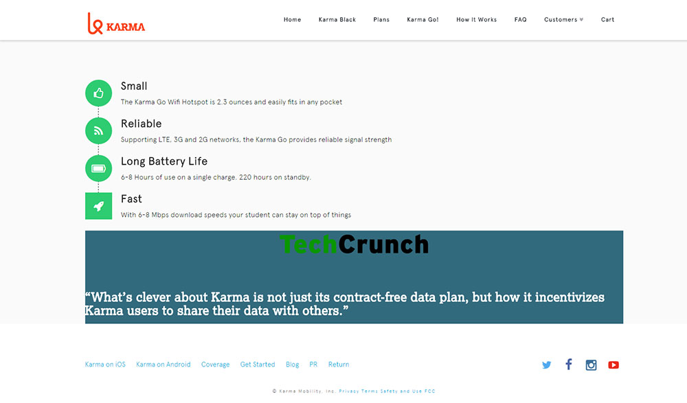
Usually, sites that are selling services or products put call-to-action in the header, making it the first thing that a visitor sees. Karma is an interesting example of how you can put another CTA in the website footer, to sway undecided visitors.
Those users who are not yet sure whether they should sign up, get to the other call-to-action at the end of the website. The second CTA is inserted on every page, with a large button that cannot be missed.
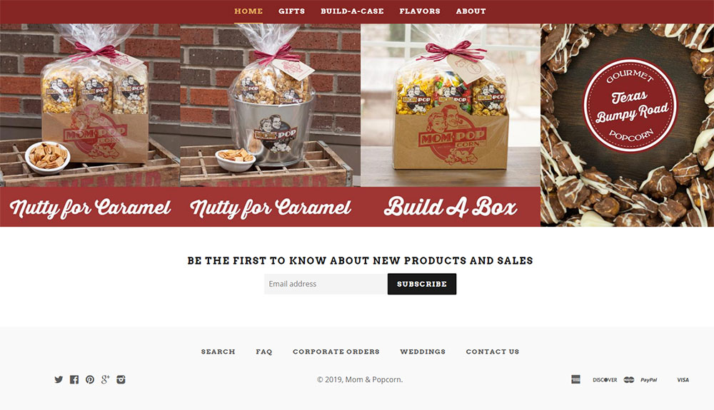
Mom & Popcorn
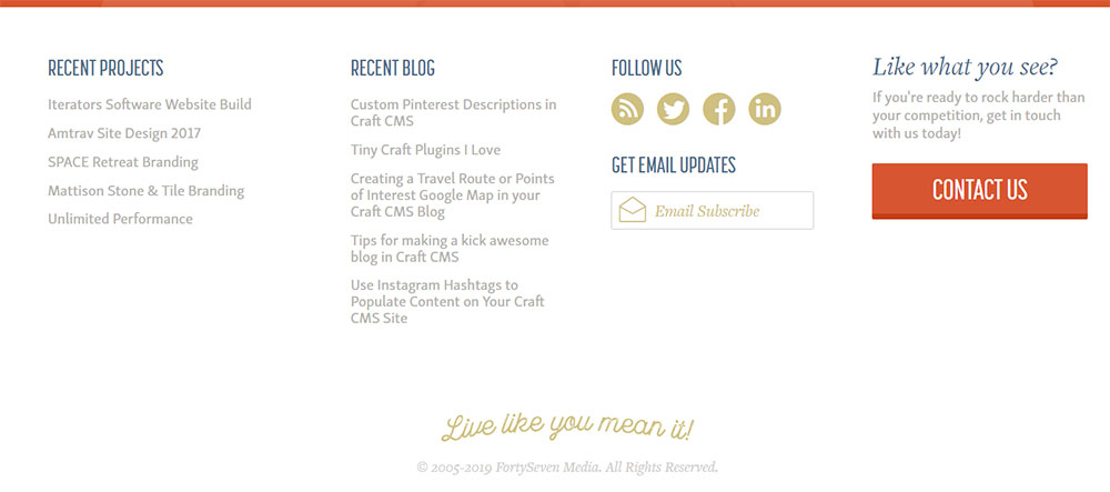
When you first open this website, you can’t miss that it is about popcorn. Their footer is quite simple, but effective. It contains a subscription box, social media buttons and menu for easy navigation. Mom & Popcorn want their visitors to subscribe so that they can let them know when new flavors are available.
Site Inspire
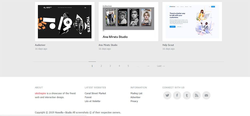
This is a website gathering interesting designs of other sites and displaying them in a gallery to inspire their visitors.
Their footer is functional and efficient while being minimalistic. This is an excellent example of a footer that contains all the necessary things that a visitor might need but in a simplistic form. Users can find all they need at the bottom of the page, which may lead to them staying longer.
Tapbots
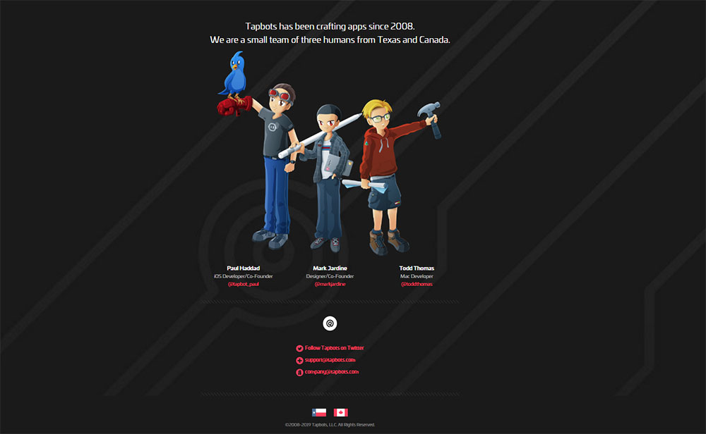
Tapbots is a small company creating apps for MacOS and iOS. What makes their website different is the large footer featuring three illustrations of their employees. Apart from that, footer contains some basic info about the company and links to social media channels.
The footer fits perfectly in the design of the whole website and it is a great example of how footer can become an integral part of a site.
Urban Pie
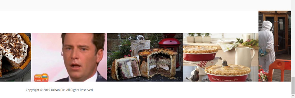
This company based in the UK has only one goal – to make the best gourmet pies. Their website is simple, with the homepage looking more like a blog than a traditional webpage.
The website footer is entirely different than what you can usually see on other sites. It features copyright info at the bottom,and the rest is just a gallery of photos of pies linked to posts on the website.
Web designer wall
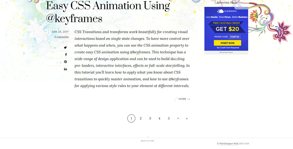
Web designer wall is a website dedicated to bringing news related to web design and various tutorials for designers. It is no surprise that their footer is beautifully designed. It has only the basic info, along with “back to top” link. Furthermore, the footer is separated by a thin, dark line from the rest of the website.
Multi-Language Footer Handling
Language Selector Design
Dropdown vs inline options: dropdowns save space, inline options improve discoverability.
Flag icon usage remains controversial; language names in native script (Español, 日本語) preferred.
Text-only alternatives avoid flag confusion (Swiss German, Canadian French share flags with other regions).
Current language indication uses checkmarks, bold text, or different background colors.
Content Translation Methods
Manual translation displays maintain quality, localize idioms and cultural references properly.
Machine translation notes disclaim automated translations, invite user corrections.
Regional content variations adapt examples, currencies, measurements to local norms.
RTL language support flips entire footer layout for Arabic, Hebrew maintaining usability.
Hreflang Implementation
Tag placement options includesection or XML sitemap depending on site architecture.
Self-referencing requirements mandate each page references itself in its language.
X-default specifications designate fallback page for unmatched language preferences.
Regional variations distinguish en-US from en-GB, es-ES from es-MX with country codes.
Footer Analytics and Tracking
Engagement Metrics Collection
Link click tracking monitors which footer links drive traffic to internal pages.
Form submission monitoring measures newsletter signup conversion rates.
Social media clicks reveal which platforms generate most traffic from footer.
Newsletter sign-up rates calculate subscribers gained per unique footer views.
User Behavior Analysis
Scroll depth tracking determines what percentage of visitors reach footer.
Time spent in footer measures engagement with footer content and links.
Mobile vs desktop usage patterns show device-specific footer interaction differences.
A/B test implementation compares footer variations for conversion optimization.
Conversion Attribution
Footer link conversions track sales/leads originating from footer navigation.
Newsletter ROI tracking calculates revenue per subscriber acquired through footer.
Social referral tracking attributes conversions to specific social platforms.
Contact form sources identify which pages users visited before submitting inquiries.
Industry-Specific Footer Examples
SaaS Product Footers
Product documentation links direct to user guides, API references, tutorials.
API reference access provides endpoint documentation for developer integration.
Developer resources include SDKs, code samples, sandbox environments.
System status pages display uptime, incidents, scheduled maintenance transparently.
Media and Publishing Footers
Article category access organizes content by topic, date, author, popularity.
Author directory links profile writers with bios and article archives.
Archive organization presents chronological or categorical content navigation.
RSS feed links let readers subscribe to content updates via feed readers.
Healthcare Website Footers
HIPAA compliance notices explain privacy protections for patient information.
Patient resources provide health education materials, forms, portal access.
Provider directories search doctors by specialty, location, insurance accepted.
Appointment scheduling integrates booking widgets or links to scheduling systems.
FAQ on website footers
What should be included in a website footer?
Essential footer components include navigation links, contact information, social media icons, legal disclaimers, copyright notices, and newsletter signup forms. E-commerce sites add payment badges and return policies. Corporate footers incorporate investor relations and press resources.
How many columns should a footer have?
Three-column layouts dominate most sites: navigation left, company info center, contact details right. Four columns work for content-heavy platforms. Single columns suit minimalist designs. Mobile breakpoints collapse all columns into stacked vertical layouts regardless of desktop configuration.
What is the ideal footer size?
Desktop footers typically span 250-400px height depending on content density. Mega footers reach 600-800px for enterprise sites. Width matches site container (1200-1440px common). Mobile footers expand vertically, often 800-1200px when fully stacked with all sections.
Should footer links be nofollow?
Navigation and content links should be dofollow to distribute link equity. Apply nofollow to login, cart, account, and user-specific pages. Legal pages (privacy, terms) can be dofollow as they provide value. Avoid blanket nofollow rules that waste internal linking opportunities.
What font size works best for footers?
Body text ranges 12-14px on desktop, 13-15px on mobile for readability. Column headings use 16-18px creating clear hierarchy. Legal text drops to 10-11px minimum while maintaining WCAG contrast requirements. Line height of 1.5-1.6 improves scanability across all sizes.
How do I make my footer mobile-friendly?
Stack columns vertically at 768px breakpoint. Implement accordion menus hiding sections behind expandable headers. Increase touch targets to 44x44px minimum. Prioritize newsletter signup and primary navigation above legal links. Use full-width inputs and buttons for easier thumb interaction.
What's the difference between footer and copyright notice?
The footer is the entire bottom section containing navigation, contact info, and supplemental content. The copyright notice is a specific element within the footer displaying © symbol, year, company name, and rights statement, typically appearing in the bottom-most row.
Should I include a sitemap in my footer?
HTML sitemap links help users find pages quickly and support SEO through internal linking structure. Place in footer's "Resources" or "Site Info" column. XML sitemaps belong in robots.txt, not visible footer. Image and video sitemaps benefit content-heavy sites but don't require footer links.
How do footers affect website performance?
Each footer widget (social feeds, maps, chat) adds 100-500kb and 200-800ms load time. Defer non-critical scripts until after above-fold content renders. Lazy load images and iframes appearing below fold. Inline SVG icons outperform icon fonts. Minimize third-party embeds for optimal performance.
What accessibility standards apply to footers?
WCAG requires 4.5:1 contrast ratio for normal text, proper ARIA labels for navigation landmarks, keyboard-accessible interactive elements, and focus indicators at 3:1 contrast minimum. Screen readers need descriptive link text, not "click here." Touch targets must meet 44x44px mobile guidelines.
Conclusion
Effective website footer design examples demonstrate how bottom sections balance functionality with user experience across devices and industries.
The footer layout patterns, typography specifications, and navigation structures covered here apply whether you're building e-commerce platforms, corporate websites, or SaaS products.
Implementation matters more than theory. Test column configurations on actual devices. Measure footer engagement metrics through analytics tracking. A/B test newsletter signup placement and call-to-action button design against conversion benchmarks.
Accessibility standards aren't optional, WCAG compliance, keyboard navigation support, and color contrast requirements protect all users while improving overall usability.
Performance optimization techniques reduce load times without sacrificing footer widget integration or social media presence. Your footer content organization should serve users first, search engines second, always maintaining clear information architecture throughout responsive breakpoints.


