10 Business Website Examples that Give Powerful First Impressions
February 26, 2016More and more consumers are doing a significant percentage of their shopping online. And, more and more shops come online every day. The more of these you see, the easier it would seem to be to create your own.
The truth is, many of these shops underperform; sometimes significantly. The reason? Website builders don’t abide by certain practices that allow eCommerce stores is to meet what should be their fundamental UX objectives; make it easy for a customer to find a product and make a purchase.
How is this accomplished?
- By keeping navigation simple
- By making certain every page is well-organized.
- By designing an attention-getting home page.
- By creating great first impressions, throughout the site.
- By presenting information in a way that builds trust.
These five rules are not difficult to understand. Neither are the means of implementing them, but only if you have the right tools to do so.
What are the Right Tools, and How Are They Applied?
Here are several examples of tools you can use to create a highly successful online shop. These tools serve as conceptual designs, they encourage beauty and simplicity in website design, and since they are customizable, they are perfect for creating outstanding user experiences.
These Be Theme pre-built websites are productivity tools. They are huge time and money savers, and you will experience higher-quality results.
Be Theme Shop
This product page is not complicated, showcasing a minimalist design, yet it has what you need to start shopping. There’s the product photo, a unique value proposition (Global Sale) that jumps out at you, prices, a menu, a shopping cart icon, and more.
This page offers a powerful first impression, but you have to follow through to turn a viewer into a paying customer. Product descriptions need to be carefully written. Product images need to show products in their best light. Your visitor must have easy access to size information, color options, stock levels, wish lists, a streamlined payment process, etc. On your side, you should be careful with inventory management, besides the main worries that you have.
Checkout processes, user-friendly navigation, and engaging visuals are mentioned as key eCommerce success factors; however, the fulfillment process is equally vital in maintaining customer satisfaction. Delving deeper into this aspect can reveal insights on mastering the art of ecommerce fulfillment, such as efficient order processing and utilizing effective staffing strategies. By refining fulfillment practices, businesses can significantly enhance operational efficiency while meeting customer expectations.
Be Cosmetics
This home page conveys a feeling of luxury. If you look closely, it’s more of an advertisement than a home page, but you can still navigate to any part of the shop. The image is clean, clear, and inviting; like one you expect in a beauty magazine. Note the “Ambassadors” page. This is an important element in shops specializing in beauty care. Its inclusion shows the designer and the client know their respective businesses well.
Beauty and personal care shops are taking up an increasingly large share of the eCommerce sector:
- Nearly half of those purchasing beauty products do not know ahead of time which brand they are going to buy; something a client can profit from.
- 66% of customers think a company's customer service reputation is a critical factor when making a purchase decision
- 43% of online shoppers will visit four or five different shops before making a purchase. This highlights the need to create an eCommerce site that outshines the competition, and stresses the need to pay attention to practices that will effectively maintain customer engagement.
Be Store
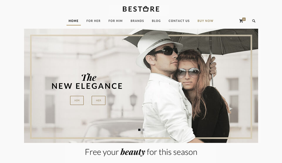
This theme features a pair of chick, yet elegant designs. One page shows the impact of properly used of white space. The other illustrates how background imagery can convey a greater sense of realism.
Our society is an image-centric one. Images play a crucial role in online marketing, and you need to make the best possible use of them
- An article with images receives twice as many views (94%).
- A photo or video in a press release receives nearly half again as many views (45%).
- Add an image to a search result; the average number of views increases by 60%
- Two-thirds of online shoppers say that images are important in making their selections.
- Shoppers believe they get more useful information from images than from write-ups, ratings, or reviews.
- On Facebook, photos have a 37% higher engagement rate than does text.
eCommerce Web Designers and Their Clients Love Be Theme and Its Pre-designed Websites
You’ve been shown three outstanding, very different pre-designed websites for three eCommerce businesses. Assuming you have another type of online store in mind, it’s natural to ask if there is a similar pre-designed website that would work for you.
You will find your answer in Be Theme’s selection of more than 170 pre-designed websites, and that answer of course is yes. There are multiple choices for whatever eCommerce theme you may have in mind. Whichever one you select will be fully customizable, so you can focus on the concept, and not only on the details. Many of these pre-designed websites are multipage affairs, which can make building an online shop even easier and quicker.
Select one you want, install it with a single click, and you’re ready to start your page building activities. Be Theme gives you a choice of two powerful page builders, BeBuilder 3 and Visual Composer (you can use both if you want). There is never a need for coding, and features like the Muffin Options Panel, the Shortcode Generator, and Be’s Grid, Header, and Layout options will make your design task as easy as can be.
Choose Be Theme to build your eCommerce shops, and you’ll find yourself creating user experiences your competition will not be able to match.
Further reading:
