


How To Reorder Pages In WordPress Easily
February 10, 2026
10 Quick Tricks to Boost WooCommerce Sales with Betheme
February 13, 2026A casting director Googles your name. What they find in the next 10 seconds decides whether you get the call.
Your personal actor website is that first impression. Not your Actors Access profile. Not your IMDb page. Your site, built around your headshot, acting reel, and personal brand.
This guide covers the best actor website design examples across career levels and platforms, from Squarespace-built theatre portfolios to custom-coded film actor sites.
You will also find the design patterns that appear across every top performer website, the platforms working actors actually use, and the mistakes that quietly cost auditions.
What Is an Actor Website?
An actor website is a personal portfolio site that functions as a casting-ready digital presence. It consolidates your headshots, acting reel, resume, bio, and contact details into one URL that casting directors, agents, and producers can access at any time.
This is different from a profile on Actors Access, Casting Networks, or IMDb. Those platforms control the layout, limit what you show, and present every actor in the same format.
Your website does not work that way. You control every element. That matters more than most actors realize.
How a personal actor website differs from casting profiles
Casting platforms are submission tools. They are built for the casting director's workflow, not for your personal branding.
| Feature | Actor Website | Casting Platform (e.g., Actors Access) |
|---|---|---|
| Layout control | Full control | Fixed template |
| Branding | Custom colors, fonts, tone | Standardized across all profiles |
| Reel format | Embed Vimeo or YouTube, choose thumbnail | Upload only, platform dictates display |
| Content depth | Unlimited pages, press, blog, gallery | Headshot, resume, basic credits |
| Discoverability | Google-indexed with your domain name | Searchable within the platform only |
Actors have booked projects directly from filmmakers finding their reel on their website, sometimes without an audition (Up-To-Date Actor, 2026). That outcome is not possible from a casting profile alone.
Why casting directors use actor websites
Casting directors Google actors before calling them in. When they search your name, your personal website is typically the first result, especially if your domain is firstnamelastname.com.
Social media expert Heidi Dean notes that a professional actor website serves as the hub for all marketing materials, including links to social media accounts, IMDb, casting profiles, resume, reel, and headshots.
A website also makes referrals easy. If a casting director asks a colleague for recommendations and 4 actor names come back, the one with a clean, searchable website is the one who gets the callback.
What Makes an Actor Website Design Effective?
An effective actor website design loads fast, places the headshot above the fold, and answers 3 questions in under 10 seconds: who you are, what type you play, and how to reach you.
Casting professionals are busy. If your site takes more than a few seconds to load or forces visitors to dig through menus, they move on. Google data shows that as page load time increases from 1 second to 3 seconds, the probability of a visitor leaving goes up by 32% (Google, 2024).
Speed is not optional. Neither is clarity.
Visual hierarchy on the homepage
The headshot must be the first thing a visitor sees. Not a logo. Not a nav bar. Not a quote about your passion for storytelling.
The 3 elements that belong above the fold on a professional actor homepage:
- Full-screen or large-format headshot
- Your name, clearly legible
- A primary navigation link (Reel, About, or Contact)
Reel placement and format standards
53% of mobile visitors leave a page if it takes longer than 3 seconds to load (Google). A poorly embedded reel is one of the fastest ways to hit that threshold.
Vimeo is preferred over YouTube for professional actor sites. It removes platform branding, shows no suggested videos after playback, and loads cleaner on desktop and mobile.
Reel placement options and when each works:
- Homepage embed: Best for actors with one strong general reel. Keeps the visitor on the page immediately.
- Dedicated reel page: Better for actors with multiple reels (film, commercial, theatre). Keeps the homepage clean.
- Both: A short sizzle reel on the homepage, full reels on a separate page. Used by more established actors with extensive footage.
Navigation structure and page count
A clean actor website uses 5 pages maximum: Home, About, Reel, Resume, and Contact.
Actor and web designer Amy Russ describes good site navigation as "simple, clear, and easy-to-use" (Backstage). That advice applies directly here. Every additional menu item is a decision the visitor has to make.
Keep navigation tight. If you cannot justify a page in one sentence, it does not belong in the main menu.
Mobile responsiveness
Mobile devices accounted for 61% of global web traffic in 2024, peaking at 62.99% in Q3 (StatCounter, 2024). Many industry professionals open actor websites from their phones, often from an email submission or a social media profile link.
If your site is not optimized for mobile viewing, the experience breaks immediately. Most modern website builders handle this automatically, but it is still worth checking every page on an actual phone before your site goes live.
What Design Patterns Appear Across Top Actor Websites?
Reviewing the top actor portfolio sites reveals recurring structural and visual decisions that appear regardless of platform, career level, or niche. These are not coincidences. They reflect what works for the primary audience: casting directors and agents.
Layout and visual choices
Full-screen or large-format headshot on the homepage appears in the vast majority of professional actor sites. This is not a trend. It is a functional decision. The headshot is the first piece of information a casting director needs.
Other consistent visual patterns:
- Muted or monochrome color palettes dominate. Bright accent colors appear on sites with a strong comedic or commercial brand.
- White space is used deliberately to keep focus on the actor, not the design. A thoughtful use of white space in a web design context means less visual competition around the headshot and reel.
- Single-column layouts on resume pages appear consistently, making credits easy to scan top to bottom.
- Social proof (notable credits, press mentions, union status) appears near the top, not buried in a bio page.
Typography choices across professional actor sites
Typography signals type and range before a casting director reads a single word. This is not subtle.
| Font Style | Signal It Sends | Common Use Case |
|---|---|---|
| Serif (e.g., Playfair Display, Georgia) | Classical, theatrical, dramatic range | Stage actors, dramatic film roles |
| Sans-serif (e.g., Futura, Helvetica Neue) | Contemporary, commercial, clean | Commercial actors, TV, voiceover |
| Mixed serif and sans-serif | Versatile range, dual-threat actor | Film and theatre actors |
| Decorative or display fonts | Strong personal brand, comedic or distinctive type | Known personalities, celebrity sites |
Laura Benanti's site is a good example of font choices reinforcing personal brand. The typography feels playful and has energy, which matches her stage presence (10Web, 2025). Typography decisions in web design carry more weight than most actors account for when building their own sites.
Navigation structure patterns
5 pages or fewer appears consistently across the best professional actor sites. When navigation grows beyond that, the sites start to feel cluttered and unfocused.
The standard navigation structure in order:
- Home (or no label, just the logo)
- About or Bio
- Reel or Watch
- Resume or Credits
- Contact
Press and Gallery pages appear on more established actor sites, but typically as secondary pages, not primary navigation items.
How Do Actors Present Their Reel on Their Website?
The acting reel is the single most important piece of content on an actor's website. How it is embedded, labeled, and positioned directly affects whether a casting director watches it or moves on.
Vimeo vs. YouTube for actor reel hosting
Vimeo is the professional standard for actor demo reels. It removes suggested video thumbnails after playback, eliminates platform branding around the player, and gives cleaner embed code.
YouTube embeds show competing content after the reel ends. For an actor website, that means a casting director might click away to an unrelated video. Vimeo Pro costs $84 per year and removes that risk entirely.
That said, YouTube is acceptable if Vimeo Pro is not in the budget yet. Just use a private or unlisted YouTube link and set the embed to hide suggested videos using the URL parameter ?rel=0.
Multiple reels and how to label them
Actors with work across multiple categories benefit from 3 separate reels rather than one long mixed reel. A commercial casting director does not want to sit through 90 seconds of dramatic scenes. A theatrical casting director does not need to see your commercial work.
Standard reel categories and their typical lengths:
- General/dramatic reel: 60 to 90 seconds. Best work first, first 15 seconds must hook.
- Commercial reel: 30 to 60 seconds. Shorter is better. Show range of commercial types.
- Theatre reel: Varies. Production clips or recorded performances, labeled by show and venue.
- Voiceover reel: 60 to 90 seconds. Multiple reads, range of copy types.
Labeling each clip directly below the player with the project name, character name, and production company is standard practice. It removes guesswork for a casting director who may recognize the production.
Reel page vs. homepage embed
Actors with one strong general reel should embed it on the homepage. Keep it above the fold where possible, or at minimum within the first scroll.
Actors with multiple reels should use a dedicated reel page with a clear page label ("Watch" or "Reel") in the primary navigation. This keeps the homepage clean while still giving the reel prominent placement one click away.
Hiro Kanagawa's site uses separate sections for acting and writing work, which demonstrates how content separation helps visitors understand the full scope of a multi-disciplinary career without overwhelming the homepage (10Web, 2025). The same logic applies to actors with multiple reel categories.
The standard page architecture for a professional actor website is 5 pages: Home, About, Reel, Resume, and Contact. Every additional page requires justification. Most actor sites do not need more than 5.
Core pages: what each one does
Home is the first impression. It communicates type, range, and professionalism in under 10 seconds. The headshot, name, and primary navigation link are the 3 non-negotiable elements.
About/Bio is where the actor's story, training, and notable credits are presented in third person. 150 to 250 words is the standard length for the version displayed on the site.
Reel (or Watch) hosts the demo reel or reels. Vimeo embed, labeled clips, and a clean layout with no distractions around the player.
Resume presents acting credits organized by medium (film, television, theatre, commercial) with columns for role, project title, and production company. A downloadable PDF version should be available on the same page.
Contact includes either a contact form or a direct email address, agent/manager contact information, and social media links (Instagram, IMDb, LinkedIn at minimum).
Secondary pages: when to add them
Not every actor needs a Press page, Gallery, or Blog. These only add value in specific situations.
| Page | Add it when... | Skip it when... |
|---|---|---|
| Press/Media | You have 3+ published interviews or significant reviews | You have only 1-2 minor mentions |
| Gallery | You have production stills or on-set photos that show range | You only have headshots (put those on the homepage) |
| Blog | You update it at least monthly with relevant content | You cannot commit to regular updates |
| Teaching/Coaching | You actively teach and want to attract students | Teaching is not part of your active work |
David Girard uses his site to promote his work as an actor, director, and educator, with quick access to downloadable resumes for each role (10Web, 2025). That model works because all 3 functions are active parts of his career, not legacy content kept online for completeness.
Actor websites share structural DNA with several other personal portfolio types. Personal website examples across different fields show the same pattern: a clear homepage, focused content pages, and a contact page. The photographer website category is especially close in structure, with the same emphasis on visual hierarchy, gallery layout, and client contact. Makeup artist websites face similar decisions around portfolio display and how to present work credits without a traditional resume format.
The hero section of an actor homepage is effectively the same design challenge as a hero section on any service-based portfolio. The goal is identical: communicate who you are and what you do within 3 seconds of the page loading.
How Do Actors Write Their Bio for Their Website?
An actor bio for a website is written in third person and runs 150 to 200 words for the version displayed on the site (Mandy.com, 2025). It is not an autobiography. It is a compact professional summary that tells casting directors and agents what roles you play and how to cast you.
The bio on the About page serves a different purpose than the one in a theatre program (50 to 75 words) or on a casting platform profile. Your website bio has more room and should use it well.
What to include in an actor bio
Opening line: name, location, a current or recent notable credit, and your casting type. This may be all someone reads, so it carries the most weight (Mandy.com, 2025).
Training: acting school, method studied, or notable workshops. List where and what, not just that you trained.
Credits: 3 to 5 of your most relevant credits, not an exhaustive list. The full list lives on your resume page.
Personal note: one sentence, something specific and memorable. Not "she loves storytelling." Something real.
What to leave out
Backstage is direct on this: avoid explaining why you became an actor (Backstage, 2022). "I knew I wanted to be an actor at age 5" tells a casting director nothing useful.
Other things that weaken a bio:
- Vague adjectives ("versatile," "passionate," "dedicated")
- Irrelevant personal details (relationship status, pets, hometown, unless it connects to your type)
- Hobbyist credits from before serious training
First person vs. third person
Third person reads as more formal and is the standard across professional directories, press releases, and printed programs.
First person works on personal sites where the tone is deliberately conversational, especially for commercial actors or those building a direct fan relationship. The key rule: pick one and use it consistently across every page of the site.
Casting Networks notes that when writing in third person, the approach should read as if a knowledgeable colleague wrote it, not as if you wrote it about yourself (Casting Networks, 2025). That framing helps get the tone right.
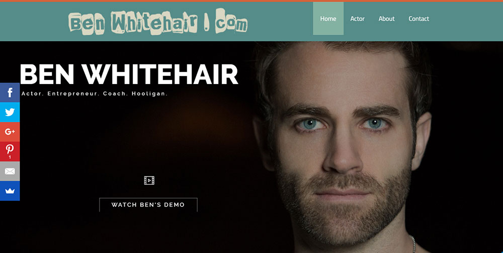
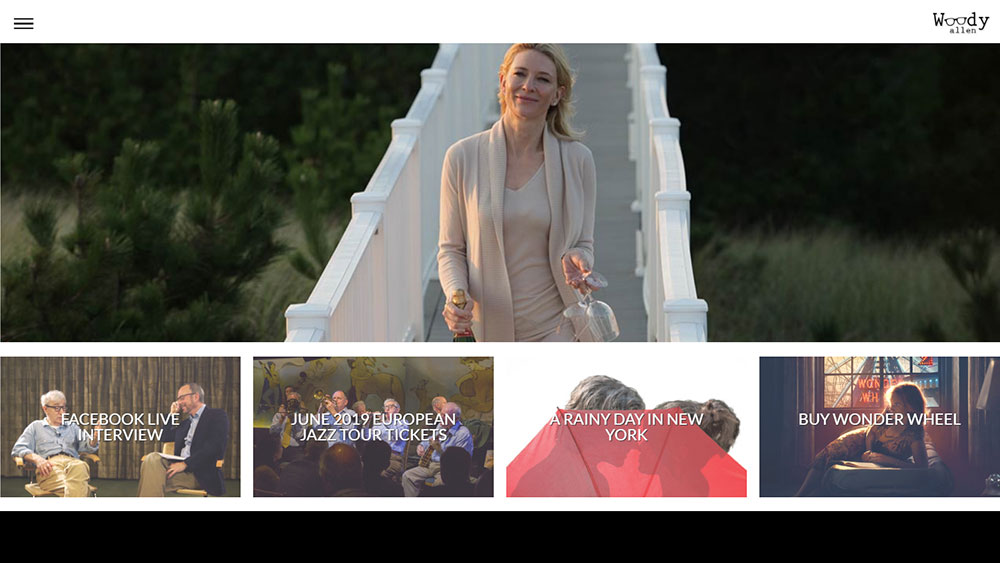
Actor Website Design Examples
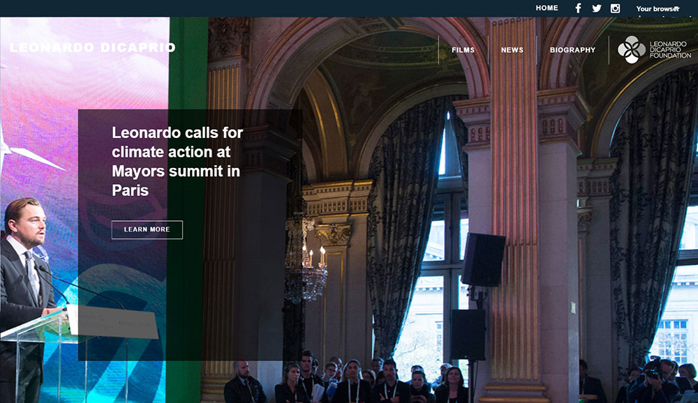
Leonardo Di Caprio
What Contact Information Should an Actor Website Include?
The contact page has one job: make it fast and frictionless for a casting director, agent, or filmmaker to reach you or your representation. Everything on the page should serve that goal.
Contact form vs. direct email
Both work. The choice affects spam management more than it affects how casting professionals reach you.
| Option | Advantage | Disadvantage |
|---|---|---|
| Contact form | Filters spam, collects structured info, mobile-friendly | Adds a step; some industry professionals prefer direct email |
| Direct email link | Immediate, familiar, feels more personal | Exposes email to scraping, more spam over time |
| Both | Covers all preferences | Slightly more cluttered page |
A professional email address matters. An address like [email protected] or [email protected] reads as more intentional than a personal Gmail (Web for Actors, 2024).
Agent and personal contact
If you have representation, list your agent's contact first. Casting directors should go through your agent, not directly to you. Contacting a casting director behind your agent's back damages professional relationships in a small industry (Nick Dunning, 2024).
Your personal contact can appear below with a label making it clear it is for non-casting inquiries: press, fans, collaborations, or teaching-related outreach.
Social links and IMDb
Instagram, IMDb, and LinkedIn are the 3 platforms that belong on an actor's contact page or footer. Twitter and Facebook are optional and declining in industry relevance for casting purposes.
IMDb Pro profiles are used by casting directors as a primary reference (Michael Roud Photography, 2024). The link from your website to your IMDb page closes the loop between your personal brand site and the industry's most-used credit database.
Other types of creative professionals face similar contact page decisions. Graphic designers' portfolio websites handle the same balance between personal contact and professional referral. The same structure appears consistently in photographer portfolio websites, where direct contact for bookings versus agent-managed inquiries requires the same careful page design.
How Does an Actor Website Design Reflect Personal Brand?
Every visual decision on an actor's website sends a signal about casting type before a single word is read. Color, typography, photography style, and layout all communicate range, tone, and professional identity. When those signals align, the site works. When they conflict, casting directors notice.
Color palette and casting type
Colors can increase brand recognition by up to 80%, and between 62% and 90% of a first impression is based on color alone (BrandWell, 2024).
On actor sites, color choices break down along fairly predictable lines:
- Black and deep neutrals: dramatic range, film, prestige television
- Clean white and light greys: commercial, contemporary, approachable
- Warm earth tones: grounded character work, theatre, indie film
- Bold or saturated color: strong personal brand, comedic type, distinct personality
Laura Benanti's site uses bold color and energetic typography deliberately. The palette matches her stage presence and commercial brand, not just her aesthetic preference.
Photography consistency across the site
The headshot style sets the visual tone. Every other image on the site, production stills, behind-the-scenes photos, gallery shots, should share the same lighting mood and color temperature.
A mismatch breaks the brand signal. A dramatic black-and-white headshot paired with bright casual production photos creates visual confusion about which type the actor is primarily pursuing.
The principles of color theory in web design apply directly here. Analogous color schemes (colors adjacent on the wheel) create visual harmony and leave more favorable impressions, while complementary schemes are more memorable but create stronger contrast (Flux Academy, 2019). For most actor sites, harmony is the better default. Websites with effective color schemes across other creative industries show the same pattern: restraint and consistency outperform variety.
Misalignment examples: when design contradicts type
These are the mismatches that undermine an otherwise solid actor site:
- A dramatic theatre actor using a pastel, playful font palette that signals children's entertainment
- A commercial actor with a dark, moody single-color homepage that reads as art-house film
- A comedic actor using minimal sans-serif design that signals corporate branding
The fix is not complicated. Ask one question: if someone visited this site without reading any text, what casting type would they infer from the visuals alone? The answer should match your actual type.
What Are Common Mistakes in Actor Website Design?
The most damaging actor website mistakes are not about aesthetics. They are about broken functionality and outdated materials that signal to a casting director that the actor either does not take their career seriously or has not worked recently.
Outdated headshots and stale content
87% of casting professionals reject heavily filtered or outdated headshot images (HeadshotsNEO, 2026). Casting director Thom Hammond states plainly that headshots should be updated every couple of years, even when actors do not think they need to be (Spotlight, 2023).
The same logic applies to website content. A blog with one post from 2021, a resume with no credits past 2022, or a reel with footage from a project that aired 5 years ago all send the same signal: this actor has not been working, or is not paying attention to their materials.
Broken reel links and missing media
A broken Vimeo embed or a dead YouTube link on the reel page is the fastest way to lose a casting director who clicked through specifically to watch your work.
Check every embedded video on your site at least once per quarter. Vimeo and YouTube both allow videos to be made private or deleted by account owners, and if you are using someone else's clip, it can disappear without notice. Web for Actors notes that broken links are among the most damaging professionalism signals on any actor site (Web for Actors, 2024).
Overloaded navigation and bloated pages
Navigation menus with 8 or more items, auto-playing audio on the homepage, and oversized uncompressed image files are the 3 most common technical mistakes on actor portfolio sites.
On the technical side, uploading raw, uncompressed headshot files is one of the most cited loading speed problems on actor websites (Web for Actors, 2024). Running images through a compression tool before upload, and using embedded video links rather than direct video uploads, resolves most load speed issues without any technical skill.
Google's data shows the probability of a visitor leaving increases 32% as page load time goes from 1 to 3 seconds (Google, 2024). A slow actor site is not just annoying. It costs real casting opportunities. Looking at examples of websites with bad design shows that these problems are industry-wide, not actor-specific. And reviewing what makes a user-friendly website reinforces the same practical checklist: fast load, clear navigation, and mobile-responsive layout.
How Much Does It Cost to Build an Actor Website?
The cost range is wide, from $16 per month on a self-managed platform to $2,500 or more for a specialist-built custom site. Career stage, technical comfort, and how much hands-on involvement you want will determine where you land in that range.
DIY builder costs
Self-building on Squarespace or Wix is the most common route for working actors. The platforms handle hosting, templates, and mobile responsiveness automatically.
| Platform | Starting Plan (monthly) | Best For |
|---|---|---|
| Squarespace | $16/month (Personal) | Design quality, theatre/commercial actors |
| Wix | $10.50/month (Light) | Design flexibility, more template options |
| Hostinger | $2.69/month | Budget-conscious actors, entry level |
| SITE123 | $5.50/month | Quick setup, minimal technical skill needed |
All platform costs above are billed annually. Month-to-month pricing runs roughly 20 to 30% higher (Cybernews, 2025).
Hiring a specialist actor web designer
Specialist designers who work specifically with actors, like Ashlee Mundy Web Design (AMWD), charge $500 to $2,500 for a complete actor site on Squarespace, depending on page count and add-ons. General web designers working at the small business level typically charge $1,000 to $5,000 for a comparable portfolio build (Invedus, 2026).
The tradeoff is time vs. money. A DIY Squarespace site takes most actors 2 to 4 hours to build from a template. A specialist designer delivers a polished, properly branded result in 1 to 2 weeks with no effort from the actor beyond providing materials.
Hidden and recurring costs
Budget items that catch actors off guard:
- Custom domain: $10 to $20 per year (firstnamelastname.com is the standard)
- Vimeo Pro: $84 per year for professional reel hosting without suggested videos
- Professional headshots for web: $150 to $600 per session depending on photographer and location
- Professional email: $6 per month via Google Workspace ([email protected])
The total ongoing cost for a self-managed Squarespace actor site with a custom domain and Vimeo Pro runs approximately $35 to $45 per month. For a working actor, that is a standard business expense. For emerging actors building on tighter budgets, Hostinger plus a free Vimeo account brings that number down to under $10 per month (Tooltester, 2025).
Other creative professionals navigating similar budget decisions include DJs building portfolio sites and singers creating their online presence. Both face the same platform choices and the same recurring cost structure. The best actor websites across different career levels all arrive at similar conclusions: Squarespace for design quality, a custom domain from day one, and a Vimeo-hosted reel as the core media asset.
FAQ on Actor Website Design
What should an actor website design include?
A professional actor website needs 5 core elements: a headshot above the fold, an embedded acting reel, a resume page, a bio, and a contact form.
Navigation should stay under 5 items. Casting directors need to find what they need fast.
Which platform do most actors use to build their website?
Squarespace is the most widely used platform among professional actors. Wix and WordPress follow. Squarespace wins for template quality, mobile responsiveness, and low maintenance requirements for busy performers.
How much does it cost to build an actor portfolio website?
DIY on Squarespace starts at $16 per month. Hiring a specialist actor web designer runs $500 to $2,500.
Add a custom domain ($10 to $20 per year) and Vimeo Pro ($84 per year) for a complete professional setup.
Should an actor use Vimeo or YouTube to host their reel?
Vimeo is the professional standard for demo reel hosting. It removes suggested videos after playback, eliminates platform branding, and loads cleaner. YouTube is acceptable on a budget but shows competing content after the reel ends.
How many pages should an actor website have?
Five pages maximum: Home, About, Reel, Resume, and Contact. Press, Gallery, and Teaching pages are added only when the content is active and substantial. Extra pages without real content weaken the site's focus.
What is the best color scheme for an actor website?
Muted or monochrome palettes dominate top actor portfolio sites. Color choice should reflect casting type. Dark neutrals signal dramatic range. Clean whites signal commercial work. Bold colors suit actors with strong personal brand identities.
How long should an actor bio be on their website?
150 to 200 words is the standard for an actor bio on a personal site. Write in third person. Lead with name, location, and a recent notable credit. Keep training and personal details concise.
What makes a good actor website homepage design?
A strong actor homepage answers 3 questions in under 10 seconds: who you are, what type you play, and how to reach you.
The headshot must appear above the fold, with your name clearly legible and a primary navigation link visible without scrolling.
Do casting directors actually look at actor websites?
Yes. Casting directors regularly Google actors before calling them in. A clean, fast-loading actor website with a current headshot and accessible reel directly increases the likelihood of getting a callback over actors without one.
What are the most common actor website design mistakes?
Outdated headshots, broken reel links, auto-playing audio, and overloaded navigation are the top mistakes.
Uncompressed image files slow load speed significantly. Google data shows bounce probability rises 32% when load time increases from 1 to 3 seconds.
Conclusion
This conclusion is for an article presenting the design decisions, platform choices, and real examples that separate a professional actor digital portfolio from one that gets ignored.
The pattern across every strong example is the same: a fast-loading homepage, a current headshot, and a demo reel a casting director can find in under 10 seconds.
Squarespace, Wix, and WordPress each serve different career stages and budgets. Pick one and build it properly rather than waiting for the perfect moment.
Your personal brand identity, color palette, and page structure all signal casting type before anyone reads a word.
Get those signals right, keep your acting resume and reel current, and your site becomes a working tool, not just a placeholder.


