


Stunning Bakery Website Design Examples to Inspire You
January 8, 2026
The Best Restaurant WordPress Themes to Choose From
January 9, 2026Your website is the first project a potential client will judge. If it looks dated or loads slowly, they move on before they ever see your actual buildings.
The best architect website design examples prove that a firm's online presence can be just as precise and intentional as its built work. Firms like Zaha Hadid Architects, Foster + Partners, and Selldorf Architects treat their sites as portfolio pieces, not afterthoughts.
This article breaks down 10 architecture firm websites, what specific design choices make each one work, and the patterns you can apply to your own site. From layout structure and typography to portfolio galleries and lead generation, every section focuses on what actually performs.
What Is Architect Website Design
Architect website design is the practice of building a digital presence that reflects an architecture firm's design philosophy, project quality, and professional identity.
It goes beyond a basic business site. The layout, imagery, and structure need to communicate the same precision and creativity that the firm brings to its built work.
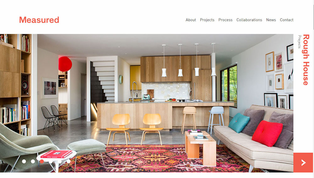
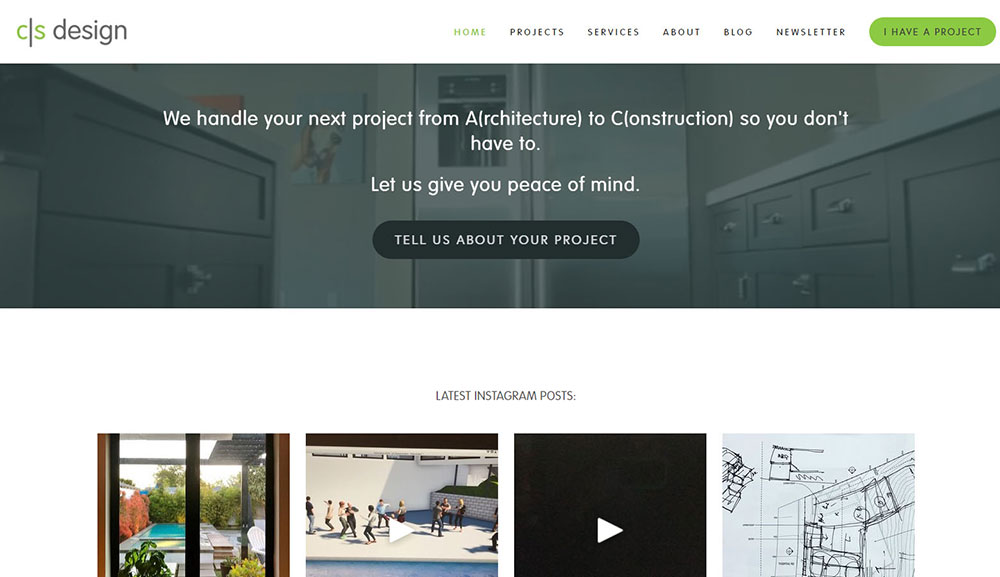
A strong architecture firm website puts the portfolio front and center, uses high-resolution project photography, and guides visitors toward clear next steps like requesting a consultation or viewing completed buildings.
Firms like Zaha Hadid Architects, Foster + Partners, and Gensler treat their websites as extensions of their brand. The site itself becomes a design statement.
That means every layout decision, from typography to grid structure, carries weight.
Architect website design examples and tips
Most architectural firm websites look identical. About page, services, portfolio. Same thinking: "Show our work, get hired."
Doesn't work.
You've built a brochure website. Architects designing for architects, not clients.
Nobody cares about your story yet. They want answers. Can you solve their problem?
Your architecture portfolio website needs to earn trust first.
What Actually Works
Your site isn't a project gallery. It's the foundation of your digital presence.
Visual storytelling beats static images
One project with process, challenges, solutions outperforms ten renderings.
Regular publishing signals you're active
Content management proves you're paying attention.
Depth demonstrates expertise
Detailed case studies and technical insights separate you from firms making empty claims. Your professional web presence should reflect actual knowledge.
Show the humans
Clients want to work with people. Real team photos, approachable language.
Clean design serves the work
White space, clear navigation structure, fast loading speed. Non-negotiable for a responsive layout.
Your online brand positioning either supports client acquisition or it doesn't.
No middle ground when prospects compare you to three firms at 11 PM on their phone.

Most architects treat their websites like digital monographs. Hero images, design philosophy, project descriptions.
The "grand showcase" approach has limits.
Your firm has stories worth telling. Conventional architectural portfolio websites can't do them justice.
Time to move beyond the standard template.
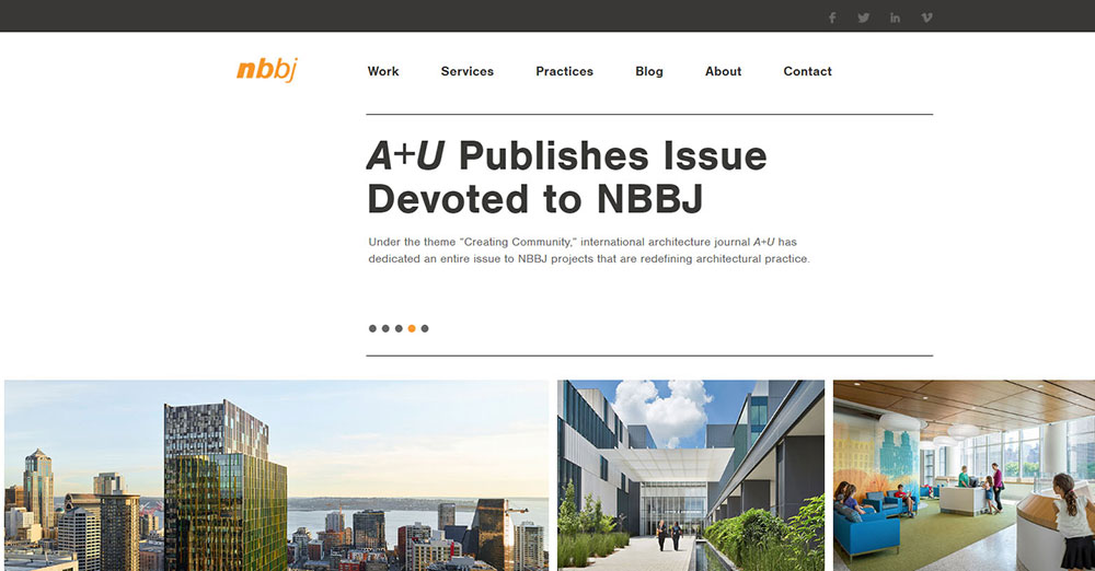
Seattle firm NBBJ redesigned their site in 2013. Killed Flash, added depth.
Their homepage now points to architect interviews and blog content. Research backing the portfolio showcase, not just pretty pictures.
Images don't tell stories. Stories tell stories.
Better content drives more people to your visual presentation. Balance matters.
Think about it. Someone lands on your project gallery. Beautiful renders, sure. But why should they care?
The design studio that explains their problem-solving approach gets remembered. The one showing only finished buildings gets forgotten.
Text adds context to imagery
Your architectural visualization web needs both. One case study with narrative beats ten silent portfolios.
This is where most architecture firm websites fail. Gorgeous photography, zero substance.
Mobile compatibility means nothing if there's nothing worth reading. Responsive layout carries content, not the other way around.
User experience depends on giving visitors something beyond surface aesthetics. Navigation structure should lead to insights, not just more galleries.
Want better client acquisition? Stop treating your professional web presence like Behance.
Flash looks smart. Kills usability.
Screen readers can't navigate Flash sites. Search engines struggle to index your pages.
Visitors can't save images or share them. Mobile devices often can't load the content at all.
Accessibility standards matter
Your professional website design needs to work for everyone. Flash blocks people with disabilities from experiencing your work.
SEO implementation becomes impossible when search engines can't read your content. Google can't rank what it can't crawl.
Loading speed suffers. Performance metrics tank.
Modern architecture websites use HTML5 and responsive grid layouts instead. Better user interface, better analytics tracking, better conversion optimization.
Plus, hosting solutions don't need special server configurations. Domain selection and site architecture stay simple.
Most architect websites are one-hit wonders. Look great once, never visited again.
No community. No interaction. Static calling cards.
The best architecture websites deliver regular value.
Update frequency matters
Too many firms launch, then abandon. Projects from 2006 with zero follow-up. Renderings gathering digital dust.
Your site shouldn't sit there. Visitors should engage with it.
Updating once a year in bulk? Wrong approach. Smaller, frequent updates work better for client testimonials and brand identity.
Content management systems make this easier. WordPress, Squarespace, Webflow all support regular publishing.
Build interaction
Email opt-in forms capture interest. Social media extends your reach beyond the portfolio website.
Page hierarchy should guide visitors toward contact forms and service pages. Call-to-action buttons need to be obvious.
Architecture blog integration keeps people coming back. Case studies show ongoing work, not just past glory.
Think about ArchDaily or Dezeen. They publish daily because fresh content builds audiences.
Your architectural firm website can do the same on a smaller scale. Project documentation online, behind-the-scenes posts, design process breakdowns.
Google Analytics shows which content works. Track it, learn from it, adjust.
Content ideas that actually get used:
Design process checklist. What clients should expect from kickoff to completion.
Local building resources. Contractors, suppliers, permit offices in your area.
Architecture styles infographic. Make it funny, make it shareable. Figma and Sketch work great for this.
Design tips by room type. "10 Kitchen Layout Mistakes" or "5 Outdoor Space Principles" perform well on Pinterest and Instagram.
Budget spreadsheet download. Help prospects manage construction costs before they even hire you.
Why this works
People search for solutions, not portfolios. Give them tools, earn their trust.
Each piece of content becomes a landing page opportunity. Better SEO implementation across your entire site architecture.
Typography choices matter here. Make downloadables look professional. Use your firm's color schemes and brand identity consistently.
Service pages should link to relevant resources. About sections can highlight your expertise through educational content.
This is good UX. Visitors get value before you ask for anything.
Google Search Console shows which topics drive traffic. Double down on what works.
Adobe Portfolio and Behance are fine for showing work. Your own domain selection gives you control over the full client experience.
Say No to Generic Descriptions
Every architecture firm has the same About page.
"Interdisciplinary organization. Award-winning. Diverse portfolio of successful projects."
Tells visitors nothing. Gives Google nothing to rank.
Better approach:
Skip the corporate speak. Answer actual questions.
What problems do you solve? Who have you solved them for? Why does your approach work?
Specific beats generic every time. "We design sustainable office buildings in Boston" outranks "We create innovative spaces."
About sections should include searchable terms. Architectural photography display, building design showcase, modern portfolio layouts mean nothing if they're buried in vague language.
Use real examples. "We reduced energy costs 40% on three corporate headquarters" beats "We prioritize sustainability."
Professional architect branding comes from substance, not claims. Show the work, name the results.
This affects your entire professional online presence. Google Search Console can't index vague mission statements effectively.
Want better visibility? Write like you're answering someone's question, not accepting an award.
Contemporary architecture sites that rank well use clear, specific language throughout their page hierarchy.
Visitors want to talk to people, not corporations.
First-person narratives work. Editorial content builds connection.
Make yourself findable:
Use your firm name consistently. Sounds obvious, gets forgotten.
List specific project types. "Schools, bars, residential homes" beats "various building types." People search for specialists, not generalists.
Include your location. "Austin architect" gets searched more than you think.
Core terms matter. Architect, architecture, design. Use them naturally throughout your content.
Go deeper with specifics:
Beach houses. Hill slope construction. BIM workflows. 3D modeling. These phrases trigger searches.
Someone looking for "sustainable office design Seattle" won't find "innovative commercial spaces."
Your navigation structure should reflect what people actually search for. Service pages organized by building type, not vague categories.
This is basic SEO implementation, but most architecture firm websites ignore it. They optimize for awards judges, not Google.
Analytics tracking shows which terms drive traffic. Google Analytics reveals search queries bringing visitors to your site.
WordPress and Webflow make adding these keywords easy through proper content management. Squarespace handles it too.
The goal isn't keyword stuffing. It's speaking the language prospects use when they need your help.
Site Usability
Usability isn't a buzzword. It's the difference between getting contacted and getting ignored.
Design minimally
Simple layout. Simple fonts. Let your architectural photography do the work.
White backgrounds, clean typography choices. Your projects should dominate, not your interface.
Minimalist website design works because it removes friction between visitor and content.
Alt tags matter more than you think
Descriptive alt text helps screen readers. Helps search engines index your images. Helps people find you.
"Modern glass office building exterior Seattle" beats "IMG_4729.jpg" every time.
This affects accessibility standards and SEO implementation simultaneously. Google can't see images, only read their descriptions.
Multiple contact options
Phone, mobile, email, social media. People reach out different ways.
List them all. Check them regularly. A mobile number nobody answers is worse than no number at all.
Contact forms should be simple, not 15-field interrogations. Name, email, project type, message. Done.
Form design impacts conversion rates directly. Complicated forms kill inquiries.
Your responsive layout needs to make contacting you easy on mobile. Most architecture website traffic comes from phones now.
Navigation structure should put contact options within two clicks from anywhere. User interface design principle: reduce friction.
Drive action with clear prompts.
"Contact" or "Tell Us About Your Project" sections need visibility. Not buried in footers, front and center.
Call to action buttons should be obvious, not subtle.
Smart timing options
Not everyone's ready now. Add "Contact me in 1 month" or "Follow up in 2 months" options.
Captures future opportunities. Shows you understand people plan ahead.
Actually follow through. Set reminders, make the call, send the email when promised.
This builds trust before you've even met. Professional service website that remembers beats one that doesn't.
Your content management system can handle this. Simple form fields, calendar integration, done.
Conversion optimization basics:
Multiple entry points. Contact forms on service pages, about sections, project galleries.
Mobile-first design makes tapping a phone number instant. No copying, pasting, switching apps.
Page hierarchy should guide visitors toward contact. Navigation structure leads somewhere specific, not just loops endlessly through portfolios.
Client testimonials near contact forms increase conversions. Social proof matters.
Landing pages for specific services outperform generic contact pages. "Restaurant Design Inquiry" converts better than "Contact Us."
Track what works through Google Analytics. Which pages lead to contact form submissions? Build more like those.
Include Social Proof
Testimonials build credibility fast.
Other industries use them constantly. Architecture should too.
Client quotes near your project gallery reinforce the work. Real feedback from real projects beats any self-promotion.
Testimonial page design matters. Don't dump quotes in a sidebar. Feature them prominently.
What works:
Video testimonials outperform text. Seeing a satisfied client talk carries weight.
Specific praise beats generic. "They delivered our office renovation three weeks early and 8% under budget" trumps "Great to work with!"
Include client names, project types, locations when possible. Adds authenticity to your professional web presence.

Why Architecture Firms Need a Well-Designed Website
How Does a Website Affect Client Acquisition for Architects
Most potential clients will visit your site before they ever call you. If the homepage feels outdated or the navigation is confusing, they leave.
Architecture is a visual profession. Your website is the first project a prospective client evaluates, and they judge it the same way they would judge a building.
What Makes an Architecture Website Different From Other Business Sites
Architecture sites are image-heavy by nature, which creates specific performance and layout challenges that a standard business website does not face.
The portfolio section carries most of the weight. Unlike a typical service page, it has to function as both a gallery and a persuasion tool, often with minimal text.
There is also a higher expectation for visual quality. Visitors assume the site reflects the firm's design standards. A sloppy layout or generic template can undermine credibility faster than in almost any other industry.
How to Evaluate an Architect Website Design
What Visual and Layout Criteria Define a Strong Architecture Website
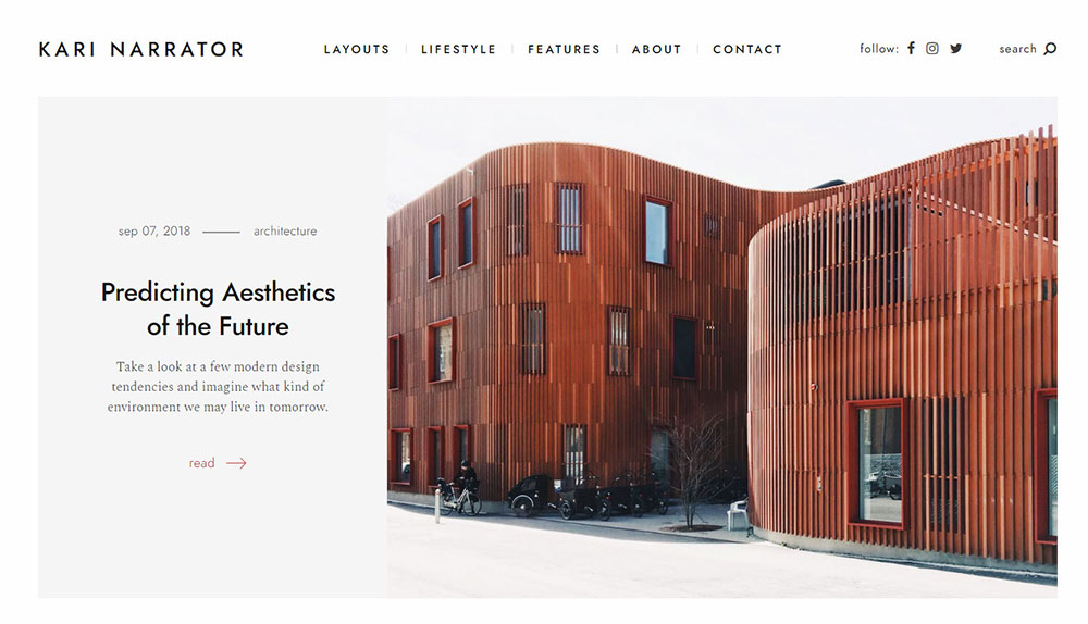
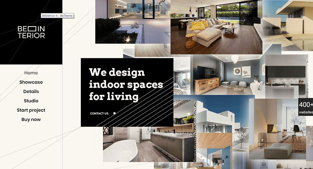
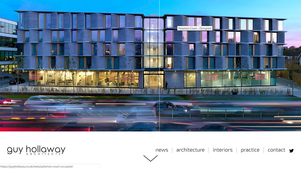
High-resolution photography, consistent grid structure, and a clear visual hierarchy. If the portfolio does not look better than the competition's, the rest of the site barely matters.
How Does Page Speed Affect Architecture Website Performance
Architecture sites are image-heavy, which means slow load times are a constant risk. Google's Core Web Vitals penalize pages that take too long to render, and visitors leave even faster. Compress images, use lazy loading, and test with Google PageSpeed Insights regularly.
What Role Does Mobile Responsiveness Play for Architect Websites
Over half of web traffic comes from mobile devices. A responsive website that adapts to smaller screens is not optional. Portfolio galleries need to scale down without losing image quality or breaking the layout.
What Design Patterns Do the Best Architect Websites Share
How Do Top Architecture Firms Use Portfolio Galleries
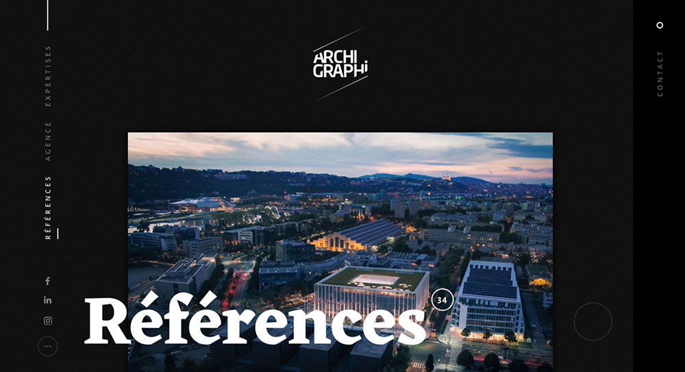
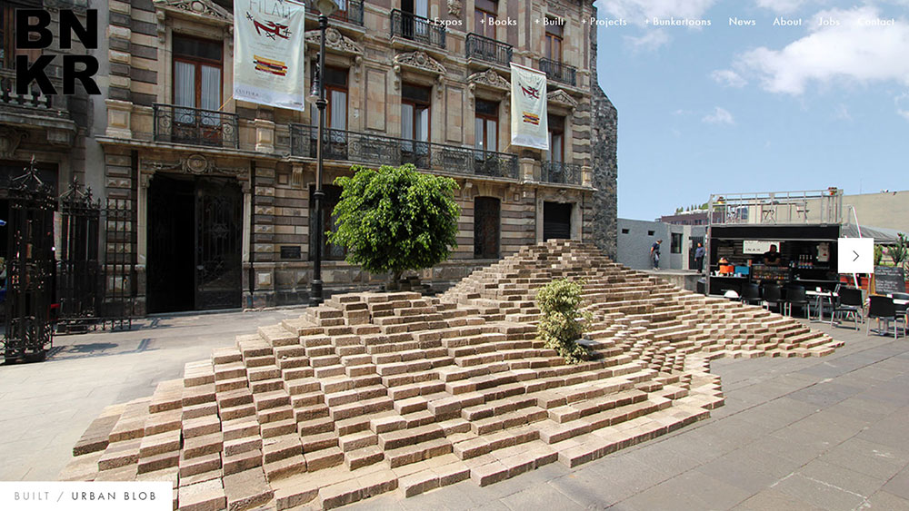
Grid-based galleries with consistent thumbnail sizes are the standard. The best ones add hover effects for project names and category filters for building type, location, or year.
What Typography Trends Are Common on Architect Websites
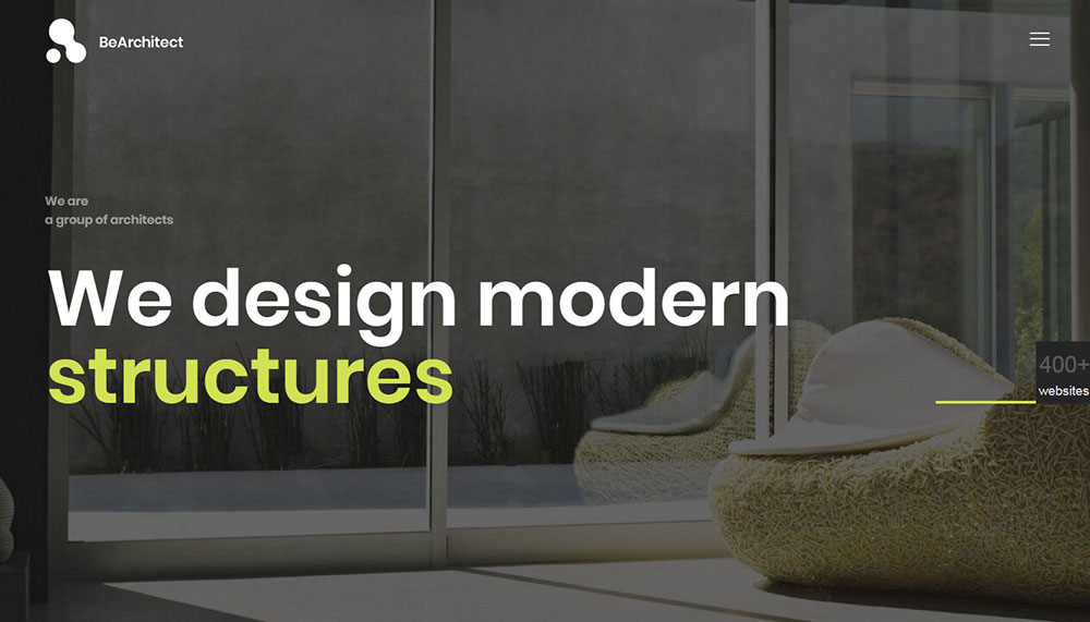
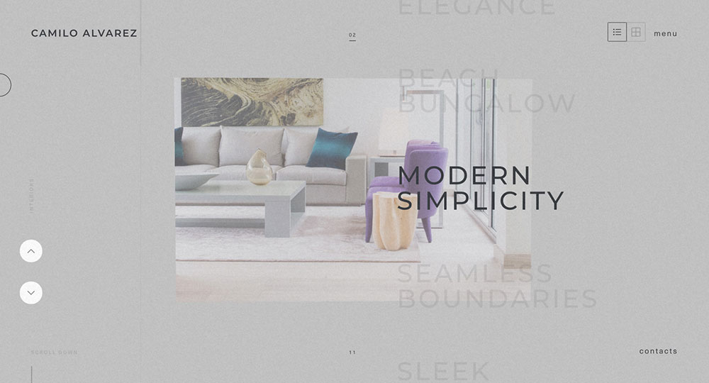
Sans-serif typefaces dominate. Firms like Wright Plus and Selldorf Architects use large, clean type to create visual impact without cluttering the page. Serif fonts occasionally appear in body text for a more editorial feel, but they are the exception.
How Do the Best Sites Use Scroll Animations and Transitions
Subtle fade-ins and parallax movement on project images are common across animated websites in this space. GSAP is one of the most popular animation libraries used by architecture studios. The key word is subtle. Heavy animations slow load times and distract from the work.
How to Structure an Architect Website for Conversions
Where Should Calls to Action Appear on an Architecture Firm Website
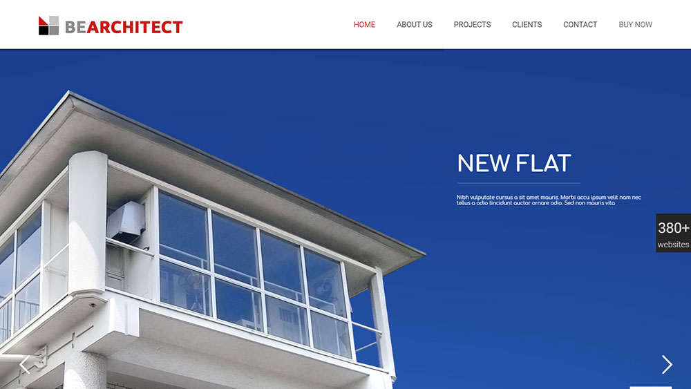
At minimum: the top navigation bar, the end of each project page, and the homepage above the fold. Firms like Mohagen Hansen place a "View Our Work" button in the main nav, which keeps the primary action visible at all times.
How Do Contact Pages and Lead Forms Differ on Architect Websites
The best architecture firm contact pages are short. Name, email, project type, brief message. Long forms with 10+ fields kill conversion rates. Clean form design matters here just as much as it does on any lead generation landing page.
What Pages Should Every Architecture Website Include
- Homepage with featured projects and a clear value statement
- Portfolio/Projects organized by type, with dedicated pages per project
- About page with team bios, firm history, and design philosophy
- Services page listing specific capabilities (residential, commercial, interiors, planning)
- Contact page with a short form, phone number, and office location
- Blog or Journal for publishing original content, project updates, and industry insights
Common Mistakes in Architect Website Design
What Happens When Architecture Firms Prioritize Aesthetics Over Usability
A stunning homepage means nothing if visitors cannot find the portfolio or contact page. Some firms over-invest in visual effects and parallax scrolling at the cost of basic usability. Looking at sites with bad design patterns shows this tradeoff clearly: beauty without function drives people away.
How Does Slow Load Time Hurt an Architecture Firm's Website
Uncompressed images are the biggest offender. A single project page with five unoptimized photos can take 8+ seconds to load on mobile. That is enough to lose most visitors and tank your Core Web Vitals scores.
Why Do Some Architect Websites Fail to Generate Leads
Missing or buried contact information, no calls to action on project pages, and generic "Contact Us" buttons with no context. The fix is simple: tell visitors what to do next and make it easy. Every project page should end with a prompt to start a conversation, not just a footer link.
FAQ on Architect Website Design
What makes a good architect website?
A good architecture firm website prioritizes high-resolution project photography, clean navigation, fast load times, and clear calls to action. The portfolio section should be the focal point, with dedicated pages for each project that include images and technical details.
Which architecture firms have the best websites?
Zaha Hadid Architects, Foster + Partners, Selldorf Architects, Olson Kundig, Bjarke Ingels Group, and Gensler consistently rank among the best. Each site reflects the firm's design philosophy through deliberate layout choices, strong imagery, and intuitive browsing.
What platform should architects use to build a website?
Webflow, Squarespace, and WordPress are the most common platforms for architect websites. Webflow offers the most design flexibility. Squarespace works well for smaller firms. WordPress handles content-heavy sites with extensive project archives.
How important is mobile responsiveness for architect websites?
Over half of web traffic comes from mobile devices. An architecture portfolio that breaks on smaller screens loses potential clients immediately. Responsive design is a baseline requirement, not a bonus feature. Google also factors it into search rankings.
How should architects organize their portfolio online?
Use a grid-based portfolio gallery with consistent thumbnail sizing. Add filters for project type, location, and year. Each project needs its own page with full-width images, a short description, and relevant specs like square footage or building use.
What pages should every architecture website include?
Homepage, portfolio with individual project pages, about page with team bios, services page, contact page with a short form, and a blog or journal section. These six sections cover what most visitors look for when evaluating an architecture firm online.
How do architect websites generate leads?
Through visible calls to action on project pages, short contact forms, and clear service descriptions. The best architect websites place a consultation prompt at the end of every project page rather than relying solely on a single contact link in the footer.
What design trends are popular on architecture websites right now?
Minimalist layouts with generous white space, sans-serif typography, full-screen hero images, subtle scroll animations using tools like GSAP, and dark mode options. Video walkthroughs and embedded 3D renderings are also gaining traction on newer architecture studio sites.
How does page speed affect an architecture website?
Architecture sites are image-heavy, which makes them prone to slow loading. Uncompressed photos can push load times past 8 seconds on mobile. Use lazy loading, compress all images, and monitor performance through Google PageSpeed Insights and Core Web Vitals reports.
Can a small architecture firm compete online with larger studios?
Yes. Felicity Christian Architect in New Zealand proves a solo practice can build a compelling site with strong photography, a clear services page, and client testimonials. A focused, well-designed site beats a bloated one from a larger firm every time.
Conclusion
These architect website design examples show that the gap between a forgettable site and one that actually wins clients comes down to a few specific decisions. Portfolio structure, image quality, page speed, and clear navigation.
Firms like Gensler and Olson Kundig prove that even content-heavy sites can feel clean when the layout is intentional. Smaller practices like Felicity Christian show that budget is not the deciding factor.
Pick one or two ideas from the sites above and apply them to your own. Maybe it is a better project gallery grid. Maybe it is finally compressing those 5MB hero images.
Your architecture speaks for itself in person. Your website should do the same thing online.


