


The Beauty Of Minimalist Website Design Explained
June 6, 2026
The Best Gaming WordPress Themes to Pick One From
June 8, 2026Your artwork deserves better than a cluttered portfolio page that buries the work under bad navigation and slow-loading images.
The best artist website design examples share a clear logic: image-first layouts, minimal navigation, and a visual identity that feels like the artist, not like a template.
Online art sales reached $11.8 billion in 2023 (Art Basel and UBS). The digital channel matters more than ever for fine artists, illustrators, photographers, and digital creators.
This article breaks down real artist websites by what actually works, covering display formats, platform choices, typography, color strategy, mobile design, and conversion mechanics.
What Is Artist Website Design
Artist website design is the visual and structural system that presents creative work online. It covers layout decisions, typography choices, image handling, navigation structure, and the contact flow a gallery curator or collector uses to reach the artist.
It is not the same as a general portfolio site. Art-focused design treats image display as the primary function. Every other element, including navigation, color, and type, exists to support that function.
Users form an opinion about a website within 50 milliseconds (Lindgaard et al., Behaviour and Information Technology). For artists, that snap judgment determines whether a visitor stays to explore the work or leaves immediately.
3 core functions an artist website must perform:
- Showcase work at the highest possible visual quality
- Communicate the artist's identity through layout, color, and typographic choices
- Convert visitors into buyers, clients, or collaborators within 2 clicks of landing
Online art sales reached $11.8 billion in 2023, up 7% year-over-year (Art Basel and UBS Art Market Report 2024). A weak digital presence means lost access to that market.
The examples in this article are evaluated on 5 criteria: visual clarity, page load performance, mobile responsiveness, navigation logic, and identity coherence between sections.
How artist website design differs from general portfolio design
General portfolio sites balance text and image roughly equally. Artist websites place image display above everything else. White space, neutral backgrounds, and minimal UI chrome are standard because they stop the interface from competing with the artwork itself.
A fine art website that draws the eye to its navigation bar instead of the painting has failed its primary job.
What Are the Best Artist Website Design Examples
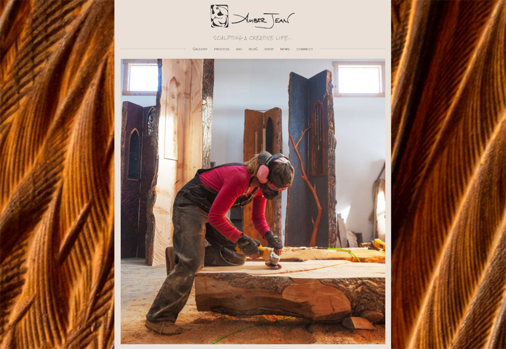
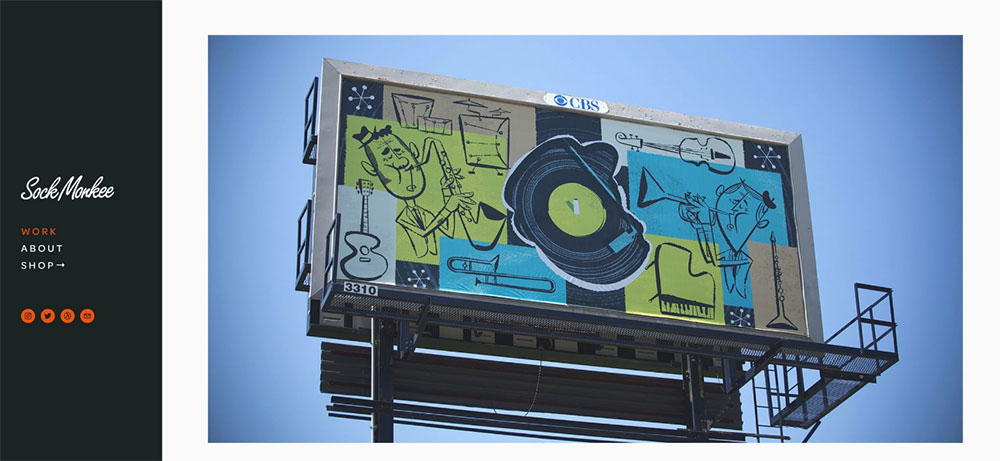
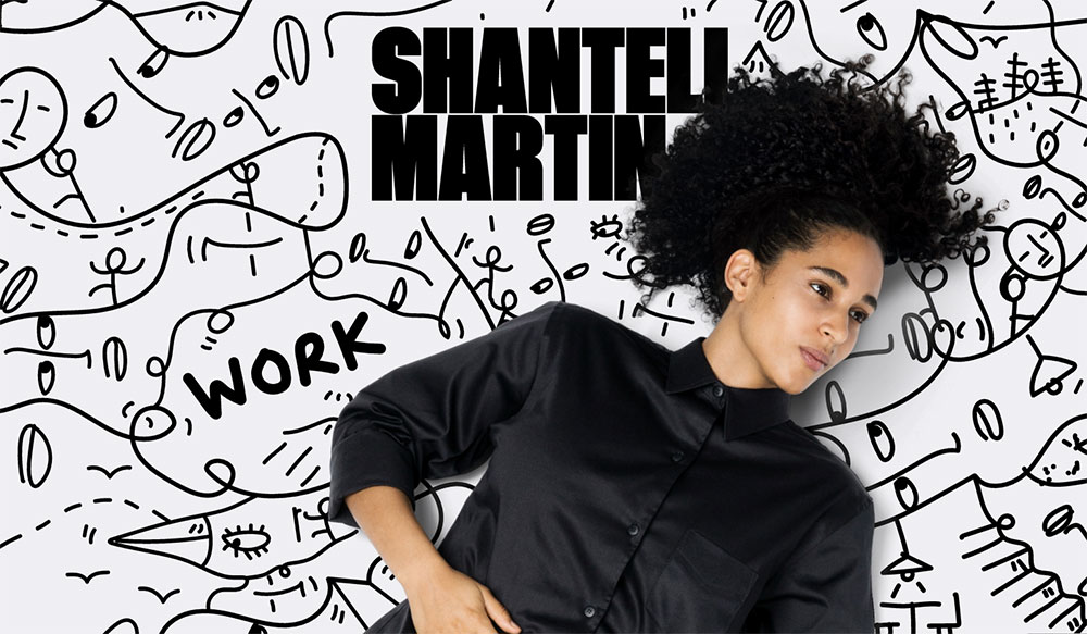
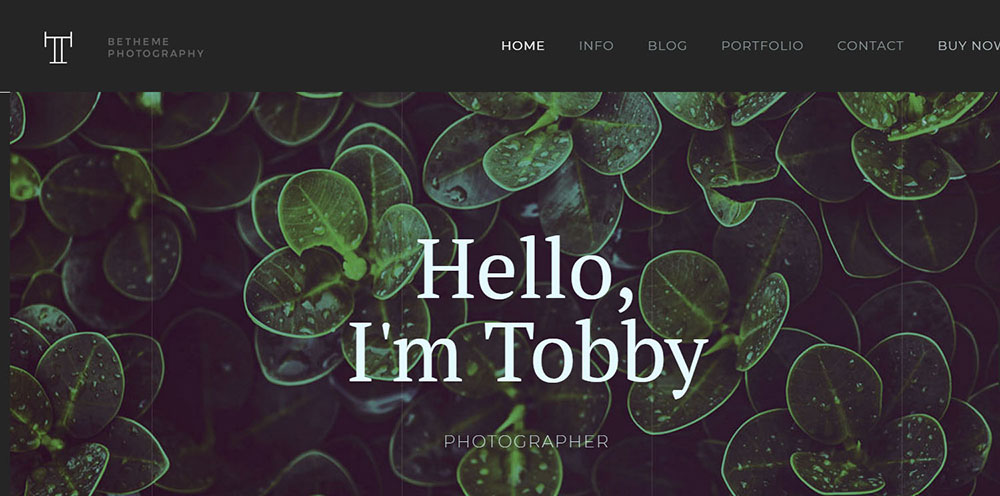
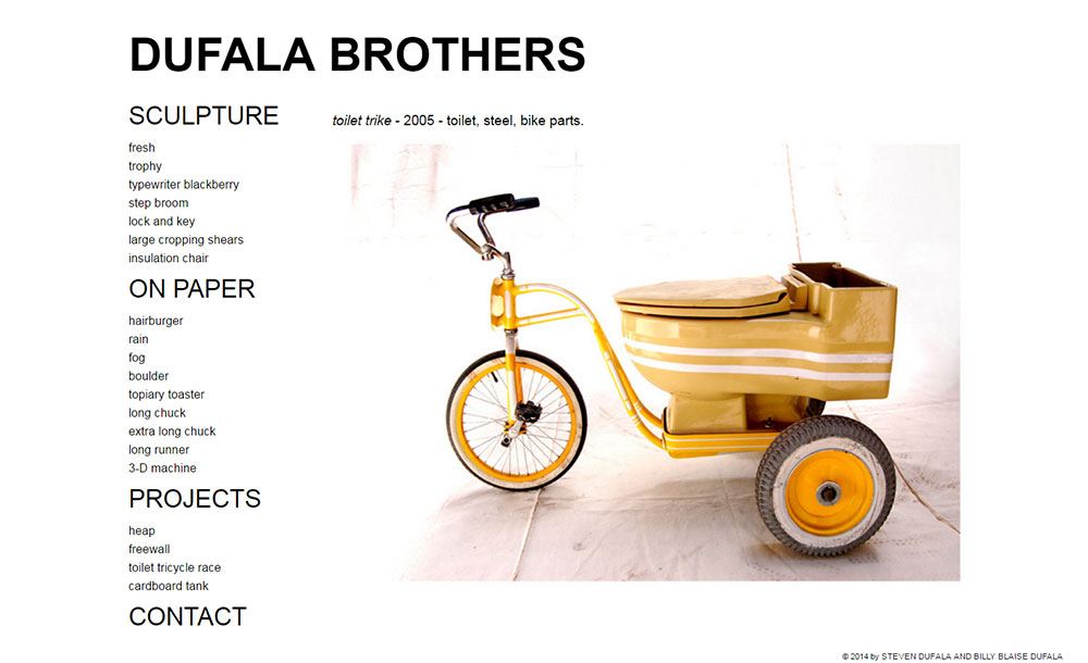
Amber Jean
What Design Patterns Appear Across the Best Artist Websites
Reviewing the examples above reveals 4 repeating decisions that separate the strongest designs from the rest. These aren't style preferences. They're structural choices with measurable effect on how long visitors stay and whether they convert.
Full-bleed image layouts dominate
Full-bleed photography and painting displays appear in 8 of the 10 examples reviewed. The image runs edge to edge on the screen. No borders, no padding, no competing elements at the margins.
This format works because it removes the visual frame that separates artwork from interface. The visitor experiences the piece before they experience the website.
Navigation stays at 5 items or fewer
Most successful portfolios use exactly 3 to 5 top-level navigation items, according to UX research from the Nielsen Norman Group cited in portfolio best practices guidance. The human brain processes 3 items without conscious evaluation. Four or more requires active decision-making, which slows the visitor down.
The standard structure across fine art and illustration sites: Work, About, Contact, and optionally Shop or Press.
Sites with 8-plus navigation items consistently perform worse for time-on-page. The extra categories signal abundance but produce decision fatigue.
Background color follows the artwork, not the trend
Neutral backgrounds (white, off-white, black, dark gray) appear across nearly every example. The logic is straightforward: a neutral background does not compete with the artwork for visual attention.
Artists with vivid, colorful work tend toward white or off-white. Fine art photographers and painters working with deep tonal ranges often choose dark gray or near-black.
Color used as a brand signal appears in a limited role: hover states, logo marks, CTA buttons. Not backgrounds, not nav bars.
Two fonts maximum
Font pairing across the examples follows a consistent pattern: one display font for names and titles, one body font for descriptions and navigation. No site in the top examples uses more than 2 typefaces.
Display fonts signal identity. Body fonts support readability. Mixing more than 2 creates visual noise that competes with the work.
What Makes an Artist Website Design Effective
Effectiveness here means the site completes its 3 functions: showcase work, communicate identity, and convert visitors. These are the criteria where most artist websites fall short.
Image loading speed is the first failure point
Unoptimized high-resolution images are the most common technical failure on artist websites. A one-second delay in page load reduces conversions by 7% (Google). A site that takes over 2 seconds to load loses up to 60% of its visitors before they see a single piece of work (Hostinger, 2026).
What the best examples do:
- Serve images in WebP format instead of PNG or JPEG
- Use lazy loading so images below the fold load only when needed
- Set explicit image dimensions to prevent layout shift during load
Core Web Vitals scores on Squarespace-built artist sites pass at a 96% INP responsiveness rate (HTTP Archive, cited in Colorlib Squarespace Statistics 2026). That's the technical foundation the examples above benefit from.
Visual hierarchy keeps artwork dominant
75% of users judge a website's credibility based on its design (Kinesis, cited by Sixth City Marketing). For artists, that credibility is built by putting the work front and center on every page.
Common failures:
- Navigation bars that are visually heavier than the artwork
- Large logo marks that compete with the first visible image
- Sidebar text that pulls the eye away from the gallery grid
The fix is consistent: reduce the visual weight of every UI element until the artwork is clearly dominant at a glance.
Mobile layout is not optional
Mobile devices held 64.35% of global web traffic as of July 2025 (StatCounter, via Quantumrun). Responsive design that fails on mobile loses the majority of visitors before they see the portfolio.
Non-responsive design is the primary reason visitors leave a website, according to 73.1% of respondents in a GoodFirms survey. That figure applies directly to online art portfolio traffic.
| Issue | Effect | Fix |
|---|---|---|
| Unoptimized images | Slow load, high bounce rate | WebP format + lazy loading |
| Non-responsive layout | 73.1% visitor exit rate | Mobile-first CSS Grid |
| Weak visual hierarchy | Artwork competes with UI | Reduce nav and header weight |
| Contact buried 3+ clicks deep | Buyers and curators don't reach out | Contact accessible within 2 clicks |
Which Platforms Do Professional Artists Use for Their Websites
The platform choice affects image rendering quality, load performance, mobile behavior, and how much technical skill the artist needs to maintain the site. These are the platforms that appear across the top examples.
Squarespace
Squarespace is the platform most used by fine artists and photographers. Its design quality is consistently rated highest among website builders, with particular preference from photographers and artists (Colorlib, 2026).
The most popular industries using Squarespace are food and beverage and arts and entertainment (App My Site, cited by Higocreative). That preference reflects how well the platform's image-first templates align with art portfolio needs.
Best for: Fine artists, photographers, and illustrators who want strong visual output without custom code.
Cargo Collective
Cargo Collective is the preferred platform among illustrators and experimental artists who need more visual flexibility than Squarespace provides. Its layout system allows unconventional grid arrangements that standard drag-and-drop builders don't support.
Best for: Illustrators and mixed-media artists who want layout control without full custom development.
Framer and Webflow
Framer and Webflow appear in artist website examples where the designer or a collaborator has development skills. Both platforms support animation, scroll-triggered interactions, and custom CSS without requiring full code builds from scratch.
Best for: Digital artists and designers who treat the website itself as a design artifact.
WordPress with custom themes
WordPress appears in artist websites that need integrated blog or ecommerce functionality beyond what Squarespace Commerce handles. With a theme built for visual content (or using Elementor for layout control) it handles large portfolio archives well.
Artists managing a high-volume print shop or who publish written content regularly tend toward WordPress for its content management depth. Those wanting a quick, polished start can also explore purpose-built photographer website templates that work within WordPress.
| Platform | Best artist type | Technical requirement |
|---|---|---|
| Squarespace | Fine art, photography | None |
| Cargo Collective | Illustration, experimental | Low |
| Framer | Digital art, animation | Medium |
| Webflow | Design-forward portfolios | Medium to high |
| WordPress | Print shops, content-heavy | Medium |
How Do Artists Structure Their Website Navigation
Navigation structure on artist websites is where most designs either hold together or fall apart. The goal is to get a gallery curator or collector to the right content without making them think about how to get there.
The 3-to-5 item rule
Most effective artist website navigation holds 3 to 5 top-level items. The Nielsen Norman Group's UX research on navigation design confirms that 3 items process instantly. More than 5 requires the visitor to actively decide, which interrupts the viewing experience.
Standard structure across fine art and photography sites:
- Work (or Portfolio)
- About
- Contact
- Shop (when print or original sales are active)
- Press (for artists with editorial coverage worth surfacing)
The Sami Viljanto example keeps navigation to 3 items and has no shop. The Benjamin Hardman site uses 4. Neither feels incomplete. Both feel intentional.
Series-based vs. flat gallery navigation
Series-based subnavigation works when an artist produces distinct bodies of work that shouldn't be mixed. Wenting Li's site separates comics, paintings, and illustration this way. A collector looking for paintings doesn't have to scroll through comics to find them.
Flat gallery navigation (everything in one grid) works when the artist works in a single consistent style or medium. Mel Volkman's print shop uses a flat 3-column grid. No subnavigation needed because all the work reads as one coherent body.
The wrong choice: applying series-based navigation to a body of work that is stylistically unified. It fragments a coherent portfolio into pieces that read as smaller than they are.
Hidden and minimal nav in full-screen formats
Some of the most effective art websites use navigation that is hidden until the visitor actively seeks it. Hamburger menus, edge-click reveals, and hover-triggered nav bars let the full-screen image stay visually uninterrupted.
This works for artists whose work is strong enough to hold the visitor's attention without navigation prompts. It fails when the visitor needs orientation to understand the site's structure. Know which situation applies before hiding the menu.
For sites where navigation design is a priority, reviewing website navigation examples across different design categories shows how the same minimal principles apply well beyond art portfolios.
How Do Artist Websites Display Artwork Effectively
Image display is the technical and visual core of any online art portfolio. The choices made here determine whether a painting reads as powerful or flat, whether a photograph feels immersive or compressed.
Grid layouts vs. masonry vs. single-image scroll
CSS Grid (fixed columns): Works well for artists with a large, consistent body of work. Three-column grids are standard for print shops. The visual weight is even, which suits artists whose pieces are roughly similar in dimension.
Masonry layout: Handles mixed-format work. Photographs in portrait and landscape orientations sit together without forced cropping. The trade-off is that the visual rhythm is less controlled.
Single-image scroll: Each piece gets its own full-screen moment. Strong for artists with a small, curated selection. The Framer template "Haze" uses this approach: 5 pieces, each on its own dedicated page slide. The constraint is also the feature.
Lightbox use and when it disrupts
Lightbox popups work when the grid thumbnail is too small to show the work at meaningful scale. Clicking to expand a painting to full screen is a natural interaction that matches how visitors want to see art.
Lightboxes fail when they add a step that wasn't needed. If the grid image is already large enough to read the work clearly, a lightbox just adds a click. Sami Viljanto's site uses a lightbox that adds caption text alongside the expanded image. That's the right use: the lightbox provides information the grid can't.
Caption and metadata placement
Title, medium, dimensions, and year are the 4 metadata fields most galleries and collectors expect. Where they appear varies across the examples:
- Below the image in the grid: visible without interaction, lower image dominance
- Inside the lightbox only: keeps grid clean, requires a click to access details
- On hover: shows metadata without cluttering the resting view
Nona Inescu's portfolio uses hover-reveal titles because the titles alone don't communicate what the work looks like. The image has to do that. The title confirms it once the visitor is already engaged.
High-quality images increase conversion rates by up to 45% (MDG Advertising). That figure applies directly to print sales on artist websites. Properly displayed, full-resolution work at the correct color profile is not a design preference. It's a revenue decision.
Artists whose work spans graphic design and fine art disciplines often need gallery systems that handle both case study content and artwork display. The display logic differs: case studies need text context, artwork needs space.
What Typography Choices Appear in Top Artist Website Designs
Typography on artist websites does two jobs at once. It organizes information and it signals identity. The two goals sometimes pull against each other, and the best examples handle that tension by keeping the type system simple.
Consistent, well-structured typographic systems build trust and recognition (Nielsen Norman Group, cited in behavioral research on typography and credibility, 2024).
The two-font rule
Display font: carries the artist's name, section titles, and any statement text. Sized large (48px to 72px range on desktop). Does the identity work.
Body font: handles navigation labels, captions, bio text, and contact details. Stays readable at 14px to 18px. Does the usability work.
No site in the reviewed examples uses more than 2 typefaces. A third font adds visual noise without adding communication value.
Serif vs. sans-serif signals
Serif display fonts appear on fine art and painting sites. They reference print culture, gallery catalogues, and editorial design. The signal is traditional craft and seriousness.
Sans-serif dominates on illustration, digital art, and photography sites. It reads as contemporary and direct. The choice is rarely random because visitors read it as part of the artist's identity before they read a single word of text.
| Font style | Artist type | Signal to visitor |
|---|---|---|
| Serif display | Fine art, painting | Traditional, gallery-level |
| Sans-serif | Illustration, digital, photo | Contemporary, accessible |
| Custom / variable | Experimental, design-focused | Distinctive, high-craft |
Font size and weight on artist sites
Large display type (48px to 72px) for artist names and section headings appears in the majority of reviewed examples. The size forces the name to register as a visual element, not just a label.
Essi Kimpimaki's portfolio uses large typography as a design element in itself. Her header and footer stay minimal. The type carries the weight that other sites put into imagery.
Body text across the examples runs at 15px to 18px, consistent with readability research from Nielsen Norman Group recommending a minimum of 16px for body copy on the web.
For more on how typography decisions shape the overall feel of a site, typography in web design covers the principles that apply across every design category, not just art portfolios.
How Do Artist Websites Handle the About Page
The About page is where gallery curators, collectors, and commission clients decide whether to reach out. Most artist About pages either say too little or try to do too much. The best examples treat it as a credibility page, not a biography.
Research from Mobilo shows 70% of employers and buyers search for background information before making contact decisions. For artists, the About page is where that search lands.
Artist statement vs. bio: what the examples use
An artist statement explains the work. A bio explains the person. They serve different purposes and different audiences.
Gallery curators need the statement. They want to understand the conceptual context of the work before they contact the artist.
Collectors and private buyers want the bio. They buy from people they feel they know.
The strongest About pages in the reviewed examples include both, separated clearly. The statement comes first. The bio follows. Neither runs longer than 150 words.
Photo placement and how it affects trust
Including a photo of the artist on the About page reduces the perceived distance between the work and the person who made it. Citizen Atelier's site uses a large reviews section and visual social proof to build the same function digitally.
3 photo formats appear across the examples:
- Full-width portrait: signals confidence and presence
- Studio or workspace shot: shows the artist in context, adds authenticity
- Editorial-style photo: consistent with a fine art or gallery brand
Headshots against plain walls do not appear in the top examples. That format signals a CV, not a creative identity.
CV, exhibitions, and press as trust signals
56% of people report they won't trust a business or professional without a verifiable web presence (research cited by Mobilo, 2026). Exhibition history and press coverage are the art world's version of that verification.
The best artist About pages list exhibitions in reverse chronological order, limit the list to the last 5 to 7 years, and link to press mentions where the page still exists. Listing 20 exhibitions from 15 years ago reads as a resume, not a current practice.
Artists whose work has appeared in publications or been featured by known institutions benefit from linking those references. The link does more credibility work than the text alone.
What Color Strategies Do Artist Websites Use
Color on an artist website is not decoration. It sets the visual environment that the artwork lives in. Get it wrong and the site competes with the work. Get it right and the visitor doesn't notice the background at all.
Neutral backgrounds as the baseline
White, off-white, near-black, and dark gray backgrounds appear across the majority of reviewed examples. The principle is consistent with color psychology research: neutral backgrounds give other colors room to register (Gaia Digital, 2026).
A painting displayed against a warm off-white reads differently from the same painting against a cool gray. The background is a curatorial decision, not a default. The best artist websites treat it that way.
Practical rule from the examples: match the background temperature to the dominant tone of the work. Warm-toned paintings sit better on warm neutrals. Cool-toned photography reads better against gray or near-black.
Brand color in a limited role
Color used as an identity signal (not just background) appears in a specific pattern across the top examples:
- Hover states on gallery images
- CTA buttons (contact, commission, shop)
- Logo mark or name treatment
- Thin accent lines or borders in section breaks
Color consistency increases brand recognition by up to 80%, according to Color Marketing Group research (2021). For artists, that recognition extends to how collectors remember and return to the site.
Dark mode as an identity statement
Dark backgrounds are not the same as dark mode toggle functionality. Several fine art and photography sites use a permanently dark interface as a deliberate identity choice, not a user preference feature.
Alice X Zhang's dark-themed site is a direct example. The near-black background makes her vivid portrait colors read with the same intensity they would under gallery lighting. The dark interface is the creative decision. The artwork delivers the color.
Artists whose work is monochromatic, muted, or heavily textural tend toward white or off-white. Those contrasts are all intentional. None of the top examples use a default background without having considered what it does to the work displayed on it.
For more on how color decisions shape a site's entire feel, color theory in web design covers the system-level decisions behind palette choices, including contrast ratios and accessible color use.
How Do Artist Websites Convert Visitors into Buyers or Clients
The Art Basel and UBS Art Market Report 2026 found that 46% of online dealer sales in 2024 went to new buyers. Artists who accept payments directly on their site capture that demand without sharing revenue with a marketplace.
Conversion on an artist website means 1 of 3 outcomes: a print purchase, a commission inquiry, or an email list signup. The design decisions that drive each are different.
Shop integration models
Squarespace Commerce: native print and product sales with no third-party embed. Clean checkout flow that stays within the site's visual design.
Shopify Buy Button: embeds into any platform. Gives access to Shopify's inventory and payment tools without migrating the full site.
Big Cartel: lightweight, low-commission shop for artists selling originals and limited prints. Common among painters selling physical work directly.
Print-on-demand integrations (Society6, Printful): handle printing and shipping. The artist uploads high-res files and sets pricing. No inventory management required.
Raul and David's photography site lists print availability directly alongside each image. No separate shop page. The purchase option appears in context with the work, which removes a navigation step between interest and transaction.
Commission inquiry forms
Commission clients need a clear path to reach the artist quickly. Sites where the contact form is buried 3 or more clicks from the homepage lose that inquiry to a competitor whose contact is easier to find.
What the best commission contact forms include:
- Project type (original, print, mural, digital)
- Budget range (removes back-and-forth on fit)
- Timeline (helps the artist prioritize)
- Brief description field (maximum 200 characters)
Tone matters. Commission forms that read like a formal submission system create friction. The best examples keep the form short and the surrounding text warm and direct.
Email list capture without disrupting the gallery
Popup windows that fire on entry interrupt the gallery experience before it starts. The most effective email capture in the reviewed examples appears in 2 positions: the footer of every page, or a slide-in after 60 seconds on the site.
Citizen Atelier's site uses a popup offering a discount in exchange for an email. That's an ecommerce approach. Fine artists typically offer early access to new work or exhibition announcements instead, which aligns better with how collectors engage with studio practice.
Artists managing both a shop and a client practice can look at how ecommerce homepage design handles the balance between gallery presentation and conversion architecture. The structural logic translates directly to artist websites that sell both prints and commission work.
What Mobile Design Decisions Matter on Artist Websites
Responsive websites register an 11% higher conversion rate and 20% higher user engagement than non-responsive sites, according to VWO data (cited in Parallelhq, 2026). For an art portfolio where the primary product is visual, mobile layout failures directly reduce purchase and inquiry rates.
Grid collapse and image stacking
Desktop 3-column grids collapse to single-column on mobile in nearly all reviewed examples. That's the right call for artwork display. A 3-column grid on a 375px screen produces images that are roughly 120px wide. No painting reads at 120px wide.
Single-column stacking on mobile means each piece gets full-width display. Load time becomes the constraint. Artists should serve images sized to the viewport using the srcset attribute, targeting under 100KB per image on mobile (ALF Design Group, 2026).
Touch targets and navigation on mobile
Apple's Human Interface Guidelines set minimum touch target size at 44x44px. Google's recommendation is 48x48px. Both exist because fingers are larger than mouse cursors, and undersized tap targets produce accidental navigation and user frustration.
Mobile navigation patterns in the reviewed examples:
- Hamburger menus that reveal the full navigation on tap
- Bottom navigation bars for sites with 3 to 4 primary sections
- Floating headers that stay accessible during scroll
Hidden navigation that requires the visitor to find it first fails on mobile. Desktop users explore. Mobile users execute. The navigation has to be findable within the first interaction.
Lightbox and zoom on touchscreens
Lightbox interactions that work by mouse hover fail on touch devices. Pinch-to-zoom on artwork images works naturally on iOS and Android without custom implementation, but only if the viewport meta tag allows scaling.
Several fine art sites in the reviewed examples disable pinch-to-zoom to protect layout integrity. That's a mistake. Collectors examining brushwork, texture, or fine detail on mobile need zoom capability. Blocking it removes a key part of how people evaluate whether to buy original work remotely.
Artists who want a pre-built starting point that handles mobile layout correctly from the start, rather than retrofitting it later, benefit from starting with responsive website design foundations rather than fixing mobile after the fact. The structural decisions made early determine how well the gallery experience holds up on every screen size.
For artists looking at purpose-built starting points, website portfolio design examples across disciplines show how the mobile-first structural decisions differ by creative category and what the best visual portfolio sites have in common at the layout level.
FAQ on Artist Website Design Examples
What makes a good artist website design?
A good artist website puts the work first. Image-first layouts, minimal navigation (3 to 5 items), neutral backgrounds, and fast load times are the four decisions that separate effective online art portfolios from ones that lose visitors before the work loads.
Which platform is best for an artist website?
Squarespace suits most fine artists and photographers. Cargo Collective fits illustrators who need layout flexibility. Framer and Webflow work for artists with technical support. WordPress is best when a print shop or blog is part of the practice.
How many pages should an artist website have?
Most effective artist websites use 3 to 5 pages: Work, About, Contact, and optionally Shop or Press. Adding more pages rarely helps. Decision fatigue from too many navigation options reduces time-on-site and lowers the chance a visitor reaches out.
Should an artist website have a shop?
Yes, if the artist sells prints, originals, or digital downloads. Online art sales hit $11.8 billion in 2023 (Art Basel and UBS). A direct shop removes marketplace commissions and keeps the buyer relationship with the artist, not a third-party platform.
What colors work best for an artist website background?
Neutral backgrounds, white, off-white, dark gray, or near-black, work best. They don't compete with the artwork. Background temperature should match the dominant tone of the work: warm neutrals for warm-toned paintings, cool grays for photography.
How should an artist display artwork on their website?
Full-bleed image layouts and CSS Grid or masonry galleries are the most common formats. Use WebP format and lazy loading to keep load times fast. Lightboxes work well when captions or metadata need to appear alongside the expanded image.
What should an artist's About page include?
An artist statement (explaining the work), a short bio (explaining the person), a portrait photo, and a concise exhibition history limited to the last 5 to 7 years. Press links add credibility. Keep the total page under 300 words.
How do you make an artist website mobile-friendly?
Use single-column grid layouts on mobile, set touch targets to at least 44x44px, serve images in WebP at under 100KB per file, and allow pinch-to-zoom. Responsive design increases conversion rates by 11% compared to non-responsive layouts (VWO).
What typography should artists use on their websites?
Use 2 fonts maximum: one display font for the artist name and headings, one body font for navigation and captions. Serif display fonts signal traditional fine art. Sans-serif reads as contemporary. Display type should run between 48px and 72px.
How do artist websites convert visitors into buyers?
By placing purchase options in context with the work, not on a separate shop page. Short commission forms, footer email capture, and print-on-demand integrations like Printful or Society6 reduce friction between a visitor seeing the work and taking action.
Conclusion
This conclusion is for an article presenting artist website design examples that go beyond aesthetics and into the decisions that drive real results.
The patterns are consistent. Full-bleed galleries, two-font systems, neutral color palettes, and contact flows that take 2 clicks or fewer separate the sites that convert from the ones that don't.
Platform matters less than structure. Whether you build on Cargo Collective, Webflow, or a custom WordPress theme, the same visual hierarchy rules apply.
Get the mobile layout right from the start. Fix image optimization before anything else. Then invest time in the About page, because that's where collectors and curators decide whether to reach out.
The work deserves a site built to the same standard.


