Fixing the Destination Folder Already Exists Error
April 22, 2021
Fixing The “Are You Sure You Want to Do This” Error in WordPress
March 1, 2023Imagine the spotlight turns your way, the curtains pull back, and there they are—the audience, eager and waiting. Only this time, the stage is virtual, and the crowd is the boundless expanse of the internet. Your website is your stage as an actor, and the design needs to dazzle.
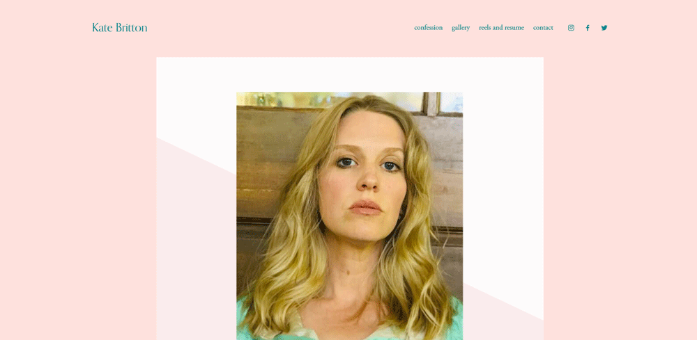
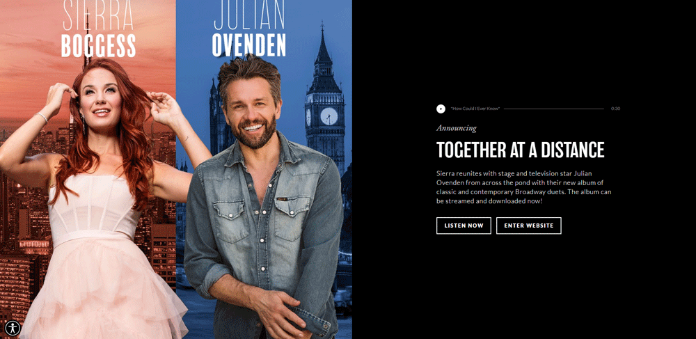
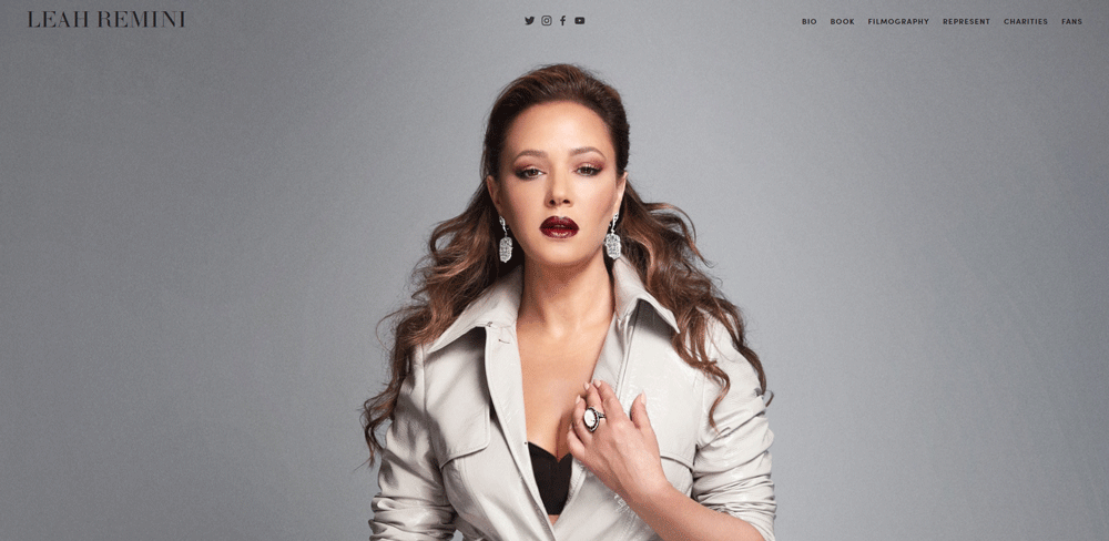
Crafting an online presence that resonates with the soul of theatre, the thrill of film, and the personal touch of your unique journey, bridges the gap to casting directors, agencies, and fans. They're all scouting for talent—something compelling, something professional, something... you.
By the finale of this read, you'll have a treasure trove of actors website design examples at your disposal. Not just pictures on a screen, but blueprints brimming with personal branding, showcasing online resumes and audition reels, all wrapped in designs that speak to the audience like a soliloquy speaks to the soul.
Dive in. Learn how to weave user experience with visual aesthetics, integrate media seamlessly, and highlight your filmography and upcoming projects. Because in this digital era, your website isn't just a website; it's an SEO-friendly gateway to the stars.
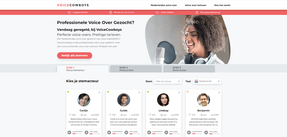
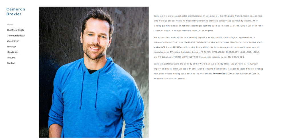
Actor Website Design Examples
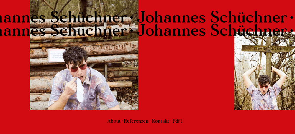
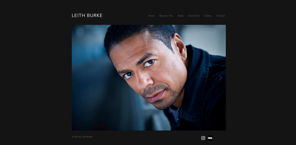
Johannes Schüchner
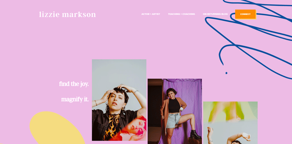
Lizzie Markson is the owner of The Embodied Artist Studio. This studio aims to mentor and teach others how to develop a passion for the performing arts and entertainment.
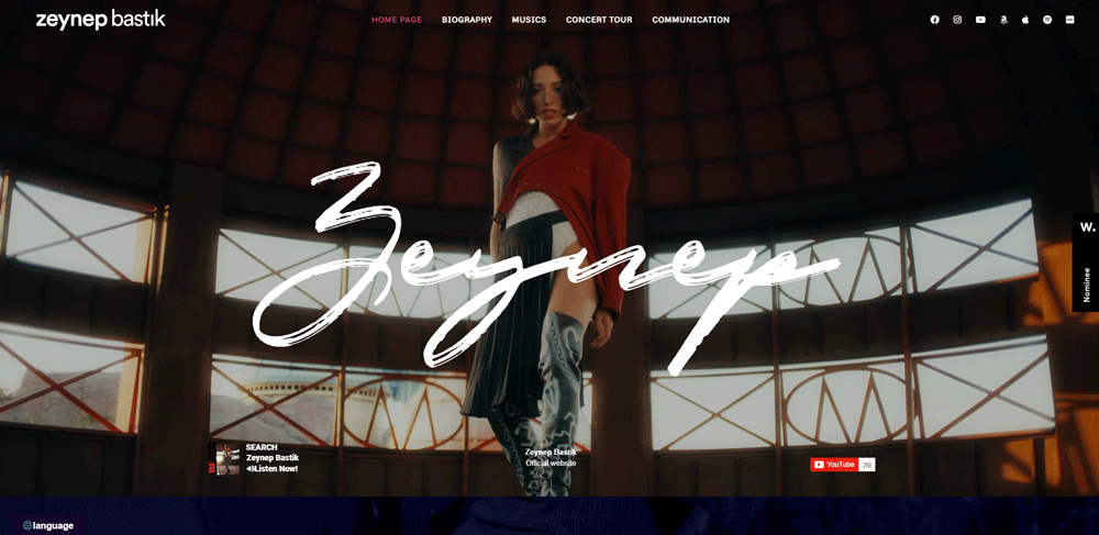
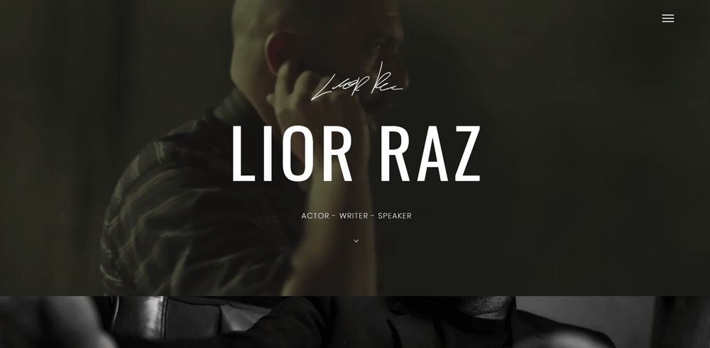
Zeynep Bastik’s Official Website
This is one of the best actor website examples that you can find. It draws you in right away. The backdrop of the website are stills from Fauda, a popular TV series. In the middle of the screen, you see the actor's name and autograph. The use of layers gives the website design a cinematic atmosphere.
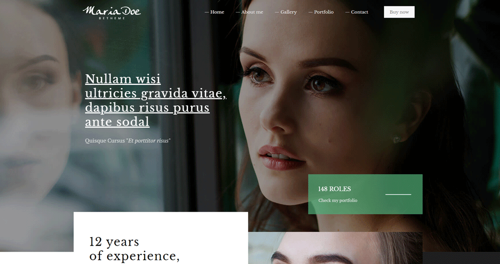
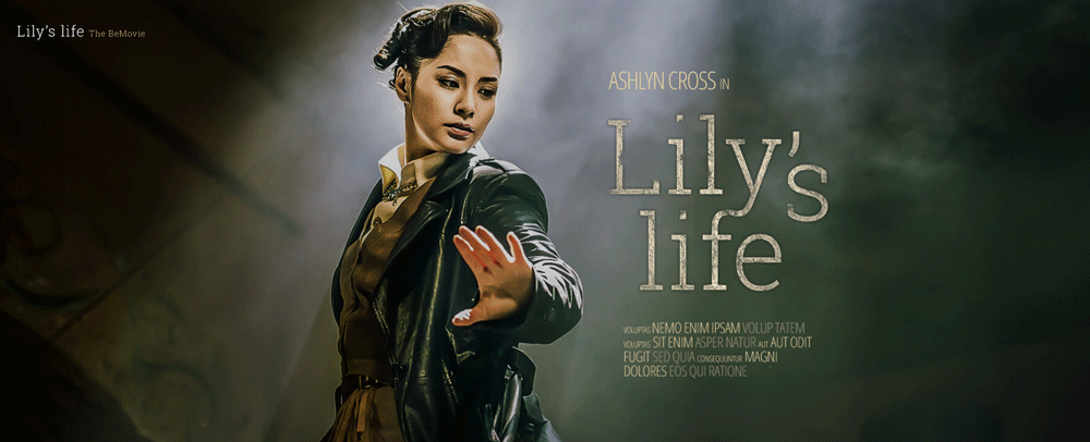
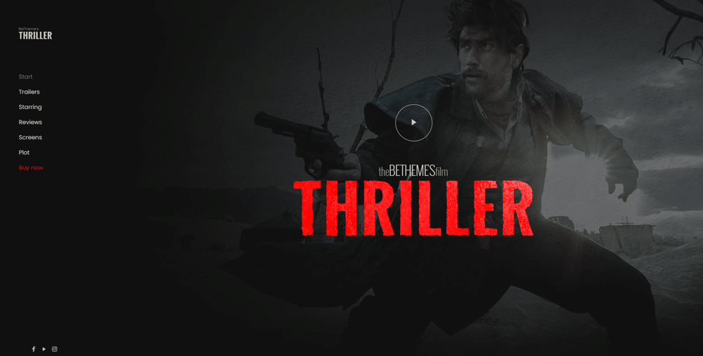
Be Movie 2
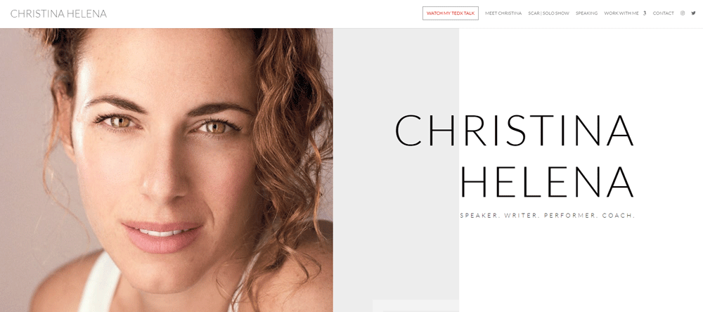
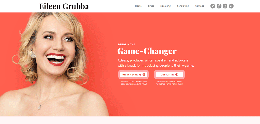
Christina Helena offers her services as an actress, speaker, and writer. There are many amazing design features on her actor website. You can find integrated videos, Instagram feeds, sticky headers, and much more. Her skills as a speaker are evident from the speaker page. There you will find many examples of her talks and writings.
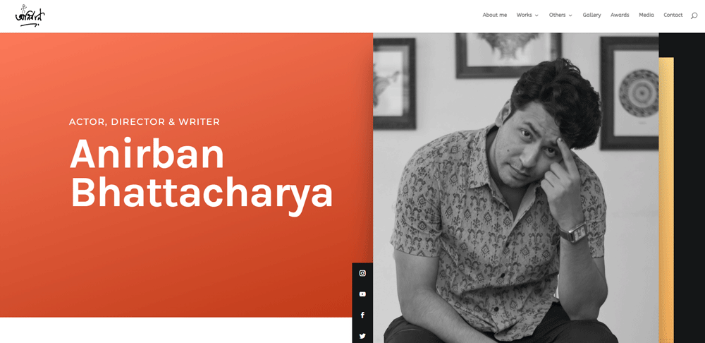
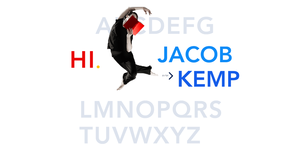
Anirban Bhattacharya
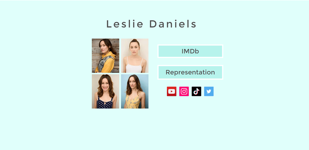
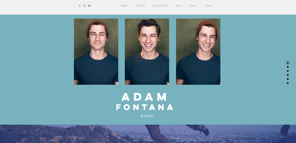
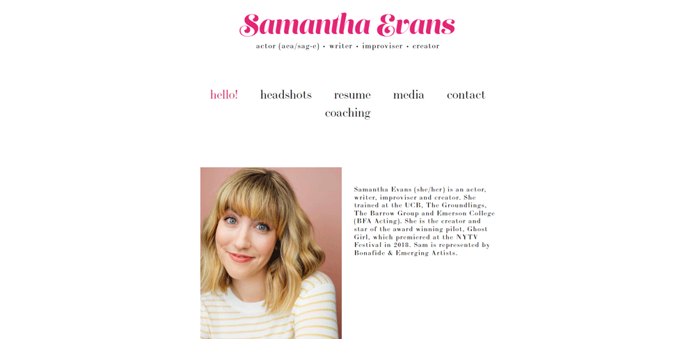
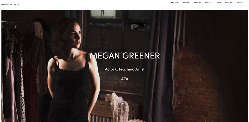
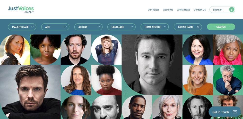
The background of this website are headshots of the actress and comedienne herself. The web designer used a bright color palette. The combination of both elements gives the actor website design a light feel.
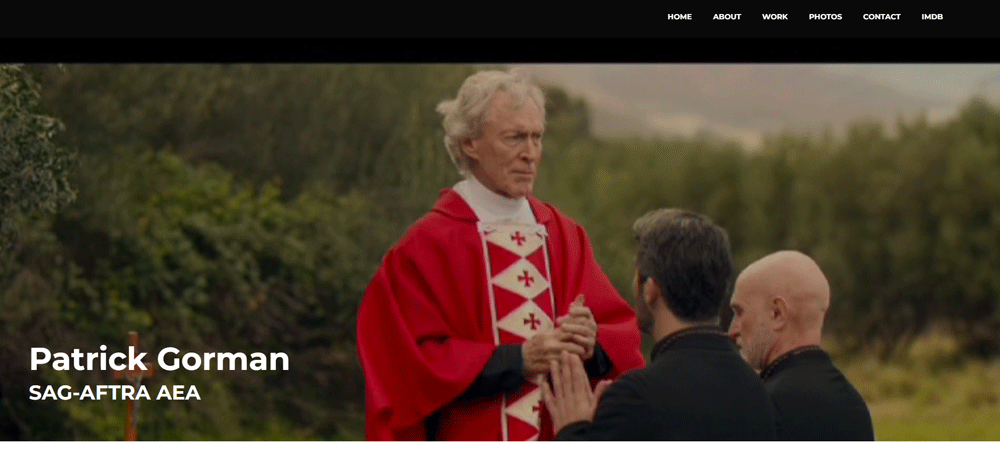
Patrick Gorman
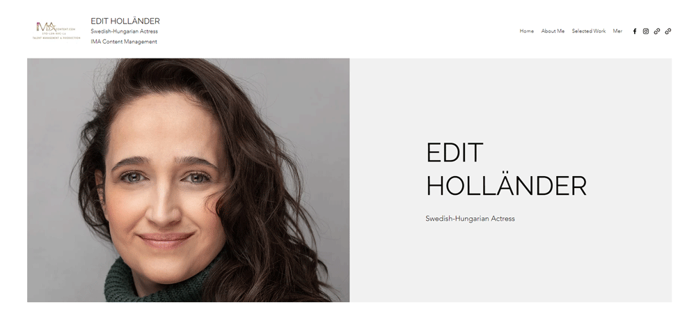
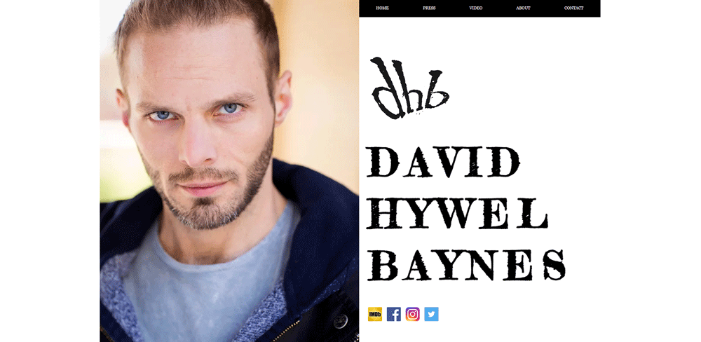
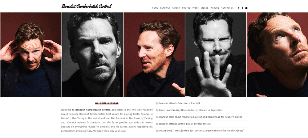
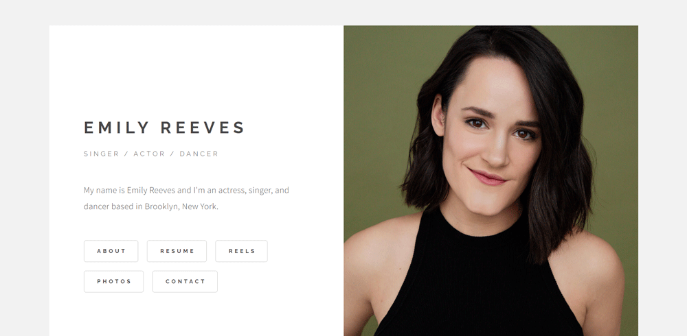
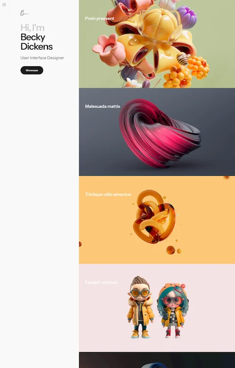
Because of the split-screen layout, you can see Edit's pictures and read a brief description at the same time. The entire actor website design is clean and pleasant thanks to the typography and stylish white space.
Pictanovo
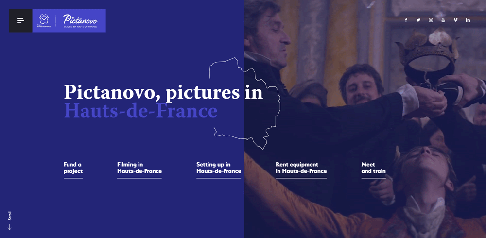
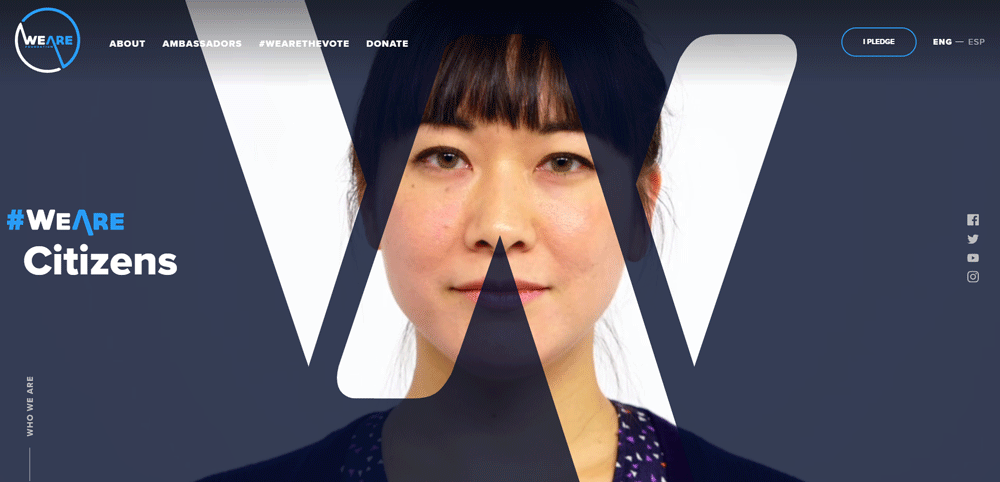
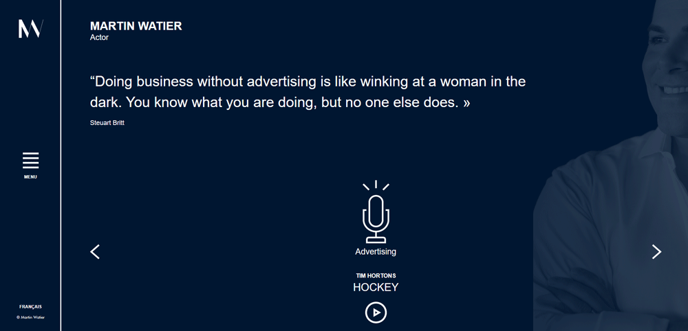
The word that best captures this website design is 'elegance'. It has some outstanding color accents that work very well with the black and white background. Yellow, red, and pink will guide your eyes through this beautiful website. The online copyright information adds to the credibility of the actress.
Edita's Casting
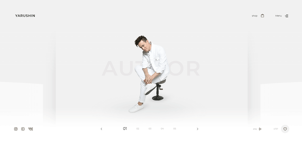
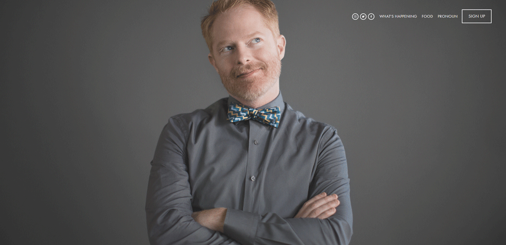
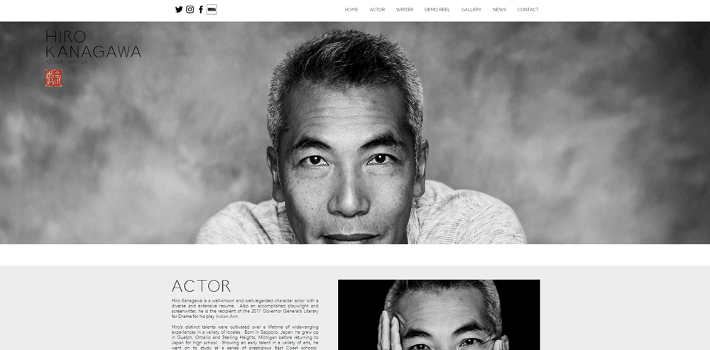
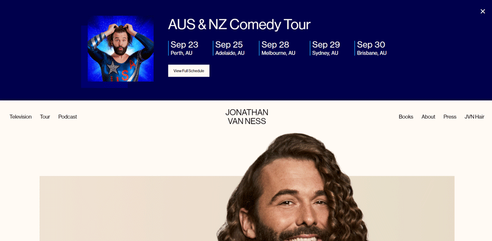
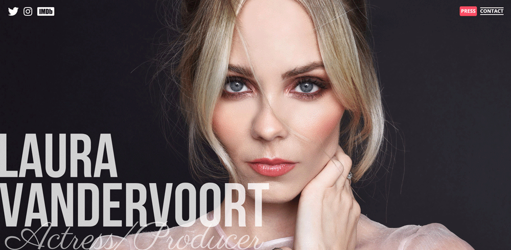
The next on this list of the best actor website examples is Jonathan Van Ness. The actor website design is very straightforward. It starts with a large photograph of the actor on a white background. The parallax effect adds volume and movement to the design.
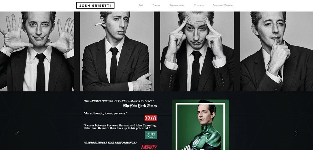
Josh Grisetti
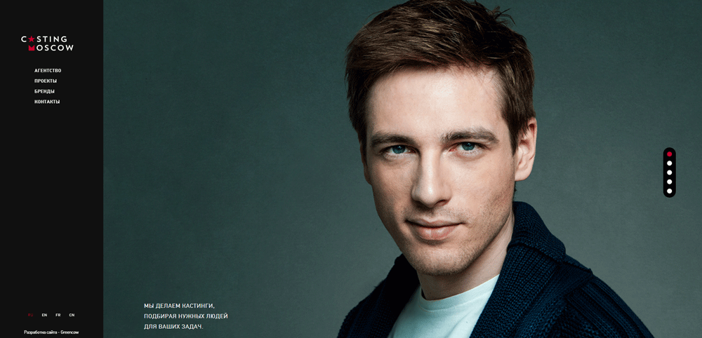
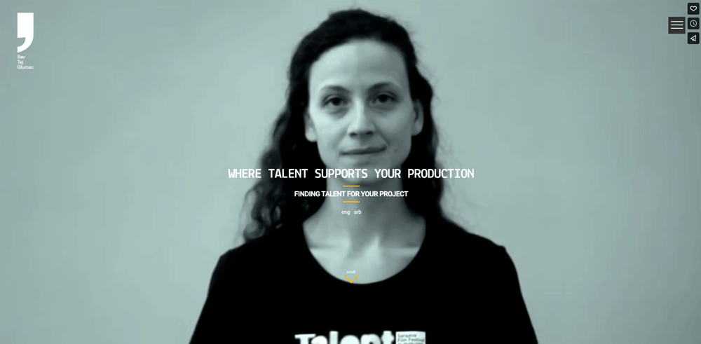
Sav Taj Glumac is a casting agency from Serbia. The owners have broad experience with actors, both behind and in front of the cameras. They have worked with some of the most famous casting directors, like Beatrice Kruger and Nancy Bishop. The result is a more creative and efficient approach to the casting process. New talent and older actors have similar opportunities.
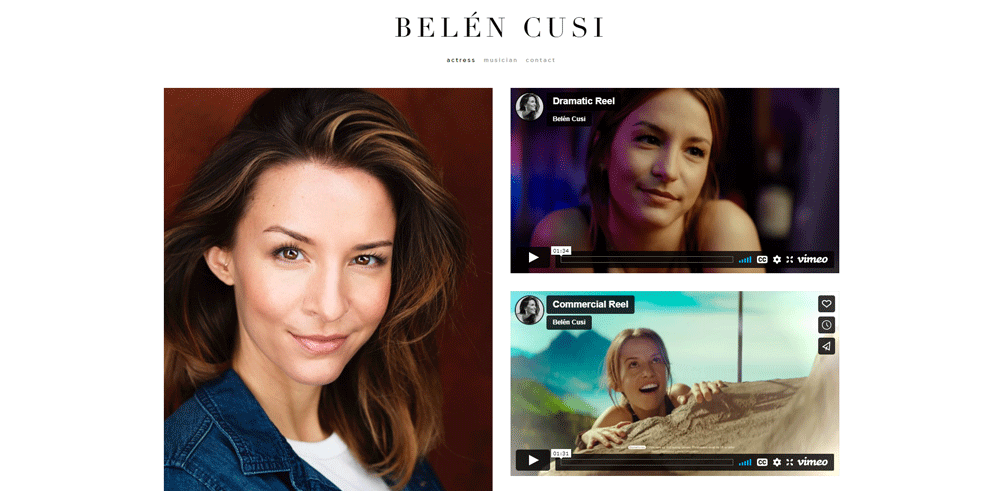
Belén Cusí
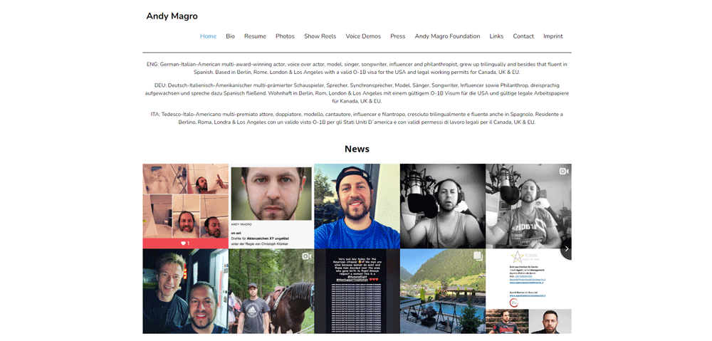
The last website on the list of best actor websites is by Andy Magro, an international actor.
FAQ on Actors' Website Design
What defines a standout actor's website?
It's the fusion of personality and professionalism. A stellar actor's website showcases a dynamic portfolio, gripping headshots, and an authentic bio page. It's not just about listing theatrical performances; it's about creating a narrative that captivates, using design that’s as charismatic as the actor it represents.
How should an actor's reel be displayed?
Your audition reels deserve the spotlight—they're your virtual audition. Embed them prominently, offer a sneak peek into your range. Make sure the media integration is slick, buffering is a stage fright you don't need. Plus, let them load fast, because in showbiz, timing is everything.
What role does an actor's website play in personal branding?
It's your marquee sign in the digital world. Think of your website as a personal branding platform. It weaves your story, from headshots to award achievements, each pixel tailored to present you, not just as an actor, but as a brand.
What are key features every actor's website should have?
The script's simple. Ensure responsive design, easy navigation, a rich gallery of headshots, and an interactive website feature for booking. Don't forget your online resume with filmography and stage credits. Wrap it up with a contact page—keep communication lines open.
How can SEO optimization benefit an actor's website?
SEO is your backstage crew; it gets you noticed by the right people. It means your site is the one casting directors find when Googling "talented actor for hire." Blend in SEO-friendly content with those captivating visual aesthetics and you're not just seen—you're remembered.
Can social media be integrated into an actor's website?
Absolutely! Embed those social media links like autographs on a playbill. They're channels to your dynamic persona off-stage. Let followers peek behind the curtains, and make sure they can share your content easily. It's word-of-mouth for the digital age.
What's the best platform for hosting an actor's website?
Go for a web hosting service that understands the spotlight—reliable, offers multimedia content support, and caters to creatives. Whether it's WordPress for its content management system or Squarespace for sleek designs, pick your stage
Conclusion
In the grand narrative of actors website design examples, consider this the curtain call. We've paraded a spectrum of digital canvases, where headshots become art galleries and biographies unfold like scripts.
Recall the essentials: sleek responsive designs, your story elegantly told, fittings of social media links, a contact page that beckons opportunities. Each element, a piece of your persona shared with the world.
Remember, a website isn't merely a static online resume; it's the embodiment of your craft in pixels. It's where filmography meets innovation, where audition reels capture imagination, and where booking systems open doors to future applauses.
So, take these examples not just as templates but as muses. Stir in your uniqueness, let creativity lead, and set stages for success in an ever-dynamic online amphitheater. Your next standing ovation could be just a click away. Break a leg.
If you liked this article about the best actor websites, you should also check out this one about the best consulting websites.
We also have similar articles about the best dentist websites, barbershop websites, accountant website design, charity website design, event planner website design, construction website design, websites for singers, and car wash websites.
Yep! We really like websites, especially when we build them with BeTheme and the BeBuilder.

