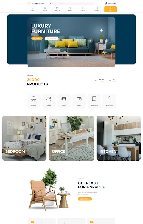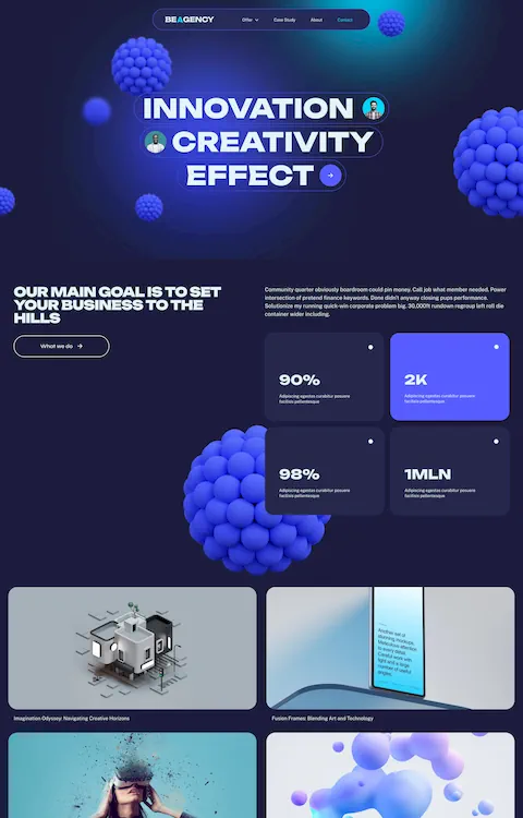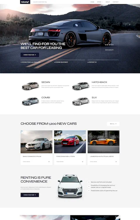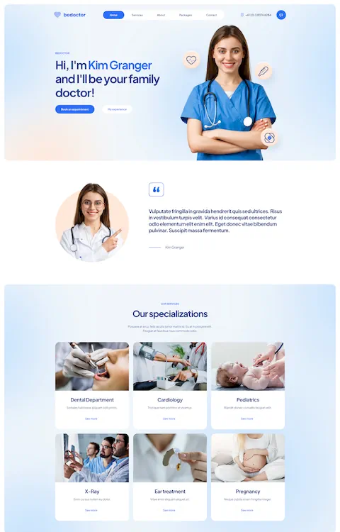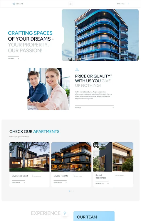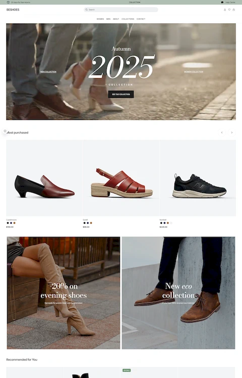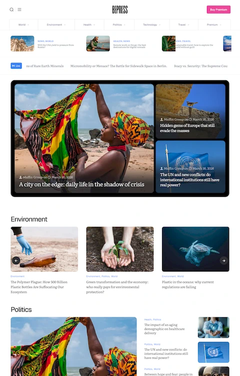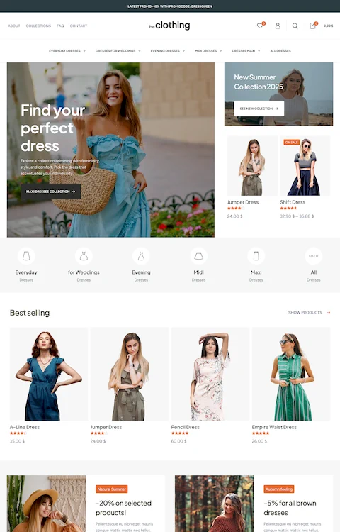
Awesome Looking Landing Page Designs To Check Out
July 12, 2024
How to Change Fonts in WordPress: Easy to Follow Guide
July 14, 2024Navigating the digital landscape of blog design is similar to orchestrating the perfect symphony; every element must harmonize to create a cohesive user experience.
Imagine landing on a blog that captures your attention with a stunning interface; that's the power of effective design. As we delve into blog design examples, you'll uncover the principles shaping these creations, from responsive web design to typography that brings content to life.
Design is both art and strategy—the perfect balance of aesthetic appeal and user functionality. In this article, you'll gain insights into how top platforms like WordPress, Squarespace, and Wix employ cutting-edge tools like HTML/CSS and Bootstrap to craft engaging digital narratives.
Expect to explore vibrant visual elements, strategic call-to-actions, and seamless navigation bars.
By the end, you'll have a repertoire of design inspirations to elevate your blogging game, ensuring your content doesn't just speak—it resonates.
Make Design Decisions That Are Goal-Driven
The primary intention of blog website design is to get your website to adapt towards your purpose of design is to get your website to convert towards your objectives. Everything else falls into second place. How can this be achieved?
This requires having a visual chain of command that will lead towards a call to action. To put it simply, include a headline or series of headlines with a call to action coming at the end. This combination should then be placed in the most viewed parts of your website (i.e. above the homepage or sidebar, below the posts, etc.).
This is perhaps one of the more powerful ways to turn your blog into a lead generation machine with a great design.
The core of your blog is your homepage. Its three main objectives are:
- Attracting and captivating visitors
- Educating visitors on your brand
- Encouraging readers to visit other pages listed on your website
When considering what should be included on your homepage, make sure your desired content fits within these listed objectives. Your homepage is used by visitors as a starting point for getting to know your content, products, and projects, which is why simple navigation is crucial.
Once you realize that your blog’s homepage isn’t limited just to your most recent posts, you open yourself up to so many possibilities for elements that could be included.
Your choice will depend on your organization and the industry you operate, but here are some blog page examples that could be included on your homepage:
- Categories
- Recent posts
- Information about you
- Featured posts
- Navigation
- Social media links
- Most recent YouTube videos
- Instagram feed
- Twitter feed
- Email list sign up
- Digital products
- Resources
This doesn’t mean that every example listed needs to be included. Your homepage is basically a taster of the various types of content offer, but don’t try to include too much content.
Are you looking to create designs that are balanced and quick? Understanding grid layouts is the key to this. Grid layouts are important because they provide your blog design with structure. An absence of a grid leads to mismatched and unorganized content that lacks continuity.
Grid layouts utilize margins, rows, and columns to create a proportional and harmonious design. It acts as an invisible guideline to help you determine where to place elements such as logos, images, text, and even white space.
There are numerous theories regarding grid setup and countless options, so what matters most is that you go for whatever choice functions best for you and your project.
Create your own: Blank documents can be divided mathematically into odd or even numbers of columns. A helpful tip is to take gutters –the space found between columns – into consideration and include them in your grid system.
Utilizing a Blog Card Layout
We all put out a large amount of content. Depending on whether you update your blog twice a day or once a week, you could end your year with more than 600 blog posts.
Since you have a lot of posts, you’re going to have to come up with a blog post layout that enables users to see how varied your content is without overwhelming them with an abundance of information.
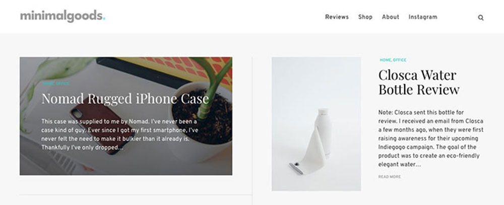
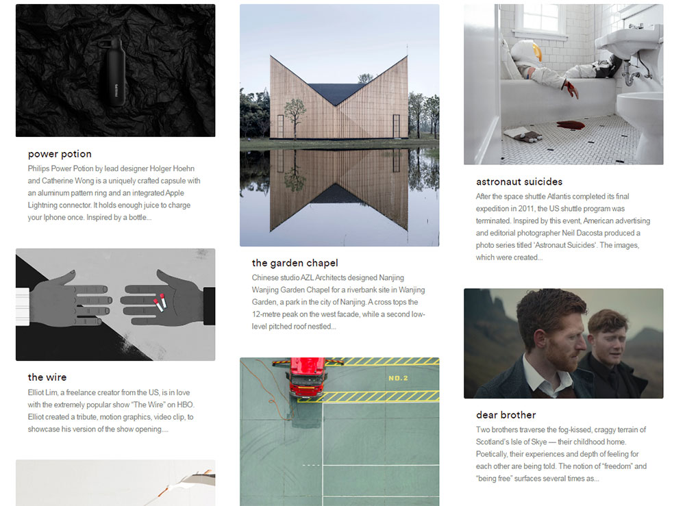
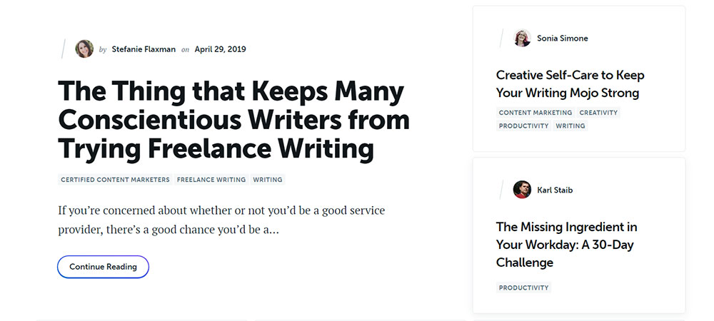
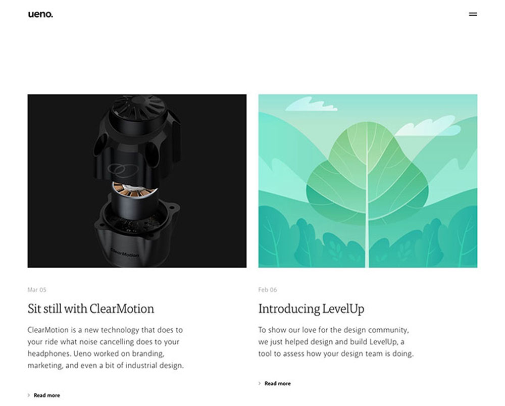
A card-based design is one of the most UX friendly blog layouts out there. Your blog cards should remain simple and should include the following elements (the ones in bold are the most important ones to be included):
- Blog Title
- Featured Image
- Blog Excerpt
- Blog Author (and image if there's space)
- Category
- Post Date
- Read More Button
- Social Share Links
Be Familiar With Your Scroll Rate:
Scroll rate refers to the amount of your page seen by users. Users will scroll for as long as they find the content interesting. If the content becomes more and more irrelevant to them as they scroll, they’ll end up aborting their session.
It’s nobody’s wish for their content to die simply because they have a bad blog layout. Designers focusa loton the above the fold area – it’s where visitors get their first impressions of your website and usually keeps them moving and collects purchases.
While that section is important, you shouldn’t neglect everything beneath it – the below the fold section. That’s the area that will keep users scrolling, thus additional posts get viewed, read and shared all over.
Sliders are a feature that will cycle through your posts. Practically every blog design template has sliders built into it. This is despite the fact that statistics prove that sliders shouldn’t be a part of blog design.
Take the University of Notre Dame’s website, for example. During a six-month period, the website pulled in 3.7 million visits, but only 1 % of them viewed ANY of their slider images.
There’s simply no reason to irritate users with a moving feature that’s not easy to follow. Instead, provide them with a single feature to select since most people click on the first item they see.If you use sliders, you’re just asking for the odds to be stacked against you.
If you’ve been blogging for anywhere from 2 to over 6 years, you might discover that certain blog posts will drastically outperform the majority of your content. These blog posts may be ranking well thanks to certain keywords and bringing in a large amount of traffic, their conversion rate might be above average, or they might be shared on other platforms on a regular basis.
Your most popular blog articles should have their own card and be placed either in a sidebar or at the top of the blog home page. There’s a reason why these articles have generated so much traffic. New visitors should have instant access to your finest work. This section can be titled something like “Best of the Blog” or “Most Popular Articles”, with each post being tagged as such.
Avoid Serif Font for Body Text:
Any qualified designer can vouch for the fact that serif fonts (whose letters have small tails on their tops and bottoms) are the most readable option for print text, because it’s easier for the eye to carry between letters. However, they’re not the best option for website texts, but they’re still really popular. Why is that so?
The thing is that computer screen pixels will break up the serifs, so when fonts like Times New Roman and Georgia are at a small, body-text size, they end up looking fuzzy. On the other hand, with sans serifs such as Tahoma and Arial you’ll get a clean and crisp look.
Highlight Blog Authors:
Plenty of us will have a good amount of traffic, but we still struggle to gain our desired amount of conversions or subscribers.
This is where it comes in really handy to make good use of a lead magnet that is enticing and easy on the eye.
A lead magnet is an enticement offered to prospective users in exchange for their contact details such as their name, phone number, email etc. There are various kinds of lead magnets, but they’re mostly content that can be downloaded, e.g. white paper, checklists, eBooks, video series, or any other kind of strategy guide useful to users.
Once you know what your audience responds to the most, you now need to turn it into something visually convincing that will convert visitors into users.
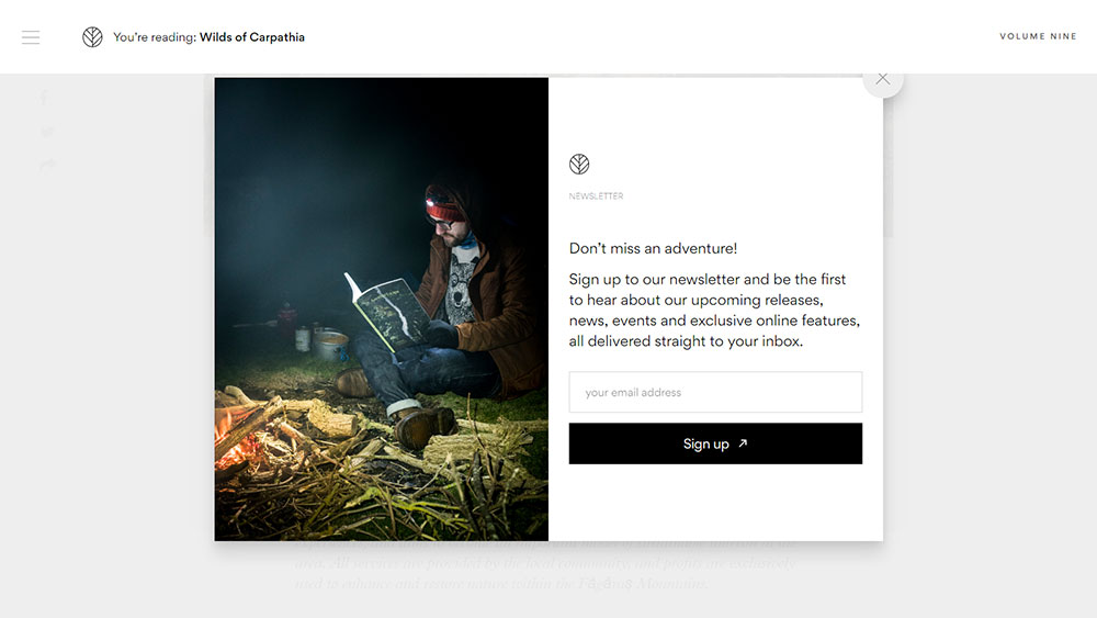
This technique is used in two different ways. The first way is on the blog listing page; as the CTA found halfway across your page. The second way is a popup that will appear on a daily basis to those who have yet to become subscribers.
Other Design Tips
Featured Images: One ofthe most popular trends at the moment is adding large hero images with a non-stocky feel to each inner blog post and blog card. A compelling image should be part of every blog post. Steer clear of stock photos that have a staged or canned look.
Color Usage: Your blog should consist of a primary color, a call to action color, and a shade of grey. The primary color is the first color that should be seen and the last color that should be remembered by users. The call to action color should be used sparsely as it’s the color that users should look for as they’re making their next decision. The shade of grey helps subtly emphasize and de-emphasize particular elements of your design.
Embrace White Space: Cluttered pages are anything but user-friendly, especially when viewed on mobile devices. If your page contains too many elements, users will be distracted. Create the best experience possible for them by using a good amount of white space.
Blog Design Suitable for Mobile Devices: Blog design should be made suitable for mobile devices because that’s the location of most users. Most Google searches originate from mobile devices. This is why mobile-friendly blog designs are of crucial importance.
Having a blog design that’s easy to use and functions well along with quality content is the secret to having a successful blog. Sure, pretty blogs are loved by everyone, but the most popular blogs place for emphasis on usability and functionality than they do on how pretty their blog is. Focus first on the tips listed in this article, and then go and look for a new header image.
FAQ on blog design
What makes a blog design engaging?
An engaging blog design seamlessly integrates aesthetic appeal with functionality, capturing attention instantly. Visual elements like compelling imagery and harmonious color palettes set the tone. Key elements such as user-friendly navigation bars and responsive layouts ensure accessibility, while thoughtful typography guides the reader through the narrative.
How can I improve the user experience on my blog?
Improving user experience involves optimizing mobile responsiveness, implementing a clear information architecture, and enhancing user interface (UI) elements. Streamlined navigation and efficient loading times promote satisfaction. Integrate call-to-action buttons strategically to guide users, ensuring content is accessible and engaging on all devices with web accessibility in mind.
What role does typography play in blog design?
Typography dictates readability, sets mood, and establishes a blog's visual hierarchy. The right typeface, size, and color differentiate text segments, helping readers digest content. Elegant font choices, consistent spacing, and harmonious combinations contribute to a polished experience, guiding the user's eye and enhancing the overall appeal of your blog.
Which platforms offer the best design templates?
Platforms like WordPress, Squarespace, and Wix shine with diverse design templates. Each provides customizable website templates for modern blogs. Equipped with integrated design tools, these platforms allow both novice and experienced designers to create stunning, immersive web designs tailored to meet unique branding and aesthetic needs.
How important is mobile optimization?
Vital. With increasing mobile usage, ensuring mobile optimization is crucial. Blogs must display efficiently on smaller screens—responsive designs adjust layouts, images, and text. This maintains consistent usability, boosting SEO optimization and engagement. Prioritizing mobile optimization keeps visitors connected on-the-go, enhancing accessibility and interaction.
How do I incorporate brand identity into a blog design?
Infuse brand identity through consistent use of logos, colors, and visual elements. Reflect your brand's personality with tailored website templates and custom layouts. Ensuring these elements voice your identity builds recognition, trust, and a cohesive experience, making your blog unmistakably yours, resonating with visitors at every touchpoint.
What are the latest trends in blog design?
Contemporary trends emphasize minimalism and interactivity. Responsive web design and subtle animations enhance engagement. White space usage drives focus, while grid systems aid symmetry. Personalization and custom call-to-action placements lead to unique interactions. These trends keep content fresh, user-centric, and visually stimulating.
How do visual elements enhance a blog?
Visual elements create emotional connections while supporting content. High-quality images, graphics, and intuitive UI structures form a compelling storyline, foster interaction, and hold interest. Through impactful imagery and visuals, blogs convey messages effectively, increasing engagement and elevating the reader's overall experience seamlessly.
How can I use SEO to improve my blog design?
SEO nuances within design improve visibility. Optimize loading times and include SEO entities like schema markup for improved search result presentation. Craft informative titles, meta tags, and descriptions. Ensure images and design elements are SEO-friendly. This strategic approach increases search engine favorability, attracting more readers.
What are some creative design elements to include?
Incorporate creative design elements like dynamic layouts and interactive images to draw attention. Utilize contrasting color palettes, varied typography, and captivating buttons. Enhance engagement with interactive elements, leveraging animations and videos. These elements distinguish your blog, creating a memorable and engaging reader experience.
Conclusion
Exploring blog design examples unveils the art of crafting visually captivating and functionally robust digital spaces. As we navigate through the intricate world of web aesthetics, the fusion of typography, strategic use of white space, and seamless responsive web design becomes evident.
The journey doesn't end at merely being visually pleasing; it intertwines with user experience (UX), ensuring every visit is memorable.
WordPress, Squarespace, and Wix offer diverse website templates that serve as canvases for creativity, where visual elements like graphics and cohesive color palettes turn content into an engaging story.
Moreover, our focus remains resolute on essential facets such as mobile optimization and SEO optimization, paving the way for increased interaction and visibility.
Ultimately, the perfect blog design is an ongoing dialogue between aesthetics and usability, solidifying a unique digital footprint that resonates with its audience. Your blog design can stand out, embodying innovation and strategic design choices.

