
Inspiring School Website Design Examples to Explore
January 27, 2026
Wedding Planner Website Templates to Wow Your Clients
January 28, 2026A catering website that looks good but doesn't generate inquiries is just an expensive brochure. The difference between a site that books events and one that gets ignored usually comes down to layout decisions, CTA placement, and how the menu is presented.
This collection of catering website design examples breaks down what actually works across wedding caterers, corporate food service companies, and private chefs. Real sites, specific design choices, honest takes on what each one does well and where it falls short.
You will also find guidance on page structure, food photography, booking forms, platform selection between WordPress, Squarespace, and Wix, plus the local SEO practices that help catering businesses show up in search results.
What Is Catering Website Design
Catering website design is the process of building a site that represents a food service business online, converts visitors into event clients, and displays menus, galleries, and booking options in a way that builds trust fast.
It is not the same thing as restaurant website design. A restaurant site sells walk-in dining. A catering website sells a service that happens offsite, often weeks or months after the first visit.
That difference changes everything about how the site needs to work.
Wedding caterers, corporate catering companies, private chefs, food truck operators, and full-service banquet providers all need different page structures, different calls to action, and different proof points.
A corporate caterer in Chicago needs a quote request form and a PDF menu download. A wedding caterer in Austin needs a gallery of past receptions and integration with platforms like The Knot or WeddingWire.
The homepage layout, the menu display design, and the inquiry flow all depend on what type of events the business serves. Getting this wrong means losing leads to competitors who got it right.
Catering Website Design Examples
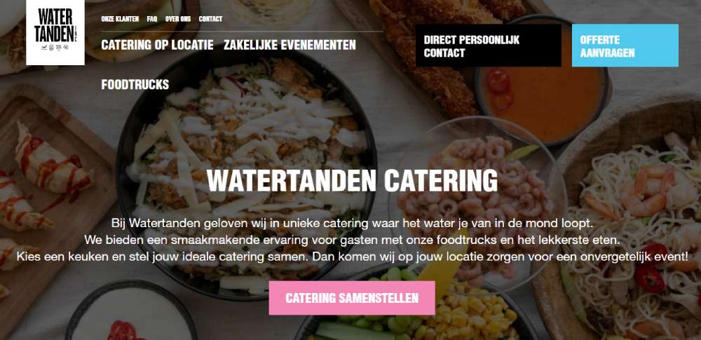
Watertanden Catering
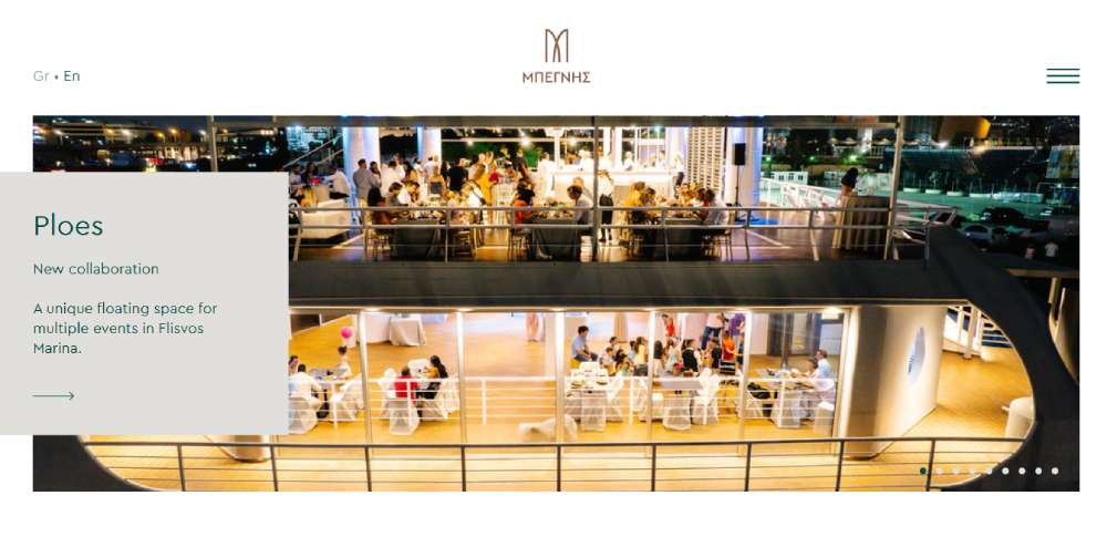
Begnis Catering
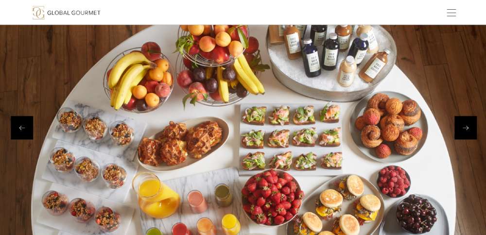
Global Gourmet
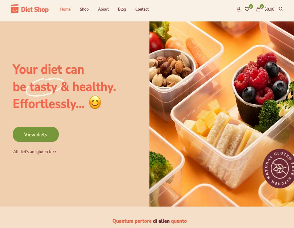
BeDietShop
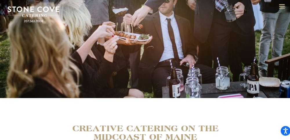
Stone Cove Catering
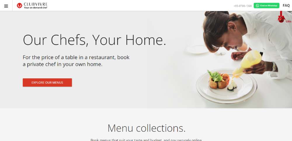
Club Vivre
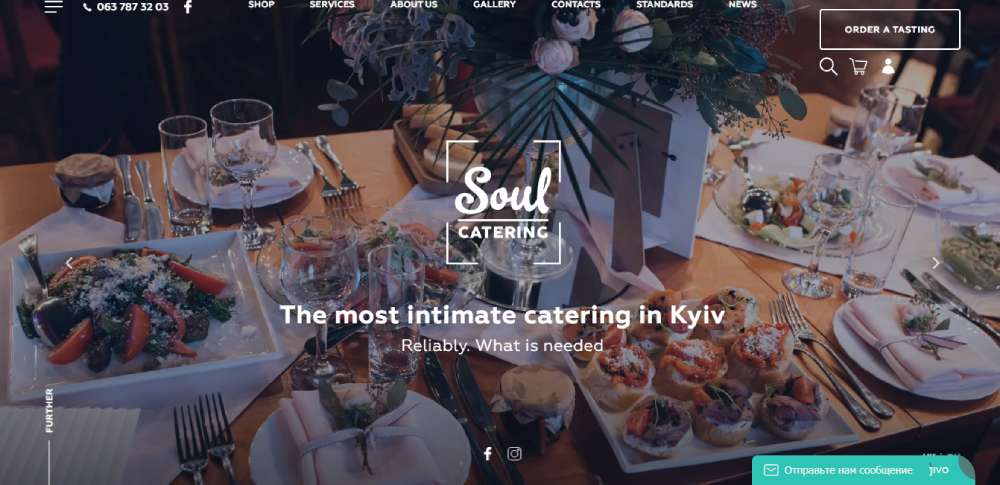
Soul Catering
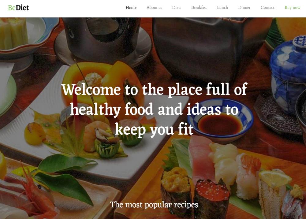
BeDiet
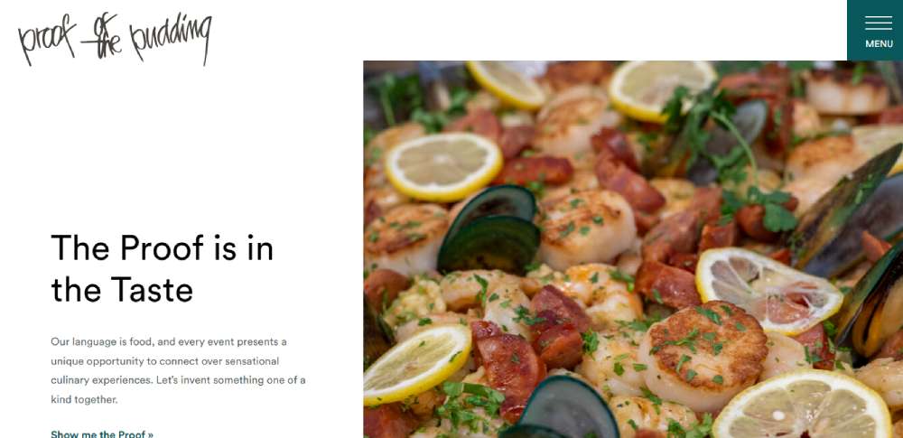
Proof of the Pudding
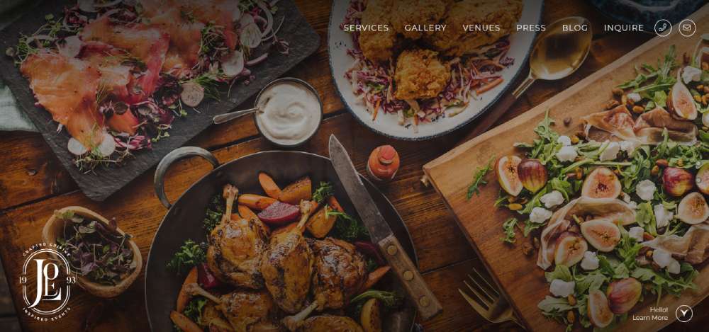
Joels Catering & Special Events
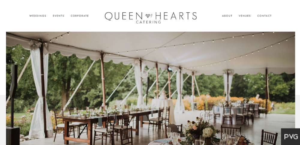
Queen of Hearts Catering
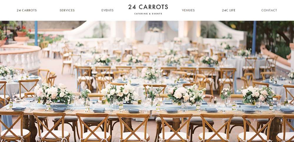
24 Carrots Catering
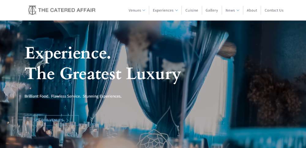
The Catered Affair
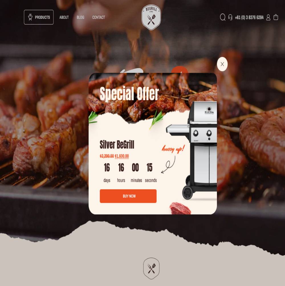
BeBarbeque
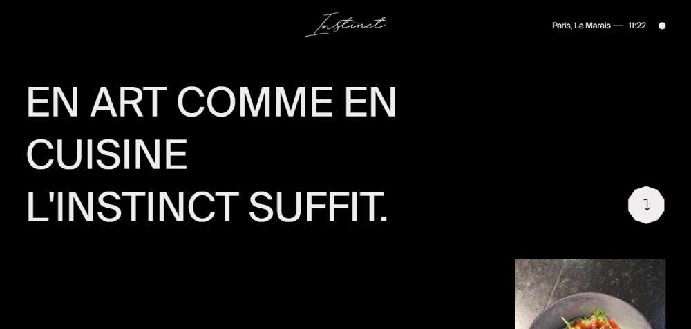
Instinct Origine
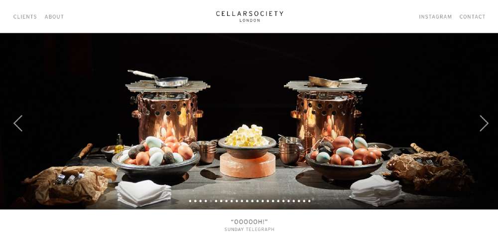
Cellar Society
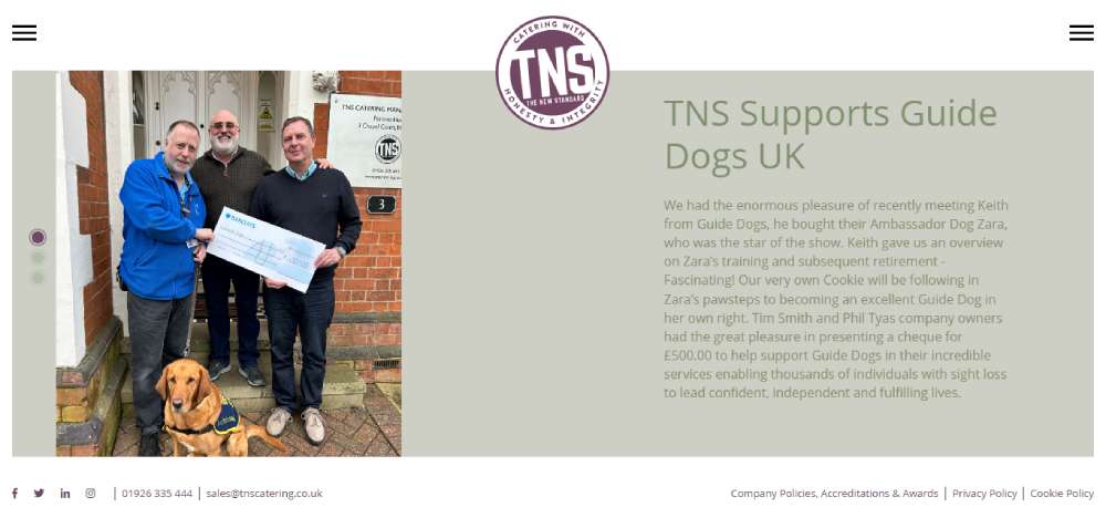
T(n)S
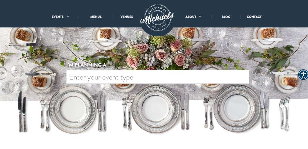
Catering by Michaels
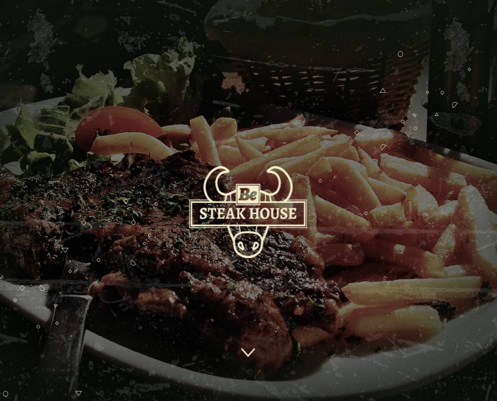
BeSteakHouse
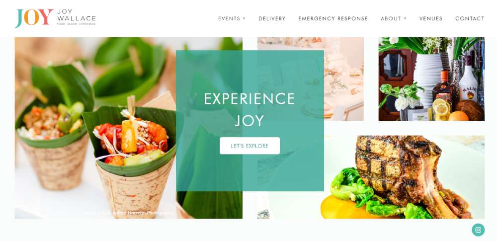
Joy Wallace Catering
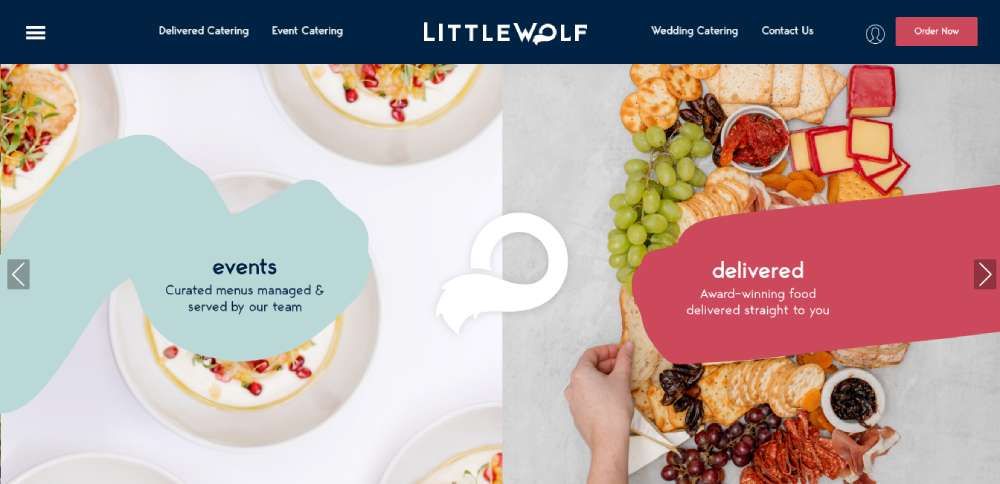
Little Wolf Catering
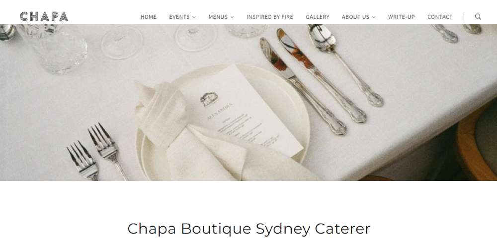
Chapa Catering
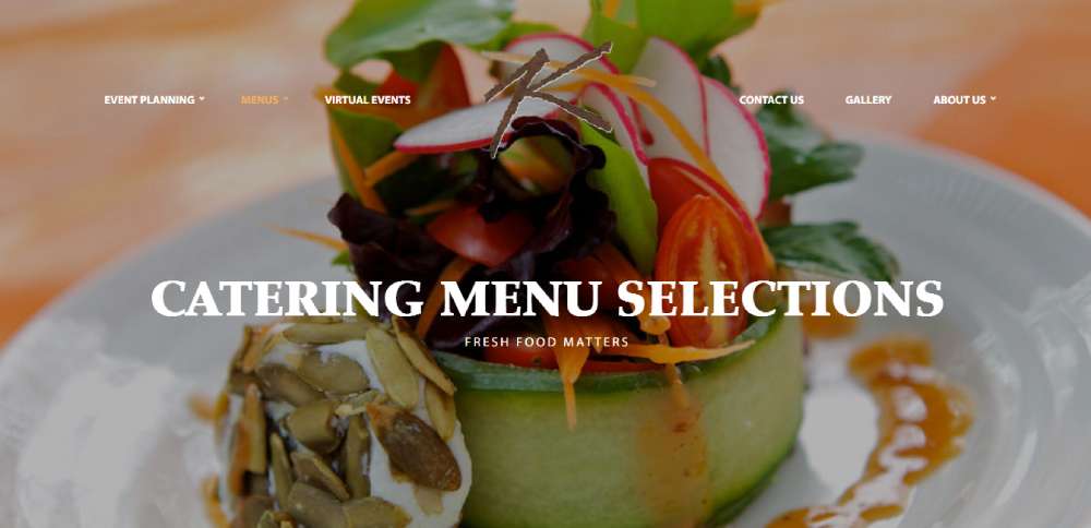
Kaspars
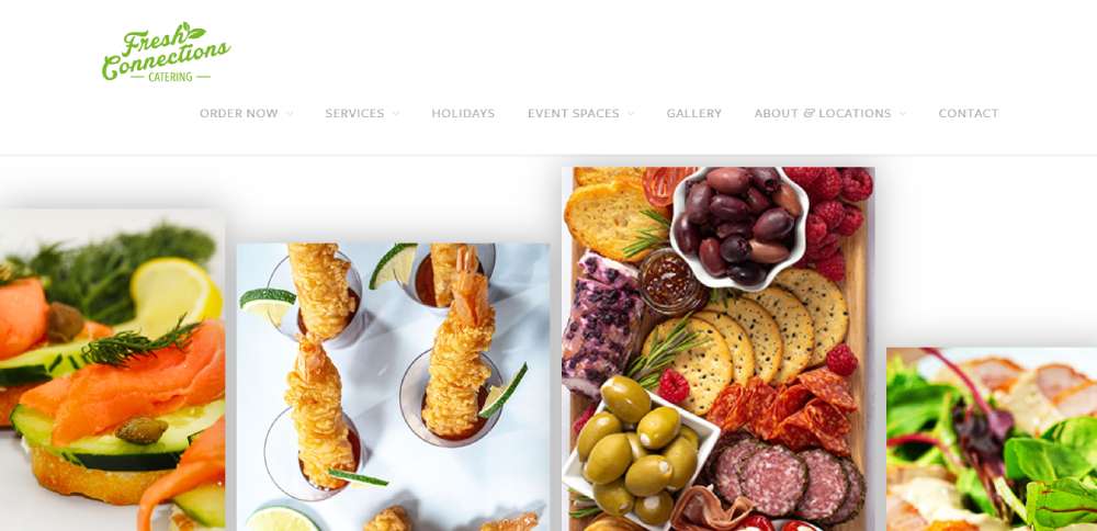
Fresh Connections Catering
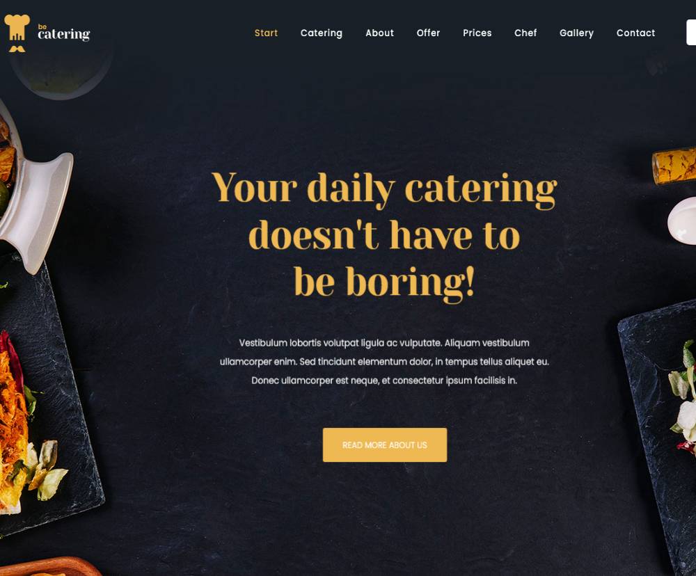
BeCatering2
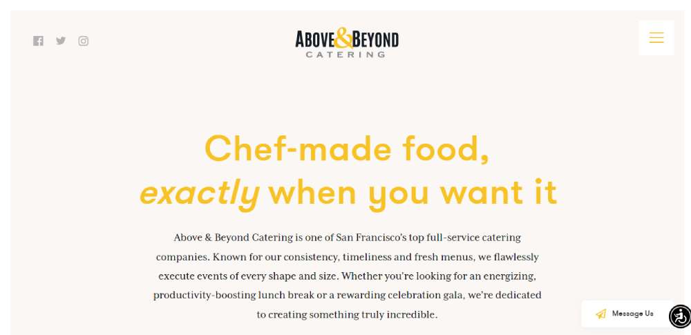
Above & Beyond Catering
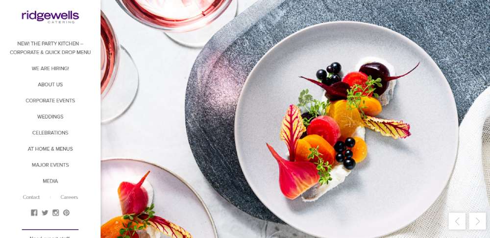
Ridgewells Catering
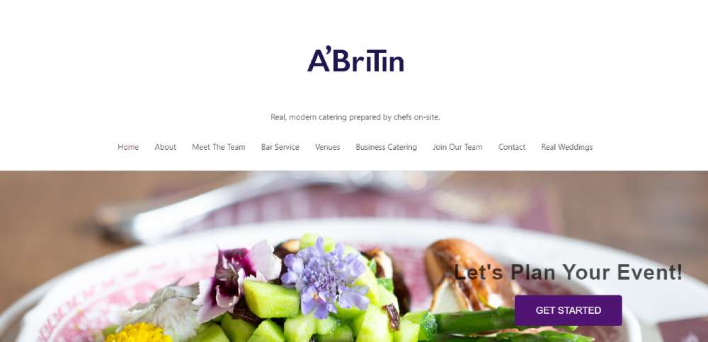
A'Britin Catering
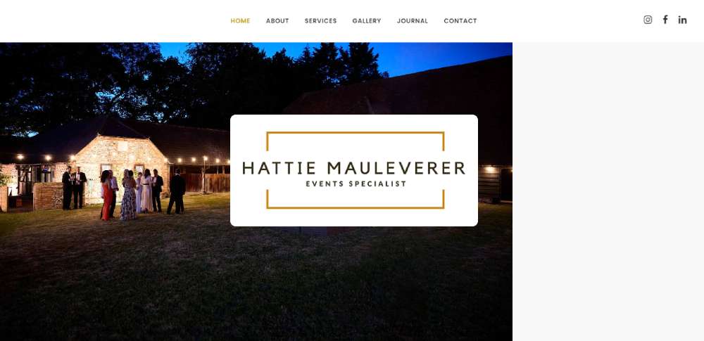
Hattie Mauleverer
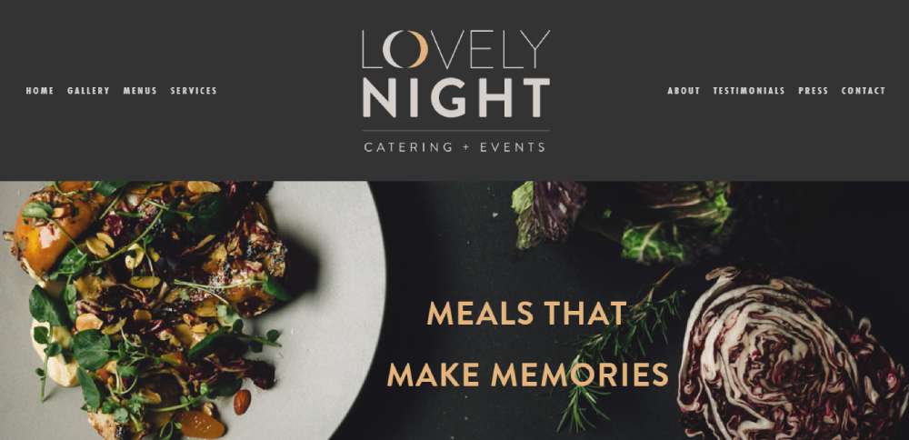
Lovely Night Catering + Events
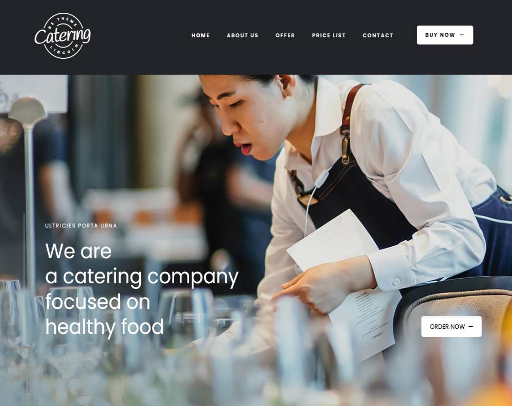
BeCatering
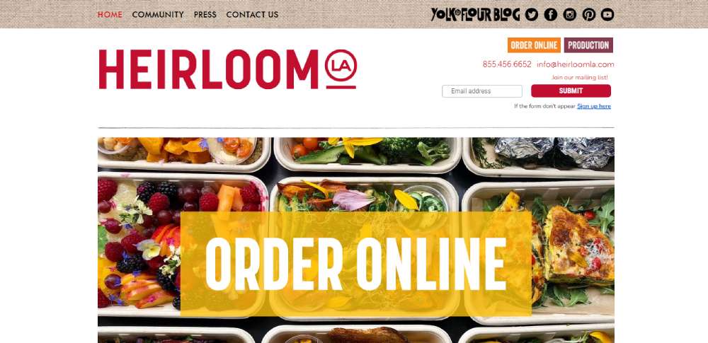
Heirloom LA
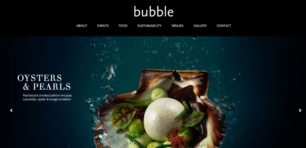
Bubble Food
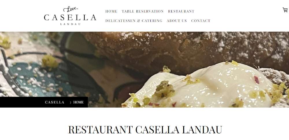
Casella Catering Configurator
Morins Catering & Events
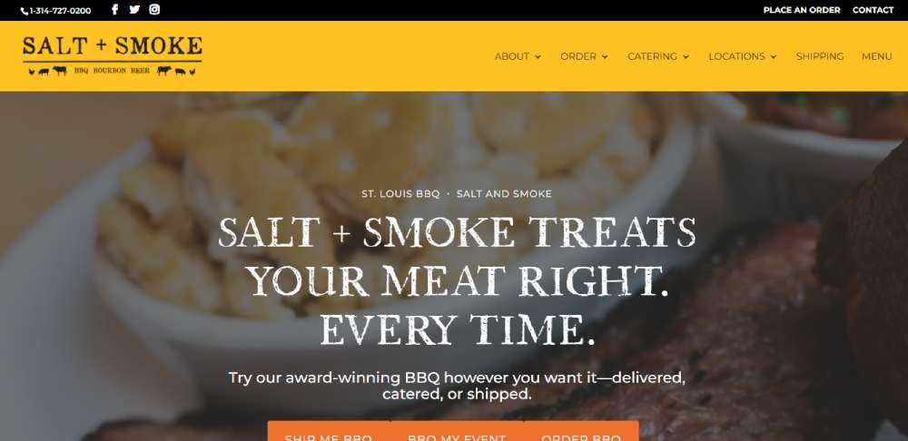
Salt + Smoke
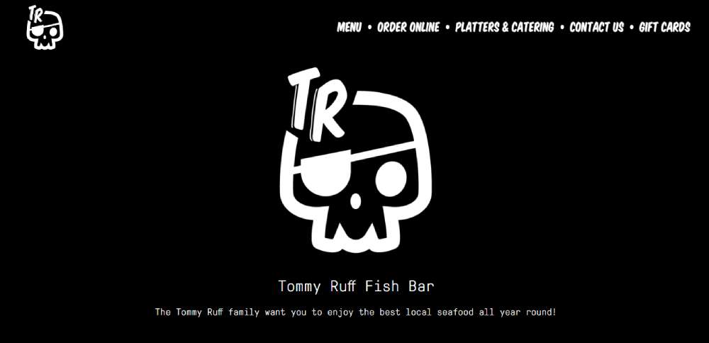
Tommy Ruff
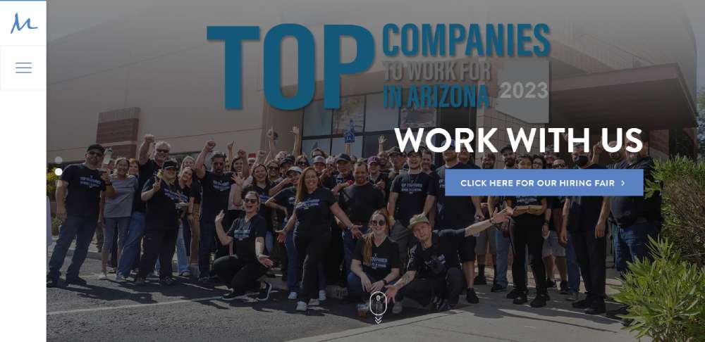
M Culinary Concepts
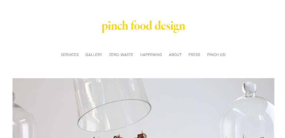
Pinch Food Design
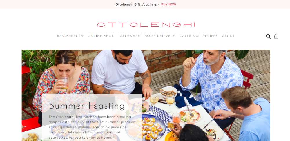
Ottolenghi
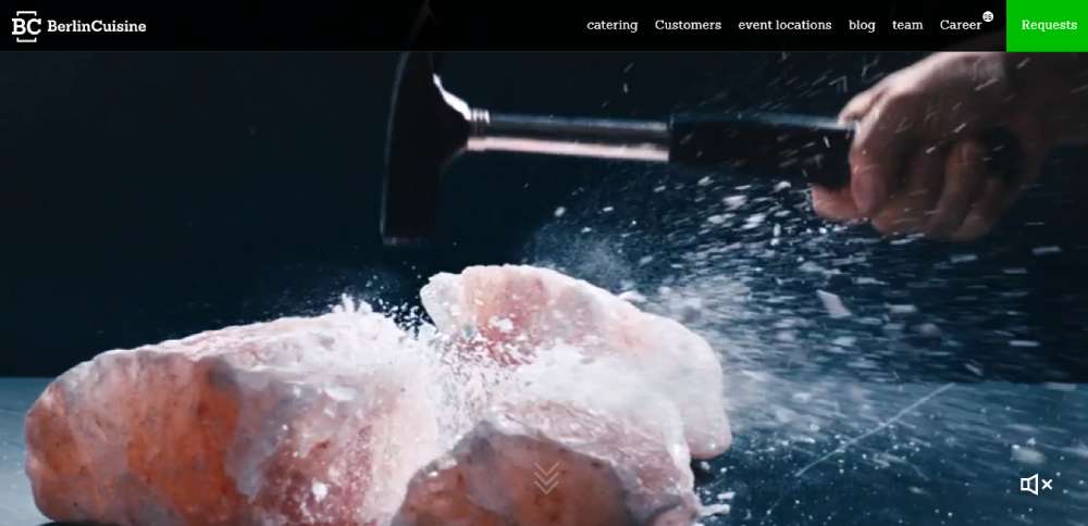
Berlin Cuisine
How Does a Catering Website Convert Visitors Into Clients
Most catering clients don't book on the first visit. They compare 3-5 caterers, check photos, skim menus, and look for social proof before filling out a single form.
So a catering site that just looks pretty but buries the quote request form on page three is basically useless.
Conversion on a catering website comes down to a few things working together. The hero section needs to show real food from real events, not stock photography. The call to action button needs to sit above the fold, visible within 2 seconds of landing.
Trust signals do most of the heavy lifting here. ServSafe certifications, health department permits, client testimonials with full names and event types, and a portfolio gallery showing actual setups from past events.
Here is what a high-converting catering site includes:
- A lead generation form with fields for event date, guest count, and budget range
- A menu page organized by cuisine type or event style, not just a flat PDF
- A testimonials section with names, event types, and specific details
- A gallery page with professional food photography from real bookings
- CRM integration with tools like HubSpot or Salesforce for automated follow-up
- A clear phone number and email visible on mobile without scrolling
Took me a while to figure out that the biggest conversion killer on catering sites isn't bad design. It is slow response time after form submission. Automated email responses matter more than most people think.
Live chat is worth testing too, especially for corporate catering where the buyer is often an office manager booking lunch for 50 people on short notice.
What Pages Does a Catering Website Need
Every catering website needs a specific set of pages, and each one has a job. Skip one, and visitors feel like something is missing. They leave.
The page structure depends partly on whether the business handles weddings, corporate events, private parties, or all three. But the core pages stay the same across most catering niches.
What Should a Catering Homepage Include
The homepage carries the brand. A full-width hero image of a real event setup, a one-line value proposition, and a visible quote request button.
Below the fold: service highlights, a few testimonial snippets, and links to the menu and gallery pages. Keep the website navigation simple, five to six items max.
How Should a Catering Menu Page Be Structured
HTML menus beat PDF menus every time for search visibility and mobile usability. Organize by event type (wedding, corporate, buffet) or cuisine style.
Add filtering by dietary restriction. Gluten-free, vegan, kosher. If pricing is public, show it. If not, link each menu section to the inquiry form.
What Makes a Catering Gallery Page Effective
A masonry grid layout with lightbox functionality works well for displaying food photography and event setups. Use WebP format with lazy loading for fast page speed.
Label each image with the event type and location. Google indexes alt text, and prospective clients want to see events similar to theirs.
How Does a Contact and Quote Request Page Work
Multi-step forms convert better than single long forms for catering inquiries. Step one: event date and type. Step two: guest count and budget. Step three: contact details.
Good form design reduces abandonment. Add a date picker, a guest count slider, and a dropdown for event type. Connect the form to a CRM for instant follow-up emails.
What Role Does an About Page Play on a Catering Website
The about page builds E-E-A-T. Who owns the business, how long they have been operating, what certifications they hold, and where they serve.
Include a headshot of the chef or owner, a brief background, and links to press mentions or industry awards. This page gets more traffic than most caterers expect.
Why Does a Catering Website Need a Testimonials Page
A dedicated testimonial page with client names, event dates, and specific feedback builds credibility faster than star ratings alone.
Pull reviews from Google Business Profile and Yelp. Embed them with structured data using Schema.org markup so they can appear as rich results in search.
What Design Elements Do the Best Catering Websites Share
After reviewing dozens of catering websites across different niches, patterns show up fast. The sites that actually generate leads share specific design choices, not just good taste.
Full-width hero images dominate homepages. Almost every top-performing catering site opens with a high-resolution photo of plated food or a styled event table. No sliders. One strong image with a clear headline layered on top.
Sticky navigation keeps the menu and CTA visible during scrolling. This is standard on modern website designs across industries, but catering sites that skip it lose engagement quickly.
Color palettes lean warm. Earth tones, deep greens, cream, black, and gold show up constantly in wedding and fine dining catering sites. Understanding color theory matters here because food photography looks different against cool blues than it does against warm neutrals.
Typography choices follow a consistent pattern too. Serif fonts for headings (to signal elegance), paired with clean sans-serif body text for readability. The best catering sites treat font pairing like part of the brand identity, not an afterthought.
Generous white space between sections lets the photography breathe. Cramming content edge-to-edge is a common mistake on catering sites built by owners who want to show everything at once.
CTA buttons appear in predictable spots: top right of the header, end of the hero section, and after every major content block. The label usually says "Request a Quote" or "Plan Your Event" rather than a generic "Contact Us."
Footer structure on high-performing catering sites includes: business address with Google Maps embed, phone number, service area list, social media links, and a secondary CTA. Some include their Google Business Profile reviews directly in the footer.
What Layout Works Best for a Catering Website
Multi-page layouts outperform single-page designs for catering businesses. A one page website works for a private chef with three menu options. A full-service caterer handling weddings, corporate events, and holiday parties needs separate pages for each service line.
Grid-based menu displays let visitors scan food options quickly. Full-width image sections between content blocks break up the page and keep scrolling feel natural.
Mobile first design is not optional here. Over 60% of catering inquiries start on a phone, usually someone browsing vendors while sitting in a planning meeting or scrolling at home after dinner.
Parallax scrolling looks great on catering sites when used sparingly, one or two sections max. Overdo it and the page feels sluggish on mid-range Android devices.
Footer structure matters more than most caterers realize. Service area list, phone number, embedded Google Maps location, and a secondary "Get a Quote" button. Every page should end with a clear next step.
How Does Food Photography Affect Catering Website Design
Photography makes or breaks a catering site. A visitor decides within 3 seconds whether the food looks worth inquiring about. Stock photos of generic platters kill trust instantly.
Hire a photographer for one event. Shoot plated dishes, buffet setups, table arrangements, and behind-the-scenes prep. That single shoot gives you enough images for an entire site, social media, and Google Business Profile.
Optimize every image for web. WebP format with lazy loading keeps page speed under control. Run the site through Google PageSpeed Insights after uploading, large uncompressed images are the number one speed killer on catering sites.
For gallery layout, a masonry grid with lightbox works best. Carousel sliders hide most of your photos behind arrows that visitors rarely click. A grid shows everything at once and lets people choose what to zoom into.
Alt text on every image should describe the dish, event type, and location. "Grilled salmon platter at corporate lunch event in Denver" beats "IMG_4392.jpg" for both accessibility and local search visibility.
What Typography and Color Choices Work for Catering Websites
Serif fonts signal tradition and elegance. Sans-serif fonts feel modern and clean. Most high-performing catering sites pair both, serif for headings, sans-serif for body text.
Playfair Display paired with Lato. Cormorant Garamond with Montserrat. These combos show up constantly on websites with good typography in the food and events space. Use free fonts from Google Fonts to keep costs at zero.
Body text at 16px minimum. Menu items at 18px. Anything smaller and mobile users squint.
Color palette depends on the niche. Wedding caterers lean toward soft neutrals, cream, blush, sage. Corporate caterers go darker, navy, charcoal, white. BBQ and casual caterers can push into bolder territory with deep reds or burnt orange.
A luxury color palette built on black, gold, and cream works well for fine dining caterers and upscale event companies. It photographs well and gives the site an elegant website feel without much effort.
Check contrast ratios for accessibility. White text on light gold backgrounds fails WCAG standards. Use a tool like Lighthouse or the WebAIM contrast checker before going live.
How Should a Catering Website Display Menus and Pricing
HTML menus indexed by Google. PDF menus do not. If local search visibility matters (and it does), build menus directly into the page using proper heading tags and structured content.
Organize menus by event type first, then by course. A website menu structure that mirrors how clients actually think about catering, "What do you serve at weddings?" not "What appetizers do you have?", performs better.
Add filters for dietary restrictions. Vegan, gluten-free, nut-free, kosher, halal. These filters reduce friction and show prospective clients that the caterer handles special requirements without a phone call.
Pricing transparency is tricky. Some caterers list per-person pricing ranges. Others use a "Request a Quote" approach for every package. Both work, but testing shows that showing starting prices ("Corporate lunch packages from $28 per person") increases form submissions by giving visitors a baseline expectation.
Update menus seasonally. A site showing a "Summer 2023 Menu" in February 2026 signals neglect. Add the current season and year to menu headings, and swap out featured dishes quarterly.
What Booking and Inquiry Features Should a Catering Website Include
Multi-step inquiry forms convert better than single long forms. Three steps: event details, food preferences, contact information. Each step on its own screen with a progress indicator.
Fields that matter: event date picker, guest count (dropdown or slider), event type (wedding, corporate, private party), budget range selector, dietary notes textarea, and preferred contact method.
Connect the form to a CRM. HubSpot's free tier handles this well for small caterers. Salesforce for larger operations running multiple events per week. The point is automated follow-up within 5 minutes of submission.
Live chat converts well for corporate catering where decisions happen fast. An office manager booking lunch for 40 people tomorrow does not want to fill out a form and wait 24 hours.
Automated email responses should include: confirmation of receipt, expected response time, a link to the full menu, and a direct phone number for urgent requests. This costs nothing to set up with Mailchimp or HubSpot and reduces the "did they get my form?" anxiety that kills conversions.
What SEO Practices Help a Catering Website Rank Locally
Google Business Profile optimization is step one. Complete every field: business category (set to "Caterer"), service area, hours, photos, and a detailed description using location-specific terms.
Add local schema markup to every page using Schema.org's LocalBusiness type. Include business name, address, phone number, service area, and cuisine type. Google Search Console will flag errors if the markup is malformed.
Build location-based landing pages. "Wedding Catering in Austin TX" and "Corporate Catering in Dallas TX" as separate pages, each with unique content, local testimonials, and area-specific menu options.
Image alt text should include location and food type. "BBQ buffet setup for corporate event in Houston" not "food photo 1."
Internal linking between menu pages, service area pages, and blog posts keeps visitors on the site longer and helps Google understand the relationship between pages. Link the "Wedding Menu" page to the "Wedding Catering in [City]" page and vice versa.
Review management on Google and Yelp directly impacts local pack rankings. Ask every client for a review within 48 hours of their event. Include a direct link to the Google review form in your follow-up email through Mailchimp or your CRM.
What Mistakes Do Catering Websites Commonly Make
Auto-playing video or music on load. Still happens in 2026. It increases bounce rate immediately, especially on mobile where data and battery matter.
Outdated menus with no dates. A menu that says "Fall Specials" with no year attached makes visitors question whether the business is still active.
No mobile optimization. The site looks fine on a 27-inch monitor and falls apart on an iPhone. Test on actual devices, not just Chrome DevTools responsive mode.
Stock photos instead of real event photos. Visitors can tell. A Getty Images watermark is the worst version of this, but even properly licensed stock food photography feels generic compared to real shots from real events.
Burying the contact information. Phone number and email should be visible on every page, in the header and the website footer. Not just on the contact page.
Slow load times from uncompressed images. A single 8MB hero image tanks the entire site's Core Web Vitals score. Compress everything, use WebP, enable lazy loading.
Missing CTA above the fold. If a visitor has to scroll to find out how to request a quote, most of them won't. Put the button where it is impossible to miss.
These are not edge cases. Check any list of bad design examples and you will find catering sites making every single one of these mistakes right now.
FAQ on Catering Website Design
What makes a catering website design effective?
An effective catering website loads fast, displays menus clearly, includes real food photography, and places a quote request form above the fold. Mobile responsiveness and trust signals like client testimonials and ServSafe certifications increase conversion rates significantly.
What platform works best for building a catering website?
WordPress with Elementor or Divi gives the most control over SEO and layout. Squarespace works for smaller operations wanting fast setup. Wix suits non-technical owners who need drag-and-drop editing without developer help.
How many pages should a catering website have?
A minimum of six pages: homepage, menu, gallery, about, testimonials, and contact with a quote request form. Larger caterers serving multiple event types benefit from separate landing pages for wedding, corporate, and private catering services.
Should a catering website show pricing?
Showing starting price ranges like "from $32 per person" increases form submissions by setting expectations upfront. Full pricing is optional. Many caterers use a hybrid approach with base pricing visible and custom quotes available through the inquiry form.
What type of photography works best on catering websites?
Professional photos from real events outperform stock imagery every time. Shoot plated dishes, buffet setups, and table arrangements in WebP format with proper alt text describing the food type, event style, and location for search visibility.
How does a catering website generate leads?
Multi-step inquiry forms, visible CTA buttons, live chat for corporate clients, and CRM integration with tools like HubSpot or Salesforce. Automated email responses within 5 minutes of form submission reduce lead drop-off significantly.
What colors work best for a catering website?
Warm tones perform well for food service sites. Wedding caterers use cream, blush, and sage. Corporate caterers lean toward navy and charcoal. Fine dining caterers go with black and gold. Always check contrast ratios for accessibility compliance.
How do catering websites rank in local search results?
Optimize Google Business Profile with correct category, service area, and photos. Add local schema markup using Schema.org. Build city-specific landing pages, collect Google and Yelp reviews, and use location terms in image alt text throughout the site.
Should a catering website use PDF or HTML menus?
HTML menus are better for SEO because Google indexes the text directly. PDF menus are harder to read on mobile and invisible to search engines. Build menus into the page with proper headings, dietary filters, and seasonal date labels.
What are the biggest mistakes on catering websites?
Auto-playing music, uncompressed images killing page speed, buried contact information, outdated menus without dates, and missing mobile optimization. Stock photography instead of real event photos is another common problem that reduces trust and lowers inquiry rates.
Conclusion
The catering website design examples covered here share a common thread. They put the client's decision-making process first, not the caterer's ego.
Real event photography, HTML menus with dietary filters, multi-step inquiry forms connected to a CRM, and proper Google Business Profile optimization. These are the pieces that turn a catering site into a lead generation tool.
Pick a platform that fits your skill level. WordPress for full control and local SEO strength. Squarespace for speed. Wix for simplicity.
Test your site on actual mobile devices. Compress every image. Put the quote request button where nobody can miss it.
Then track what happens in Google Analytics and Google Search Console. Adjust based on data, not guesswork. The caterers who treat their website like a sales tool, not a digital flyer, are the ones filling their event calendar.


