How to fix the “WordPress publishing failed” error
February 5, 2024
WordPress missing a temporary folder: Easy fixing guide
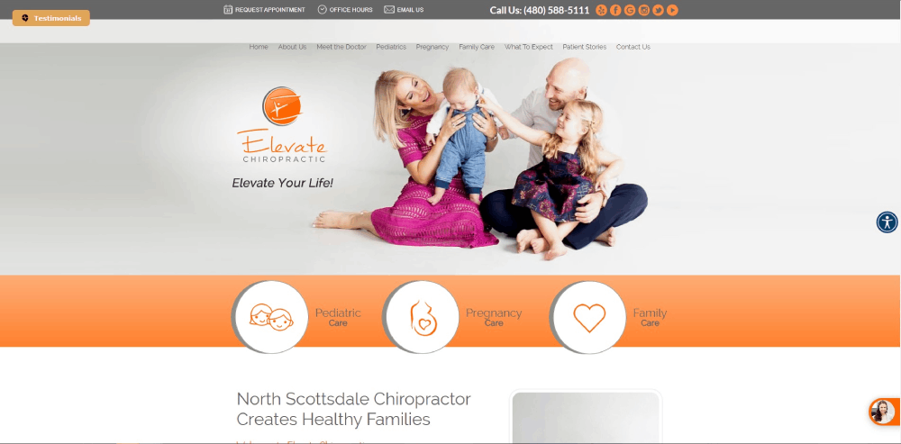
February 7, 2024Picture this: A potential patient lands on your website—it's their first step through your virtual door, their initial handshake with your practice. In a digital realm where aesthetics mesh with functionality, your chiropractic website isn't just a platform; it's an ambassador, whispering the caliber of care they can anticipate.
Navigating the fusion of crisp user experience and sleek responsive web design can elevate your practice from back-page obscurity to front-row prominence. This landscape is ever-evolving—today's innovation becomes tomorrow's standard. Leverage chiropractic digital marketing, tuning the chords of SEO for chiropractic offices, and merge an online booking system with patient testimonies to resonate with your audience.
You're stepping into a gallery of the finest chiropractic website design examples—a curated showcase revealing how branding, patient engagement, and conversion optimization harmonize to amplify your online presence. Unwind the intricacies of tailored chiropractic web development that not only speaks but sings to your audience. Let's unveil the elements that render a site not just navigable, but memorable.
Chiropractic Website Design Examples
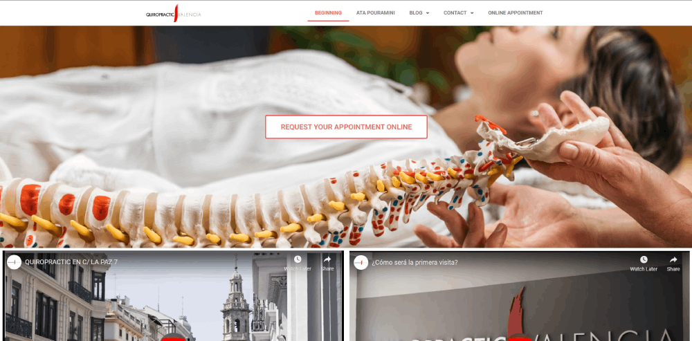
Quiropractic Valencia
Several professionals share this chiropractic practice. The practice’s website uses an international online marketing approach.
First, you will notice the header with a catchy tagline. Looking down, you will find a background image that spans the width of your screen. Finally, you see the clear calls to action. The website design features bright and attractive colors.
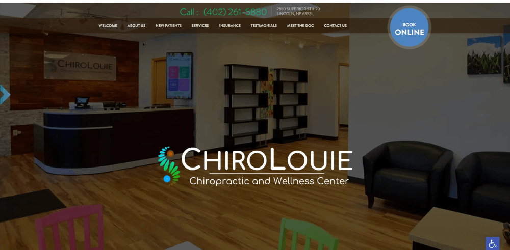
Modern Chiropractic
The prominent feature of the link to their contact page will surely help this chiropractic practice bring in new patients. You will find it right at the top of the page. The blue and green color scheme contributes to a pleasant and professional impression. The website effectively boosts the brand by showing testimonials throughout the website.
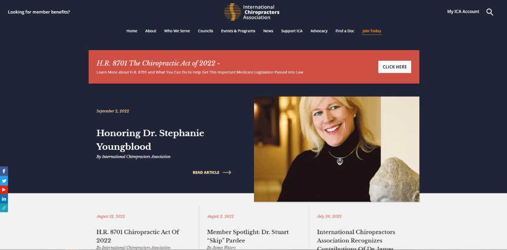
Be Massage 2
The website design of the International Chiropractic Association is simple and clean. It features a hero slider that shows various images. The website is well organized and uses whitespace very effectively. A special feature is the testimonials sections. It has great style and an attractive slider.
Chiropractic Chicago
Going down the list of chiropractic websites, you find Chiropractic Chicago. This website makes effective use of icons and links for more information. A nice detail is that the icons change color when you hover over them. The high-quality images provide good information and will attract more patients.
Be Beauty 4
The online marketing solution for Advanced Health is a website with a blue, red, and white color palette. You will notice the video and slider right away. They contribute to the value of the site by showing what kind of chiropractic services Advanced Health provides. There is even a list that details what current and potential patients can expect. Near the bottom, you find testimonials in the form of videos.
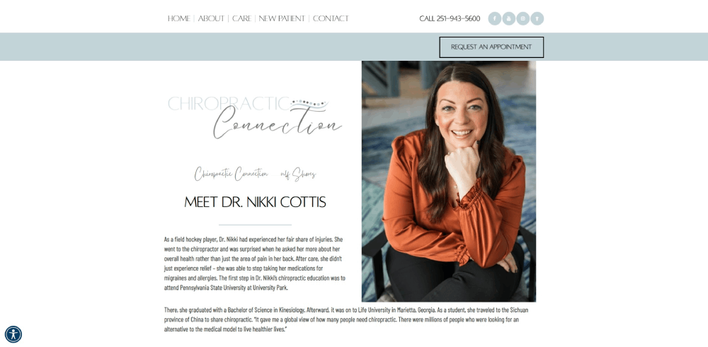
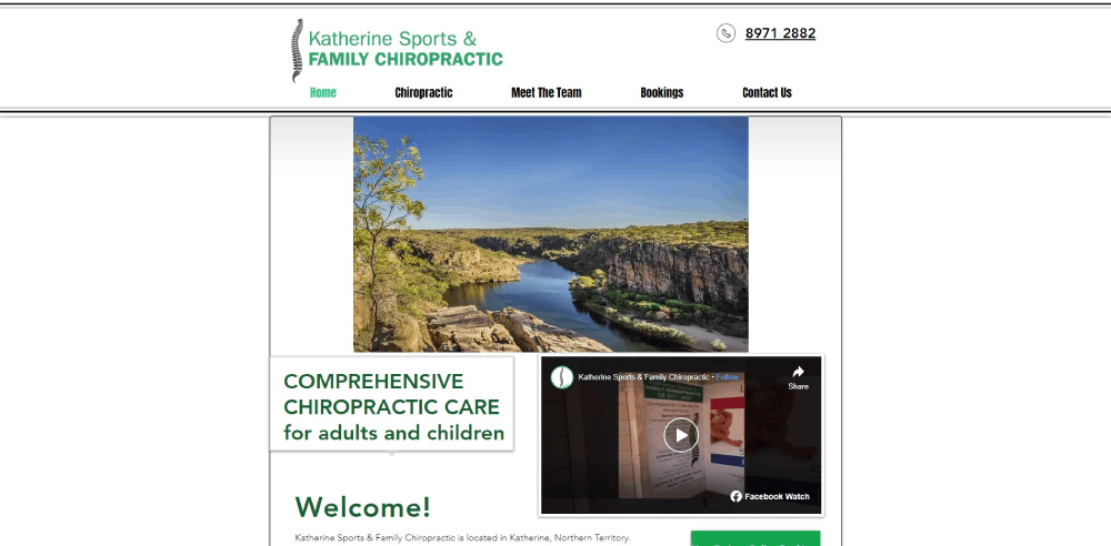
Katherine Chiropractic
Website visitors will enjoy an excellent experience on this chiropractic website. Things to note are the prominent contact details, colors, and images. The design itself moves people to take action. The chiropractic website design gives a feeling of assurance, commitment, and approachability.
Structure Integrative Healthcare
This outstanding chiropractic website stands out from the rest thanks to its bright color scheme. It shows that using the right colors is very important to grab the attention of the visitors on your website. Information organization consists of boxes which makes it easy to understand.
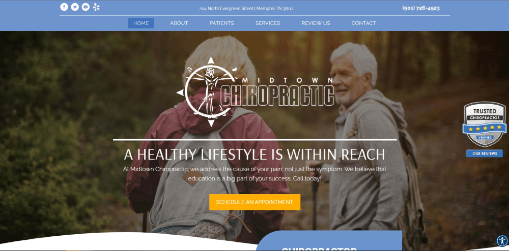
Midtown Chiropractic
This practice has been in the chiropractic profession since 1951. If you go here, you will receive chiropractic treatment from a skilled professional. They treat headaches, sprains, strains, whiplashes, neck and back pains, and much more.
FAQ on Chiropractic Website Design
What's the ideal aesthetic for a chiropractic website?
Aesthetic's a personal thing, yet universally, it's about striking balance. Cool, soothing colors merge with bold accents. Think less is more. Visuals? High-quality, relatable images that echo the serenity and professionalism of your practice. Striking the perfect chord in design invites users into a space that feels both innovative and comforting.
How important is mobile-responsiveness for my site?
It's crucial. Mobile-responsiveness ensures your site adapts like a spine to treatment—smoothly, to any device. With more folks browsing on the go, a site that shifts seamlessly from desktop to smartphone is non-negotiable. It's about user experience—no pinching, zooming, just intuitive navigation—one flick of a thumb, and they're booked in.
What role does SEO play in chiropractic website design?
Sure, design's about looks, but SEO's the backbone, giving your site the stand-up posture it needs in search rankings. From the content to the meta tags, every bit should target semantically relevant keywords. It's like laying down a breadcrumbs trail for search engines to find you, then leading patients straight to your door.
Can integrating a blog boost my website's performance?
Blogs aren't just ramblings. They're strategic. Rich posts about spinal health, peppered with LSI keywords, give Google more to chew on, raising your site's cred. Plus, you're handing out valuable nuggets of info—building trust. It morphs your site into not just a digital brochure but a go-to wellbeing resource.
What's the ideal navigation structure for a chiropractic website?
Patients come seeking ease from pain, not a headache from navigation mazes. Your site's structure? Make it intuitive. Clearly defined sections, a simple menu, breadcrumbs. The aim is for them to glide through pages like a well-aligned spine—effortlessly finding the online appointment scheduling or those warm patient testimonials.
How do I showcase my chiropractic specialities on my website?
Your specialities are your superpowers—display them with pride. Each service, a page of its own, detailing benefits, procedures, maybe even a video demo. You're painting a full picture here, explaining what sets you apart. It's your content strategy—educating while enticing. A visibility boost? A dedicated SEO tweak for each speciality.
Should I include patient testimonials on my chiropractic website?
Testimonials are trust signals—honest, powerful endorsements. Include them. Position them where they're easily seen, like right there on the home page. Spotlight the successes, the transformations. It's about connecting, showing prospects the human side of your practice, and the real-world health care web design best practices at work.
What features are a must for a chiropractic website?
Apart from killer content and a design that's easy on the eyes, think patient engagement strategies. An online booking system, a secure patient portal, responsive web design—these aren't just handy, they're expected in today's digital-first climate. They streamline the experience, getting them from 'just looking' to 'just booked' with minimal clicks.
How do I ensure my chiropractic website is accessible to all?
Accessibility isn't just nice to have; it's a must. It's about inclusivity—making sure everyone, regardless of ability, gets a seat at the table. Employ ARIA landmarks, alt text for images, and ensure your user interface plays nice with screen readers. Web accessibility equals care for all.
How often should I update my chiropractic website design?
Think of your website like a living room—would you leave it the same for years? Styles change, and so do best practices. A refresh every few years keeps you relevant. Staying on top of trends, like incorporating new healthcare website compliance measures or just sprucing up the layout, keeps the experience fresh.
Conclusion
Diving into a sea of chiropractic website design examples, it's clear: the perfect blend is powerful. It's the intersection where clinical expertise waltzes with digital finesse. You've seen the harmony of responsive web design and conversion optimization at play—a symphony orchestrated for connection and impact.
Buckle up because what's been unveiled is just the start. It's up to you to stoke that spark into a blaze. Put those tactics to work, craft content with a mix of LSI keywords and patient engagement strategies. Be the maestro of your online domain, and make that user experience sing.
Take these inspirations, these golden nuggets wrapped in actionable insights, and watch as your digital space transforms—from mere pages and links to an immersive, welcoming hub. Your site, the lighthouse in the vast ocean of choices, guiding the way to wellness.
If you enjoyed reading this article about chiropractic websites, you should check out these hairstylist websites, florist websites, wedding photographer websites, and massage therapist websites.
We also wrote about similar topics like gym websites, pizza websites, optometrist websites, furniture website design, coaching websites, surfing websites, and plumber website designs.

