Websites for Singers to Take as an Example When Designing
February 9, 2024
The Best Dentist Websites That Are Doing It Right
February 13, 2024Picture a skyscraper. As much as its steel bones reach for the clouds, your construction website must ascend in the digital landscape. Standing tall amidst a city of virtual impressions, crafting a digital foundation is non-negotiable for success.
In urban jungles or sprawling suburbs, a construction website becomes the portfolio, the handshake, the first "Hello!" Construction website design examples are the blueprints for showing potential clients not just what you build but how you build; poised professionalism matched with on-the-ground grit.
Here's the bedrock: a well-structured, visually engaging web presence can cement your reputation. From showcasing remodeling website aesthetics to making each call-to-action count, the virtual steel of your site frames your business narrative.
By article's end, know-how layouts can transform clicks into clients, with user-friendly construction interfaces, lead generation strategies, and visual imagery that does your projects justice. Together, we'll cement the keystones of stellar web design for builders—an investment in well-wrought design that repays you in dividends of client trust.
Construction Website Design Examples
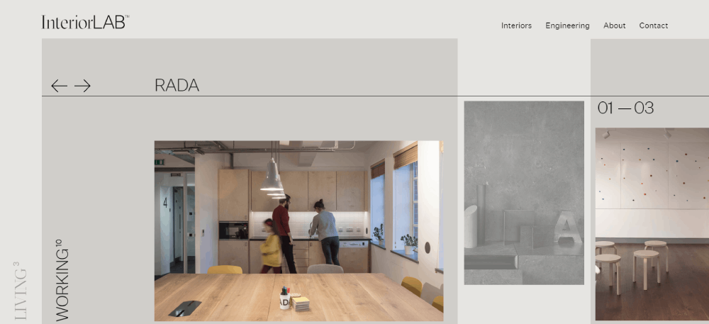
Clevershot
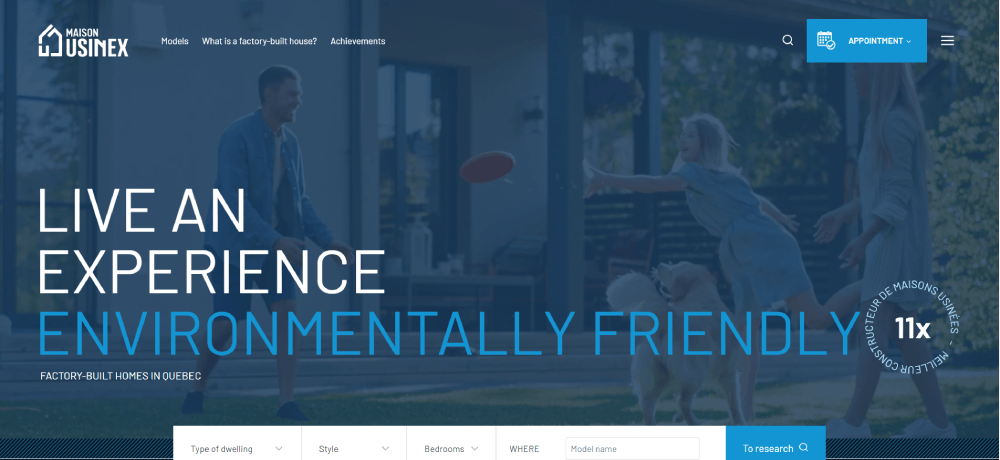
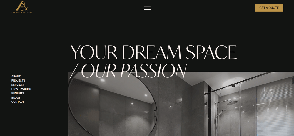
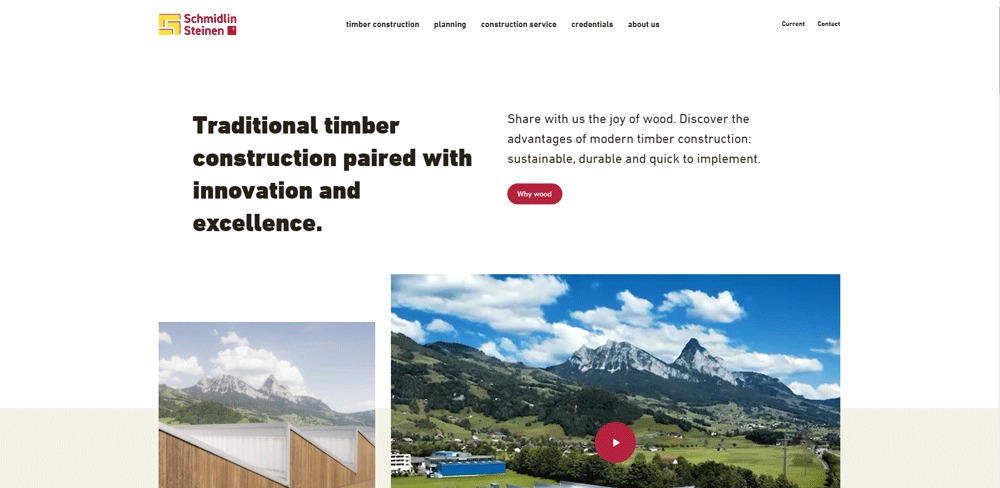
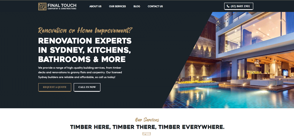
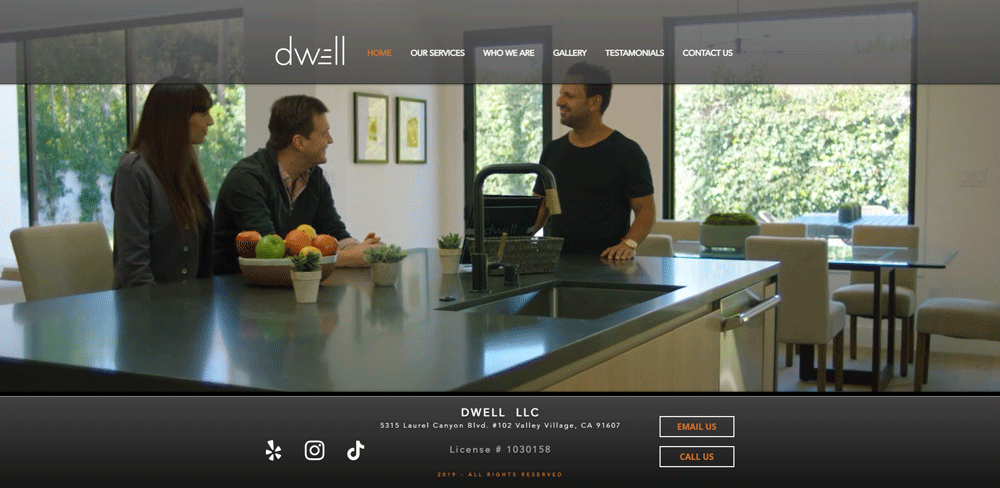
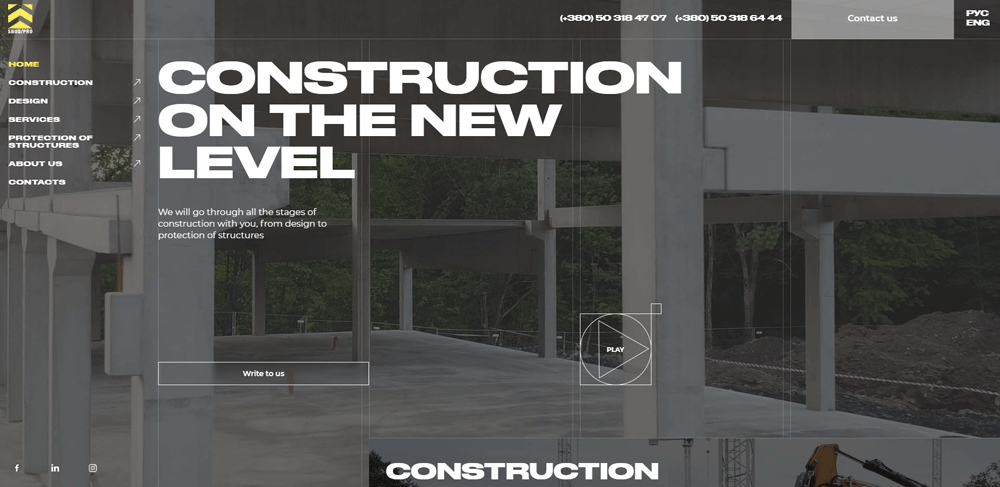
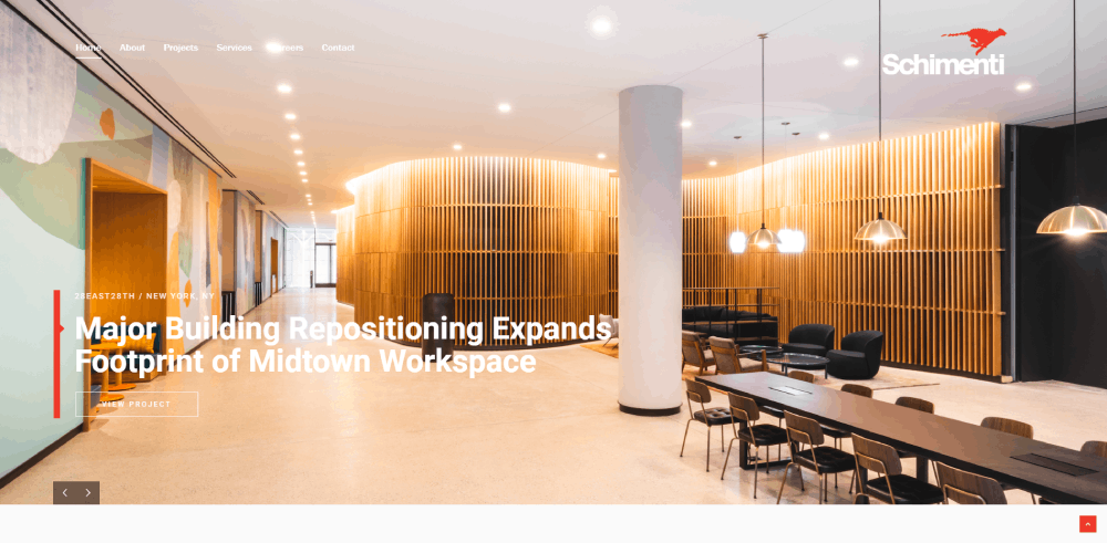
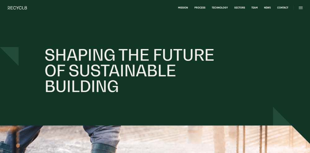
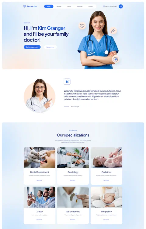
nteriorLab has worked towards one singular goal: to modernize the construction industry. They indicate this with their very sleek and interesting website design that helps establish trust in their services. Of course, they follow the other aspects of good construction website design too.
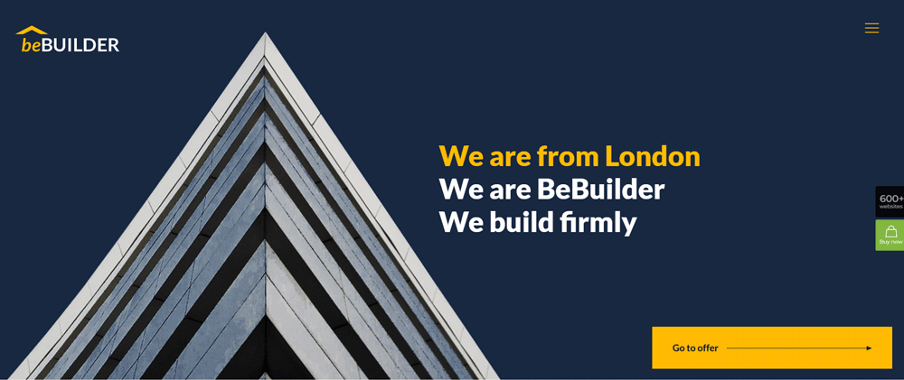
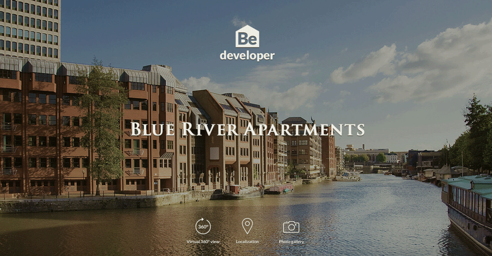
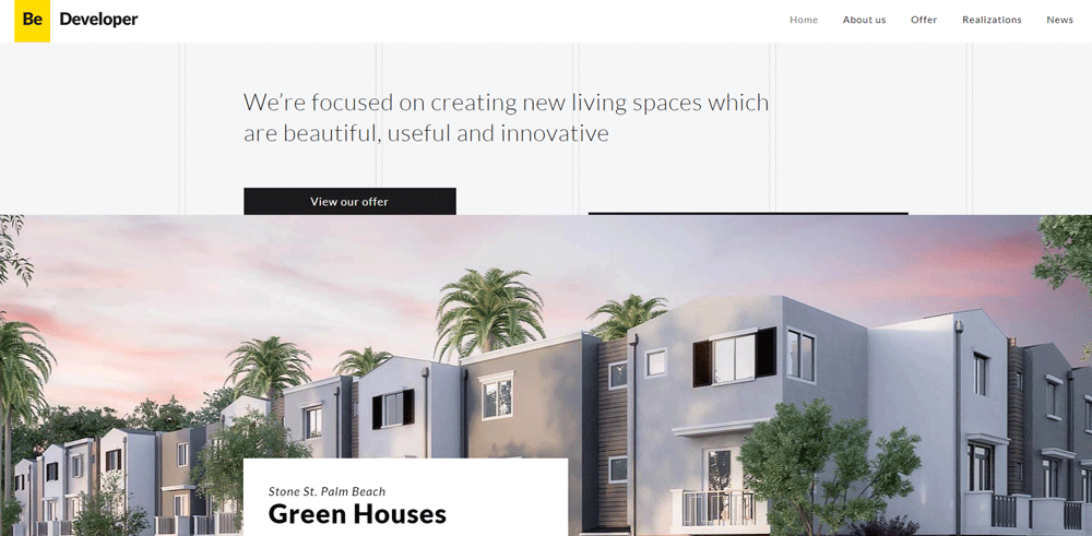
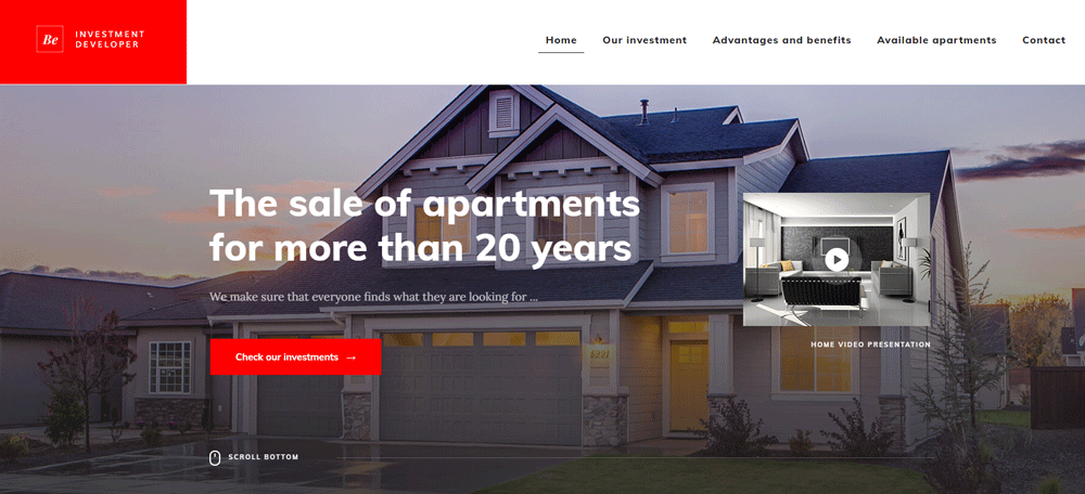
Be Developer
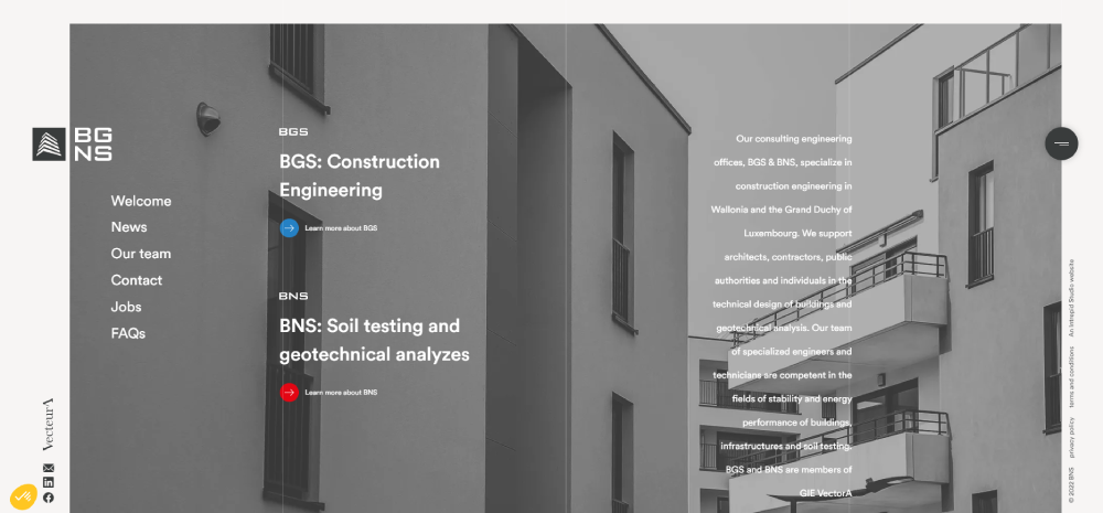
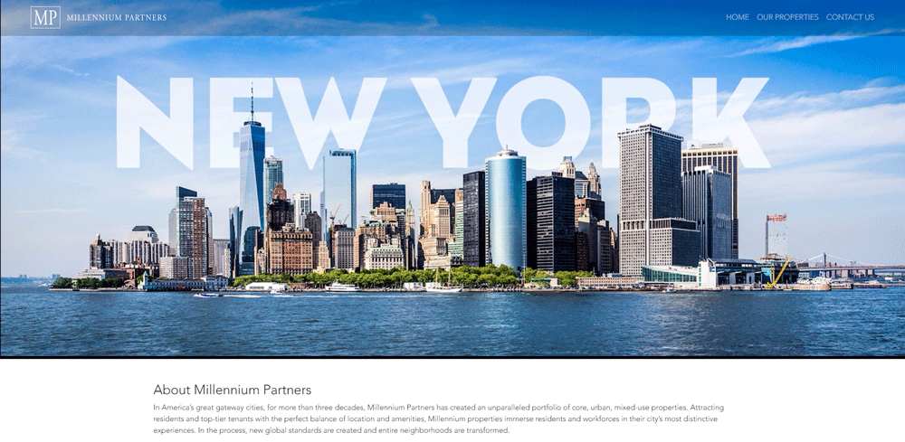
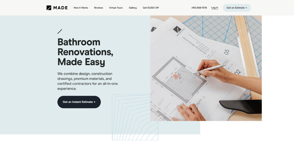
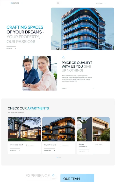
BGS and BNS were tasked with a difficult challenge: make a construction website for two separate companies. They knocked it out of the park, they made a great website that clearly represents each company. Each company is clearly distinguishable by the color of the background and information box on the top left corner.
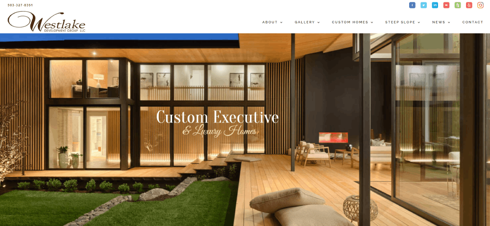
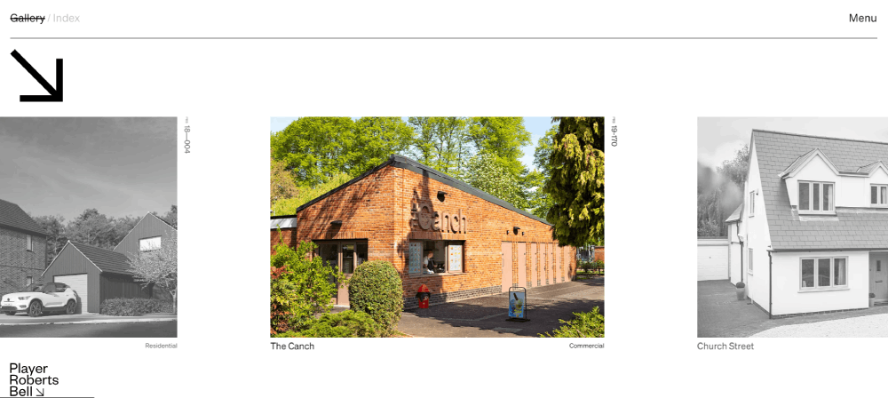
Be Developer 3
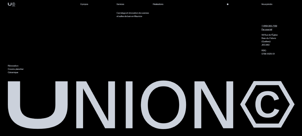
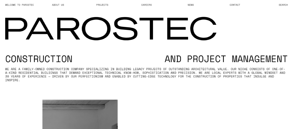
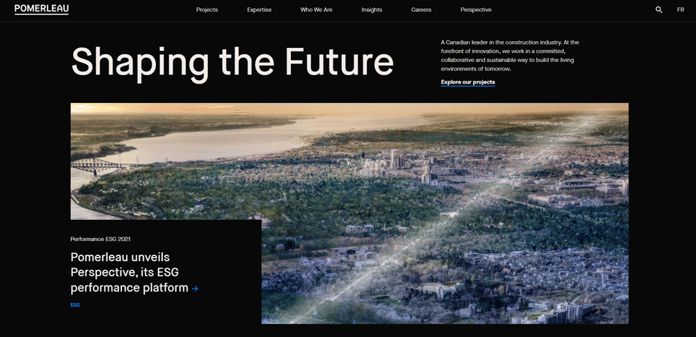
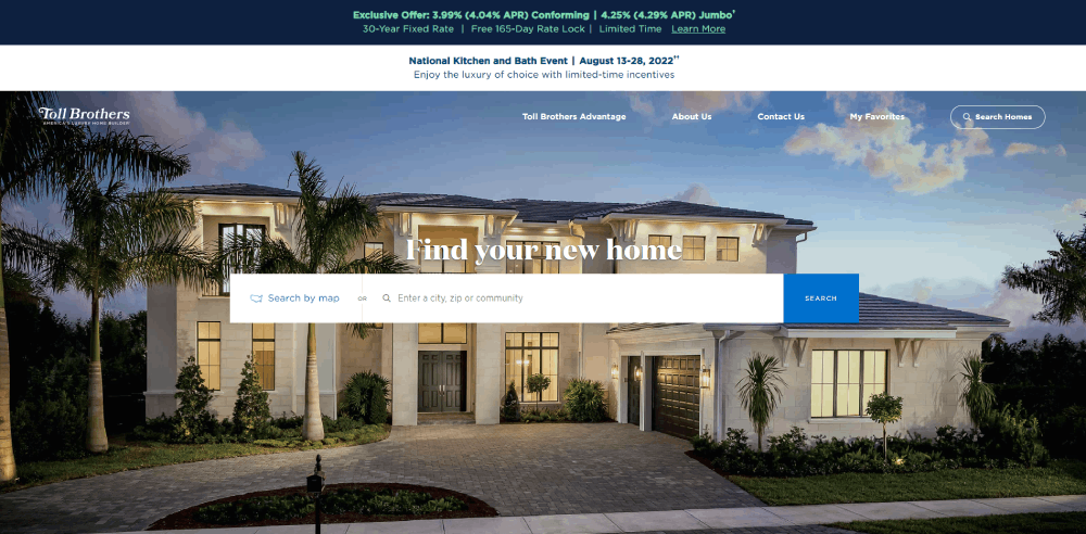
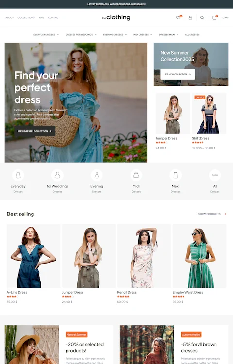
Parostec is a construction business that has an abundance of experience. Not only are they one of the best in project management, but they also are one of the best in construction web design. They display many of their impressive past construction projects accompanied by a brief explanation of the process therefore showcasing their prowess.
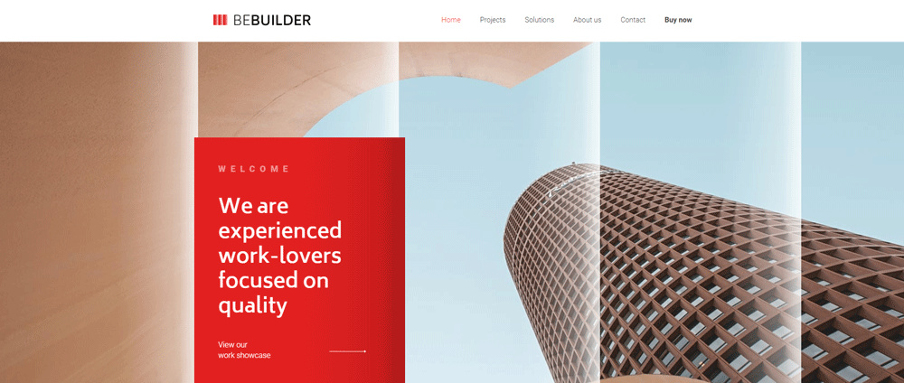
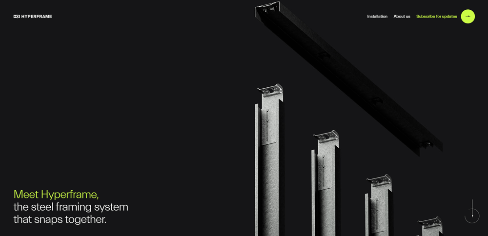
Hyperframe
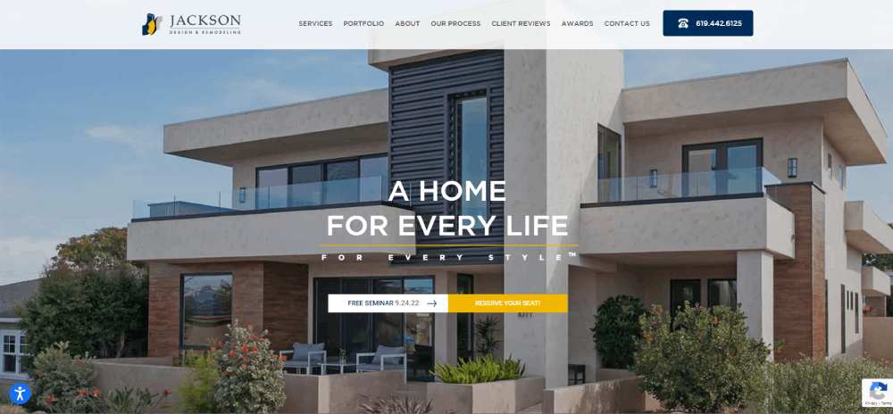
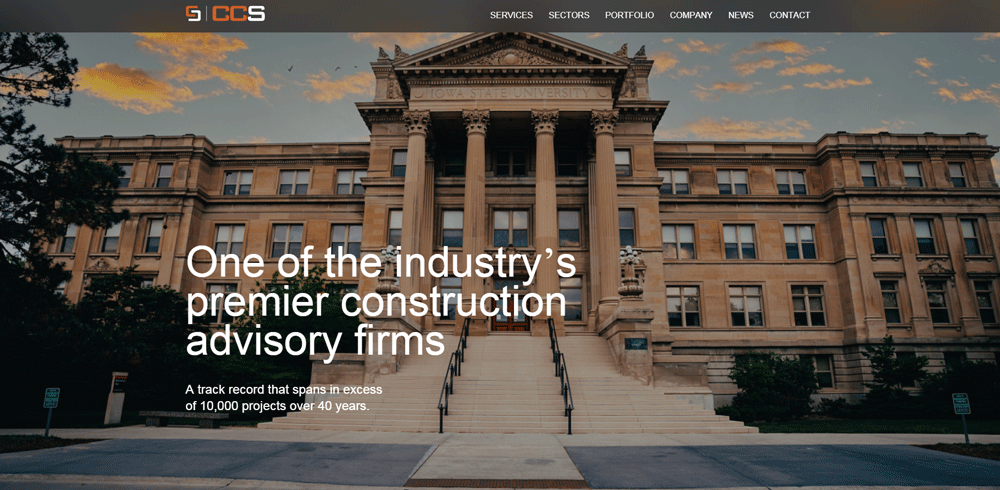
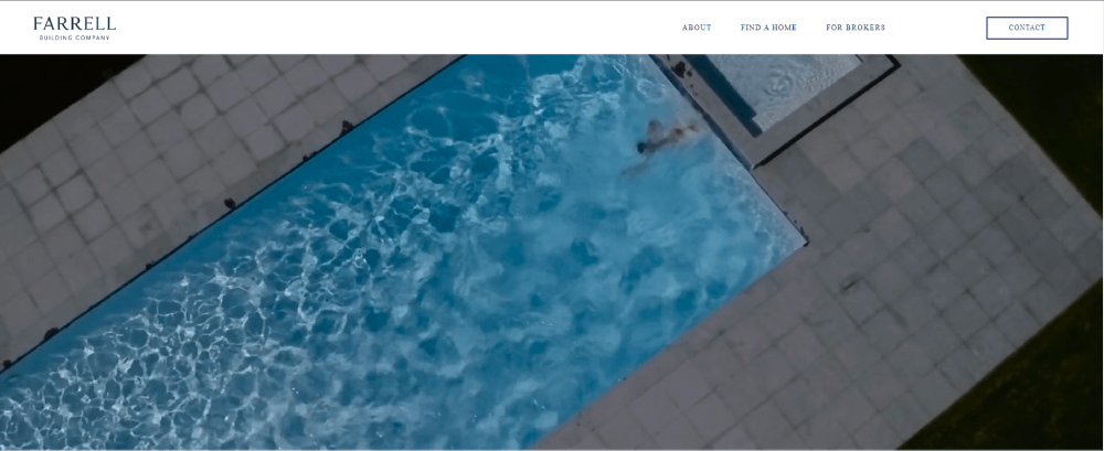
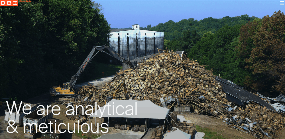
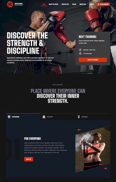
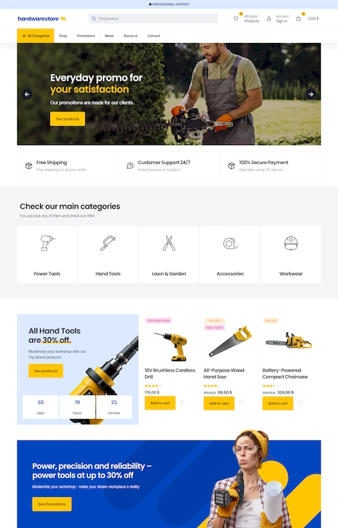
Farrell Building Company includes many important elements of website design, such as an about page, a homebuyers menu as well as a brokers menu. The design is practical, in that they can publish all of their services. It also greatly aids them in projecting confidence to their clients.
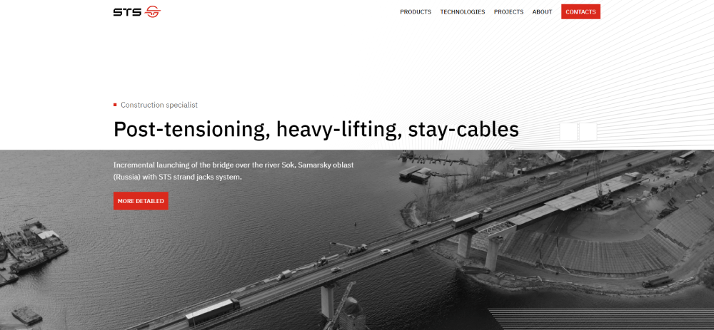
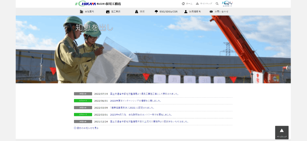
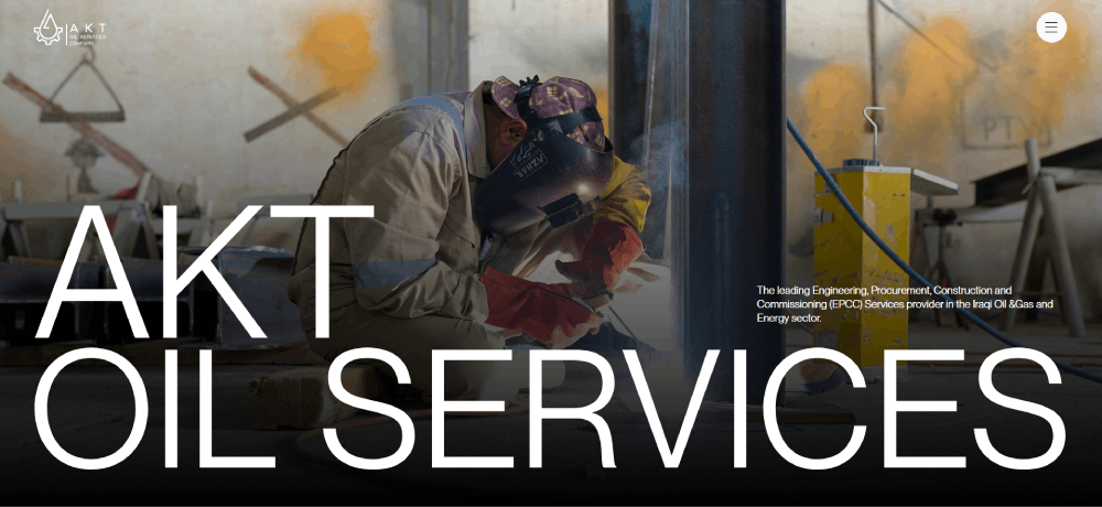
AKT Oil Services
The Construction Sales Company has a prominent Contact Us button. This helps gain clientele at a fast rate.
FAQ on Construction Website Design
What features are a must-have for a successful construction company website?
Website navigation that clients can trek through with ease, you know? User-friendly interfaces that guide. Showcase your portfolio – clear images, crisp project descriptions. Mobile optimization ain't optional; it's a given. Quick contact forms, social proof like testimonials, oh, and don't forget strong call-to-action prompts. It just makes sense.
How does responsive design impact construction industry websites?
Hey, it's like this – no device left behind. Everyone’s on the go, and your website? It’s gotta keep up. Phones, tablets, laptops. No matter the gadget, responsive design ensures your site looks top-notch and functions without a hitch. First impressions are all about that smooth visual and operational adaptability.
Can you integrate e-commerce features into a construction website?
Sure thing. Maybe you’re selling building materials or offering bookable consultations. E-commerce features slide right into your digital tool belt. Secure payment gateways, online store management through a CMS - it's doable and honestly, it's getting pretty popular in the trades.
What's the role of SEO in construction web design?
It’s foundational, like properly laid concrete. SEO lets your site be seen, climbing the ranks in search results. Think keyword optimization, but not just that, oh no. Site speed, mobile-friendliness, quality backlinks – all these elements, they mesh together to boost your online visibility. Turns those queries into contracts.
How frequently should a construction website be updated?
Stagnant's not in our vocab, okay? Content should flow like fresh cement. Keep updating projects, blog posts, company news - it keeps Google interested and your visitors too. Regular updates signal you’re alive, kicking, and the dust is far from settled. Every couple of months, at least, revamp something.
What are the best practices for displaying a construction project portfolio online?
Lay it out clean and clear - high-resolution images, crisp project overviews. Professional web design brings out your best work. Break it down by sector, say commercial or residential. Add filter options, so visitors can sort through with ease. Every project tells a story, give it the limelight it deserves.
How do I choose the right web design agency for my construction company?
Look at their track record, like seriously dig in. You want expertise in building industry branding and SEO know-how. Agencies should have a pile of construction website design examples to show. They got experience? They talk your language? Good. Also, make sure they respect your budget while crafting something distinct.
What's the significance of color schemes and typography in construction web design?
It’s your brand's hard hat and boots. Color schemes and typography echo your business identity. Strong, sturdy, reliable – your design needs to scream that. You wouldn't wear neon to a worksite, right? So, don't let your website. Go for robust, professional tones, clear, readable fonts. Those decisions frame your site visitor’s perception.
How can analytics be used to improve a construction company's website design?
Numbers tell tales, mate. Website analytics track the traveler's journey through your site. Bounce rates high on some page? Maybe it’s a sign to revamp. Popular content? That's your golden goose; breed more of it. Use this intel to optimize user experience and functionality on the fly.
How might social media integration be beneficial for my construction website?
It's like the open-plan office of the online world - connecting teams. Mesh your social profiles with your site; it builds community around your brand. Clients can jump from Instagram progress shots to your latest blog update, no sweat. Share buttons on portfolio pieces? That's free marketing – word of mouth goes digital.
Conclusion
So, we've dug deep. Sifted through a ton. It's clear, isn't it? Construction website design examples, they're not just digital dirt heaps. They're the modern-day pillars of an online presence that can stand the test of time.
What we've scooped up here isn't just for show. It's about laying down those internet I-beams with precision. Think intuitive user experience, robust responsive design, and those subtle cues like color schemes that drive the message home – 'We build strong, and our website’s proof'.
- Lead generation? It's not left to chance.
- Visual imagery and portfolio showcases? They speak volumes louder than words.
- Mobile optimization? Non-negotiable.
Wrapping this up, remember: an impeccable online presence for a construction biz isn’t a nice-to-have. It's like the heavy-duty machinery in your site yard. Essential. Keeps you building skywards, in both the physical and digital realms.
If you liked this article about construction website design, you should also check out this one about the best consulting websites.
We also have similar articles about the best dentist websites, barbershop websites, accountant website design, charity website design, event planner website design, car wash websites, websites for singers, and the best actor websites.
Yep! We really like websites, especially when we build them with BeTheme and the BeBuilder.

