

Retail Website Design Examples That Drive Sales
January 11, 2026
Powerful Gym Website Design Examples to Inspire You
January 11, 2026A great event website does one thing well: it makes people want to show up. And then it makes signing up dead simple.
But pulling that off is trickier than it sounds. Between the countdown timers, speaker lineups, ticket tiers, and mobile responsiveness, there are a lot of moving pieces that can go sideways fast.
This collection of event website design examples breaks down 15 real sites from conferences, festivals, and corporate events. You will see what makes each one work, from hero section layout and registration flow to visual branding and page speed.
Whether you are building a site for a tech summit like CES or a music festival landing page, these examples give you something concrete to reference.
What Is an Event Website
An event website is a standalone online platform built to promote a specific event, share its schedule, and convert visitors into registered attendees. It serves as the central hub for everything from ticket sales to speaker announcements.
Unlike a standard business site, an event website has one job: get people to show up. Every design decision, from the hero section to the footer, points toward that single conversion goal.
The best event website design examples share a few things in common. They load fast, communicate the event date and location immediately, and make registration ridiculously easy to find.
Conferences like Web Summit and festivals like Coachella treat their websites as full brand experiences. Corporate gatherings and charity fundraisers, on the other hand, lean harder on clarity and trust signals.
The design approach changes based on the audience. But the underlying structure stays consistent: event details first, social proof second, registration always visible.
What Makes an Event Website Different From a Regular Website
A regular website exists indefinitely. An event website has a deadline, and that deadline shapes everything about how it looks and functions.
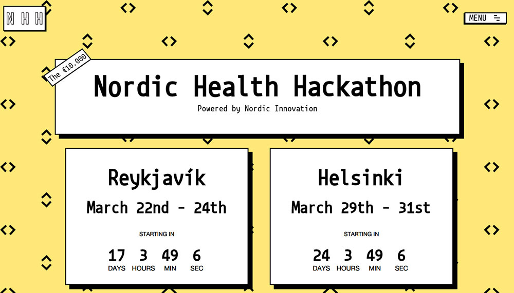
Countdown timers, urgency-driven call to action buttons, and date-specific content create pressure that standard sites never need. The entire website layout funnels visitors toward a time-sensitive action.
What Types of Events Use Dedicated Websites
Almost every event category benefits from a dedicated site. The design priorities shift depending on the type:
- Conferences and summits like Google I/O and Adobe MAX focus on speaker lineups, multi-track schedules, and sponsor visibility
- Music festivals like Sziget Festival and KIKK Festival prioritize visual energy, lineup announcements, and ticket tiers
- Corporate events lean on clean layouts, agenda clarity, and branded registration flows
- Charity fundraisers need emotional storytelling paired with donation and RSVP functionality
- Trade shows and expos like CES require exhibitor directories, interactive floor maps, and attendee badges
- Webinars and virtual events center around a simple landing page with a registration form and speaker bios
A conference website and a festival website solve completely different problems. Took me a while to really internalize that, but once you see the registration flow differences, it clicks.
Event websites tips and examples
Basically, your event page should be:
- Inviting and aesthetically pleasing
- Converting
- Easy to navigate
- User-friendly
If your goal is creating an event website that will convert passers-by into participants as well as generating a lot of buzz before the event even takes place, check out these tips for creating the best event websites.
Designing Your Landing Page
When designing event or conference websites, select a theme and don’t stray away from it. No matter whether you’ve gone for an 80s aesthetics or black and white typography, ensure it matches the tone and mood of the conference. You can also match your theme to your web copy (techie, serious, funny) or to how you used white space to organize your page’s content.
Interface consistency is guaranteed when designing with a theme. Since thematic websites generate patterns for users to pick up, they’re popular among them due to being user-friendly. If incredible graphics don’t match your event, they’re not necessary. However, it’s a good idea to recreate the conference’s mood by creating a mood for your event page.
Are you aware of the link between colors and psychology? Various feelings are invoked by various colors – e.g. blue invokes trustworthiness, red invokes confidence, and yellow invokes fun. This allows you to set the website’s tone by selecting colors that represent the feeling you want to invoke in your visitors.
The branding guidelines of your organization may restrict you, but generally speaking, light backgrounds go with dark-colored texts. It’s visually appealing, encourages engagement, and boosts conversions.
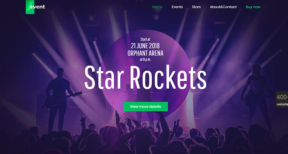
Homepage header:
A good homepage header features everything found on the best conference websites:
- A large logo with a clear tagline
- A full-screen background image
- A fixed header and crisp navigation links
- Event dates containing extra info about the activities of each day
- Other images of scheduled speakers, along with other header photos applied to internal pages such as the event seminar and workshops.
Keep the user experience in mind while designing your layout. Think about your typical visitor’s desires and needs. Consider how they might scroll through the page, what they might click on, and how they might navigate your content.
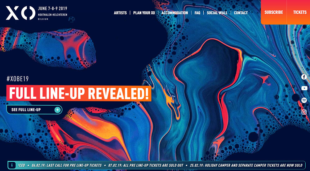
Mobile World Congress draws attention to its navigation bar by utilizing bright colors. The first link says “start here” and has a dropdown menu of links explaining where and when, what should be expected, and the agenda of the conference. This is as simple as it can get.
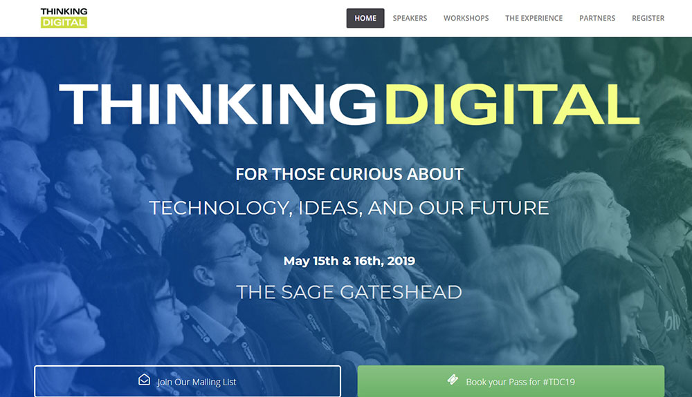
Thinking Digital Conference‘s UX methodologydiffers slightly but is just as effective. Their homepage contains everything necessary: location, date, and a brief tagline. Their most unique feature is their guiding link text which reads “so, is this for you?” and it auto-scrolls as you go down the page.
All conference and event websites require a user-friendly experience that aims to help visitors answer their own questions, and possibly even take certain actions.
Visual hierarchy is what sets apart a site that simply “looks good” from a site that has an impact on user decisions and flow.
With strategic use of layout, color, size, style, and spacing, your visitors are enticed into remaining on your site, continuing to read and building toward the main objective, which is signing up for your event. Your readers are also able to tell the difference between fun facts and vital information.
Typography With Structure:
When designing event websites, be careful of your text’s style, placement, and size, and especially the relationship between paragraphs and headers. Visitors should be aware of the content hierarchy that divides content sections even when just skimming through the website.
Another important principle of design is related to the wonderful universe of hover states.
Use this as the chance to include emotion and motion in your event site. Here are some ideas:
- The appearance of a drop shadow or slick underline on a button
- Adding some fun to your page by having that button transform into an animated GIF
- Having your speaker’s bio revealed when hovering on their image.
All of these examples are really effective at adding life to event websites.
Feature signup prompts in various parts of the site:
The best event sites are able to convert website visitors into event attendees. Each page’s brightest and largest button should be leading your visitors to your registration page. This is why a call-to-action button or link should be featured on every page of your website in the same place.
CTAs may be in the form of links, forms, buttons, or basically anything that encourages users to take a certain action. Event websites aim to sell tickets, provide new visitors with information, increase email lists and perhaps even allow speakers and sponsors to contact them offering their services.
This varies based on what kind of conference is being held, so play around to find out which actions boost conversions the most.

Visitors should have a cohesive experience, therefore narrow your registration process down to these key elements:
- Include a button that’s fun to click on
- Ensure the beautiful branding of your form: feature options for ticket type or registration, tracks/sessions, add-ons, meals, payment information etc.
- Tie everything together with an on-page or email confirmation message
Use Visuals as Selling Points:
Visitors are more enticed by visually-presented information. This is why should include the right amount of videos or images related to your event. Images give visitors something to expect, which is why they’re so popular. They can view previous venues, speakers, audience members, stages, and can relive the atmosphere of previous events.
There are various kinds of visuals that can be incorporated into event websites. Here are some examples:
- Images of the event’s location (neighborhood, city etc.)
- Images from your previous events give insight into what visitors can expect if they sign up for your event.
- Image galleries from previous events – may include action shots, close-ups, and presentations on the event stage.
Keep Track of Conversions:
Google Analytics is a free and valuable tool to gain insight which will optimize your event’s website and content. Not only is it’s set-up quite simple, but you’re also able to gain real insights into your website’s and audience’s behavior thanks to its powerful reports.
Contact, Mobile, and Social Sharing:
Since more than half of your audience will visit your website using a mobile device, you’ll risk losing them when it’s most important to keep them if they’re unable to easily access vital information regarding your event.
Your landing page’s design should be optimized for mobile use. If visitors have any questions regarding the event or there are issues with your registration process, they should be able to let you know without any fuss. Your event webpage should include easy ways to reach out to you, be that through email, social media, or a contact form.
Elements That Must Be Included On An Event Landing Page
The event’s name is the first thing that visitors’ eyes should go to. Use large and bold letters, and position it in the middle of your page if possible so that they know exactly what site they are currently on.
ConveyUX‘s website includes an example that’s difficult to miss. There are two large above-the-fold sections dedicated to where and when, and both of them are appropriately labeled. Since the term UX is featured in the conference’s name, the general assumption is that this is an event about user experience design. There’s still a tagline underneath to make sure everyone’s on the same page.
A conference website isn’t the final product. The final product is the event itself; the website is just a means to an end.
If you’re uncertain about which information should be placed in clear view, check out this list:
- Location – city, state, country, perhaps venue address
- Time – year, month, and date(s)
- Ticket price – optional but valuable; challenging when it comes to multi-pass prices
- Description – what’s happening? What’s the event’s purpose? What’s the reason to attend? Who else might come? What can I learn?
Prominently display why the event should be attended and who the target audience is:
This what is sometimes known as the unique selling proposition – it informs your audience of the features that make your event stand out and how they’ll benefit from attending it. The aim is for your website to be visited by your target audience, and for them to recognize themselves as the target audience without difficulty and tell themselves, "This event is for me."
This is why your homepage and other pages should include a list of your target audience(s).
A good idea is to specifically mention those whose attendance will benefit them: human resources professionals, repair technicians, marketing managers etc.
Other event details to include on your homepage:
Once all of the essential information at the top of your site has been viewed by visitors, the next step is to get into the more in-depth details. Visitors should be able to find the following information as they scroll down:
- links to the schedule of the event
- a list of the event’s speakers
- galleries from previous events
- social proof
- sponsors and event summaries
Your conference or event page website is what helps guarantee the success of your event. In order to ensure your marketing plan’s success, each element needs to be addressed in a strategic way so that the right notes can be hit and your organization’s bottom line impacted.
How to Evaluate an Event Website Design
Before looking at specific examples, you need a framework. Not every flashy site is a good site. And not every minimal design is underperforming.
These are the criteria that actually matter when comparing event website design examples. They separate the sites that look cool from the ones that convert.
Does the Layout Prioritize Registration and Conversion
The register button should be visible within the first screen, no scrolling required. Sticky headers with a persistent CTA outperform buried registration links every time.
Sites that hide the signup behind three clicks are losing attendees. Good form design matters here too; fewer fields, faster completions.
Does the Visual Design Match the Event Brand Identity
A tech conference using watercolor illustrations looks off. A music festival with a plain white background and Times New Roman feels wrong.
The color scheme and typography should match the event's personality instantly, before the visitor reads a single word.
How Accessible Is the Website Across Devices
Over 60% of event website traffic comes from mobile devices. If the registration form breaks on a phone screen, that is a direct revenue problem.
Responsive design is not optional for event sites. WCAG compliance, readable font sizes, and touch-friendly buttons are the baseline, not a bonus.
Does the Site Communicate the Event Schedule and Speaker Information Clearly
Attendees want to know who is speaking and when. Multi-day conferences like SXSW and HubSpot INBOUND handle this with filterable agenda pages and linked speaker bios.
If a visitor has to dig through PDFs or scroll through an unformatted wall of text to find session times, the site has failed at its most basic job.
How Fast Does the Event Website Load
Heavy hero videos and uncompressed images are the usual culprits. A site that takes 5+ seconds to load on mobile loses nearly half its visitors before the page even renders.
Google PageSpeed Insights is the quickest way to check. Event sites with video backgrounds need extra attention to compression and lazy loading.
FAQ on Event Website Design Examples
What makes a good event website design?
A good event website design puts the event date, location, and registration button above the fold. Fast load times, mobile responsiveness, and clear schedule pages are the basics. Visual branding should match the event's identity without slowing the site down.
What pages should an event website include?
At minimum: a homepage with a hero section, an agenda or schedule page, a speaker bio section, a registration or ticket purchase page, a venue map, and a contact page. Sponsor sections and testimonial pages from past attendees help build trust.
How do I design an event landing page that converts?
Keep the layout focused on one action: registration. Use a single visible CTA, a short event description, speaker highlights, and social proof. Remove distractions. Every element on the page should push toward that signup button.
What is the best platform to build an event website?
It depends on the event size. Squarespace and Wix work for smaller events. WordPress with Eventbrite integration handles mid-size conferences. Platforms like Bizzabo and Cvent are built specifically for large-scale corporate events and trade shows.
How important is mobile optimization for event websites?
Critical. Over 60% of event site traffic comes from phones. If the registration form or schedule page breaks on mobile, you lose attendees directly. A mobile first design approach is the standard now, not a nice-to-have.
Should an event website use video backgrounds?
Video backgrounds work well for festivals and experiential events where visual energy matters. For corporate conferences, they can slow load times without adding value. Compress heavily, use lazy loading, and always provide a static fallback image.
How do I make my event website accessible?
Follow WCAG guidelines. Use sufficient color contrast ratios, add alt text to all images, make forms keyboard-navigable, and test with screen readers. Accessible design expands your audience reach and signals professionalism to attendees.
What design style works best for conference websites?
Clean, structured layouts with filterable agendas and linked speaker profiles. Conferences like Google I/O and Apple WWDC use grid-based designs with clear content hierarchy. Avoid heavy decoration. Let the content, speakers, and schedule do the work.
How often should I update my event website?
Update it whenever new information is confirmed. Speaker announcements, schedule changes, early bird deadlines, and venue details should go live immediately. A stale event page with outdated info damages credibility and kills registration momentum.
Can I use a one-page design for my event website?
Yes, for smaller events like webinars, local meetups, or single-day workshops. A one page website keeps everything in one scroll. Larger multi-day events with multiple tracks need dedicated subpages for schedules, speakers, and logistics.
Conclusion
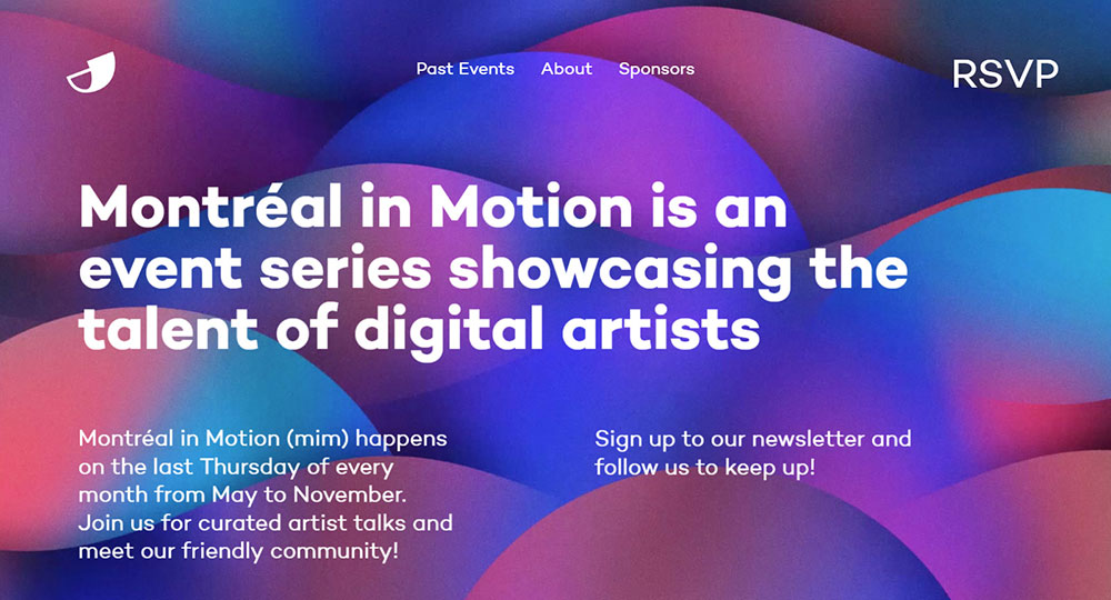
These event website design examples prove that there is no single formula. A Coachella festival page and a Salesforce Dreamforce registration site solve completely different problems with completely different visual approaches.
What stays consistent is the structure. Clear event details above the fold, a visible registration path, fast page speed, and a design that matches the event's brand identity.
Pay attention to how sites like TED and C2 Montreal handle speaker discovery and agenda filtering. Those details separate functional event pages from forgettable ones.
Start with your event type, pick a layout pattern that fits, and build your event landing page around one conversion goal. Keep testing on mobile. Keep trimming what does not serve the attendee.
The best event websites are not the flashiest. They are the ones where registration feels effortless.


