Surfing Website Design Examples That Make Waves
September 26, 2025
Clean Accountant Website Design Examples
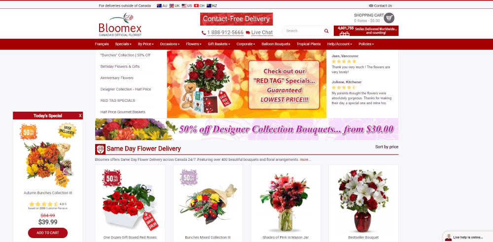
October 7, 2025Florist website design is the process of creating digital storefronts specifically built for flower shops, wedding florists, and botanical businesses.
Unlike generic e-commerce templates, these sites prioritize high-quality flower photography and occasion-based browsing.
The primary goal? Showcase floral arrangements while making online ordering feel effortless.
A well-built flower shop website handles same-day delivery scheduling, seasonal bouquet collections, and custom arrangement requests without confusing visitors.
Wedding florists need dedicated portfolio galleries. Retail shops need streamlined checkout flows. Subscription services need recurring order management.
Each business model demands different functionality, but every florist website shares one thing: visuals come first.
Your arrangements do the selling. The website just needs to get out of the way.
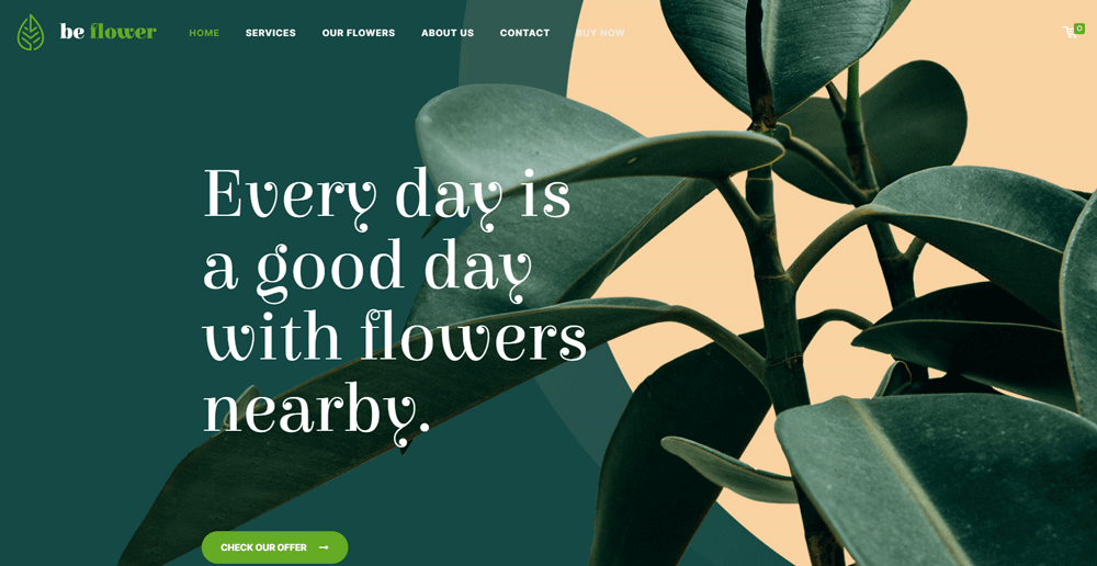
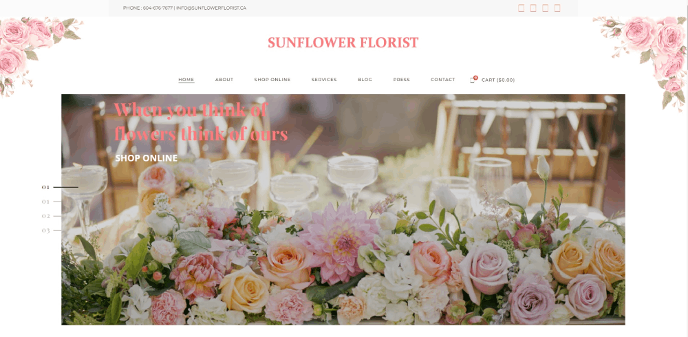
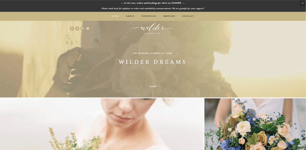
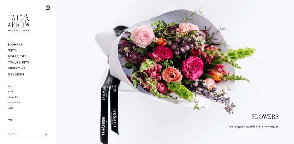
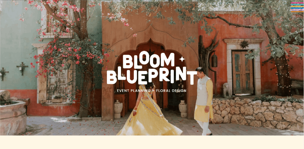
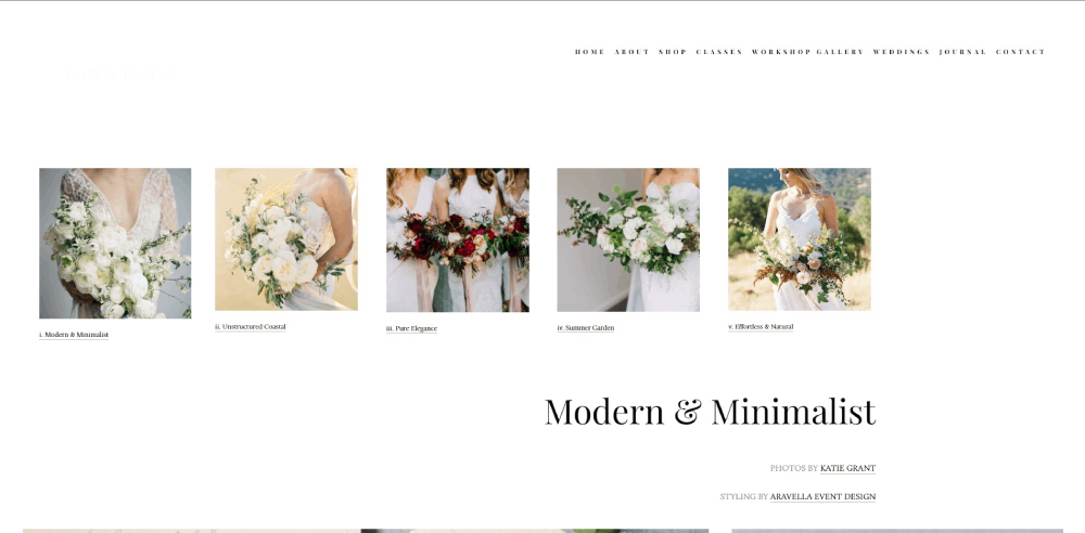
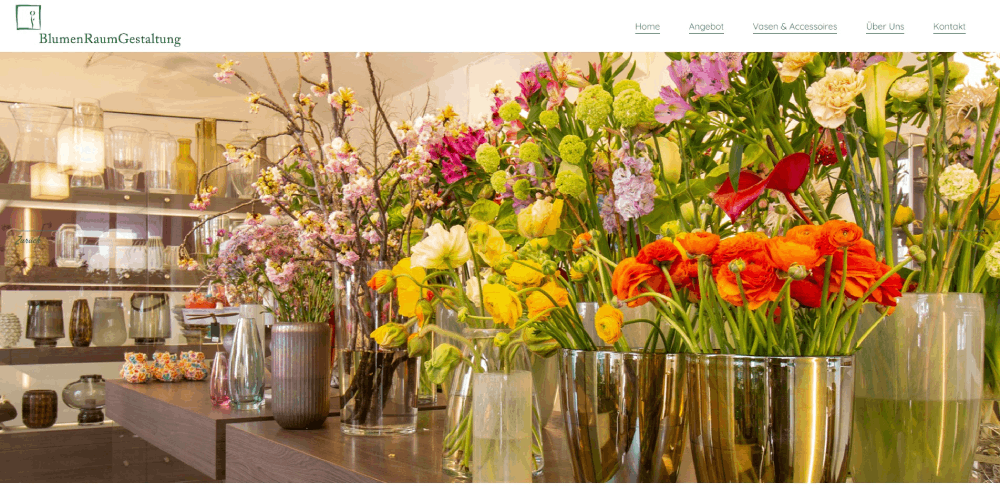
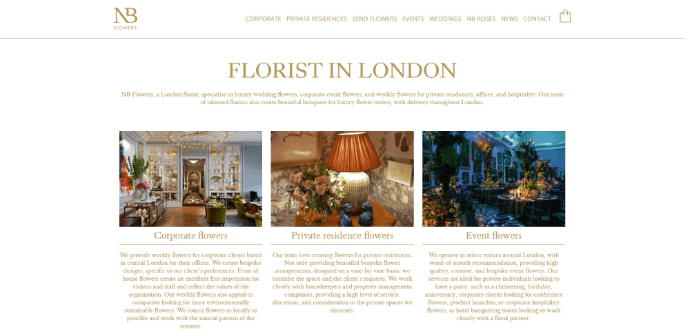
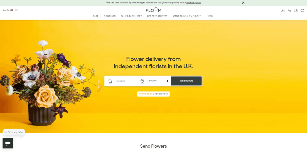
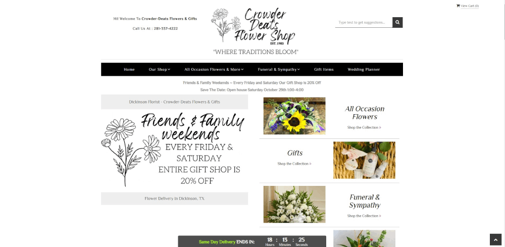
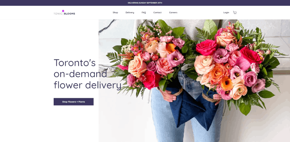
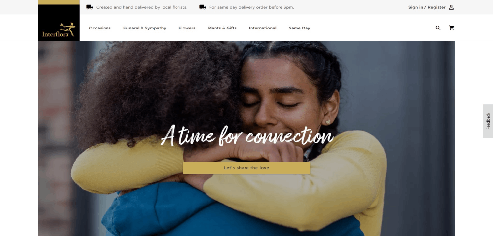
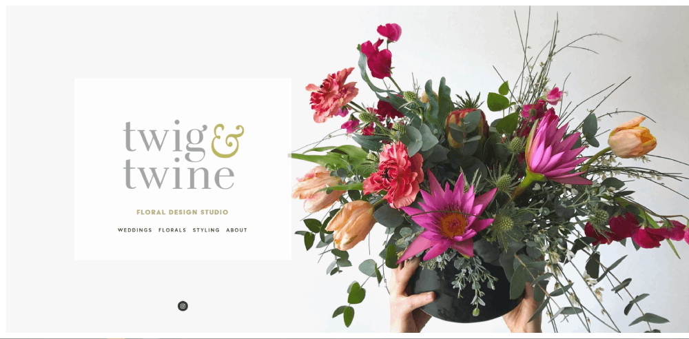
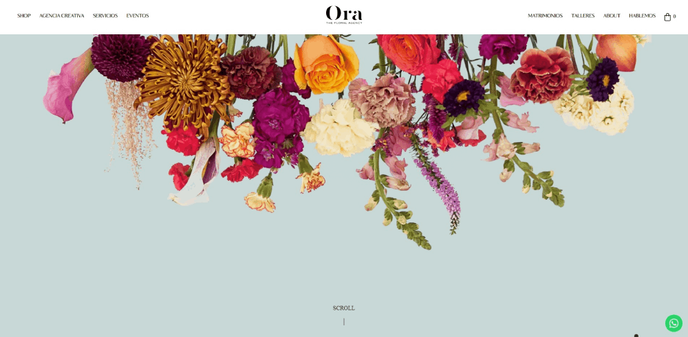
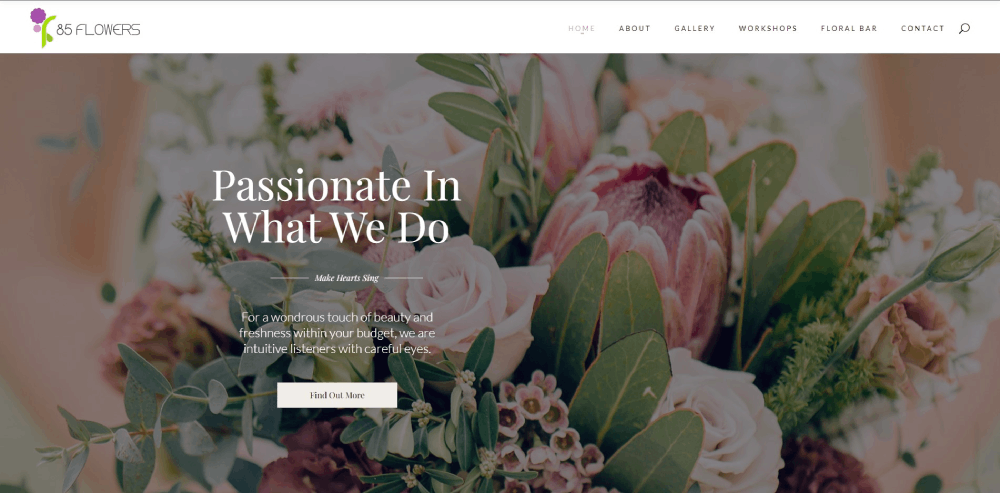
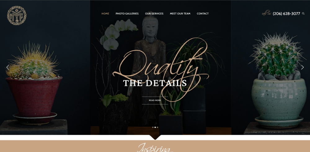
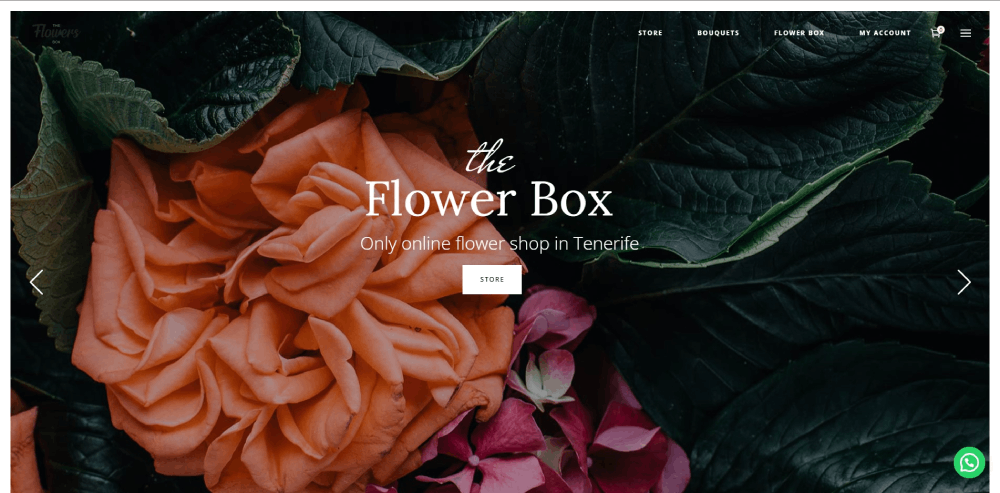
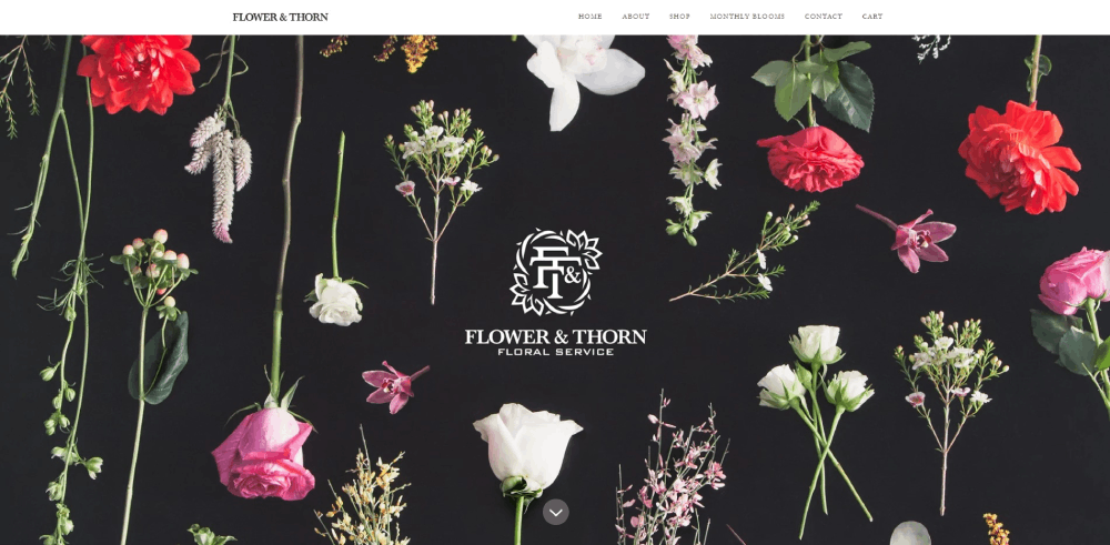
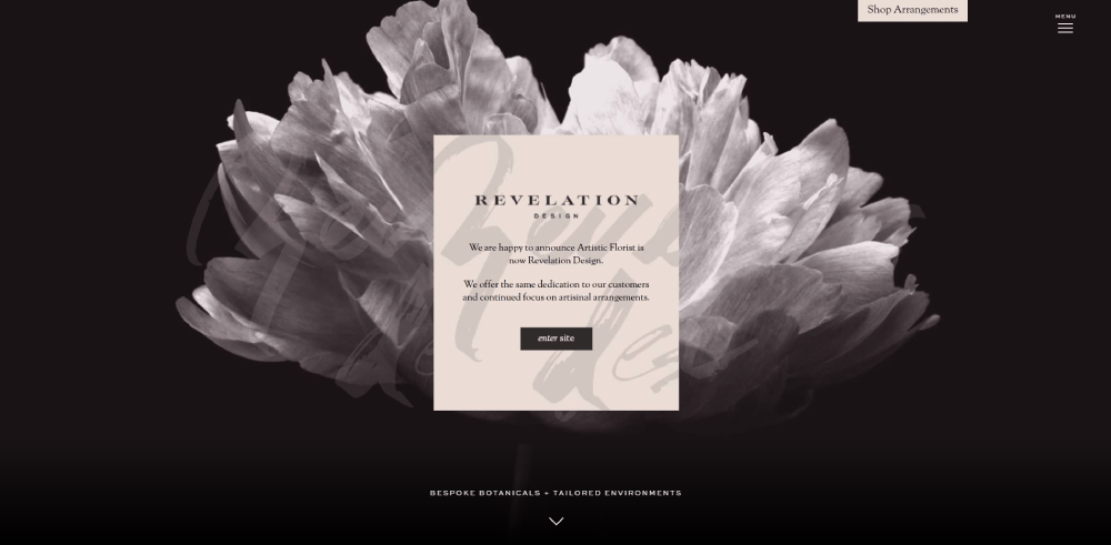
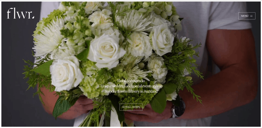
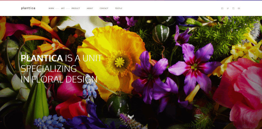
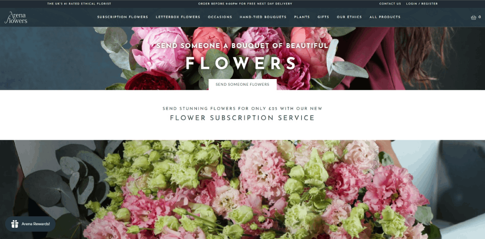
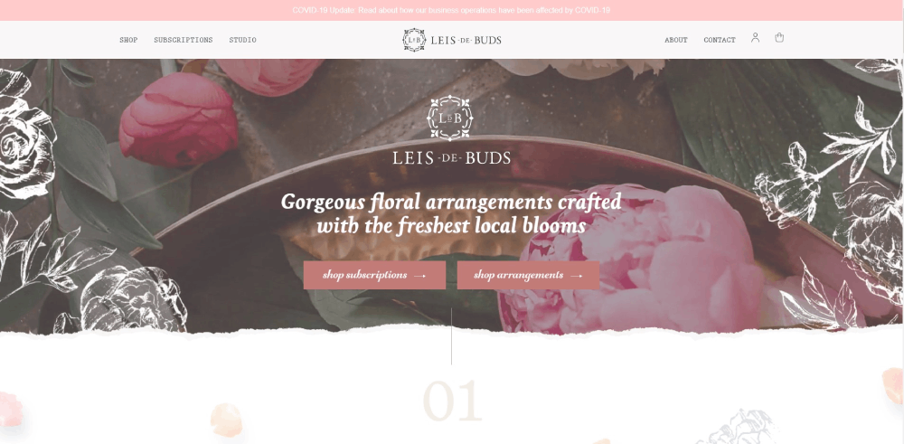
Florist Website Design Examples
goshá
How Florist Websites Differ from Standard E-commerce Sites
Most e-commerce platforms treat products like inventory items. Florist websites treat them like art.
That fundamental difference changes everything about how these sites get built.
Visual-First Design Requirements
Flower arrangement galleries need room to breathe. Product images shouldn't compete with cluttered sidebars or aggressive promotional banners.
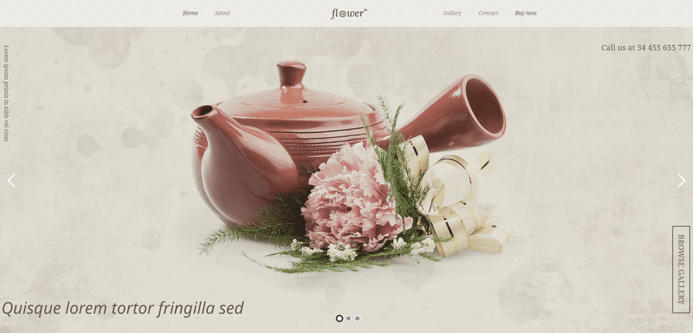
The best botanical website templates use neutral backgrounds, generous white space, and minimal text overlays.
Perishable Product Considerations
Flowers die. That reality shapes every purchasing decision.
Delivery date selection becomes critical. Customers need real-time availability, not "ships in 3-5 business days."
Same-day flower delivery options require backend systems that standard Shopify or WooCommerce setups don't provide out of the box.
Occasion-Based Navigation
People don't search for "red roses." They search for "anniversary flowers" or "sympathy arrangements."
Smart website navigation organizes by occasion first: weddings, birthdays, funerals, corporate events.
Flower type becomes secondary. This matches how customers actually think.
Seasonal Collection Management
Inventory changes constantly. Spring tulips disappear by summer. Holiday poinsettias dominate December.
Florist sites need easy ways to rotate featured arrangements, update availability, and highlight what's currently blooming.
Consultation Booking Integration
Wedding florists don't just sell products. They sell expertise and custom design services.
These sites need booking system integration for consultations, not just shopping carts. Calendly, HoneyBook, and similar tools become standard features.
Types of Florist Website Designs
Not every flower business needs the same website structure. Your specialty determines your design approach.
Wedding Florist Websites
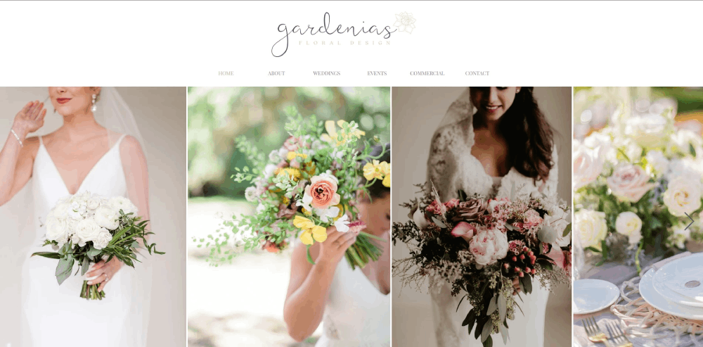
Portfolio-heavy with bridal galleries organized by style: rustic, modern, romantic, bohemian.
Consultation booking takes priority over direct purchasing. These sites sell the designer, not just the flowers.
Testimonials from past brides carry significant weight. Similar to how wedding planner websites operate, trust signals matter enormously.
Retail Flower Shop Websites
E-commerce functionality drives everything. Product pages, shopping carts, delivery zone calculators.
These sites compete with 1-800-Flowers and FTD on convenience. Speed and simplicity win.
Local SEO integration through Google Business Profile becomes essential for neighborhood visibility.
Subscription Flower Service Websites
Recurring order management sits at the core. Weekly, bi-weekly, monthly delivery options.
These sites borrow heavily from SaaS websites with their pricing tiers and membership models.
Customer accounts and delivery scheduling interfaces need special attention.
Event Florist Websites
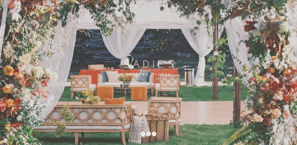
Corporate clients and event planners make up the primary audience.
Portfolio galleries showcase large-scale installations: conference centerpieces, gala arrangements, office lobby displays.
Inquiry forms replace shopping carts. Custom quotes replace fixed pricing.
Wholesale Florist Websites
B2B functionality with bulk ordering, tiered pricing, and account-based access.
These sites need features similar to B2B websites in other industries: login portals, order history, volume discounts.
Less visual flair, more operational efficiency.
What Makes a Florist Website Effective
Before looking at specific examples, you need clear criteria for evaluation.
These six factors separate florist websites that convert from those that just look pretty.
Photography Quality and Presentation
Arrangement photography makes or breaks florist sites. Blurry iPhone shots won't cut it.
The best sites feature professional images with consistent lighting, multiple angles, and detail shots showing individual blooms.
Background consistency matters too. Chaotic backdrops distract from the flowers themselves.
Navigation Structure and Usability
Can visitors find wedding flowers in under three clicks? Is the sympathy section clearly labeled?
Check out website navigation examples from top-performing sites. Clear website menu organization correlates directly with conversion rates.
Mobile Responsiveness
Most flower orders happen on phones. Someone remembers an anniversary at 10 PM and needs same-day delivery.
Touch-friendly buttons, fast-loading images, and simplified mobile checkout aren't optional.
Booking and Ordering Functionality
The checkout process should take three steps maximum. Every additional click loses customers.
For wedding florists, consultation scheduling needs to feel effortless. Calendar integration through Calendly or similar tools.
Brand Identity Consistency
Does the website feel like walking into the actual flower shop?
Color palettes, typography choices, and imagery style should match the florist's real-world brand. A rustic farmhouse florist needs different aesthetics than a luxury urban boutique.
Understanding color theory helps create cohesive visual experiences.
Page Load Performance
Image-heavy sites load slowly without proper optimization. Google PageSpeed Insights scores matter.
Compress images. Use lazy loading. Choose hosting that handles traffic spikes around Valentine's Day and Mother's Day.
Homepage Design Elements for Florist Websites
The homepage sells the experience before visitors see a single product page.
Get these elements right and browsing continues. Get them wrong and visitors bounce.
Hero Section Approaches
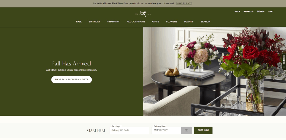
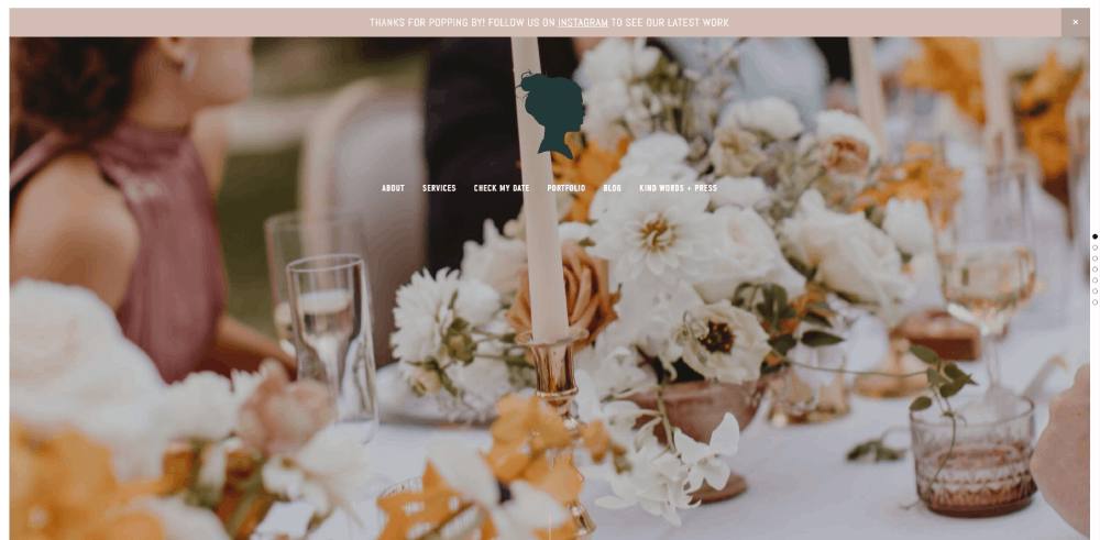
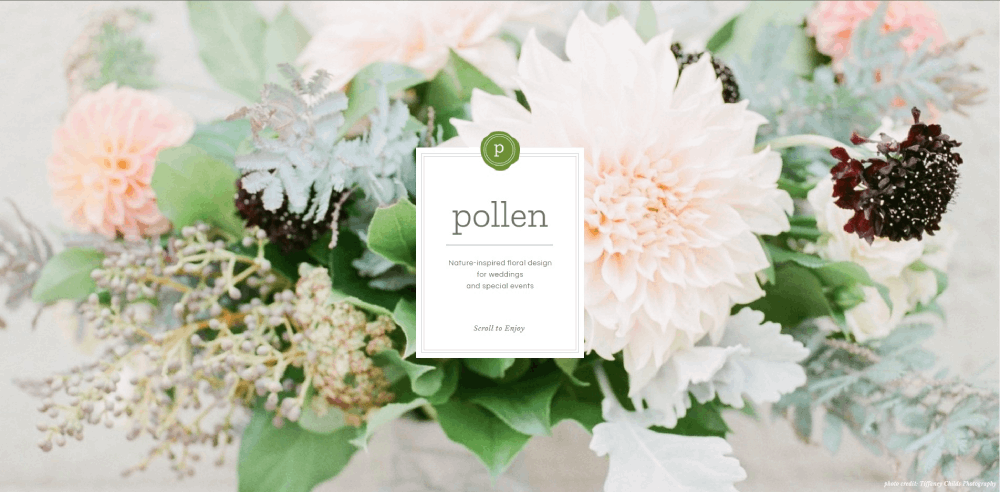
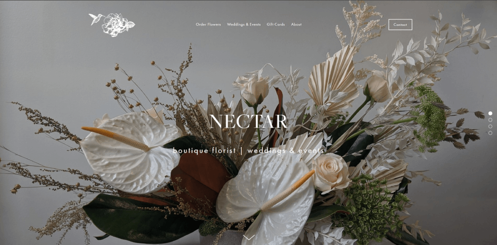
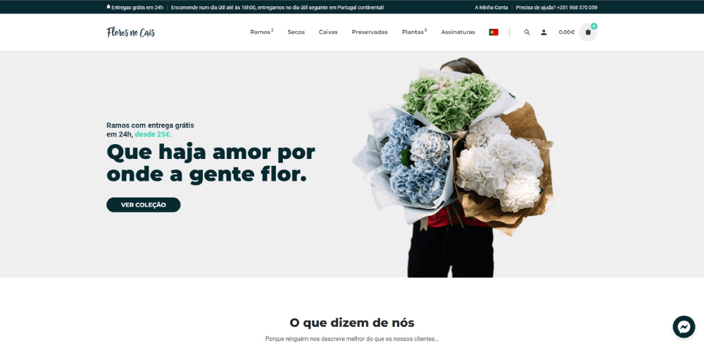
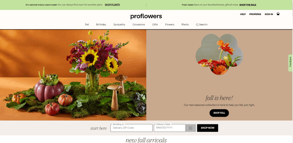
Full-screen arrangement photography works best for luxury and wedding florists. Split layouts suit shops balancing multiple services.
A strong hero section communicates brand identity within three seconds.
Call-to-Action Placement
"Shop Bouquets" and "Book Consultation" deserve prime real estate. Above the fold, high contrast, impossible to miss.
Effective call to action buttons use action verbs and create urgency for same-day delivery options.
Navigation Menu Structure
Five to seven main categories maximum. Shop, Weddings, Events, About, Contact.
Mega menus work for florists with extensive catalogs; simple dropdowns suit smaller boutiques.
Trust Signals Positioning
Google reviews, wedding industry awards, "As seen in" press mentions. Place these below the hero, above the product grid.
Payment icons (Stripe, PayPal) near the footer reassure checkout-hesitant visitors.
Featured Arrangement Displays
Seasonal collections rotate front and center. Valentine's roses in February; autumn centerpieces in October.
Best sellers and staff picks help undecided browsers commit faster.
Portfolio and Gallery Design for Florists
Your portfolio does the heavy lifting. Especially for wedding and event florists.
Image Organization Methods
Three approaches work: by occasion (weddings, corporate, sympathy), by style (modern, rustic, romantic), or by flower type (roses, peonies, seasonal).
Pick one primary organization method; add filters for secondary sorting.
Gallery Layout Options
Masonry grids showcase varied image dimensions beautifully. Standard grids feel cleaner but require consistent photo ratios.
Carousels work for featured projects but frustrate users wanting to browse quickly.
Image Quality Requirements
Professional photography from actual weddings outperforms studio shots. Hire wedding photographers or request images from past clients.
Minimum 1200px width for desktop display; compress to under 200KB for speed.
Wedding Portfolio Specifics
Bridal bouquets, ceremony installations, reception centerpieces, boutonnieres. Each deserves its own subsection.
Similar to wedding photographer websites, emotional shots of brides holding bouquets convert better than isolated product images.
Florist Website Navigation Structures
Poor navigation kills conversions. Visitors won't hunt for what they need.
Menu Organization Strategies
Occasion-first navigation (Birthday, Anniversary, Sympathy, Wedding) matches how customers think.
Flower-type navigation (Roses, Lilies, Mixed Bouquets) serves returning customers who know what they want.
Service Page Hierarchy
- Wedding Flowers (with subpages for bridal, ceremony, reception)
- Event Design (corporate, galas, installations)
- Daily Delivery (standard bouquets, plants, gifts)
- Subscriptions (weekly, monthly plans)
Mobile Navigation Considerations
Hamburger menus work fine. Bottom navigation bars work better for e-commerce-heavy sites.
Sticky "Order Now" buttons that follow scrolling increase mobile conversions significantly.
Product Page Design for Flower Arrangements
Every product page is a sales pitch. Photography, pricing, and purchasing flow matter equally.
Photography Best Practices
Main image shows full arrangement. Secondary images: close-up details, scale reference, alternate angles.
Lifestyle context (flowers on a dining table) outperforms white-background studio shots for gift purchases.
Pricing Display Approaches
Clear, visible, no surprises. Include delivery fees upfront or face cart abandonment.
Size variations (small, medium, large) with corresponding prices help customers self-select within budget.
Customization Options
Vase upgrades, add-on gifts (chocolates, cards), color substitution requests. Display these as simple checkboxes or dropdowns.
A well-designed form design handles special instructions without overwhelming buyers.
Delivery Date Integration
Calendar widget showing available delivery dates beats dropdown menus. Visual clarity reduces errors.
Same-day cutoff times displayed prominently prevent disappointed customers.
Online Ordering Features for Florist Websites
Checkout friction loses sales. Every unnecessary step costs revenue.
Shopping Cart Functionality
Persistent cart icons showing item count. Easy quantity adjustments. Clear "Continue Shopping" and "Checkout" paths.
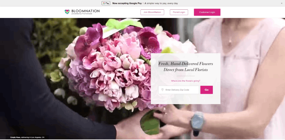
WooCommerce and Shopify handle basics well; Floranext and BloomNation offer florist-specific features.
Checkout Process Optimization
Three steps maximum: delivery details, payment, confirmation.
Guest checkout mandatory. Forced account creation kills conversions for one-time gift buyers.
Same-Day Delivery Handling
Delivery zone checker early in the process. ZIP code validation before customers fall in love with unavailable arrangements.
Cutoff time countdown ("Order within 2 hours for same-day delivery") creates urgency.
Custom Arrangement Requests
Some customers want bespoke work. Inquiry forms with budget ranges, occasion details, and color preferences capture these leads.
Photo upload options help florists understand customer vision before consultation calls.
Subscription Management
Account dashboards for recurring orders: pause, skip, cancel, change frequency.
Similar to membership websites, subscriber retention depends on easy self-service management.
Delivery Zone and Scheduling Display
Delivery logistics make or break florist e-commerce. Communicate capabilities clearly.
Delivery Area Presentation
Interactive maps showing service zones. ZIP code lookup tools. Clear lists of covered cities and neighborhoods.
Out-of-area visitors should see wire service options (FTD, Teleflora) or nationwide shipping alternatives.
Real-Time Availability
API integration with inventory systems prevents selling arrangements that can't be fulfilled.
Grayed-out dates on delivery calendars set expectations before checkout.
Express Delivery Indicators
Badge or icon system: "Same-Day Available," "Express 2-Hour Delivery," "Next-Day Only."
Filter options letting customers see only same-day-eligible arrangements save time.
Color Palettes and Typography for Florist Websites
Design choices either complement your arrangements or compete with them.
Background Color Strategy
Neutral backgrounds (white, cream, soft gray) let flower photography pop. Busy patterns distract.
A calm color palette works for most florists; luxury boutiques might consider green color palettes echoing botanical themes.
Typography Recommendations
Serif fonts communicate elegance and tradition. Sans-serif reads modern and clean.
Studying websites with good typography reveals how font pairing affects brand perception.
Brand Color Integration
Accent colors in buttons, links, and icons. Never backgrounds competing with product images.
Consistent application across website, social media, and physical materials builds recognition.
Mobile Optimization for Florist Websites
Over 60% of flower orders happen on mobile devices. Desktop-first design is obsolete.
Touch-Friendly Navigation
Buttons minimum 44px tap targets. Adequate spacing between clickable elements.
Swipe gestures for gallery browsing feel native on mobile.
Image Optimization
Responsive images serving appropriate sizes per device. WebP format where supported.
Lazy loading prevents slow initial page loads on image-heavy category pages.
Mobile Checkout Simplification
Autofill for addresses and payment. Apple Pay and Google Pay integration.
Embracing mobile first design principles ensures checkout flows work on small screens.
Click-to-Call Integration
Phone numbers as tappable links. Customers with complex orders prefer calling over form submissions.
Prominent placement in header and footer.
About Page and Brand Storytelling for Florists
Customers buy from people, not corporations. Your story creates connection.
Florist Background Display
Training credentials, years of experience, design philosophy. Brief and scannable, not autobiography.
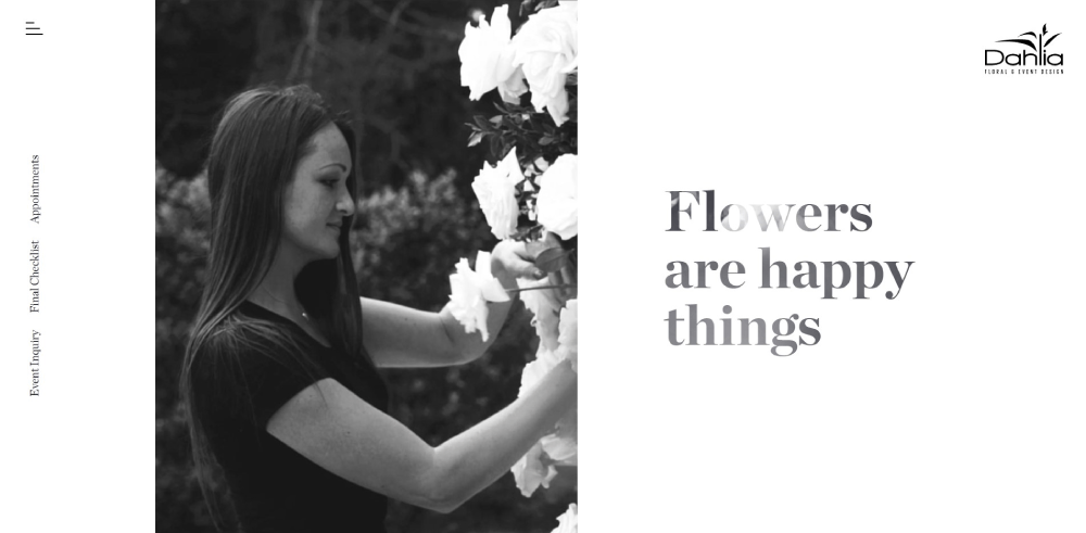
Photos of the actual florist working build authenticity.
Team Introductions
Names, faces, roles. Especially for wedding florists where clients want to know who's handling their big day.
Personality comes through better on video than text.
Studio Photography
Behind-the-scenes workspace shots. Coolers full of fresh blooms. Design tables mid-arrangement.
Similar approach to photography studio websites: show the creative environment.
Testimonials and Social Proof on Florist Websites
Reviews influence purchasing decisions more than product descriptions.
Review Display Formats
Star ratings for quick scanning. Full testimonials for detailed social proof.
Photo reviews showing delivered arrangements build trust in product quality.
Wedding Testimonial Placement
Dedicated section within wedding portfolio pages. Bride quotes alongside photos of their actual flowers.
Emotional language ("made my day perfect") resonates stronger than generic praise.
Third-Party Review Integration
Google Reviews widget pulling live ratings. The Knot and WeddingWire badges for wedding florists.
External validation carries more weight than self-selected testimonials.
Blog and Content Sections for Florist Websites
Content marketing drives organic traffic and establishes expertise.
Seasonal Flower Guides
Spring blooms, summer arrangements, fall colors, winter greenery. Updated annually.
These pages rank well and attract planning-stage customers months before purchase.
Care Instructions
How to keep roses fresh. When to change water. Trimming techniques.
Helpful content reduces customer complaints and positions the brand as knowledgeable.
Wedding Planning Tips
Timeline for booking florists. Questions to ask during consultations. Budget allocation guidance.
Captures couples early in their planning journey.
Event Recaps as Portfolio Updates
Blog posts featuring recent weddings and events keep portfolio fresh without full redesigns.
Tags and categories enable this content to appear in relevant gallery sections.
FAQ on Florist Website Design
What platform is best for building a florist website?
Squarespace suits portfolio-focused wedding florists prioritizing visual presentation. Shopify handles high-volume retail flower shops with advanced e-commerce needs. WordPress with WooCommerce offers maximum customization. Wix works for beginners wanting drag-and-drop simplicity without coding knowledge.
How much does a professional florist website cost?
Template-based sites on Squarespace or Wix cost $200-500 setup plus $20-50 monthly. Custom professional websites with booking systems and gallery management range from $2,000-10,000. Add 2-3% transaction fees for online ordering functionality.
What pages should every florist website include?
Homepage with hero section imagery, about page with florist background, services page detailing offerings, portfolio gallery showcasing arrangements, contact page with inquiry forms, and shop pages for online flower ordering. Wedding florists need dedicated bridal portfolio sections.
How do I photograph flowers for my website?
Use natural light near large windows on overcast days. Choose neutral backgrounds like white marble or light wood. Capture four angles minimum: front view, 45-degree, overhead, and detail close-up. Compress images under 200KB for fast page load speed.
Should florist websites have online ordering?
Retail flower shops benefit significantly from e-commerce checkout functionality. Wedding and event florists often perform better with consultation booking through Calendly or HoneyBook instead. Consider your business website model before adding complex shopping cart features.
What colors work best for florist website design?
Neutral backgrounds (white, cream, soft gray) let flower arrangement photography stand out. Avoid busy patterns competing with product images. Use brand accent colors sparingly in buttons and links. Nature-inspired greens work for botanical-focused brands.
How do I display delivery zones on my florist website?
Interactive maps showing service areas work best. Add ZIP code lookup tools for quick validation. List covered cities and neighborhoods clearly. Show wire service options through FTD or Teleflora for out-of-area customers wanting nationwide delivery.
What makes a florist website mobile-friendly?
Touch-friendly buttons with 44px minimum tap targets. Responsive website templates that adapt to screen sizes. Simplified mobile checkout with Apple Pay and Google Pay integration. Fast-loading compressed images using lazy loading techniques.
How should wedding florists organize their portfolio?
Categorize by style (rustic, modern, romantic) or by element (bridal bouquets, ceremony installations, reception centerpieces). Use professional images from actual weddings rather than studio shots. Include bride testimonials alongside corresponding arrangement photos for stronger social proof.
How often should I update my florist website?
Rotate seasonal bouquet collections quarterly. Add new portfolio images after major weddings and events. Update blog content monthly with care guides and flower tips. Refresh homepage hero imagery for holidays like Valentine's Day and Mother's Day.
Conclusion
These florist website design examples prove that botanical businesses need more than generic e-commerce templates.
Your flower shop web design should prioritize arrangement photography, intuitive product page structure, and streamlined checkout flows.
Whether you choose Squarespace for visual portfolios or Shopify for high-volume retail, match the platform to your business model.
Wedding florists need consultation booking through tools like HoneyBook. Retail shops need same-day delivery scheduling and delivery zone displays.
Mobile responsiveness isn't optional when most bouquet orders happen on phones.
Study what works from sites like Bloom & Wild and UrbanStems. Adapt their navigation patterns, gallery layouts, and brand identity approaches to fit your floral business.
Start with strong photography and clear service pages. Everything else builds from there.

