Addressing Different Audiences in Web Design
May 31, 2016
How the “Gig Economy” is Influencing Your Web Design Work
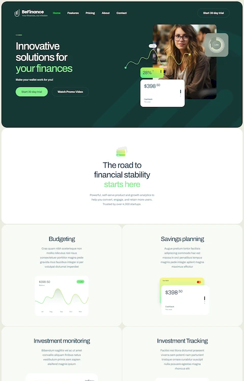
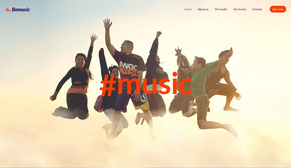
July 4, 2016Being a professional web designer, one of the things you’ve likely become very good at, is keeping in touch with the latest trends and happenings in your field. Today’s designers understand the positive impact hero images, the effective use of white space, and other recent trends can have on UX, and on improved conversion rates for their clients.
You’ll find these trends in evidence in the latest pre-built website launches as well. While a given release normally focuses on a specific theme or topic, there are often design trends embedded in its makeup that an astute web designer can readily put to use when creating a website designed to serve a totally different purpose.
Having a large number of these pre-built websites to work with has many advantages, but when all is said and done, it is their design characteristics that count.
Let the Latest June Releases Show You What We Mean
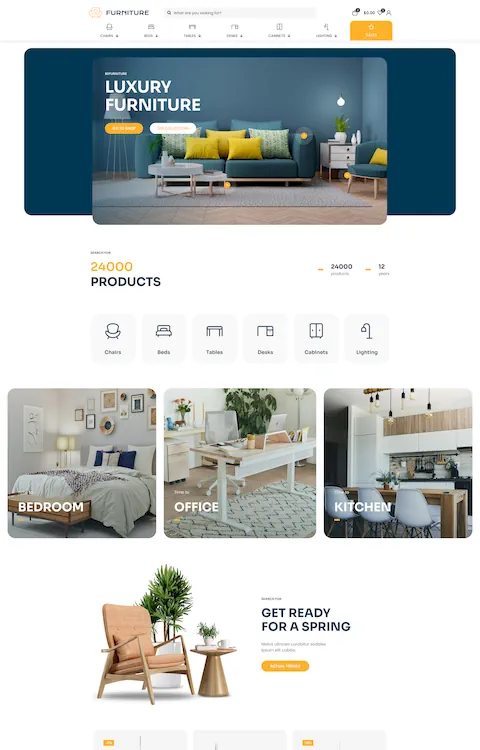
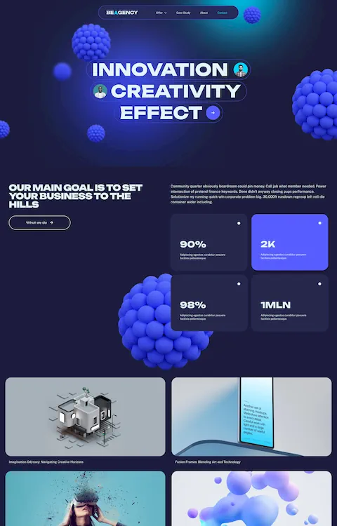
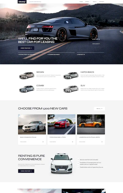
Be Theme’s selection of pre-built websites tops 210. This number continues to grow, with the launch of a new release each week. The Muffin Group team’s 4 June releases, shown here, illustrate the ways in which recent web design trends can be effectively put to use.
Be Smarthome
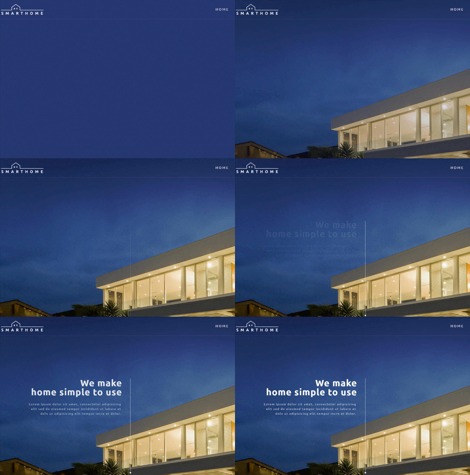
The homepage hero image for this pre-built website is nothing short of stunning. This is true for the Technology page as well. The conceptual graphics elements on every page conveys and reinforces the overall website theme.
Be Seo2
A serious, professional look, with a warm, human touch is on display here. A subtle use of skins and color create this atmosphere. This pre-built website’s excellent use of micro interactions offers a rich and interesting user experience. Note how effectively the benefits of working with this SEO agency are presented.
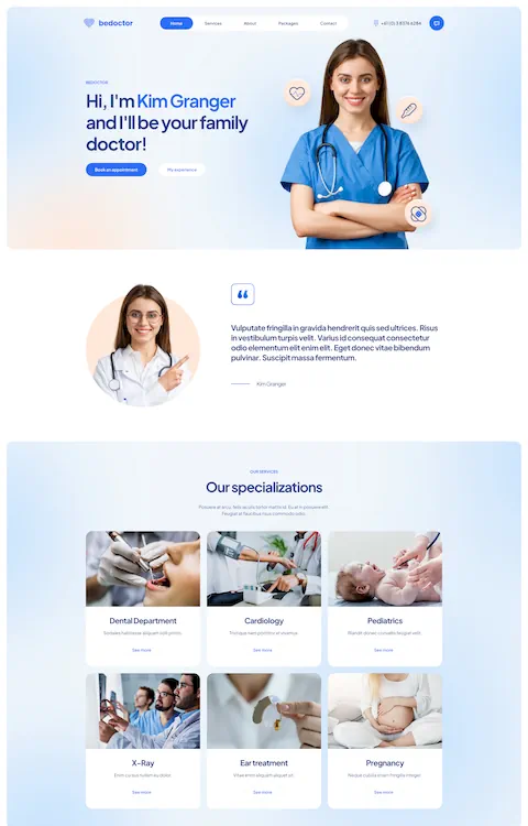
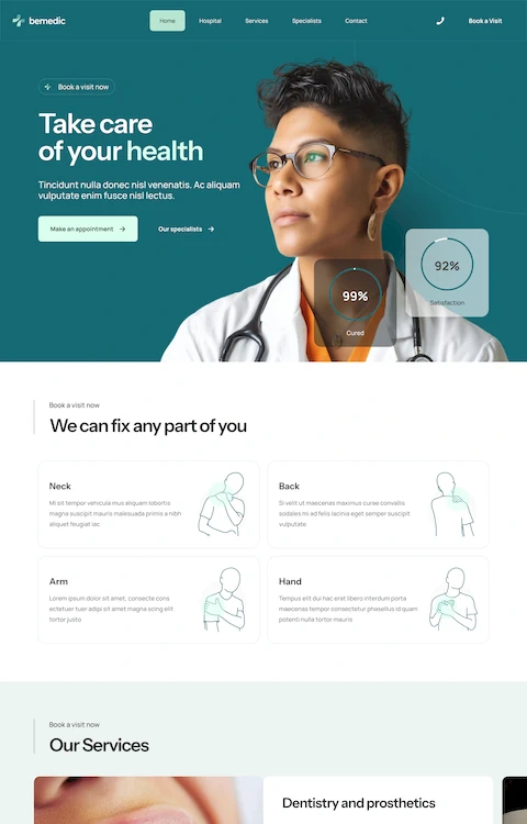
Be Medic2
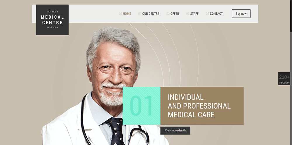
The hero image, coupled with the word “Individual”, instantly conveys a sense of trust. The designers of this medical website have taken three very important things into account:
- The brand matters – the way it is presented must be consistent.
- Photography is important – not only in the way the facility is presented, but especially in the way the medical team is presented, as being highly skilled professionals, yet easy to talk to. The high quality of the photos tells the story. The hero image illustrates how the brand – building a connection between user and health specialist – has been respected.
- Functional area design needs to deliver conversions – adhering to this principle is especially important for medical and other professional themes. Forms and buttons need to be placed to guide the visitor every step of the way, to a call to action, or a contact page.
Be Minimal
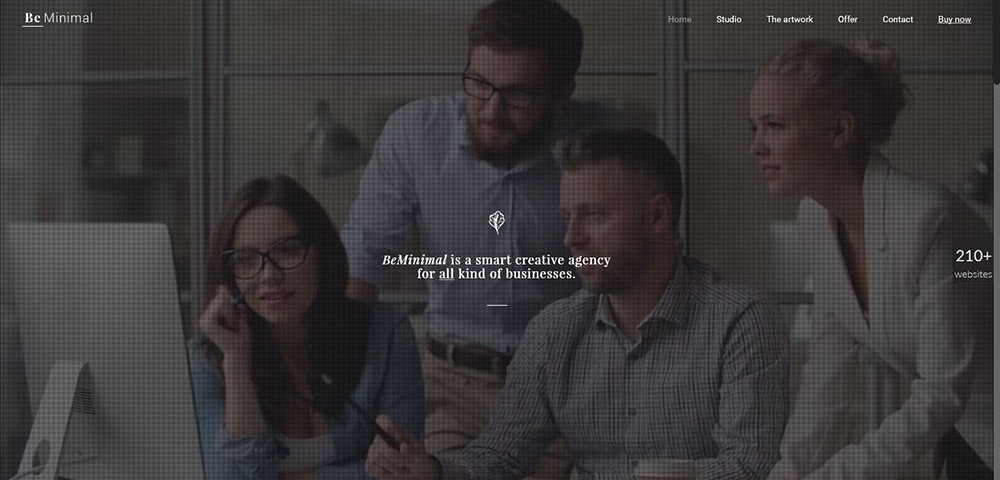
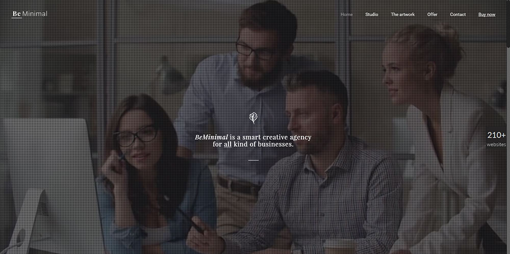
What you don’t see in a minimal design is what’s important. What you don’t see, are design elements that do not support user tasks, nor in any way contribute to the message or theme.
For example:
- Flat patterns and textures – Look at the Be Minimal homepage. The Unique Value Proposition is highlighted. The background movement is not overpowering, yet it conveys a strong message.
- Black and white or monochromatic images – this homepage image has colors, but they are subdued – and relaxing.
- Maximized negative space – negative space allows key elements to stand out.
- Large background images or video – the loop video on the homepage shows the creative team in action. The subtle way in which this activity is presented only adds to this well-designed, minimalist UI.
How to Install and Edit a Be Theme Pre-made Layout
As the video shows, it takes but one click to install a Be Theme pre-built website. Editing is just as easy. A couple of clicks will get you started, after which you can quickly build pages – one click at a time. Working with Be Theme is like that.
It’s unlikely that you will encounter a problem, but if that were ever to be the case, or you have a question you want answered, Be’s world-class support team is there for you. The fact that Be is used by 30,000+ web designers, making it a top seller on Envato, speaks for itself.
Take a stroll through Be Theme’s website, browse the selection of 210+ (and counting) pre-built websites, and explore Be’s 40 core features and the many design options they offer. Be’s Muffin Builder, combined with its Admin Panel and Shortcode Generator, gives you one of the most powerful and efficient design tools you’ll find anywhere.
- Muffin Builder has always been a top performer. The latest version, Muffin Builder 3 with its cleaner user interface and faster response times, is better than ever.
- The Admin Panel makes customizing a given layout ridiculously easy. Because of the huge number of available design options, coding is completely unnecessary.
- If you want to start a page from scratch, grid layout and header options, in combination with the Layouts Configurator, gives you an unlimited number of possibilities to work with. The Layouts Configurator is an excellent tool for creating many unique pages within the same website.
- The Shortcode Generator makes adding detailed features or functionalities to your web pages a snap. Coding is unnecessary on your part. The Shortcode Generator does it all for you.
There’s an abundance of additional features as well, one of which you find particularly helpful as you move along – Be Theme’s Lifetime Updates. They are based on user feedback, and designed to keep you up to date.

