The Best Massage Therapist Website Design Examples
January 4, 2026Podcast Website Design Examples That Attract Listeners
January 4, 2026Most law firm websites look like they were built in 2014 and never touched again. Stock photo of a gavel, a paragraph about "aggressive representation," and a contact form buried three clicks deep.
That's a problem when 49% of potential clients judge a firm by its website before ever picking up the phone.
This collection of lawyer website design examples breaks down what actually works, from solo practitioner sites to large firm builds. You'll see specific design decisions behind effective homepage layouts, attorney profile pages, practice area structures, mobile responsiveness, conversion elements, and accessibility compliance.
No generic advice. Just real sites doing it right, and what you can take from each one.
What Is Lawyer Website Design
Lawyer website design is the process of building a website that represents a law firm or solo attorney practice online, with the goal of converting visitors into clients through clear communication of legal services, credentials, and trust signals.
It sits at the crosspoint of legal marketing and web development.
A well-built attorney website does three things: it explains what the firm does, it proves credibility through bar admissions and case results, and it makes contacting the firm dead simple.
That last part trips up more firms than you'd think.
Unlike a generic business website, a law firm site has to meet specific ethical guidelines from organizations like the American Bar Association (ABA) and state bar associations regarding attorney advertising.
Google's E-E-A-T framework (Experience, Expertise, Authoritativeness, Trustworthiness) matters heavily here because legal services fall under YMYL (Your Money or Your Life) topics.
That means Google holds law firm websites to a higher standard than, say, a blog about houseplants.
The design itself needs to balance professionalism with approachability. Too corporate and you scare off individuals looking for a personal injury attorney. Too casual and you lose the corporate clients searching for M&A counsel.
Practice area pages, attorney bio pages, client intake forms, case result summaries, and consultation CTAs form the backbone of every effective law firm website.
Lawyer Website Design Examples
Lawyers Without Borders Canada
How Does a Lawyer Website Differ from Other Professional Websites
Law firm websites carry restrictions that most other industries never deal with.
Attorney advertising rules vary by state. Some jurisdictions prohibit the use of words like "specialist" or "expert" unless the lawyer holds a specific board certification. Others require disclaimers on testimonial pages.
Compare that to finance websites or healthcare websites, which have their own compliance issues but operate under different regulatory bodies entirely.
Client confidentiality adds another layer. Contact forms on a law firm site need to include privacy disclaimers, and many firms add SSL certificates specifically because intake forms collect sensitive case details.
The trust-building mechanics are also different.
A real estate landing page can rely heavily on property photos. A consulting website might lean on case studies and ROI numbers.
Lawyer websites depend on credentials: bar admissions, court appearances, verdicts, settlements, peer reviews on Martindale-Hubbell or Avvo, and published legal scholarship.
The conversion path looks different too. Most law firm visitors are in a stressful situation. They need a personal injury attorney after an accident, or a family lawyer during a divorce.
That urgency changes how you structure navigation, where you place phone numbers, and how prominent you make the "Free Consultation" button.
SaaS websites optimize for free trial signups. B2C websites push product purchases. Lawyer websites optimize for phone calls and form submissions from people who need help now.
What Are the Key Design Elements of a Lawyer Website
Every effective law firm website shares a core set of components that work together to build trust, communicate expertise, and push visitors toward making contact.
Skip any one of these and you'll feel it in your lead numbers.
The key elements include:
- Homepage with a clear value proposition and primary CTA
- Attorney profile pages with headshots, credentials, and bar admissions
- Individual practice area pages (personal injury, family law, criminal defense, corporate law, immigration law)
- Client testimonial page with real reviews
- Case results or verdict summaries
- Contact page with intake form, phone number, office address, and map
- Blog or legal resource section for SEO and topical authority
Each element serves a different stage of the visitor's decision. The homepage hooks attention. Practice area pages match intent. Attorney profiles build confidence. And the contact form closes the loop.
What Makes an Effective Law Firm Homepage
The hero section needs to answer one question instantly: "Can this firm handle my case?" A strong headline, a sub-line about core practice areas, and a visible call to action button for free consultations.
Trust signals above the fold matter: "As Seen In" media logos, awards from Super Lawyers or Best Lawyers, and a clickable phone number.
Keep website navigation clean with no more than 6-7 top-level menu items.
How Should Attorney Profile Pages Be Structured
Professional headshot first, then name, title, bar admissions, education, and areas of focus. Include published work, speaking engagements, or notable verdicts where applicable.
These pages are direct E-E-A-T signals for Google Search Console indexing, so adding Schema.org attorney markup helps search engines connect the person to their credentials.
What Role Do Practice Area Pages Play in Lawyer Website Design
Each practice area gets its own dedicated page. Personal injury, criminal defense, family law, estate planning, immigration, corporate law, employment law.
One page per service is the standard for law firm SEO structure because it lets you target specific search queries like "personal injury lawyer in Chicago" or "immigration attorney near me."
Internal linking between related practice areas (like connecting DUI defense to criminal defense) strengthens the site's topical coverage.
What Are the Best Lawyer Website Design Examples
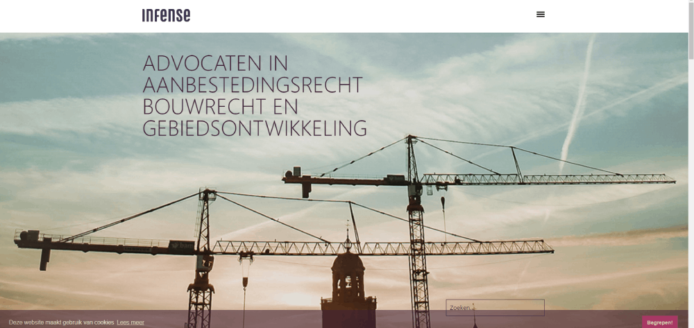
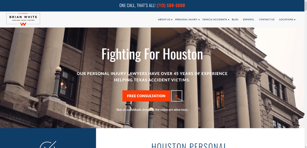
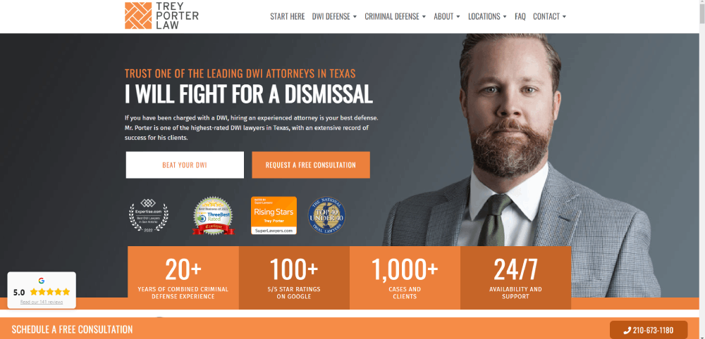
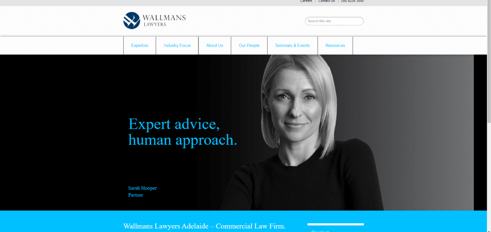
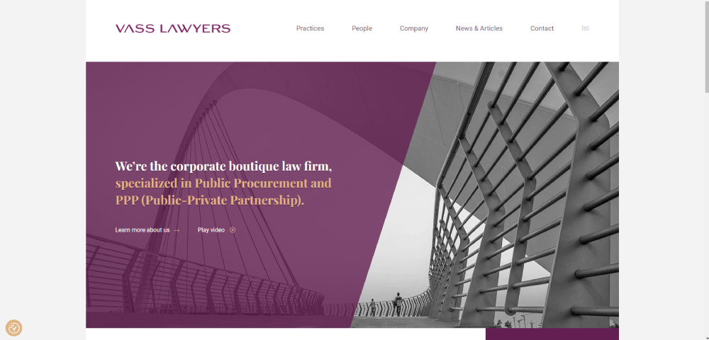
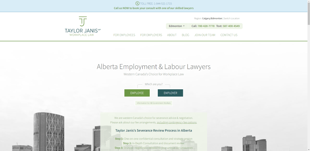
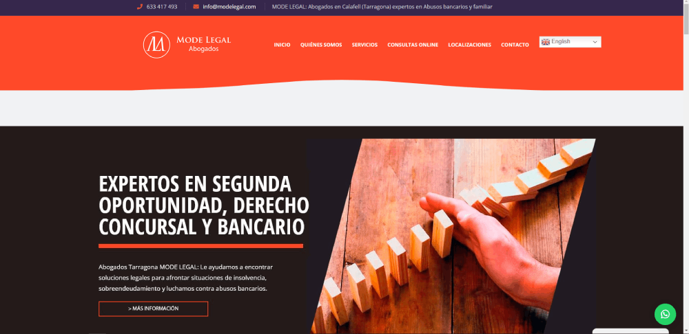
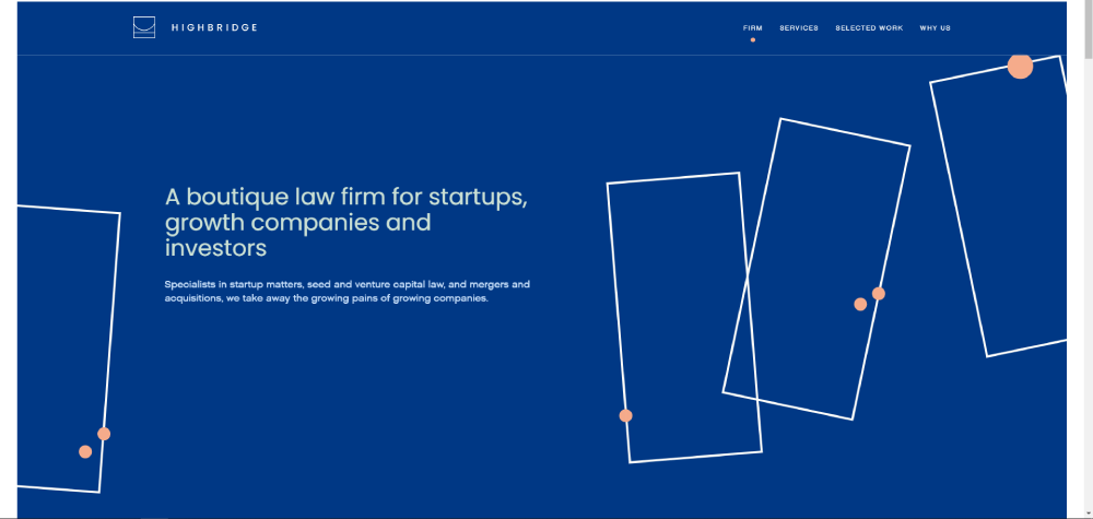
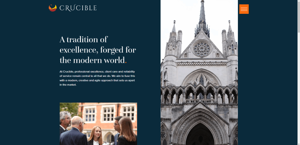
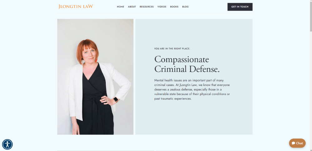
The firms listed below represent different approaches to legal website design, from minimalist solo practitioner sites to full-scale BigLaw digital platforms.
Before looking at individual examples, here are the criteria used to evaluate them:
- Visual design and brand consistency
- Mobile responsiveness and Core Web Vitals performance
- Conversion elements (CTAs, forms, chat, phone number placement)
- Content quality on practice area and attorney pages
- Trust signals (awards, media mentions, client reviews, case results)
- Accessibility compliance with WCAG 2.1 standards
- Page load speed via Google PageSpeed Insights
Each example below highlights specific design decisions worth studying. Some excel at branding. Others get conversion mechanics right. A few do both.
Look, the "best" lawyer website depends on the firm's size, practice areas, and target clients. A personal injury firm in Miami needs a completely different site than a corporate M&A practice in Manhattan.
What these examples share is intentional design. Nothing accidental about any of them.
Note: The specific law firm examples and screenshots for this section will be covered in the next part of this article.
What Design Trends Are Law Firms Using
Law firm website design in 2025 has moved past the era of stock photo gavels and leather-bound book backgrounds. Finally.
The biggest shift is toward mobile first design. Over 60% of legal searches happen on smartphones, and Google's mobile-first indexing means your desktop site is basically irrelevant if the mobile version performs poorly.
Here's what top-performing attorney websites are using right now:
- Cinemagraphs and video backgrounds in hero sections instead of static images
- Micro-animations on scroll for practice area cards and attorney profiles
- AI-powered chatbots (Smith.ai, LawDroid) for 24/7 intake
- Dark themed options for firms wanting a more contemporary feel
- Minimalist layouts with aggressive use of white space
- Parallax scrolling for storytelling on About pages
Typography choices have shifted too. More firms are pairing serif fonts for headings (conveying tradition and authority) with sans-serif body text (for screen readability). Google Fonts like Playfair Display and Inter are showing up on a lot of new law firm builds.
How Are Chatbots and AI Intake Forms Changing Lawyer Websites
Tools like Smith.ai, LawDroid, and Clio's built-in intake features let firms capture leads at 2 AM without a receptionist. The chatbot qualifies the visitor, collects case details, and books a consultation.
Firms using live chat or AI intake report 30-40% more qualified leads compared to static contact form design alone.
What Typography and Color Choices Work Best for Law Firm Websites
Navy blue, charcoal, white, and gold remain the dominant color scheme combinations for law firms. These colors signal trust and professionalism without looking dated.
Applying basic color theory principles, warm accent colors (burgundy, deep green) work well for family law or estate planning firms that want to feel approachable.
For font sizing, 16px minimum for body text. Anything smaller and you're losing mobile readers. Headings at 32-48px on desktop create the visual hierarchy that keeps people scanning instead of bouncing.
How Does Mobile Responsiveness Affect Lawyer Website Performance
Google uses mobile-first indexing. If your law firm website looks broken on a phone, it won't rank. Period.
Over 60% of legal searches come from mobile devices. That number climbs higher for personal injury and criminal defense queries, where people are often searching from hospital waiting rooms or police stations.
A responsive website adjusts layout, images, and navigation automatically across screen sizes. The standard breakpoints for attorney websites are 320px (small phones), 768px (tablets), and 1024px+ (desktop).
Key mobile performance benchmarks from Google PageSpeed Insights:
- Largest Contentful Paint (LCP) under 2.5 seconds
- First Input Delay (FID) under 100 milliseconds
- Cumulative Layout Shift (CLS) under 0.1
Touch-friendly CTAs matter more than most firms realize. A "Call Now" button that's 44x44 pixels minimum, placed within thumb reach on mobile screens. Tiny links buried in paragraphs don't convert.
Took me a while to realize this, but the firms that get mobile right aren't just shrinking their desktop site. They're rethinking the entire flow for someone holding a phone with one hand.
What Are Common Mistakes in Lawyer Website Design
Most law firm websites fail for the same predictable reasons. Recognizing bad design patterns early saves thousands in redesign costs later.
The biggest offenders:
- Stock photo overuse. Gavels, scales of justice, handshake photos. Every firm uses them. They build zero trust.
- Missing or buried CTAs. If visitors have to scroll past three screens to find a phone number, they'll leave.
- Walls of legal jargon. Writing practice area pages like court briefs instead of client-facing content.
- Slow load times. Uncompressed images and bloated JavaScript pushing load times past 4-5 seconds.
- No SSL certificate. A "Not Secure" warning in Chrome destroys credibility instantly for a law firm.
- Outdated sliders. Rotating hero banners slow down page speed and most visitors ignore them anyway.
- No Schema markup. Missing Schema.org structured data for attorneys, practice areas, and local business information.
- Cluttered navigation. Mega menus with 40+ links confuse visitors. A clean website menu with 6-7 top-level items performs better.
One more that drives me crazy. Firms that hide their phone number behind a "Contact Us" page with no number on the homepage. People searching for a criminal defense attorney at midnight are not filling out a form.
How Much Does a Lawyer Website Design Cost
Law firm website design cost varies wildly depending on firm size, custom features, and whether you're building on a template or from scratch.
General price ranges in 2025:
- Solo practitioner / small firm: $3,000 to $15,000 for a WordPress or Squarespace build with 5-10 pages, basic SEO, and a contact form
- Mid-size firm (5-20 attorneys): $15,000 to $50,000 for custom design, attorney profile system, practice area pages, blog integration, and Clio or HubSpot CRM connection
- Large firm / BigLaw: $50,000 to $150,000+ for fully custom builds with multilingual support, office location finders, advanced intake workflows, and accessibility audits
Monthly maintenance runs $100-$500 for small firms (hosting, security updates, minor edits) and $1,000-$3,000+ for larger firms with ongoing content, SEO, and technical support.
DIY platforms cut upfront costs but create long-term headaches. A Wix site for a law firm might cost $200 to set up, but you'll hit design limitations fast and migration to WordPress or Webflow later eats into whatever you saved.
Your mileage may vary, but generally, firms that spend under $5,000 on their site end up paying for a website redesign within 18 months.
What Platforms Do Law Firms Use to Build Websites
The platform choice affects everything from design flexibility to ongoing maintenance costs and law firm SEO capabilities.
WordPress dominates the legal industry. Around 40% of law firm websites run on it. The combination of customizable themes, plugin ecosystem (Yoast SEO, Gravity Forms, Rank Math), and full ownership of your content makes it the default choice for firms that want control.
Legal-specific WordPress themes from providers like suspended and LawLytics offer pre-built practice area templates, attorney directory pages, and intake form integrations out of the box.
Squarespace works for solo practitioners who need something polished fast. Clean professional website templates, drag-and-drop editing, built-in SSL. Limited on SEO customization compared to WordPress, though.
Webflow is gaining ground with mid-size firms that want custom design without hiring a full development team. Visual builder, clean code output, strong animation capabilities. Steeper learning curve than Squarespace.
Wix handles basic sites but lacks the depth most law firms need for proper schema implementation, blog management, and integration with legal tech tools like Clio or PracticePanther.
Custom-coded sites (HTML/CSS/JavaScript or React-based) give maximum control but cost 3-5x more than template-based builds and require a developer for every update.
How Does a Lawyer Website Design Affect Client Conversion
The average conversion rate for law firm websites sits between 2-5%. Top-performing sites push 8-10%.
The difference comes down to a few specific design decisions:
Phone number placement. Sites with a clickable phone number in the header on every page convert 20-30% more than those hiding contact info on a separate page.
Form length. Legal intake forms with 3-5 fields (name, email, phone, case type, brief description) outperform forms with 10+ fields. Every additional field drops completion rates by roughly 10%.
Live chat impact. Firms using tools like Smith.ai or Ruby Receptionist for live chat see a measurable increase in after-hours leads. Most legal searches happen between 6 PM and 10 PM, when offices are closed.
CTA button testing. "Get a Free Case Review" consistently outperforms generic "Submit" or "Contact Us" buttons on attorney websites. Specificity wins.
Placing client testimonials directly on practice area pages (not buried in a separate reviews section) keeps social proof visible at the point where visitors are making decisions.
Case result summaries with dollar amounts ($1.2M verdict, $500K settlement) near the bottom of personal injury pages add concrete proof that generic "we fight for you" messaging can't match.
At least in my experience, most firms spend too much time picking colors and not enough time testing where their phone number sits on mobile.
What Accessibility Standards Apply to Lawyer Websites
Law firm websites that don't meet ADA compliance standards face real legal liability. The irony of a law firm getting sued for an inaccessible website is not lost on anyone.
WCAG 2.1 Level AA is the standard that most courts reference in web accessibility lawsuits. Key requirements for accessible websites:
- Color contrast ratio of at least 4.5:1 for body text and 3:1 for large text
- Alt text on all images, including attorney headshots and office photos
- Keyboard navigation support for every interactive element (forms, menus, chat widgets)
- Screen reader compatibility with proper heading hierarchy (H1 through H4 in order, no skipping levels)
- Captions on video content, including any video used on landing pages or attorney bios
- Focus indicators visible on all clickable elements
Federal court filings related to website accessibility have increased every year since 2018. Law firms are not exempt from these claims.
Tools like Hotjar's heatmaps, axe DevTools, and WAVE (Web Accessibility Evaluation Tool) can audit your current site for compliance gaps. Cloudflare's accessibility widget offers a quick fix, but a proper audit from a WCAG specialist is the more reliable approach.
Building accessibility into the initial design costs far less than retrofitting a finished site. Most web design tools now include accessibility checkers, so there's really no excuse for skipping it.
One thing worth flagging: good UX and accessibility overlap heavily. Larger tap targets, clear heading structure, readable fonts, and high-contrast text improve the experience for everyone, not just users with disabilities.
FAQ on Lawyer Website Design
What makes a good lawyer website design?
A good law firm website combines clean navigation, fast load times, mobile responsiveness, clear practice area pages, attorney credentials, and strong CTAs like "Free Consultation." Trust signals, client testimonials, and ADA compliance round out the core requirements.
How much does it cost to design a lawyer website?
Solo practitioners pay $3,000 to $15,000 for a WordPress or Squarespace build. Mid-size firms spend $15,000 to $50,000 for custom designs. Large firms with complex needs invest $50,000 to $150,000+ for fully custom, multi-office websites.
What platform is best for building a law firm website?
WordPress powers roughly 40% of law firm websites due to its flexibility, SEO plugin ecosystem (Yoast SEO, Rank Math), and full content ownership. Webflow and Squarespace work for smaller firms wanting simpler maintenance.
What pages should every attorney website include?
Homepage, individual practice area pages, attorney bio pages with bar admissions and credentials, client testimonials, case results, a contact page with intake form, and a blog section. Each page targets a specific stage in the client decision process.
How do I improve my law firm website conversion rate?
Place a clickable phone number in the header on every page. Shorten intake forms to 3-5 fields. Add live chat through tools like Smith.ai or LawDroid. Put client testimonials directly on practice area pages near CTAs.
Does mobile responsiveness matter for lawyer websites?
Over 60% of legal searches happen on mobile devices. Google uses mobile-first indexing, so a non-responsive law firm site ranks lower and loses visitors. Core Web Vitals scores directly affect search visibility for attorney websites.
What colors work best for law firm website design?
Navy blue, charcoal, white, and gold are the most common combinations for legal websites. These signal professionalism and trust. Family law and estate planning firms sometimes use warmer tones like burgundy or deep green for approachability.
Do law firm websites need to be ADA compliant?
Yes. WCAG 2.1 Level AA is the standard courts reference in accessibility lawsuits. Requirements include 4.5:1 color contrast, alt text on images, keyboard navigation, and screen reader compatibility. Non-compliant law firms face real legal liability.
What is the biggest mistake in lawyer website design?
Hiding contact information. Potential clients searching for a criminal defense or personal injury attorney often need help urgently. If your phone number isn't visible on every page, especially on mobile, you're losing leads to competitors.
How does SEO affect lawyer website design decisions?
Law firm SEO shapes site structure directly. Each practice area needs its own page for keyword targeting. Schema.org markup on attorney profiles helps Google Search Console index credentials. Internal linking between related legal services strengthens topical authority.
Conclusion
These lawyer website design examples show that effective legal websites share common ground: fast performance, clear practice area structure, visible contact options, and real credibility signals like case results and bar admissions.
The platform you pick matters less than how you use it. WordPress, Webflow, Squarespace. All can produce strong results when paired with proper Schema.org markup, WCAG 2.1 compliance, and a conversion-focused layout.
Don't overthink the aesthetics. Focus on what drives leads: a clickable phone number on every page, short intake forms, attorney profiles that prove expertise, and mobile responsive design that handles Core Web Vitals benchmarks.
Test your CTAs. Read your Google Analytics data. Ask someone outside your firm to find your phone number on mobile in under five seconds.
If they can't, start there.

