

Top Fashion Website Templates For A Stunning Online Brand
March 27, 2026
How to Remove the Proudly Powered by WordPress Message
March 30, 2026The wrong colors can make a $500 product look like it belongs on a clearance shelf. That's not an exaggeration. Research shows that up to 90% of snap judgments about products are based on color alone.
Picking the right luxury color palette examples for your brand, website, or packaging is one of the fastest ways to shift perceived value. But "luxury" doesn't just mean black and gold anymore. Modern premium color combinations range from muted earth tones to monochromatic schemes with a single metallic accent.
This guide breaks down real palette combinations used by brands like Chanel, Bottega Veneta, and Tom Ford. You'll find specific hex codes, industry applications, and the common mistakes that make designs look cheap instead of refined.
What Is a Luxury Color Palette?
A luxury color palette is a curated set of colors that signals exclusivity, high perceived value, and refined taste. It's not just "pretty colors thrown together." These palettes work because they trigger specific psychological responses tied to wealth, quality, and sophistication.
The difference between a generic color combination and a premium one comes down to restraint. Luxury palettes rarely exceed four or five active colors. They lean on deep saturation, muted tones, and metallic accents that reference high-end materials like gold leaf, marble, silk, and velvet.
Straits Research data shows that color can increase brand recognition by up to 80%. That stat matters even more in luxury contexts, where brands like Chanel and Hermès have built entire visual identities around two or three carefully chosen hues.
And here's something a lot of people miss. A luxury palette isn't always dark. The old-money aesthetic of ivory, champagne, and warm taupe can feel just as premium as black and gold. Pantone's 2025 Color of the Year, Mocha Mousse (PANTONE 17-1230), reflects this shift toward earthy warmth and understated elegance. Your mileage may vary depending on the industry and audience, but the principle stays the same: fewer colors, more intention.
Understanding color theory is what separates a palette that "looks expensive" from one that actually communicates luxury. The psychology behind deep navy, emerald green, burgundy, or champagne gold ties directly to how consumers perceive price and quality.
Website Designs With A Luxury Color Palette
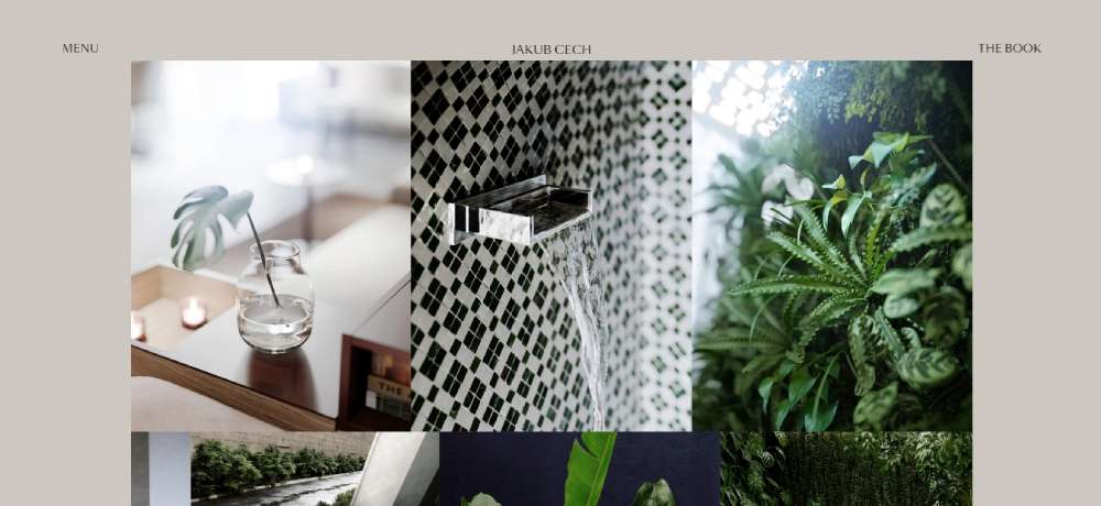
Jakub Cech
Australian Distilling Co.
Chronoto
BeWedding 3
Margaux Leroy
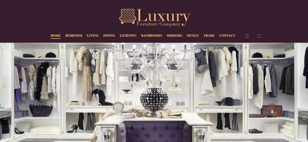
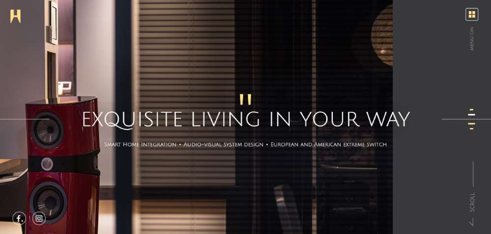
Luxury Furniture Company
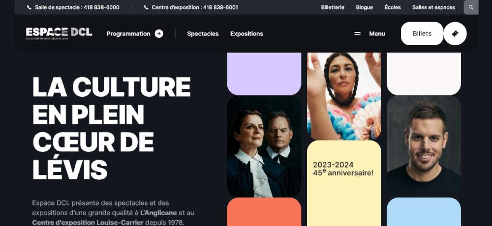
Espace DCL
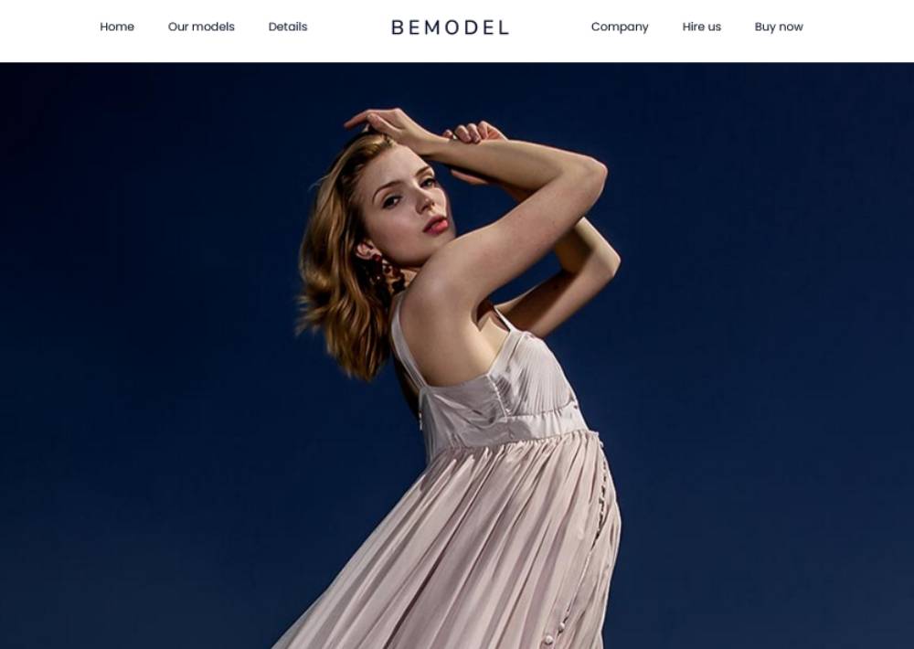
BeModel2
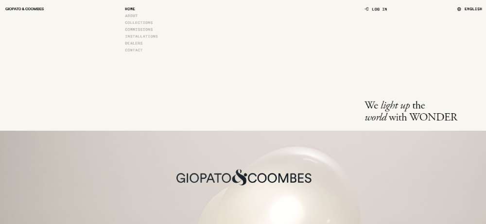
Giopato & Coombes
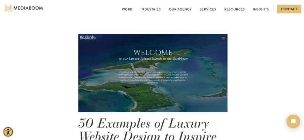
Musha Cay and the Islands of Copperfield Bay
Coachman Luxury Transport
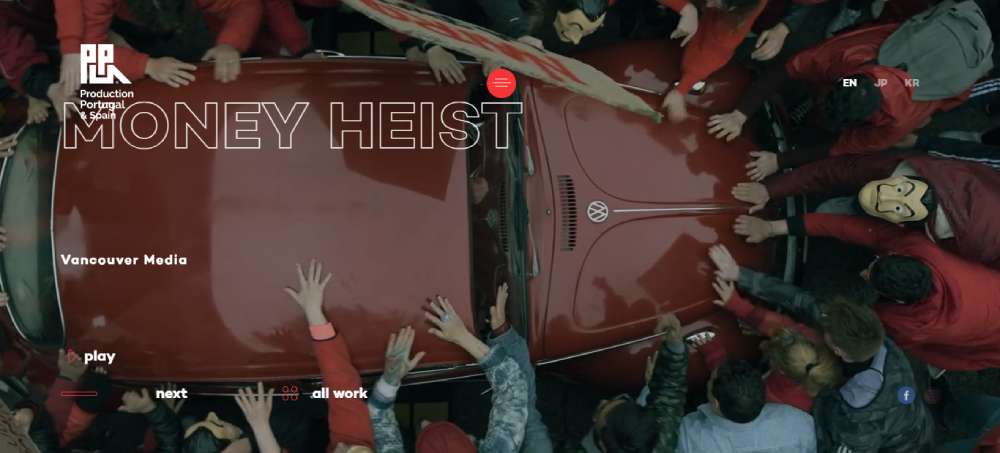
Production Portugal
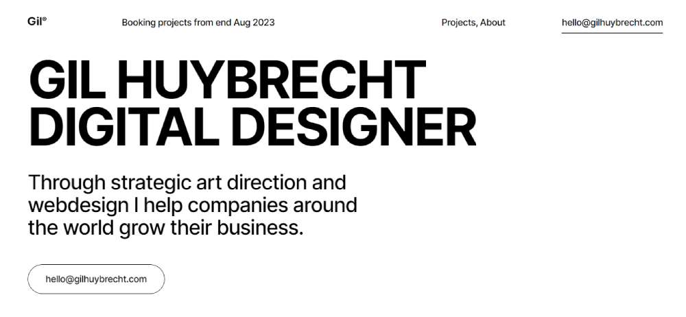
Gil Huybrecht
BeDigital
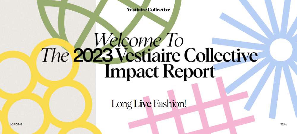
Vestiaire Collective Report 23
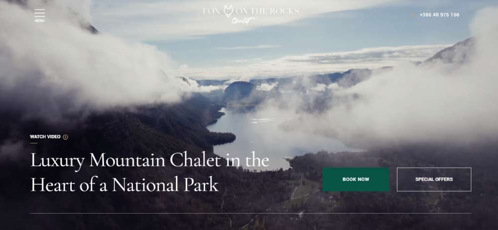
Fox On The Rocks Luxury Chalet
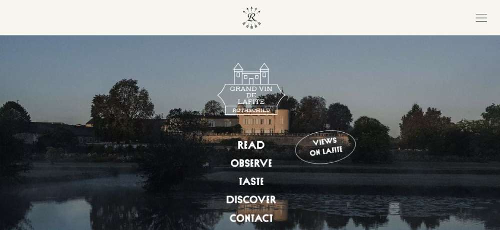
Chateau Lafite Rothschild
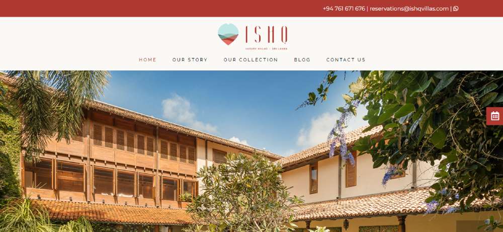
ISHQ Luxury Villas Sri Lanka
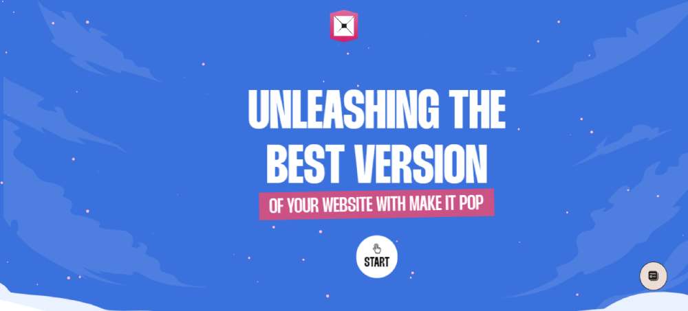
Make It Pop
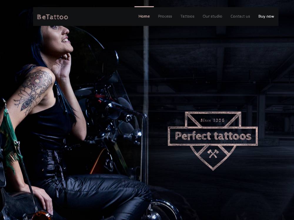
BeTattoo
Sol

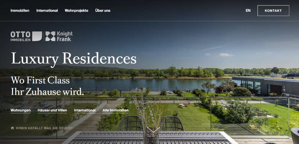
Luxury Residences By Otto
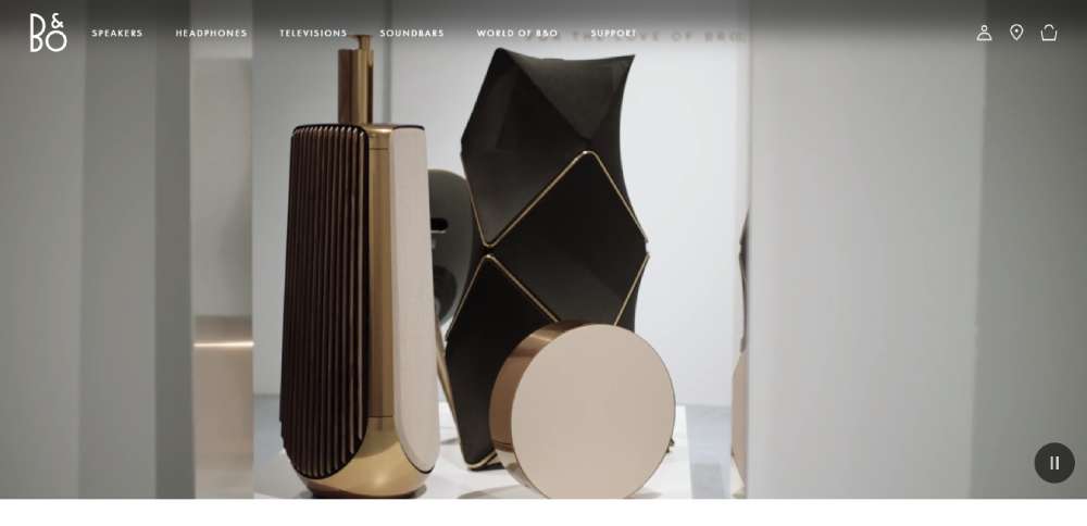
Bronze collection by Bang Olufsen
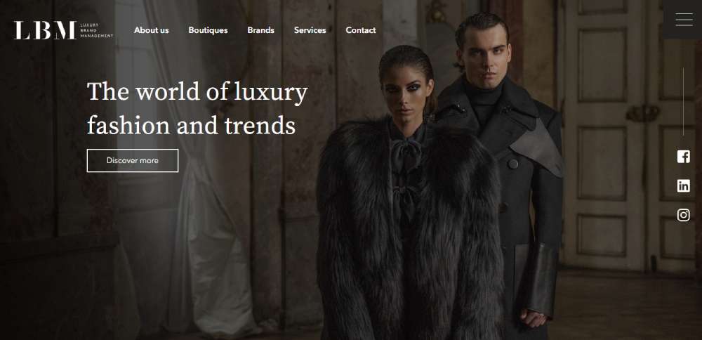
Luxury Brand Management (LBM)
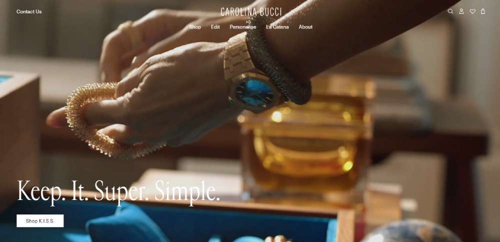
Carolina Bucci
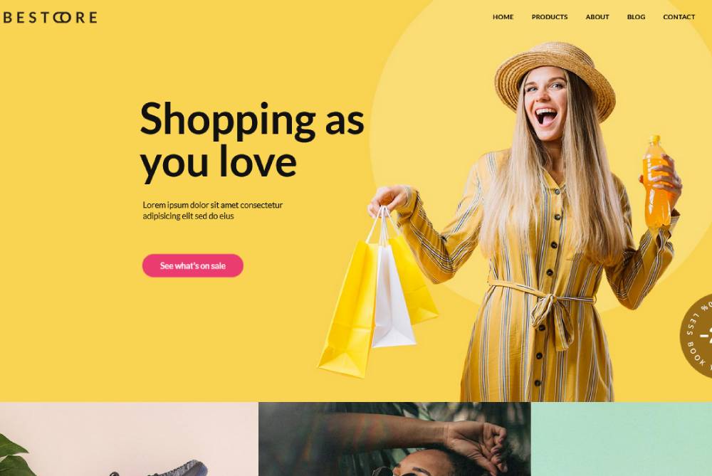
BeStore2
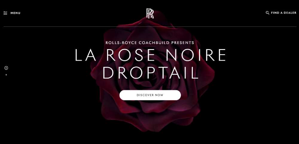
Rolls-Royce
Stephanides Luxury Goods
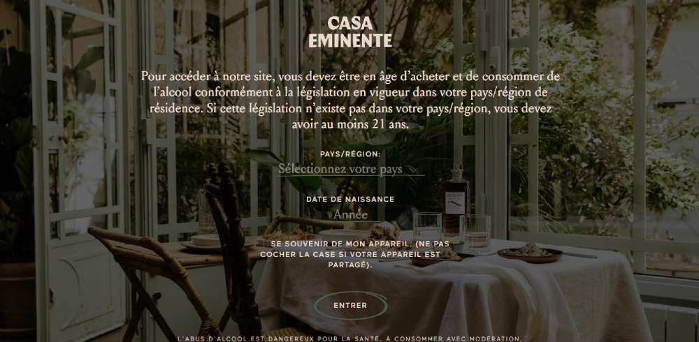
Casa Eminente
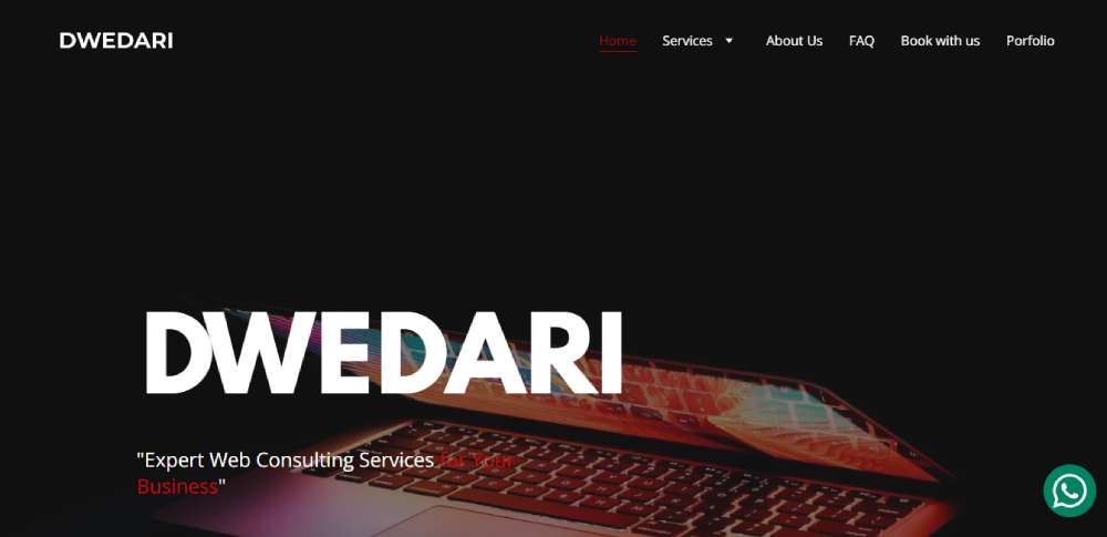
Dwedari
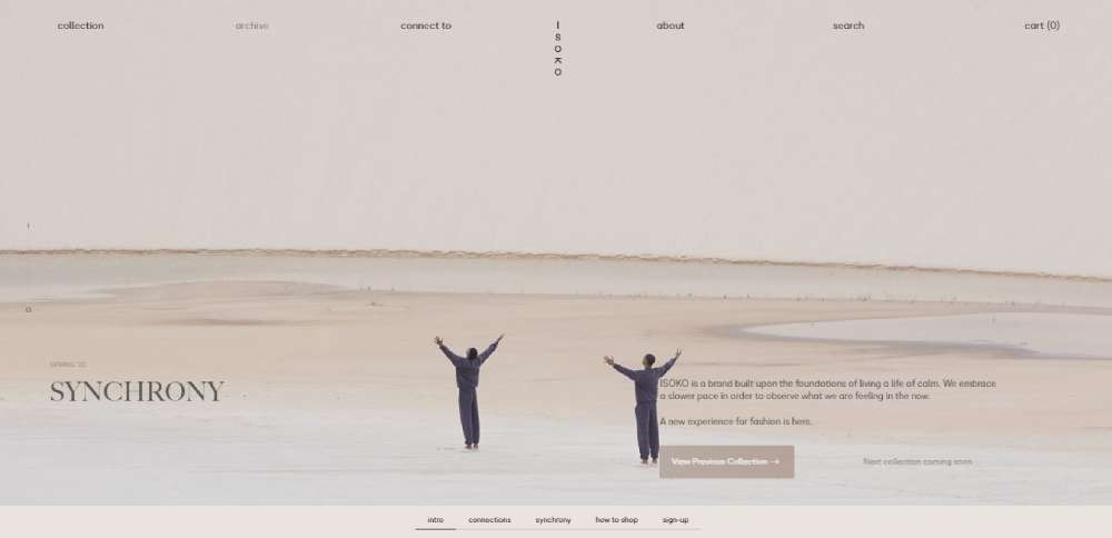
ISOKO
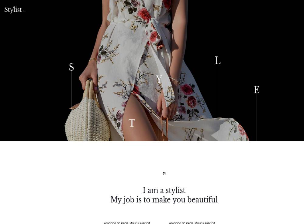
BeStylist
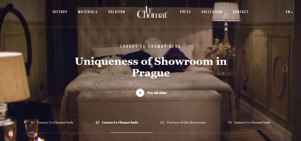
Le Chomat
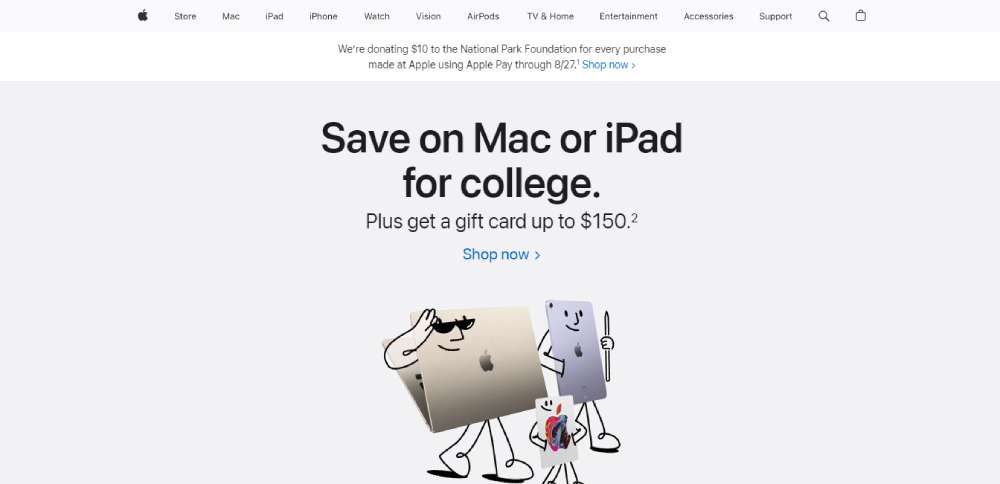
Apple
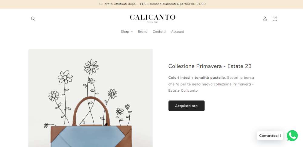
Calicanto Luxury Bags
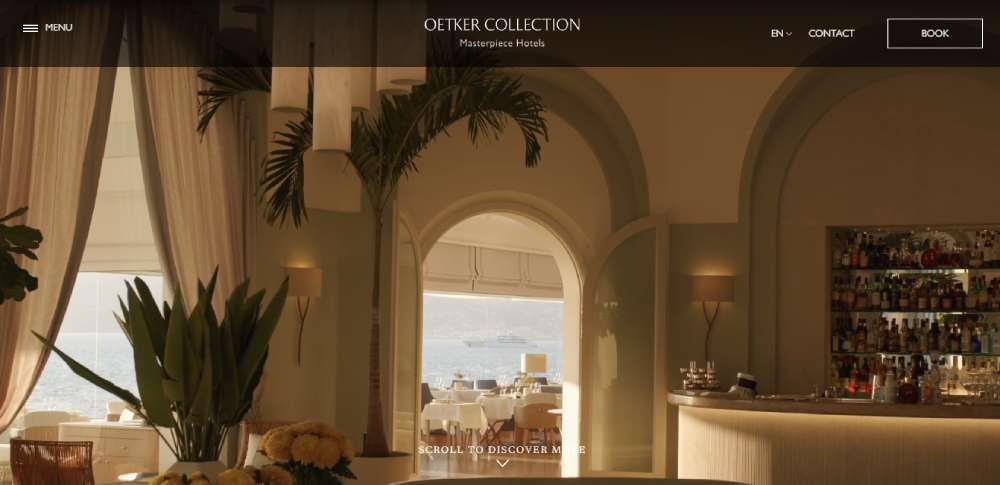
Oetker Collection
Hang Luxury
Muchacha
0039 - Luxury Italian Projects
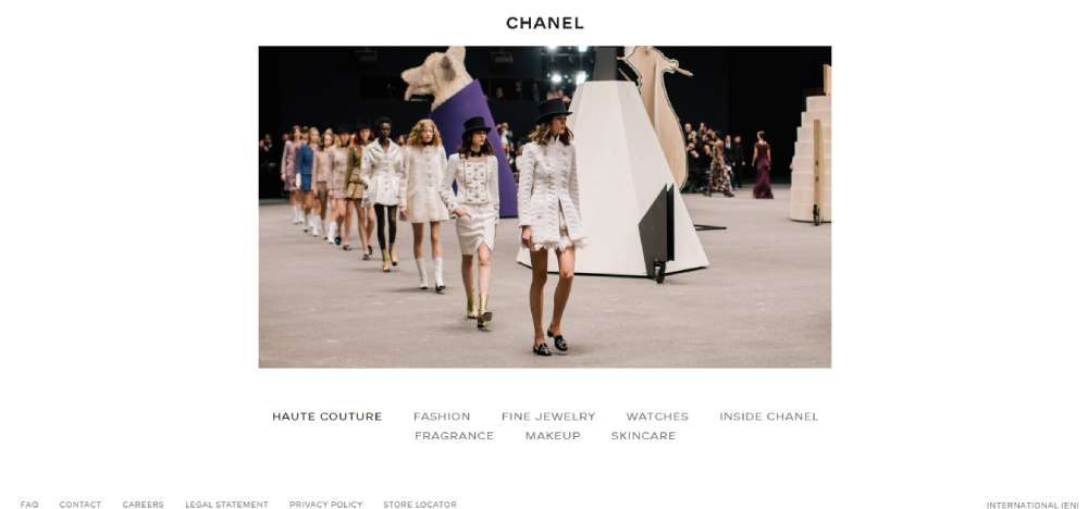
Chanel
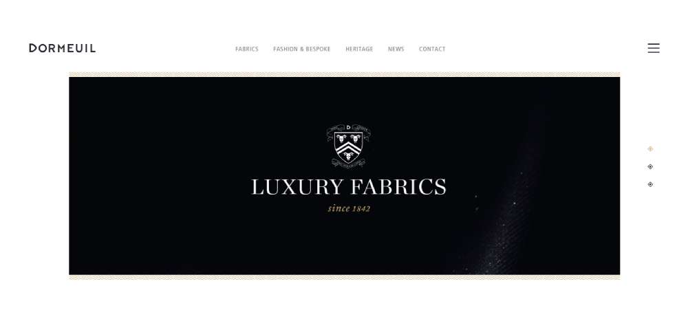
Luxury Fabrics House
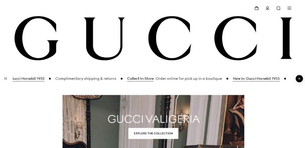
Gucci
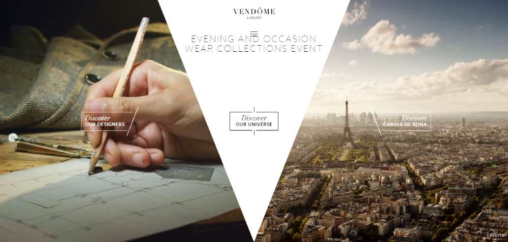
Vendôme Luxury
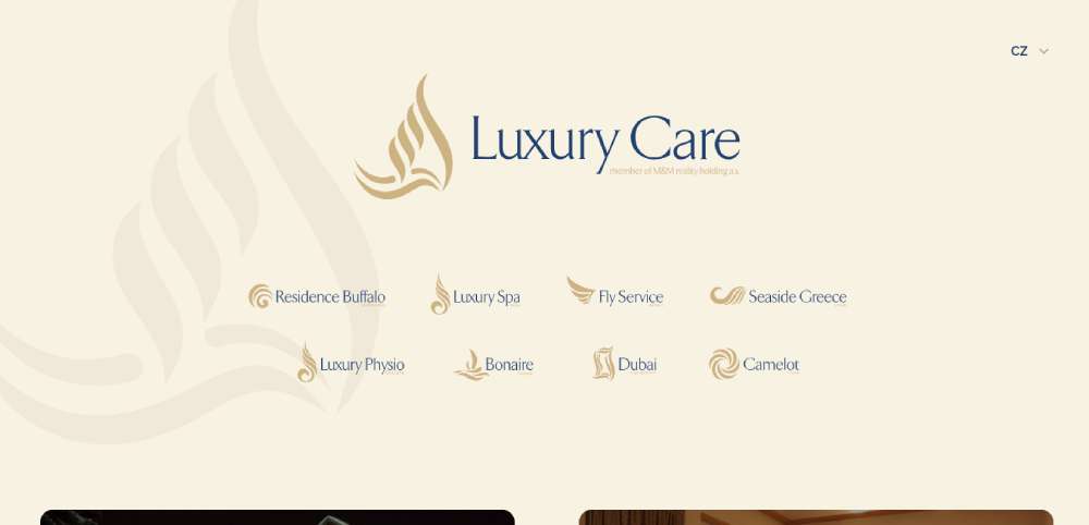
Luxury Care
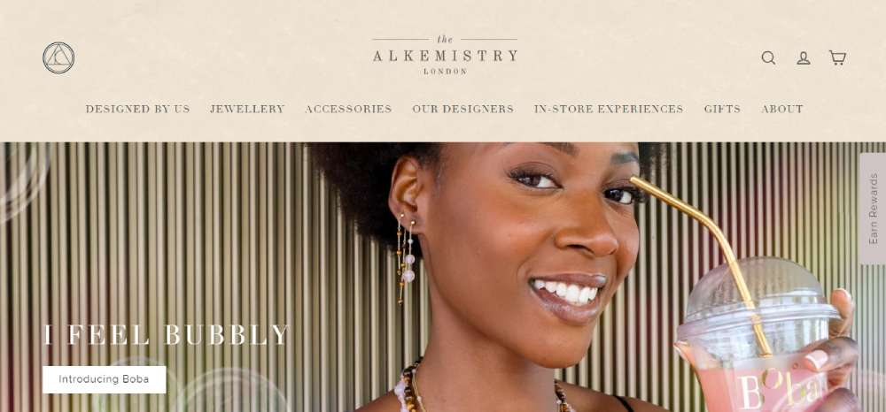
The Alkemistry
What Colors Are Associated with Luxury?
Certain colors show up repeatedly across luxury branding, high-end packaging, and premium interiors. That's not random. Color psychology research confirms that black and gold increase perceived product value, especially in markets like fashion, watches, and automobiles.
The usual suspects:
- Black: Power, authority, sophistication. Used heavily by Chanel, Prada, and Gucci across packaging and digital presence
- Gold and rose gold: Wealth, prestige, exclusivity. Rolex and Versace lean into gold for exactly this reason
- Deep navy: Trust and timelessness. Ralph Lauren has built an entire brand language around it
- Emerald green: Rarity and opulence, tied to gemstones and natural luxury
- Burgundy and deep red: Valentino and Christian Louboutin use red to signal passion and exclusivity
- Ivory and champagne: Understated refinement, common in modern "quiet luxury" brands
According to Amra and Elma, 85% of consumers say color is the primary reason they buy a product. In luxury markets, this percentage likely skews even higher because color does double duty. It communicates both the brand identity and the perceived value of the product itself.
Cultural context shifts things, though. White reads as purity and minimalism in Western luxury branding (think Apple, The Row). In parts of East Asia, white carries associations with mourning. Red, on the other hand, signals luck and fortune in Chinese markets. Apple understood this well enough to release red packaging during Chinese New Year, despite never using that color in their core branding.
Warm Luxury Colors vs. Cool Luxury Colors
Warm luxury leans into golds, ambers, rich browns, and terracotta. It creates a heritage feel, something old-money and established. Think private banking logos, heritage jewelers, and Tiffany & Co.'s warm brand world.
Cool luxury goes the other direction: slate, charcoal, icy blue, silver, platinum. This is the editorial, modern, minimalist side. Bottega Veneta's muted digital presence and The Row's nearly colorless aesthetic live here.
Mixing both creates tension and depth. A palette combining warm gold accents with cool charcoal greys can feel simultaneously modern and timeless. Took me a while to realize that the most effective luxury palettes don't pick one temperature and stick with it. They play both sides, but deliberately.
Classic Luxury Color Palette Examples
These are the combinations that have defined premium branding for decades. They work because they've been tested across countless applications, from packaging to luxury websites and high-end retail spaces.
Black + Gold + Ivory
The definitive luxury combination. Versace, Rolex, and dozens of heritage brands use it because it immediately signals prestige.
| Color | Hex Code | Role in Palette |
| Jet Black | #0A0A0A | Dominant base |
| Rich Gold | #C5A24D | Accent / metallic |
| Warm Ivory | #FFFFF0 | Neutral balance |
This palette works best for packaging, fragrance branding, and dark themed websites. The contrast between black and ivory creates visual hierarchy, while gold adds the aspirational layer.
Navy + Cream + Burgundy
British tailoring, old money, Ivy League energy. Ralph Lauren built an empire on this combination.
Deep Navy (#1B2A4A) anchors everything. Warm Cream (#F5F0E8) softens the mood. Burgundy (#6B1C2A) provides a sophisticated accent that never screams for attention.
Well, the thing is, this palette shows up everywhere from yacht club interiors to private equity firm websites. It reads as "established wealth" without trying too hard. You'll see it in finance websites and legal firm branding more than anywhere else.
Deep Green + Gold + Off-White
Heritage jewelers and private banks love this one. Emerald green paired with gold carries an unavoidable association with gemstones, rarity, and prestige.
Hex values: Deep Emerald (#0C3C2D), Antique Gold (#B8860B), Parchment (#FAF0E6).
Cartier's green boxes are probably the most recognizable example. The color combination tells your brain "this thing is valuable" before you even open the lid.
Modern Luxury Color Palette Examples
Classic is great, but a lot of contemporary brands are moving away from the standard black-and-gold formula. Consumers under 40 now represent 40% of the luxury market, and their taste leans toward subtlety over flash.
Soft Blush + Charcoal + Matte Gold
This is the palette of high-end skincare and beauty brands right now. Glossier helped popularize soft millennial pink in premium contexts, and the approach has spread into fragrance, cosmetics, and wellness branding.
Dusty Rose (#D4A5A5) paired with Soft Charcoal (#36454F) and a Matte Gold (#C9B037) accent. The blush adds warmth without becoming overly feminine. Charcoal grounds it. The matte gold finishes it off without the flashiness of polished gold.
If you're designing for beauty websites or cosmetics websites, this palette is a safe bet. It's been proven across the industry.
Warm Taupe + Off-Black + Sand
The Row. Aesop. Byredo. If you've noticed a pattern in quiet luxury branding, this is the palette driving it.
Warm Taupe (#8B7D6B), Near-Black (#1A1A1A), Warm Sand (#D2B48C).
No metallic accents here. The entire approach relies on muted tones and material textures to communicate quality. Aesop's brown packaging and minimalist store design prove that luxury doesn't require gold foil or obvious opulence. At least in my experience, this palette works best when paired with strong typography and generous white space.
Monochromatic Palettes with a Single Metallic Accent
This approach strips everything down to variations of one base color, then adds a single metallic element to break the monotony.
Think all-grey palettes with a copper accent. Or all-cream with brushed brass. The effect is sophisticated without being complicated.
Louis Vuitton's current digital presence leans into this approach, using warm neutral tones with minimal color variation. Dior does something similar with its online store. Both brands understand that a restrained color scheme can communicate more luxury than a complex one.
Muted Pastels for High-End Hospitality
Pale sage, dusty rose, warm grey. These muted pastel tones have taken over luxury hotel interiors and boutique hospitality branding in the last few years.
According to a Fixr.com industry report, 55% of interior design experts named color drenching as the top color trend for 2025. In luxury hospitality, that often translates to rooms bathed in a single muted pastel tone, creating an immersive, calming experience.
This palette works well for hotel websites, spa websites, and wellness branding. The key is keeping saturation low. The moment a pastel gets too bright, the luxury feel evaporates.
Luxury Color Palettes for Web and Digital Design
Color on screens works differently than color on physical materials. There's no paper stock to lean on, no foil stamp to catch light. Everything has to come from pixel values and contrast alone.
Colorlib data shows that dark mode-first design is now specified in 30% of new web design projects, up from 8% in 2021. That's a massive shift, and it directly affects how luxury palettes translate to digital.
Dark-Mode Luxury
Near-black backgrounds with one or two restrained accent colors. That's the formula most elegant websites in the luxury space follow right now.
Chanel's website runs on an almost entirely monochromatic base. Bottega Veneta uses a deep forest green background that reads as both modern and grounded. Neither site uses more than three active colors at any time.
Key principle: avoid pure black (#000000) as your background. A softer near-black like #1A1A1A or #121212 reduces eye strain and feels more refined. Nielsen Norman Group data confirms that 82% of mobile users now prefer dark mode, which means luxury brands ignoring this preference are leaving engagement on the table.
Typography Color Pairing on Premium Sites
Body text on luxury sites is rarely pure black or pure white. It's usually a warm off-white (#F5F0EB) on dark backgrounds or a soft charcoal (#333333) on light ones.
This subtle shift does two things. It reduces harsh contrast that feels cheap, and it gives the page a warmer, more considered feel. Pair that with carefully chosen free fonts or premium typefaces, and the entire experience changes.
How to Maintain Luxury Feel on Mobile Screens
| Challenge | Solution |
| Small screen, limited space | Reduce palette to 2-3 colors max |
| Metallic effects don't translate | Use subtle gradients as stand-ins |
| Touch targets look clunky | Match button colors to palette, not defaults |
| Brand recognition drops | Keep primary brand color consistent across breakpoints |
Designing for mobile luxury is about restraint. If your desktop site uses five colors, your mobile version probably needs three. A minimalist website approach actually works in luxury's favor here because fewer colors mean a cleaner, more focused experience.
How to Build a Luxury Color Palette from Scratch
Copying an existing palette is fine for mood boards. But if you're building a brand, you need a method. A method that produces something distinctive enough to stand on its own, not just a Chanel knockoff.
Start with One Anchor Color
Pick the darkest or most saturated color first. Everything else builds from that.
If your anchor is a deep emerald (#0C3C2D), your neutral base might be a warm ivory, and your accent might be a muted gold. If your anchor is charcoal, you might go with sand and copper. The anchor sets the entire emotional direction.
According to Colorlib, AI color palette tools like Coolors saw over 400% growth in usage from 2024 to 2025. These tools are helpful for exploration, but they won't automatically give you a "luxury" output. You still need to make deliberate choices about saturation, value, and temperature.
The Three-Part Formula
Anchor + Neutral + Accent. That's it.
- Anchor: your signature color, deep and saturated
- Neutral: warm white, greige, or soft grey for breathing room
- Accent: one metallic or contrasting tone for visual interest
Coolors processed over 50 million color palettes in 2024 alone. Adobe Color and Pantone Connect are also solid for pulling and refining combinations, especially when you need specific HEX code accuracy or CMYK conversion for print.
Testing a Palette Against Real Applications
A palette that looks great as a five-color swatch strip can completely fall apart in context. I've seen it happen more times than I can count.
Always mock up before committing. Apply the palette to a business card, a website hero section, and a packaging dieline. If it doesn't work across all three, the palette has a problem.
Lighting matters too. Warm ambient light shifts how cool tones read. What looks sleek under office fluorescents might feel cold and clinical in a retail space. Get feedback from people outside your own taste bubble, because your eye adjusts to colors you stare at all day.
Luxury Color Palettes Sorted by Mood
Sometimes you don't start with a specific brand direction. You start with a feeling. These mood-based palettes give you a starting point organized by the emotional response they're designed to create.
Bold and Dramatic
Black (#0A0A0A) + Deep Red (#6B1C2A) + Gold (#C5A24D)
Maximum intensity. This combination works for high-fashion clothing websites and luxury event branding. Versace and Dolce & Gabbana both lean into this territory.
Quiet and Understated
Warm Grey (#A8A29E) + Oatmeal (#D4C5A9) + Soft Brass (#C4A35A)
The "quiet luxury" palette. No loud signals, just quality materials and muted tones. This is the aesthetic behind The Row and a growing number of premium websites in fashion and hospitality.
Amra and Elma research found that 87% of Chinese luxury consumers now prefer timeless designs over trends. That preference aligns perfectly with this understated approach.
Romantic and Soft
| Color | Hex | Best For |
| Dusty Rose | #D4A5A5 | Beauty, bridal, stationery |
| Champaign | #F7E7CE | Backgrounds, packaging |
| Warm Ivory | #FFFFF0 | Neutral base, text areas |
This palette dominates wedding planner websites and high-end stationery brands. The pink color palette family fits naturally here when kept muted and warm.
Editorial and Sharp
Pure white, jet black, one vivid accent. Pick almost any accent color (electric blue, bold red, sharp yellow) and this formula works.
It's the palette of high-end magazines and editorial creative websites. Fashion websites use this approach frequently because it lets the photography do the talking while the design frame stays clean.
Earthy and Grounded
Terracotta (#CC7755) + Olive (#556B2F) + Walnut Brown (#5C4033) + Aged Gold (#B8860B)
Pantone's 2025 Color of the Year, Mocha Mousse, fits right into this mood. This palette connects to nature without going "crunchy." It works for luxury hospitality, artisan food brands, and winery websites.
Mistakes That Make a Color Palette Look Cheap Instead of Luxurious
The gap between "almost luxury" and "actually luxury" is often one or two small color decisions. Honestly, the mistakes below are ones that I still catch myself making if I'm not paying attention.
Using Too Many Colors
Straits Research data confirms that 62 to 90% of consumer judgments about a product happen based on color alone. When there are too many colors competing for attention, none of them register as premium.
Rule of thumb: if your palette has more than four or five active colors, you're diluting the luxury signal. Dior's entire web presence operates on essentially two colors. There's a reason for that.
Fully Saturated Primaries Without Adjustment
Bright red (#FF0000), true blue (#0000FF), pure yellow (#FFFF00). These scream "default" and "basic." Luxury palettes always mute, darken, or warm their colors. Burgundy instead of red. Navy instead of blue. Gold instead of yellow.
A colorful website can absolutely feel premium, but only if the saturation is controlled. The moment colors feel like they came straight from a crayon box, the perceived value drops.
Wrong Gold Pairings
Yellow-toned golds with cool greys: looks cheap and mismatched.
Warm golds with warm neutrals: looks cohesive and considered.
The temperature of your gold accent has to match the temperature of your neutral tones. This is a mistake that surfaces constantly in jewelry websites and fragrance packaging. Getting this wrong makes the gold look like an afterthought instead of an intentional design choice.
Ignoring Material Context
Colors don't exist in isolation. A deep burgundy on matte uncoated stock? Premium. The same burgundy on a glossy plastic surface? Suddenly it looks like a mass-market product.
Websites have their own version of this problem. A color that looks rich on a desktop Retina display might look washed out on a budget Android phone. Always test your palette across devices and, if applicable, across physical materials like paper, fabric, and plastic.
Overusing Gradients and Fake Metallics
CSS gradients trying to mimic gold foil never look right. At best, they look dated. At worst, they look like a 2010 Photoshop tutorial.
If metallic effects matter to your brand, use them on physical products where real foil and real materials carry the weight. On screen, a flat matte gold tone (#C5A24D or #B8860B) communicates luxury more effectively than a shiny gradient. Websites focused on good UI understand this and avoid simulated textures that don't translate well to pixels.
FAQ on Luxury Color Palettes
What makes a color palette look luxurious?
Restraint, deep saturation, and intentional contrast. Luxury palettes typically use three to five colors maximum, lean on muted tones or jewel tones, and incorporate metallic accents like gold or copper that reference premium materials.
What are the most common luxury brand colors?
Black, gold, deep navy, emerald green, burgundy, ivory, and champagne. Brands like Chanel, Rolex, and Hermès consistently build their visual identities around these refined, high-perceived-value hues.
How do I choose colors for luxury packaging?
Start with two or three colors, then rely on material finishes (foil stamping, embossing, matte coating) to do the heavy lifting. The paper stock and printing technique affect how colors appear more than most people realize.
Does black and gold always work for luxury branding?
It works, but it's overused. Modern luxury brands like The Row and Aesop prove that muted neutrals and warm earth tones can signal premium value without relying on traditional black-and-gold combinations.
What hex codes are used for luxury gold?
Common choices include #C5A24D (rich gold), #B8860B (antique gold), and #C9B037 (matte gold). Avoid overly bright yellows. The gold should lean warm and subdued to feel authentic rather than cheap.
Can pastel colors feel luxurious?
Yes, when saturation stays low. Dusty rose, pale sage, and soft champagne tones are used across luxury hospitality and beauty branding. The key is keeping pastels warm and muted rather than bright or candy-like.
What luxury color palette works best for websites?
Dark-mode palettes with near-black backgrounds and one or two restrained accents perform well. Body text in warm off-white (#F5F0EB) instead of pure white creates a more refined digital experience across devices.
How many colors should a luxury palette have?
Three to five active colors. One anchor, one neutral base, and one accent. Dior's entire web presence runs on two colors. More than five starts diluting the premium feel and confusing the visual hierarchy.
What tools help create luxury color palettes?
Coolors, Adobe Color, and Pantone Connect are the most popular. Coolors processed over 50 million palettes in 2024. Use these tools for exploration, but make deliberate manual adjustments for luxury-specific saturation and warmth.
What colors should I avoid in luxury design?
Fully saturated primaries like pure red (#FF0000) or true blue (#0000FF). These read as generic. Also avoid pairing yellow-toned golds with cool greys, because the temperature mismatch instantly cheapens the result.
Conclusion
Every luxury color palette example in this guide comes back to one principle: intentional restraint. Whether you're working with classic black and gold or a quiet taupe-and-sand scheme, fewer well-chosen colors will always outperform a crowded palette.
The brands that get this right (Hermès, Dior, Bottega Veneta) treat color as a strategic asset. Not decoration.
Start with your anchor color. Add a neutral base and a single accent. Test it against real mockups, not just swatches. Check how it reads on mobile, on packaging, under warm lighting.
Tools like Coolors and Adobe Color speed up the process, but your eye makes the final call. Match the palette to your audience, your materials, and your brand positioning.
Color psychology, material context, and cultural awareness all factor into whether a palette reads as premium or forgettable. Get those right, and the rest follows.


