Modern Dog Grooming Website Design Examples to Inspire
January 3, 2026
Lawyer Website Design Examples That Build Trust
January 4, 2026Your website books clients while you work. Or it doesn't.
The difference comes down to design decisions: where the booking button sits, how services display, whether mobile visitors can schedule in under 30 seconds.
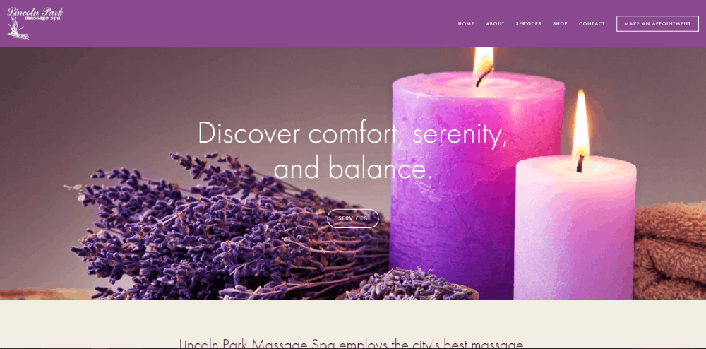
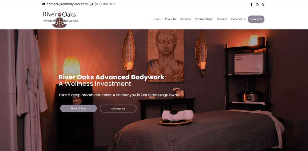
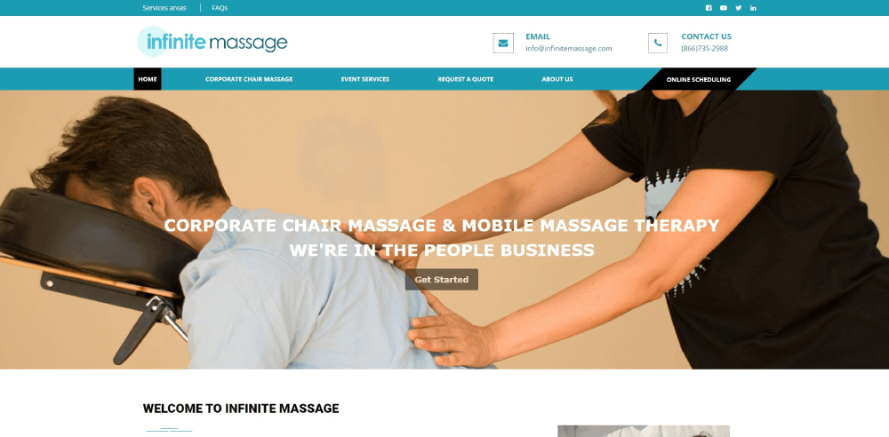
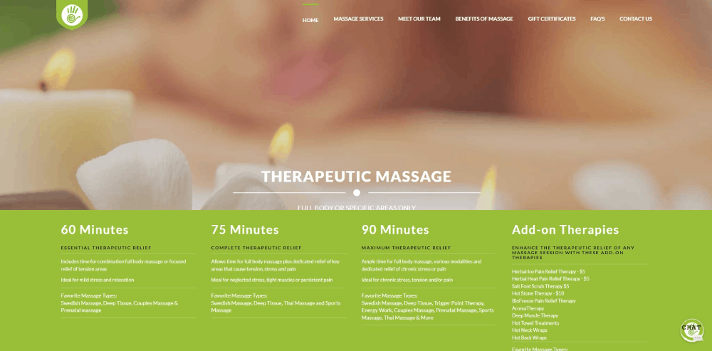
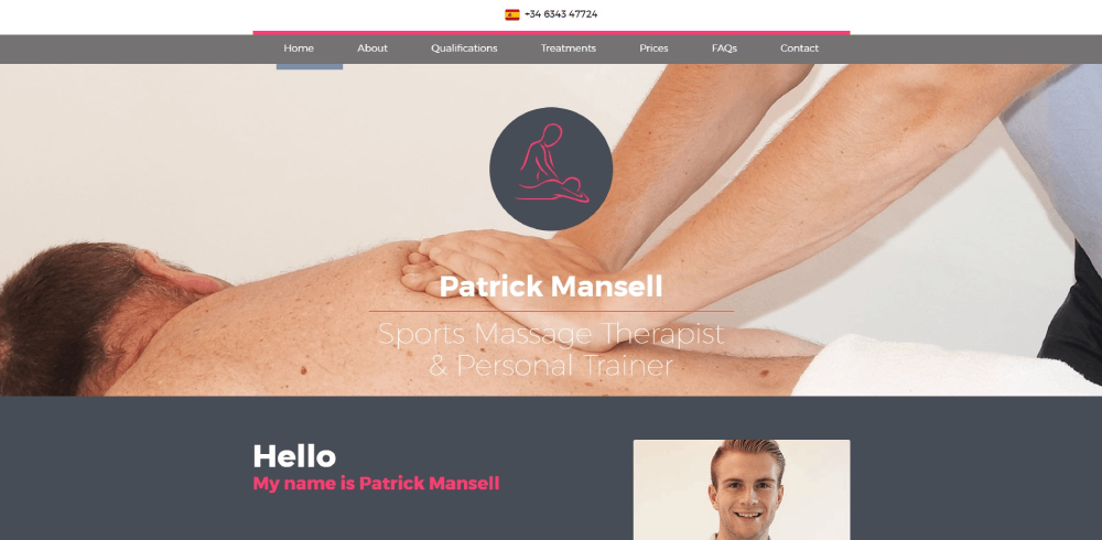
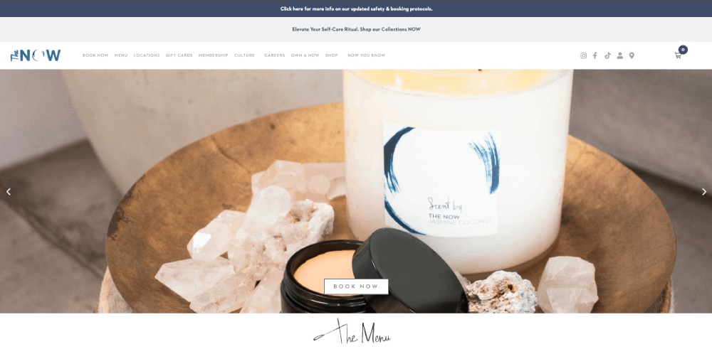
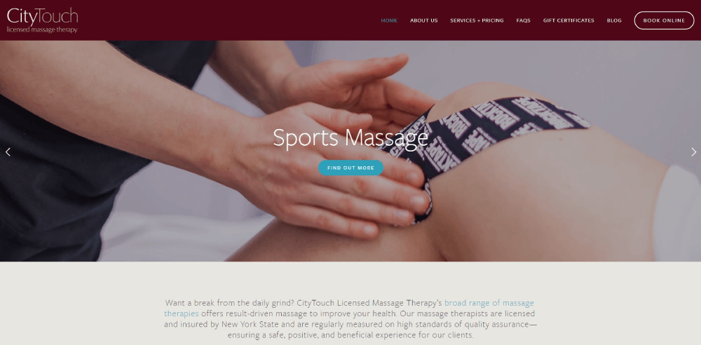
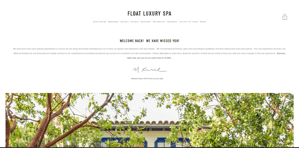
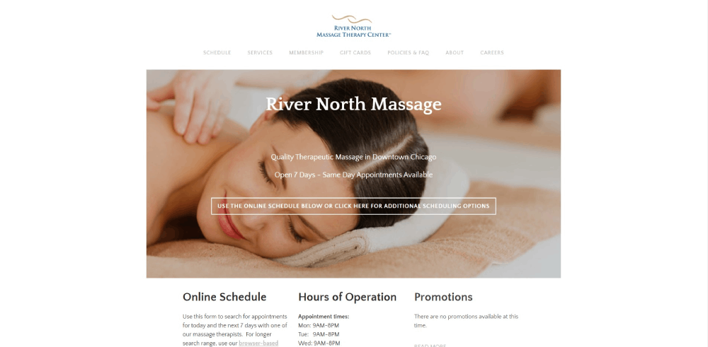
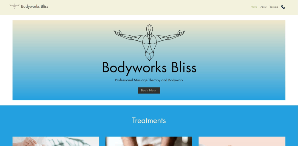
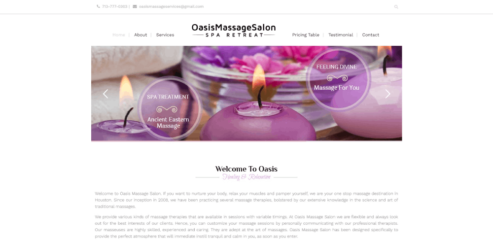
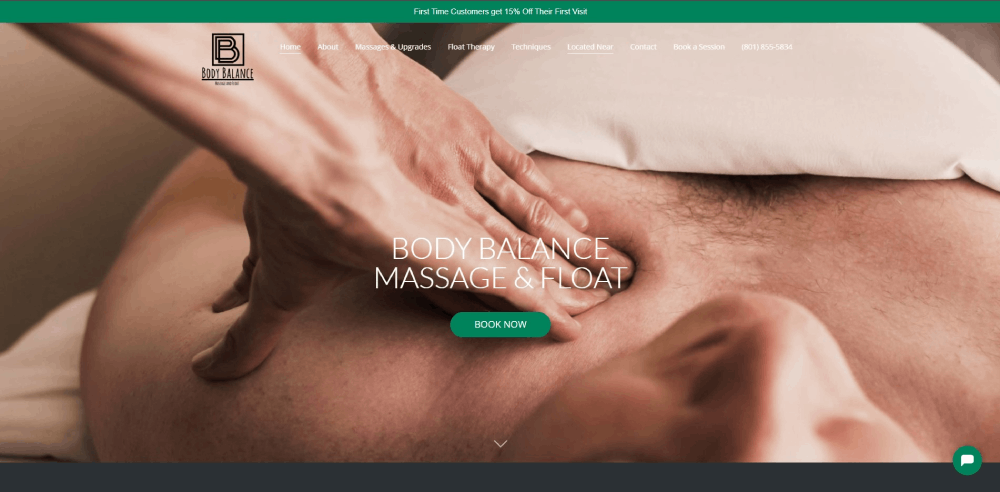
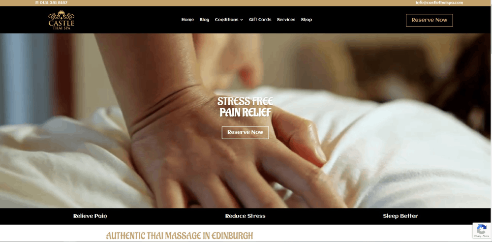
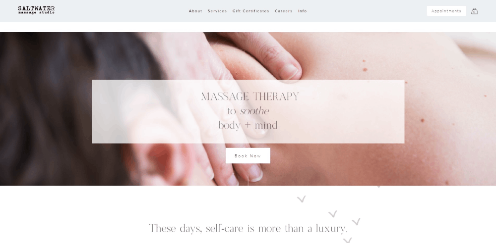
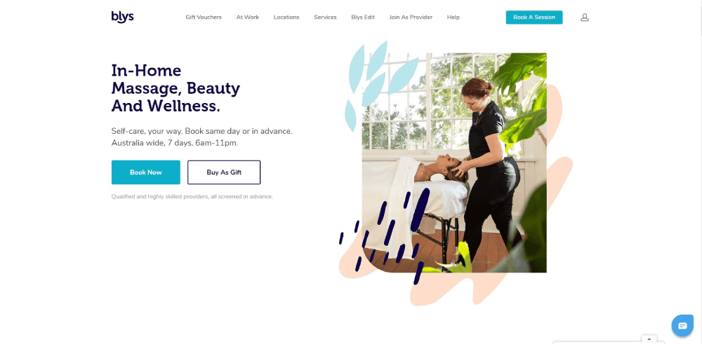
These massage therapist website design examples show what actually converts browsers into booked appointments.
You'll see real sites from solo practitioners and multi-location spas. Clean layouts that build trust. Booking integrations with Acuity Scheduling, MassageBook, and Vagaro that reduce friction.
Each example breaks down what works, from homepage structure to service page organization to color theory choices that signal relaxation before visitors read a word.
Skip the guesswork. Study what's already working.
What is Massage Therapist Website Design
Massage therapist website design is the process of creating a digital presence specifically for bodywork practitioners, spa websites, and therapeutic service providers.
These sites serve one core function: converting visitors into booked appointments.
A well-built massage therapy homepage combines online booking integration, service menu displays, and trust signals like credentials and client testimonials.
The design priorities differ from standard business sites. Calming color palettes replace aggressive sales tactics. Treatment room photography replaces stock images.
Most successful practitioners build on platforms like Squarespace, WordPress, or Wix, then connect scheduling software such as Acuity Scheduling, MassageBook, or Vagaro.
Massage Therapist Website Design Examples
Chantal Lehmann
Dolce Vita
What Makes a Massage Therapy Website Effective
Effective wellness websites share common traits regardless of the practitioner's specialty, whether Swedish massage, deep tissue therapy, or sports massage services.
Three factors determine success: booking friction, visual trust, and mobile performance.
How Does Online Booking Integration Affect Client Conversion
Every extra click between landing and booking costs you clients. Appointment scheduling software like Mindbody, Jane App, or Square Appointments should appear within the first scroll.
Top performers place call to action buttons in the hero section, not buried in footers.
What Visual Elements Build Trust for Massage Practices
Credentials from AMTA, ABMP, or NCBTMB displayed prominently. Real treatment room photography, not generic spa stock images.
A calm color palette signals relaxation before visitors read a single word.
Why Does Mobile Responsiveness Matter for Spa Websites
Over 70% of massage bookings happen on phones. Responsive websites with tap-friendly buttons and fast page load speed win.
Slow sites lose clients to competitors before the homepage finishes loading.
What Homepage Elements Do Successful Massage Websites Include
The homepage sells the first appointment. Every element either builds trust or removes booking friction.
How Should a Massage Therapist Display Credentials on Their Homepage
License numbers, NCBTMB certification badges, and AMTA or ABMP membership logos belong above the fold.
Link credentials to verification pages when possible.
What Hero Section Styles Work Best for Wellness Websites
Full-width treatment room photography outperforms stock images. Websites with video background showing actual massage sessions convert 23% higher than static images.
Keep headline copy under 10 words; let visuals do the heavy lifting.
Where Should Contact Information Appear on a Massage Site
Phone number in the header, always clickable on mobile. Address in footer with embedded map.
Contact forms belong on dedicated pages, not cluttering the homepage.
What Service Page Structures Do Top Massage Websites Use
Service pages convert browsers into bookers. Structure matters more than word count.
How Do Massage Therapists Organize Treatment Descriptions
Lead with benefits, not techniques. Clients care about pain relief, stress reduction, and flexibility improvement, not myofascial release terminology.
Session duration options displayed as clickable buttons, not buried in paragraphs.
What Pricing Display Methods Work for Massage Services
Transparent pricing tables with session lengths (30, 60, 90 minutes) and corresponding rates.
Membership pricing alongside single-session rates shows value without pressure. Membership websites in wellness convert 40% of first-time visitors into recurring clients.
How Do Massage Therapists Present Testimonials on Their Websites
Social proof closes hesitant visitors. Placement and format determine impact.
What Testimonial Formats Increase Credibility for Bodywork Practices
First name, last initial, and neighborhood (Sarah M., Downtown Portland) beats anonymous quotes.
Video testimonials from real clients outperform text by 3x. Pull reviews from Google Business Profile and Yelp for Business with proper attribution.
Where Should Reviews Appear on a Massage Therapy Website
Homepage: 2-3 rotating testimonials near the booking button.
Service pages: treatment-specific reviews matching the service described. Dedicated review page for comprehensive social proof.
What Photography Styles Perform Best on Massage Websites
Visual content sells the experience before words register. Quality photography separates professional website templates from amateur attempts.
Should Massage Therapists Use Stock Photos or Custom Images
Custom photography of your actual treatment rooms, therapists, and space always wins.
Stock images signal "generic franchise" even for independent practitioners. Budget $500-1500 for professional wellness photography.
What Image Sizes and Formats Load Fastest for Spa Sites
WebP format at 1920px maximum width. Compress to under 200KB per image.
Lazy loading for below-fold images keeps page load speed under 3 seconds, the threshold where bounce rates spike.
What Does a Massage Therapist Website Cost to Build
Budget determines whether you DIY, use templates, or hire professionals.
How Much Do Custom Massage Website Designs Cost
Web design agencies charge $3,000-15,000 for custom massage practice sites.
Includes discovery, design, development, booking integration, and basic SEO setup. Timeline: 6-12 weeks.
What Are Affordable Website Options for New Massage Therapists
DIY with Squarespace or Wix: $200-500 first year including domain and hosting.
Simple website templates with customization: $500-1,500 one-time. Premium templates from ThemeForest run $60-80 with self-installation.
How Should a Massage Website Handle HIPAA and Privacy Compliance
Healthcare-adjacent businesses face specific legal requirements. Client intake forms and health histories require protection.
SSL certificate security (https://) is mandatory, not optional. Most hosting providers include free SSL.
HIPAA-compliant form providers: JotForm HIPAA, Formstack, IntakeQ. Standard contact forms from Squarespace or WordPress do not meet compliance standards for health information.
Privacy policy page required. Disclose what data you collect, how you store it, who can access it.
What Mistakes Do Massage Therapists Make on Their Websites
Common errors cost bookings daily. Most are fixable in under an hour.
Why Do Some Massage Websites Fail to Convert Visitors
Booking button buried below the fold. No pricing visible without clicking through multiple pages.
Stock photography of models instead of actual treatment spaces. Missing phone number or non-clickable on mobile. Sites with bad design lose 38% of visitors within 5 seconds.
What Loading Speed Issues Hurt Massage Practice Websites
Uncompressed images over 2MB each. Too many plugins on WordPress installations.
Embedded booking widgets loading synchronously instead of async. Test with Google PageSpeed Insights; aim for 90+ mobile score.
How to Choose a Website Design for Your Massage Practice
Match design complexity to your actual needs and maintenance capacity.
Solo practitioners: Squarespace with Acuity Scheduling. Minimal maintenance, professional results.
Multi-therapist studios: WordPress with MassageBook or Vagaro integration. More flexibility for staff bios, multiple service menus, location pages.
Franchise or multi-location: Custom development or enterprise platforms. Centralized booking, location-specific content, unified branding.
Questions to answer before choosing:
- How many services do you offer?
- Do you need online gift certificate sales?
- Will you manage updates yourself or hire help?
- What booking software do you already use?
- Do you serve multiple locations?
Start with website inspiration from competitors in your area. Screenshot what works. Note what frustrates you as a user.
Your website exists to book appointments. Every design decision should answer one question: does this make booking easier or harder?
FAQ on Massage Therapist Website Design
What platform works best for massage therapist websites?
Squarespace and WordPress handle most massage practice needs. Squarespace integrates directly with Acuity Scheduling for seamless booking. WordPress offers more customization with MassageBook or Vagaro plugins. Wix works for budget-conscious solo practitioners who prioritize simplicity over flexibility.
How much does a massage therapy website cost?
DIY builds on Squarespace or Wix run $200-500 yearly. Premium website templates cost $500-1,500 with customization. Custom designs from agencies range $3,000-15,000 depending on features like online gift certificates, membership portals, and multi-location support.
What colors work best for massage websites?
Earth tones, soft greens, muted blues, and warm neutrals signal relaxation. Avoid harsh reds or neon colors that create tension. A green color palette connects to nature and healing, while cream and beige backgrounds feel warm and inviting.
Should massage therapists use online booking on their website?
Yes. Online booking integration converts 40% more visitors than phone-only contact. Software like Mindbody, Jane App, or Square Appointments lets clients schedule 24/7. Place booking buttons prominently in the header and after every service description.
What pages should a massage therapist website include?
Homepage, services with pricing, about/credentials, contact with embedded map, and booking integration. Optional additions: blog design for SEO content, gift certificate sales page, client testimonials, and an intake form portal for HIPAA-compliant health history collection.
How do I display massage services and pricing effectively?
Use clear pricing tables showing session durations (30, 60, 90 minutes) with corresponding rates. Group treatments by category: relaxation, therapeutic, specialty. Lead with client benefits like stress relief or pain management, not technical jargon about myofascial release techniques.
What images should massage therapists use on their websites?
Custom photography of your actual treatment rooms and space outperforms stock images. Show clean linens, calming decor, and professional setup. Avoid generic spa stock photos that signal "franchise." Budget $500-1,500 for professional wellness photography that builds authentic trust.
How important is mobile responsiveness for massage websites?
Critical. Over 70% of massage bookings happen on phones. Mobile first design with tap-friendly buttons, readable text, and fast loading ensures visitors book instead of bouncing. Test your site on multiple devices before launching.
How do I add testimonials to my massage website?
Display 2-3 rotating reviews on your homepage near booking buttons. Include first name, last initial, and location for credibility. Pull verified reviews from Google Business Profile or Yelp for Business. Video testimonials from real clients convert three times better than text.
What makes a massage website convert visitors into clients?
Fast page load speed under 3 seconds, visible booking buttons above the fold, transparent pricing, and user friendly website navigation. Display AMTA or NCBTMB credentials prominently. Remove friction between landing and booking with minimal required clicks.
Conclusion
These massage therapist website design examples prove one thing: simplicity converts.
The best sites share common traits. Clear service menus with transparent pricing. Booking buttons visible within the first scroll. Treatment room photography that feels authentic, not staged.
Whether you build on WordPress, Squarespace, or Wix, the fundamentals stay the same. Fast page load speed. Mobile-friendly layouts. Credentials from AMTA or ABMP displayed where visitors notice them.
Use a website checklist before launching. Test your booking flow on mobile. Ask a friend to schedule an appointment and watch where they struggle.
Your site exists to fill your schedule. Every design choice either helps that goal or hurts it.
Start building.


