5 Extra Useful Shortcodes You Should Know About
April 18, 2016
Designing for a Small Business? Check Out These New Pre-Built Websites
May 9, 2016Should you happen to come upon clients who are filmmakers, you can be certain they are familiar with the various options open to them for promoting their films; options ranging from submitting their films to film festivals, to posting information on online film sites.
More and more filmmakers are discovering that the best approach is to own a website that is dedicated to promoting their films. They want a website that serves as a home base, and one that includes all the information a prospective theater-goer will want or need to know.
Such a website needs to –
- be Simple and Concise
- be Extremely Well Organized
- represent and Characterize the Film (Branding), and naturally --
- feature Beautiful Content, Including Shots or Stills from the Film
Simple and concise refers to the user interface (UI), while far as the user experience (UX) is concerned, bells and whistles that provide a dynamic and interactive experience become the norm.
Large photos and background images play key roles, as do videos and/or trailers. The latter are expected, not only within the website, but as the first thing a visitor sees when the home page loads.
A video website may be a different animal, but it isn’t difficult to design one – if you have the proper tools.
BeMovie – The Newest Pre-Built Website Dedicated to Film Promotion
The Be Movie Pre-built website does much more than provide a conceptual design for a movie website.
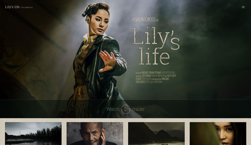
The demo is itself a joy to watch. It demonstrates the effectiveness of showing a trailer up front, or of giving the visitor the option of viewing trailers of several movies.
- Observe how the layout of the home page is simple, while at the same time it is powerful and engaging.
- Note how a trailer plays on an overlayer, and serves as an effective call to action.
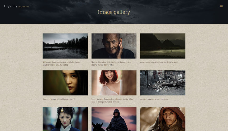
- Note the simplicity of the gallery, and imagine how it can be used to tell a story.
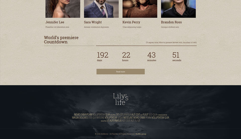
- See how effective the use of a countdown feature can be, as opposed to simply posting a release date.
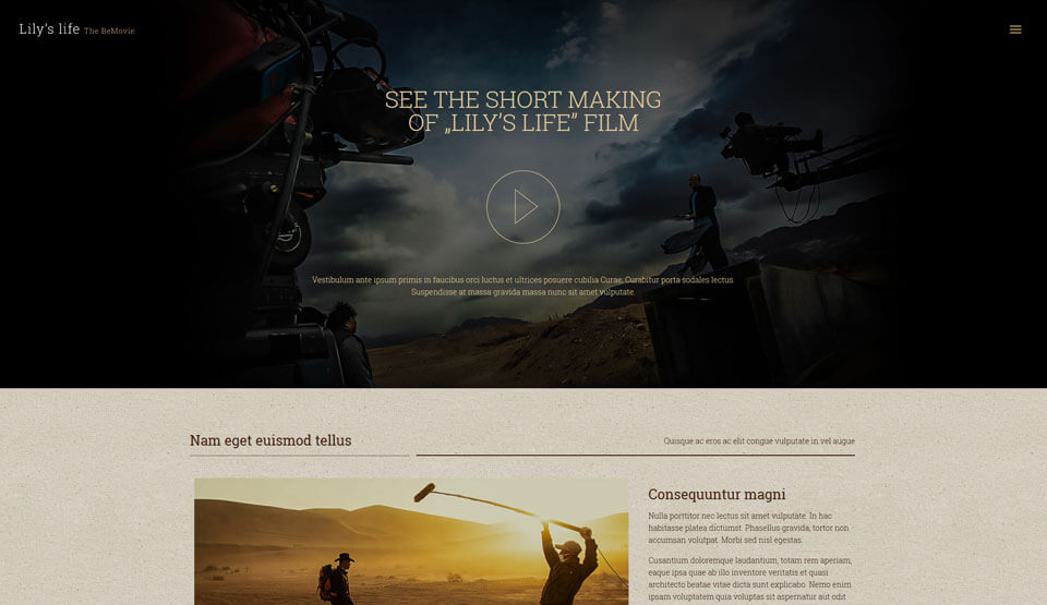
- Observe the making of a beautiful page, and note how the focus is placed on the video, the still images, and on readability.
- Also observe the effective use of simple but elegant lines to create the cast page.
It’s worth mentioning at this point that visitors to a movie website are generally interested in seeing a few images that show examples of how the movie was made. This information can be a great way to engage website visitors, as suggests the movie was made especially for them.
What Do Visitors Expect When Entering a Movie Website?
Movies are meant to entertain. The same can be said for movie websites. It needs to be kept in mind however, that even though this type of a website should be entertaining, its primary purpose is to assist the user in analyzing and judging whether the movie being promoted will be worth watching.
That said, visitors expect to find the website to be graphically rich, and they should expect to be able to decide whether or not they want to see the movie within a few minutes. The branding of the website’s homepage should give a quick indication as to the atmosphere of the movie – horror, action, romance, comedy, etc.
In most other types of websites, when a video automatically starts, it is often viewed as a somewhat negative feature. On the other hand, visitors to a movie website have a tendency to expect a trailer to start automatically when they enter the site.
A nice compromise, and one that is used on the BeMovie pre-designed layout, is to prominently center a play trailer button on the home page.
Viewers also want to know dates or countdown to a movies release, and show times and be given links to theater chains or ticket sales website.
The Most Important Elements in a Movie Website
Like every other Be Theme pre-built website, the rules of the game pertaining to a given client’s theme are to be respected. This is true for the rules of the website promotion game as well.
- The website must have large background images (think movie posters)
- It should have a heavy focus on video (think trailers or the making of the movie)
- (insert image)
- It needs to communicate the time of launch (release date, or countdown), and
- It should include nominations, awards, a download page (free wallpaper, icons, posters), and possibly a few games or activities. A description of a film’s Academy Awards always is a good selling point.
Other things to consider would be an option to view a trailer full screen, adding a search feature to locate a theater by zip code, and including social networking links. Some movie promotors like their website to give a viewer the capability to e-mail a trailer to a friend.
The list of features a user and your client would expect to see in a movie website may seem long and complex. There is however nothing that has been mentioned here that cannot easily be incorporated when BeMovie is your tool of choice.
Be Movie has everything you need for this website theme. It makes the incorporating seemingly complicated features a snap, and it makes creating an awesome, attention-grabbing website about as easy as you can imagine.
Be Theme has more than 200 pre-built websites, including websites for entertainment, online shops, travel, and everything beyond and everything in between.
Over 35,000 web designers, scattered across the globe, use these pre-built websites.
When you select a pre-built website as the foundation to build a website that is responsive, multilingual, and RTL and retina ready, you also have Be Theme’s 40 core features at your disposal.
The most important of these are the one-click demo import, a premium page builder, and layout configuration features and options. Be is exactly the partner you want to help you build a movie website your client will love.
